
diff options
| author | wxiaoguang <wxiaoguang@gmail.com> | 2023-09-04 18:22:46 +0800 |
|---|---|---|
| committer | GitHub <noreply@github.com> | 2023-09-04 18:22:46 +0800 |
| commit | 51cfe0e7deb511233ecca331359e8c875448a940 (patch) | |
| tree | 92e40d43cc972c830053261fc5a1e888e702553d /web_src/css/base.css | |
| parent | a38cf868c5345e7c7ec9a2236ac26ce602b25995 (diff) | |
| download | gitea-51cfe0e7deb511233ecca331359e8c875448a940.tar.gz gitea-51cfe0e7deb511233ecca331359e8c875448a940.zip | |
Remove CSS `has` selector and improve various styles (#26891)
Replace #26850
Major changes:
1. Remove all `has` selectors, it is still not supported by firefox.
Actually there could be some more general and clearer approaches
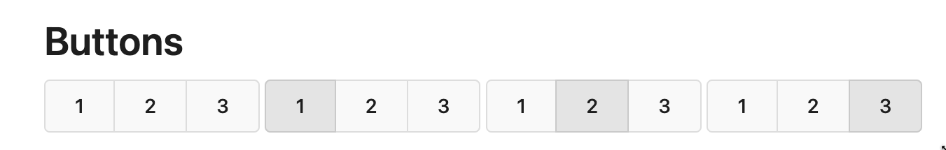
2. Remove `two-toggle-buttons`, the `.ui.buttons` just works well
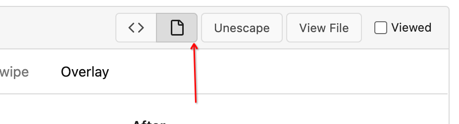
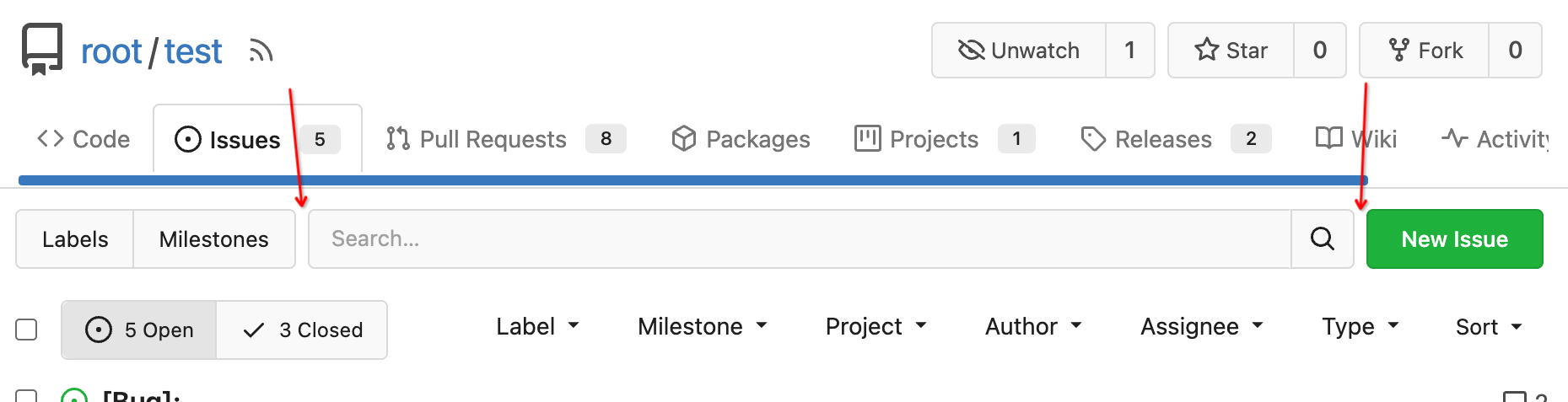
3. Rewrite the `.ui.buttons` border styles, see the screenshots
4. Remove the "fine-tuning" paddings from the the flex children, they
could layout themselves well.

Diffstat (limited to 'web_src/css/base.css')
| -rw-r--r-- | web_src/css/base.css | 24 |
1 files changed, 10 insertions, 14 deletions
diff --git a/web_src/css/base.css b/web_src/css/base.css index 9d7c12525e..cbd3336d26 100644 --- a/web_src/css/base.css +++ b/web_src/css/base.css @@ -485,8 +485,10 @@ a.label, border-color: var(--color-primary); } -.ui.action.input .button { +.ui.action.input .ui.ui.button { border-color: var(--color-input-border); + padding-top: 0; /* the ".action.input" is "flex + stretch", so let the buttons layout themselves */ + padding-bottom: 0; } /* currently used for search bar dropdowns in repo search and explore code */ @@ -2015,25 +2017,19 @@ a.ui.basic.label:hover { border-color: var(--color-secondary); } -.ui.attached.header .right .button { - padding: 8px 10px; - font-weight: var(--font-weight-normal); -} - -/* reduce height of buttons with dropdown icon */ -.ui.attached.header .right .button:has(.dropdown.icon) { - padding-top: 7px; - padding-bottom: 7px; -} - /* fix misaligned right buttons on box headers */ -.ui.attached.header .right:not(.dropdown) { +.ui.attached.header > .ui.right { position: absolute; right: 0.78571429rem; top: 0; bottom: 0; display: flex; - align-items: center; +} + +.ui.attached.header > .ui.right > .button, +.ui.attached.header > .ui.right > .dropdown > .button { + padding: 8px 10px; + font-weight: var(--font-weight-normal); } /* if a .top.attached.header is followed by a .segment, add some margin */ |