| Commit message (Collapse) | Author | Age | Files | Lines |
|---|
| |
|
|
|
|
|
|
|
|
|
|
|
|
|
|
|
| |
Fixes https://github.com/go-gitea/gitea/issues/30082.
Adds a new linter that searches for non-existant SVG images in
templates. Output before the fix was:
```
$ make lint-templates
SVG "octicon-warning" not found, used in templates/devtest/flex-list.tmpl
SVG "octicon-warning" not found, used in templates/devtest/flex-list.tmpl
SVG "octicon-markup" not found, used in templates/repo/diff/comment_form.tmpl
make: *** [Makefile:438: lint-templates] Error 1
```
<img width="306" alt="Screenshot 2024-03-25 at 23 31 05"
src="https://github.com/go-gitea/gitea/assets/115237/1052d1a9-bfec-4d5a-9cae-f895f78f7c93">
|
| |
|
|
|
|
|
|
|
|
|
|
|
| |
This will conclude the refactor of 1:1 class replacements to tailwind,
except `gt-hidden`. Commands ran:
```bash
perl -p -i -e 's#gt-(p|m)([lrtbxy])?-0#tw-$1$2-0#g' {web_src/js,templates,routers,services}/**/*
perl -p -i -e 's#gt-(p|m)([lrtbxy])?-1#tw-$1$2-0.5#g' {web_src/js,templates,routers,services}/**/*
perl -p -i -e 's#gt-(p|m)([lrtbxy])?-2#tw-$1$2-1#g' {web_src/js,templates,routers,services}/**/*
perl -p -i -e 's#gt-(p|m)([lrtbxy])?-3#tw-$1$2-2#g' {web_src/js,templates,routers,services}/**/*
perl -p -i -e 's#gt-(p|m)([lrtbxy])?-4#tw-$1$2-4#g' {web_src/js,templates,routers,services}/**/*
perl -p -i -e 's#gt-(p|m)([lrtbxy])?-5#tw-$1$2-8#g' {web_src/js,templates,routers,services}/**/*
```
|
| |
|
|
|
|
| |
These should be all simple inline styles that were left in the
templates.
Co-authored-by: Giteabot <teabot@gitea.io>
|
| |
|
|
|
|
|
| |
Used all existing css vars, other migrations are 1:1.
---------
Co-authored-by: wxiaoguang <wxiaoguang@gmail.com>
|
| | |
|
| |
|
|
|
|
|
|
|
|
|
|
|
|
|
|
|
|
|
|
|
|
|
|
| |
I think it's better if the primary actions have primary color instead of
green which fits better into the overall single-color UI design. This PR
currently replaces every green button with primary:
<img width="141" alt="Screenshot 2023-09-16 at 14 07 59"
src="https://github.com/go-gitea/gitea/assets/115237/843c1e50-4fb2-4ec6-84ba-0efb9472dcbe">
<img width="161" alt="Screenshot 2023-09-16 at 14 07 51"
src="https://github.com/go-gitea/gitea/assets/115237/9442195a-a3b2-4a42-b262-8377d6f5c0d1">
Modal actions now use uncolored/primary instead of previous green/red
colors. I also removed the box-shadow on all basic buttons:
<img width="259" alt="Screenshot 2023-09-16 at 14 16 39"
src="https://github.com/go-gitea/gitea/assets/115237/5beea529-127a-44b0-8d4c-afa7b034a490">
<img width="261" alt="Screenshot 2023-09-16 at 14 17 42"
src="https://github.com/go-gitea/gitea/assets/115237/4757f7b2-4d46-49bc-a797-38bb28437b88">
The change currently includes the "Merge PR" button, for which we might
want to make an exception to match the icon color there:
<img width="442" alt="Screenshot 2023-09-16 at 14 33 53"
src="https://github.com/go-gitea/gitea/assets/115237/993ac1a5-c94d-4895-b76c-0d872181a70b">
|
| |
|
|
|
|
|
|
|
|
|
|
|
|
|
|
|
|
|
|
| |
Some small dashboard tweaks:
- Remove margin-bottom from divider so first item does not appear to
have un-equal margins
- Restore previous icon color
- Add slight margin-right to icon
Before:
<img width="783" alt="Screenshot 2023-08-31 at 00 10 28"
src="https://github.com/go-gitea/gitea/assets/115237/b75f70d7-8704-4afb-866d-fea0484c52d4">
After:
<img width="783" alt="Screenshot 2023-08-31 at 00 10 08"
src="https://github.com/go-gitea/gitea/assets/115237/50ed0c47-6f7c-449e-a054-13091369d43f">
---------
Co-authored-by: wxiaoguang <wxiaoguang@gmail.com>
|
| |
|
|
|
|
|
|
|
|
|
|
|
|
|
|
|
|
|
|
|
|
|
|
|
|
| |
Replace #26761
It's better to keep children elements simple, and let parent containers
layout the necessary padding/margin.
The old `not(:last-child)` and `.flex-item + .flex-item` are not easy to
maintain (for example, what if the developer would like to use a "tiny
height" item?)
The old approach also makes some UI look strange because the first item
doesn't have proper padding-top.
In this PR, we just simply use `.flex-item { padding: ... }`:
* Developers could manually set the item height they want easily
* It's easier to make it work with various containers -- with padding
(`ui segment`) and without padding (`div`)
And added more samples/examples.
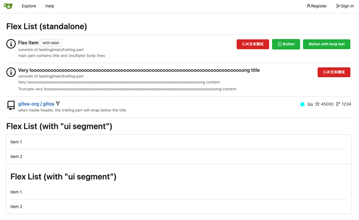
Co-authored-by: Giteabot <teabot@gitea.io>
|
| |
|
| |
Follow #26649 and #25790 and add one more example (text truncate) in the devtest page
|
|
|
Fix #26617
1. Separate the "flex-list" examples into a dedicated template, and add some more examples
2. Use `flex-basis` instead of `flex-shrink` for `flex-item-trailing`, to avoid wrapping the texts too aggressively
3. Some `flex-wrap: wrap;` are removed
|
