| Commit message (Collapse) | Author | Age | Files | Lines |
|---|
| |
|
|
|
|
|
|
| |
Backport #30849 by wxiaoguang
Follow #30345
Follow #30547
Co-authored-by: wxiaoguang <wxiaoguang@gmail.com>
|
| |
|
|
| |
1. Rewrite initGlobalEnterQuickSubmit (by the way, remove jQuery)
2. Fix issue comment form layout
|
| |
|
|
|
|
|
|
|
|
| |
Partial revert of https://github.com/go-gitea/gitea/pull/30479
It's causing problems at least here:
https://github.com/go-gitea/gitea/pull/30344#discussion_r1564895591
---------
Co-authored-by: wxiaoguang <wxiaoguang@gmail.com>
|
| |
|
|
|
|
|
| |

---------
Co-authored-by: silverwind <me@silverwind.io>
|
| |
|
|
|
|
|
|
|
|
| |
CSS-only module. Button colors are reduced to this:
<img width="639" alt="Screenshot 2024-04-14 at 15 36 07"
src="https://github.com/go-gitea/gitea/assets/115237/882d6c02-d1de-44f2-b707-db02a9f5070d">
---------
Co-authored-by: wxiaoguang <wxiaoguang@gmail.com>
|
| |
|
|
| |
Another pure CSS module. Some styling is part of the `form` module which
will likely follow next.
|
| |
|
|
|
|
|
|
|
|
|
|
|
|
|
|
|
| |
Fixes https://github.com/go-gitea/gitea/issues/30082.
Adds a new linter that searches for non-existant SVG images in
templates. Output before the fix was:
```
$ make lint-templates
SVG "octicon-warning" not found, used in templates/devtest/flex-list.tmpl
SVG "octicon-warning" not found, used in templates/devtest/flex-list.tmpl
SVG "octicon-markup" not found, used in templates/repo/diff/comment_form.tmpl
make: *** [Makefile:438: lint-templates] Error 1
```
<img width="306" alt="Screenshot 2024-03-25 at 23 31 05"
src="https://github.com/go-gitea/gitea/assets/115237/1052d1a9-bfec-4d5a-9cae-f895f78f7c93">
|
| |
|
|
|
|
|
|
|
|
|
|
|
| |
This will conclude the refactor of 1:1 class replacements to tailwind,
except `gt-hidden`. Commands ran:
```bash
perl -p -i -e 's#gt-(p|m)([lrtbxy])?-0#tw-$1$2-0#g' {web_src/js,templates,routers,services}/**/*
perl -p -i -e 's#gt-(p|m)([lrtbxy])?-1#tw-$1$2-0.5#g' {web_src/js,templates,routers,services}/**/*
perl -p -i -e 's#gt-(p|m)([lrtbxy])?-2#tw-$1$2-1#g' {web_src/js,templates,routers,services}/**/*
perl -p -i -e 's#gt-(p|m)([lrtbxy])?-3#tw-$1$2-2#g' {web_src/js,templates,routers,services}/**/*
perl -p -i -e 's#gt-(p|m)([lrtbxy])?-4#tw-$1$2-4#g' {web_src/js,templates,routers,services}/**/*
perl -p -i -e 's#gt-(p|m)([lrtbxy])?-5#tw-$1$2-8#g' {web_src/js,templates,routers,services}/**/*
```
|
| |
|
|
|
|
|
|
|
|
|
|
|
|
|
|
|
|
|
|
|
|
|
|
|
|
|
|
|
|
|
|
| |
1. Restore missing styles for message close icon
2. Move `code-line-button` so that it does not go off-screen on small
viewports
3. Make `code-line-button` look and behave like other buttons
4. Make `code-line-button` work in blame
5. Make the active selection span the whole line, not just the code part
6. Tweak colors, make dark theme code bg darker, make line numbers same
color in diff and file view.
7. Move code background to parent, fixing border radius and other
problems
8. Enable code wrap in blame
9. Improve blame responsiveness
10. Remove `--color-code-sidebar-bg` in blame, now it uses same
background as code
11. Rename `--color-active-line` to `--color-highlight-bg`
12. Add `--color-highlight-bg`
13. Fix button group borders on hover and border-right on last button.
<img width="1343" alt="Screenshot 2024-03-23 at 22 34 13"
src="https://github.com/go-gitea/gitea/assets/115237/fcbb919f-5dc3-43f0-97f6-870d6f412554">
<img width="1334" alt="Screenshot 2024-03-23 at 22 34 26"
src="https://github.com/go-gitea/gitea/assets/115237/ca44c3b7-4328-4645-ba49-b0dc6a5ac06d">
<img width="1338" alt="Screenshot 2024-03-23 at 22 34 57"
src="https://github.com/go-gitea/gitea/assets/115237/00eb0b5a-1ec7-4669-a94a-4602b9d1c1ac">
<img width="1337" alt="Screenshot 2024-03-23 at 22 34 42"
src="https://github.com/go-gitea/gitea/assets/115237/752edc4a-064f-413c-9dff-c086187fcd85">
Fixes: https://github.com/go-gitea/gitea/issues/18074
|
| |
|
|
|
|
| |
These should be all simple inline styles that were left in the
templates.
Co-authored-by: Giteabot <teabot@gitea.io>
|
| |
|
|
|
|
|
|
|
|
|
|
|
|
|
|
|
|
|
|
| |
Likely the biggest change of the tailwind refactors. Only thing of note
is that `tw-flex-1` resolves to `flex: 1 1 0%` while our `gt-f1` was
`flex: 1 1 0`, I don't think it will make any difference. Commands I've
ran:
```sh
perl -p -i -e 's#gt-vm#tw-align-middle#g' web_src/js/**/* templates/**/* models/**/*
perl -p -i -e 's#gt-fw#tw-flex-wrap#g' web_src/js/**/* templates/**/* models/**/*
perl -p -i -e 's#gt-f1#tw-flex-1#g' web_src/js/**/* templates/**/* models/**/*
perl -p -i -e 's#gt-fc#tw-flex-col#g' web_src/js/**/* templates/**/* models/**/*
perl -p -i -e 's#gt-sb#tw-justify-between#g' web_src/js/**/* templates/**/* models/**/*
perl -p -i -e 's#gt-je#tw-justify-end#g' web_src/js/**/* templates/**/* models/**/*
perl -p -i -e 's#gt-jc#tw-justify-center#g' web_src/js/**/* templates/**/* models/**/*
perl -p -i -e 's#gt-ac#tw-content-center#g' web_src/js/**/* templates/**/* models/**/* tests/**/*
perl -p -i -e 's#gt-df#tw-flex#g' web_src/js/**/* templates/**/* models/**/* tests/**/*
perl -p -i -e 's#gt-dib#tw-inline-block#g' web_src/js/**/* templates/**/* models/**/* tests/**/*
Co-authored-by: wxiaoguang <wxiaoguang@gmail.com>
|
| |
|
|
|
|
|
| |
Used all existing css vars, other migrations are 1:1.
---------
Co-authored-by: wxiaoguang <wxiaoguang@gmail.com>
|
| |
|
|
|
|
|
|
|
|
|
|
|
|
|
|
|
|
|
|
|
|
|
|
|
|
|
|
|
|
|
|
| |
1. Introduce a special "flex-items-block" for menu items, to align the
dropdown menu items
2. Simplify the "repo search" form
3. Add missing "TopicOnly" search option
Screenshots:
The old UI items don't align:
<details>
</details>
New UI (doesn't change much, but the items align)
<details>


</details>
---------
Co-authored-by: silverwind <me@silverwind.io>
|
| |
|
|
|
|
|
|
|
|
|
|
|
|
|
|
|
|
|
|
|
|
|
|
|
|
|
|
|
|
|
|
|
|
|
|
| |
1. Add `<overflow-menu>` web component
2. Rename `<gitea-origin-url>` to `<origin-url>` and make filenames
match.
<img width="439" alt="image"
src="https://github.com/go-gitea/gitea/assets/115237/2fbe4ca4-110b-4ad2-8e17-c1e116ccbd74">
<img width="444" alt="Screenshot 2024-03-02 at 21 36 52"
src="https://github.com/go-gitea/gitea/assets/115237/aa8f786e-dc8c-4030-b12d-7cfb74bdfd6e">
<img width="537" alt="Screenshot 2024-03-03 at 03 05 06"
src="https://github.com/go-gitea/gitea/assets/115237/fddd50aa-adf1-4b4b-bd7f-caf30c7b2245">

TODO:
- [x] Check if removal of `requestAnimationFrame` is possible to avoid
flash of content. Likely needs a `MutationObserver`.
- [x] Hide tippy when button is removed from DOM.
- [x] ~~Implement right-aligned items
(https://github.com/go-gitea/gitea/pull/28976)~~. Not going to do it.
- [x] Clean up CSS so base element has no background and add background
via tailwind instead.
- [x] Use it for org and user page.
---------
Co-authored-by: Giteabot <teabot@gitea.io>
Co-authored-by: wxiaoguang <wxiaoguang@gmail.com>
|
| |
|
|
|
|
|
|
|
|
|
|
|
| |
Alternative to: https://github.com/go-gitea/gitea/pull/29698
Fixes: https://github.com/go-gitea/gitea/issues/29034
<img width="278" alt="image"
src="https://github.com/go-gitea/gitea/assets/115237/12ecd967-2723-410d-8a28-a1b0f41b7bba">
It also fixes a secondary issue that we were showing timestamp tooltips
over date, which makes no sense, so these are now gone as well:
<img width="284" alt="image"
src="https://github.com/go-gitea/gitea/assets/115237/a70432f3-97b6-41e6-b202-b53b76924a66">
|
| |
|
|
|
| |
Follow #29357
- Replace `gt-w-*` -> `tw-w-*` and remove `gt-w-*`
- Replace `gt-h-*` -> `tw-h-*` and remove `gt-h-*`
|
| |
|
|
|
|
|
|
|
|
|
|
|
|
|
|
|
|
|
|
|
|
|
|
|
|
|
|
|
|
|
|
|
|
|
|
|
|
|
|
|
|
|
|
|
|
|
|
|
|
|
|
|
|
|
|
|
|
|
|
|
|
|
|
|
|
|
|
|
|
|
|
|
|
|
|
|
|
|
|
|
|
|
|
|
|
|
|
|
|
|
|
|
|
|
|
|
|
|
|
|
|
|
|
|
|
|
|
|
|
|
|
|
|
|
|
|
|
|
|
|
|
|
|
|
|
|
|
|
|
|
|
|
|
|
|
|
|
|
|
|
|
|
|
|
|
|
|
|
|
|
|
|
|
|
|
|
|
|
|
|
|
|
|
|
|
|
|
|
|
|
|
|
|
|
|
|
|
|
|
|
|
|
|
|
|
|
|
|
|
|
|
|
|
|
|
|
|
|
|
|
|
|
|
|
|
|
|
|
|
|
|
|
|
|
|
|
|
|
|
|
|
|
|
|
|
|
|
|
|
|
|
|
|
|
|
|
|
|
|
|
|
|
|
|
|
|
|
|
|
|
|
|
|
|
|
|
|
|
|
|
|
|
|
|
|
|
|
|
|
|
|
|
|
|
|
|
|
|
|
|
|
|
|
|
|
|
|
|
|
|
|
|
|
|
|
|
|
|
|
|
|
|
|
|
|
|
|
|
|
|
|
|
|
|
|
|
|
|
|
|
|
|
|
|
|
|
|
|
|
|
| |
This will get tailwindcss working on a basic level. It provides only the
utility classes, e.g. no tailwind base which we don't need because we
have our own CSS reset. Without the base, we also do not have their CSS
variables so a small amount of features do not work and I removed the
generated classes for them.
***Note for future developers: This currently uses a `tw-` prefix, so we
use it like `tw-p-3`.***
<details>
<summary>Currently added CSS, all false-positives</summary>
```
.\!visible{
visibility: visible !important
}
.visible{
visibility: visible
}
.invisible{
visibility: hidden
}
.collapse{
visibility: collapse
}
.static{
position: static
}
.\!fixed{
position: fixed !important
}
.absolute{
position: absolute
}
.relative{
position: relative
}
.sticky{
position: sticky
}
.left-10{
left: 2.5rem
}
.isolate{
isolation: isolate
}
.float-right{
float: right
}
.float-left{
float: left
}
.mr-2{
margin-right: 0.5rem
}
.mr-3{
margin-right: 0.75rem
}
.\!block{
display: block !important
}
.block{
display: block
}
.inline-block{
display: inline-block
}
.inline{
display: inline
}
.flex{
display: flex
}
.inline-flex{
display: inline-flex
}
.\!table{
display: table !important
}
.inline-table{
display: inline-table
}
.table-caption{
display: table-caption
}
.table-cell{
display: table-cell
}
.table-column{
display: table-column
}
.table-column-group{
display: table-column-group
}
.table-footer-group{
display: table-footer-group
}
.table-header-group{
display: table-header-group
}
.table-row-group{
display: table-row-group
}
.table-row{
display: table-row
}
.flow-root{
display: flow-root
}
.inline-grid{
display: inline-grid
}
.contents{
display: contents
}
.list-item{
display: list-item
}
.\!hidden{
display: none !important
}
.hidden{
display: none
}
.flex-shrink{
flex-shrink: 1
}
.shrink{
flex-shrink: 1
}
.flex-grow{
flex-grow: 1
}
.grow{
flex-grow: 1
}
.border-collapse{
border-collapse: collapse
}
.select-all{
user-select: all
}
.resize{
resize: both
}
.flex-wrap{
flex-wrap: wrap
}
.overflow-visible{
overflow: visible
}
.rounded{
border-radius: 0.25rem
}
.border{
border-width: 1px
}
.text-justify{
text-align: justify
}
.uppercase{
text-transform: uppercase
}
.lowercase{
text-transform: lowercase
}
.capitalize{
text-transform: capitalize
}
.italic{
font-style: italic
}
.text-red{
color: var(--color-red)
}
.text-shadow{
color: var(--color-shadow)
}
.underline{
text-decoration-line: underline
}
.overline{
text-decoration-line: overline
}
.line-through{
text-decoration-line: line-through
}
.outline{
outline-style: solid
}
.ease-in{
transition-timing-function: cubic-bezier(0.4, 0, 1, 1)
}
.ease-in-out{
transition-timing-function: cubic-bezier(0.4, 0, 0.2, 1)
}
.ease-out{
transition-timing-function: cubic-bezier(0, 0, 0.2, 1)
}
```
</details>
---------
Co-authored-by: Giteabot <teabot@gitea.io>
|
| |
|
|
| |
* `gt-w-100` => `gt-w-full` to match tailwind
* clarify `gt-hidden` priority
|
| |
|
|
| |
1. fix #27631 , and add samples to devtest page
2. fix incorrect color for "ui dropdown button" when hover
|
| | |
|
| | |
|
| | |
|
| |
|
|
|
| |
Fix #27224
And add the case to the devtest page.
|
| |
|
|
|
|
|
|
|
|
|
|
|
|
|
|
|
|
|
|
|
|
|
|
| |
I think it's better if the primary actions have primary color instead of
green which fits better into the overall single-color UI design. This PR
currently replaces every green button with primary:
<img width="141" alt="Screenshot 2023-09-16 at 14 07 59"
src="https://github.com/go-gitea/gitea/assets/115237/843c1e50-4fb2-4ec6-84ba-0efb9472dcbe">
<img width="161" alt="Screenshot 2023-09-16 at 14 07 51"
src="https://github.com/go-gitea/gitea/assets/115237/9442195a-a3b2-4a42-b262-8377d6f5c0d1">
Modal actions now use uncolored/primary instead of previous green/red
colors. I also removed the box-shadow on all basic buttons:
<img width="259" alt="Screenshot 2023-09-16 at 14 16 39"
src="https://github.com/go-gitea/gitea/assets/115237/5beea529-127a-44b0-8d4c-afa7b034a490">
<img width="261" alt="Screenshot 2023-09-16 at 14 17 42"
src="https://github.com/go-gitea/gitea/assets/115237/4757f7b2-4d46-49bc-a797-38bb28437b88">
The change currently includes the "Merge PR" button, for which we might
want to make an exception to match the icon color there:
<img width="442" alt="Screenshot 2023-09-16 at 14 33 53"
src="https://github.com/go-gitea/gitea/assets/115237/993ac1a5-c94d-4895-b76c-0d872181a70b">
|
| |
|
|
|
|
|
|
|
|
|
| |
Close #27012
By the way, rename the single-word ID to a long ID.
|
| |
|
|
|
|
|
|
|
|
|
|
|
|
|
|
|
|
|
|
| |
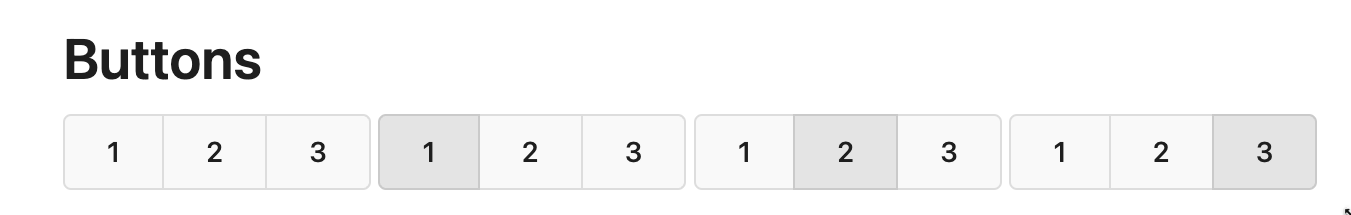
Replace #26850
Major changes:
1. Remove all `has` selectors, it is still not supported by firefox.
Actually there could be some more general and clearer approaches
2. Remove `two-toggle-buttons`, the `.ui.buttons` just works well
3. Rewrite the `.ui.buttons` border styles, see the screenshots
4. Remove the "fine-tuning" paddings from the the flex children, they
could layout themselves well.

|
| |
|
|
|
|
|
|
|
|
|
|
|
|
|
|
|
|
|
|
| |
Some small dashboard tweaks:
- Remove margin-bottom from divider so first item does not appear to
have un-equal margins
- Restore previous icon color
- Add slight margin-right to icon
Before:
<img width="783" alt="Screenshot 2023-08-31 at 00 10 28"
src="https://github.com/go-gitea/gitea/assets/115237/b75f70d7-8704-4afb-866d-fea0484c52d4">
After:
<img width="783" alt="Screenshot 2023-08-31 at 00 10 08"
src="https://github.com/go-gitea/gitea/assets/115237/50ed0c47-6f7c-449e-a054-13091369d43f">
---------
Co-authored-by: wxiaoguang <wxiaoguang@gmail.com>
|
| |
|
|
|
|
|
|
|
|
|
|
|
|
|
|
|
|
|
|
|
|
|
|
|
|
| |
Replace #26761
It's better to keep children elements simple, and let parent containers
layout the necessary padding/margin.
The old `not(:last-child)` and `.flex-item + .flex-item` are not easy to
maintain (for example, what if the developer would like to use a "tiny
height" item?)
The old approach also makes some UI look strange because the first item
doesn't have proper padding-top.
In this PR, we just simply use `.flex-item { padding: ... }`:
* Developers could manually set the item height they want easily
* It's easier to make it work with various containers -- with padding
(`ui segment`) and without padding (`div`)
And added more samples/examples.
Co-authored-by: Giteabot <teabot@gitea.io>
|
| |
|
|
|
| |
1. Fine tune the CSS styles, and add more examples
2. Add necessary "dimmer" animation for modal dialogs, otherwise the UI
seems flicking (follow #26469)
|
| |
|
| |
Follow #26649 and #25790 and add one more example (text truncate) in the devtest page
|
| |
|
|
|
|
|
|
| |
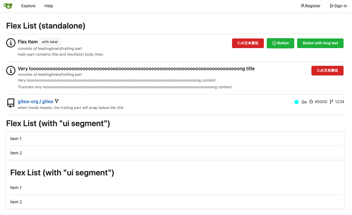
Fix #26617
1. Separate the "flex-list" examples into a dedicated template, and add some more examples
2. Use `flex-basis` instead of `flex-shrink` for `flex-item-trailing`, to avoid wrapping the texts too aggressively
3. Some `flex-wrap: wrap;` are removed
|
| |
|
|
|
|
|
|
|
|
|
|
|
|
|
|
|
|
|
|
|
|
|
|
|
|
|
|
|
|
|
|
|
|
|
|
|
|
|
|
|
|
|
|
|
|
|
|
|
|
|
|
|
|
|
|
|
|
|
|
|
|
|
|
|
|
|
|
|
|
|
|
|
|
|
| |
This PR introduces a new UI element type for Gitea called `flex-item`.
It consists of a horizontal card with a leading, main and trailing part:

The idea behind it is that in Gitea UI, we have many cases where we use
this kind of layout, but it is achieved in many different ways:
- grid layout
- `.ui.list` with additional hacky flexbox
- `.ui.key.list` - looks to me like a style set originally created for
ssh/gpg key list, was used in many other places
- `.issue.list` - created for issue cards, used in many other places
- ...
This new style is based on `.issue.list`, specifically the refactoring
of it done in #25750.
In this PR, the new element is introduced and lots of templates are
being refactored to use that style. This allows to remove a lot of
page-specific css, makes many of the elements responsive or simply
provides a cleaner/better-looking way to present information.
A devtest section with the new style is also available.
<details>
<summary>Screenshots (left: before, right: after)</summary>


</details>
---------
Co-authored-by: Giteabot <teabot@gitea.io>
|
| |
|
|
|
|
|
|
|
|
|
| |
Replace #25446, fix #25438
All "cancel" buttons which do not have "type" should not submit the
form, should not be triggered by "Enter".
This is a complete fix for all modal dialogs.
The major change is "modules/aria/modal.js", "devtest" related code is
for demo/test purpose.
|
| |
|
|
|
| |
Fixes https://github.com/go-gitea/gitea/issues/24353
In some case like async success/error, it is useful to show toasts in UI.
|
| |
|
|
|
|
|
| |
----

|
| |
|
|
|
| |
1. Add "batch delete" button for selected issues, close #22273
2. Address the review in
https://github.com/go-gitea/gitea/pull/25219#discussion_r1229266083
|
| |
|
|
|
|
|
|
|
|
|
|
|
|
|
|
| |
The code can be as simple as:
```html
<div class="flex-text-block">{{svg "octicon-alert"}} {{svg "octicon-x"}} text (block)</div>
<div><div class="flex-text-inline">{{svg "octicon-alert"}} {{svg "octicon-x"}} text</div> (inline)</div>
<div><button class="ui red button">{{svg "octicon-alert" 24}} {{svg "octicon-x" 24}} text</button></div>
```
---------
Co-authored-by: Giteabot <teabot@gitea.io>
|
| |
|
|
|
|
|
|
|
|
|
|
|
|
|
|
|
|
|
|
|
|
|
|
|
|
|
|
|
|
|
|
|
|
| |
Co-author: @wxiaoguang
Close #25096
The way to fix it in this PR is to change form submit to fetch using
formData, and add flags to avoid post repeatedly.
Should be able to apply to more forms that have the same issue after
this PR.
In the demo below, 'approve' is clicked several times, and then
'comment' is clicked several time after 'request changes' clicked.
After:
https://github.com/go-gitea/gitea/assets/17645053/beabeb1d-fe66-4b76-b048-4f022b4e83a0
Update: screenshots from /devtest
>
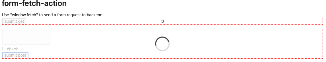
>
>
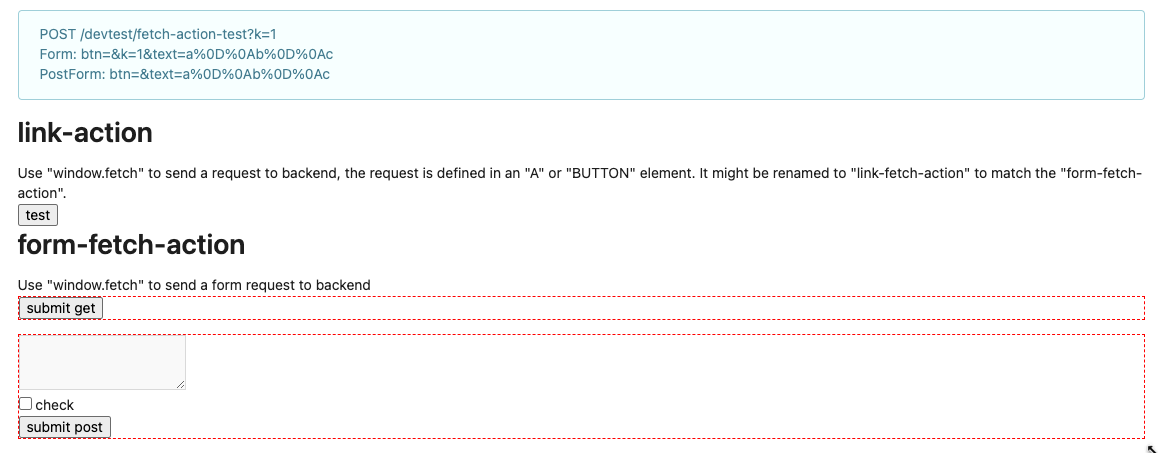
>
>
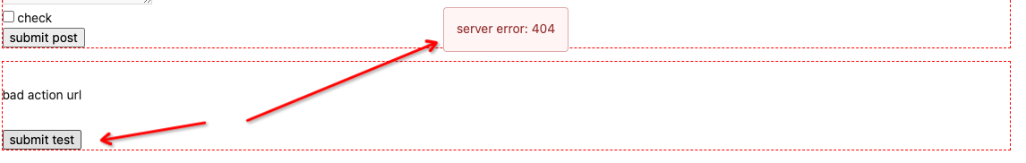
---------
Co-authored-by: wxiaoguang <wxiaoguang@gmail.com>
|
| |
|
|
|
|
|
|
|
|
|
|
|
|
|
|
|
|
| |
- Various corrections to button styles, especially secondary
- Remove focus highlight, it's annoying when it stays on button after
press
- Clearly define ghost and link buttons with demos in devtest
- Remove black, grey and tertiary buttons, they should not be used
- Make `arc-green` slightly darker
<img width="1226" alt="image"
src="https://github.com/go-gitea/gitea/assets/115237/8d89786a-01ab-40f8-ae5a-e17f40e35084">
<img width="1249" alt="image"
src="https://github.com/go-gitea/gitea/assets/115237/83651e6d-3c27-46ff-b8bd-ff344d70e949">
---------
Co-authored-by: wxiaoguang <wxiaoguang@gmail.com>
Co-authored-by: Giteabot <teabot@gitea.io>
|
| |
|
|
|
|
|
|
|
|
|
|
|
|
|
|
|
|
|
|
|
|
|
|
| |
<img width="474" alt="image"
src="https://github.com/go-gitea/gitea/assets/2114189/7fd231f9-71c3-4769-ba96-37a5b77cf224">
<img width="557" alt="image"
src="https://github.com/go-gitea/gitea/assets/2114189/c9945f61-39b4-4711-aea8-c34ef1d714c5">
<img width="641" alt="image"
src="https://github.com/go-gitea/gitea/assets/2114189/691be76e-74fd-420d-9b9e-ba1f3b08e0b4">
And a page to test buttons:
<details>
<img width="451" alt="image"
src="https://github.com/go-gitea/gitea/assets/2114189/5f61da24-2f36-40ad-a9bb-2205da5f5f04">
</details>
---------
Co-authored-by: Giteabot <teabot@gitea.io>
Co-authored-by: silverwind <me@silverwind.io>
|
| |
|
|
|
|
|
|
|
|
|
|
|
|
|
|
|
|
|
|
|
|
|
|
|
|
|
|
|
|
|
| |
Follow #24097 and #24285
And add a devtest page for modal action button testing.
http://localhost:3000/devtest/fomantic-modal
Now the `modal_actions_confirm.tmpl` could support: green / blue /
yellow positive buttons, the negative button is "secondary".
ps: this PR is only a small improvement, there are still a lot of
buttons not having proper colors. In the future these buttons could be
improved by this approach.
These buttons could also be improved according to the conclusion of
#24285 in the future.

And add GitHub-like single danger button (context:
https://github.com/go-gitea/gitea/issues/24285#issuecomment-1519100312)

---------
Co-authored-by: silverwind <me@silverwind.io>
|
| |
|
|
|
|
|
|
|
|
|
|
|
|
|
|
|
|
|
|
|
|
|
|
|
|
| |
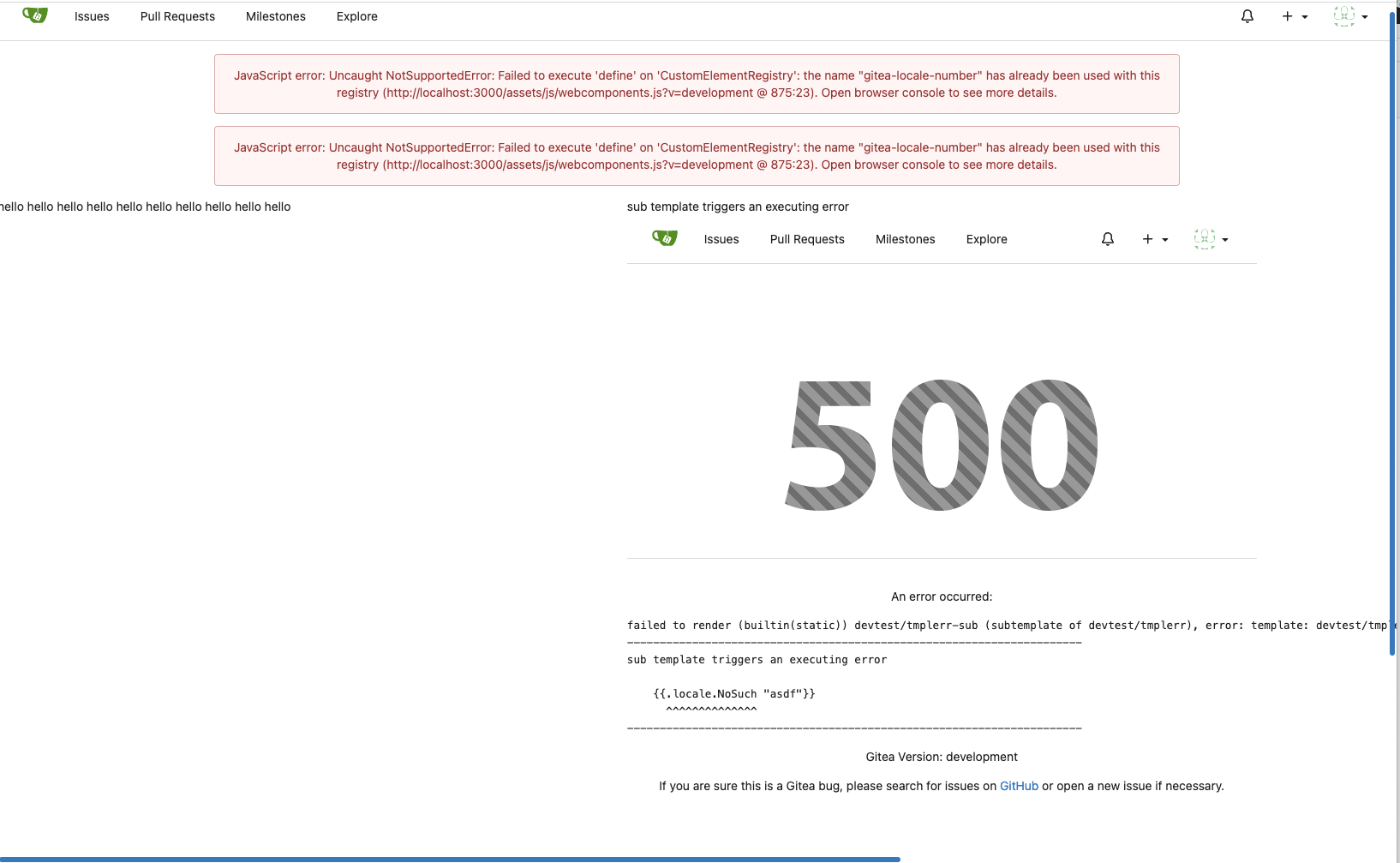
Before, the `GiteaLocaleNumber.js` was just written as a a drop-in
replacement for old `js-pretty-number`.
Actually, we can use Golang's `text` package to format.
This PR partially completes the TODOs in `GiteaLocaleNumber.js`:
> if we have complete backend locale support (eg: Golang "x/text"
package), we can drop this component.
> tooltip: only 2 usages of this, we can replace it with Golang's
"x/text/number" package in the future.
This PR also helps #24131
Screenshots:
<details>
</details>
|
| |
|
|
|
|
|
|
|
|
|
|
|
|
|
|
|
|
|
|
| |
- Follows #23988
- Fixes: #24074 by removing this key
GitHub's `relative-time` elements allow us to force their rendering to
`auto`, `past`, or `future` tense. We will never show an absolute date
`on ...` in `TimeSince`
## Before
## After
---------
Co-authored-by: wxiaoguang <wxiaoguang@gmail.com>
|
| |
|
|
|
|
|
|
|
|
|
|
|
|
|
|
|
|
|
|
|
|
| |
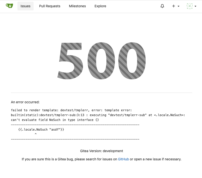
Close #24104
This also introduces many tests to cover many complex error handling
functions.
### Before
The details are never shown in production.
<details>
</details>
### After
The details could be shown to site admin users. It is safe.
|
|
|
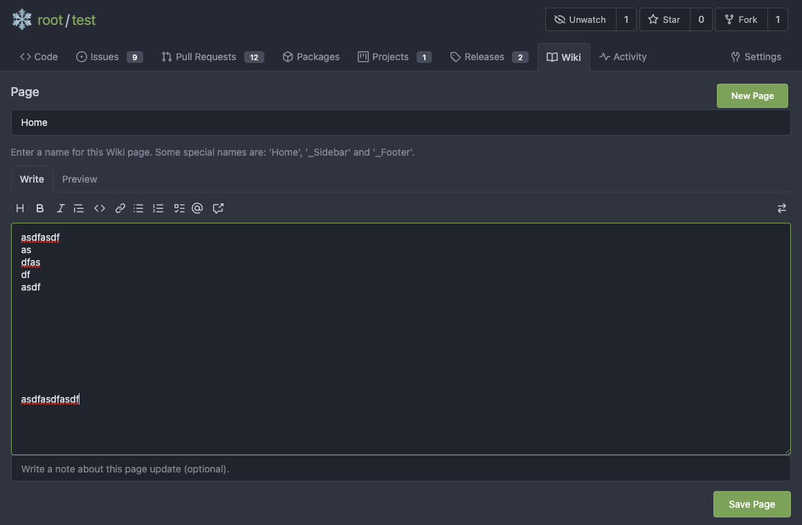
The first step of the plan
* #23290
Thanks to @silverwind for the first try in #15394 . Close #10729 and a
lot of related issues.
The EasyMDE is not removed, now it works as a fallback, users can switch
between these two editors.
Editor list:
* Issue / PR comment
* Issue / PR comment edit
* Issue / PR comment quote reply
* PR diff view, inline comment
* PR diff view, inline comment edit
* PR diff view, inline comment quote reply
* Release editor
* Wiki editor
Some editors have attached dropzone
Screenshots:
<details>
</details>
---------
Co-authored-by: silverwind <me@silverwind.io>
|
