| Commit message (Collapse) | Author | Age | Files | Lines |
|---|
| |
|
| |
Clean up the templates
|
| |
|
| |
Follow #32383 and #32402
|
| | |
|
| |
|
|
|
|
|
|
|
|
|
|
| |
explore pages and fix an issue related to user search (#32288)
These settings can allow users to only display the repositories explore page.
Thanks to yp05327 and wxiaoguang !
---------
Co-authored-by: Giteabot <teabot@gitea.io>
Co-authored-by: wxiaoguang <wxiaoguang@gmail.com>
|
| |
|
|
|
|
|
| |
Re-organize the routes in web.go and use ctx constants instead of `context.UnitTypes()`
---------
Co-authored-by: Giteabot <teabot@gitea.io>
|
| |
|
|
|
|
|
|
|
|
|
|
|
| |
This will conclude the refactor of 1:1 class replacements to tailwind,
except `gt-hidden`. Commands ran:
```bash
perl -p -i -e 's#gt-(p|m)([lrtbxy])?-0#tw-$1$2-0#g' {web_src/js,templates,routers,services}/**/*
perl -p -i -e 's#gt-(p|m)([lrtbxy])?-1#tw-$1$2-0.5#g' {web_src/js,templates,routers,services}/**/*
perl -p -i -e 's#gt-(p|m)([lrtbxy])?-2#tw-$1$2-1#g' {web_src/js,templates,routers,services}/**/*
perl -p -i -e 's#gt-(p|m)([lrtbxy])?-3#tw-$1$2-2#g' {web_src/js,templates,routers,services}/**/*
perl -p -i -e 's#gt-(p|m)([lrtbxy])?-4#tw-$1$2-4#g' {web_src/js,templates,routers,services}/**/*
perl -p -i -e 's#gt-(p|m)([lrtbxy])?-5#tw-$1$2-8#g' {web_src/js,templates,routers,services}/**/*
```
|
| |
|
|
|
|
|
|
|
|
|
|
|
|
|
|
|
|
| |
(#29982)
Fixes: https://github.com/go-gitea/gitea/issues/29981. Introduce
`.secondary-nav` as a universal way for styling and margin adjustments
inside `.page-content`.
If the first child of `.page-content` is `.secondary-nav`, we add margin
below it, otherwise we add padding to the first child. Notable changes:
- `--color-header-wrapper` is replaced with `--color-secondary-nav-bg`.
- `navbar` class is removed.
---------
Co-authored-by: Giteabot <teabot@gitea.io>
Co-authored-by: wxiaoguang <wxiaoguang@gmail.com>
|
| |
|
|
|
|
|
|
|
|
|
| |
Fixes https://github.com/go-gitea/gitea/issues/30005. Regression from
https://github.com/go-gitea/gitea/pull/29945.
There was only once instance of `tw-content-center` before that PR, so I
just ran below command and reverted that one instance.
```sh
perl -p -i -e 's#tw-content-center#tw-items-center#g' web_src/js/**/* templates/**/* models/**/* tests/**/*
```
|
| |
|
|
|
|
|
|
|
|
|
|
|
|
|
|
|
|
|
|
| |
Likely the biggest change of the tailwind refactors. Only thing of note
is that `tw-flex-1` resolves to `flex: 1 1 0%` while our `gt-f1` was
`flex: 1 1 0`, I don't think it will make any difference. Commands I've
ran:
```sh
perl -p -i -e 's#gt-vm#tw-align-middle#g' web_src/js/**/* templates/**/* models/**/*
perl -p -i -e 's#gt-fw#tw-flex-wrap#g' web_src/js/**/* templates/**/* models/**/*
perl -p -i -e 's#gt-f1#tw-flex-1#g' web_src/js/**/* templates/**/* models/**/*
perl -p -i -e 's#gt-fc#tw-flex-col#g' web_src/js/**/* templates/**/* models/**/*
perl -p -i -e 's#gt-sb#tw-justify-between#g' web_src/js/**/* templates/**/* models/**/*
perl -p -i -e 's#gt-je#tw-justify-end#g' web_src/js/**/* templates/**/* models/**/*
perl -p -i -e 's#gt-jc#tw-justify-center#g' web_src/js/**/* templates/**/* models/**/*
perl -p -i -e 's#gt-ac#tw-content-center#g' web_src/js/**/* templates/**/* models/**/* tests/**/*
perl -p -i -e 's#gt-df#tw-flex#g' web_src/js/**/* templates/**/* models/**/* tests/**/*
perl -p -i -e 's#gt-dib#tw-inline-block#g' web_src/js/**/* templates/**/* models/**/* tests/**/*
Co-authored-by: wxiaoguang <wxiaoguang@gmail.com>
|
| |
|
|
| |
1. Use general "mobile-only" and "not-mobile" CSS styles, remove some`@media (max-width: 767.98px)` tricks
2. Use `CountFmt` for repo list, just like the repo header (and it matches GitHub, to avoid big numbers bloat the page)
|
| |
|
| |
In HTML, `?key=val` already means "use the current link with new query parameters"
|
| |
|
|
|
|
|
|
|
|
|
|
|
|
|
|
|
|
|
|
|
|
|
|
|
|
|
|
|
|
|
|
|
|
|
|
| |
1. Add `<overflow-menu>` web component
2. Rename `<gitea-origin-url>` to `<origin-url>` and make filenames
match.
<img width="439" alt="image"
src="https://github.com/go-gitea/gitea/assets/115237/2fbe4ca4-110b-4ad2-8e17-c1e116ccbd74">
<img width="444" alt="Screenshot 2024-03-02 at 21 36 52"
src="https://github.com/go-gitea/gitea/assets/115237/aa8f786e-dc8c-4030-b12d-7cfb74bdfd6e">
<img width="537" alt="Screenshot 2024-03-03 at 03 05 06"
src="https://github.com/go-gitea/gitea/assets/115237/fddd50aa-adf1-4b4b-bd7f-caf30c7b2245">


TODO:
- [x] Check if removal of `requestAnimationFrame` is possible to avoid
flash of content. Likely needs a `MutationObserver`.
- [x] Hide tippy when button is removed from DOM.
- [x] ~~Implement right-aligned items
(https://github.com/go-gitea/gitea/pull/28976)~~. Not going to do it.
- [x] Clean up CSS so base element has no background and add background
via tailwind instead.
- [x] Use it for org and user page.
---------
Co-authored-by: Giteabot <teabot@gitea.io>
Co-authored-by: wxiaoguang <wxiaoguang@gmail.com>
|
| |
|
|
|
|
|
|
|
|
|
|
|
|
|
|
|
|
|
|
|
|
|
|
|
|
|
|
|
|
|
|
|
| |
Unify all but a few search boxes to use uniform style, uniform
translations and shared templates where possible.
Remove a few duplicated search templates, e. g. code search.
<details><summary>Example after screenshots:</summary>


</details>
Also includes #29700
Co-authored-by: 6543 <6543@obermui.de>
---------
Co-authored-by: 6543 <m.huber@kithara.com>
Co-authored-by: 6543 <6543@obermui.de>
Co-authored-by: silverwind <me@silverwind.io>
Co-authored-by: Giteabot <teabot@gitea.io>
|
| |
|
|
|
|
|
|
|
|
|
|
|
| |
Filter Repositories by type (resolves #1170, #1318)
before:
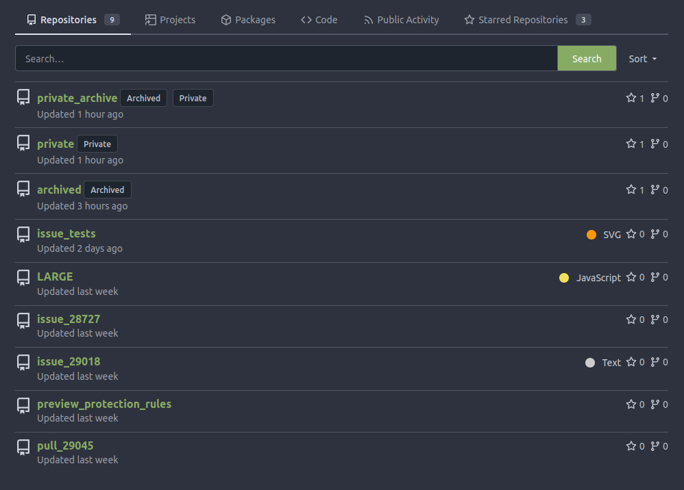
after:

|
| |
|
|
|
|
|
|
|
|
|
|
|
|
| |
Thanks to inferenceus : some sort orders on the "explore/users" page
could list users by their lastlogintime/updatetime.
It leaks user's activity unintentionally. This PR makes that page only
use "supported" sort orders.
Removing the "sort orders" could also be a good solution, while IMO at
the moment keeping the "create time" and "name" orders is also fine, in
case some users would like to find a target user in the search result,
the "sort order" might help.
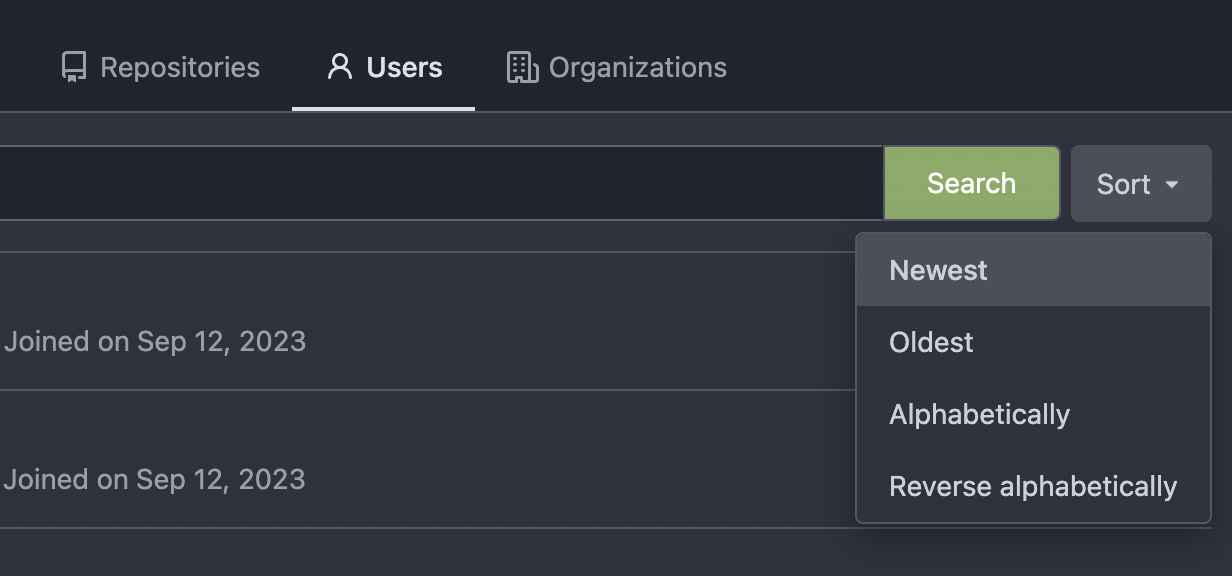
|
| |
|
|
|
|
|
|
|
|
|
| |
Follow #29165
* some of them are incorrect, which would lead to double escaping (eg:
`(print (Escape $.RepoLink)`)
* other of them are not necessary, because `Tr` handles strings&HTML
automatically
Suggest to review by "unified view":
https://github.com/go-gitea/gitea/pull/29394/files?diff=unified&w=0
|
| |
|
| |
Follow #29165
|
| |
|
|
|
|
|
|
|
|
|
|
|
|
|
|
| |
Currently only SHA1 repositories are supported by Gitea. This adds
support for alternate SHA256 with the additional aim of easier support
for additional hash types in the future.
Fixes: #13794
Limited by: https://github.com/go-git/go-git/issues/899
Depend on: #28138
<img width="776" alt="图片" src="https://github.com/go-gitea/gitea/assets/81045/5448c9a7-608e-4341-a149-5dd0069c9447">
---------
Co-authored-by: Lunny Xiao <xiaolunwen@gmail.com>
Co-authored-by: 6543 <6543@obermui.de>
|
| |
|
|
|
|
|
|
|
|
|
| |
User can select access repo or owner's home page.
Before:

After:
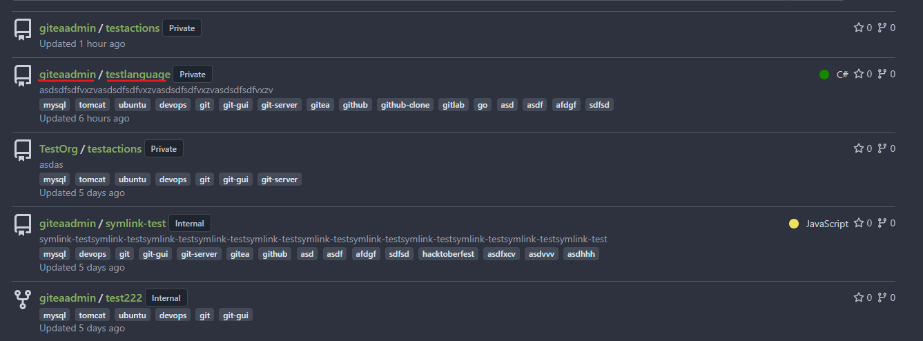
|
| |
|
| |
Fixes https://codeberg.org/Codeberg/Community/issues/1355
|
| |
|
|
| |
Mentioned here:
https://github.com/go-gitea/gitea/pull/27982#issuecomment-1807923026
|
| |
|
|
|
|
|
|
|
|
|
|
|
|
|
|
|
|
|
|
|
|
|
|
|
|
|
|
|
|
|
|
|
|
|
|
| |
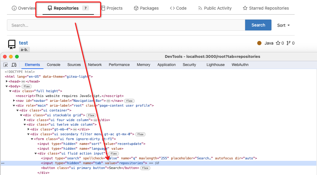
Fixes some problems in #27955:
- autofocus of the search box
before:
if access the home page will jump to the search box

after:
will not jump to the search box
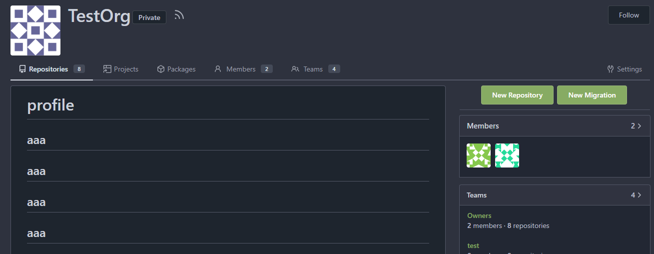
- incorrect display of overview tab
before:

after:
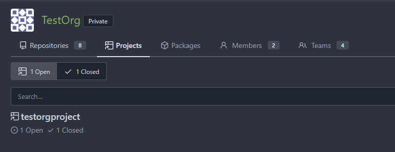
- improve the permission check to the private profile repo
In #26295, we simply added access control to the private profile.
But if user have access to the private profile repo , we should also
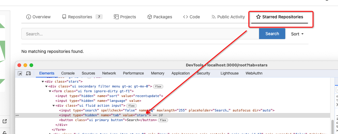
display the profile.
- add a button which can jump to the repo list?
I agree @wxiaoguang 's opinion here:
https://github.com/go-gitea/gitea/pull/27955#issuecomment-1803178239
But it seems that this feature is sponsored.
So can we add a button which can quickly jump to the repo list or just
move profile to the `overview` page?
---------
Co-authored-by: silverwind <me@silverwind.io>
|
| |
|
|
|
|
| |
|
| |
|
|
|
|
|
| |
Fix #27596
Change confusing behavior when showing information about a repo via
labels and icons. Implement changes proposed by @lng2020 in
https://github.com/go-gitea/gitea/pull/27627#pullrequestreview-1678787673.
|
| |
|
|
|
|
|
| |
Fixes https://codeberg.org/Codeberg/Community/issues/1302
---------
Co-authored-by: wxiaoguang <wxiaoguang@gmail.com>
|
| | |
|
| | |
|
| |
|
|
|
|
|
|
|
|
|
|
|
|
|
|
|
|
|
|
|
|
|
|
|
|
| |
The `.new-menu` was using a pseudo-element based fade-out effect.
Replace this with a more modern mask-based effect which in this case
required a child element to avoid fading out the background as well, so
I applied it to child `new-menu-inner` which was present on all these
menus except explore where I added it.
There is no visual difference except that the items on the explore page
have no `gap` between them any longer, making it consistent with other
menus. Before and after:
<img width="221" alt="Screenshot 2023-09-21 at 21 13 19"
src="https://github.com/go-gitea/gitea/assets/115237/b4a38ce2-cee1-4c54-84a5-e1d0bfd79e29">
<img width="222" alt="Screenshot 2023-09-21 at 21 32 36"
src="https://github.com/go-gitea/gitea/assets/115237/bb6b1335-d935-4ad4-bb85-3b0fc3027c2b">
Also, this cleans up the related CSS vars:
- `--color-header-wrapper-transparent` is removed, no longer needed
- `--color-header-wrapper` is defined in base theme as well, was
previously unset and therefor transparent.
[no whitespace
diff](https://github.com/go-gitea/gitea/pull/27181/files?diff=unified&w=1)
[demo of mask fade](https://jsfiddle.net/silverwind/tsfadb3u/)
|
| | |
|
| |
|
|
|
|
| |
According to https://fomantic-ui.com/modules/dropdown.html and our
"devtest" page, many dropdown elements has incorrect "icon" position.
This PR fixes all of them. Fix #27173
|
| |
|
| |
A bit more performant when we only use it for appending strings.
|
| |
|
|
|
|
|
|
|
|
|
|
|
|
|
|
|
|
|
|
| |
1. There is already `gt-ac`, so no need to introduce `flex-item-center`
2. The `flex-item-baseline` and `.flex-item-icon svg { margin-top: 1px
}` seem to be a tricky patch, they don't resolve the root problem, and
still cause misalignment in some cases.
* The root problem is: the "icon" needs to align with the sibling
"title"
* So, make the "icon" and the "title" both have the same height
3. `flex-text-inline` could only be used if the element is really
"inline", otherwise its `vertical-align` would make the box size change.
In most cases, `flex-text-block` is good enough.

---------
Co-authored-by: silverwind <me@silverwind.io>
Co-authored-by: Giteabot <teabot@gitea.io>
|
| |
|
|
|
|
|
|
|
|
|
|
|
|
|
|
|
|
|
|
|
|
|
|
|
|
|
|
|
|
|
|
|
|
|
| |
This PR implements a proposal to clean up the admin users table by
moving some information out to a separate user details page (which also
displays some additional information).
Other changes:
- move edit user page from `/admin/users/{id}` to
`/admin/users/{id}/edit` -> `/admin/users/{id}` now shows the user
details page
- show if user is instance administrator as a label instead of a
separate column
- separate explore users template into a page- and a shared one, to make
it possible to use it on the user details page
- fix issue where there was no margin between alert message and
following content on admin pages
<details>
<summary>Screenshots</summary>


</details>
Partially resolves #25939
---------
Co-authored-by: Giteabot <teabot@gitea.io>
|
| | |
|
| |
|
|
| |
Introduce `AvatarUtils`, no need to pass `$.Context` to every
sub-template, and simplify the template helper functions.
|
| |
|
| |
And simplify the "repo/icon" code
|
| |
|
| |
fix #26360
|
| |
|
|
|
|
|
|
|
|
|
|
|
|
|
|
|
|
|
|
|
|
|
|
|
|
|
|
|
|
|
|
|
|
|
|
|
|
|
|
|
|
|
|
|
|
|
|
|
|
|
|
|
|
|
|
|
|
|
|
|
|
|
|
|
|
|
|
|
|
|
|
|
|
|
| |
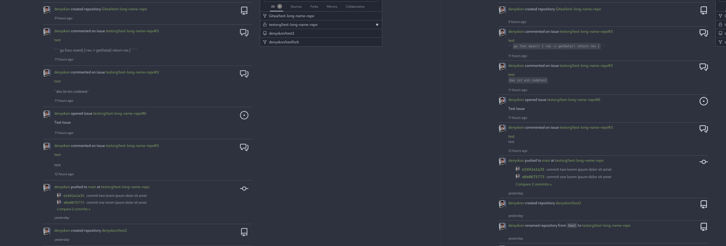
This PR introduces a new UI element type for Gitea called `flex-item`.
It consists of a horizontal card with a leading, main and trailing part:

The idea behind it is that in Gitea UI, we have many cases where we use
this kind of layout, but it is achieved in many different ways:
- grid layout
- `.ui.list` with additional hacky flexbox
- `.ui.key.list` - looks to me like a style set originally created for
ssh/gpg key list, was used in many other places
- `.issue.list` - created for issue cards, used in many other places
- ...
This new style is based on `.issue.list`, specifically the refactoring
of it done in #25750.
In this PR, the new element is introduced and lots of templates are
being refactored to use that style. This allows to remove a lot of
page-specific css, makes many of the elements responsive or simply
provides a cleaner/better-looking way to present information.
A devtest section with the new style is also available.
<details>
<summary>Screenshots (left: before, right: after)</summary>




</details>
---------
Co-authored-by: Giteabot <teabot@gitea.io>
|
| | |
|
| |
|
|
|
|
|
|
|
|
|
|
|
|
|
|
|
|
|
|
|
|
|
|
|
|
|
|
|
|
|
|
|
|
|
|
|
|
|
|
|
|
|
|
|
|
|
|
|
| |
Fix ::User Profile Page Project Tab Have Inconsistent Layout and Style
Added the big_avator for consistency in the all header_items tabs.
Fixes: #24871
> ### Description
> in the user profile page the `Packages` and `Projects` tab have small
icons for user but other tabs have bigger profile picture with user
info:
>
> ### Screenshots
> ### **For Packages And Projects:**
>

>
> ### **For Other Tabs:**
>

>
## Before

## After changes
Project View
<img width="1394" alt="image"
src="https://github.com/go-gitea/gitea/assets/80308335/95d181d7-8e61-496d-9899-7b825c91ad56">
Packages View
<img width="1378" alt="image"
src="https://github.com/go-gitea/gitea/assets/80308335/7f5fd60f-6b18-4fa8-8c56-7b0d45d1a610">
## Org view for projects page
<img width="1385" alt="image"
src="https://github.com/go-gitea/gitea/assets/80308335/6400dc89-a5ae-4f0a-831b-5b6efa020d89">
## Org view for packages page
<img width="1387" alt="image"
src="https://github.com/go-gitea/gitea/assets/80308335/4e1e9ffe-1e4b-4334-8657-de11b5fd31d0">
---------
Co-authored-by: wxiaoguang <wxiaoguang@gmail.com>
Co-authored-by: Giteabot <teabot@gitea.io>
Co-authored-by: silverwind <me@silverwind.io>
|
| |
|
|
|
|
|
|
|
|
|
|
|
|
|
|
|
|
|
|
|
| |
Should look exactly like before for normal dividers. "Horizontal" ones
look better because they no longer use image backgrounds.
<img width="917" alt="Screenshot 2023-06-27 at 19 07 56"
src="https://github.com/go-gitea/gitea/assets/115237/d97d8dec-6859-44a8-85ba-e4549b4dd9df">
<img width="914" alt="Screenshot 2023-06-27 at 19 05 58"
src="https://github.com/go-gitea/gitea/assets/115237/8bf98544-2d82-4ebf-ac68-d6dc237bd6b2">
<img width="1246" alt="Screenshot 2023-06-27 at 19 00 42"
src="https://github.com/go-gitea/gitea/assets/115237/36a6bb21-6029-4f53-8bee-535f55c66fed">
<img width="344" alt="Screenshot 2023-06-27 at 18 58 15"
src="https://github.com/go-gitea/gitea/assets/115237/a9e70aee-8e6b-4ea1-9e93-19c9f96aec6e">
<img width="823" alt="Screenshot 2023-06-27 at 18 56 22"
src="https://github.com/go-gitea/gitea/assets/115237/e7a497cd-f262-4683-8872-23c3c8cce32f">
<img width="330" alt="Screenshot 2023-06-27 at 19 21 11"
src="https://github.com/go-gitea/gitea/assets/115237/42f24149-a655-4c7e-bd26-8ab52db6446b">
|
| |
|
|
|
|
|
|
|
|
|
|
|
|
|
|
|
|
|
|
|
|
|
|
| |
Right now some sort buttons beside search input are unclickable because
#25338 removed `max-width` and the sort button is using float, sort
button is then covered by the `input`.
The way to fix this in this PR is changing the layout to `flex` and put
`input form` and sort `button` into `secondary menu`.
After:
<img width="1411" alt="Screen Shot 2023-06-26 at 16 40 52"
src="https://github.com/go-gitea/gitea/assets/17645053/63c12b17-793a-4ae7-bbda-f67b13b87212">
<img width="1428" alt="Screen Shot 2023-06-26 at 16 34 06"
src="https://github.com/go-gitea/gitea/assets/17645053/cb7d967e-355d-4cb0-955c-6139580fc17a">
<img width="716" alt="Screen Shot 2023-06-26 at 16 34 22"
src="https://github.com/go-gitea/gitea/assets/17645053/c74b5ef2-d46e-4487-8794-28bec984bb36">
<img width="1424" alt="Screen Shot 2023-06-26 at 16 34 32"
src="https://github.com/go-gitea/gitea/assets/17645053/8a5fdc05-a2c5-4ec4-979d-15a21501fe14">
<img width="1425" alt="Screen Shot 2023-06-26 at 16 35 21"
src="https://github.com/go-gitea/gitea/assets/17645053/eb73cd31-3914-4bc9-92ab-aba56f25128b">
<img width="1437" alt="Screen Shot 2023-06-26 at 16 36 14"
src="https://github.com/go-gitea/gitea/assets/17645053/1c3b4595-bb26-491f-aa68-60dc9ab22b84">
|
| |
|
|
|
|
|
| |
This is my first pr, there are many things I don't understand very well,
I am very sorry, I rearranged the code and opened this new pr.
Now:

|
| |
|
|
| |
Fix #25433
Caused by #23260
|
| |
|
|
|
|
|
|
|
|
|
|
| |
- Set
[type=search](https://developer.mozilla.org/en-US/docs/Web/HTML/Element/input/search)
- Disable spellcheck
- Set maxLength 255 that I found in `templates/repo/issue/search.tmpl`
- Remove unnecessary `max-width`, it does nothing
---------
Co-authored-by: delvh <dev.lh@web.de>
Co-authored-by: Giteabot <teabot@gitea.io>
|
| |
|
|
|
|
|
|
|
|
|
|
|
|
|
|
|
|
|
|
|
|
|
|
|
| |
View diff:
https://github.com/go-gitea/gitea/pull/24738/files?diff=unified&w=1
Improve layout and functionality in review area:
<img width="439" alt="Screenshot 2023-05-15 at 20 10 01"
src="https://github.com/go-gitea/gitea/assets/115237/be10452b-5829-4927-8801-7b26a57b3dbd">
Remove the "Reviewers" timeline box that appears before the merge box.
it's a duplicate of the top-right review area and all functionality of
it has been moved to the other box:
<img width="868" alt="Screenshot 2023-05-15 at 19 39 31"
src="https://github.com/go-gitea/gitea/assets/115237/35489445-e54b-40d3-b3cf-38d029478f96">
Increase timeline item vertical padding from 12px to 16px:
<img width="449" alt="Screenshot 2023-05-15 at 19 43 50"
src="https://github.com/go-gitea/gitea/assets/115237/919c4f9d-a485-4f51-b08c-2c0fc714a413">
---------
Co-authored-by: Giteabot <teabot@gitea.io>
|
| |
|
|
|
|
| |
The Repolist contains the Number of Stars and Forks. Now these Numbers
are a Link to the corresponding pages of the Repo.
Co-authored-by: Giteabot <teabot@gitea.io>
|
| |
|
|
|
|
|
|
|
|
|
|
|
|
|
|
| |
date (#24550)
The correct thing to do is to translate the entire phrase into a single
string. The previous translation assumed all languages have a space
between the "joined on" and the date (and that "joined on" comes before
the date).
Some languages, like Hebrew, have no space between the "joined on" and
the date. For example:
```ini
joined_on=נרשם ב-%s
```
("joined" becomes נרשם, "on" is ב and when paired with a date we use a
dash to connect ב with the date)
|
| |
|
|
|
|
|
|
|
|
|
|
|
|
| |
Don't remember why the previous decision that `Code` and `Release` are
non-disable units globally. Since now every unit include `Code` could be
disabled, maybe we should have a new rule that the repo should have at
least one unit. So any unit could be disabled.
Fixes #20960
Fixes #7525
---------
Co-authored-by: delvh <dev.lh@web.de>
Co-authored-by: yp05327 <576951401@qq.com>
|
| |
|
|
|
|
|
|
|
|
|
|
|
| |
I am not sure what "new-menu" means, but I think we need to fix these
problems:
1. it shouldn't have "stackable", which makes the items stacked when
width is small. the `new-menu` already has `overflow: auto`
2. `justify-content: center` doesn't work with `overflow: auto` (for
small width), so use `margin: auto`
*
https://bhch.github.io/posts/2021/04/centring-flex-items-and-allowing-overflow-scroll/
3. `runner-new-menu` is dead code (copying & pasting ?)
|
