| Commit message (Collapse) | Author | Age | Files | Lines |
|---|
| |
|
| |
Inspired by #28182
|
| |
|
|
|
|
|
| |
Part of #27065
This PR touches functions used in templates. As templates are not static
typed, errors are harder to find, but I hope I catch it all. I think
some tests from other persons do not hurt.
|
| | |
|
| | |
|
| | |
|
| | |
|
| |
|
|
|
|
| |
According to https://fomantic-ui.com/modules/dropdown.html and our
"devtest" page, many dropdown elements has incorrect "icon" position.
This PR fixes all of them. Fix #27173
|
| |
|
|
|
|
|
|
|
|
|
|
|
|
|
|
|
|
|
|
|
|
|
|
| |
I think it's better if the primary actions have primary color instead of
green which fits better into the overall single-color UI design. This PR
currently replaces every green button with primary:
<img width="141" alt="Screenshot 2023-09-16 at 14 07 59"
src="https://github.com/go-gitea/gitea/assets/115237/843c1e50-4fb2-4ec6-84ba-0efb9472dcbe">
<img width="161" alt="Screenshot 2023-09-16 at 14 07 51"
src="https://github.com/go-gitea/gitea/assets/115237/9442195a-a3b2-4a42-b262-8377d6f5c0d1">
Modal actions now use uncolored/primary instead of previous green/red
colors. I also removed the box-shadow on all basic buttons:
<img width="259" alt="Screenshot 2023-09-16 at 14 16 39"
src="https://github.com/go-gitea/gitea/assets/115237/5beea529-127a-44b0-8d4c-afa7b034a490">
<img width="261" alt="Screenshot 2023-09-16 at 14 17 42"
src="https://github.com/go-gitea/gitea/assets/115237/4757f7b2-4d46-49bc-a797-38bb28437b88">
The change currently includes the "Merge PR" button, for which we might
want to make an exception to match the icon color there:
<img width="442" alt="Screenshot 2023-09-16 at 14 33 53"
src="https://github.com/go-gitea/gitea/assets/115237/993ac1a5-c94d-4895-b76c-0d872181a70b">
|
| |
|
|
|
| |
Refactor some CSS styles and simplify code.
Some styles are not in use, remove them.
|
| |
|
|
|
|
|
|
|
|
|
|
| |
Fix #26731
Almost all "tabindex" in code are incorrect.
1. All "input/button" by default are focusable, so no need to use "tabindex=0"
2. All "div/span" by default are not focusable, so no need to use "tabindex=-1"
3. All "dropdown" are focusable by framework, so no need to use "tabindex"
4. Some tabindex values are incorrect (eg: `new_form.tmpl`), so remove them
Co-authored-by: Giteabot <teabot@gitea.io>
|
| |
|
|
|
|
|
|
|
|
|
|
| |
Fix https://github.com/go-gitea/gitea/pull/26448#issuecomment-1676194200
I accidentally set grab cursor for project columns instead of issue
cards, which actually turned out not to be a problem - with proper check
for the default column, which can't be moved.
---------
Co-authored-by: delvh <dev.lh@web.de>
Co-authored-by: Giteabot <teabot@gitea.io>
|
| |
|
|
|
|
|
|
|
|
|
|
|
|
|
|
|
|
|
|
|
|
|
|
|
|
|
|
|
| |
This PR refactors a bunch of projects-related code, mostly the
templates.
The following things were done:
- rename boards to columns in frontend code
- use the new `ctx.Locale.Tr` method
- cleanup template, remove useless newlines, classes, comments
- merge org-/user and repo level project template together
- move "new column" button into project toolbar
- move issue card (shared by projects and pinned issues) to shared
template, remove useless duplicated styles
- add search function to projects (to make the layout more similar to
milestones list where it is inherited from :laughing:)
- maybe more changes I forgot I've done :laughing:
Closes #24893
After:


---------
Co-authored-by: silverwind <me@silverwind.io>
|
| |
|
|
| |
Introduce `AvatarUtils`, no need to pass `$.Context` to every
sub-template, and simplify the template helper functions.
|
| |
|
|
|
|
|
|
|
|
| |
together (#26265)
(cherry picked from commit 473862a1d599382ca022482e2e044025872d240b)
Refs: https://codeberg.org/forgejo/forgejo/pulls/1126
Co-authored-by: Louis Seubert <louis.seubert.ls@gmail.com>
Co-authored-by: Giteabot <teabot@gitea.io>
|
| |
|
|
|
|
|
|
|
|
|
|
|
|
|
|
|
|
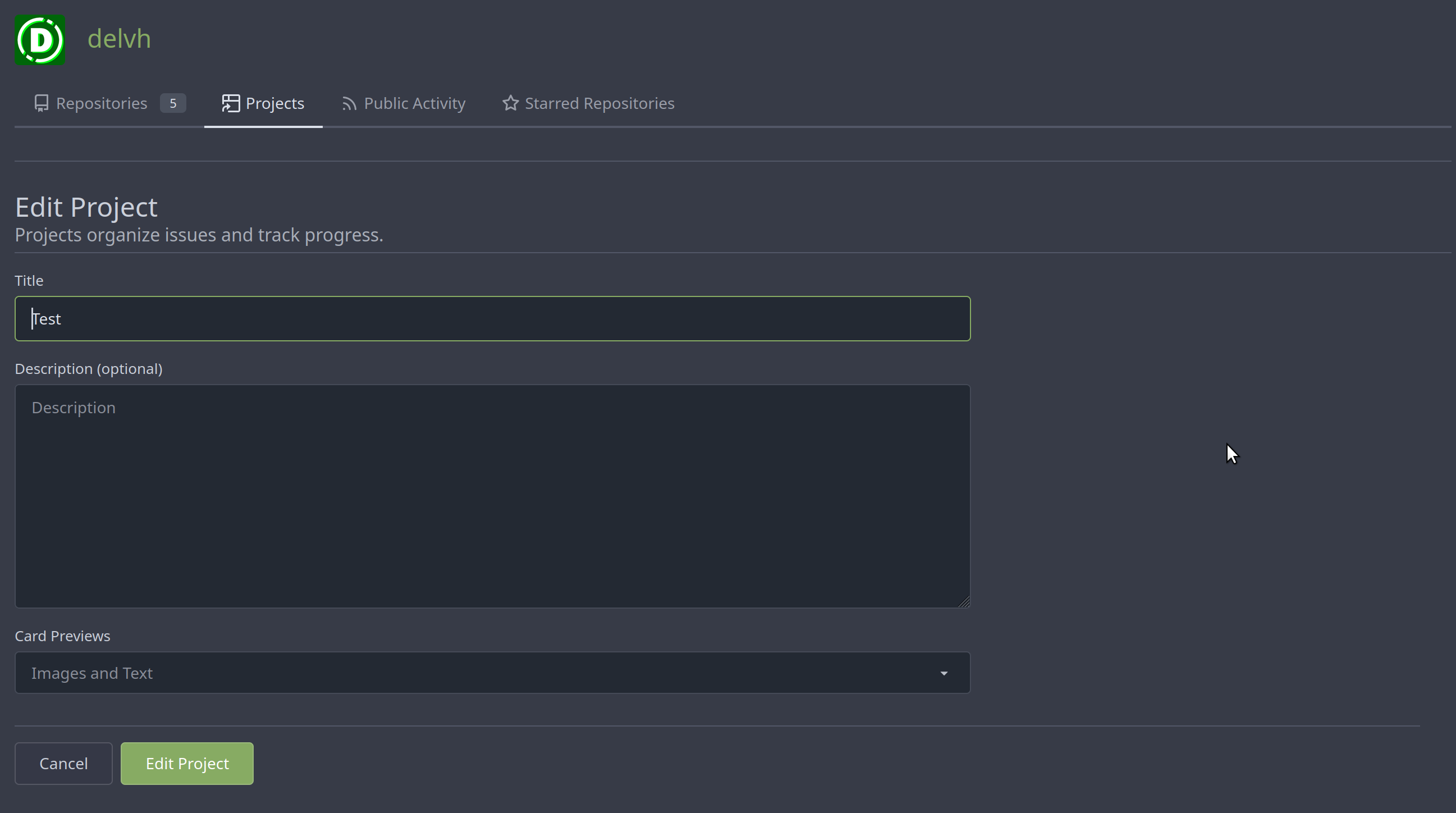
| |
New/Edit Project page consistent layout. Fix margin on the new/edit
page.
Before:
<img width="1381" alt="image"
src="https://github.com/go-gitea/gitea/assets/80308335/303e128c-0bd0-4289-a395-ff077e33b1c8">
<img width="1392" alt="image"
src="https://github.com/go-gitea/gitea/assets/80308335/d11f7a42-ddf4-4c0a-a1b1-b8cefca9dfa1">
After
<img width="1390" alt="image"
src="https://github.com/go-gitea/gitea/assets/80308335/8ae1a979-9050-4d68-8f5d-9dfaa620c0e8">
<img width="1391" alt="image"
src="https://github.com/go-gitea/gitea/assets/80308335/24a62711-dc0a-4425-bf84-7c1896b9a005">
Co-authored-by: silverwind <me@silverwind.io>
|
| |
|
|
|
|
|
|
|
|
|
|
|
|
|
|
|
|
|
|
|
|
|
|
|
|
|
|
|
| |
Changes:
* Rename gt-tl/gt-tc/gt-tr to gt-text-left/gt-text-center/gt-text-right
* The gt-ab and gt-br-0 are removed because they are not needed anymore
* Fix the clone dropdown button padding by ":not(.icon)"
Before:
<details>

</details>
After:
<details>

</details>
Fixes #25758
Co-authored-by: Giteabot <teabot@gitea.io>
|
| |
|
| |
Only: indent/dedent/newline
|
| |
|
|
|
|
|
|
|
|
|
|
|
|
|
|
|
|
|
|
|
|
|
|
|
| |
(#25739)
Follow
https://github.com/go-gitea/gitea/pull/25625#issuecomment-1621577816
1. Fix the incorrect "project view" layout
2. Fix the "follow/unfollow" link on "packages" and "projects" tab
Before:

After:

---------
Co-authored-by: Giteabot <teabot@gitea.io>
|
| |
|
|
|
|
|
|
|
|
|
|
|
|
|
|
|
|
|
|
|
|
|
|
|
|
|
|
|
|
|
|
|
|
|
|
|
|
|
|
|
|
|
|
|
|
|
|
|
| |
Fix ::User Profile Page Project Tab Have Inconsistent Layout and Style
Added the big_avator for consistency in the all header_items tabs.
Fixes: #24871
> ### Description
> in the user profile page the `Packages` and `Projects` tab have small
icons for user but other tabs have bigger profile picture with user
info:
>
> ### Screenshots
> ### **For Packages And Projects:**
>

>
> ### **For Other Tabs:**
>

>
## Before

## After changes
Project View
<img width="1394" alt="image"
src="https://github.com/go-gitea/gitea/assets/80308335/95d181d7-8e61-496d-9899-7b825c91ad56">
Packages View
<img width="1378" alt="image"
src="https://github.com/go-gitea/gitea/assets/80308335/7f5fd60f-6b18-4fa8-8c56-7b0d45d1a610">
## Org view for projects page
<img width="1385" alt="image"
src="https://github.com/go-gitea/gitea/assets/80308335/6400dc89-a5ae-4f0a-831b-5b6efa020d89">
## Org view for packages page
<img width="1387" alt="image"
src="https://github.com/go-gitea/gitea/assets/80308335/4e1e9ffe-1e4b-4334-8657-de11b5fd31d0">
---------
Co-authored-by: wxiaoguang <wxiaoguang@gmail.com>
Co-authored-by: Giteabot <teabot@gitea.io>
Co-authored-by: silverwind <me@silverwind.io>
|
| |
|
|
|
|
|
|
|
|
|
|
|
|
|
|
|
|
|
|
|
| |
Should look exactly like before for normal dividers. "Horizontal" ones
look better because they no longer use image backgrounds.
<img width="917" alt="Screenshot 2023-06-27 at 19 07 56"
src="https://github.com/go-gitea/gitea/assets/115237/d97d8dec-6859-44a8-85ba-e4549b4dd9df">
<img width="914" alt="Screenshot 2023-06-27 at 19 05 58"
src="https://github.com/go-gitea/gitea/assets/115237/8bf98544-2d82-4ebf-ac68-d6dc237bd6b2">
<img width="1246" alt="Screenshot 2023-06-27 at 19 00 42"
src="https://github.com/go-gitea/gitea/assets/115237/36a6bb21-6029-4f53-8bee-535f55c66fed">
<img width="344" alt="Screenshot 2023-06-27 at 18 58 15"
src="https://github.com/go-gitea/gitea/assets/115237/a9e70aee-8e6b-4ea1-9e93-19c9f96aec6e">
<img width="823" alt="Screenshot 2023-06-27 at 18 56 22"
src="https://github.com/go-gitea/gitea/assets/115237/e7a497cd-f262-4683-8872-23c3c8cce32f">
<img width="330" alt="Screenshot 2023-06-27 at 19 21 11"
src="https://github.com/go-gitea/gitea/assets/115237/42f24149-a655-4c7e-bd26-8ab52db6446b">
|
| |
|
|
| |
Remove test string on delete project button, I overlooked it in a
previous PR 😄
|
| |
|
|
|
|
|
|
|
|
|
| |
Numerous small UI fixes:
- Fix double border in collaborator list
- Fix system notice table background
- Mute links in repo and org lists
- Downsize projects edit buttons
- Improve milestones and project list rendering
- Condense milestone list entry to a single line of "metas"
- Mute ".." button in repo files list
|
| |
|
|
|
|
|
|
|
|
|
|
|
|
|
|
|
|
|
|
|
|
|
|
|
|
|
|
|
|
|
|
| |
Various fixes to pages or elements which were looking ugly on mobile.
<details>
<summary>Screenshots</summary>


</details>
Co-authored by @silverwind
---------
Co-authored-by: silverwind <me@silverwind.io>
|
| |
|
|
|
|
|
|
|
|
|
|
|
|
|
|
|
|
|
|
|
|
|
|
|
|
|
|
|
|
|
|
|
|
|
|
|
|
|
|
|
|
|
|
|
|
|
| |
Additionally simplify the `new project` template slightly.
Review hint: Disable whitespace changes.
<details><summary>Before</summary>
## New repo project

## Edit repo project

## New user/org project

## Edit user/org project
</details>
<details><summary>After</summary>
## New repo project
## Edit repo project

## New user/org project
## Edit user/org project

</details>
---------
Co-authored-by: Giteabot <teabot@gitea.io>
|
| |
|
|
|
|
| |
We can reuse the recently created subtemplate here. I also checked the
whole templates for similar constructs, these appear to be the only one.
Co-authored-by: Giteabot <teabot@gitea.io>
|
| |
|
|
|
|
|
|
|
| |
Continue #23531
Thanks for the update in https://github.com/primer/octicons/issues/940,
@CameronFoxly


|
| |
|
|
| |
Fix #22954
Only users who have write permission can move issues in the project view page.
|
| |
|
|
|
|
|
|
|
|
|
|
|
|
|
|
|
|
|
|
|
|
|
|
|
|
|
|
|
|
|
|
|
|
|
|
|
|
|
|
|
|
|
|
|
|
|
|
|
|
|
|
|
| |
- Remove various horizontal dividers on repo pages that didn't provide
visual benefit
- Remove label/milestone pills on single issue/pr page
- Remove issue-related pill buttons on projects page
- Increase contrast of color-secondary on arc-green
- Improve notifications icon, make circle bigger
- Remove some inline styles
- Fix focus in issue/pr title edit and select all text on button click
### Issue and PR before and after
<img width="1249" alt="Screenshot 2023-05-01 at 11 44 22"
src="https://user-images.githubusercontent.com/115237/235436662-a708288e-84fb-4b2e-a5a2-3a1c17d28f6c.png">
<img width="1248" alt="Screenshot 2023-05-01 at 11 58 51"
src="https://user-images.githubusercontent.com/115237/235437992-f863e483-f3cc-4cc1-8204-fd223647a0c9.png">
### Projects before and after
<img width="1255" alt="Screenshot 2023-05-01 at 11 41 02"
src="https://user-images.githubusercontent.com/115237/235436433-0deb85d6-4e7d-4e74-847f-254cc70a0cf9.png">
<img width="1267" alt="Screenshot 2023-05-01 at 11 40 03"
src="https://user-images.githubusercontent.com/115237/235436431-715b13cb-f78c-4d86-b27a-9229f9738c5b.png">
### Releases before and after
<img width="1243" alt="Screenshot 2023-05-01 at 11 41 12"
src="https://user-images.githubusercontent.com/115237/235436457-b655ee6f-03b8-4595-8d8c-b15ea469e988.png">
<img width="1240" alt="Screenshot 2023-05-01 at 11 40 10"
src="https://user-images.githubusercontent.com/115237/235436456-05a2a0dd-7cbb-4f26-b0d3-4f667df4bb95.png">
### Misc
<img width="58" alt="Screenshot 2023-05-01 at 10 49 13"
src="https://user-images.githubusercontent.com/115237/235432494-936ce995-6e22-47bc-ab2d-c9e93d31987d.png">
<img width="57" alt="Screenshot 2023-05-01 at 18 57 08"
src="https://user-images.githubusercontent.com/115237/235492430-1d32cfe0-0f2c-467c-b2fa-925b27e30e0e.png">
Issue title edit and wrap:
<img width="1238" alt="Screenshot 2023-05-01 at 12 34 40"
src="https://user-images.githubusercontent.com/115237/235441407-d5067a57-e586-4865-a652-282e5944abb4.png">
<img width="1232" alt="Screenshot 2023-05-01 at 12 06 24"
src="https://user-images.githubusercontent.com/115237/235438710-1a543dda-220f-4d87-8f93-f1710c0695f0.png">
---------
Co-authored-by: wxiaoguang <wxiaoguang@gmail.com>
|
| |
|
|
|
|
|
|
|
|
|
|
|
|
|
|
|
|
|
|
|
| |
- Make search bar dynamic full width via flexbox
- Make all buttons `small` so font size is the same for all elements in
the header
- Remove primary color from search field, add SVG icon like on Code tab
- Fix button vertical padding being enlarged by SVG icons
[View diff without
whitespace](https://github.com/go-gitea/gitea/pull/24420/files?diff=unified&w=1)
<img width="1226" alt="Screenshot 2023-04-29 at 11 58 53"
src="https://user-images.githubusercontent.com/115237/235296851-74848267-664f-4c1f-b94c-a1b94196ff75.png">
<img width="1219" alt="Screenshot 2023-04-29 at 11 59 39"
src="https://user-images.githubusercontent.com/115237/235296852-bcfde5ed-8658-43c2-b7e5-3ad84611e76f.png">
Mobile:
<img width="437" alt="Screenshot 2023-04-29 at 11 59 52"
src="https://user-images.githubusercontent.com/115237/235296860-99263373-7b27-4540-868c-a93e70f281ca.png">
<img width="433" alt="Screenshot 2023-04-29 at 12 00 00"
src="https://user-images.githubusercontent.com/115237/235296862-6cf64317-a864-405a-a00f-b5ab620349f5.png">
|
| |
|
|
|
|
|
|
|
|
|
|
|
|
|
|
|
|
|
|
|
|
|
|
|
|
|
|
|
|
|
| |
Follow #24097 and #24285
And add a devtest page for modal action button testing.
http://localhost:3000/devtest/fomantic-modal
Now the `modal_actions_confirm.tmpl` could support: green / blue /
yellow positive buttons, the negative button is "secondary".
ps: this PR is only a small improvement, there are still a lot of
buttons not having proper colors. In the future these buttons could be
improved by this approach.
These buttons could also be improved according to the conclusion of
#24285 in the future.

And add GitHub-like single danger button (context:
https://github.com/go-gitea/gitea/issues/24285#issuecomment-1519100312)

---------
Co-authored-by: silverwind <me@silverwind.io>
|
| |
|
|
|
|
|
|
|
|
|
|
|
|
|
|
|
|
|
|
|
|
|
|
|
|
|
|
|
|
|
|
|
|
|
|
|
|
|
|
|
|
|
|
|
|
|
|
|
|
|
|
|
| |
actions (#24097)
Co-Author: @wxiaoguang
This PR is to fix
https://github.com/go-gitea/gitea/issues/23318#issuecomment-1506275446 .
The way to fix this in this PR is to use `delete_modal_actions.tmpl`
here both to fix this issue and keep ui consistency (as suggested by
[TODO
here](https://github.com/go-gitea/gitea/blob/4299c3b7db61f8741eca0ba3d663bb65745a4acc/templates/projects/view.tmpl#L161))
And this PR also refactors `delete_modal_actions.tmpl` and its related
styles, and use the template for more modal actions:
1. Added template attributes:
* locale
* ModalButtonStyle: "yes" (default) or "confirm"
* ModalButtonCancelText
* ModalButtonOkText
2. Rename `delete_modal_actions.tmpl` template to
`modal_actions_confirm.tmpl` because it is not only used for action
modals deletion now.
3. Refactored css related to modals into `web_src/css/modules/modal.css`
and improved the styles.
4. Also use the template for PR deletion modal and remove issue
dependency modal.
5. Some modals should also use the template, but not sure how to open
them, so mark these modal actions by `{{/* TODO: Convert to
base/modal_actions_confirm */}}`
After (Also tested on arc green):
Hovering on the left buttons
<img width="711" alt="Screen Shot 2023-04-23 at 15 17 12"
src="https://user-images.githubusercontent.com/17645053/233825650-76307e65-9255-44bb-80e8-7062f58ead1b.png">
<img width="786" alt="Screen Shot 2023-04-23 at 15 17 21"
src="https://user-images.githubusercontent.com/17645053/233825652-4dc6f7d1-a180-49fb-a468-d60950eaee0d.png">
Test for functionalities:
https://user-images.githubusercontent.com/17645053/233826857-76376fda-022c-42d0-b0f3-339c17ca4e59.mov
---------
Co-authored-by: wxiaoguang <wxiaoguang@gmail.com>
|
| |
|
|
| |
Close: https://github.com/go-gitea/gitea/issues/23401
|
| |
|
|
|
|
|
|
|
|
|
|
|
|
|
|
|
|
|
|
|
|
|
|
|
|
| |
Before, the `GiteaLocaleNumber.js` was just written as a a drop-in
replacement for old `js-pretty-number`.
Actually, we can use Golang's `text` package to format.
This PR partially completes the TODOs in `GiteaLocaleNumber.js`:
> if we have complete backend locale support (eg: Golang "x/text"
package), we can drop this component.
> tooltip: only 2 usages of this, we can replace it with Golang's
"x/text/number" package in the future.
This PR also helps #24131
Screenshots:
<details>
</details>
|
| |
|
|
|
|
|
|
|
|
|
|
|
|
|
|
|
|
|
|
|
|
|
|
|
|
|
|
|
|
| |
Part of #23318
The way to fix the missing cardtype for user/org level projects in this
PR is to port the cardtype related part from #22112 to org/user level
projects' template and router functions.
Before:
<img width="1135" alt="截屏2023-04-11 13 55 49"
src="https://user-images.githubusercontent.com/17645053/231069068-ba897129-ae90-4aa0-9b0f-468bf5c65375.png">
<img width="1131" alt="截屏2023-04-11 13 55 59"
src="https://user-images.githubusercontent.com/17645053/231069084-279f6681-5a10-42da-b5a8-2b0ba47c7078.png">
After:
Create
<img width="835" alt="截屏2023-04-11 13 27 16"
src="https://user-images.githubusercontent.com/17645053/231064445-0d6e12bd-5725-48db-a102-80e7472757c2.png">
Edit
<img width="852" alt="截屏2023-04-11 13 27 05"
src="https://user-images.githubusercontent.com/17645053/231064503-c70525cd-1038-43ec-8d93-8b8d95d183d4.png">
View
<img width="1329" alt="截屏2023-04-11 13 26 56"
src="https://user-images.githubusercontent.com/17645053/231064529-26023c85-698b-4b2e-af02-45f9820c77ec.png">
Co-authored-by: Giteabot <teabot@gitea.io>
|
| |
|
|
|
|
|
|
|
|
|
|
|
|
|
|
|
|
|
|
|
| |
Follow
https://github.com/go-gitea/gitea/pull/23988#pullrequestreview-1377696819
Many template helper functions are not good enough and cause various
problems, that's why I am cleaning them.
## Before


## After

|
| |
|
|
|
|
|
|
|
|
|
|
|
|
|
|
|
|
|
|
|
|
|
| |
pages. (#23861)
Follow #21429 & #22861
Use `<gitea-locale-number>` instead of backend `PrettyNumber`. All old
`PrettyNumber` related functions are removed. A lot of code could be
simplified.
And some functions haven't been used for long time (dead code), so they
are also removed by the way (eg: `SplitStringAtRuneN`, `Dedent`)
This PR only tries to improve the `PrettyNumber` rendering problem, it
doesn't touch the "plural" problem.
Screenshot:
|
| |
|
|
|
|
|
|
|
|
|
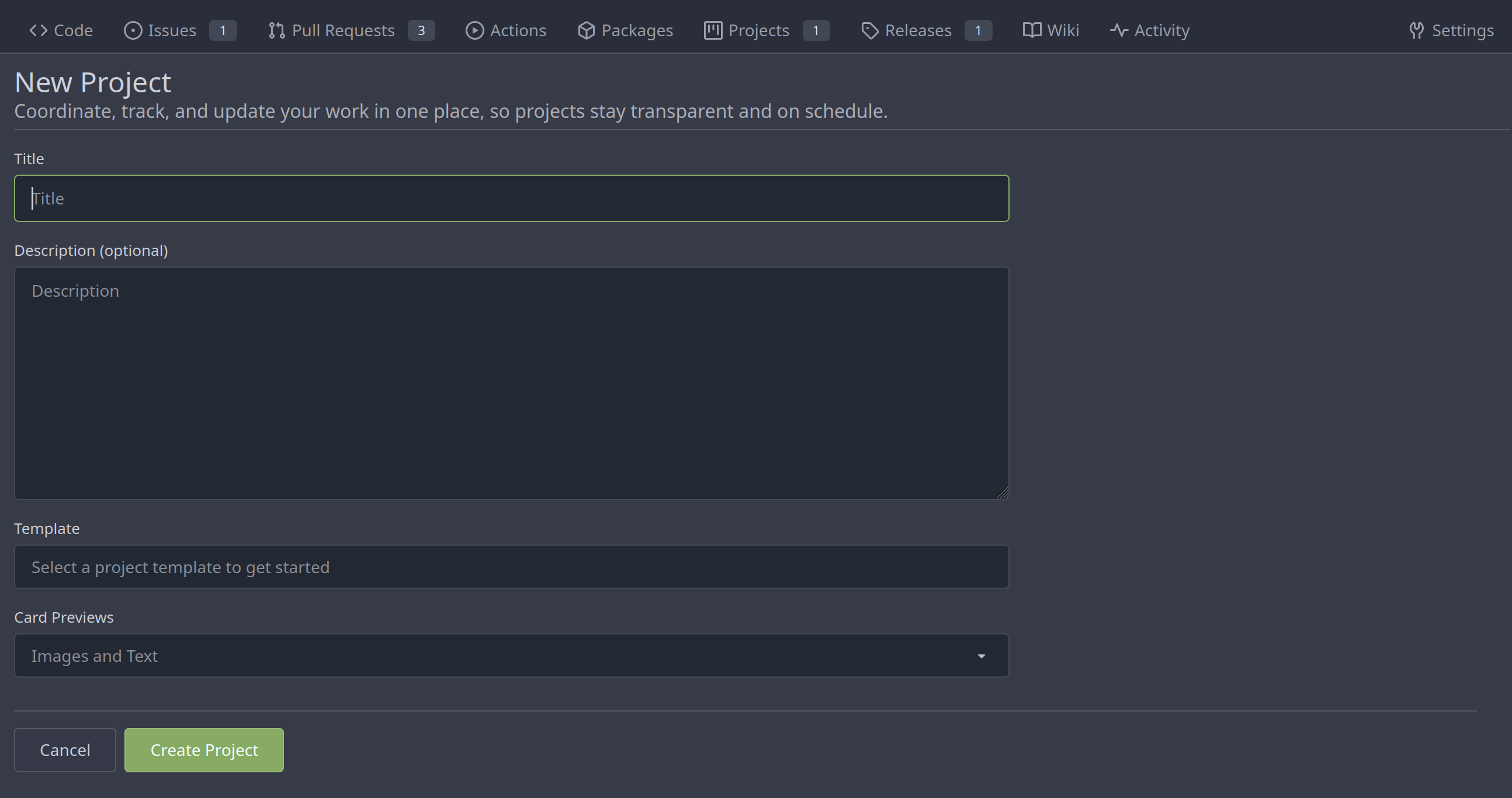
| |
Now user cannot set Card Previews when creating a new project.
Before:
https://user-images.githubusercontent.com/15528715/227488883-29bbd636-8b98-45b3-b2f8-de5206b045dc.mp4
After:
https://user-images.githubusercontent.com/15528715/227488976-3447f252-805a-4f18-ae0e-1cddd921dcc3.mp4
|
| |
|
|
|
|
|
|
|
|
|
|
|
|
|
|
|
| |
Follow:
* #23574
* Remove all ".tooltip[data-content=...]"
Major changes:
* Remove "tooltip" class, use "[data-tooltip-content=...]" instead of
".tooltip[data-content=...]"
* Remove legacy `data-position`, it's dead code since last Fomantic
Tooltip -> Tippy Tooltip refactoring
* Rename reaction attribute from `data-content` to
`data-reaction-content`
* Add comments for some `data-content`: `{{/* used by the form */}}`
* Remove empty "ui" class
* Use "text color" for SVG icons (a few)
|
| |
|
|
|
|
|
|
|
|
|
|
|
|
|
|
| |
Before, in project edit page, the cancel button is not work.
https://user-images.githubusercontent.com/33891828/227182731-6478e29f-0e52-48c4-beb0-6a7d1dda6a1d.mov
1. The wrong classname `cancel` was added to the `<a>` tag. That
classname caused the default click event of `<a>` tag to be cancelled.
Because we have the following settings in the global. So I remove the
classname `cancel`.
https://github.com/go-gitea/gitea/blob/9be90a58754061171bbd5025d85d2b891364efd3/web_src/js/features/common-global.js#L325-L327
2. Another change is that page will redirect to the previous page.
https://user-images.githubusercontent.com/33891828/227187326-c653c6d6-9715-440f-a732-ba0a6f012c81.mov
|
| |
|
|
|
|
|
|
|
|
|
|
|
|
|
|
|
|
|
|
|
|
|
|
|
|
|
|
|
|
|
|
|
| |
(#23570)
Before, the Vue `<SvgIcon>` always outputs DOM nodes like:
```html
<span class="outer-class">
<svg class="class-name-defined" ...></svg>
</span>
```
The `span` is redundant and I guess such layout and the inconsistent
`class/class-name` attributes would cause bugs sooner or later.
This PR makes the `<SvgIcon>` clear, and it's faster than before,
because it doesn't need to parse the whole SVG string.
Before:
<details>
</details>
After:
---------
Co-authored-by: silverwind <me@silverwind.io>
|
| |
|
|
|
|
|
|
|
|
|
| |
The project type will be changed in
https://github.com/go-gitea/gitea/pull/23353, so the old fix
https://github.com/go-gitea/gitea/pull/23325 will not work as well.
And I also found that there were some problems in the old fix....
---------
Co-authored-by: Lauris BH <lauris@nix.lv>
|
| |
|
|
|
|
|
|
|
|
|
|
|
|
|
|
|
|
|
|
|
|
|
|
|
|
|
|
|
|
|
|
| |
This improves a lot of accessibility shortcomings.
Every possible instance of `<div class="button">` matching the command
`ag '<[^ab].*?class=.*?[" ]button[ "]' templates/ | grep -v 'dropdown'`
has been converted when possible.
divs with the `dropdown` class and their children were omitted as
1. more analysis must be conducted whether the dropdowns still work as
intended when they are a `button` instead of a `div`.
2. most dropdowns have `div`s as children. The HTML standard disallows
`div`s inside `button`s.
3. When a dropdown child that's part of the displayed text content is
converted to a `button`, the dropdown can be focused twice
Further changes include that all "gitea-managed" buttons with JS code
received an `e.preventDefault()` so that they don't accidentally submit
an underlying form, which would execute instead of cancel the action.
Lastly, some minor issues were fixed as well during the refactoring.
## Future improvements
As mentioned in
https://github.com/go-gitea/gitea/pull/23337#discussion_r1127277391,
`<a>`s without `href` attribute are not focusable.
They should later on be converted to `<button>`s.
---------
Co-authored-by: wxiaoguang <wxiaoguang@gmail.com>
Co-authored-by: silverwind <me@silverwind.io>
Co-authored-by: techknowlogick <techknowlogick@gitea.io>
Co-authored-by: Lunny Xiao <xiaolunwen@gmail.com>
|
| |
|
| |
A part of https://github.com/go-gitea/gitea/pull/22865
|
| |
|
|
|
|
|
|
|
|
| |
In #22767, we changed the class of `Edit Column` button from `red` to
`primary`
But `red` is used to find this button in js.....
---------
Co-authored-by: techknowlogick <techknowlogick@gitea.io>
Co-authored-by: zeripath <art27@cantab.net>
|
| |
|
|
|
|
|
| |
A part of https://github.com/go-gitea/gitea/pull/22865
We have edit buttons in projects list page and project view page.
But after user edit a project, it will always redirect to the projects
list page.
|
| |
|
|
|
|
|
|
| |
Previously, a 500 response was returned when
- an issue had assignees
- the issue was assigned to a project
- you tried to view this project
Co-authored-by: techknowlogick <techknowlogick@gitea.io>
|
| |
|
|
|
|
|
|
|
|
|
|
| |
Fix displaying same projects icons between user/repo projects.
And fix incorrect projects links.
A part of https://github.com/go-gitea/gitea/pull/22865.
|
| |
|
|
|
|
|
|
|
|
|
|
| |
This branch continues the work of #23092 and attempts to rid the
codebase of any `nil` contexts when using a `RenderContext`.
Anything that renders markdown or does post processing may call
`markup.sha1CurrentPatternProcessor()`, and this runs
`git.OpenRepository()`, which needs a context. It will panic if the
context is `nil`. This branch attempts to _always_ include a context
when creating a `RenderContext` to prevent future crashes.
Co-authored-by: Kyle D <kdumontnu@gmail.com>
|
| | |
|
| |
|
|
|
|
|
|
|
|
|
|
|
|
|
|
|
|
|
|
|
|
|
|
|
|
|
|
|
|
|
|
|
|
|
|
|
|
|
|
|
|
|
|
|
|
|
|
|
|
|
|
|
|
| |
Add a new "exclusive" option per label. This makes it so that when the
label is named `scope/name`, no other label with the same `scope/`
prefix can be set on an issue.
The scope is determined by the last occurence of `/`, so for example
`scope/alpha/name` and `scope/beta/name` are considered to be in
different scopes and can coexist.
Exclusive scopes are not enforced by any database rules, however they
are enforced when editing labels at the models level, automatically
removing any existing labels in the same scope when either attaching a
new label or replacing all labels.
In menus use a circle instead of checkbox to indicate they function as
radio buttons per scope. Issue filtering by label ensures that only a
single scoped label is selected at a time. Clicking with alt key can be
used to remove a scoped label, both when editing individual issues and
batch editing.
Label rendering refactor for consistency and code simplification:
* Labels now consistently have the same shape, emojis and tooltips
everywhere. This includes the label list and label assignment menus.
* In label list, show description below label same as label menus.
* Don't use exactly black/white text colors to look a bit nicer.
* Simplify text color computation. There is no point computing luminance
in linear color space, as this is a perceptual problem and sRGB is
closer to perceptually linear.
* Increase height of label assignment menus to show more labels. Showing
only 3-4 labels at a time leads to a lot of scrolling.
* Render all labels with a new RenderLabel template helper function.
Label creation and editing in multiline modal menu:
* Change label creation to open a modal menu like label editing.
* Change menu layout to place name, description and colors on separate
lines.
* Don't color cancel button red in label editing modal menu.
* Align text to the left in model menu for better readability and
consistent with settings layout elsewhere.
Custom exclusive scoped label rendering:
* Display scoped label prefix and suffix with slightly darker and
lighter background color respectively, and a slanted edge between them
similar to the `/` symbol.
* In menus exclusive labels are grouped with a divider line.
---------
Co-authored-by: Yarden Shoham <hrsi88@gmail.com>
Co-authored-by: Lauris BH <lauris@nix.lv>
|
