| Commit message (Collapse) | Author | Age | Files | Lines |
|---|
| ... | |
| |
|
|
|
|
|
|
|
|
|
|
|
|
|
|
|
|
|
|
|
|
|
|
|
|
|
|
|
|
|
|
|
|
|
| |
(#26785)
## Description
Sometimes, we need to use an upstream mirror repository to update the
current development repository, but mirror repositories are prohibited
from PR. It should not appear in `merge to,` but it can appear in `pull
from.`
Fix #24585 #26193 #26781
Related #24183
Many thanks to @apnote for assisting me in reproducing this bug!
## ScreenShot
---
### Before
<img
src="https://github.com/go-gitea/gitea/assets/50507092/3d76c376-1f54-45b9-80c9-6ba8319d6a9a"
width="400px">
<img
src="https://github.com/go-gitea/gitea/assets/50507092/fbfd9f7f-421f-4a2e-9a3e-f2958bbf3312"
width="400px">
### After
<img
src="https://github.com/go-gitea/gitea/assets/50507092/e6984524-4f61-4310-b795-4d8598bd8963"
width="400px">
<img
src="https://github.com/go-gitea/gitea/assets/50507092/04065b44-78d7-4721-bf31-0f1674150727"
width="400px">
|
| | |
|
| | |
|
| |
|
|
|
| |
1. Use `is-loading` instead of `ui loader`
2. Introduce class name `image-diff-tabs`, instead of searching `gt-hidden`, which is fragile
3. Align the UI elements, see the screenshots.
|
| |
|
|
|
| |
Previously, the tooltip for this button was only shown after opening and
closing it once because it was only set after the server response, now
it shows before opening it.
|
| |
|
|
| |
Introduce `AvatarUtils`, no need to pass `$.Context` to every
sub-template, and simplify the template helper functions.
|
| |
|
|
|
|
|
|
|
|
|
|
|
|
|
|
| |
Now, you don't need to be a git expert anymore to know what these
numbers mean.
## Before
## After

or when the mode actually changed:

|
| |
|
|
|
|
|
|
|
|
|
|
|
|
|
|
| |
Resizing the comment editor can be a very expensive operation because it
triggers page reflows, which on large PRs can take upwards of seconds to
complete. Disable this mechanism on the diff page only where we know
that the page can get large.
Fixes https://github.com/go-gitea/gitea/issues/26201 for the textarea
editor.
I don't think this can be fixed for EasyMDE because as far as I can
tell, it exposes no option to disable this resizing.
---------
Co-authored-by: Giteabot <teabot@gitea.io>
|
| |
|
|
|
|
|
|
|
|
|
|
|
|
|
|
|
|
|
|
|
|
|
|
|
|
|
|
|
|
|
|
|
|
|
|
|
|
|
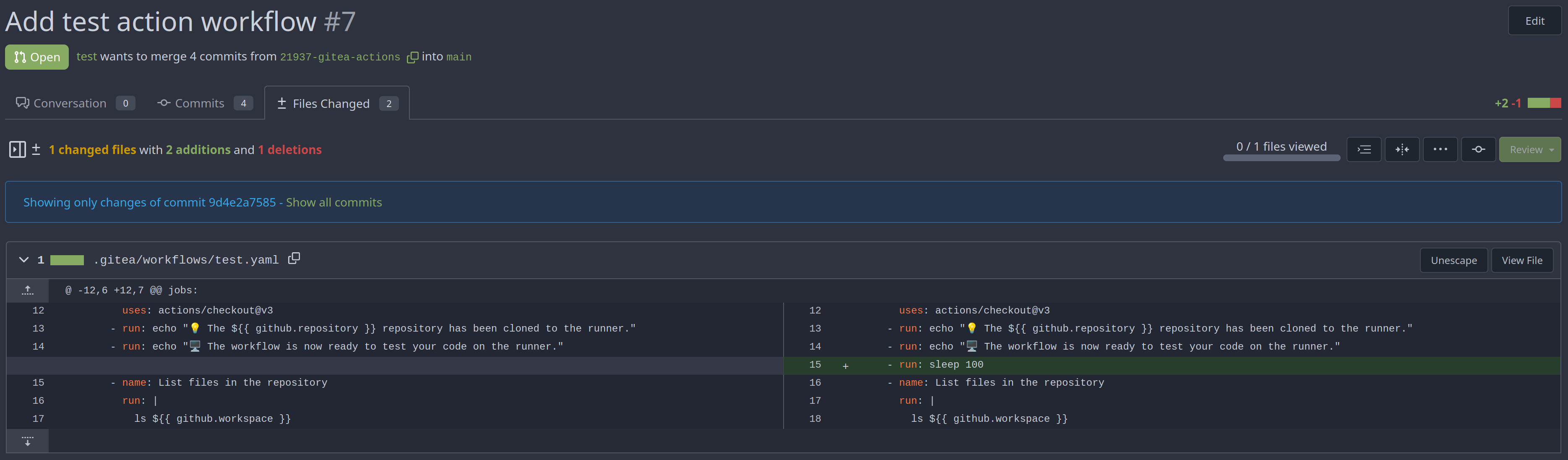
| |
This PR adds a new dropdown to select a commit or a commit range
(shift-click like github) of a Pull Request.
After selection of a commit only the changes of this commit will be shown.
When selecting a range of commits the diff of this range is shown.
This allows to review a PR commit by commit or by viewing only commit ranges.
The "Show changes since your last review" mechanism github uses is implemented, too.
When reviewing a single commit or a commit range the "Viewed" functionality is disabled.
## Screenshots
### The commit dropdown
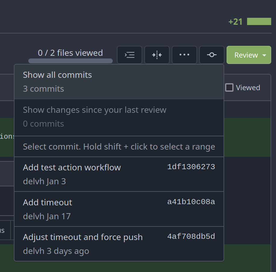
### Selecting a commit range

### Show changes of a single commit only
### Show changes of a commit range

Fixes https://github.com/go-gitea/gitea/issues/20989
Fixes https://github.com/go-gitea/gitea/issues/19263
---------
Co-authored-by: silverwind <me@silverwind.io>
Co-authored-by: KN4CK3R <admin@oldschoolhack.me>
Co-authored-by: wxiaoguang <wxiaoguang@gmail.com>
Co-authored-by: delvh <dev.lh@web.de>
|
| |
|
|
| |
Fixing the align center to row and space around for commit_page
template.
|
| |
|
|
|
|
|
|
| |
Use a real button and add an aria-label.
Additionally, show the button whenever it is focused.
See https://codeberg.org/forgejo/forgejo/issues/998 for explanation.
Our handling of this button is now equal to that of GitHub.
Nothing has changed visually.
|
| |
|
|
|
|
|
|
|
|
|
|
| |
Enable these rules:
- H014 | More than 2 blank lines.
- H023 | Do not use entity references.
There are more potential rules to enable but they are blocked by bugs in
the linter:
- https://github.com/Riverside-Healthcare/djLint/issues/711
- https://github.com/Riverside-Healthcare/djLint/issues/712
|
| |
|
|
|
|
|
|
|
|
|
|
|
|
|
|
|
|
|
|
|
|
|
|
|
|
|
|
| |
Archive text title center align
<details>
<summary>Screen shots</summary>
Before
After

BTW On github
</details>
---------
Co-authored-by: Giteabot <teabot@gitea.io>
|
| |
|
|
|
|
|
|
|
|
|
|
|
|
|
|
|
|
|
|
|
|
|
|
| |
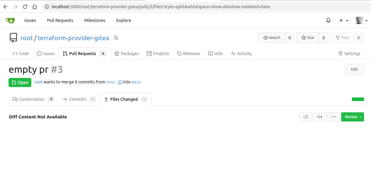
gitea allows to create empty PRs.
Currently when you need approvals for a merge, you have to manually add
/files to the url to get to the files tab to approve / reject the PR.
This PR allows to open the files tab via the normal tab / link and then
fixes the layout of the files tab.
**Screenshots:**
Before:

After:
---------
Co-authored-by: silverwind <me@silverwind.io>
Co-authored-by: Giteabot <teabot@gitea.io>
|
| |
|
|
|
|
|
|
| |
the PullHeadCommitID is not always available when the PR is merged.
Not sure if this is the best solution but in my simple tests it looks
like this fixes the problem - happy to get any feedback.
hopefully fixes https://github.com/go-gitea/gitea/issues/24813
|
| |
|
|
|
|
|
|
|
|
|
|
|
|
|
|
|
|
|
|
|
| |
Should look exactly like before for normal dividers. "Horizontal" ones
look better because they no longer use image backgrounds.
<img width="917" alt="Screenshot 2023-06-27 at 19 07 56"
src="https://github.com/go-gitea/gitea/assets/115237/d97d8dec-6859-44a8-85ba-e4549b4dd9df">
<img width="914" alt="Screenshot 2023-06-27 at 19 05 58"
src="https://github.com/go-gitea/gitea/assets/115237/8bf98544-2d82-4ebf-ac68-d6dc237bd6b2">
<img width="1246" alt="Screenshot 2023-06-27 at 19 00 42"
src="https://github.com/go-gitea/gitea/assets/115237/36a6bb21-6029-4f53-8bee-535f55c66fed">
<img width="344" alt="Screenshot 2023-06-27 at 18 58 15"
src="https://github.com/go-gitea/gitea/assets/115237/a9e70aee-8e6b-4ea1-9e93-19c9f96aec6e">
<img width="823" alt="Screenshot 2023-06-27 at 18 56 22"
src="https://github.com/go-gitea/gitea/assets/115237/e7a497cd-f262-4683-8872-23c3c8cce32f">
<img width="330" alt="Screenshot 2023-06-27 at 19 21 11"
src="https://github.com/go-gitea/gitea/assets/115237/42f24149-a655-4c7e-bd26-8ab52db6446b">
|
| |
|
|
|
|
|
|
|
|
|
|
| |
when trying to create a PR for an existing PRs branch combination link
to the PR directly and not just to the repo.
Before:
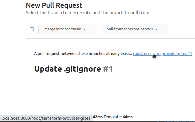
After:
|
| |
|
|
|
|
|
|
|
| |
fixes #24566
---------
Co-authored-by: wxiaoguang <wxiaoguang@gmail.com>
|
| |
|
|
|
|
|
|
|
|
|
|
|
|
|
|
|
|
| |
Two small tweaks:
1. Vertically center arrow here when editing a PR:
<img width="405" alt="Screenshot 2023-06-20 at 19 48 49"
src="https://github.com/go-gitea/gitea/assets/115237/1d63764d-9fd9-467e-8a8e-9258c06475eb">
2. Use 2-row layout on diff viewed status and show it again on mobile:
<img width="142" alt="Screenshot 2023-06-20 at 19 51 21"
src="https://github.com/go-gitea/gitea/assets/115237/3046e782-163c-4f87-910c-a22066de8f1b">
Mobile view:
<img width="370" alt="Screenshot 2023-06-20 at 19 44 40"
src="https://github.com/go-gitea/gitea/assets/115237/9cf56347-7323-4d05-99a5-17ad215ee44d">
|
| |
|
|
|
|
|
|
|
|
|
|
|
|
|
|
|
|
|
|
|
|
|
|
|
|
|
|
|
|
|
|
|
| |
If enabled show a clickable label in the comment. A click on the label
opens the Conversation tab with the comment focussed - there you're able
to view the old diff (or original diff the comment was created on).
**Screenshots**

When resolved and outdated:

Option to enable/disable this (stored in user settings - default is
disabled):


fixes #24913
---------
Co-authored-by: silverwind <me@silverwind.io>
|
| |
|
|
|
|
|
|
|
|
|
|
|
|
|
|
|
|
|
|
|
|
|
|
|
|
|
|
| |
Address
https://github.com/go-gitea/gitea/pull/25163#issuecomment-1599207916
Remove the unused "icon-button".
And fix the layout:
Without the dropdown icon:
```
{{svg "gitea-whitespace"}}
```
With the dropdown icon:
```
{{svg "gitea-whitespace" 16 "gt-mr-3"}}
{{svg "octicon-triangle-down" 14 "dropdown icon"}}
```

|
| |
|
|
|
|
|
|
|
|
|
|
|
|
|
|
|
|
| |
So I found this [linter](https://github.com/Riverside-Healthcare/djlint)
which features a mode for go templates, so I gave it a try and it did
find a number of valid issue, like unbalanced tags etc. It also has a
number of bugs, I had to disable/workaround many issues.
Given that this linter is written in python, this does add a dependency
on `python` >= 3.8 and `poetry` to the development environment to be
able to run this linter locally.
- `e.g.` prefixes on placeholders are removed because the linter had a
false-positive on `placeholder="e.g. cn=Search"` for the `attr=value`
syntax and it's not ideal anyways to write `e.g.` into a placeholder
because a placeholder is meant to hold a sample value.
- In `templates/repo/settings/options.tmpl` I simplified the logic to
not conditionally create opening tags without closing tags because this
stuff confuses the linter (and possibly the reader as well).
|
| |
|
|
|
|
|
|
|
|
|
|
|
|
|
|
| |
The code can be as simple as:
```html
<div class="flex-text-block">{{svg "octicon-alert"}} {{svg "octicon-x"}} text (block)</div>
<div><div class="flex-text-inline">{{svg "octicon-alert"}} {{svg "octicon-x"}} text</div> (inline)</div>
<div><button class="ui red button">{{svg "octicon-alert" 24}} {{svg "octicon-x" 24}} text</button></div>
```
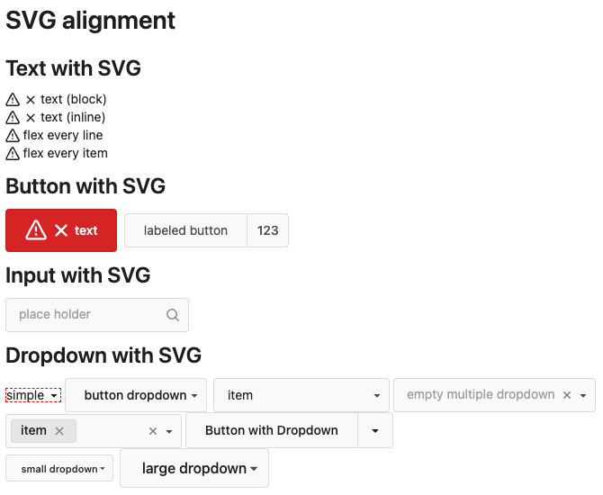
---------
Co-authored-by: Giteabot <teabot@gitea.io>
|
| |
|
|
|
|
|
|
|
|
|
|
|
|
|
|
|
|
|
|
|
|
|
|
|
|
|
|
|
|
|
|
|
|
| |
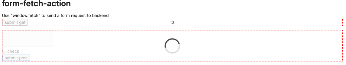
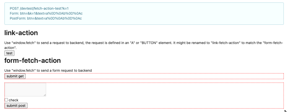
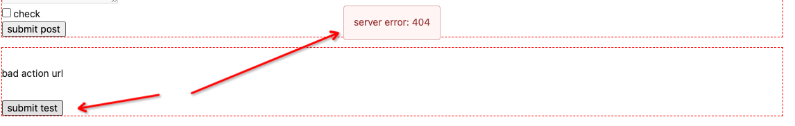
Co-author: @wxiaoguang
Close #25096
The way to fix it in this PR is to change form submit to fetch using
formData, and add flags to avoid post repeatedly.
Should be able to apply to more forms that have the same issue after
this PR.
In the demo below, 'approve' is clicked several times, and then
'comment' is clicked several time after 'request changes' clicked.
After:
https://github.com/go-gitea/gitea/assets/17645053/beabeb1d-fe66-4b76-b048-4f022b4e83a0
Update: screenshots from /devtest
>
>
>
>
>
---------
Co-authored-by: wxiaoguang <wxiaoguang@gmail.com>
|
| |
|
|
|
|
|
|
|
|
|
|
|
|
|
|
|
|
| |
- Various corrections to button styles, especially secondary
- Remove focus highlight, it's annoying when it stays on button after
press
- Clearly define ghost and link buttons with demos in devtest
- Remove black, grey and tertiary buttons, they should not be used
- Make `arc-green` slightly darker
<img width="1226" alt="image"
src="https://github.com/go-gitea/gitea/assets/115237/8d89786a-01ab-40f8-ae5a-e17f40e35084">
<img width="1249" alt="image"
src="https://github.com/go-gitea/gitea/assets/115237/83651e6d-3c27-46ff-b8bd-ff344d70e949">
---------
Co-authored-by: wxiaoguang <wxiaoguang@gmail.com>
Co-authored-by: Giteabot <teabot@gitea.io>
|
| |
|
|
|
|
|
|
|
|
|
|
|
|
|
|
| |
Feel free to close this if there isn't interest.
The tree view looks amazing, and all of our users are really enjoying it
(major kudos to developers!), but only IF I tell them it exists!
Essentially, the file tree view as it is effectively undiscoverable.
This PR changes the default state for the tree view to open, which
should significantly help with discoverability.
An alternative could be to reserve more horizontal space, as a typical
accordion panel would look (eg. VS Code), eg.

|
| |
|
|
|
|
|
|
|
|
|
|
|
|
|
|
|
|
|
|
|
| |
1. Add this button:
<img width="232" alt="Screenshot 2023-05-29 at 15 21 47"
src="https://github.com/go-gitea/gitea/assets/115237/5eaf6bd1-83db-4ffc-9503-eda0c59807d2">
<img width="297" alt="Screenshot 2023-05-29 at 15 20 22"
src="https://github.com/go-gitea/gitea/assets/115237/708a344f-f6d7-4229-bfda-76e1571b42c8">
2. Correct `button-link` styles to not have a background hover effect.
3. Tweak `.ui.container` padding to be the same for fluid and non-fluid.
4. Misc enhancements to diff header:
Before:
<img width="984" alt="Screenshot 2023-05-29 at 15 38 53"
src="https://github.com/go-gitea/gitea/assets/115237/c7926f6a-bd0a-4b05-97ad-c91fc25c62d5">
After:
<img width="987" alt="Screenshot 2023-05-29 at 15 43 10"
src="https://github.com/go-gitea/gitea/assets/115237/0149f545-45f8-42cf-b443-e1c76bd5cdeb">
|
| |
|
|
|
|
|
|
|
|
|
|
|
|
|
|
|
|
|
|
|
|
|
|
|
|
|
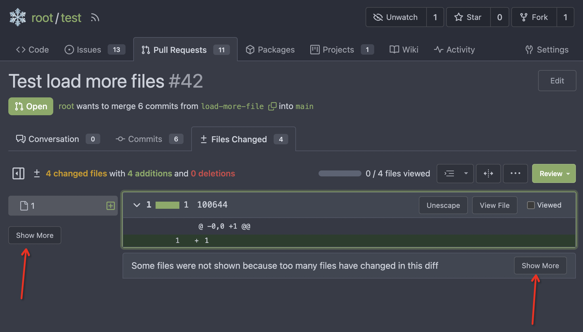
| |
Follow #21012, #22399
Replace #24983, fix #24938
Help #24956
Now, the `window.config.pageData.diffFileInfo` itself is a reactive
store, so it's quite easy to sync values/states by it, no need to do
"doLoadMoreFiles" or "callback".
Screenshot: these two buttons both work. After complete loading, the UI
is also right.
<details>


</details>
|
| |
|
|
|
|
|
|
|
|
|
|
|
|
|
|
|
|
|
|
|
|
|
| |
This MR introduces the addition of file mode display support for both
new file creation and file mode changes, following a similar approach as
GitLab.
GitLab:

Gitea:

Replaces: https://github.com/go-gitea/gitea/pull/23159
Closes: https://github.com/go-gitea/gitea/issues/23021
---------
Co-authored-by: silverwind <me@silverwind.io>
Co-authored-by: delvh <dev.lh@web.de>
Co-authored-by: Giteabot <teabot@gitea.io>
|
| |
|
|
|
|
|
|
|
|
|
|
|
|
|
|
|
|
|
|
|
|
|
|
|
|
|
|
|
| |
- Slightly decrease size of reaction buttons
- Remove tooltip inside menu, it's obvious by the picture alone
- Fix top menu triangle
- Use `display: grid` to align icons in menu
- Use regular tooltip for reaction users
- Fix bug that deleted the reaction bar on clicking already reacted
reaction in dropdown
<img width="490" alt="Screenshot 2023-05-17 at 00 03 42"
src="https://github.com/go-gitea/gitea/assets/115237/61588b37-facb-4829-b75b-e1cb5dda8ca4">
<img width="67" alt="Screenshot 2023-05-17 at 00 11 14"
src="https://github.com/go-gitea/gitea/assets/115237/29605589-3b5f-40c6-8ad4-09923094bb8e">
<img width="211" alt="Screenshot 2023-05-17 at 00 29 30"
src="https://github.com/go-gitea/gitea/assets/115237/7d2725da-6a3d-4e42-a351-53647f79f762">
<img width="210" alt="Screenshot 2023-05-17 at 00 29 54"
src="https://github.com/go-gitea/gitea/assets/115237/b50f8364-033c-4445-ba25-61a814bb2d92">
<img width="892" alt="Screenshot 2023-05-17 at 00 12 20"
src="https://github.com/go-gitea/gitea/assets/115237/30a46424-406a-46e5-b4de-47172eb8679d">
---------
Co-authored-by: wxiaoguang <wxiaoguang@gmail.com>
Co-authored-by: Giteabot <teabot@gitea.io>
|
| |
|
|
|
|
|
|
|
|
|
|
|
| |
introduce new font weight variables (#24827)
There was some recent discussion about this in Discord `ui-design`
channel and the conclusion was that
https://github.com/go-gitea/gitea/issues/24305 should have fixed their
OS font installation to have semibold weights.
I have now tested this 601 weight on a Windows 10 machine on Firefox
myself, and I immediately noticed that bold was excessivly bold and
rendering as 700 because browsers are biased towards bolder fonts. So
revert this back to the previous value.
|
| |
|
|
|
|
|
|
|
|
|
|
|
|
|
|
|
|
|
|
|
|
|
|
|
|
|
| |
Visually, nothing should have changed.
Changes include
- Convert most `<a [no href]>` to `<button>` when (re-)viewing files:
- `<a [no href]>` are, by HTML definition, not a link and hence cannot
be focused
- `<a class="ui button">` can now be clicked (again?) using
<kbd>Enter</kbd>
- Previously, the installed keypress handler on `.ui.button` elements
disabled it for links somehow
- The `(un)escape file`, the `expand section` and the `expand/collapse
file` buttons can now be focused (and subsequently clicked using only
the keyboard)
- You can now press <kbd>Space</kbd> on a focused `View file` checkbox
to mark the file as viewed.
- previously, this was impossible as this checkbox listened on the wrong
event listener
The `add code comment` button has been left inaccessible for now as it
requires quite a bit of extra logic so that it is unhidden when it is
focused (you can otherwise focus it without seeing it as you are not
hovering on the corresponding line).
---------
Co-authored-by: silverwind <me@silverwind.io>
|
| |
|
|
|
|
|
|
|
|
|
|
|
|
| |
Before:
After:
---------
Co-authored-by: wxiaoguang <wxiaoguang@gmail.com>
Co-authored-by: Giteabot <teabot@gitea.io>
|
| |
|
|
|
|
|
|
|
|
|
|
|
|
|
|
|
| |
As discuessed in
https://github.com/go-gitea/gitea/pull/24598/files#r1189290462
After:
Diff Page
<img width="1426" alt="Screen Shot 2023-05-10 at 10 44 48"
src="https://github.com/go-gitea/gitea/assets/17645053/bc1a5f78-ec17-4ac2-8390-081a5fc059d1">
New PR Page
<img width="1428" alt="Screen Shot 2023-05-10 at 10 45 17"
src="https://github.com/go-gitea/gitea/assets/17645053/ce94a28e-39d5-4534-9e78-c0edd4c7a339">
<img width="1432" alt="Screen Shot 2023-05-10 at 10 45 27"
src="https://github.com/go-gitea/gitea/assets/17645053/047809e1-abb2-4c16-ae62-63b71094c1c7">
|
| |
|
|
|
|
| |
Regression of #24459 , [the related
line](https://github.com/go-gitea/gitea/pull/24459/files#diff-f255004de8d715ff40852710390429bf2a06e7e33a4e3f8ad568af636557ac71L8)
The PR file diff view needs to be full-screen width.
|
| |
|
|
|
|
|
|
|
|
|
|
|
|
|
|
|
|
|
|
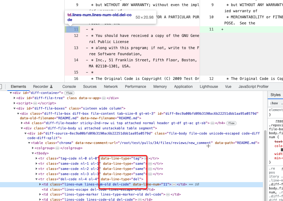
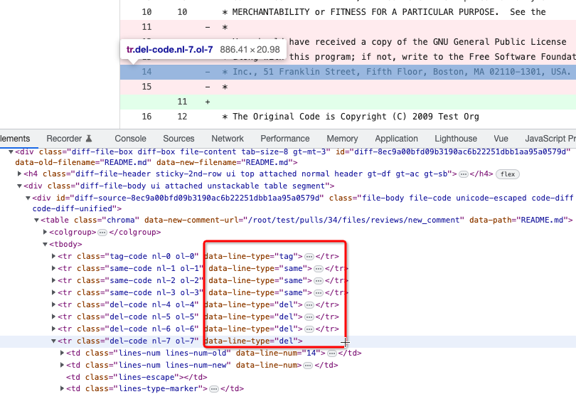
| |
To avoid bloating the template helper functions, some functions could be
provided by type methods.
And the new code `data-line-type="{{.GetHTMLDiffLineType}}"` reads
better than `data-line-type="{{DiffLineTypeToStr .GetType}}"`
After the fix, screenshots (the same as before):
<details>
</details>
|
| |
|
|
|
|
|
|
|
|
|
|
|
| |
I am not sure what "new-menu" means, but I think we need to fix these
problems:
1. it shouldn't have "stackable", which makes the items stacked when
width is small. the `new-menu` already has `overflow: auto`
2. `justify-content: center` doesn't work with `overflow: auto` (for
small width), so use `margin: auto`
*
https://bhch.github.io/posts/2021/04/centring-flex-items-and-allowing-overflow-scroll/
3. `runner-new-menu` is dead code (copying & pasting ?)
|
| |
|
|
|
|
|
|
|
|
|
|
|
|
|
|
|
|
|
|
|
|
|
|
|
|
|
|
|
|
|
|
|
|
| |
fix stackable menu (#24393)
Since 2015/2016, there is a global pollution: ".ui.left" / ".ui.right".
Fomantic UI doesn't work this way, it just conflicts with many Fomantic
definitions.
This PR starts the cleaning work of such techinical debts.
And, the "label list" page has been quite messy for long time, for
example, why "li" appears in "div" ......
And fix #24296
<details>


</details>
|
| |
|
|
|
|
|
|
|
|
|
|
|
|
|
|
| |
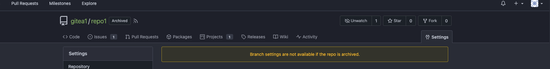
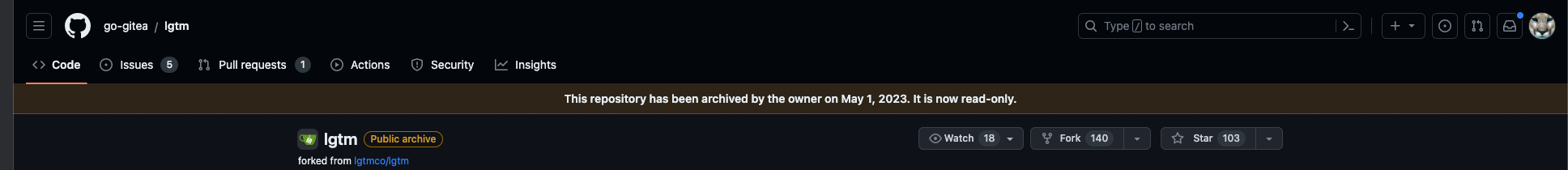
This adds the date a repo is archived to Gitea and shows it in the UI
and API. A feature, that GitHub has been [introduced
recently](https://github.blog/changelog/2022-11-23-repository-archive-date-now-shown-in-ui/).
I currently don't know how to correctly deal with the Date in the
template, as different languages have different ways of writing a date.
---------
Co-authored-by: silverwind <me@silverwind.io>
Co-authored-by: Lunny Xiao <xiaolunwen@gmail.com>
|
| |
|
|
|
|
|
|
|
|
|
|
|
|
|
|
|
|
|
|
|
|
| |
Close #24195
Some of the changes are taken from my another fix
https://github.com/go-gitea/gitea/pull/20147/commits/f07b0de997125c9b79cc5af27966a7cdd1803a4d
in #20147 (although that PR was discarded ....)
The bug is:
1. The old code doesn't handle `removedfile` event correctly
2. The old code doesn't provide attachments for type=CommentTypeReview
This PR doesn't intend to refactor the "upload" code to a perfect state
(to avoid making the review difficult), so some legacy styles are kept.
---------
Co-authored-by: silverwind <me@silverwind.io>
Co-authored-by: Giteabot <teabot@gitea.io>
|
| |
|
|
|
|
|
|
|
|
| |
close #23628
Now in `...` dropdown, you can expand or collapse all diff files that
have loaded.
https://user-images.githubusercontent.com/33891828/227749688-2d406916-3347-49f6-93a5-4092a00e8809.mov
Co-authored-by: silverwind <me@silverwind.io>
|
| |
|
|
|
|
|
|
|
|
|
|
|
|
|
|
|
|
|
|
|
|
|
|
|
|
|
|
|
|
|
|
| |
messages (#23982)
Follow #23328
Major changes:
* Group the function in `templates/help.go` by their purposes. It could
make future work easier.
* Remove the `Printf` helper function, there is already a builtin
`printf`.
* Remove `DiffStatsWidth`, replace with `Eval` in template
* Rename the `NewTextFuncMap` to `mailSubjectTextFuncMap`, it's for
subject text template only, no need to make it support HTML functions.
----
And fine tune template error messages, to make it more friendly to
developers and users.
---------
Co-authored-by: silverwind <me@silverwind.io>
|
| |
|
|
|
|
|
|
|
|
|
|
|
|
|
|
|
|
| |
One of the steps in #23328
Before there were 3 different but similar functions: dict/Dict/mergeinto
The code was just copied & pasted, no test.
This PR defines a new stable `dict` function, it covers all the 3 old
functions behaviors, only +160 -171
Future developers do not need to think about or guess the different dict
functions, just use one: `dict`
Why use `dict` but not `Dict`? Because there are far more `dict` than
`Dict` in code already ......
|
| |
|
|
|
|
|
|
|
|
|
|
|
|
|
|
|
|
|
|
|
|
|
|
|
|
|
|
|
|
|
|
|
|
|
|
|
|
|
|
|
|
|
|
|
|
|
|
|
|
|
|
|
|
|
|
|
|
|
|
|
|
|
|
|
|
|
| |
One of the proposals in #23328
This PR introduces a simple expression calculator
(templates/eval/eval.go), it can do basic expression calculations.
Many untested template helper functions like `Mul` `Add` can be replaced
by this new approach.
Then these `Add` / `Mul` / `percentage` / `Subtract` / `DiffStatsWidth`
could all use this `Eval`.
And it provides enhancements for Golang templates, and improves
readability.
Some examples:
----
* Before: `{{Add (Mul $glyph.Row 12) 12}}`
* After: `{{Eval $glyph.Row "*" 12 "+" 12}}`
----
* Before: `{{if lt (Add $i 1) (len $.Topics)}}`
* After: `{{if Eval $i "+" 1 "<" (len $.Topics)}}`
## FAQ
### Why not use an existing expression package?
We need a highly customized expression engine:
* do the calculation on the fly, without pre-compiling
* deal with int/int64/float64 types, to make the result could be used in
Golang template.
* make the syntax could be used in the Golang template directly
* do not introduce too much complex or strange syntax, we just need a
simple calculator.
* it needs to strictly follow Golang template's behavior, for example,
Golang template treats all non-zero values as truth, but many 3rd
packages don't do so.
### What's the benefit?
* Developers don't need to add more `Add`/`Mul`/`Sub`-like functions,
they were getting more and more.
Now, only one `Eval` is enough for all cases.
* The new code reads better than old `{{Add (Mul $glyph.Row 12) 12}}`,
the old one isn't familiar to most procedural programming developers
(eg, the Golang expression syntax).
* The `Eval` is fully covered by tests, many old `Add`/`Mul`-like
functions were never tested.
### The performance?
It doesn't use `reflect`, it doesn't need to parse or compile when used
in Golang template, the performance is as fast as native Go template.
### Is it too complex? Could it be unstable?
The expression calculator program is a common homework for computer
science students, and it's widely used as a teaching and practicing
purpose for developers. The algorithm is pretty well-known.
The behavior can be clearly defined, it is stable.
|
| |
|
|
|
|
|
|
|
|
|
|
|
|
|
|
| |
Close #22911
I think it's ready for review now, feel free to test it, welcome to help
to improve.
### Before

### After
|
| |
|
|
|
|
|
|
|
|
|
|
|
|
|
|
|
|
|
|
|
|
|
|
|
|
|
|
|
|
|
|
|
|
|
|
|
|
|
|
|
|
|
|
|
|
| |
The first step of the plan
* #23290
Thanks to @silverwind for the first try in #15394 . Close #10729 and a
lot of related issues.
The EasyMDE is not removed, now it works as a fallback, users can switch
between these two editors.
Editor list:
* Issue / PR comment
* Issue / PR comment edit
* Issue / PR comment quote reply
* PR diff view, inline comment
* PR diff view, inline comment edit
* PR diff view, inline comment quote reply
* Release editor
* Wiki editor
Some editors have attached dropzone
Screenshots:
<details>
</details>
---------
Co-authored-by: silverwind <me@silverwind.io>
|
| |
|
|
|
| |
Regression of #23245
Close #23843
|
| |
|
|
|
|
|
|
|
|
|
|
|
|
|
|
|
|
|
|
|
|
|
|
|
|
|
|
| |
- Avoid flash of wrong tree toggle icon on page load by setting icon
based on sync state
- Avoid "pop-in" of tree on page load by leaving space based on sync
state
- Use the same border/box-shadow combo used on comment `:target` also
for file `:target`.
- Refactor `DiffFileTree.vue` to use `toggleElem` instead of hardcoded
class name.
- Left-align inline comment boxes and make them fit the same amount of
markup content on a line as GitHub.
- Fix height of `diff-file-list`
Fixes: https://github.com/go-gitea/gitea/issues/23593
<img width="1250" alt="Screenshot 2023-03-18 at 00 52 04"
src="https://user-images.githubusercontent.com/115237/226071392-6789a644-aead-4756-a77e-aba3642150a0.png">
<img width="1246" alt="Screenshot 2023-03-18 at 00 59 43"
src="https://user-images.githubusercontent.com/115237/226071443-8bcba924-458b-48bd-b2f0-0de59cb180ac.png">
<img width="1250" alt="Screenshot 2023-03-18 at 01 27 14"
src="https://user-images.githubusercontent.com/115237/226073121-ccb99f9a-d3ac-40b7-9589-43580c4a01c9.png">
<img width="1231" alt="Screenshot 2023-03-19 at 21 44 16"
src="https://user-images.githubusercontent.com/115237/226207951-81bcae1b-6b41-4e39-83a7-0f37951df6be.png">
(Yes I'm aware the border-radius in bottom corners is suboptimal, but
this would be notorously hard to fix without relying on `overflow:
hidden`).
|
| |
|
| |
HTML is not XML.
|
| |
|
|
|
|
|
|
|
|
|
|
|
|
|
|
| |
Some of those are still Copy&Paste problems.
This PR:
* Only cleans the legacy incorrect code, doesn't change or improve the
"action" logic.
* Remove the redundant `$('.toggle.button').on('click')`, now
`$('.show-panel.button').on('click')` handles that kinds of buttons
Actually, there is only one correct "toggle button" in code, the one on
the webhook page.
No need to backport.
|
