| Commit message (Collapse) | Author | Age | Files | Lines |
|---|
| ... | |
| |
|
|
|
|
|
|
|
|
|
|
|
|
|
|
|
|
|
|
|
|
|
|
|
|
|
| |
- Fix regression with icons wrapping from
https://github.com/go-gitea/gitea/pull/24459
- Fix box misalignment on small screen
- Fix avatar misalignment on review comment
- Fix incorrect underline hover effect on review icons
- Move status icon to left side in review box
- Enhance review icon colors, add helper function for it
- Add missing inline avatars in review comments
- Tweak icon sizes because some octicons have inconsistent sizing
### Before
<img width="655" alt="Screenshot 2023-05-04 at 20 50 28"
src="https://user-images.githubusercontent.com/115237/236301230-92325507-6e03-47ac-bfb4-c9ddde310571.png">
<img width="260" alt="Screenshot 2023-05-04 at 20 50 42"
src="https://user-images.githubusercontent.com/115237/236301236-0dfa50e7-b8fc-4179-ae68-d872bc90f1f3.png">
### After
<img width="498" alt="Screenshot 2023-05-04 at 20 55 08"
src="https://user-images.githubusercontent.com/115237/236301810-23862c2c-c0a9-43a4-a3eb-ee611c14a7f4.png">
<img width="219" alt="Screenshot 2023-05-04 at 20 55 16"
src="https://user-images.githubusercontent.com/115237/236301817-d0de02ea-6ab5-43e1-9183-6b3848b72995.png">
---------
Co-authored-by: Giteabot <teabot@gitea.io>
|
| |
|
|
|
|
|
|
|
|
|
|
|
|
|
|
|
| |
As discuessed in
https://github.com/go-gitea/gitea/pull/24598/files#r1189290462
After:
Diff Page
<img width="1426" alt="Screen Shot 2023-05-10 at 10 44 48"
src="https://github.com/go-gitea/gitea/assets/17645053/bc1a5f78-ec17-4ac2-8390-081a5fc059d1">
New PR Page
<img width="1428" alt="Screen Shot 2023-05-10 at 10 45 17"
src="https://github.com/go-gitea/gitea/assets/17645053/ce94a28e-39d5-4534-9e78-c0edd4c7a339">
<img width="1432" alt="Screen Shot 2023-05-10 at 10 45 27"
src="https://github.com/go-gitea/gitea/assets/17645053/047809e1-abb2-4c16-ae62-63b71094c1c7">
|
| |
|
|
|
|
|
|
|
|
|
|
|
|
|
| |
Fixes #24145
To solve the bug, I added a "computed" `TargetBehind` field to the
`Release` model, which indicates the target branch of a release.
This is particularly useful if the target branch was deleted in the
meantime (or is empty).
I also did a micro-optimization in `calReleaseNumCommitsBehind`. Instead
of checking that a branch exists and then call `GetBranchCommit`, I
immediately call `GetBranchCommit` and handle the `git.ErrNotExist`
error.
This optimization is covered by the added unit test.
|
| |
|
|
|
|
|
|
|
|
|
|
|
|
| |
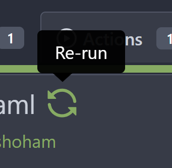
To clearly communicate the current state of the action

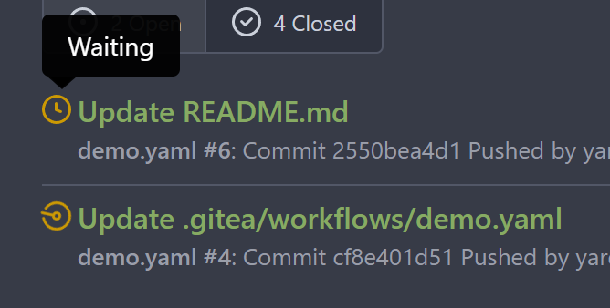
---------
Signed-off-by: Yarden Shoham <git@yardenshoham.com>
|
| |
|
|
|
|
| |
Regression of #24459 , [the related
line](https://github.com/go-gitea/gitea/pull/24459/files#diff-f255004de8d715ff40852710390429bf2a06e7e33a4e3f8ad568af636557ac71L8)
The PR file diff view needs to be full-screen width.
|
| |
|
|
|
|
|
|
|
|
|
|
|
|
|
|
|
|
|
|
|
|
|
|
|
|
| |
The first time I saw the big red X button I thought something failed but
apparently, it was just a "Cancel" button
# Before

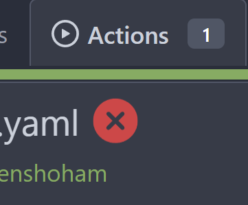
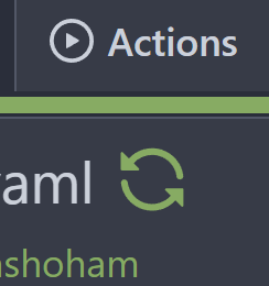
# After
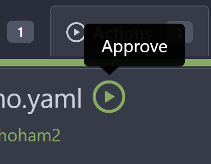
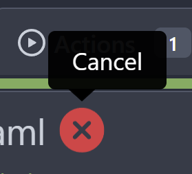
---------
Signed-off-by: Yarden Shoham <git@yardenshoham.com>
Co-authored-by: Giteabot <teabot@gitea.io>
Co-authored-by: silverwind <me@silverwind.io>
|
| |
|
|
|
|
|
|
|
|
|
|
|
|
|
|
|
|
|
|
|
|
|
|
|
|
|
| |
Fixes #24398
Task:
- [x] Reusing "textarea" like GitHub seems more friendly to users.
- [x] ^V image pasting and file uploading handling.
<details><summary>screenshots</summary>
Display only one markdown editor:
Support file upload and ^V image pasting
</details>
---------
Co-authored-by: wxiaoguang <wxiaoguang@gmail.com>
Co-authored-by: silverwind <me@silverwind.io>
|
| |
|
|
|
|
|
|
|
|
|
|
| |
for
https://github.com/go-gitea/gitea/issues/4109#issuecomment-1527104992
Supports format:
`#1234`
`Org/Repo#1234`
---------
Co-authored-by: techknowlogick <techknowlogick@gitea.io>
|
| |
|
|
|
|
|
|
|
|
|
|
|
|
|
|
|
|
|
|
| |
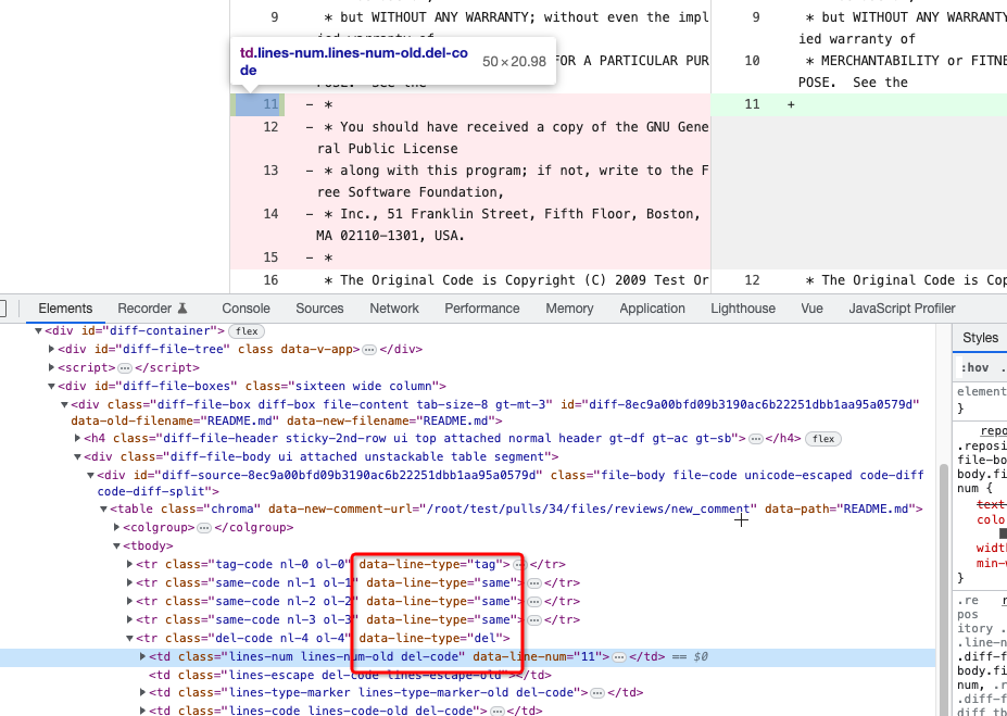
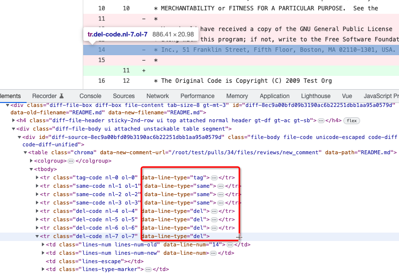
To avoid bloating the template helper functions, some functions could be
provided by type methods.
And the new code `data-line-type="{{.GetHTMLDiffLineType}}"` reads
better than `data-line-type="{{DiffLineTypeToStr .GetType}}"`
After the fix, screenshots (the same as before):
<details>
</details>
|
| |
|
|
|
|
|
|
|
|
|
|
|
|
|
|
|
|
|
|
|
|
|
| |
date (#24562)
- Very similar to #24550
The correct thing to do is to translate the entire phrase into a single
string. The previous translation assumed all languages have a space
between the "added on" and the date (and that "added on" comes before
the date).
Some languages, like Hebrew, have no space between the "added on" and
the date. For example:
```ini
added_on=נוסף ב-%s
```
("added" becomes נוסף, "on" is ב and when paired with a date we use a
dash to connect ב with the date)
---------
Signed-off-by: Yarden Shoham <git@yardenshoham.com>
Co-authored-by: delvh <dev.lh@web.de>
|
| |
|
|
|
|
|
|
|
|
|
|
|
|
|
|
| |
date (#24550)
The correct thing to do is to translate the entire phrase into a single
string. The previous translation assumed all languages have a space
between the "joined on" and the date (and that "joined on" comes before
the date).
Some languages, like Hebrew, have no space between the "joined on" and
the date. For example:
```ini
joined_on=נרשם ב-%s
```
("joined" becomes נרשם, "on" is ב and when paired with a date we use a
dash to connect ב with the date)
|
| |
|
| |
Fix #24534
|
| |
|
| |
Fix https://github.com/go-gitea/gitea/pull/24512#discussion_r1185664695
|
| |
|
|
|
|
|
|
|
|
|
|
|
|
|
| |
Follow #24380
It's better to warn users when they try to rename the default branch.
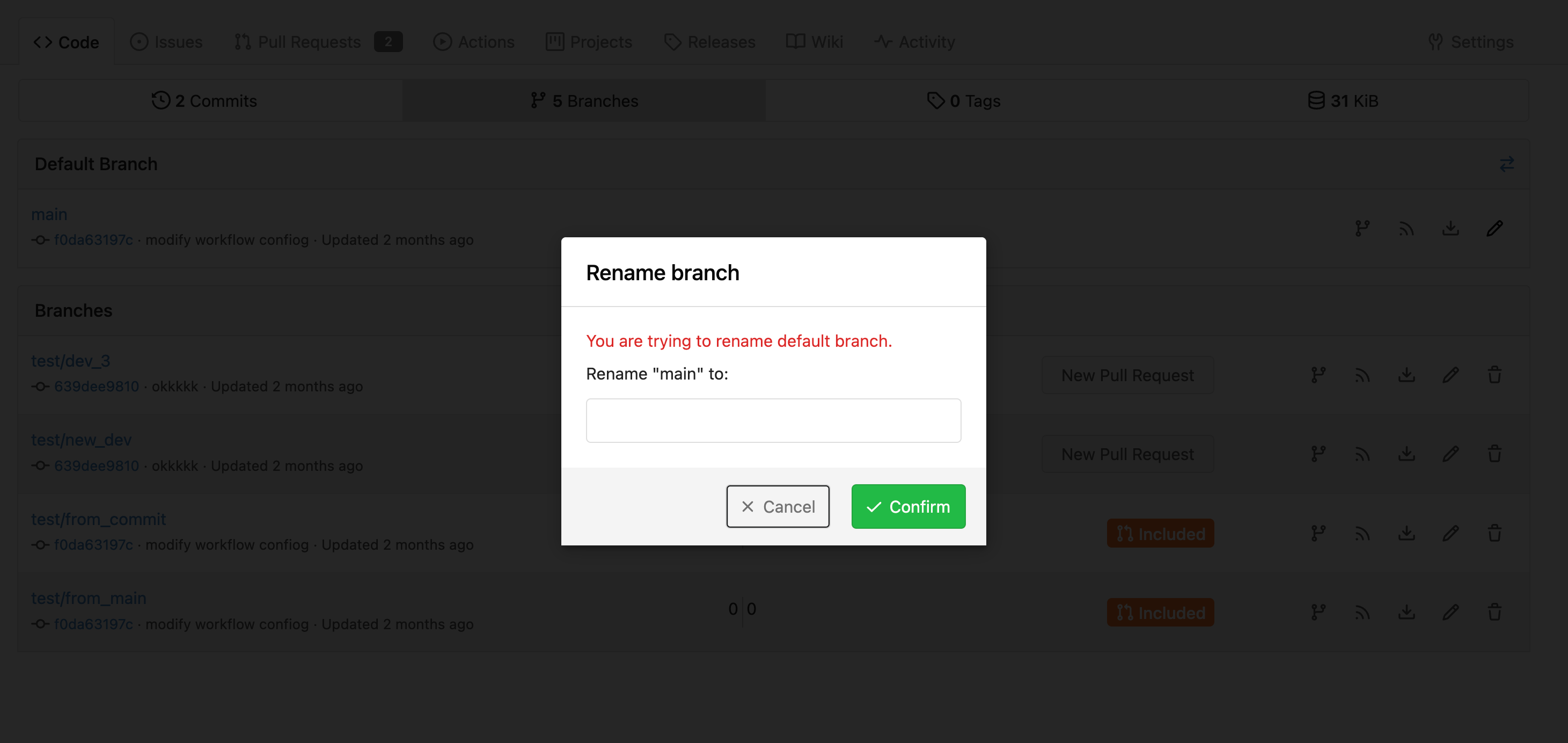
---------
Co-authored-by: techknowlogick <matti@mdranta.net>
Co-authored-by: Jason Song <i@wolfogre.com>
Co-authored-by: silverwind <me@silverwind.io>
Co-authored-by: Giteabot <teabot@gitea.io>
|
| |
|
|
|
|
|
|
|
|
|
|
|
|
|
|
|
|
|
|
|
|
|
|
|
|
|
|
|
| |
Before:
<img width="1410" alt="Screen Shot 2023-05-04 at 09 28 23"
src="https://user-images.githubusercontent.com/17645053/236100146-2b64d274-2d79-4b4c-827c-3906a2a9dbb7.png">
<img width="1413" alt="Screen Shot 2023-05-04 at 09 28 30"
src="https://user-images.githubusercontent.com/17645053/236100157-15c12e83-a4f5-4b4e-b26b-73a8ce8bc0db.png">
After:
With no permission:
<img width="1409" alt="Screen Shot 2023-05-04 at 12 17 12"
src="https://user-images.githubusercontent.com/17645053/236144666-c2bb6ca2-59e1-45ae-93cd-d43545500d06.png">
<img width="1402" alt="Screen Shot 2023-05-04 at 12 17 17"
src="https://user-images.githubusercontent.com/17645053/236144677-c51a65cf-8aef-4566-b265-14b2ebb46d0b.png">
With permission:
<img width="1412" alt="Screen Shot 2023-05-04 at 12 16 45"
src="https://user-images.githubusercontent.com/17645053/236144565-9c5aa9a6-1424-49e3-a2b2-a129fecb856c.png">
<img width="1420" alt="Screen Shot 2023-05-04 at 12 16 51"
src="https://user-images.githubusercontent.com/17645053/236144573-a4064136-80d9-4c41-8f98-f51b4352bdf7.png">
---------
Co-authored-by: Giteabot <teabot@gitea.io>
|
| |
|
|
| |
A mirror repository with wiki is also a mirror. So creating page from UI
should be disabled. This PR hides the button like other places.
|
| |
|
|
|
|
|
|
|
|
|
| |
Fixes #24414
After click replay this webhook, it will display `now`
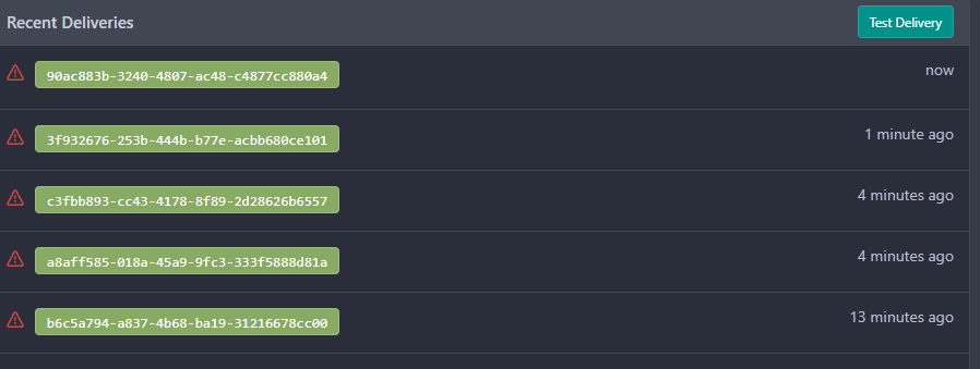
---------
Co-authored-by: wxiaoguang <wxiaoguang@gmail.com>
Co-authored-by: Giteabot <teabot@gitea.io>
|
| |
|
|
|
|
|
|
|
|
|
|
|
|
|
|
|
|
|
|
|
|
|
|
|
|
|
|
|
|
|
|
|
|
|
|
|
|
|
|
|
|
|
|
|
|
|
|
|
|
|
|
|
| |
- Remove various horizontal dividers on repo pages that didn't provide
visual benefit
- Remove label/milestone pills on single issue/pr page
- Remove issue-related pill buttons on projects page
- Increase contrast of color-secondary on arc-green
- Improve notifications icon, make circle bigger
- Remove some inline styles
- Fix focus in issue/pr title edit and select all text on button click
### Issue and PR before and after
<img width="1249" alt="Screenshot 2023-05-01 at 11 44 22"
src="https://user-images.githubusercontent.com/115237/235436662-a708288e-84fb-4b2e-a5a2-3a1c17d28f6c.png">
<img width="1248" alt="Screenshot 2023-05-01 at 11 58 51"
src="https://user-images.githubusercontent.com/115237/235437992-f863e483-f3cc-4cc1-8204-fd223647a0c9.png">
### Projects before and after
<img width="1255" alt="Screenshot 2023-05-01 at 11 41 02"
src="https://user-images.githubusercontent.com/115237/235436433-0deb85d6-4e7d-4e74-847f-254cc70a0cf9.png">
<img width="1267" alt="Screenshot 2023-05-01 at 11 40 03"
src="https://user-images.githubusercontent.com/115237/235436431-715b13cb-f78c-4d86-b27a-9229f9738c5b.png">
### Releases before and after
<img width="1243" alt="Screenshot 2023-05-01 at 11 41 12"
src="https://user-images.githubusercontent.com/115237/235436457-b655ee6f-03b8-4595-8d8c-b15ea469e988.png">
<img width="1240" alt="Screenshot 2023-05-01 at 11 40 10"
src="https://user-images.githubusercontent.com/115237/235436456-05a2a0dd-7cbb-4f26-b0d3-4f667df4bb95.png">
### Misc
<img width="58" alt="Screenshot 2023-05-01 at 10 49 13"
src="https://user-images.githubusercontent.com/115237/235432494-936ce995-6e22-47bc-ab2d-c9e93d31987d.png">
<img width="57" alt="Screenshot 2023-05-01 at 18 57 08"
src="https://user-images.githubusercontent.com/115237/235492430-1d32cfe0-0f2c-467c-b2fa-925b27e30e0e.png">
Issue title edit and wrap:
<img width="1238" alt="Screenshot 2023-05-01 at 12 34 40"
src="https://user-images.githubusercontent.com/115237/235441407-d5067a57-e586-4865-a652-282e5944abb4.png">
<img width="1232" alt="Screenshot 2023-05-01 at 12 06 24"
src="https://user-images.githubusercontent.com/115237/235438710-1a543dda-220f-4d87-8f93-f1710c0695f0.png">
---------
Co-authored-by: wxiaoguang <wxiaoguang@gmail.com>
|
| |
|
|
|
|
|
|
|
|
|
|
|
|
|
|
|
|
|
|
|
|
|
|
|
|
|
|
|
|
|
|
|
|
| |
Follow #24393
The funny history:
* At the beginning, `.ui.message` was polluted by `text-align: center`
* Then people do `<div class="ui ... message text left">`
* But `.ui.left` is polluted by `float: left`
* Then people do `#xxx .ui.message { width: 100% !important;}`
The code just becomes more and more hacky.
After removing the pollution, everything becomes clear and straight.
And, this PR also does:
1. Remove the `package.css`, its styles could be provided by `top
aligned`
2. Remove `#avatar-arrow`, dead code
Screenshot:


Co-authored-by: Giteabot <teabot@gitea.io>
|
| |
|
|
|
|
|
|
|
|
|
|
|
|
|
|
|
|
|
|
|
|
| |
(#24397)
This PR hide the pull request merge box totally if it's merged and branch deleted.
It's also add a bold for merge base commit id in merged message comment
Before:
<img width="989" alt="图片"
src="https://user-images.githubusercontent.com/81045/235066590-28deb506-e824-4a42-a9a2-791cd136756e.png">
After:
<img width="1030" alt="图片"
src="https://user-images.githubusercontent.com/81045/235080749-11d5efe8-a06e-4528-a75f-f6c6d191db50.png">
---------
Co-authored-by: silverwind <me@silverwind.io>
Co-authored-by: wxiaoguang <wxiaoguang@gmail.com>
|
| |
|
|
|
|
|
|
|
|
|
|
|
| |
Caused by
https://github.com/go-gitea/gitea/pull/24246/files#diff-2bfe41d93dbb409583a4f945902e46bb513f60f1c9301649c1689200c4f1466eR1
Class `new` was removed in #24246, but in function
`initCompWebHookEditor`, it will check `.new.webhook`.
So in repo webhook settings page, `initCompWebHookEditor` will init
nothing, and no response after click the test delivery button.
https://github.com/go-gitea/gitea/blob/da65b7ad47e8d0d82f47cb24ee9ac2a0ec50dc25/web_src/js/features/comp/WebHookEditor.js#L6-L9
Co-authored-by: Giteabot <teabot@gitea.io>
|
| |
|
|
|
|
|
|
|
|
|
|
|
|
| |
Followup to https://github.com/go-gitea/gitea/pull/24427.
Reasoning is that `N/A` is specific to english while `-` is
language-neutral and does not need translation.
Before:
<img width="891" alt="Screenshot 2023-05-01 at 20 58 20"
src="https://user-images.githubusercontent.com/115237/235511592-8a36d0f2-34ff-4dbe-b642-67c0ade644fe.png">
After:
<img width="901" alt="Screenshot 2023-05-01 at 20 59 59"
src="https://user-images.githubusercontent.com/115237/235511594-d49f6d09-92e8-4e99-be7b-2a37f5d24129.png">
|
| |
|
|
| |
Fixes https://github.com/go-gitea/gitea/issues/10410.
This PR removes around 120kB of CSS.
|
| |
|
|
|
|
|
|
|
|
|
|
|
| |
I am not sure what "new-menu" means, but I think we need to fix these
problems:
1. it shouldn't have "stackable", which makes the items stacked when
width is small. the `new-menu` already has `overflow: auto`
2. `justify-content: center` doesn't work with `overflow: auto` (for
small width), so use `margin: auto`
*
https://bhch.github.io/posts/2021/04/centring-flex-items-and-allowing-overflow-scroll/
3. `runner-new-menu` is dead code (copying & pasting ?)
|
| |
|
|
|
|
|
|
|
|
|
|
|
|
|
|
|
|
|
|
|
|
|
| |
### File path before/after
<img width="522" alt="Screenshot 2023-05-01 at 13 23 33"
src="https://user-images.githubusercontent.com/115237/235445636-57776038-c98e-4cab-8abe-045138a76958.png">
<img width="522" alt="Screenshot 2023-05-01 at 13 24 08"
src="https://user-images.githubusercontent.com/115237/235445638-70bef62a-1b70-41f8-ba51-728db4d54402.png">
### File edit before/after
<img width="499" alt="Screenshot 2023-05-01 at 13 24 46"
src="https://user-images.githubusercontent.com/115237/235445676-7b3cc23e-289b-40a6-8d4f-0d7fb2efb55e.png">
<img width="497" alt="Screenshot 2023-05-01 at 13 24 52"
src="https://user-images.githubusercontent.com/115237/235445677-db9f3974-8456-46de-a32b-9198110c0540.png">
### Cherry-pick before/after
<img width="590" alt="Screenshot 2023-05-01 at 13 25 30"
src="https://user-images.githubusercontent.com/115237/235445717-99445024-1bb2-46d4-9bd8-8086bad57d34.png">
<img width="582" alt="Screenshot 2023-05-01 at 13 25 37"
src="https://user-images.githubusercontent.com/115237/235445720-9c1dc497-eb23-4e10-a727-27f4d6df69e6.png">
|
| |
|
|
|
|
|
|
|
| |
- Replace leftover dropdown triangles with SVG
- Replace remove icon with SVG and add styling for it:
<img width="817" alt="Screenshot 2023-05-01 at 00 40 05"
src="https://user-images.githubusercontent.com/115237/235379271-4674d4f7-b11e-4d6d-90f9-1478325443ca.png">
<img width="816" alt="Screenshot 2023-05-01 at 00 46 56"
src="https://user-images.githubusercontent.com/115237/235379451-b515afb3-9773-4f6f-a259-e7048235bcba.png">
|
| |
|
|
|
|
|
|
|
|
|
|
|
|
|
|
|
|
|
|
|
|
| |
Partial regression of #24393, not only regression, but broken for long
time, 24393 didn't really improve it but used wrong `overflow: scroll`.
Actually, that "ui secondary filter menu labels" shouldn't be set as
scrollable (I missed that at that time), the problem is: if a "ui menu"
has "dropdown" items, then it should not be scrollable. Otherwise the
dropdown menu can't be shown correctly.
And there are more problems:
* The "issue-filters" shouldn't be used anywhere else (copying&pasting
problem again ....)
* There is also an "issue-actions" container, it should also be fixed.
* There are similar problems on the milestone page.
* The old comment in code: "grid column" doesn't work well.
The major changes of this PR are: use "flex: 1" instead of "ui grid
column".
After this PR, not 100% perfect but much better than before.
|
| |
|
|
|
|
|
|
|
|
|
|
|
|
|
|
| |
(#24380)
Co-Author: @wxiaoguang
It is more convenient that user just need to enter a new branch name after he selects the branch which he want to rename.
So this PR move the function of renaming branch to the page of branches list.
This PR also restyle the button of `new branch`, `download`, `delete`....
https://user-images.githubusercontent.com/33891828/235277997-413060bb-759f-430a-b5c4-df5e40ffcd28.mov
---------
Co-authored-by: wxiaoguang <wxiaoguang@gmail.com>
|
| |
|
|
|
|
|
|
|
|
| |
Now we have `All milestones`, `No milestones`, `Open milestones` and
`Closed milestones`.
Fix #11924
Fix #22411
<img width="1166" alt="image"
src="https://user-images.githubusercontent.com/81045/212243375-95eea035-a972-44b8-8088-53db614cb07e.png">
|
| |
|
|
|
|
|
|
|
|
|
|
|
|
|
|
|
|
|
|
|
| |
- Make search bar dynamic full width via flexbox
- Make all buttons `small` so font size is the same for all elements in
the header
- Remove primary color from search field, add SVG icon like on Code tab
- Fix button vertical padding being enlarged by SVG icons
[View diff without
whitespace](https://github.com/go-gitea/gitea/pull/24420/files?diff=unified&w=1)
<img width="1226" alt="Screenshot 2023-04-29 at 11 58 53"
src="https://user-images.githubusercontent.com/115237/235296851-74848267-664f-4c1f-b94c-a1b94196ff75.png">
<img width="1219" alt="Screenshot 2023-04-29 at 11 59 39"
src="https://user-images.githubusercontent.com/115237/235296852-bcfde5ed-8658-43c2-b7e5-3ad84611e76f.png">
Mobile:
<img width="437" alt="Screenshot 2023-04-29 at 11 59 52"
src="https://user-images.githubusercontent.com/115237/235296860-99263373-7b27-4540-868c-a93e70f281ca.png">
<img width="433" alt="Screenshot 2023-04-29 at 12 00 00"
src="https://user-images.githubusercontent.com/115237/235296862-6cf64317-a864-405a-a00f-b5ab620349f5.png">
|
| |
|
| |
Fixes #24418
|
| |
|
|
|
|
|
|
|
|
|
|
|
|
|
|
|
|
|
|
|
|
|
|
|
|
|
|
|
| |
It seems that we really need the "context function" soon. So we should
clean up the helper functions first.
Major changes:
* Improve StringUtils and add JsonUtils
* Remove one-time-use helper functions like CompareLink
* Move other code (no change) to util_avatar/util_render/util_misc (no
need to propose changes for them)
I have tested the changed templates:
---------
Co-authored-by: Giteabot <teabot@gitea.io>
|
| |
|
|
|
|
|
|
|
|
|
|
|
|
|
|
|
|
|
|
|
|
|
|
|
|
|
|
|
|
|
|
|
|
| |
fix stackable menu (#24393)
Since 2015/2016, there is a global pollution: ".ui.left" / ".ui.right".
Fomantic UI doesn't work this way, it just conflicts with many Fomantic
definitions.
This PR starts the cleaning work of such techinical debts.
And, the "label list" page has been quite messy for long time, for
example, why "li" appears in "div" ......
And fix #24296
<details>


</details>
|
| |
|
|
|
|
|
|
|
|
|
|
|
|
|
|
|
|
|
|
|
|
|
|
|
|
|
|
|
|
|
|
|
|
|
|
|
|
|
|
|
|
|
|
|
|
|
|
|
|
|
|
|
|
|
|
| |
Main changes:
1. Change html structure of protected branch page, use [`grouped
fields`](https://fomantic-ui.com/collections/form.html#grouped-fields)
instead of `fields` for better margin, and wrap `grouped fields` around
related `field`s, remove unnecessary `<div id="protection_box"
class="fields">` outer div
2. Changed some order of field to make them more categorized, used `ui
dividing header` for categorization and fine tune css.
Before:
<img width="1907" alt="Screen Shot 2023-04-27 at 14 56 19"
src="https://user-images.githubusercontent.com/17645053/234783731-bce8a7ce-dfc9-4d47-a3a8-b962ebea9467.png">
<img width="1849" alt="Screen Shot 2023-04-27 at 14 56 30"
src="https://user-images.githubusercontent.com/17645053/234783740-c47d314e-5e2d-4854-98fd-c88f85ef3584.png">
<img width="1872" alt="Screen Shot 2023-04-27 at 14 56 36"
src="https://user-images.githubusercontent.com/17645053/234783745-18e35a75-07e8-451d-b001-f9bcf16fcab5.png">
After:
https://user-images.githubusercontent.com/17645053/235114568-da010aad-7654-4410-ab8c-5d0fce7edadb.mov
3. Changed "Enable Merge Whitelist" to radio checkbox, and added "Enable
Merge" radio checkbox, which are exclusive
Before:
<img width="926" alt="Screen Shot 2023-04-28 at 13 08 29"
src="https://user-images.githubusercontent.com/17645053/235059233-75790f7a-e5ea-4e1c-82c6-509fef8b84b3.png">
After:
<img width="942" alt="Screen Shot 2023-04-28 at 13 09 28"
src="https://user-images.githubusercontent.com/17645053/235059367-852d1f61-8407-4126-8c79-315b9c1ffada.png">
4. Add a link to set default branch on branch list page (with reference
to github)
https://user-images.githubusercontent.com/17645053/234787404-61c1c7b6-aabf-429f-a109-5b690e4e0b5a.mov
5. Removed dead codes.
---------
Co-authored-by: wxiaoguang <wxiaoguang@gmail.com>
Co-authored-by: silverwind <me@silverwind.io>
Co-authored-by: Giteabot <teabot@gitea.io>
|
| |
|
| |
The "unit" part shouldn't have bold style.
|
| |
|
|
|
|
|
|
|
|
|
|
| |
The commit date time is based on server's time zone not user's local
time zone.
Before:
After:
|
| |
|
|
|
|
|
|
|
|
|
|
|
|
|
|
|
|
|
|
|
| |
Ref:
https://github.com/go-gitea/gitea/pull/24315#pullrequestreview-1403034993
And fix the incorrect layout for "dasbboard", the "form" shouldn't
follow `<h4 class="ui top attached header">`, so move it to inner.
Diff with ignoring spaces:
https://github.com/go-gitea/gitea/pull/24370/files?diff=unified&w=1
A known bug: the adapt/delete button doesn't work due to a historical
messy logic, will fix it in next PR (#24374)
|
| |
|
|
|
|
|
|
|
|
|
|
|
|
|
|
|
|
|
|
|
|
|
|
|
|
|
|
|
|
|
|
|
|
|
|
|
|
|
|
|
|
|
|
|
|
|
|
|
| |
This PR moves the secrets and runners settings to actions settings on
all settings(repo,org,user,admin) levels.
After this PR, if
[ENABLED](https://github.com/go-gitea/gitea/blob/5e7543fcf441afb30aba6188edac754ef32b9ac3/custom/conf/app.example.ini#L2604)
inside `app.ini` under `[actions]` is set to `false`, the "Actions" tab
(including runners management and secrets management) will not be shown.
After, the settings under actions settings for each level:
1. Admin Level
"Runners Management"
<img width="1437" alt="Screen Shot 2023-04-26 at 14 34 20"
src="https://user-images.githubusercontent.com/17645053/234489731-15822d21-38e1-4560-8bbe-69f122376abc.png">
2. User Level
"Secrets Management"
<img width="1427" alt="Screen Shot 2023-04-26 at 14 34 30"
src="https://user-images.githubusercontent.com/17645053/234489795-68c9c0cb-24f8-4f09-95c6-458ab914c313.png">
3. Repo and Organization Levels
"Runners Management" and "Secrets Management"
Org:
<img width="1437" alt="Screen Shot 2023-04-26 at 14 35 07"
src="https://user-images.githubusercontent.com/17645053/234489996-f3af5ebb-d354-46ca-9087-a0b586845281.png">
<img width="1433" alt="Screen Shot 2023-04-26 at 14 35 14"
src="https://user-images.githubusercontent.com/17645053/234490004-3abf8fed-81fd-4ce2-837a-935dade1793d.png">
Repo:
<img width="1419" alt="Screen Shot 2023-04-26 at 14 34 50"
src="https://user-images.githubusercontent.com/17645053/234489904-80c11038-4b58-462c-9d0b-8b7cf70bc2b3.png">
<img width="1430" alt="Screen Shot 2023-04-26 at 14 34 57"
src="https://user-images.githubusercontent.com/17645053/234489918-4e8d1fe2-9bcd-4d8a-96c1-238a8088d92e.png">
It also finished these tasks :
- [x] rename routers function "runners" to "actions", and refactor
related file names
- [x] check and modify part of the runners related functions to match
their name
- [x] Fix backend check caused by fmt check
---------
Co-authored-by: wxiaoguang <wxiaoguang@gmail.com>
|
| |
|
|
|
|
|
|
|
|
|
|
|
|
|
|
|
|
|
|
|
|
|
|
|
|
|
|
|
| |
header (#24315)
Close #24302
Part of #24229, Follows #24246
This PR focused on CSS style fine-tune, main changes:
1. Give `.ui.ui.ui.container` a width of `1280px` with a max-width of
`calc(100vw - 64px)`, so the main contents looks better on large
devices.
2. Share styles for table elements in all levels settings pages to fix
overflow of runners table on mobile and for consistency (The headers on
mobile can be further improved, but haven't found a proper way yet).
3. Use [stackable
grid](https://fomantic-ui.com/collections/grid.html#stackable) and
[device column width](https://fomantic-ui.com/examples/responsive.html)
for responsiveness for some pages (repo/org collaborators settings
pages, org teams related page)
4. Fixed #24302 by sharing label related CSS in reporg.css
5. Fine tune repo tags settings page
---------
Co-authored-by: wxiaoguang <wxiaoguang@gmail.com>
|
| |
|
|
|
|
|
|
|
|
|
|
|
|
|
|
| |
This adds the date a repo is archived to Gitea and shows it in the UI
and API. A feature, that GitHub has been [introduced
recently](https://github.blog/changelog/2022-11-23-repository-archive-date-now-shown-in-ui/).
I currently don't know how to correctly deal with the Date in the
template, as different languages have different ways of writing a date.
---------
Co-authored-by: silverwind <me@silverwind.io>
Co-authored-by: Lunny Xiao <xiaolunwen@gmail.com>
|
| |
|
|
|
|
|
| |
I made it render the script even if the repo is archived
- Fixes #24324
Signed-off-by: Yarden Shoham <git@yardenshoham.com>
|
| |
|
|
|
|
|
|
|
|
|
|
|
|
|
|
|
|
|
|
|
|
|
|
|
|
|
|
|
|
|
|
|
|
|
|
|
|
|
|
|
|
|
|
|
|
|
|
| |
Follow #22719
### Major changes
1. `ServerError` doesn't do format, so remove the `%s`
2. Simplify `RenderBranchFeed` (slightly)
3. Remove unused `BranchFeedRSS`
4. Make `feed.RenderBranchFeed` respect `EnableFeed` config
5. Make `RepoBranchTagSelector.vue` respect `EnableFeed` setting,
otherwise there is always RSS icon
6. The `(branchURLPrefix + item.url).replace('src', 'rss')` doesn't seem
right for all cases, for example, the string `src` could appear in
`branchURLPrefix`, so we need a separate `rssURLPrefix`
7. The `<a>` in Vue menu needs `@click.stop`, otherwise the menu itself
would be triggered at the same time
8. Change `<a><button></button></a>` to `<a role=button>`
9. Use `{{PathEscapeSegments .TreePath}}` instead of `{{range $i, $v :=
.TreeNames}}/{{$v}}{{end}}`
Screenshot of changed parts:
<details>
</details>
### Other thoughts
Should we remove the RSS icon from the branch dropdown list? It seems
too complex for a list UI, and users already have the chance to get the
RSS feed URL from "branches" page.
---------
Co-authored-by: 6543 <6543@obermui.de>
Co-authored-by: silverwind <me@silverwind.io>
|
| |
|
|
|
|
| |
Before, 500 error

|
| |
|
|
|
|
|
|
|
|
|
|
|
|
|
|
|
|
|
|
|
|
|
|
|
|
|
|
|
|
| |
Close #23427
Co-Author: @wxiaoguang
If a repo's release setting is enabled, the logic has't changed.
Clicking the "Tags" button will jump to `/{user}/{repo}/tags` and
`templates/repo/release/list.tmpl` template will be used.
<img
src="https://user-images.githubusercontent.com/15528715/224939362-bd8974fd-08b0-4f79-a114-3389d15847ca.png"
width="600px" />
If the release setting is disabled, clicking the "Tags" button will
still jump to `/{user}/{repo}/tags` but a new template
`templates/repo/tag/list.tmpl` will be used.
<img
src="https://user-images.githubusercontent.com/15528715/233834564-74741e49-f4e9-47c8-ac12-e306642798dc.png"
width="600px" />
Since both templates above need to render the tags list, I moved the
tags list to a shared template located in
`templates/repo/tag/table.tmpl`.
---------
Co-authored-by: wxiaoguang <wxiaoguang@gmail.com>
Co-authored-by: Giteabot <teabot@gitea.io>
|
| |
|
|
|
|
|
|
|
|
|
| |
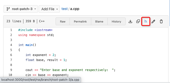
Fix #22228 adding RSS feeds for branches and files.
RSS feeds are accessed through:
* [gitea]/src/branch/{branch}.rss
* [gitea]/src/branch/{branch}/{file_name}.rss
No changes have been made to the UI to expose the feed urls for branches
and files.
|
| |
|
|
|
|
|
|
|
|
|
|
|
|
|
|
|
| |
If you use a External Wiki, with Gitea, it brings currently 2 Problems
in the Header:
1. It always uses the Wiki Icon. When you use e.g. a External Issue
Tracker, it shows the External Link icon to Indicate, that the User will
send to a External Side. This helps preventing fishing.
2. If you use a External Wiki, the Link in the Header still goes to
`{repo}/wiki` which will redirect the user to the External Wiki. That
means, that if the users hovers with the Cursor over the link, it shows
`{repo}/wiki`, so the User does not know, where he will land.
This PR fixes both.

|
| |
|
|
|
|
|
|
|
| |
I noticed that it is possible to break the push mirror list by entering
a too long URL. This should fix it.
| Before | After |
|--------------|-----------|
||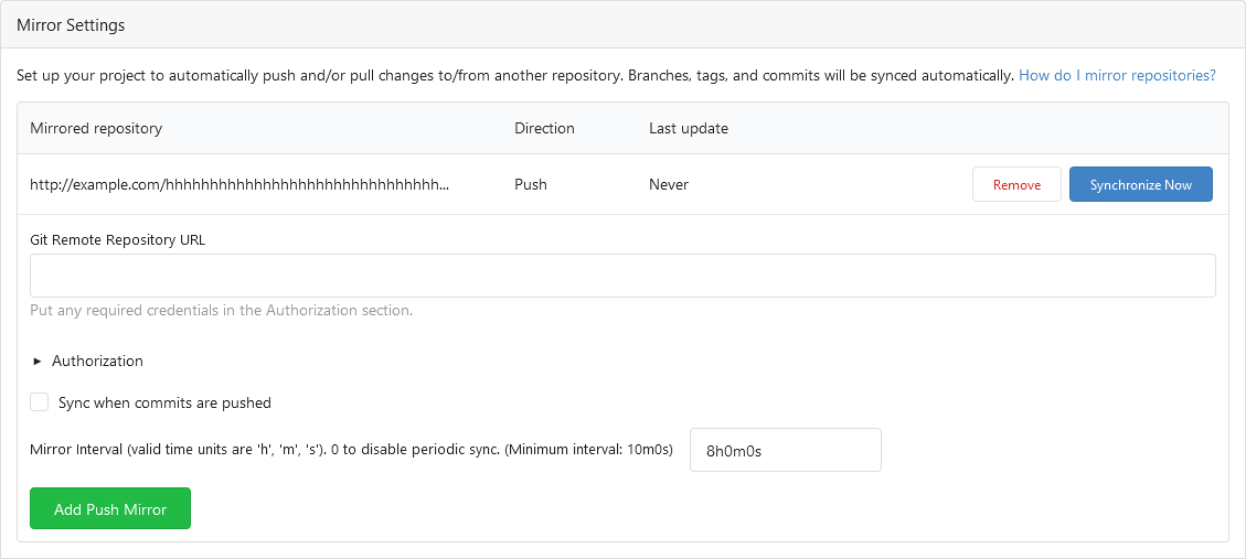|
|
| |
|
|
|
|
|
|
|
|
|
|
|
|
|
|
|
|
|
|
|
|
|
|
|
|
|
|
|
|
|
| |
Follow #24097 and #24285
And add a devtest page for modal action button testing.
http://localhost:3000/devtest/fomantic-modal
Now the `modal_actions_confirm.tmpl` could support: green / blue /
yellow positive buttons, the negative button is "secondary".
ps: this PR is only a small improvement, there are still a lot of
buttons not having proper colors. In the future these buttons could be
improved by this approach.
These buttons could also be improved according to the conclusion of
#24285 in the future.

And add GitHub-like single danger button (context:
https://github.com/go-gitea/gitea/issues/24285#issuecomment-1519100312)

---------
Co-authored-by: silverwind <me@silverwind.io>
|
| |
|
| |
Part of #23318.
|
| |
|
|
| |
Remove space/tab after `(` and before `)` in templates. Only two
violations it seems.
|
