| Commit message (Collapse) | Author | Age | Files | Lines |
|---|
| ... | |
| |
|
|
|
|
|
|
|
|
|
|
|
|
|
| |
the stacking takes up screen space - display the tabs as the navigation
bar. github uses the same layout.
Screenshots (left before, right after):

Large screen:

|
| |
|
|
|
|
|
|
|
|
|
|
|
|
|
|
| |
Issue filters are being used on repo list page and on milestone issues
page, and the code is mostly duplicated.
This PR does the following changes:
- move issue filters into a shared template
- allow filtering milestone issues by project, so no need to hide this
filter on milestone issues page
- remove some dead code (e. g. issue actions in milestone issues
template)
- fix label filter dropdown width
---------
Co-authored-by: 6543 <6543@obermui.de>
|
| |
|
|
|
|
|
|
|
|
|
|
|
|
|
|
|
|
|
|
|
|
|
|
|
|
|
|
|
|
|
|
| |
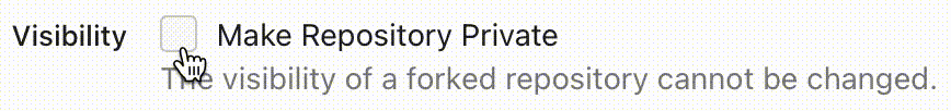
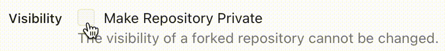
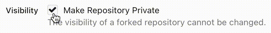
There is some distortion in desktop and mobile ui for new/edit milestone
page.
Fixing the new/edit milestone page for desktop and mobile ui
Design background
https://uxplanet.org/primary-secondary-action-buttons-c16df9b36150
https://balsamiq.com/learn/articles/button-design-best-practices/
<details>
<summary>Screen shots</summary>
Before:


After


</details>
---------
Co-authored-by: Denys Konovalov <privat@denyskon.de>
Co-authored-by: Giteabot <teabot@gitea.io>
|
| |
|
|
|
|
|
|
|
|
|
|
| |
Enable these rules:
- H014 | More than 2 blank lines.
- H023 | Do not use entity references.
There are more potential rules to enable but they are blocked by bugs in
the linter:
- https://github.com/Riverside-Healthcare/djLint/issues/711
- https://github.com/Riverside-Healthcare/djLint/issues/712
|
| |
|
|
|
|
|
|
|
|
|
|
|
|
|
|
|
|
|
|
|
|
|
|
|
|
|
|
|
|
|
|
|
|
|
| |
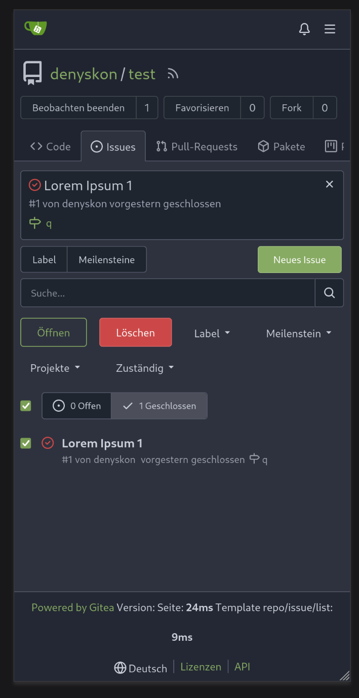
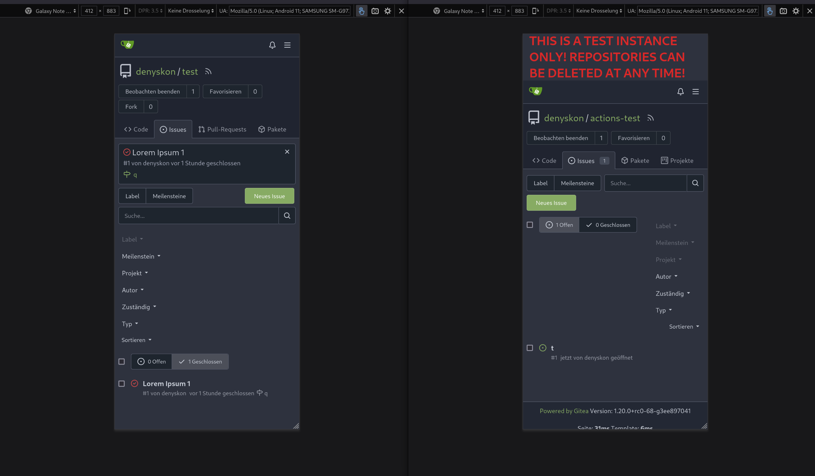
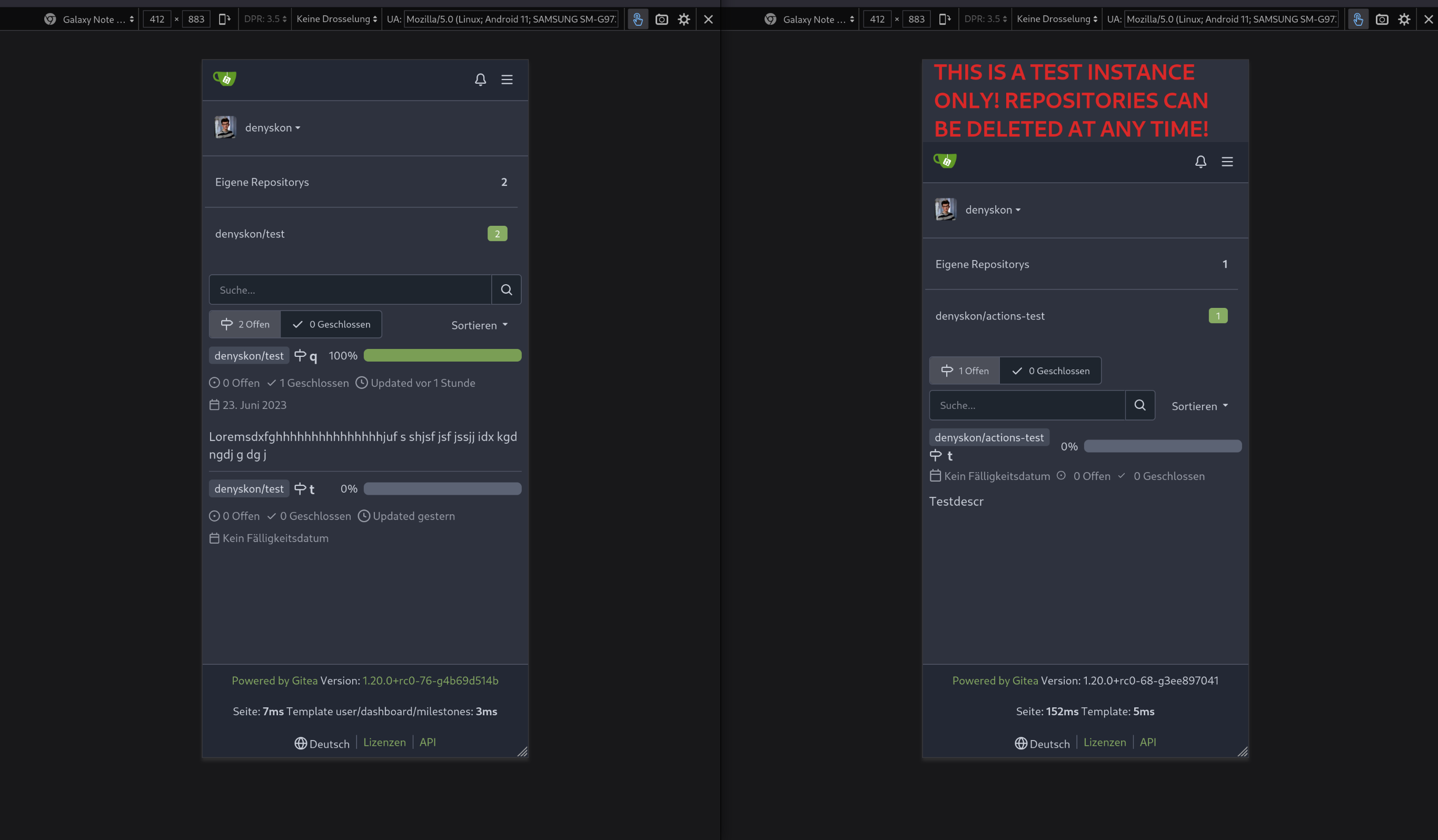
This PR does various modifications on the issue list shared template:
- restructure layout to achieve better responsiveness
- fix various style issues
- restructure styles (better result with less code :)
- remove numerous `gt-*` patches and other unneeded classes -> use
existing css classes
<details>
<summary>Before:</summary>

</details>
<details>
<summary>After:</summary>

</details>
---------
Co-authored-by: silverwind <me@silverwind.io>
|
| |
|
|
|
|
|
|
|
|
|
| |
Related: #22743
Before:
After:
|
| |
|
|
|
|
|
|
|
|
|
|
|
|
|
|
|
|
|
|
|
|
|
|
| |
Minor tweaks to repo topics:
- Use gap instead of margin to align "Manage Topics" when no topics
present
- Add margin to description instead
Before:
<img width="1232" alt="Screenshot 2023-07-08 at 13 08 15"
src="https://github.com/go-gitea/gitea/assets/115237/a5d3586c-6cbf-4b74-8137-11d91f2cbb45">
<img width="1233" alt="Screenshot 2023-07-08 at 13 08 05"
src="https://github.com/go-gitea/gitea/assets/115237/59b18d93-e4cb-4f2b-9bc2-d6aa63f93827">
After:
<img width="1232" alt="Screenshot 2023-07-08 at 13 08 42"
src="https://github.com/go-gitea/gitea/assets/115237/470d42ad-3f7e-40f9-b0a1-203b4af77eb9">
<img width="1231" alt="Screenshot 2023-07-08 at 13 08 32"
src="https://github.com/go-gitea/gitea/assets/115237/42d18048-748c-4a3f-ab89-3403866cef34">
---------
|
| |
|
|
|
|
|
|
|
|
|
|
|
|
|
|
|
|
|
|
|
|
|
|
|
|
|
|
| |
Archive text title center align
<details>
<summary>Screen shots</summary>
Before
After

BTW On github
</details>
---------
Co-authored-by: Giteabot <teabot@gitea.io>
|
| |
|
|
|
|
|
|
|
|
|
|
|
|
|
|
|
|
|
|
|
|
|
|
|
|
|
|
|
| |
Changes:
* Rename gt-tl/gt-tc/gt-tr to gt-text-left/gt-text-center/gt-text-right
* The gt-ab and gt-br-0 are removed because they are not needed anymore
* Fix the clone dropdown button padding by ":not(.icon)"
Before:
<details>

</details>
After:
<details>

</details>
Fixes #25758
Co-authored-by: Giteabot <teabot@gitea.io>
|
| |
|
|
|
|
|
|
|
|
|
|
|
| |
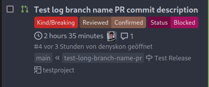
This PR will display a pull request creation hint on the repository home
page when there are newly created branches with no pull request. Only
the recent 6 hours and 2 updated branches will be displayed.
Inspired by #14003
Replace #14003
Resolves #311
Resolves #13196
Resolves #23743
co-authored by @kolaente
|
| |
|
|
|
|
|
|
|
|
|
| |
I think hiding the add file button for mirror repositories that can keep the ui clean.
Before:
After:
|
| |
|
|
|
|
|
|
|
|
|
|
|
|
|
|
|
|
|
|
|
|
|
|
|
|
|
|
|
|
|
|
|
|
|
|
|
|
|
|
|
|
|
|
|
|
|
|
|
| |
Fix ::User Profile Page Project Tab Have Inconsistent Layout and Style
Added the big_avator for consistency in the all header_items tabs.
Fixes: #24871
> ### Description
> in the user profile page the `Packages` and `Projects` tab have small
icons for user but other tabs have bigger profile picture with user
info:
>
> ### Screenshots
> ### **For Packages And Projects:**
>

>
> ### **For Other Tabs:**
>

>
## Before

## After changes
Project View
<img width="1394" alt="image"
src="https://github.com/go-gitea/gitea/assets/80308335/95d181d7-8e61-496d-9899-7b825c91ad56">
Packages View
<img width="1378" alt="image"
src="https://github.com/go-gitea/gitea/assets/80308335/7f5fd60f-6b18-4fa8-8c56-7b0d45d1a610">
## Org view for projects page
<img width="1385" alt="image"
src="https://github.com/go-gitea/gitea/assets/80308335/6400dc89-a5ae-4f0a-831b-5b6efa020d89">
## Org view for packages page
<img width="1387" alt="image"
src="https://github.com/go-gitea/gitea/assets/80308335/4e1e9ffe-1e4b-4334-8657-de11b5fd31d0">
---------
Co-authored-by: wxiaoguang <wxiaoguang@gmail.com>
Co-authored-by: Giteabot <teabot@gitea.io>
Co-authored-by: silverwind <me@silverwind.io>
|
| |
|
|
|
|
|
|
|
|
|
|
|
|
|
|
|
|
|
|
|
|
|
|
| |
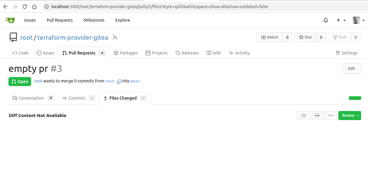
gitea allows to create empty PRs.
Currently when you need approvals for a merge, you have to manually add
/files to the url to get to the files tab to approve / reject the PR.
This PR allows to open the files tab via the normal tab / link and then
fixes the layout of the files tab.
**Screenshots:**
Before:

After:
---------
Co-authored-by: silverwind <me@silverwind.io>
Co-authored-by: Giteabot <teabot@gitea.io>
|
| |
|
|
|
|
| |
- Resolves https://codeberg.org/forgejo/forgejo/issues/948
Co-authored-by: Gusted <postmaster@gusted.xyz>
Co-authored-by: Giteabot <teabot@gitea.io>
|
| |
|
| |
This caused by #23465
|
| |
|
|
|
|
|
|
|
|
|
|
|
|
|
|
|
|
|
|
|
|
|
|
|
|
|
|
|
| |
Resolves #25622
<details>
<summary>Screenshots</summary>


</details>
---------
Co-authored-by: wxiaoguang <wxiaoguang@gmail.com>
Co-authored-by: silverwind <me@silverwind.io>
|
| |
|
|
|
|
|
|
|
|
|
|
| |
Various small enhancements to the actions list. Before and after:
<img width="1264" alt="Screenshot 2023-06-30 at 00 11 40"
src="https://github.com/go-gitea/gitea/assets/115237/bb4162ee-cdcf-4a73-b05e-f9521562edbb">
<img width="1264" alt="Screenshot 2023-06-30 at 00 09 51"
src="https://github.com/go-gitea/gitea/assets/115237/52a70ea9-4bb3-406e-904b-0fdaafde9582">
---------
Co-authored-by: Giteabot <teabot@gitea.io>
|
| |
|
|
|
|
|
|
|
| |
Fix #10388
This PR adds a status icon for every branch which has a status check for
the latest commit on branch list page.
<img width="1313" alt="图片"
src="https://github.com/go-gitea/gitea/assets/81045/727cd540-d03a-40c6-a7dd-e87c118af0ac">
|
| |
|
|
|
|
|
| |
Fix #25326
---------
Co-authored-by: silverwind <me@silverwind.io>
|
| |
|
|
|
|
|
|
|
|
|
|
|
|
|
|
| |
Adding branch-name copy to clipboard and button in branches screen
Replaces #25569
Fixes #25120
New mocks:
<img width="876" alt="Screenshot 2023-06-30 at 12 01 41 AM"
src="https://github.com/go-gitea/gitea/assets/80308335/a34ab00f-5625-4529-ba17-f2bf7af58e2a">
<img width="822" alt="Screenshot 2023-06-30 at 12 03 59 AM"
src="https://github.com/go-gitea/gitea/assets/80308335/3a32dffc-52cd-49e1-a437-6d11d58d0939">
<img width="476" alt="image"
src="https://github.com/go-gitea/gitea/assets/80308335/85e8f361-5cb7-45d4-aced-ad2523d54ab0">
|
| |
|
|
|
|
|
|
| |
the PullHeadCommitID is not always available when the PR is merged.
Not sure if this is the best solution but in my simple tests it looks
like this fixes the problem - happy to get any feedback.
hopefully fixes https://github.com/go-gitea/gitea/issues/24813
|
| |
|
|
|
|
|
|
|
|
|
|
|
|
|
|
|
|
|
|
|
|
|
|
|
|
|
|
|
|
|
| |
expect (#25573)
This pull request fades read-only checkboxes and checkmark, and it makes
the checkboxes act more read-only/disabled by not changing the
border-color when clicked.
Examples using light mode:
| Before | After |
| - | - |
| 
| 
|
| 
| 
|
| | read-only checkboxes and checkmark are faded<br>and the checkboxes
act more read-only/disabled |
Fixes/Closes/Resolves #25076
---------
Co-authored-by: silverwind <me@silverwind.io>
Co-authored-by: wxiaoguang <wxiaoguang@gmail.com>
|
| |
|
|
|
|
|
|
|
|
|
|
|
|
|
|
|
|
|
|
|
| |
Should look exactly like before for normal dividers. "Horizontal" ones
look better because they no longer use image backgrounds.
<img width="917" alt="Screenshot 2023-06-27 at 19 07 56"
src="https://github.com/go-gitea/gitea/assets/115237/d97d8dec-6859-44a8-85ba-e4549b4dd9df">
<img width="914" alt="Screenshot 2023-06-27 at 19 05 58"
src="https://github.com/go-gitea/gitea/assets/115237/8bf98544-2d82-4ebf-ac68-d6dc237bd6b2">
<img width="1246" alt="Screenshot 2023-06-27 at 19 00 42"
src="https://github.com/go-gitea/gitea/assets/115237/36a6bb21-6029-4f53-8bee-535f55c66fed">
<img width="344" alt="Screenshot 2023-06-27 at 18 58 15"
src="https://github.com/go-gitea/gitea/assets/115237/a9e70aee-8e6b-4ea1-9e93-19c9f96aec6e">
<img width="823" alt="Screenshot 2023-06-27 at 18 56 22"
src="https://github.com/go-gitea/gitea/assets/115237/e7a497cd-f262-4683-8872-23c3c8cce32f">
<img width="330" alt="Screenshot 2023-06-27 at 19 21 11"
src="https://github.com/go-gitea/gitea/assets/115237/42f24149-a655-4c7e-bd26-8ab52db6446b">
|
| |
|
|
|
|
|
|
|
|
|
|
|
|
|
|
|
|
|
|
|
|
|
|
|
|
| |
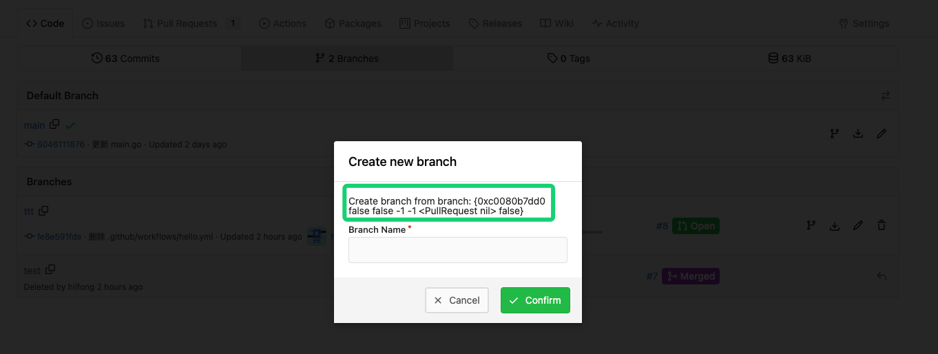
Related #14180
Related #25233
Related #22639
Close #19786
Related #12763
This PR will change all the branches retrieve method from reading git
data to read database to reduce git read operations.
- [x] Sync git branches information into database when push git data
- [x] Create a new table `Branch`, merge some columns of `DeletedBranch`
into `Branch` table and drop the table `DeletedBranch`.
- [x] Read `Branch` table when visit `code` -> `branch` page
- [x] Read `Branch` table when list branch names in `code` page dropdown
- [x] Read `Branch` table when list git ref compare page
- [x] Provide a button in admin page to manually sync all branches.
- [x] Sync branches if repository is not empty but database branches are
empty when visiting pages with branches list
- [x] Use `commit_time desc` as the default FindBranch order by to keep
consistent as before and deleted branches will be always at the end.
---------
Co-authored-by: Jason Song <i@wolfogre.com>
|
| |
|
|
|
|
| |
Close #25557
Fix regression from #25315
`data-id` is still needed for deleting milestone.
|
| |
|
|
|
|
|
|
|
|
|
|
|
|
|
|
|
|
|
|
|
|
|
|
|
|
|
|
| |
Before:
<img width="364" alt="Screen Shot 2023-06-20 at 11 59 11"
src="https://github.com/go-gitea/gitea/assets/17645053/ad284b7e-8d21-43be-b178-bbcfd37cb5bd">
Might trigger many posts when keep clicking the buttons above.
<img width="448" alt="Screen Shot 2023-06-20 at 11 52 28"
src="https://github.com/go-gitea/gitea/assets/17645053/a60aa6ac-af74-45e4-b13a-512b436b81b0">
<img width="678" alt="Screen Shot 2023-06-20 at 11 52 37"
src="https://github.com/go-gitea/gitea/assets/17645053/d6662700-3643-4cc7-a2ec-64e1c0f5fbdb">
After (PR sidebar, Same for issue):
https://github.com/go-gitea/gitea/assets/17645053/9df3ad1f-e29c-439b-8bde-e6b917d63cc6
For delete, it is using `base/modal_actions_confirm` subtemplate, and we
might need another general solution for this (maybe add another
attribute to the subtemplate or something)
---------
Co-authored-by: silverwind <me@silverwind.io>
Co-authored-by: Giteabot <teabot@gitea.io>
Co-authored-by: wxiaoguang <wxiaoguang@gmail.com>
|
| |
|
|
|
|
|
|
| |
Hi!
This pull request adds support for downloading raw task logs for Gitea
Actions, similar to Github Actions
It looks like the following:
|
| |
|
|
|
|
|
|
|
|
|
|
|
|
|
|
|
|
|
|
| |
releated to #21820
- Split `Size` in repository table as two new colunms, one is `GitSize`
for git size, the other is `LFSSize` for lfs data. still store full size
in `Size` colunm.
- Show full size on ui, but show each of them by a `title`; example:
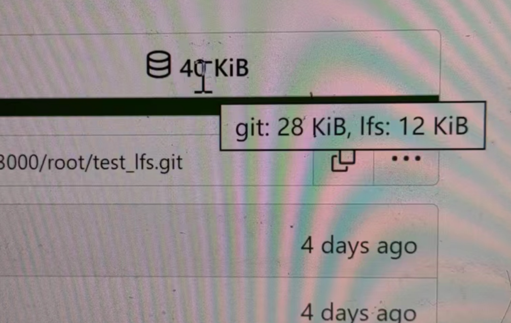
- Return full size in api response.
---------
Signed-off-by: a1012112796 <1012112796@qq.com>
Co-authored-by: Lunny Xiao <xiaolunwen@gmail.com>
Co-authored-by: silverwind <me@silverwind.io>
Co-authored-by: DmitryFrolovTri <23313323+DmitryFrolovTri@users.noreply.github.com>
Co-authored-by: Giteabot <teabot@gitea.io>
|
| |
|
|
|
|
|
|
|
|
|
|
| |
Fixes: https://github.com/go-gitea/gitea/issues/25462
On supporting browsers, text in description is [wrapped
equally](https://caniuse.com/css-text-wrap-balance).
<img width="488" alt="Screenshot 2023-06-26 at 00 17 21"
src="https://github.com/go-gitea/gitea/assets/115237/cb8e3a50-6225-4a8c-a6c0-f35a17d2af76">
<img width="1254" alt="Screenshot 2023-06-26 at 00 14 51"
src="https://github.com/go-gitea/gitea/assets/115237/0885404e-973e-45ce-b41e-5cb265a4cd1e">
|
| |
|
|
|
|
|
|
|
|
|
|
| |
when trying to create a PR for an existing PRs branch combination link
to the PR directly and not just to the repo.
Before:
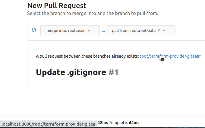
After:
|
| |
|
|
|
|
|
| |
----

|
| |
|
|
|
|
|
|
|
| |
fixes #24566
---------
Co-authored-by: wxiaoguang <wxiaoguang@gmail.com>
|
| | |
|
| |
|
|
|
|
|
|
|
|
|
|
|
|
| |
Close #20976
Close #20975
1. Fix the bug: the TOC in footer was incorrectly rendered as main
content's TOC
2. Fix the layout: on mobile, the TOC is put above the main content,
while the sidebar is put below the main content
3. Auto collapse the TOC on mobile
ps: many styles of "wiki.css" are moved from old css files, so leave
nits to following PRs.
|
| |
|
|
|
|
|
|
|
|
|
| |
this will allow us to fully localize it later
PS: we can not migrate back as the old value was a one-way conversion
prepare for #25213
---
*Sponsored by Kithara Software GmbH*
|
| |
|
|
|
|
|
|
| |
Close #25127
Co-authored-by: Giteabot <teabot@gitea.io>
|
| |
|
|
|
|
|
|
|
|
|
|
|
|
|
|
|
|
| |
Two small tweaks:
1. Vertically center arrow here when editing a PR:
<img width="405" alt="Screenshot 2023-06-20 at 19 48 49"
src="https://github.com/go-gitea/gitea/assets/115237/1d63764d-9fd9-467e-8a8e-9258c06475eb">
2. Use 2-row layout on diff viewed status and show it again on mobile:
<img width="142" alt="Screenshot 2023-06-20 at 19 51 21"
src="https://github.com/go-gitea/gitea/assets/115237/3046e782-163c-4f87-910c-a22066de8f1b">
Mobile view:
<img width="370" alt="Screenshot 2023-06-20 at 19 44 40"
src="https://github.com/go-gitea/gitea/assets/115237/9cf56347-7323-4d05-99a5-17ad215ee44d">
|
| |
|
|
|
|
|
|
|
|
|
|
| |
- Set
[type=search](https://developer.mozilla.org/en-US/docs/Web/HTML/Element/input/search)
- Disable spellcheck
- Set maxLength 255 that I found in `templates/repo/issue/search.tmpl`
- Remove unnecessary `max-width`, it does nothing
---------
Co-authored-by: delvh <dev.lh@web.de>
Co-authored-by: Giteabot <teabot@gitea.io>
|
| |
|
|
|
|
|
|
|
|
|
| |
Numerous small UI fixes:
- Fix double border in collaborator list
- Fix system notice table background
- Mute links in repo and org lists
- Downsize projects edit buttons
- Improve milestones and project list rendering
- Condense milestone list entry to a single line of "metas"
- Mute ".." button in repo files list
|
| |
|
|
|
|
|
|
|
|
|
|
|
|
|
|
|
|
|
|
|
|
|
|
|
|
|
|
|
|
|
|
|
| |
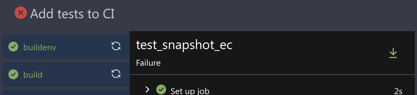
If enabled show a clickable label in the comment. A click on the label
opens the Conversation tab with the comment focussed - there you're able
to view the old diff (or original diff the comment was created on).
**Screenshots**

When resolved and outdated:

Option to enable/disable this (stored in user settings - default is
disabled):


fixes #24913
---------
Co-authored-by: silverwind <me@silverwind.io>
|
| |
|
|
|
|
|
|
|
|
|
|
|
|
|
|
|
|
|
|
|
|
|
|
| |
Part of #25042
1. Added actor and status dropdowns first in case something is offtrack
and PR is too large.
2. Also added "No results matched." and "The workflow has no runs yet.",
and "No results matched." will show if there is no filter results and
there is no workflows (with [reference to github
action](https://github.com/go-gitea/gitea/actions/workflows/files-changed.yml?query=actor%3AGiteaBot))
Demo:
https://github.com/go-gitea/gitea/assets/17645053/6e76292c-4c1f-450d-8b48-99944cfc920c
TODOs:
- [x] Get available status (same as those in `aggregateJobStatus`)
instead of getting from database
- [x] Use `JOIN` to get actors, actors order by name
- [x] Make self on top
|
| |
|
|
|
|
|
|
|
|
|
|
|
|
|
|
|
|
|
|
|
|
|
|
|
|
|
|
| |
Address
https://github.com/go-gitea/gitea/pull/25163#issuecomment-1599207916
Remove the unused "icon-button".
And fix the layout:
Without the dropdown icon:
```
{{svg "gitea-whitespace"}}
```
With the dropdown icon:
```
{{svg "gitea-whitespace" 16 "gt-mr-3"}}
{{svg "octicon-triangle-down" 14 "dropdown icon"}}
```

|
| |
|
|
|
|
|
|
|
|
|
|
|
|
|
|
|
|
|
|
|
|
|
|
|
|
|
|
|
|
|
|
|
|
|
|
|
|
|
|
|
|
|
|
|
|
|
|
|
|
|
|
|
| |
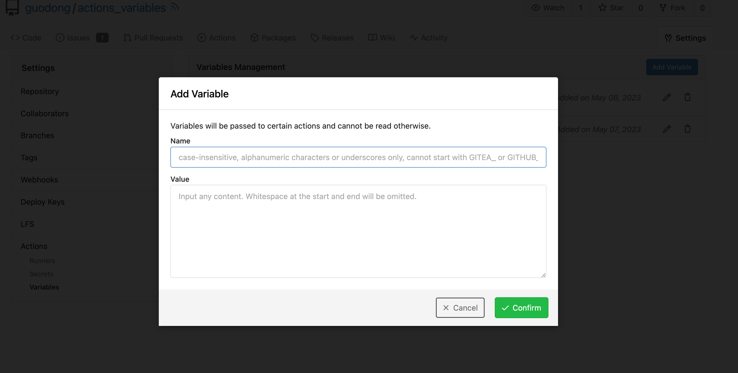
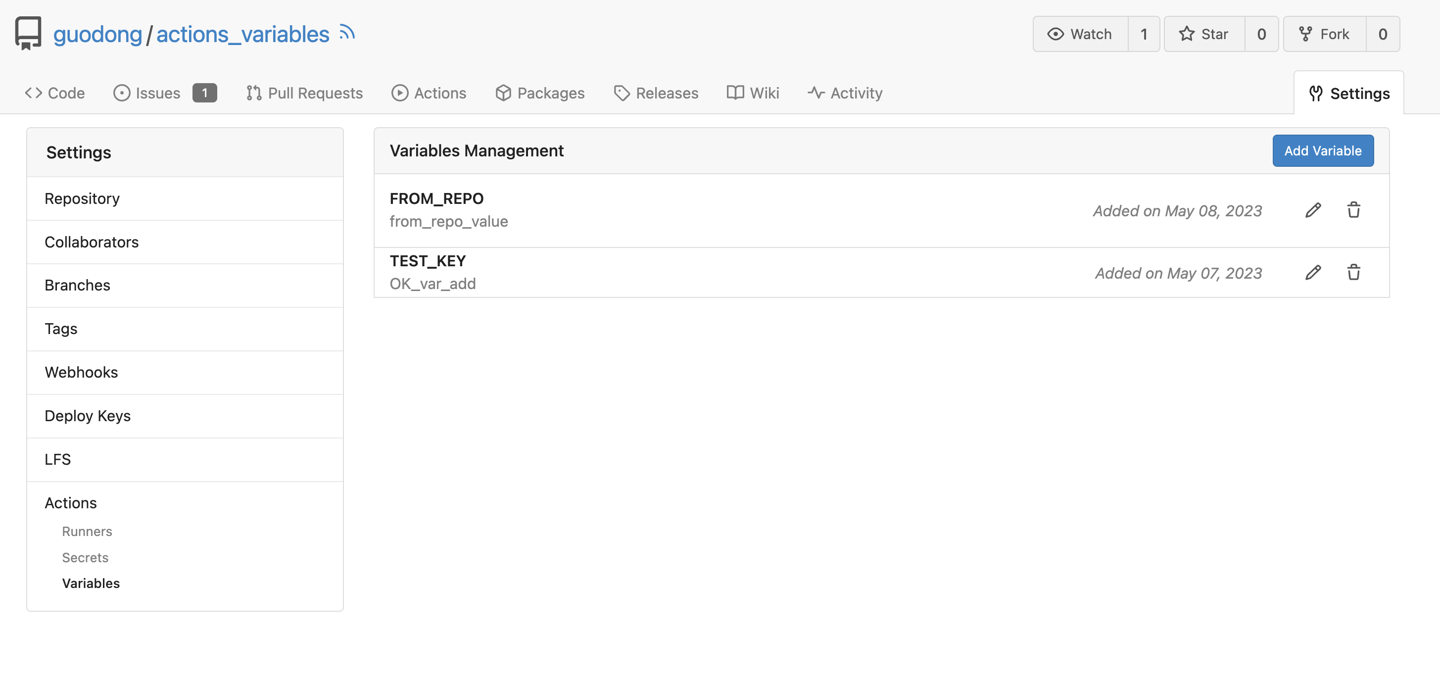
Co-Author: @silverwind @wxiaoguang
Replace: #24404
See:
- [defining configuration variables for multiple
workflows](https://docs.github.com/en/actions/learn-github-actions/variables#defining-configuration-variables-for-multiple-workflows)
- [vars
context](https://docs.github.com/en/actions/learn-github-actions/contexts#vars-context)
Related to:
- [x] protocol: https://gitea.com/gitea/actions-proto-def/pulls/7
- [x] act_runner: https://gitea.com/gitea/act_runner/pulls/157
- [x] act: https://gitea.com/gitea/act/pulls/43
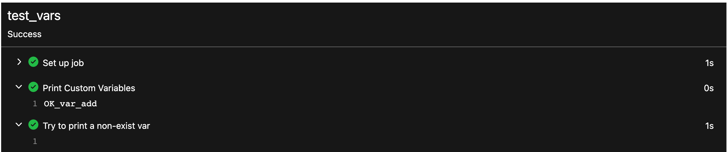
#### Screenshoot
Create Variable:
Workflow:
```yaml
test_vars:
runs-on: ubuntu-latest
steps:
- name: Print Custom Variables
run: echo "${{ vars.test_key }}"
- name: Try to print a non-exist var
run: echo "${{ vars.NON_EXIST_VAR }}"
```
Actions Log:
---
This PR just implement the org / user (depends on the owner of the
current repository) and repo level variables, The Environment level
variables have not been implemented.
Because
[Environment](https://docs.github.com/en/actions/deployment/targeting-different-environments/using-environments-for-deployment#about-environments)
is a module separate from `Actions`. Maybe it would be better to create
a new PR to do it.
---------
Co-authored-by: silverwind <me@silverwind.io>
Co-authored-by: wxiaoguang <wxiaoguang@gmail.com>
Co-authored-by: Giteabot <teabot@gitea.io>
|
| |
|
|
|
|
|
|
|
|
|
|
|
|
|
|
|
|
|
|
|
|
|
|
|
| |
Fix #24846 applying the solution proposed by @silverwind
<details>
<summary>Screenshots</summary>
</details>
Replaces #25335
|
| |
|
|
|
|
| |
so template/browser can deal with string format
---
*Sponsored by Kithara Software GmbH*
|
| |
|
|
|
| |
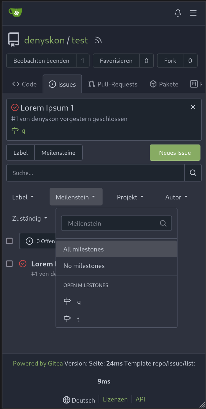
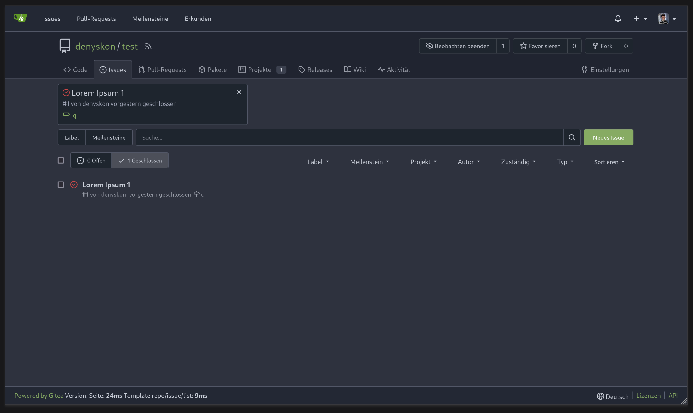
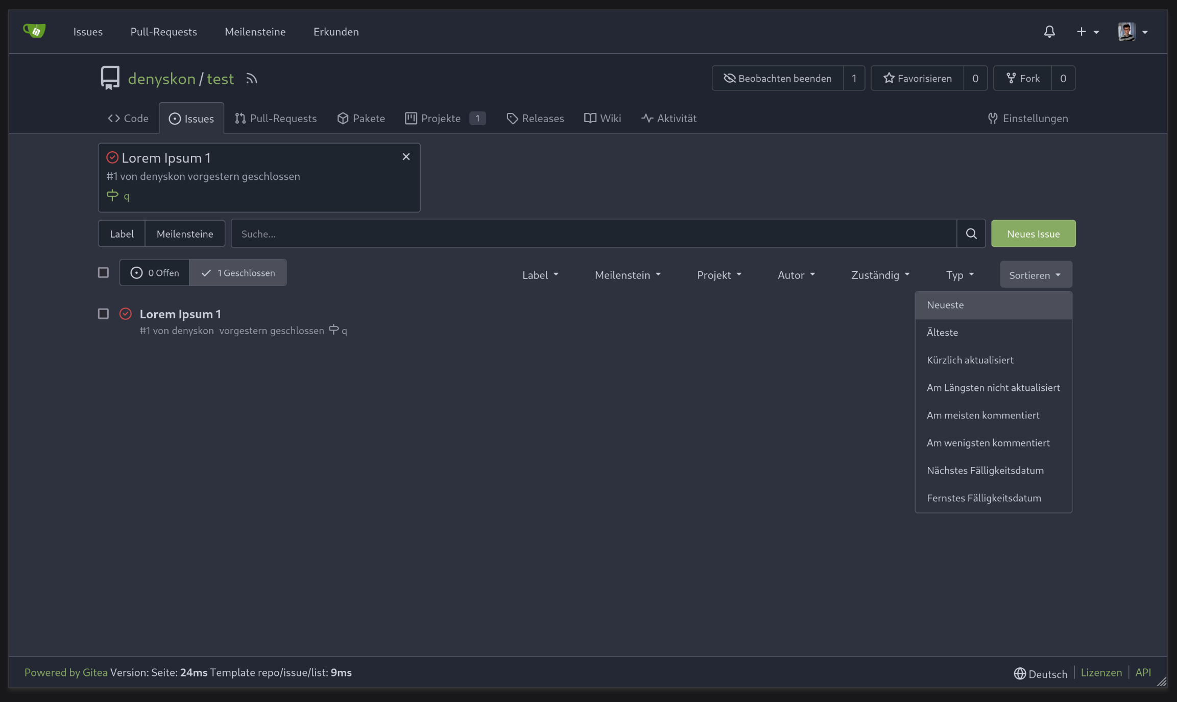
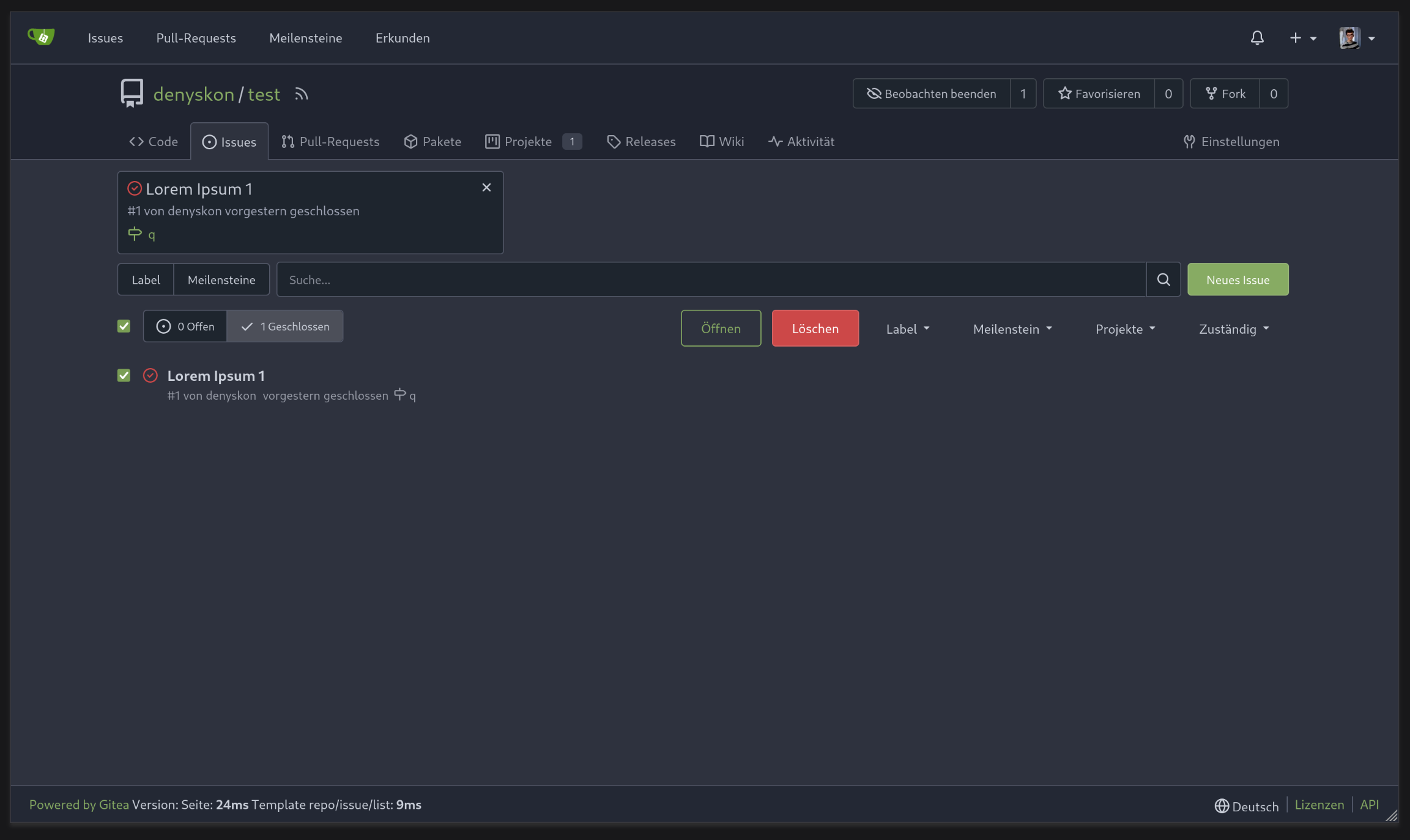
1. Add "batch delete" button for selected issues, close #22273
2. Address the review in
https://github.com/go-gitea/gitea/pull/25219#discussion_r1229266083
|
| |
|
|
|
|
|
|
|
|
|
|
|
|
|
|
| |
We only needs 2 lines to hide the dividers.
```
$dropdownLabelFilter.dropdown('setting', {'hideDividers': 'empty'});
$dropdownLabelFilter.dropdown('refreshItems');
```
Other code blocks are refactored by the way.


|
| |
|
|
|
|
|
|
|
|
|
|
|
|
|
|
|
|
|
|
|
|
|
|
|
|
|
|
|
|
|
|
| |
Various fixes to pages or elements which were looking ugly on mobile.
<details>
<summary>Screenshots</summary>


</details>
Co-authored by @silverwind
---------
Co-authored-by: silverwind <me@silverwind.io>
|
| |
|
|
|
|
|
|
| |
Fix #25281
When viewing a file, hide the add button

|
| |
|
|
|
|
|
|
|
|
|
|
|
|
|
|
| |
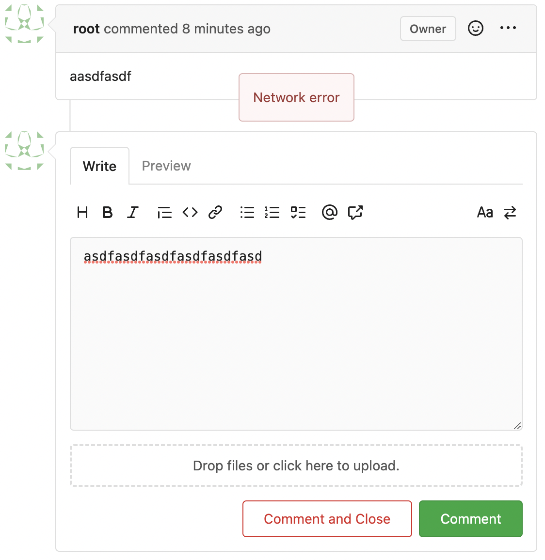
Follow #23290
Network error won't make content lost. And this is a much better
approach than "loading-button".
The UI is not perfect and there are still some TODOs, they can be done
in following PRs, not a must in this PR's scope.
<details>
</details>
|
