| Commit message (Collapse) | Author | Age | Files | Lines |
|---|
| ... | |
| |
|
|
|
|
|
|
| |
* Close #24483
* Close #28123
* Close #23682
* Close #23149
(maybe more)
|
| |
|
|
|
|
| |
Follow-up for #28368
- Just replace button with an a-element with the button class
- Remove useless link-action class from template/org/home.tmpl
|
| |
|
|
|
|
|
|
|
| |
Before:
After:
|
| |
|
|
|
|
|
|
|
|
|
|
|
|
|
|
|
|
|
|
| |
- The RSS Feed icons were placed in a proper button, so that it does
not look "inconsistent". This also makes the problem of the button
being improperly aligned go away.
- The icon that shows on user profiles has not been modified because
of a lack of better implementation ideas.
- Where applicable, the RSS Feed icon was put directly next to the
Follow button (right menu), as both functionalities effectively
share the same purpose.
- Despite the attempt at achieving less inconsistency, a conscious
decision to not add any text to those buttons was made, opting for
tooltips instead. "Make it present, but not too annoying."
- A special exception was made for the Releases pages (which contains
text, not a tooltip), where an RSS feed would be particularly
beneficial to users.
The fact that the RSS functionality is explicitly optional was taken
into account, and these improvements were made with public-facing
instances (where the feature works best) in mind.
|
| |
|
|
| |
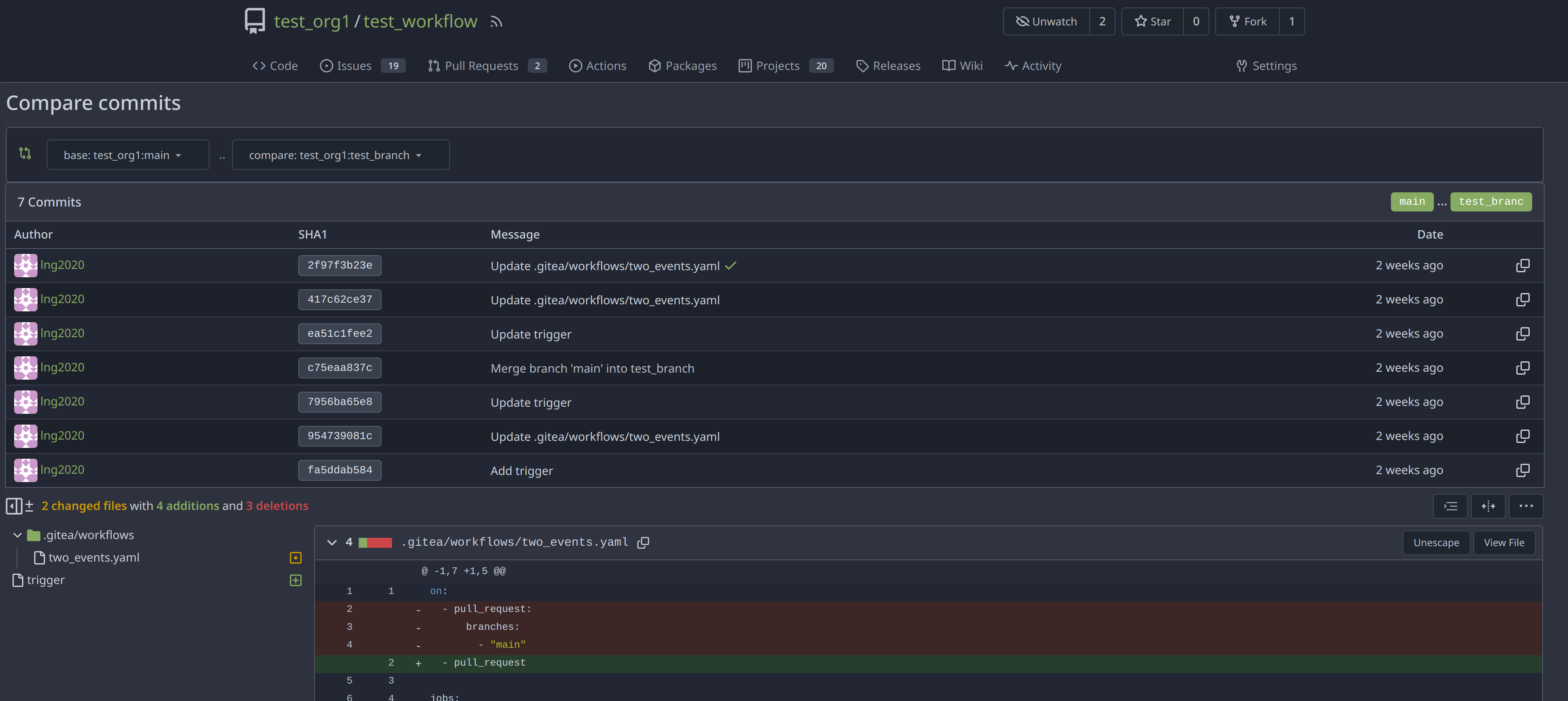
workflows but other branches have (#28359)
|
| | |
|
| |
|
| |
Inspired by #28182
|
| |
|
|
|
|
|
|
| |
Fixes https://codeberg.org/forgejo/forgejo/issues/1759
If you are bowing another branch than the default branch and click n the
Code tab, it will take you to the root of the branch. The `BranchName`
variable is also set when viewing a Wiki commit, so we also need to
check if we are on a Wiki.
|
| |
|
|
|
|
|
|
|
|
|
|
| |
Follow-up #22844
close #28142
Before

After
Co-authored-by: Giteabot <teabot@gitea.io>
|
| |
|
|
|
|
|
|
|
|
|
|
| |
fix #28173
regression #25948
That PR is supposed to only change the style but somehow delete a code
snippet. See the
diff(https://github.com/go-gitea/gitea/pull/25948/files#diff-7c36d66fe058f4ff9f2beaac73cf710dca45b350d0dd98daf806828a4745fe62L125-L129)
for details.
---------
Co-authored-by: wxiaoguang <wxiaoguang@gmail.com>
|
| |
|
|
| |
Reverts go-gitea/gitea#27141
close #28097
|
| |
|
|
|
|
|
|
|
| |
Before:

After:

|
| |
|
| |
Fix #27901
|
| |
|
|
|
|
|
| |
Fix #28059
|
| |
|
|
|
|
|
| |
the gt-df's display:flex !important did override the display:none on small displays
---------
Co-authored-by: wxiaoguang <wxiaoguang@gmail.com>
|
| |
|
|
|
|
|
|
|
|
|
|
|
|
|
|
|
|
|
|
|
|
|
|
|
|
|
|
|
|
| |
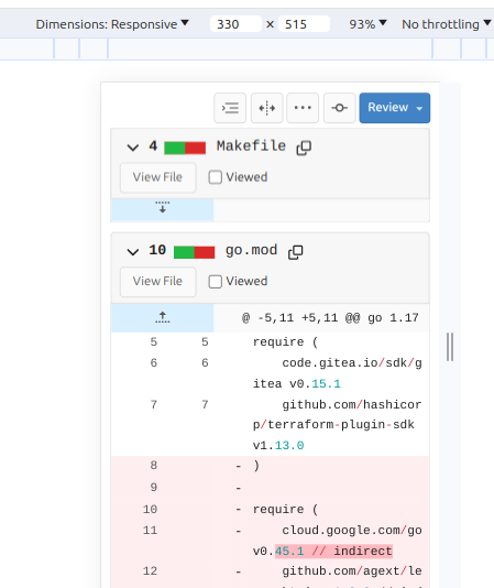
1. Show diff stats only on large screens
these are already shown in tabs, so no need for this duplicate
information on small screens
2. Hide viewed files information on small screens
Github does the same and this gives us more free space on small screens
3. Review bar now doesn't wrap so we don't need the 77px even on very
small screens
(the sticky headers are still working)
|
| |
|
|
|
|
|
|
|
|
|
|
|
|
|
|
|
|
|
|
|
|
|
|
|
|
| |
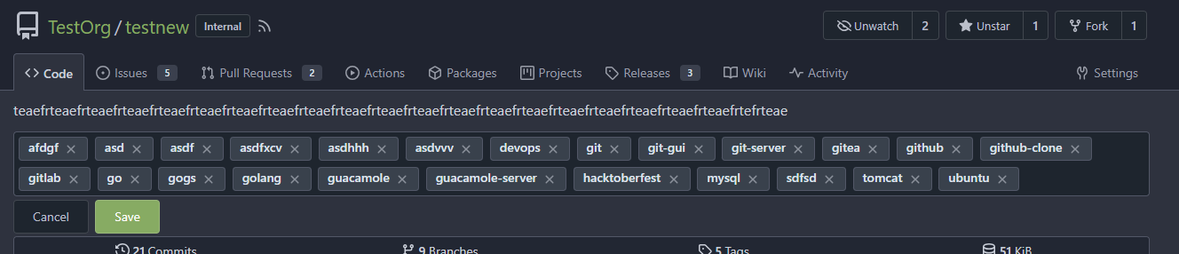
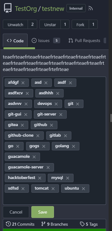
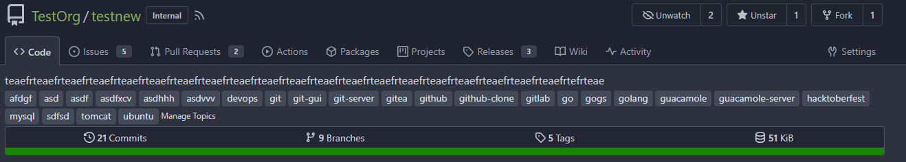
In #25315, @denyskon fixed UI on mobile view.
But for the repo description, on desktop view there's no word-break.
So maybe we can just add `gt-word-break` to fix it on both mobile view
and desktop view.
Before:
desktop view:

mobile view:

After:
desktop view:

mobile view(almost same?)
---------
Co-authored-by: silverwind <me@silverwind.io>
|
| |
|
|
|
|
|
|
|
|
|
|
|
|
|
|
|
|
|
|
|
|
|
|
|
|
| |
When an assignee changed event comment is rendered, most of it is
guarded behind the assignee ID not being 0. However, if it is 0, that
results in quite broken rendering for that comment and the next one.
This can happen, for example, when repository data imported from outside
of Gitea is incomplete.
This PR makes sure comments with an assignee ID of 0 are not rendered at
all.
---
Screenshot before:
<img width="272" alt="Bildschirmfoto 2023-11-05 um 20 12 18"
src="https://github.com/go-gitea/gitea/assets/42910/7d629d76-fee4-4fe5-9e3a-bf524050cead">
The comments in this screenshot are:
1. A regular text comment
2. A user being unassigned
3. A user being assigned
4. The title of the PR being changed
Comments 2 and 3 are rendered without any text, which indents the next
comment and does not leave enough vertical space.
Co-authored-by: Giteabot <teabot@gitea.io>
|
| |
|
|
|
|
|
|
|
| |
Before:

After:
|
| |
|
|
|
|
|
|
|
|
|
|
|
|
|
|
|
|
|
|
|
|
|
|
|
|
|
|
|
|
|
| |
Before:
desktop view:
mobile view:

after click `Save` btn:


refresh the page, you will see that `gt-m-0` is missing after save
topic:

After:
desktop view:
mobile view:
after click `Save` btn:
|
| |
|
|
|
|
| |
Show the correct sha when viewing a single commit.

|
| |
|
|
|
|
|
|
| |
Remove the "tabindex" from some form buttons on the "diff box" / "issue view content" page, let the browser use the default tab order.
---------
Co-authored-by: Gusted <postmaster@gusted.xyz>
Co-authored-by: wxiaoguang <wxiaoguang@gmail.com>
|
| |
|
|
|
|
|
|
|
|
|
|
|
|
|
|
|
|
|
|
|
|
|
|
|
| |
Step one for a GitHub like commit status check ui:
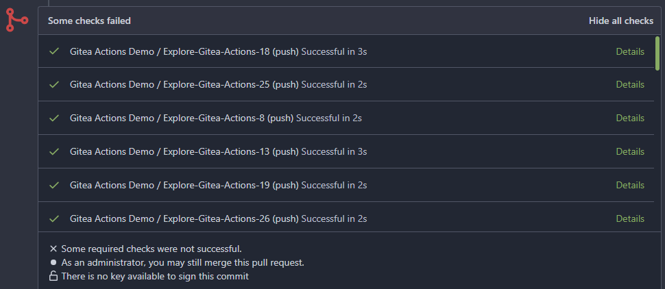
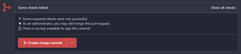
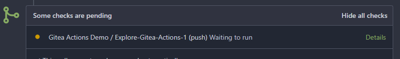
Step two:

The design now will list all commit status checks which takes too much
space.
This is a pre-improve for #26247
---------
Co-authored-by: delvh <dev.lh@web.de>
Co-authored-by: silverwind <me@silverwind.io>
Co-authored-by: wxiaoguang <wxiaoguang@gmail.com>
|
| |
|
|
|
|
|
|
| |
Display the issue task list on project cards.
Co-authored-by: Giteabot <teabot@gitea.io>
|
| |
|
|
|
|
|
|
|
|
|
|
| |
Currently this feature is only available to admins, but there is no
clear reason why. If a user can actually merge pull requests, then this
seems fine as well.
This is useful in situations where direct pushes to the repository are
commonly done by developers.
---------
Co-authored-by: delvh <dev.lh@web.de>
|
| |
|
|
|
|
|
|
|
|
| |
Fixes: https://github.com/go-gitea/gitea/issues/27784
<img width="1033" alt="Screenshot 2023-10-25 at 19 07 15"
src="https://github.com/go-gitea/gitea/assets/115237/1a363851-1a86-48cb-99ec-0a573371bb6e">
<img width="1051" alt="Screenshot 2023-10-25 at 19 07 41"
src="https://github.com/go-gitea/gitea/assets/115237/add4b606-2264-430a-af35-249ef005817f">
Co-authored-by: KN4CK3R <admin@oldschoolhack.me>
|
| |
|
|
|
|
|
|
|
|
|
|
|
| |
* Show checkout instructions also when there is no permission to push,
for anyone who wants to locally test the changes.
* First checkout the branch exactly as is, without immediately having to
solve merge conflicts. Leave this to the merge step, since it's often
convenient to test a change without worrying about this.
* Use `git fetch -u`, so an existing local branch is updated when
re-testing the same pull request. But not the more risky `git fetch -f`
in to handle force pushes, as we don't want to accidentally overwrite
important local changes.
* Show different merge command depending on the chosen merge style,
interactively updated.
|
| |
|
|
|
|
|
|
|
|
| |
When 0 or 1 files changed in a diff, we don't need to show a file tree.
This behaviour matches GitHub. Single-file diff after this change, note
absence of button:
<img width="1234" alt="image"
src="https://github.com/go-gitea/gitea/assets/115237/3618438b-e655-42a3-989f-f299267b2b8b">
Co-authored-by: Giteabot <teabot@gitea.io>
|
| |
|
|
|
|
|
|
|
| |
Fixes: https://github.com/go-gitea/gitea/issues/27600

Also tested together with https://github.com/go-gitea/gitea/pull/27704,
works well.
|
| |
|
|
|
|
|
|
|
|
|
|
|
|
| |
TODOs:
- [x] write test for `GetIssueTotalTrackedTime`
- [x] frontport kitharas template changes and make them mobile-friendly
---


---
*Sponsored by Kithara Software GmbH*
|
| |
|
|
|
|
|
|
|
|
|
|
|
| |
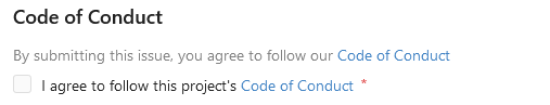
If you set a checkbox as required in a issue form at the moment, the
checkbox is checked and read only, what does not make much sense. With
this PR, the Checkbox actually needs to be checked. The label supports
now also Markdown. This matches GitHub's behaviour.
And yes, I know the CSS is a ugly workaround. It looks like the given
CSS code is part Fomantic and I don't know how to change that. The
Maintainers are free to change that.
|
| |
|
|
|
|
|
|
|
|
|
|
|
|
|
| |
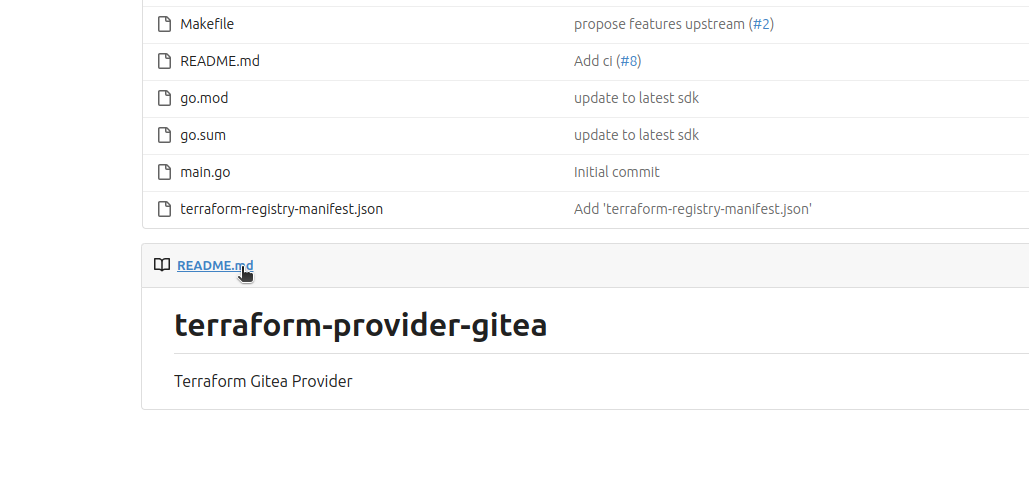
this allows to deep link to the readme section of a repository.
fixes #27641
Screenshots:
No changes on initial display:
On hover the link is shown:
|
| |
|
|
|
|
|
|
|
|
|
|
|
|
|
|
|
|
|
|
|
|
|
|
|
|
|
|
|
| |
The ui of list header in milestone page is not same as issue and pr list
page.
And they are using different template codes which can be merged into
one.
Before:
After:


---------
Co-authored-by: puni9869 <80308335+puni9869@users.noreply.github.com>
|
| |
|
|
|
|
|
|
|
|
|
|
|
|
|
|
|
|
|
|
|
|
|
|
| |
for an issue (#27451)
Followup of #27115
Finally closes #25237
## Screenshots
### Issue Sidebar
<img width="513" alt="image"
src="https://github.com/go-gitea/gitea/assets/80308335/9f7fda2f-5a03-4684-8619-fd3498a95b41">
### PR sidebar
<img width="367" alt="image"
src="https://github.com/go-gitea/gitea/assets/80308335/53db9b64-faec-4a67-91d6-76945596a469">
### PR sidebar with archived labels shown
<img width="352" alt="image"
src="https://github.com/go-gitea/gitea/assets/80308335/9dc5050f-4e69-4f76-bb83-582480a2281e">
---------
Signed-off-by: puni9869 <punitinani1@hotmail.com>
Co-authored-by: silverwind <me@silverwind.io>
|
| |
|
|
|
|
|
| |
Fix #27596
Change confusing behavior when showing information about a repo via
labels and icons. Implement changes proposed by @lng2020 in
https://github.com/go-gitea/gitea/pull/27627#pullrequestreview-1678787673.
|
| |
|
|
|
|
|
|
|
|
|
|
|
|
|
|
|
|
|
|
| |
- The review type '22' is a general comment type that is attached to
single codecomments, reviews with multiple comments or to simple approve
and request changes comment. This comment can be used to create a link
towards this action on an pull request.
- Adds an anchor to the review comment type, so that when its getting
linked to it, it actually jumps towards that event.
- This also now fixes the behavior that after you created a review you
will be redirected to that review and because this is an general comment
type other mails will also be 'fixed' such as the approved or request
changes.
- Resolves https://codeberg.org/forgejo/forgejo/issues/1248
(cherry picked from commit 1741a5f1fe6adc68bb5f87bdd1c5bdc5bfaa45c7)
---------
Co-authored-by: Gusted <postmaster@gusted.xyz>
Co-authored-by: Caesar Schinas <caesar@caesarschinas.com>
|
| |
|
|
|
|
|
|
|
|
|
| |
1. Dropzone attachment removal, pretty simple replacement
2. Image diff: The previous code fetched every image twice, once via
`img[src]` and once via `$.ajax`. Now it's only fetched once and a
second time only when necessary. The image diff code was partially
rewritten.
---------
Co-authored-by: Giteabot <teabot@gitea.io>
|
| |
|
|
|
|
|
| |
Part of #27065
---------
Co-authored-by: Lunny Xiao <xiaolunwen@gmail.com>
|
| |
|
| |
Closes https://github.com/go-gitea/gitea/issues/27358
|
| |
|
|
|
|
|
|
|
|
|
|
|
|
|
|
|
|
|
|
|
|
|
|
|
|
| |
Follow #27354
Major changes:
1. The `right aligned` in `<th class="one wide right aligned">` is a
no-op because it doesn't have any content
2. The `gt-df` in `<td class="sha gt-df">` was wrong, it causes UI
misalignment, a table cell shouldn't be "flex"
3. Use `gt-py-0` for `gt-pt-0 gt-pb-0`
4. Simplify the layout for buttons, because the `text right aligned` is
widely used and good enough, it doesn't make sense to introduce the
`<div class="gt-df gt-je">`
5. Escape the `$.FileName` correctly
Before:

After:

|
| |
|
|
|
|
|
|
|
|
|
|
|
| |
Partial revert of https://github.com/go-gitea/gitea/pull/25839. This
commit status is used by a number of external integrations, so I think
we should not remove it (See
https://github.com/go-gitea/gitea/pull/25839#issuecomment-1729002077).
This is a rare case where an existing migration needed to be alterted to
avoid data loss.
---------
Co-authored-by: delvh <dev.lh@web.de>
Co-authored-by: Giteabot <teabot@gitea.io>
|
| |
|
|
|
|
|
| |
added the ctx for the project link in new_form.tmpl
---

|
| |
|
|
|
|
|
|
|
|
|
|
|
| |
- Update all JS and PY dependencies
- Enable eslint `prefer-object-has-own` and autofix issue
- Fix styling on citation buttons
- Tested citation, mermaid, monaco, swagger, katex
Citation button issue was that these buttons were not filled:
<img width="136" alt="Screenshot 2023-10-07 at 14 05 08"
src="https://github.com/go-gitea/gitea/assets/115237/435f0c91-28ac-46b3-bae4-dad768b29c05">
Co-authored-by: techknowlogick <techknowlogick@gitea.com>
|
| |
|
| |
Fix #27431
|
| |
|
|
| |
Fix #27432
Regression of #27265
|
| |
|
|
|
|
|
|
|
|
|
| |
Same as https://github.com/go-gitea/gitea/pull/26046 but for repo and
org settings pages, reducing the margins between the boxes:
<img width="1247" alt="Screenshot 2023-10-03 at 23 25 19"
src="https://github.com/go-gitea/gitea/assets/115237/4e68ad5e-5fdc-4466-aefb-ec71bf411d45">
<img width="1255" alt="Screenshot 2023-10-03 at 23 27 12"
src="https://github.com/go-gitea/gitea/assets/115237/9068369b-a75d-401e-8b8d-3bd4bbe097dc">
Co-authored-by: Giteabot <teabot@gitea.io>
|
| |
|
|
|
|
|
|
|
| |
Fixes #3852
Fixes https://github.com/go-gitea/gitea/issues/26707
Add a button on file history which directs you to the file at the
selected commit.
Co-authored-by: silverwind <me@silverwind.io>
|
| |
|
|
|
|
|
|
|
|
|
|
|
|
|
|
|
|
|
|
|
|
|
|
|
|
|
|
|
|
|
|
|
|
|
|
|
|
|
|
|
|
|
|
|
|
|
|
|
|
|
|
|
|
|
|
|
|
|
| |
Followup https://github.com/go-gitea/gitea/pull/26820
## Archived labels UI for issue filter and issue filter actions for
issues/pull request pages.
Changed:
* Enhanced the Issue filter and Issue filter actions UI page to
seamlessly incorporate a list of archived labels.
* Pagination functionality is same as before. If archived label checkbox
is checked then we are adding a query string`archived=true` in the url
to save the state of page.
* Issue filter actions menu is separated into different template.
* Adding the archived flag in issue url labels.
* Pull Request page is also work the same.
Outsourced:
* Defer the implementation of specialized handling for archived labels
to upcoming pull requests. This step will be undertaken subsequent to
the successful merge of this pull request.
Screenshots
### Issue page
<img width="1360" alt="image"
src="https://github.com/go-gitea/gitea/assets/80308335/d7efb2ef-5b2b-449d-83f0-d430a32ec432">
### Issue page with label filter on archived label checkbox when not
checked --> No archived label is there in list
<img width="1249" alt="image"
src="https://github.com/go-gitea/gitea/assets/80308335/ceea68ef-91f2-4693-910f-2e25e236bfc9">
### Issue page with label filter on archived label checkbox when checked
--> Show archived label in the list.
<img width="710" alt="image"
src="https://github.com/go-gitea/gitea/assets/80308335/2414d26b-2079-4c3c-bd9e-f2f5411bcabf">
### Issue page with label filter on issue action menu on archived label
checkbox when checked --> Show archived label in the list.
<img width="409" alt="image"
src="https://github.com/go-gitea/gitea/assets/80308335/259cac87-3e21-4778-99a2-a6a0b8c81178">
### Applied the archived=true in Issue labels when archived checkbox is
checked.
<img width="984" alt="image"
src="https://github.com/go-gitea/gitea/assets/80308335/657ce3db-c0ae-402e-b12d-3b580d3c2ed0">
---
Part of https://github.com/go-gitea/gitea/issues/25237
---------
Signed-off-by: puni9869 <punitinani1@hotmail.com>
Co-authored-by: delvh <dev.lh@web.de>
Co-authored-by: Giteabot <teabot@gitea.io>
|
| |
|
| |
Fix #27361
|
| |
|
| |
Co-authored-by: delvh <dev.lh@web.de>
|
