| Commit message (Collapse) | Author | Age | Files | Lines |
|---|
| |
|
|
|
|
|
|
|
|
|
|
|
|
|
|
|
|
|
|
|
|
|
| |
date (#24562)
- Very similar to #24550
The correct thing to do is to translate the entire phrase into a single
string. The previous translation assumed all languages have a space
between the "added on" and the date (and that "added on" comes before
the date).
Some languages, like Hebrew, have no space between the "added on" and
the date. For example:
```ini
added_on=נוסף ב-%s
```
("added" becomes נוסף, "on" is ב and when paired with a date we use a
dash to connect ב with the date)
---------
Signed-off-by: Yarden Shoham <git@yardenshoham.com>
Co-authored-by: delvh <dev.lh@web.de>
|
| |
|
|
|
|
|
|
|
|
|
|
|
| |
placeholder for the date (#24563)
- Similar to #24550
- Similar to #24562
The correct thing to do is to translate the entire phrase into a single
string. The previous translation assumed all languages have a space
between the "valid until" and the date (and that "valid until" comes
before the date).
Signed-off-by: Yarden Shoham <git@yardenshoham.com>
|
| |
|
| |
Fix #24555
|
| |
|
|
|
|
|
|
|
|
|
|
|
|
|
|
| |
date (#24550)
The correct thing to do is to translate the entire phrase into a single
string. The previous translation assumed all languages have a space
between the "joined on" and the date (and that "joined on" comes before
the date).
Some languages, like Hebrew, have no space between the "joined on" and
the date. For example:
```ini
joined_on=נרשם ב-%s
```
("joined" becomes נרשם, "on" is ב and when paired with a date we use a
dash to connect ב with the date)
|
| |
|
|
|
|
|
|
|
|
|
|
|
|
| |
Don't remember why the previous decision that `Code` and `Release` are
non-disable units globally. Since now every unit include `Code` could be
disabled, maybe we should have a new rule that the repo should have at
least one unit. So any unit could be disabled.
Fixes #20960
Fixes #7525
---------
Co-authored-by: delvh <dev.lh@web.de>
Co-authored-by: yp05327 <576951401@qq.com>
|
| |
|
|
|
|
|
| |
This might be a bit contentious, but I think we should try to limit the
impact of deprecating scoped PATs with the rewrite proposed here we're
working on for v1.20: https://github.com/go-gitea/gitea/issues/24501
We should have a PR opened shortly to re-scope the routes.
|
| |
|
| |
Fix regression from #23405
|
| |
|
|
|
|
|
|
|
|
|
|
|
|
|
|
|
|
|
|
|
|
|
|
|
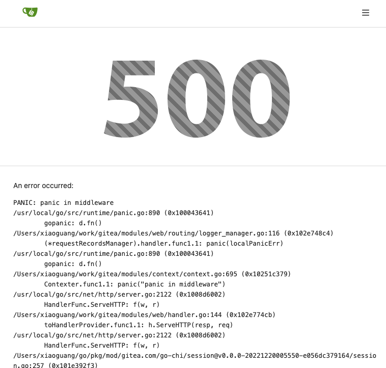
| |
Partially for #24457
Major changes:
1. The old `signedUserNameStringPointerKey` is quite hacky, use
`ctx.Data[SignedUser]` instead
2. Move duplicate code from `Contexter` to `CommonTemplateContextData`
3. Remove incorrect copying&pasting code `ctx.Data["Err_Password"] =
true` in API handlers
4. Use one unique `RenderPanicErrorPage` for panic error page rendering
5. Move `stripSlashesMiddleware` to be the first middleware
6. Install global panic recovery handler, it works for both `install`
and `web`
7. Make `500.tmpl` only depend minimal template functions/variables,
avoid triggering new panics
Screenshot:
<details>
</details>
|
| |
|
|
|
|
|
|
|
|
|
|
|
|
|
|
|
|
|
|
|
|
|
|
|
|
|
|
|
|
|
|
|
|
|
|
|
|
|
|
|
|
|
|
|
|
|
|
|
|
|
|
|
| |
- Remove various horizontal dividers on repo pages that didn't provide
visual benefit
- Remove label/milestone pills on single issue/pr page
- Remove issue-related pill buttons on projects page
- Increase contrast of color-secondary on arc-green
- Improve notifications icon, make circle bigger
- Remove some inline styles
- Fix focus in issue/pr title edit and select all text on button click
### Issue and PR before and after
<img width="1249" alt="Screenshot 2023-05-01 at 11 44 22"
src="https://user-images.githubusercontent.com/115237/235436662-a708288e-84fb-4b2e-a5a2-3a1c17d28f6c.png">
<img width="1248" alt="Screenshot 2023-05-01 at 11 58 51"
src="https://user-images.githubusercontent.com/115237/235437992-f863e483-f3cc-4cc1-8204-fd223647a0c9.png">
### Projects before and after
<img width="1255" alt="Screenshot 2023-05-01 at 11 41 02"
src="https://user-images.githubusercontent.com/115237/235436433-0deb85d6-4e7d-4e74-847f-254cc70a0cf9.png">
<img width="1267" alt="Screenshot 2023-05-01 at 11 40 03"
src="https://user-images.githubusercontent.com/115237/235436431-715b13cb-f78c-4d86-b27a-9229f9738c5b.png">
### Releases before and after
<img width="1243" alt="Screenshot 2023-05-01 at 11 41 12"
src="https://user-images.githubusercontent.com/115237/235436457-b655ee6f-03b8-4595-8d8c-b15ea469e988.png">
<img width="1240" alt="Screenshot 2023-05-01 at 11 40 10"
src="https://user-images.githubusercontent.com/115237/235436456-05a2a0dd-7cbb-4f26-b0d3-4f667df4bb95.png">
### Misc
<img width="58" alt="Screenshot 2023-05-01 at 10 49 13"
src="https://user-images.githubusercontent.com/115237/235432494-936ce995-6e22-47bc-ab2d-c9e93d31987d.png">
<img width="57" alt="Screenshot 2023-05-01 at 18 57 08"
src="https://user-images.githubusercontent.com/115237/235492430-1d32cfe0-0f2c-467c-b2fa-925b27e30e0e.png">
Issue title edit and wrap:
<img width="1238" alt="Screenshot 2023-05-01 at 12 34 40"
src="https://user-images.githubusercontent.com/115237/235441407-d5067a57-e586-4865-a652-282e5944abb4.png">
<img width="1232" alt="Screenshot 2023-05-01 at 12 06 24"
src="https://user-images.githubusercontent.com/115237/235438710-1a543dda-220f-4d87-8f93-f1710c0695f0.png">
---------
Co-authored-by: wxiaoguang <wxiaoguang@gmail.com>
|
| |
|
|
|
|
|
|
|
|
|
|
|
| |
I am not sure what "new-menu" means, but I think we need to fix these
problems:
1. it shouldn't have "stackable", which makes the items stacked when
width is small. the `new-menu` already has `overflow: auto`
2. `justify-content: center` doesn't work with `overflow: auto` (for
small width), so use `margin: auto`
*
https://bhch.github.io/posts/2021/04/centring-flex-items-and-allowing-overflow-scroll/
3. `runner-new-menu` is dead code (copying & pasting ?)
|
| |
|
|
|
| |
Fix #24460
That's a mistake but ..... no idea why I wrote so ... remove it.
|
| |
|
|
|
|
|
|
|
|
|
|
|
|
|
| |
Addition to
https://github.com/go-gitea/gitea/pull/24426#discussion_r1181261215
I updated all existing translations too because otherwise they would
show something like
> For more information on the Container registry, see [the
documentation](#).%!(EXTRA
string=https://docs.gitea.io/en-us/packages/container/)
---------
Co-authored-by: Giteabot <teabot@gitea.io>
|
| |
|
|
|
|
|
|
|
|
|
|
|
|
|
|
|
|
|
|
|
|
| |
Partial regression of #24393, not only regression, but broken for long
time, 24393 didn't really improve it but used wrong `overflow: scroll`.
Actually, that "ui secondary filter menu labels" shouldn't be set as
scrollable (I missed that at that time), the problem is: if a "ui menu"
has "dropdown" items, then it should not be scrollable. Otherwise the
dropdown menu can't be shown correctly.
And there are more problems:
* The "issue-filters" shouldn't be used anywhere else (copying&pasting
problem again ....)
* There is also an "issue-actions" container, it should also be fixed.
* There are similar problems on the milestone page.
* The old comment in code: "grid column" doesn't work well.
The major changes of this PR are: use "flex: 1" instead of "ui grid
column".
After this PR, not 100% perfect but much better than before.
|
| |
|
|
|
|
|
|
|
|
|
|
|
|
|
|
|
|
|
|
|
| |
- Make search bar dynamic full width via flexbox
- Make all buttons `small` so font size is the same for all elements in
the header
- Remove primary color from search field, add SVG icon like on Code tab
- Fix button vertical padding being enlarged by SVG icons
[View diff without
whitespace](https://github.com/go-gitea/gitea/pull/24420/files?diff=unified&w=1)
<img width="1226" alt="Screenshot 2023-04-29 at 11 58 53"
src="https://user-images.githubusercontent.com/115237/235296851-74848267-664f-4c1f-b94c-a1b94196ff75.png">
<img width="1219" alt="Screenshot 2023-04-29 at 11 59 39"
src="https://user-images.githubusercontent.com/115237/235296852-bcfde5ed-8658-43c2-b7e5-3ad84611e76f.png">
Mobile:
<img width="437" alt="Screenshot 2023-04-29 at 11 59 52"
src="https://user-images.githubusercontent.com/115237/235296860-99263373-7b27-4540-868c-a93e70f281ca.png">
<img width="433" alt="Screenshot 2023-04-29 at 12 00 00"
src="https://user-images.githubusercontent.com/115237/235296862-6cf64317-a864-405a-a00f-b5ab620349f5.png">
|
| |
|
|
|
|
|
|
|
|
|
|
|
|
|
| |

Maybe we can fix user card tmpl in #24319?
Or maybe a list is better here
---------
Co-authored-by: silverwind <me@silverwind.io>
Co-authored-by: Giteabot <teabot@gitea.io>
|
| |
|
|
|
|
|
|
|
|
|
|
|
|
|
|
|
|
|
|
|
|
|
|
|
|
|
|
|
| |
It seems that we really need the "context function" soon. So we should
clean up the helper functions first.
Major changes:
* Improve StringUtils and add JsonUtils
* Remove one-time-use helper functions like CompareLink
* Move other code (no change) to util_avatar/util_render/util_misc (no
need to propose changes for them)
I have tested the changed templates:
---------
Co-authored-by: Giteabot <teabot@gitea.io>
|
| |
|
|
|
|
|
|
|
|
|
|
|
|
|
|
|
|
|
|
|
|
|
|
|
|
|
|
|
|
|
|
|
|
| |
fix stackable menu (#24393)
Since 2015/2016, there is a global pollution: ".ui.left" / ".ui.right".
Fomantic UI doesn't work this way, it just conflicts with many Fomantic
definitions.
This PR starts the cleaning work of such techinical debts.
And, the "label list" page has been quite messy for long time, for
example, why "li" appears in "div" ......
And fix #24296
<details>


</details>
|
| |
|
|
|
|
|
|
|
|
|
|
|
|
|
|
|
|
|
|
|
| |
Ref:
https://github.com/go-gitea/gitea/pull/24315#pullrequestreview-1403034993
And fix the incorrect layout for "dasbboard", the "form" shouldn't
follow `<h4 class="ui top attached header">`, so move it to inner.
Diff with ignoring spaces:
https://github.com/go-gitea/gitea/pull/24370/files?diff=unified&w=1
A known bug: the adapt/delete button doesn't work due to a historical
messy logic, will fix it in next PR (#24374)
|
| |
|
|
|
|
|
|
|
|
|
|
|
|
|
|
|
|
|
|
|
|
|
|
|
|
|
|
|
|
|
|
|
|
|
|
|
|
|
|
|
|
|
|
|
|
|
|
|
| |
This PR moves the secrets and runners settings to actions settings on
all settings(repo,org,user,admin) levels.
After this PR, if
[ENABLED](https://github.com/go-gitea/gitea/blob/5e7543fcf441afb30aba6188edac754ef32b9ac3/custom/conf/app.example.ini#L2604)
inside `app.ini` under `[actions]` is set to `false`, the "Actions" tab
(including runners management and secrets management) will not be shown.
After, the settings under actions settings for each level:
1. Admin Level
"Runners Management"
<img width="1437" alt="Screen Shot 2023-04-26 at 14 34 20"
src="https://user-images.githubusercontent.com/17645053/234489731-15822d21-38e1-4560-8bbe-69f122376abc.png">
2. User Level
"Secrets Management"
<img width="1427" alt="Screen Shot 2023-04-26 at 14 34 30"
src="https://user-images.githubusercontent.com/17645053/234489795-68c9c0cb-24f8-4f09-95c6-458ab914c313.png">
3. Repo and Organization Levels
"Runners Management" and "Secrets Management"
Org:
<img width="1437" alt="Screen Shot 2023-04-26 at 14 35 07"
src="https://user-images.githubusercontent.com/17645053/234489996-f3af5ebb-d354-46ca-9087-a0b586845281.png">
<img width="1433" alt="Screen Shot 2023-04-26 at 14 35 14"
src="https://user-images.githubusercontent.com/17645053/234490004-3abf8fed-81fd-4ce2-837a-935dade1793d.png">
Repo:
<img width="1419" alt="Screen Shot 2023-04-26 at 14 34 50"
src="https://user-images.githubusercontent.com/17645053/234489904-80c11038-4b58-462c-9d0b-8b7cf70bc2b3.png">
<img width="1430" alt="Screen Shot 2023-04-26 at 14 34 57"
src="https://user-images.githubusercontent.com/17645053/234489918-4e8d1fe2-9bcd-4d8a-96c1-238a8088d92e.png">
It also finished these tasks :
- [x] rename routers function "runners" to "actions", and refactor
related file names
- [x] check and modify part of the runners related functions to match
their name
- [x] Fix backend check caused by fmt check
---------
Co-authored-by: wxiaoguang <wxiaoguang@gmail.com>
|
| |
|
|
|
|
|
|
|
|
|
|
|
|
|
|
|
|
|
|
|
|
|
|
|
|
|
|
|
| |
header (#24315)
Close #24302
Part of #24229, Follows #24246
This PR focused on CSS style fine-tune, main changes:
1. Give `.ui.ui.ui.container` a width of `1280px` with a max-width of
`calc(100vw - 64px)`, so the main contents looks better on large
devices.
2. Share styles for table elements in all levels settings pages to fix
overflow of runners table on mobile and for consistency (The headers on
mobile can be further improved, but haven't found a proper way yet).
3. Use [stackable
grid](https://fomantic-ui.com/collections/grid.html#stackable) and
[device column width](https://fomantic-ui.com/examples/responsive.html)
for responsiveness for some pages (repo/org collaborators settings
pages, org teams related page)
4. Fixed #24302 by sharing label related CSS in reporg.css
5. Fine tune repo tags settings page
---------
Co-authored-by: wxiaoguang <wxiaoguang@gmail.com>
|
| |
|
|
|
|
| |
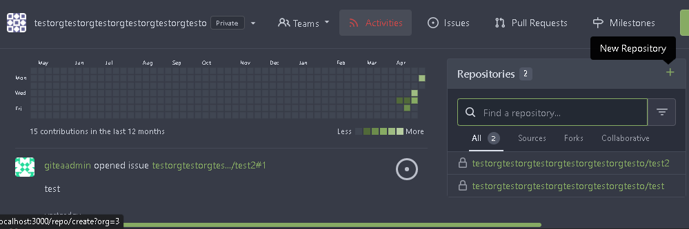
In org dashboard, the create repo link will be `repo/create?org={orgId}`
|
| |
|
|
|
|
| |
Before, 500 error

|
| |
|
|
|
|
|
|
|
|
|
|
|
|
|
|
|
|
|
|
|
|
|
|
|
|
|
|
|
|
|
| |
Follow #24097 and #24285
And add a devtest page for modal action button testing.
http://localhost:3000/devtest/fomantic-modal
Now the `modal_actions_confirm.tmpl` could support: green / blue /
yellow positive buttons, the negative button is "secondary".
ps: this PR is only a small improvement, there are still a lot of
buttons not having proper colors. In the future these buttons could be
improved by this approach.
These buttons could also be improved according to the conclusion of
#24285 in the future.

And add GitHub-like single danger button (context:
https://github.com/go-gitea/gitea/issues/24285#issuecomment-1519100312)

---------
Co-authored-by: silverwind <me@silverwind.io>
|
| |
|
|
|
|
|
|
|
|
|
|
|
|
|
|
|
|
|
|
|
|
|
|
|
|
|
|
|
|
|
|
|
|
| |
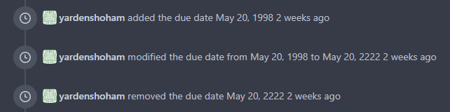
and localize issue due date events (#24275)
This refactors the `shared/datetime/short|long|full` templates into a
template helper function, which allows us to render absolute date times
within translatable phrases.
- Follows #23988
- The first attempt was in #24055
- This should help #22664
Changes:
1. Added the `DateTime` template helper that replaces the
`shared/datetime/short|long|full` templates
2. Used find-and-replace with varying regexes to replace the templates
from step 1 (for example, `\{\{template "shared/datetime/(\S+) \(dict
"Datetime" ([^"]+) "Fallback" ([^\)]+\)?) ?\)?\}\}` -> `{{DateTime "$1
$2 $3}}`)
3. Used the new `DateTime` helper in the issue due date timestamp
rendering
# Before
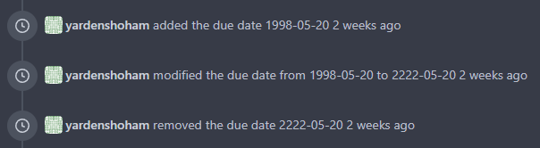
# After
---------
Signed-off-by: Yarden Shoham <git@yardenshoham.com>
Co-authored-by: wxiaoguang <wxiaoguang@gmail.com>
|
| |
|
|
|
|
|
|
|
|
|
|
|
|
|
|
|
|
|
|
|
|
|
|
|
|
|
|
|
|
| |
settings (#24246)
Co-Author: @wxiaoguang
This is the first step of #24229. And this PR will only includes html
changes, and followed by other PRs that fine tune css and change to
submenus.
After:
Admin Level
<img width="1400" alt="Screen Shot 2023-04-21 at 10 07 16"
src="https://user-images.githubusercontent.com/17645053/233523870-f848b61d-056a-4b41-9760-a9a49fea1fe8.png">
User Level
<img width="1422" alt="Screen Shot 2023-04-21 at 10 07 23"
src="https://user-images.githubusercontent.com/17645053/233523878-979adb20-a657-43d9-99a6-ad414010c0ef.png">
Repo Level
<img width="1404" alt="Screen Shot 2023-04-21 at 10 07 07"
src="https://user-images.githubusercontent.com/17645053/233523863-337440bd-c03a-4dfd-87fa-cef40300bfe0.png">
---------
Co-authored-by: wxiaoguang <wxiaoguang@gmail.com>
|
| |
|
|
|
|
|
|
|
|
|
|
|
|
|
|
|
|
|
|
|
|
|
|
|
|
|
|
|
|
|
|
|
|
|
|
|
|
|
|
|
|
|
|
|
|
|
|
|
|
|
|
|
| |
actions (#24097)
Co-Author: @wxiaoguang
This PR is to fix
https://github.com/go-gitea/gitea/issues/23318#issuecomment-1506275446 .
The way to fix this in this PR is to use `delete_modal_actions.tmpl`
here both to fix this issue and keep ui consistency (as suggested by
[TODO
here](https://github.com/go-gitea/gitea/blob/4299c3b7db61f8741eca0ba3d663bb65745a4acc/templates/projects/view.tmpl#L161))
And this PR also refactors `delete_modal_actions.tmpl` and its related
styles, and use the template for more modal actions:
1. Added template attributes:
* locale
* ModalButtonStyle: "yes" (default) or "confirm"
* ModalButtonCancelText
* ModalButtonOkText
2. Rename `delete_modal_actions.tmpl` template to
`modal_actions_confirm.tmpl` because it is not only used for action
modals deletion now.
3. Refactored css related to modals into `web_src/css/modules/modal.css`
and improved the styles.
4. Also use the template for PR deletion modal and remove issue
dependency modal.
5. Some modals should also use the template, but not sure how to open
them, so mark these modal actions by `{{/* TODO: Convert to
base/modal_actions_confirm */}}`
After (Also tested on arc green):
Hovering on the left buttons
<img width="711" alt="Screen Shot 2023-04-23 at 15 17 12"
src="https://user-images.githubusercontent.com/17645053/233825650-76307e65-9255-44bb-80e8-7062f58ead1b.png">
<img width="786" alt="Screen Shot 2023-04-23 at 15 17 21"
src="https://user-images.githubusercontent.com/17645053/233825652-4dc6f7d1-a180-49fb-a468-d60950eaee0d.png">
Test for functionalities:
https://user-images.githubusercontent.com/17645053/233826857-76376fda-022c-42d0-b0f3-339c17ca4e59.mov
---------
Co-authored-by: wxiaoguang <wxiaoguang@gmail.com>
|
| |
|
|
|
|
|
|
|
|
|
|
|
|
|
|
|
|
|
|
| |
- Implement fix for user and organization page
- Add necessary ctx.Data
When switching tabs on `user profile page` the badges are shown for
`/gitea_user?tab=stars`, `/gitea_user?tab=activity` and missing under
`gitea_user/-/projects` and `gitea_user/-/packages`
This was added for users and organizations.
Before:
After:
Co-authored-by: silverwind <me@silverwind.io>
Co-authored-by: Giteabot <teabot@gitea.io>
|
| |
|
|
|
|
|
|
| |
This causes the browser to allow only valid images in the file picker by
default.
---------
Co-authored-by: silverwind <me@silverwind.io>
|
| |
|
|
|
|
|
|
|
|
|
|
|
|
|
|
|
|
|
|
|
|
|
|
|
|
|
| |
Some user/org pages use `Owner` variable. It's an incorrect concept
since year 2016: what is a user's owner?
Actually, new code is right: use `ContextUser`.
This PR cleans all legacy "Owner" variables.
## Screenshots for related pages and test results
All pages are as before:
### `web/org/home.go`
### `web/user/profile.go`
### `web/user/setting/profile.go`
|
| |
|
|
|
|
|
|
|
|
|
|
|
|
|
|
|
|
|
|
|
|
|
|
|
|
|
|
|
|
|
|
|
|
|
| |
Close #24108
Use secondary pointing menu for tabs on user/organization home page so
the tabs look the same.
Main changes:
1. modified a part of dom structure in
`templates/user/overview/header.tmpl` to make it the same as
`templates/org/header.tmpl` in order to produce the same ui.
2. Move some css to `web_src/css/shared/repoorgshared.css` to make them
shareable between `templates/user/overview/header.tmpl` and
`templates/org/header.tmpl`
After:
https://user-images.githubusercontent.com/17645053/232400617-2add5bec-d483-4ab1-b48d-eaee157f7b09.mov
For further improvements. Need some thoughts:
For [this
TODO](https://github.com/HesterG/gitea/blob/729ad294cbec7a77623b2e3eab750ea7a20e8ee0/templates/user/overview/header.tmpl#L1),
it is viable to make it a shared template for [this
part](https://github.com/HesterG/gitea/blob/729ad294cbec7a77623b2e3eab750ea7a20e8ee0/templates/user/overview/header.tmpl#L2-L17)
and [this
part](https://github.com/HesterG/gitea/blob/729ad294cbec7a77623b2e3eab750ea7a20e8ee0/templates/org/header.tmpl#L1-L16)
because they are the same except for the variable. But for the menu
parts, they are quite different so might not be suitable to use a shared
template. So need some thoughts and advice about extracting the shared
template from these two headers.
---------
Co-authored-by: Giteabot <teabot@gitea.io>
|
| |
|
|
|
|
|
|
|
| |
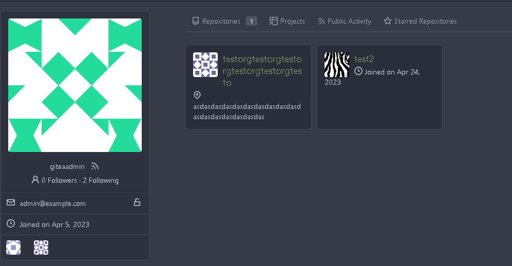
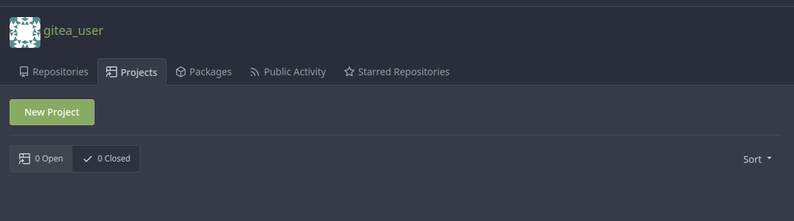
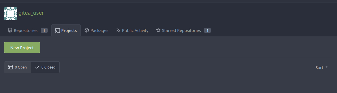
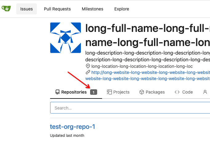
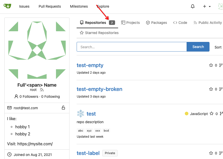
Add a new badge to the repository tab for users and organizations.
The badge is only visible if a repo exists.
Change the badge color of existing "Starred Repositories". (from primary to small)
Closes #24188
|
| | |
|
| |
|
|
|
|
|
|
|
|
|
|
|
|
|
| |
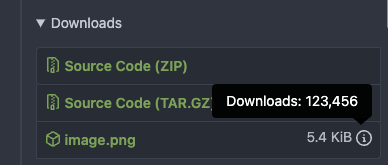
The calculation of the total sum is moved to the backend so a full HTML
string could be sent.
- Closes #10669
- 2nd attempt (the first was in #21570)
---------
Signed-off-by: Yarden Shoham <git@yardenshoham.com>
Co-authored-by: Giteabot <teabot@gitea.io>
|
| |
|
|
|
|
|
|
|
|
|
|
|
|
|
|
|
|
|
|
|
|
|
|
|
|
| |
Before, the `GiteaLocaleNumber.js` was just written as a a drop-in
replacement for old `js-pretty-number`.
Actually, we can use Golang's `text` package to format.
This PR partially completes the TODOs in `GiteaLocaleNumber.js`:
> if we have complete backend locale support (eg: Golang "x/text"
package), we can drop this component.
> tooltip: only 2 usages of this, we can replace it with Golang's
"x/text/number" package in the future.
This PR also helps #24131
Screenshots:
<details>
</details>
|
| |
|
|
|
| |
Previously, this setting was pretty confusing for users, especially the
difference between "reference" and "issue reference".
Related: #21321.
|
| |
|
|
|
|
|
| |
- With #23988 in place, we can improve these timestamps
---------
Co-authored-by: silverwind <me@silverwind.io>
|
| |
|
|
|
|
|
|
|
|
|
|
|
|
|
|
|
|
|
|
|
| |
Follow
https://github.com/go-gitea/gitea/pull/23988#pullrequestreview-1377696819
Many template helper functions are not good enough and cause various
problems, that's why I am cleaning them.
## Before


## After

|
| |
|
|
|
|
|
|
|
|
|
|
|
|
|
|
|
|
|
|
|
|
|
|
|
|
|
|
|
|
|
|
|
|
|
|
|
|
|
|
|
|
| |
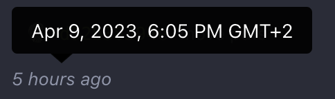
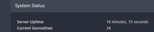
- Added [GitHub's `relative-time` element](https://github.com/github/relative-time-element)
- Converted all formatted timestamps to use this element
- No more flashes of unstyled content around time elements
- These elements are localized using the `lang` property of the HTML file
- Relative (e.g. the activities in the dashboard) and duration (e.g.
server uptime in the admin page) time elements are auto-updated to keep
up with the current time without refreshing the page
- Code that is not needed anymore such as `formatting.js` and parts of `since.go` have been deleted
Replaces #21440
Follows #22861
## Screenshots
### Localized
### Tooltips
#### Native for dates

#### Interactive for relative
### Auto-update
---------
Signed-off-by: Yarden Shoham <git@yardenshoham.com>
Co-authored-by: wxiaoguang <wxiaoguang@gmail.com>
Co-authored-by: silverwind <me@silverwind.io>
Co-authored-by: delvh <dev.lh@web.de>
|
| |
|
|
|
| |
This is useful in case you want to use them for signature verification.
A notice is added to avoid confusion.
|
| |
|
|
|
|
|
|
|
|
|
|
|
|
|
|
|
|
|
|
|
|
|
|
|
|
|
|
|
|
|
|
|
|
|
| |
I've heard many reports of users getting scared when they see their own
email address for their own profile, as they believe that the email
field is also visible to other users. Currently, using Incognito mode
or going over the Settings is the only "reasonable" way to verify this
from the perspective of the user.
A locked padlock should be enough to indicate that the email is not
visible to anyone apart from the user and the admins. An unlocked
padlock is used if the email address is only shown to authenticated
users.
Some additional string-related changes in the Settings were introduced
as well to ensure consistency, and the comments in the relevant tests
were improved so as to allow for easier modifications in the future.
---
#### Screenshot (EDIT: Scroll down for more up-to-date screenshots)
***Please remove this section before merging.***
This lock should only appear if the email address is explicitly hidden
using the `Hide Email Address` setting. The change was originally tested
on top of and designed for the Forgejo fork, but I don't expect any
problems to arise from this and I don't think that a
documentation-related change is strictly necessary.
---------
Co-authored-by: silverwind <me@silverwind.io>
|
| |
|
|
|
|
|
|
|
|
|
|
|
|
|
|
|
|
| |
One of the steps in #23328
Before there were 3 different but similar functions: dict/Dict/mergeinto
The code was just copied & pasted, no test.
This PR defines a new stable `dict` function, it covers all the 3 old
functions behaviors, only +160 -171
Future developers do not need to think about or guess the different dict
functions, just use one: `dict`
Why use `dict` but not `Dict`? Because there are far more `dict` than
`Dict` in code already ......
|
| |
|
|
|
|
|
|
|
|
|
|
|
|
|
|
|
|
|
|
|
|
|
|
|
|
|
|
|
|
|
| |
It's difficult to play with Fomantic's ".link" selector&styles, and it
doesn't bring any real benefit.
Instead, it sometimes introduces regressions (because of the `:not`
selector, really difficult to fine-tune).
Regression:
<details>
</details>
After this PR, there is no ".link" in code anymore. We do not need to
play the overwriting and `:not()` game anymore.
|
| |
|
|
|
|
|
|
|
|
|
|
|
|
|
|
|
|
|
|
|
|
|
| |
pages. (#23861)
Follow #21429 & #22861
Use `<gitea-locale-number>` instead of backend `PrettyNumber`. All old
`PrettyNumber` related functions are removed. A lot of code could be
simplified.
And some functions haven't been used for long time (dead code), so they
are also removed by the way (eg: `SplitStringAtRuneN`, `Dedent`)
This PR only tries to improve the `PrettyNumber` rendering problem, it
doesn't touch the "plural" problem.
Screenshot:
|
| |
|
| |
HTML is not XML.
|
| |
|
|
|
|
|
|
|
|
|
|
| |
Resolves #22692
I don't think there's a need for this entire row to be clickable (and
even different links depending on which segment you click)
The links still point to the same spot, so no information is lost here.
---------
Signed-off-by: jolheiser <john.olheiser@gmail.com>
Co-authored-by: wxiaoguang <wxiaoguang@gmail.com>
|
| |
|
|
|
|
|
|
|
|
|
|
|
|
|
|
|
| |
Follow:
* #23574
* Remove all ".tooltip[data-content=...]"
Major changes:
* Remove "tooltip" class, use "[data-tooltip-content=...]" instead of
".tooltip[data-content=...]"
* Remove legacy `data-position`, it's dead code since last Fomantic
Tooltip -> Tippy Tooltip refactoring
* Rename reaction attribute from `data-content` to
`data-reaction-content`
* Add comments for some `data-content`: `{{/* used by the form */}}`
* Remove empty "ui" class
* Use "text color" for SVG icons (a few)
|
| |
|
|
|
|
|
|
|
|
|
|
|
|
|
|
|
|
|
|
|
| |
Close #23627
Added margin left to the button when it is next to the svg, which has a
margin-right of `-0.5rem`
And here it might be better if `white-space: nowrap;` is added because
otherwise it might look like below on pull requests page on smaller
screen
<img width="945" alt="截屏2023-03-23 09 57 41"
src="https://user-images.githubusercontent.com/17645053/227079613-71c696ab-55ec-4641-acb9-622a8baebb31.png">
After:
<img width="936" alt="截屏2023-03-23 10 08 27"
src="https://user-images.githubusercontent.com/17645053/227080971-6bf2588e-40dd-4770-b0d1-45d7c63e0f48.png">
Pull Request on smaller screen
<img width="922" alt="截屏2023-03-23 10 25 16"
src="https://user-images.githubusercontent.com/17645053/227084144-0c2ed3e6-5c11-4252-bba2-b5f971b70f4a.png">
|
| |
|
|
|
|
|
|
| |
That's incorrect code caused by Copy&Paste.
`show-modal` / `show-panel` are used by JS to show something, but these
links have `href`, they should navigate to new page.
Close #23657
|
| |
|
|
|
|
|
|
|
|
|
|
|
|
|
|
|
|
|
|
|
|
|
|
|
|
|
|
|
|
|
|
|
| |
(#23570)
Before, the Vue `<SvgIcon>` always outputs DOM nodes like:
```html
<span class="outer-class">
<svg class="class-name-defined" ...></svg>
</span>
```
The `span` is redundant and I guess such layout and the inconsistent
`class/class-name` attributes would cause bugs sooner or later.
This PR makes the `<SvgIcon>` clear, and it's faster than before,
because it doesn't need to parse the whole SVG string.
Before:
<details>
</details>
After:
---------
Co-authored-by: silverwind <me@silverwind.io>
|
| |
|
|
|
|
|
|
|
|
|
|
|
|
|
|
|
|
| |
(#23565)
Dropdowns on `/notifications/subscriptions` before and after:
<img width="157" alt="Screenshot 2023-03-18 at 20 37 12"
src="https://user-images.githubusercontent.com/115237/226133906-e4ad6a0a-de24-4324-8e1d-94081d23fe85.png">
<img width="152" alt="Screenshot 2023-03-18 at 20 41 29"
src="https://user-images.githubusercontent.com/115237/226134038-c3946c32-a424-4b92-ad15-890e1036cafe.png">
These selectors are meant to target the notification list which I
improved:
<img width="1145" alt="Screenshot 2023-03-19 at 01 52 11"
src="https://user-images.githubusercontent.com/115237/226147907-1c35736a-4bc9-4698-9813-21a20a1d2106.png">
<img width="1148" alt="Screenshot 2023-03-19 at 01 54 17"
src="https://user-images.githubusercontent.com/115237/226147920-626dbd84-11d3-48db-a177-6d808e3212c0.png">
|
