| Commit message (Collapse) | Author | Age | Files | Lines |
|---|
| |
|
| |
To quickly see what changed without having to re-read the whole diff.
|
| |
|
|
|
|
|
|
|
|
|
|
|
|
|
|
|
|
|
|
|
|
|
|
|
|
|
|
|
|
|
|
|
|
|
|
|
|
|
|
|
|
| |
Co-author: yp05327 , this PR is based on yp05327's #22813.
The problems of the old DashboardRepoList / repolist.tmpl:
* It mixes many different frameworks together
* It "just works", bug on bug
* It uses many anti-pattern of Vue
This PR:
* Fix bugs and close #22800
* Decouple the "checkbox" elements from Fomantic UI (only use CSS
styles)
* Simplify the HTML layout
* Simplify JS logic
* Make it easier to refactor the DashboardRepoList into a pure Vue
component in the future.
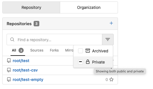
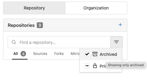
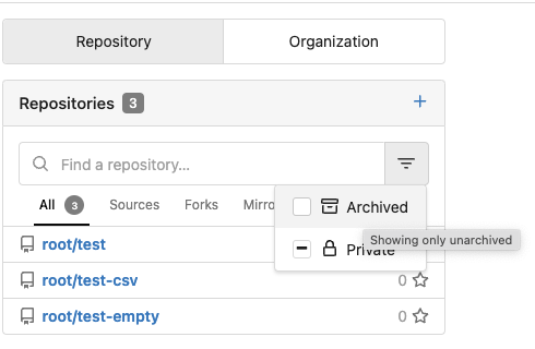
### Screenshots
#### Default
#### Click "Archived" to make it checked
#### Click "Archived" to make it intermediate

#### Click "Archived" to make it unchecked
---------
Co-authored-by: yp05327 <576951401@qq.com>
Co-authored-by: Lunny Xiao <xiaolunwen@gmail.com>
|
| |
|
|
|
|
|
|
|
|
| |
This includes pull requests that you approved, requested changes or
commented on. Currently such pull requests are not visible in any of the
filters on /pulls, while they may need further action like merging, or
prodding the author or reviewers.
Especially when working with a large team on a repository it's helpful
to get a full overview of pull requests that may need your attention,
without having to sift through the complete list.
|
| | |
|
| |
|
|
| |
Previously only the last few activities where available. This works for
all activity and for activity on a date chosen on the heatmap.
|
| |
|
|
|
|
|
|
|
|
| |
Fix #23082.
This bug is caused by a nil context in
https://github.com/go-gitea/gitea/issues/23082#issuecomment-1441276546 .
---------
Co-authored-by: Lunny Xiao <xiaolunwen@gmail.com>
|
| |
|
|
|
|
|
|
|
|
|
|
|
|
|
|
|
|
|
|
|
|
|
|
|
|
|
|
|
|
|
|
|
|
|
|
|
|
|
|
|
|
|
|
|
|
|
|
|
|
|
|
|
|
|
|
| |
As the title. Label/assignee share the same code.
* Close #22607
* Close #20727
Also:
* partially fix for #21742, now the comment reaction and menu work with
keyboard.
* partially fix for #17705, in most cases the comment won't be lost.
* partially fix for #21539
* partially fix for #20347
* partially fix for #7329
### The `Enter` support
Before, if user presses Enter, the dropdown just disappears and nothing
happens or the window reloads.
After, Enter can be used to select/deselect labels, and press Esc to
hide the dropdown to update the labels (still no way to cancel ....
maybe you can do a Cmd+R or F5 to refresh the window to discard the
changes .....)
This is only a quick patch, the UX is still not perfect, but it's much
better than before.
### The `confirm` before reloading
And more fixes for the `reload` problem, the new behaviors:
* If nothing changes (just show/hide the dropdown), then the page won't
be reloaded.
* If there are draft comments, show a confirm dialog before reloading,
to avoid losing comments.
That's the best effect can be done at the moment, unless completely
refactor these dropdown related code.
Screenshot of the confirm dialog:
<details>

</details>
---------
Co-authored-by: Brecht Van Lommel <brecht@blender.org>
Co-authored-by: Lunny Xiao <xiaolunwen@gmail.com>
|
| |
|
|
| |
Fixes
https://github.com/go-gitea/gitea/issues/22621#issuecomment-1439309200
|
| |
|
|
|
|
| |
This PR is a possible solution for issue #22866. Main change is to add a
`author-wrapper` class around author name, like the wrapper added to
message. The `max-width` is set to 200px on PC, and 100px on mobile
device for now.
|
| |
|
|
|
|
|
|
|
|
|
|
| |
Currently in Gitea issue comments are not marked up with headings. I'm
trying to fix this by adding an appropriate
[ARIA](https://www.w3.org/WAI/standards-guidelines/aria/) role for
comment header and also by enclosing the comment itself in a semantical
article element.
---------
Co-authored-by: Lunny Xiao <xiaolunwen@gmail.com>
Co-authored-by: John Olheiser <john.olheiser@gmail.com>
|
| |
|
|
|
|
|
|
| |
This PR is trying to add accessibility to the menu as mentioned in
#23053 so the menu can be accessed using keyboard (A quick demo is added
below), with a reference to
[PR2612](https://github.com/go-gitea/gitea/pull/22612). The goal is to
make the menu accessible merely using keyboard like shown below. And
this PR might need confirmation from developers using screen readers.
|
| |
|
| |
Follows #22950
|
| |
|
|
| |
fix: #22647
|
| |
|
|
|
|
|
|
|
|
|
|
|
|
|
|
|
|
|
|
|
|
|
|
|
|
|
|
|
|
|
|
|
|
|
|
|
|
|
|
|
|
|
|
|
|
|
|
| |
This PR follows:
* #22950
### Before
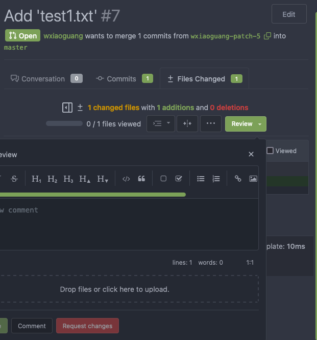
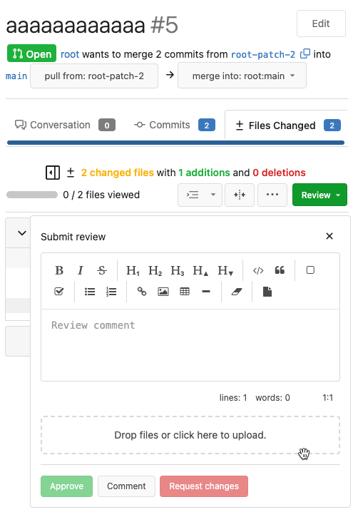
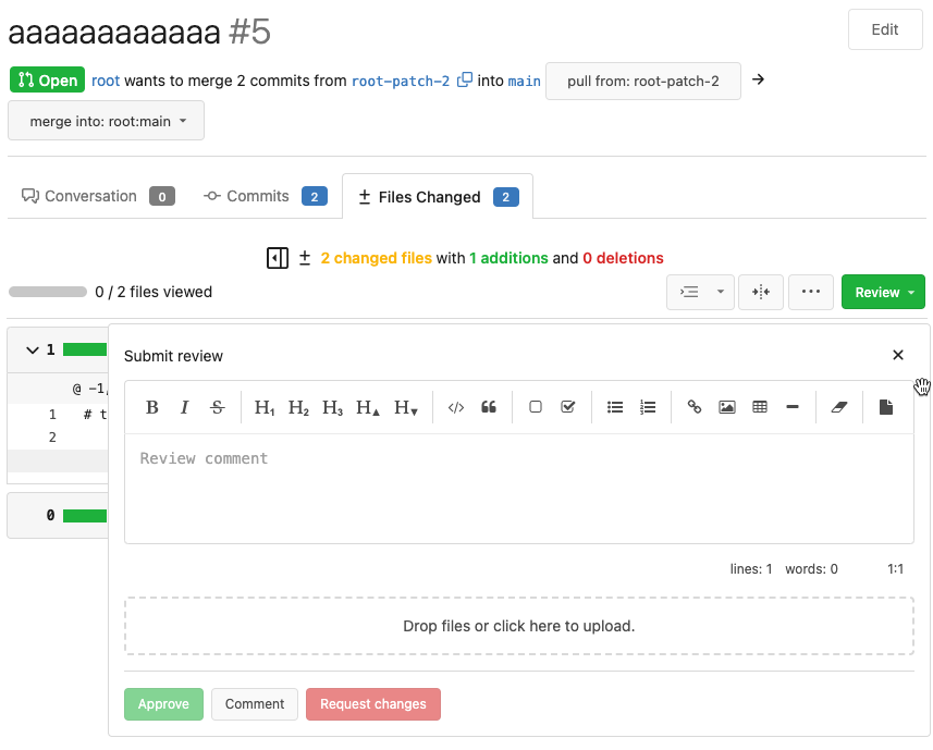
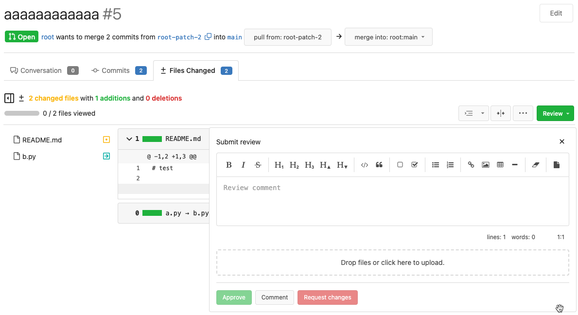
The Review Box has many problems:
* It doesn't work for small screens.
* It has an anonying animation which makes the UI laggy.
* It uses "custom dropdown menu" which is very difficult to fine tune.
* `$().toggle('visible')` is not a correct call
* jQuery just accepts any invalid `duration` argument:
`$().toggle('anyting')`
* The button is not a button.
<details>
</details>
### After
These problems are fixed, and eliminate many `!important` games.
<details>
</details>
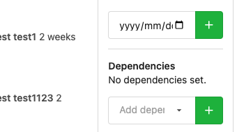
And most dropdown icons still looks good:
<details>

</details>
Co-authored-by: delvh <leon@kske.dev>
|
| |
|
|
|
|
|
|
|
|
|
|
|
|
|
|
|
|
|
| |
Regression bug of #19650
Close #20983
Close #21912
### The "Manually Merged" form

### Mark a PR as Manually Merged and close it

---------
Co-authored-by: Jason Song <i@wolfogre.com>
Co-authored-by: Lunny Xiao <xiaolunwen@gmail.com>
|
| |
|
|
|
|
|
|
|
|
|
|
|
|
|
|
|
|
|
|
| |
Fix #23031.
Currently, only comments with type `CommentTypeComment` or
`CommentTypeCode` can be deleted. If user create a review comment, the
type of the comment will be `CommentTypeReview` so the comment cannot be
deleted.
https://github.com/go-gitea/gitea/blob/e7be610d5773e69abbfb98d19e23112dfad6dfcc/routers/web/repo/issue.go#L2860-L2868
And in Github, user also cannot delete a review comment. There isn't a
delete button in the menu.
<img
src="https://user-images.githubusercontent.com/15528715/220275166-5ae2dc10-4003-4857-b14e-d7b02644345f.png"
width="640px" />
So we should remove the delete button from the menu when the comment's
type is `CommentTypeReview`.
|
| |
|
|
|
|
|
|
| |
add margin top as mentioned in #22973
---------
Co-authored-by: jidi <jidi@jidideMacBook-Pro.local>
Co-authored-by: Lunny Xiao <xiaolunwen@gmail.com>
|
| |
|
|
|
|
|
|
|
|
| |
`.gt-relative` is also `position: relative !important;`
There are `gt-pr-?` styles below (line 140) for `padding-right`, which
makes `.gt-pr` ambiguous
Co-authored-by: delvh <leon@kske.dev>
Co-authored-by: John Olheiser <john.olheiser@gmail.com>
Co-authored-by: techknowlogick <techknowlogick@gitea.io>
|
| |
|
|
|
| |
This is rather private information that should not be given to all
members in the same organization. Only show it to organization owners.
|
| |
|
|
|
|
|
|
| |
The API to create tokens is missing the ability to set the required
scopes for tokens, and to show them on the API and on the UI.
This PR adds this functionality.
Signed-off-by: Andrew Thornton <art27@cantab.net>
|
| |
|
| |
Caused by #22950
|
| |
|
|
|
|
|
|
|
|
|
|
|
|
| |
Since #22632, when a commit status has multiple checks, no check is
shown at all (hence no way to see the other checks).
This PR fixes this by always adding a tag with the
`.commit-statuses-trigger` to the DOM (the `.vm` is for vertical
alignment).

---------
Co-authored-by: Lunny Xiao <xiaolunwen@gmail.com>
|
| |
|
|
|
|
|
|
|
|
|
|
| |
Add all units to the units permission list in org team members sidebar.
Before:
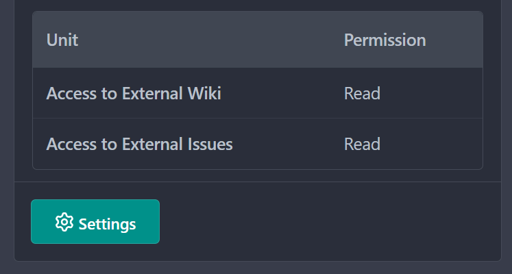
After:

Co-authored-by: Lunny Xiao <xiaolunwen@gmail.com>
|
| |
|
|
|
|
|
|
|
|
|
|
|
|
|
|
|
| |
Replaces: https://github.com/go-gitea/gitea/pull/22947
Fixes https://github.com/go-gitea/gitea/issues/22946
Probably related to https://github.com/go-gitea/gitea/issues/19530
Basically, many of the diffs were broken because they were comparing to
the base commit, where a 3-dot diff should be comparing to the [last
common
ancestor](https://matthew-brett.github.io/pydagogue/git_diff_dots.html).
This should have an integration test so that we don’t run into this
issue again.
---------
Co-authored-by: Jonathan Tran <jonnytran@gmail.com>
|
| |
|
| |
Fix #22961
|
| |
|
|
|
|
|
|
|
|
|
|
|
|
|
|
|
|
|
|
| |
Fix #22818.
| Before | After |
| ---- | ---- |
| <img
src="https://user-images.githubusercontent.com/15528715/219617504-d86e7a90-d4ac-4a92-bd8a-100dddc693d5.png"
width="200px" /> | <img
src="https://user-images.githubusercontent.com/15528715/219618645-a4045f65-bda6-49ce-a676-f03a9817bb70.png"
width="200px" />|
| <img
src="https://user-images.githubusercontent.com/15528715/219618013-844ef208-853b-44bd-a67c-36e360f0ffa7.png"
width="200px" /> | <img
src="https://user-images.githubusercontent.com/15528715/219618361-cb13c369-852e-47bf-ae30-e429d348823d.png"
width="200px" /> |
---------
Co-authored-by: Lunny Xiao <xiaolunwen@gmail.com>
|
| |
|
|
|
|
|
|
|
|
|
| |
https://github.com/go-gitea/gitea/pull/22294 introduced this bug.
Before:

After:

Co-authored-by: Lunny Xiao <xiaolunwen@gmail.com>
|
| |
|
|
|
|
|
|
|
|
|
|
|
|
|
|
|
|
|
|
|
|
|
|
|
|
|
|
| |
remove inline style=display:none (#22950)
Close #22847
This PR:
* introduce Gitea's own `showElem` and related functions
* remove jQuery show/hide
* remove .hide class
* remove inline style=display:none
From now on:
do not use:
* "[hidden]" attribute: it's too weak, can not be applied to an element
with "display: flex"
* ".hidden" class: it has been polluted by Fomantic UI in many cases
* inline style="display: none": it's difficult to tweak
* jQuery's show/hide/toggle: it can not show/hide elements with
"display: xxx !important"
only use:
* this ".gt-hidden" class
* showElem/hideElem/toggleElem functions in "utils/dom.js"
cc: @silverwind , this is the all-in-one PR
|
| |
|
|
|
|
|
|
|
|
|
|
|
|
|
|
|
|
|
|
|
|
|
|
|
|
|
|
|
|
|
|
|
|
|
|
|
|
|
|
|
|
|
|
|
|
|
|
|
|
|
|
|
|
| |
Add a new "exclusive" option per label. This makes it so that when the
label is named `scope/name`, no other label with the same `scope/`
prefix can be set on an issue.
The scope is determined by the last occurence of `/`, so for example
`scope/alpha/name` and `scope/beta/name` are considered to be in
different scopes and can coexist.
Exclusive scopes are not enforced by any database rules, however they
are enforced when editing labels at the models level, automatically
removing any existing labels in the same scope when either attaching a
new label or replacing all labels.
In menus use a circle instead of checkbox to indicate they function as
radio buttons per scope. Issue filtering by label ensures that only a
single scoped label is selected at a time. Clicking with alt key can be
used to remove a scoped label, both when editing individual issues and
batch editing.
Label rendering refactor for consistency and code simplification:
* Labels now consistently have the same shape, emojis and tooltips
everywhere. This includes the label list and label assignment menus.
* In label list, show description below label same as label menus.
* Don't use exactly black/white text colors to look a bit nicer.
* Simplify text color computation. There is no point computing luminance
in linear color space, as this is a perceptual problem and sRGB is
closer to perceptually linear.
* Increase height of label assignment menus to show more labels. Showing
only 3-4 labels at a time leads to a lot of scrolling.
* Render all labels with a new RenderLabel template helper function.
Label creation and editing in multiline modal menu:
* Change label creation to open a modal menu like label editing.
* Change menu layout to place name, description and colors on separate
lines.
* Don't color cancel button red in label editing modal menu.
* Align text to the left in model menu for better readability and
consistent with settings layout elsewhere.
Custom exclusive scoped label rendering:
* Display scoped label prefix and suffix with slightly darker and
lighter background color respectively, and a slanted edge between them
similar to the `/` symbol.
* In menus exclusive labels are grouped with a divider line.
---------
Co-authored-by: Yarden Shoham <hrsi88@gmail.com>
Co-authored-by: Lauris BH <lauris@nix.lv>
|
| |
|
|
|
|
|
|
|
|
|
|
|
|
|
|
|
| |
`member` is how it's named in the code
Closes #22931
Before | After
--- | ---

|

---------
Signed-off-by: Yarden Shoham <hrsi88@gmail.com>
Co-authored-by: delvh <leon@kske.dev>
|
| |
|
|
|
|
|
|
|
|
|
|
|
|
|
|
|
|
|
|
|
|
|
|
|
|
|
|
|
|
|
|
|
|
|
|
|
|
|
|
|
|
|
|
|
|
|
|
|
|
|
|
|
|
|
|
|
|
|
|
| |
(#22861)
This PR follows:
* #21986
* #22831
This PR also introduce customized HTML elements, which would also help
problems like:
* #17760
* #21429
* #21440
With customized HTML elements, there won't be any load-search-replace
operations, and it can avoid page flicking (which @silverwind cares a
lot).
Browser support:
https://developer.mozilla.org/en-US/docs/Web/API/Window/customElements
# FAQ
## Why the component has the prefix?
As usual, I would strongly suggest to add prefixes for our own/private
names. The dedicated prefix will avoid conflicts in the future, and it
makes it easier to introduce various 3rd components, like GitHub's
`relative-time` component. If there is no prefix, it's impossible to
introduce another public component with the same name in the future.
## Why the `custcomp.js` is loaded before HTML body? The `index.js` is
after HTML body.
Customized components must be registered before the content loading.
Otherwise there would be still some flicking.
`custcomp.js` should have its own dependencies and should be very light,
so it won't affect the page loading time too much.
## Why use `data-url` attribute but not use the `textContent`?
According to the standard, the `connectedCallback` occurs on the
tag-opening moment. The element's children are not ready yet.
## Why not use `{{.GuessCurrentOrigin $.ctx ...}}` to let backend decide
the absolute URL?
It's difficult for backend to guess the correct protocol(scheme)
correctly with zero configuration. Generating the absolute URL from
frontend can guarantee that the URL is 100% correct -- since the user is
visiting it.
# Screenshot
<details>

</details>
|
| |
|
|
|
|
|
|
|
|
|
|
|
|
| |
The main purpose of these home pages should be getting an overview of
what's going on or needs attention. Recently updated is a better default
than newest for that purpose, to avoid missing active issues and pulls
that were not created recently.
The default sorting order in repository issues and pulls remains newest.
Repositories in an organization are already sorted by recently updated.
---------
Co-authored-by: Jason Song <i@wolfogre.com>
Co-authored-by: Lunny Xiao <xiaolunwen@gmail.com>
|
| |
|
|
|
|
|
|
|
| |
Fix #22734.
According to
[`view_file.tmpl`](https://github.com/go-gitea/gitea/blob/main/templates/repo/view_file.tmpl#L82),
`lfs_file.tmpl` should use `AssetUrlPrefix` instead of `AppSubUrl`.
Co-authored-by: Jason Song <i@wolfogre.com>
|
| |
|
|
|
|
|
|
|
|
|
|
| |
This is an alternative solution to #22824
and would also close #22781
This makes the PR diff view always full width.
It makes sense to make use of that screen real estate. If you want a
more narrow view you can always resize your browser.
It also avoids cluttering the UI with another button + the database with
another column for the setting.
This is also how github and gitlab do it.
|
| |
|
| |
Fix https://try.gitea.io/wxiaoguang/test/issues/19
|
| |
|
|
|
|
|
|
|
|
|
|
|
|
|
| |
Allow back-dating user creation via the `adminCreateUser` API operation.
`CreateUserOption` now has an optional field `created_at`, which can
contain a datetime-formatted string. If this field is present, the
user's `created_unix` database field will be updated to its value.
This is important for Blender's migration of users from Phabricator to
Gitea. There are many users, and the creation timestamp of their account
can give us some indication as to how long someone's been part of the
community.
The back-dating is done in a separate query that just updates the user's
`created_unix` field. This was the easiest and cleanest way I could
find, as in the initial `INSERT` query the field always is set to "now".
|
| |
|
| |
A separate PR from #22884 (without touching the jQuery methods)
|
| |
|
|
|
|
|
| |
- Regression from https://github.com/go-gitea/gitea/pull/22294
Error:

|
| |
|
|
|
|
| |
conflicts (#22909)
Always show the `command line instructions` button even if there are
conflicts.
|
| |
|
|
|
|
|
|
|
|
|
|
|
|
|
|
|
|
|
|
|
|
|
|
|
|
|
|
|
|
|
|
|
|
|
|
|
|
|
|
|
|
|
|
|
|
|
|
|
|
|
|
|
|
|
|
|
|
|
|
|
|
|
|
|
|
| |
To avoid duplicated load of the same data in an HTTP request, we can set
a context cache to do that. i.e. Some pages may load a user from a
database with the same id in different areas on the same page. But the
code is hidden in two different deep logic. How should we share the
user? As a result of this PR, now if both entry functions accept
`context.Context` as the first parameter and we just need to refactor
`GetUserByID` to reuse the user from the context cache. Then it will not
be loaded twice on an HTTP request.
But of course, sometimes we would like to reload an object from the
database, that's why `RemoveContextData` is also exposed.
The core context cache is here. It defines a new context
```go
type cacheContext struct {
ctx context.Context
data map[any]map[any]any
lock sync.RWMutex
}
var cacheContextKey = struct{}{}
func WithCacheContext(ctx context.Context) context.Context {
return context.WithValue(ctx, cacheContextKey, &cacheContext{
ctx: ctx,
data: make(map[any]map[any]any),
})
}
```
Then you can use the below 4 methods to read/write/del the data within
the same context.
```go
func GetContextData(ctx context.Context, tp, key any) any
func SetContextData(ctx context.Context, tp, key, value any)
func RemoveContextData(ctx context.Context, tp, key any)
func GetWithContextCache[T any](ctx context.Context, cacheGroupKey string, cacheTargetID any, f func() (T, error)) (T, error)
```
Then let's take a look at how `system.GetString` implement it.
```go
func GetSetting(ctx context.Context, key string) (string, error) {
return cache.GetWithContextCache(ctx, contextCacheKey, key, func() (string, error) {
return cache.GetString(genSettingCacheKey(key), func() (string, error) {
res, err := GetSettingNoCache(ctx, key)
if err != nil {
return "", err
}
return res.SettingValue, nil
})
})
}
```
First, it will check if context data include the setting object with the
key. If not, it will query from the global cache which may be memory or
a Redis cache. If not, it will get the object from the database. In the
end, if the object gets from the global cache or database, it will be
set into the context cache.
An object stored in the context cache will only be destroyed after the
context disappeared.
|
| |
|
|
|
|
|
|
|
|
|
|
|
|
|
| |
Previously, you had no idea what you are copying with the issue
reference button for either long repo names, user names, or issue
indexes.
Now, it is simply a bit redundant for short references but a lot easier
for long references.
## Before

## After

|
| |
|
|
|
|
|
|
|
|
|
|
|
|
|
|
|
|
|
|
|
|
|
|
|
|
|
|
|
| |
* Like #22851
* All other dropdown menu elements do not have such `hidden` class.
* Actually the dropdown menu elements do not need it in HTML, so this PR
removes it.
* There is already `.ui.dropdown .menu { display: none; }`, so when
loading the page, the menu is correctly hidden initially, no need to add
any more CSS classes.
* The Fomantic UI's `.hidden` class should still exist until there is no
its checkbox/dropdown module anymore. The Fomantic UI JS code still
addes `hidden` for `ui checkbox` and addes `transition hidden` for `ui
menu` at the moment.
* This PR also cleans the legacy inline `style`, which is quite hacky
and no need anymore.
All these dropdown menus work well.
I have tested these 5 places:
* The code search from User Profile
* The issue sidebar to lock issue
* The repo search form
* The repo setting page: branch list
* The repo setting page: merge option list
Screenshot:

|
| |
|
|
|
|
|
|
|
|
|
|
|
|
|
|
|
|
|
|
| |
As discussed in #22847 the helpers in helpers.less need to have a
separate prefix as they are causing conflicts with fomantic styles
This will allow us to have the `.gt-hidden { display:none !important; }`
style that is needed to for the reverted PR.
Of note in doing this I have noticed that there was already a conflict
with at least one chroma style which this PR now avoids.
I've also added in the `gt-hidden` style that matches the tailwind one
and switched the code that needed it to use that.
Signed-off-by: Andrew Thornton <art27@cantab.net>
---------
Signed-off-by: Andrew Thornton <art27@cantab.net>
Co-authored-by: wxiaoguang <wxiaoguang@gmail.com>
|
| |
|
|
|
|
|
|
|
|
|
|
|
|
|
|
|
|
| |
(#22862)
Add setting to allow edits by maintainers by default, to avoid having to
often ask contributors to enable this.
This also reorganizes the pull request settings UI to improve clarity.
It was unclear which checkbox options were there to control available
merge styles and which merge styles they correspond to.
Now there is a "Merge Styles" label followed by the merge style options
with the same name as in other menus. The remaining checkboxes were
moved to the bottom, ordered rougly by typical order of operations.
---------
Co-authored-by: Lunny Xiao <xiaolunwen@gmail.com>
|
| |
|
|
|
|
|
|
|
|
| |
Fomantic-UI's `.hidden` CSS class is badly designed.
* Checkbox elements do not need it in HTML, so this PR removes it (JS
adds the `.hidden` class back by `$('.ui.checkbox').checkbox()`)
* `menu transaction hidden` is still needed, and it should be the only
usage for the `.hidden` from now on (until they get refactored properly)
Co-authored-by: zeripath <art27@cantab.net>
|
| |
|
|
|
|
|
|
|
|
|
|
|
|
|
| |
* Add role heading level 1 to username/repo title.
* Copy behaviour of Releases to some other views.
Contributed by @Forgejo.


Co-authored-by: delvh <leon@kske.dev>
Co-authored-by: zeripath <art27@cantab.net>
Co-authored-by: Lunny Xiao <xiaolunwen@gmail.com>
|
| |
|
|
|
|
|
|
|
|
|
|
|
|
|
|
|
|
|
|
| |
Replace #22853 since it's closed, and actually there are 2 places need
to be fixed.
~~Follow @fsologureng 's suggestion to keep the `<hX>` tags.~~
Update: from fsologureng: this doesn't change anything from a11y's point
of view. So I think this PR could be fine to fix the UI looking problems
as a quick patch, then defer the a11y problems to new PRs together.
Before: the font-size is too large.
After: it seems better.


Co-authored-by: Lunny Xiao <xiaolunwen@gmail.com>
|
| |
|
|
|
|
|
|
|
|
|
|
|
|
|
|
|
|
|
|
|
|
|
|
|
|
|
|
|
|
|
|
|
|
|
|
|
|
| |
Original Issue: https://github.com/go-gitea/gitea/issues/22102
This addition would be a big benefit for design and art teams using the
issue tracking.
The preview will be the latest "image type" attachments on an issue-
simple, and allows for automatic updates of the cover image as issue
progress is made!
This would make Gitea competitive with Trello... wouldn't it be amazing
to say goodbye to Atlassian products? Ha.
First image is the most recent, the SQL will fetch up to 5 latest images
(URL string).
All images supported by browsers plus upcoming formats: *.avif *.bmp
*.gif *.jpg *.jpeg *.jxl *.png *.svg *.webp
The CSS will try to center-align images until it cannot, then it will
left align with overflow hidden. Single images get to be slightly
larger!
Tested so far on: Chrome, Firefox, Android Chrome, Android Firefox.
Current revision with light and dark themes:


---------
Co-authored-by: Jason Song <i@wolfogre.com>
Co-authored-by: Lunny Xiao <xiaolunwen@gmail.com>
Co-authored-by: delvh <dev.lh@web.de>
|
| |
|
|
|
|
|
|
|
|
|
|
|
|
|
|
|
|
|
|
|
|
|
|
|
|
|
|
|
|
|
|
|
|
| |
Replace #19922 , which is stale since my last review:
https://github.com/go-gitea/gitea/pull/19922#pullrequestreview-1003546506
and https://github.com/go-gitea/gitea/pull/19922#issuecomment-1153181546
Close #19769
Changes:
1. Use `<button>` instead of `<div>` for buttons
2. Prevent default event handler in `initGlobalButtonClickOnEnter`
3. Fix the incorrect call to `pullrequest_targetbranch_change`
4. Add a slight margin-left to the input element to make UI look better
The logic in repo-issue.js is not ideal, but this PR isn't going to
touch the logic.
This is also an example for future developers to understand how to make
buttons work properly.
### Before

### After
* Add a slight margin-left.
* The `Cancel` button is focused.

Co-authored-by: techknowlogick <techknowlogick@gitea.io>
|
| |
|
| |
Use Project instead of Filter Project like the other filter menus.
|
