| Commit message (Collapse) | Author | Age | Files | Lines |
|---|
| |
|
|
|
|
|
|
|
|
|
|
|
|
|
|
|
|
| |
Before, 20px:
<img width="474" alt="Screenshot 2023-09-19 at 00 10 05"
src="https://github.com/go-gitea/gitea/assets/115237/4bed4edb-219d-4844-9d3c-0d747033b09f">
After, 28px:
<img width="576" alt="Screenshot 2023-09-19 at 00 20 40"
src="https://github.com/go-gitea/gitea/assets/115237/f482ac09-38ae-4c84-80d9-0bd39b7f9772">
Dropdown in account settings is unchanged at 20px:
<img width="157" alt="Screenshot 2023-09-19 at 00 09 11"
src="https://github.com/go-gitea/gitea/assets/115237/9c998cdf-eeed-4118-9262-664faaa56092">
---------
Co-authored-by: Giteabot <teabot@gitea.io>
|
| |
|
|
|
|
|
|
|
|
|
|
|
|
|
|
|
|
|
|
|
|
|
|
| |
I think it's better if the primary actions have primary color instead of
green which fits better into the overall single-color UI design. This PR
currently replaces every green button with primary:
<img width="141" alt="Screenshot 2023-09-16 at 14 07 59"
src="https://github.com/go-gitea/gitea/assets/115237/843c1e50-4fb2-4ec6-84ba-0efb9472dcbe">
<img width="161" alt="Screenshot 2023-09-16 at 14 07 51"
src="https://github.com/go-gitea/gitea/assets/115237/9442195a-a3b2-4a42-b262-8377d6f5c0d1">
Modal actions now use uncolored/primary instead of previous green/red
colors. I also removed the box-shadow on all basic buttons:
<img width="259" alt="Screenshot 2023-09-16 at 14 16 39"
src="https://github.com/go-gitea/gitea/assets/115237/5beea529-127a-44b0-8d4c-afa7b034a490">
<img width="261" alt="Screenshot 2023-09-16 at 14 17 42"
src="https://github.com/go-gitea/gitea/assets/115237/4757f7b2-4d46-49bc-a797-38bb28437b88">
The change currently includes the "Merge PR" button, for which we might
want to make an exception to match the icon color there:
<img width="442" alt="Screenshot 2023-09-16 at 14 33 53"
src="https://github.com/go-gitea/gitea/assets/115237/993ac1a5-c94d-4895-b76c-0d872181a70b">
|
| |
|
|
|
|
|
|
|
| |
Regression of #26713
After #26713 , the base path of user edit has been changed to
`/admin/users/{userid}/edit`
## Before
https://github.com/go-gitea/gitea/assets/50507092/5f4a3f64-fe2b-4499-b110-e01c9d87ea19
|
| |
|
|
|
|
|
|
|
|
|
|
|
|
| |
Follow up https://github.com/go-gitea/gitea/pull/26741
Changes:
Added archived label for org labels and added into issue filter list.
Part of https://github.com/go-gitea/gitea/issues/25237
---------
Signed-off-by: puni9869 <punitinani1@hotmail.com>
Co-authored-by: silverwind <me@silverwind.io>
|
| |
|
|
|
|
|
|
| |
Follow Remove polluted .ui.right #26825
Remove more `gt-float-right`, remove unnecessary helpers, remove
negative margin tricks.
|
| |
|
|
|
|
|
|
|
| |
Fix #26234
close #26323
close #27040
---------
Co-authored-by: silverwind <me@silverwind.io>
|
| |
|
|
|
|
|
|
|
| |
Resolve #25233
<img width="1315" alt="图片"
src="https://github.com/go-gitea/gitea/assets/81045/3ba59b58-471a-4e1b-985c-87edac2268c0">
<img width="1297" alt="图片"
src="https://github.com/go-gitea/gitea/assets/81045/b6caa12f-323b-4f70-9c44-ef91cb71a26c">
|
| |
|
|
|
|
|
|
|
|
|
|
|
|
|
|
|
| |
Closes #26329
This PR adds the ability to ignore revisions specified in the
`.git-blame-ignore-revs` file in the root of the repository.

The banner is displayed in this case. I intentionally did not add a UI
way to bypass the ignore file (same behaviour as Github) but you can add
`?bypass-blame-ignore=true` to the url manually.
---------
Co-authored-by: wxiaoguang <wxiaoguang@gmail.com>
|
| |
|
|
|
| |
This PR adds a new field `RemoteAddress` to both mirror types which
contains the sanitized remote address for easier (database) access to
that information. Will be used in the audit PR if merged.
|
| |
|
| |
A bit more performant when we only use it for appending strings.
|
| |
|
|
|
|
|
|
|
|
| |
Follow #24026
<img width="1049" alt="图片"
src="https://github.com/go-gitea/gitea/assets/81045/d3fc5159-b5e7-411a-b6f8-4a111a027e6b">
---------
Co-authored-by: delvh <dev.lh@web.de>
|
| |
|
| |
Fix #27008
|
| |
|
|
|
|
|
|
|
|
|
|
|
|
|
|
|
|
| |
Before:
After:
---
1. **Remove the scroll bar exception that in the a tag**
2. **Reduce the actual width of the a tag to the actual width of the
content**
As shown in the screenshot, the red box area should not be clickable
|
| |
|
|
|
|
|
|
| |
Fix #19809
---------
Signed-off-by: Dmitry Sharshakov <d3dx12.xx@gmail.com>
Co-authored-by: jackHay22 <jack@allspice.io>
|
| |
|
|
|
|
|
|
|
|
|
|
|
|
| |
Hello,
The current package guide for cargo gives you only the git index, with
the HTTP Index stabilized being used as default for crates.io and being
better for most use-cases.
However, it's not documented that gitea supports the sparse spec, and it
does not require the _crates-index git repo for the sparse api.
I personally think we should push users to use the sparse instead of the
git repository. (Even let users disable crates-index repos if they only
want to use sparse)
|
| |
|
|
|
| |
Most middleware throw a 404 in case something is not found e.g. a Repo
that is not existing. But most API endpoints don't include the 404
response in their documentation. This PR changes this.
|
| |
|
|
|
|
|
|
|
|
|
|
|
|
|
| |
* Fix a regression from #26809 (the `data-org` is missing)
* Remove unnecessary style
Screenshots:


|
| |
|
|
| |
Fixes #24327 to avoid the sort icon changing the table header over
multiple lines and adds missing sort icons on the runners page.
|
| |
|
|
|
|
|
|
|
|
|
| |
Close #27012
By the way, rename the single-word ID to a long ID.
|
| |
|
|
|
|
|
|
|
|
|
| |
Before:
* The layout is quite complex
* The UI flickers when switch the stats (https://try.gitea.io/)
After:
* Simplify the code
* The UI doesn't flicker
|
| |
|
|
|
|
|
|
| |
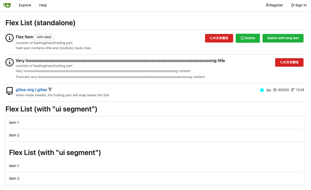
Align everything with a new layout.
* Use "baseline" for some special elements, the "flex-item-icon" is for
the issue list only at the moment and I think it should be general
enough now (but not using "flex-item-leading" anymore in this case).
* Make the labels stretch themselves.
|
| |
|
|
|
|
|
|
| |
Fix #26971
And the UI now will display it's scheduled but not triggered by a push.
<img width="954" alt="图片"
src="https://github.com/go-gitea/gitea/assets/81045/d211845c-457e-4c3e-af1f-a0d654d3f365">
|
| |
|
|
|
|
|
|
|
|
|
|
|
|
|
|
|
|
|
|
| |
1. There is already `gt-ac`, so no need to introduce `flex-item-center`
2. The `flex-item-baseline` and `.flex-item-icon svg { margin-top: 1px
}` seem to be a tricky patch, they don't resolve the root problem, and
still cause misalignment in some cases.
* The root problem is: the "icon" needs to align with the sibling
"title"
* So, make the "icon" and the "title" both have the same height
3. `flex-text-inline` could only be used if the element is really
"inline", otherwise its `vertical-align` would make the box size change.
In most cases, `flex-text-block` is good enough.

---------
Co-authored-by: silverwind <me@silverwind.io>
Co-authored-by: Giteabot <teabot@gitea.io>
|
| |
|
|
| |
- ~~Refactor `ActionType` to `models/activities/action_type.go`~~
- Replace the magic number in `feed.tmlp` with `InAction`
|
| |
|
|
|
|
|
|
|
|
|
| |
1. In many cases, the `flex-list` has previous and next `gt-hidden`
siblings, so relax the CSS selector to remove all ".segument .flex-list"
paddings.
2. Make the "Add key" button can toggle
3. Move help message into the related segment(panel). Otherwise users
would misread the message, eg: the SSH help seemed for GPG because they
are so near
4. Move modal element into the segment element, otherwise it affects the
layout
|
| |
|
| |
Same as #26903
|
| |
|
|
| |
The error is caused by the web page not handling the post form
failure, which is 400 bad requests in this case.
|
| |
|
|
|
| |
as title
Co-authored-by: Giteabot <teabot@gitea.io>
|
| |
|
|
| |
- Share code between web and api
- Add some tests
|
| |
|
|
|
|
|
|
|
|
|
|
|
| |
- Add routes for creating or updating a user's actions secrets in
`routers/api/v1/api.go`
- Add a new file `routers/api/v1/user/action.go` with functions for
creating or updating a user's secrets and deleting a user's secret
- Modify the `templates/swagger/v1_json.tmpl` file to include the routes
for creating or updating a user's secrets and deleting a user's secret
---------
Signed-off-by: Bo-Yi Wu <appleboy.tw@gmail.com>
Co-authored-by: KN4CK3R <admin@oldschoolhack.me>
|
| |
|
|
|
|
|
|
|
| |
I noticed that the code of several new webhook pages is highly
repetitive, so I pulled out the common parts to a new template, unified
reference, unified maintenance
---------
Co-authored-by: KN4CK3R <admin@oldschoolhack.me>
|
| |
|
|
|
|
|
|
|
|
|
| |
The changes for "commit-body" in #26877 are not ideal.
The reason is: the "commit-body" is usually a `<pre>`, it has default
margins. In most cases, we do not need that large margin. So, this PR
introduces a general but small margin for all "commit-body" elements.
Then these `gt-m-0` could be removed.
The `:not` selector is not needed, because the `.timeline-item` selector
is already clear enough.
|
| | |
|
| |
|
|
|
|
|
|
|
|
|
|
|
|
|
|
|
|
|
|
| |
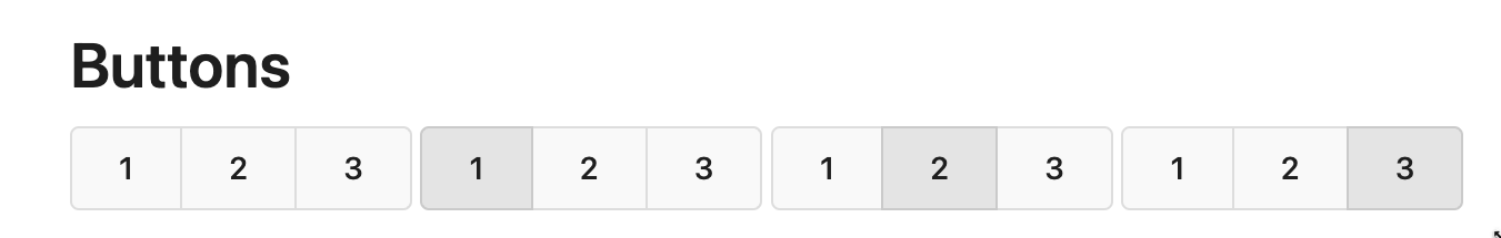
Replace #26850
Major changes:
1. Remove all `has` selectors, it is still not supported by firefox.
Actually there could be some more general and clearer approaches
2. Remove `two-toggle-buttons`, the `.ui.buttons` just works well
3. Rewrite the `.ui.buttons` border styles, see the screenshots
4. Remove the "fine-tuning" paddings from the the flex children, they
could layout themselves well.

|
| |
|
|
|
|
|
|
|
|
|
| |
before:

after:

Co-authored-by: KN4CK3R <admin@oldschoolhack.me>
|
| |
|
|
|
|
|
|
|
|
|
|
|
|
|
|
|
|
|
|
| |
The old code used complex `if` blocks and strange HTML layouts.
<details>

</details>
This PR refactors the template code and remove legacy CSS styles. The UI
doesn't change much.

|
| |
|
|
|
|
|
|
| |
1. The `og:description` should be "a one to two sentence description of
your object"
* It shouldn't output all the user inputted content -- it would be
pretty huge.
* Maybe it only needs at most 300 bytes.
2. Do not render commit message as HTML
|
| |
|
| |
Enable `H008 | Attributes should be double quoted` and fix issues.
|
| |
|
|
|
|
|
|
|
|
|
|
| |
Add more useful Open Graph metadata for commit and file URLs:
- Set `og:title` to the page title, which is a concise summary in both
cases (`<commit message> · <commit hash>` and `<filename> at <branch>`,
respectively)
- Set `og:description` to the commit message body, if available
- Set `og:url` to the relevant URLs instead of the repo URL
Also move the relevant meta tags into a separate template as they now
take up the majority of the base head template.
|
| |
|
|
|
|
|
|
| |
## Changes
- Forces flashed error to render immediately when forgot password code
is incorrect or has expired.
- Adds a link back to the `forgot_password` page so that the user can
restart the process (in the event that their link has expired)
|
| |
|
|
|
|
|
|
|
| |
Now that we have the `/assets` directory, we can put`licenses.txt`
directly into it instead of incorrect `/js` path which was previously
only done to avoid reserving a username.
---------
Co-authored-by: Giteabot <teabot@gitea.io>
|
| |
|
|
|
|
|
|
|
|
|
|
|
|
|
| |
- Modify the `CreateOrUpdateSecret` function in `api.go` to include a
`Delete` operation for the secret
- Modify the `DeleteOrgSecret` function in `action.go` to include a
`DeleteSecret` operation for the organization
- Modify the `DeleteSecret` function in `action.go` to include a
`DeleteSecret` operation for the repository
- Modify the `v1_json.tmpl` template file to update the `operationId`
and `summary` for the `deleteSecret` operation in both the organization
and repository sections
---------
Signed-off-by: Bo-Yi Wu <appleboy.tw@gmail.com>
|
| |
|
|
|
|
|
|
|
|
|
|
|
|
|
|
|
|
|
|
| |
Some small dashboard tweaks:
- Remove margin-bottom from divider so first item does not appear to
have un-equal margins
- Restore previous icon color
- Add slight margin-right to icon
Before:
<img width="783" alt="Screenshot 2023-08-31 at 00 10 28"
src="https://github.com/go-gitea/gitea/assets/115237/b75f70d7-8704-4afb-866d-fea0484c52d4">
After:
<img width="783" alt="Screenshot 2023-08-31 at 00 10 08"
src="https://github.com/go-gitea/gitea/assets/115237/50ed0c47-6f7c-449e-a054-13091369d43f">
---------
Co-authored-by: wxiaoguang <wxiaoguang@gmail.com>
|
| |
|
|
|
| |
Co-authored-by: Kyle D <kdumontnu@gmail.com>
Co-authored-by: Jonathan Tran <jonnytran@gmail.com>
|
| |
|
|
|
|
|
|
| |
1. Use `gt-invisible` instead of `invisible`.
2. Use `gt-word-break` instead of `dont-break-out` (there is a slight
different "hyphens", but I think it won't affect too much since it is
only used for the "full name").
3. Remove `.small.button:has(svg)` , now our buttons could layout SVG
correctly, and actually I didn't see this CSS class is used in code.
|
| |
|
|
|
|
|
|
|
|
|
|
|
|
|
|
|
|
|
|
|
|
|
|
|
|
|
|
|
|
|
|
|
|
|
| |
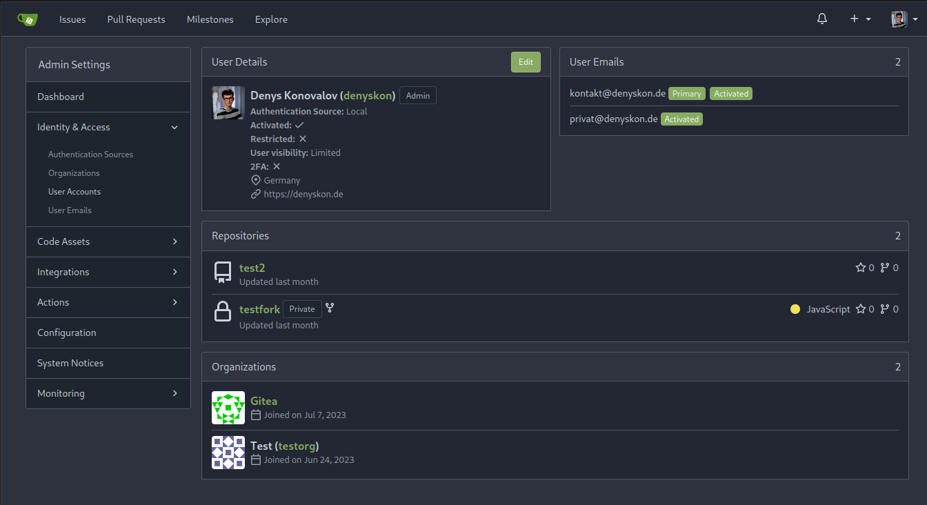
This PR implements a proposal to clean up the admin users table by
moving some information out to a separate user details page (which also
displays some additional information).
Other changes:
- move edit user page from `/admin/users/{id}` to
`/admin/users/{id}/edit` -> `/admin/users/{id}` now shows the user
details page
- show if user is instance administrator as a label instead of a
separate column
- separate explore users template into a page- and a shared one, to make
it possible to use it on the user details page
- fix issue where there was no margin between alert message and
following content on admin pages
<details>
<summary>Screenshots</summary>
</details>
Partially resolves #25939
---------
Co-authored-by: Giteabot <teabot@gitea.io>
|
| |
|
|
|
|
|
|
|
|
| |
Backtick syntax now works in repo description too. Also, I replaced the
CSS for this was a new single class, making it more flexible and not
dependent on a parent. Also, very slightly reduced font size from 16.8px
to 16px.
---------
Co-authored-by: wxiaoguang <wxiaoguang@gmail.com>
|
| |
|
|
|
|
|
|
|
|
|
|
|
| |
Each change is tested manually line by line. There are too many changes
so I can't share dozens of screenshots.
In short:
1. `ui right` could be still used in `ui top attached header`, because
there is a special case.
2. A lot of `ui right` are just no-op, so they can be removed safely.
3. Some of the `ui right` should be replaced by `gt-float-right` (to
avoid breaking, leave them to the future).
4. A few of the `ui right` could be rewritten by flex.
|
| | |
|
| |
|
|
|
|
|
|
|
|
|
|
|
|
|
|
|
|
|
|
|
|
|
|
|
|
| |
Replace #26761
It's better to keep children elements simple, and let parent containers
layout the necessary padding/margin.
The old `not(:last-child)` and `.flex-item + .flex-item` are not easy to
maintain (for example, what if the developer would like to use a "tiny
height" item?)
The old approach also makes some UI look strange because the first item
doesn't have proper padding-top.
In this PR, we just simply use `.flex-item { padding: ... }`:
* Developers could manually set the item height they want easily
* It's easier to make it work with various containers -- with padding
(`ui segment`) and without padding (`div`)
And added more samples/examples.
Co-authored-by: Giteabot <teabot@gitea.io>
|
