| Commit message (Collapse) | Author | Age | Files | Lines |
|---|
| ... | |
| |
|
|
|
|
|
|
|
| |
We are using `<a>` for commit status check icon with no link. So it is
clickable but this is no sense.
I think we can convert this to `div`.
Co-authored-by: Giteabot <teabot@gitea.io>
|
| |
|
|
|
|
|
|
|
|
|
|
|
|
|
| |
This commit assumes that the warning can be made more discreet
so as to make it less annoying for the people that do not actually
need the warning, without necessarily increasing the risk for those
that do need it.
This doesn't fix the underlying problem of the warning being shown
in certain cases that, say, a certain kind of whitespace character
like 0x1E could be absolutely justifiable from a technical
perspective.
---------
Co-authored-by: delvh <dev.lh@web.de>
|
| |
|
|
|
|
|
|
|
|
| |
together (#26265)
(cherry picked from commit 473862a1d599382ca022482e2e044025872d240b)
Refs: https://codeberg.org/forgejo/forgejo/pulls/1126
Co-authored-by: Louis Seubert <louis.seubert.ls@gmail.com>
Co-authored-by: Giteabot <teabot@gitea.io>
|
| |
|
|
|
|
|
|
|
|
|
|
|
|
|
|
|
|
|
|
|
|
|
|
|
|
|
|
|
|
|
|
|
|
|
|
|
|
|
|
|
|
| |
Allow users to edit the sync interval for existing push mirrors.
Currently, there is no way to modify the interval once the mirror is
created.
<details>
<summary>Screenshots</summary>
## Before
<img width="936" alt="Screenshot 2023-07-26 at 9 31 21 AM"
src="https://github.com/go-gitea/gitea/assets/80308335/35b8a40c-4320-474c-a866-1dea0f1fa0de">
## After
<img width="945" alt="Screenshot 2023-07-26 at 9 44 40 AM"
src="https://github.com/go-gitea/gitea/assets/80308335/ee12e12f-0f68-4feb-90eb-33366f5997d3">
### On hover
<img width="247" alt="image"
src="https://github.com/go-gitea/gitea/assets/80308335/2f32de45-bd50-4150-9623-3be2ef3ea7f8">
<img width="237" alt="image"
src="https://github.com/go-gitea/gitea/assets/80308335/49f4ab4d-ccff-4489-80ce-a9788a73c3bb">
<img width="245" alt="image"
src="https://github.com/go-gitea/gitea/assets/80308335/165fc888-9d48-438a-b730-d4beb12122af">
### Edit modal
<img width="905" alt="image"
src="https://github.com/go-gitea/gitea/assets/80308335/2a7ca24b-4f36-4e0e-9799-39f2ecc46413">
### Only valid times are allowed
<img width="728" alt="Screenshot 2023-07-26 at 9 50 01 AM"
src="https://github.com/go-gitea/gitea/assets/80308335/ced6d330-c235-4e29-8f17-28daddcf1444">
<img width="853" alt="image"
src="https://github.com/go-gitea/gitea/assets/80308335/8636f62a-70d1-4684-a3e8-b205adc03580">
</details>
Fixes #21295
---------
Co-authored-by: wxiaoguang <wxiaoguang@gmail.com>
|
| |
|
|
|
|
|
|
|
|
|
|
|
|
|
| |
Closes #26263
We have to pass the date without the time.
# Before
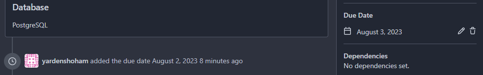
# After
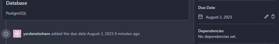
Signed-off-by: Yarden Shoham <git@yardenshoham.com>
|
| |
|
|
|
|
|
|
|
| |
Related to #26239
This PR makes some fixes:
- do not show the prompt for mirror repos and repos with pull request
units disabled
- use `commit_time` instead of `updated_unix`, as `commit_time` is the
real time when the branch was pushed
|
| |
|
|
|
|
|
|
|
|
|
|
|
|
|
|
|
|
|
|
|
|
|
|
|
|
|
|
|
|
|
|
|
|
|
|
|
|
|
|
|
|
|
|
|
|
|
|
|
|
|
|
|
|
|
|
|
|
|
|
|
|
|
|
|
|
|
|
|
|
|
|
|
|
|
| |
This PR introduces a new UI element type for Gitea called `flex-item`.
It consists of a horizontal card with a leading, main and trailing part:

The idea behind it is that in Gitea UI, we have many cases where we use
this kind of layout, but it is achieved in many different ways:
- grid layout
- `.ui.list` with additional hacky flexbox
- `.ui.key.list` - looks to me like a style set originally created for
ssh/gpg key list, was used in many other places
- `.issue.list` - created for issue cards, used in many other places
- ...
This new style is based on `.issue.list`, specifically the refactoring
of it done in #25750.
In this PR, the new element is introduced and lots of templates are
being refactored to use that style. This allows to remove a lot of
page-specific css, makes many of the elements responsive or simply
provides a cleaner/better-looking way to present information.
A devtest section with the new style is also available.
<details>
<summary>Screenshots (left: before, right: after)</summary>


</details>
---------
Co-authored-by: Giteabot <teabot@gitea.io>
|
| |
|
|
|
|
|
|
|
|
|
| |
Not too important, but I think that it'd be a pretty neat touch.
Also fixes some layout bugs introduced by a previous PR.
---------
Co-authored-by: Gusted <postmaster@gusted.xyz>
Co-authored-by: Caesar Schinas <caesar@caesarschinas.com>
Co-authored-by: wxiaoguang <wxiaoguang@gmail.com>
|
| |
|
|
| |
Fixes: https://github.com/go-gitea/gitea/issues/26241
|
| |
|
|
|
|
|
|
|
|
|
| |
Same as https://github.com/go-gitea/gitea/pull/26026 but for the user
settings page. It introduces a new `flex-container` class and shares it
across both pages.
Before and After:
<img width="1264" alt="Screenshot 2023-07-21 at 19 35 57"
src="https://github.com/go-gitea/gitea/assets/115237/1358dab4-55c0-40ce-a4d5-673099304f3d">
<img width="1269" alt="Screenshot 2023-07-21 at 19 35 42"
src="https://github.com/go-gitea/gitea/assets/115237/34812f6d-dc65-4009-b977-90e03efdc6d1">
|
| |
|
|
|
|
|
| |
This simply shows the Image size on the view page. This is useful, if
you search a image with a specific size.

|
| |
|
|
|
|
|
|
|
|
|
|
|
|
|
|
|
|
|
|
| |
I find the colored buttons in the issue sidebar distracting, given that
they are not primary actions, I think we can de-colorize them.
Before:
<img width="285" alt="Screenshot 2023-07-26 at 19 42 22"
src="https://github.com/go-gitea/gitea/assets/115237/7e784805-4e01-4199-94bb-0538a0130264">
<img width="288" alt="Screenshot 2023-07-26 at 19 43 06"
src="https://github.com/go-gitea/gitea/assets/115237/3a89c661-e24a-4ebf-a585-d404d0a6a78a">
<img width="285" alt="Screenshot 2023-07-26 at 19 44 36"
src="https://github.com/go-gitea/gitea/assets/115237/c1aa8c13-6f41-4763-8149-d1c07cb4be5c">:
After:
<img width="286" alt="Screenshot 2023-07-26 at 19 42 04"
src="https://github.com/go-gitea/gitea/assets/115237/74d640c2-e0ab-4fef-87aa-9e788e9010e2">
<img width="285" alt="Screenshot 2023-07-26 at 19 42 51"
src="https://github.com/go-gitea/gitea/assets/115237/3b69976a-9aa4-4e1c-8df3-4168f4a9fcf9">
<img width="286" alt="Screenshot 2023-07-26 at 19 45 15"
src="https://github.com/go-gitea/gitea/assets/115237/897222fd-4df2-4d99-98eb-e5f8fb77c4d6">
|
| |
|
|
|
|
|
|
|
|
|
|
|
|
|
|
| |
Resizing the comment editor can be a very expensive operation because it
triggers page reflows, which on large PRs can take upwards of seconds to
complete. Disable this mechanism on the diff page only where we know
that the page can get large.
Fixes https://github.com/go-gitea/gitea/issues/26201 for the textarea
editor.
I don't think this can be fixed for EasyMDE because as far as I can
tell, it exposes no option to disable this resizing.
---------
Co-authored-by: Giteabot <teabot@gitea.io>
|
| |
|
|
|
|
|
|
|
|
|
|
|
|
| |
as title
Fixes : #25825
Before
<img width="1334" alt="image"
src="https://github.com/go-gitea/gitea/assets/80308335/c54a41b0-39bd-4094-a956-081a8f4128f2">
After change
<img width="1340" alt="image"
src="https://github.com/go-gitea/gitea/assets/80308335/c112d235-6bbe-4bcb-9529-78da3ab0fa14">
Co-authored-by: Giteabot <teabot@gitea.io>
|
| |
|
|
|
| |
Fixed two incorrect headers for setting the page navigation bar:
* User settings page, should not use the title "`org.settings`"
* Repo settings page, should not use the title "`org.settings`"
|
| | |
|
| |
|
|
|
|
|
|
|
|
|
|
|
|
|
|
|
|
|
|
|
|
|
|
|
|
|
|
|
|
|
|
|
|
|
|
|
|
|
| |
This PR adds a new dropdown to select a commit or a commit range
(shift-click like github) of a Pull Request.
After selection of a commit only the changes of this commit will be shown.
When selecting a range of commits the diff of this range is shown.
This allows to review a PR commit by commit or by viewing only commit ranges.
The "Show changes since your last review" mechanism github uses is implemented, too.
When reviewing a single commit or a commit range the "Viewed" functionality is disabled.
## Screenshots
### The commit dropdown
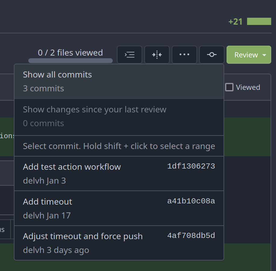
### Selecting a commit range

### Show changes of a single commit only
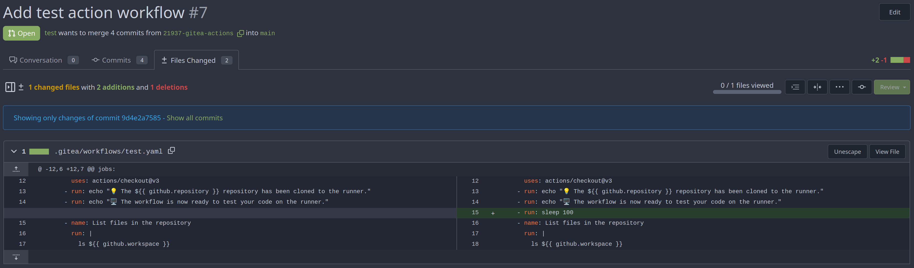
### Show changes of a commit range

Fixes https://github.com/go-gitea/gitea/issues/20989
Fixes https://github.com/go-gitea/gitea/issues/19263
---------
Co-authored-by: silverwind <me@silverwind.io>
Co-authored-by: KN4CK3R <admin@oldschoolhack.me>
Co-authored-by: wxiaoguang <wxiaoguang@gmail.com>
Co-authored-by: delvh <dev.lh@web.de>
|
| |
|
|
| |
Fixing the align center to row and space around for commit_page
template.
|
| |
|
|
|
|
|
|
|
|
|
|
|
|
|
|
|
|
|
|
|
|
| |
red (#26181)
Fix: https://github.com/go-gitea/gitea/issues/26152
Thease changes are related to UX and accessibility changes in desktop
mode.
<img width="50" alt="image"
src="https://github.com/go-gitea/gitea/assets/80308335/30a75b50-4f8d-4108-9219-2c69b2a8fa6f">
Also this is incomplete header
<img width="264" alt="image"
src="https://github.com/go-gitea/gitea/assets/80308335/87837076-dfc7-4a68-863a-795edf61eb02">
Lets add a tooltip if it is applicable or add `title` attribute so that
it will be clearly visible.
After
|
| |
|
|
|
|
|
|
|
|
|
|
|
|
|
|
|
|
|
|
|
|
|
| |
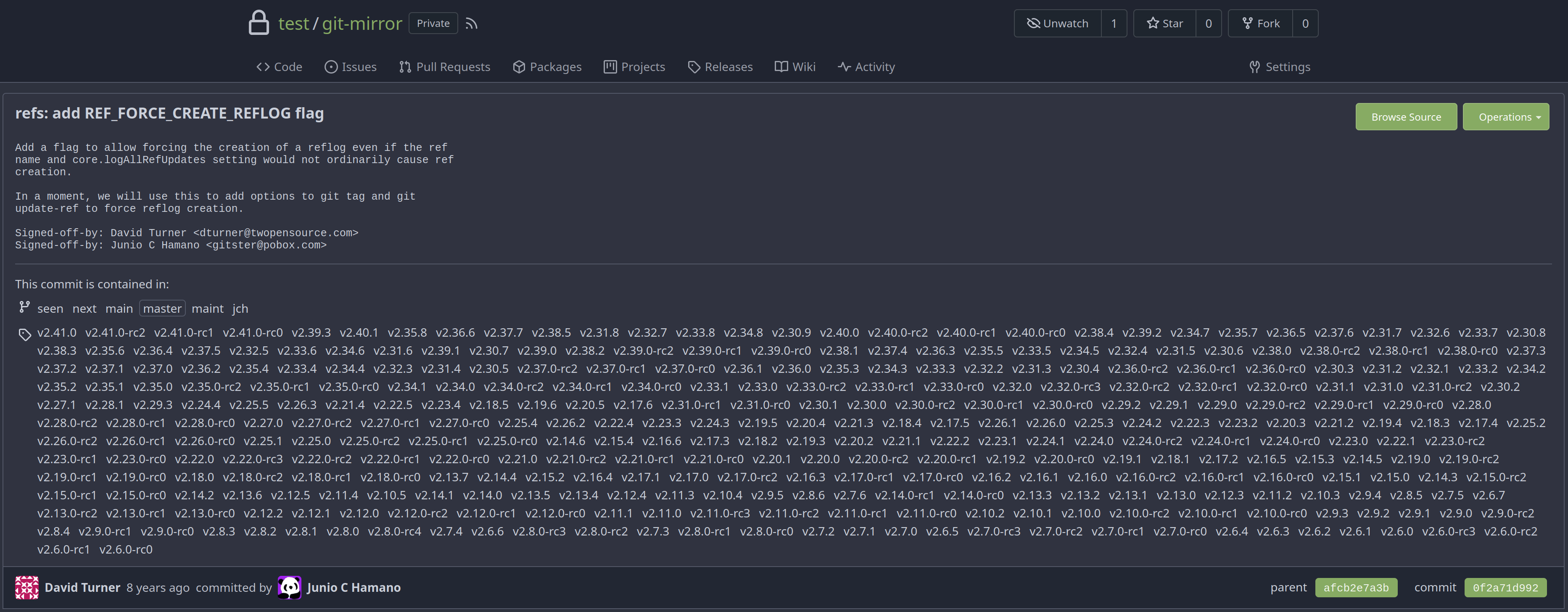
Now, you can see for a commit which existing branches and tags contain it.
You first have to click on the `load branches and tags` button, they are not preloaded by default.
All branches and tags are ordered descending by creation date.
You can even see without much hassle if the given commit is already part of the default branch.
Closes #25152
## Screenshots
### Initial
### Loaded
---------
Co-authored-by: silverwind <me@silverwind.io>
Co-authored-by: wxiaoguang <wxiaoguang@gmail.com>
|
| |
|
|
|
|
|
|
|
|
|
|
|
|
|
|
|
|
|
|
|
|
|
|
|
|
|
|
|
|
|
|
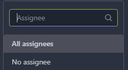
| |
Labels:
Before: (no highlights)
After:
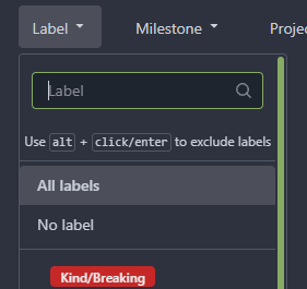

Projects:
Before: (no highlights)
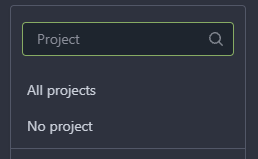
After:


Assignee:
Before: (no highlights)

After:

|
| |
|
|
|
|
|
|
|
| |
Before:

After:
|
| |
|
| |
close #26111
|
| |
|
|
|
|
|
|
|
|
|
|
|
| |
- The `NoBetterThan` function can only handle comparisons between
"pending," "success," "error," and "failure." For any other comparison,
we directly return false. This prevents logic errors like the one in
#26121.
- The callers of the `NoBetterThan` function should also avoid making
incomparable calls.
---------
Co-authored-by: yp05327 <576951401@qq.com>
Co-authored-by: puni9869 <80308335+puni9869@users.noreply.github.com>
|
| |
|
|
|
|
|
|
|
|
|
|
|
|
|
| |
(#26094)
This PR includes #26007 's changes but have a UI to prompt administrator
about the deprecated settings as well as the log or console warning.
Then users will have enough time to notice the problem and don't have
surprise like before.
<img width="1293" alt="图片"
src="https://github.com/go-gitea/gitea/assets/81045/c33355f0-1ea7-4fb3-ad43-cd23cd15391d">
---------
Co-authored-by: wxiaoguang <wxiaoguang@gmail.com>
|
| |
|
|
|
|
|
|
|
|
|
|
|
|
|
|
|
|
|
|
|
|
|
|
|
|
|
| |
Close #26104 . Only a quick fix, the UI is not perfect.
Before:
<details>
</details>
After:
<details>
</details>
|
| |
|
|
|
|
|
|
|
|
|
|
|
|
|
|
|
|
|
|
|
|
|
|
|
|
|
|
|
|
|
|
|
|
|
|
|
|
|
|
|
|
|
|
|
|
|
|
|
|
|
|
|
|
|
|
|
|
|
|
|
|
|
|
|
|
|
|
|
|
|
|
|
|
|
|
|
|
|
|
|
|
|
|
|
|
|
|
|
|
|
|
|
|
|
|
|
|
|
|
|
|
|
|
|
|
|
|
|
|
|
|
|
|
|
|
|
|
|
|
|
|
|
|
|
|
|
|
|
| |
Agenda:
This PR contains UI fixes for release tag page / wiki page /
subscription page.
Here is the list of changes made in this PR.
1. Release tag page
a. In the New Release page the whole ui got change. Now it is covering
in full page page with mobile view port. Description about the release
the editor preview now has a min-height. and the check boxes for
`Prerelease` and option are left aligned. Couple of divider are added.
2. Subscription page:
a. In the subscription page the ui was distorted in mobile view. Now its
fix. Couple of unused styles were removed.
3. Create Wiki page:-
a. In the page the preview of markdown is now contains a fix min-height
so this it will not distorted in desktop view and a divider is added
before action buttons. Couple of unused styles were removed.
# Before
## Release page
<img width="1391" alt="image"
src="https://github.com/go-gitea/gitea/assets/80308335/319dec2e-08cf-40c5-920a-d651930ee28e">
<img width="494" alt="image"
src="https://github.com/go-gitea/gitea/assets/80308335/03249f40-2d36-4552-bb93-43832aac2f8b">
<img width="1390" alt="image"
src="https://github.com/go-gitea/gitea/assets/80308335/bf8b2d31-4857-480b-abd9-66a3ae6e24d8">
<img width="484" alt="image"
src="https://github.com/go-gitea/gitea/assets/80308335/c3a58210-a337-4c8e-89a6-edb3975986bb">
Editor
<img width="958" alt="image"
src="https://github.com/go-gitea/gitea/assets/80308335/3bdd299d-d12b-4774-ace9-7184b1a57b18">
Editor preview
<img width="1293" alt="image"
src="https://github.com/go-gitea/gitea/assets/80308335/2b61c528-c018-4800-ab86-07aae56adecd">
<img width="484" alt="image"
src="https://github.com/go-gitea/gitea/assets/80308335/ff7bc5ee-9dc0-4f78-a0b1-94277ab27700">
#### After
<img width="1439" alt="image"
src="https://github.com/go-gitea/gitea/assets/80308335/94f7e073-5977-40bd-98ef-0711ed0815cc">
<img width="1384" alt="image"
src="https://github.com/go-gitea/gitea/assets/80308335/83e3105f-c1ee-4329-b90f-8bb724dac50f">
<img width="1440" alt="image"
src="https://github.com/go-gitea/gitea/assets/80308335/05f024a5-52eb-4072-8599-d6ca12f6fad1">
<img width="1387" alt="image"
src="https://github.com/go-gitea/gitea/assets/80308335/c73f069b-572a-4a13-aaa9-fc5b4dd3420d">
<img width="1440" alt="image"
src="https://github.com/go-gitea/gitea/assets/80308335/2f98f012-8e64-4a12-9595-5acdef18f85c">
Markdown preview change
<img width="1368" alt="image"
src="https://github.com/go-gitea/gitea/assets/80308335/31e583ec-48f6-4f1a-8b56-0164fcb127a5">
Wiki page
Before
<img width="1393" alt="image"
src="https://github.com/go-gitea/gitea/assets/80308335/9c9cfdf6-3c2a-4f47-883b-76624d96f9a0">
<img width="499" alt="image"
src="https://github.com/go-gitea/gitea/assets/80308335/522ad573-1ad2-4fa2-8bf7-48a3dded14e7">
Preview of mark down.
<img width="488" alt="image"
src="https://github.com/go-gitea/gitea/assets/80308335/998f3c25-9fca-43c8-b1ff-648aab291727">
Footer
<img width="490" alt="image"
src="https://github.com/go-gitea/gitea/assets/80308335/89c6cf4e-4599-4403-bac8-285efdd9361a">
After
<img width="1389" alt="image"
src="https://github.com/go-gitea/gitea/assets/80308335/1ee0fc72-f864-44c0-b2e4-e0e8a8470204">
<img width="498" alt="image"
src="https://github.com/go-gitea/gitea/assets/80308335/b35b9a5d-8e26-4869-a6ed-6cef1f4a87a6">
<img width="499" alt="image"
src="https://github.com/go-gitea/gitea/assets/80308335/b40bcbaa-fca6-42ab-9556-f950811b565d">
Preview tab block has min-height
<img width="1392" alt="image"
src="https://github.com/go-gitea/gitea/assets/80308335/4a53d6c2-596c-423a-91b1-533cef734f93">
Mobile view
<img width="496" alt="image"
src="https://github.com/go-gitea/gitea/assets/80308335/c5ffc4c9-3c21-4cad-bc32-2ea3f0644a08">
<img width="497" alt="image"
src="https://github.com/go-gitea/gitea/assets/80308335/08dd560f-4333-41ec-95b9-8154910d2254">
<img width="496" alt="image"
src="https://github.com/go-gitea/gitea/assets/80308335/9fba8f55-727b-4756-a4a6-2070c719b15b">
## Subscription page
### Before
<img width="1393" alt="image"
src="https://github.com/go-gitea/gitea/assets/80308335/0a7d561b-f56c-4ebe-93bd-952abecd437f">
<img width="492" alt="image"
src="https://github.com/go-gitea/gitea/assets/80308335/4dc44d0c-ea81-4130-8afb-8f271c029e8a">
After
<img width="1394" alt="image"
src="https://github.com/go-gitea/gitea/assets/80308335/a3567e30-2b5b-49d6-9ecb-2ab481ea4d36">
<img width="494" alt="image"
src="https://github.com/go-gitea/gitea/assets/80308335/024da9e2-dfc4-4672-95cc-a6ac034d9712">
<img width="508" alt="image"
src="https://github.com/go-gitea/gitea/assets/80308335/b748ecea-427c-4f8b-a1bf-08f82f9a42e6">
|
| |
|
|
|
|
| |
This problem occurs because in #25839, the warning status has been
removed, but there is something in the tmpl that hasn't been changed.
related #25839
close #26118
|
| |
|
|
|
| |
Fix #26101

|
| |
|
|
|
|
|
|
|
|
|
|
|
|
|
|
|
|
|
|
| |
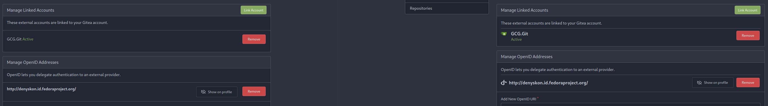
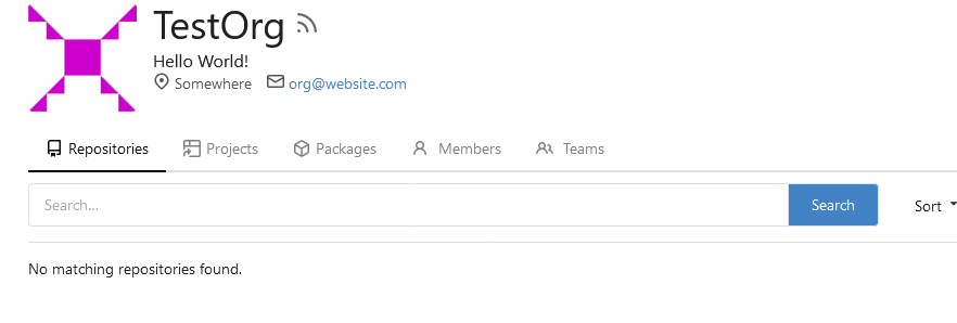
Resolves #25057
This adds a E-Mail field to Organisations. The E-Mail is just shown on
the Profile when it is visited by a logged in User. The E-mail is not
used for something else.
**Screenshots:**

---------
Co-authored-by: Denys Konovalov <kontakt@denyskon.de>
Co-authored-by: Denys Konovalov <privat@denyskon.de>
Co-authored-by: wxiaoguang <wxiaoguang@gmail.com>
Co-authored-by: Giteabot <teabot@gitea.io>
|
| |
|
| |
close #26079
|
| |
|
|
|
|
|
|
|
|
|
|
|
|
|
|
|
|
|
|
|
|
|
|
|
|
|
|
|
|
|
|
|
|
|
|
| |
This PR reorganize and categorize the admin settings sidebar panel into
groups:
- User Accounts, User Emails, Organizations, Authentication Sources ->
Identity & Access
- Repositories, Packages -> Code Assets
- Webhooks, Applications -> Integrations
Before:
<img width="1346" alt="Screen Shot 2023-07-21 at 10 30 28"
src="https://github.com/go-gitea/gitea/assets/17645053/e0c5ae83-464f-4aaa-8bab-2c5258c9278d">
After:
all configurable settings enabled (package, oauth, webhook)
<img width="1153" alt="Screen Shot 2023-07-21 at 10 27 30"
src="https://github.com/go-gitea/gitea/assets/17645053/88acf3f5-0623-4307-8654-69c654d80874">
all configurable settings disabled (package, oauth, webhook)
<img width="1391" alt="Screen Shot 2023-07-21 at 10 25 19"
src="https://github.com/go-gitea/gitea/assets/17645053/9e13aa60-e75c-4077-afd6-3da9e0ae18dd">
only oauth enabled
<img width="1323" alt="Screen Shot 2023-07-21 at 10 26 23"
src="https://github.com/go-gitea/gitea/assets/17645053/ce4f9ec0-b141-4d5e-ac13-46d001724dc5">
only webhook enabled
<img width="1350" alt="Screen Shot 2023-07-21 at 10 26 55"
src="https://github.com/go-gitea/gitea/assets/17645053/702491bd-083e-44fa-82bc-52c4571e54ac">
|
| |
|
| |
Fix #26060
|
| |
|
|
|
|
|
|
|
|
|
|
|
| |
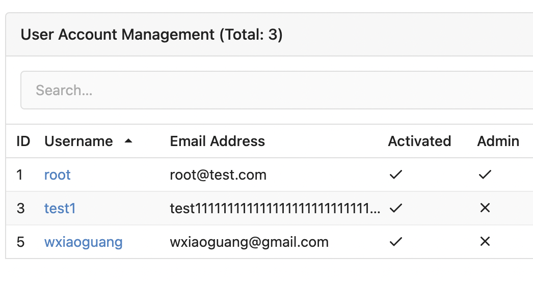
Some "text truncate email" code were just copied&pasted, they are not
suitable for most admin tables.
For the table layouts, some "max-width" helpers could be very helpful.
At least, we can get rid of the confusing "email" CSS class.

|
| |
|
|
|
|
|
|
|
|
|
|
|
|
|
|
|
|
|
|
|
|
|
|
|
|
|
|
|
|
|
|
|
|
|
|
|
|
|
|
|
|
|
|
|
|
|
|
|
| |
- Send request to get branch/tag list, use loading icon when waiting for
response.
- Only fetch when the first time branch/tag list shows.
- For backend, removed assignment to `ctx.Data["Branches"]` and
`ctx.Data["Tags"]` from `context/repo.go` and passed these data wherever
needed.
- Changed some `v-if` to `v-show` and used native `svg` as mentioned in
https://github.com/go-gitea/gitea/pull/25719#issuecomment-1631712757 to
improve perfomance when there are a lot of branches.
- Places Used the dropdown component:
Repo Home Page
<img width="1429" alt="Screen Shot 2023-07-06 at 12 17 51"
src="https://github.com/go-gitea/gitea/assets/17645053/6accc7b6-8d37-4e88-ae1a-bd2b3b927ea0">
Commits Page
<img width="1431" alt="Screen Shot 2023-07-06 at 12 18 34"
src="https://github.com/go-gitea/gitea/assets/17645053/2d0bf306-d1e2-45a8-a784-bc424879f537">
Specific commit -> operations -> cherry-pick
<img width="758" alt="Screen Shot 2023-07-06 at 12 23 28"
src="https://github.com/go-gitea/gitea/assets/17645053/1e557948-3881-4e45-a625-8ef36d45ae2d">
Release Page
<img width="1433" alt="Screen Shot 2023-07-06 at 12 25 05"
src="https://github.com/go-gitea/gitea/assets/17645053/3ec82af1-15a4-4162-a50b-04a9502161bb">
- Demo
https://github.com/go-gitea/gitea/assets/17645053/d45d266b-3eb0-465a-82f9-57f78dc5f9f3
- Note:
UI of dropdown menu could be improved in another PR as it should apply
to more dropdown menus.
Fix #14180
---------
Co-authored-by: silverwind <me@silverwind.io>
Co-authored-by: wxiaoguang <wxiaoguang@gmail.com>
|
| |
|
|
|
|
|
|
| |
Also added comments so the next time the dashboard repo list won't be
forgotten
Follows #25839
Signed-off-by: Yarden Shoham <git@yardenshoham.com>
|
| |
|
|
|
|
|
|
|
|
|
|
|
|
|
|
|
|
|
|
|
|
| |
Fix #25776. Close #25826.
In the discussion of #25776, @wolfogre's suggestion was to remove the
commit status of `running` and `warning` to keep it consistent with
github.
references:
-
https://docs.github.com/en/rest/commits/statuses?apiVersion=2022-11-28#about-commit-statuses
## :warning: BREAKING :warning:
So the commit status of Gitea will be consistent with GitHub, only
`pending`, `success`, `error` and `failure`, while `warning` and
`running` are not supported anymore.
---------
Co-authored-by: Jason Song <i@wolfogre.com>
|
| |
|
| |
Fix #14303
|
| |
|
|
|
|
|
|
|
|
| |
Reduce margins around admin boxes and reduce sidebar size from 275px to
240px. This is the same 16px margin we use on issue pages.
Before and After:
<img width="1270" alt="Screenshot 2023-07-21 at 00 28 11"
src="https://github.com/go-gitea/gitea/assets/115237/f9b0dcb0-8f7e-49b4-b130-54bf31c142fd">
<img width="1271" alt="Screenshot 2023-07-21 at 00 30 51"
src="https://github.com/go-gitea/gitea/assets/115237/ddd75d59-9ab9-4061-8989-852e89727560">
|
| | |
|
| |
|
|
|
|
|
|
|
| |
After RPM is supported with https://github.com/go-gitea/gitea/pull/23380
let's show the user
how to add the repo and install the RPM via all common package managers.
---------
Co-authored-by: Giteabot <teabot@gitea.io>
|
| |
|
|
|
|
|
|
|
|
| |
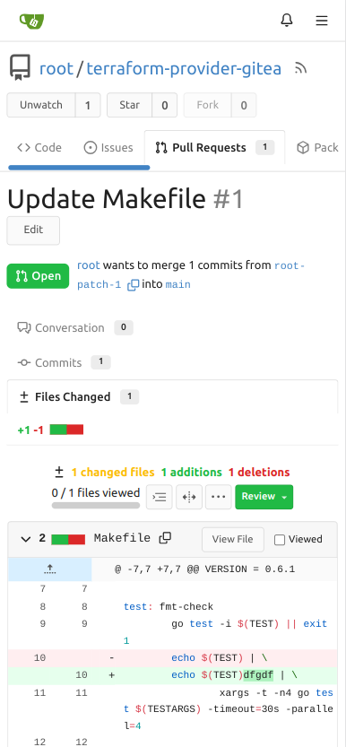
(#25831)
#16205 To obtain a closer behavior to the api from github, the status
(added, modified, removed) of a file should be available in addition to
the filename.
See github doc :
https://docs.github.com/fr/rest/commits/commits?apiVersion=2022-11-28#get-a-commit
|
| |
|
|
|
|
|
|
|
|
|
|
| |
Update WorkPath/WORK_PATH related documents, remove out-dated
information.
Remove "StaticRootPath" on the admin config display page, because few
end user really need it, it only causes misconfiguration.

Co-authored-by: Giteabot <teabot@gitea.io>
|
| |
|
|
|
|
|
|
|
|
|
|
|
|
|
| |
Before: the concept "Content string" is used everywhere. It has some
problems:
1. Sometimes it means "base64 encoded content", sometimes it means "raw
binary content"
2. It doesn't work with large files, eg: uploading a 1G LFS file would
make Gitea process OOM
This PR does the refactoring: use "ContentReader" / "ContentBase64"
instead of "Content"
This PR is not breaking because the key in API JSON is still "content":
`` ContentBase64 string `json:"content"` ``
|
| |
|
|
|
|
|
|
|
|
|
|
|
|
|
|
|
|
|
|
|
|
|
|
|
|
| |
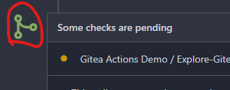
With the introduction of Actions, the pending commit icon has changed
from yellow to grey for Drone integrations which never set the "running"
status, so it stays in "pending" until completion.
I find it better to have this icon colored like on 1.19. Now both the
"pending" and "running" icons look the same, but I guess we could add an
animation to the "running" state similar to GitHub has to it later.
Before:
<img width="339" alt="Screenshot 2023-07-17 at 19 14 19"
src="https://github.com/go-gitea/gitea/assets/115237/2f4886e4-74fd-42ea-b59e-9af8f141bf1f">
After:
<img width="335" alt="Screenshot 2023-07-17 at 19 14 30"
src="https://github.com/go-gitea/gitea/assets/115237/53189642-e72d-47f6-9cbe-f14eda28f730">
Also, it matches GH's icon:
<img width="466" alt="image"
src="https://github.com/go-gitea/gitea/assets/115237/5804ff90-d223-4a3c-8093-7a9abbaacf87">
---------
Co-authored-by: delvh <dev.lh@web.de>
|
| |
|
|
|
|
|
|
|
|
|
|
|
|
|
|
|
|
| |
New/Edit Project page consistent layout. Fix margin on the new/edit
page.
Before:
<img width="1381" alt="image"
src="https://github.com/go-gitea/gitea/assets/80308335/303e128c-0bd0-4289-a395-ff077e33b1c8">
<img width="1392" alt="image"
src="https://github.com/go-gitea/gitea/assets/80308335/d11f7a42-ddf4-4c0a-a1b1-b8cefca9dfa1">
After
<img width="1390" alt="image"
src="https://github.com/go-gitea/gitea/assets/80308335/8ae1a979-9050-4d68-8f5d-9dfaa620c0e8">
<img width="1391" alt="image"
src="https://github.com/go-gitea/gitea/assets/80308335/24a62711-dc0a-4425-bf84-7c1896b9a005">
Co-authored-by: silverwind <me@silverwind.io>
|
| |
|
|
|
|
|
|
| |
Use a real button and add an aria-label.
Additionally, show the button whenever it is focused.
See https://codeberg.org/forgejo/forgejo/issues/998 for explanation.
Our handling of this button is now equal to that of GitHub.
Nothing has changed visually.
|
| |
|
|
|
|
|
|
|
|
|
|
|
|
|
|
|
|
|
|
| |
Release count is not correct:
https://try.gitea.io/yp05327/testrepo/tags

https://try.gitea.io/yp05327/testrepo/releases

https://try.gitea.io/yp05327/testrepo/releases/tag/testtag

We already have correct release count, no need to calculate it again.
https://github.com/go-gitea/gitea/blob/c5e187c389b35b9e080a3187b93a775a3c81e585/modules/context/repo.go#L547
Co-authored-by: Giteabot <teabot@gitea.io>
|
| |
|
|
|
|
|
|
|
|
|
|
|
|
| |
Before:

emmm, don't know how to write a good title to describe this issue.
If you have a good idea, I can change the title.
The fix code is copied from L122. Not sure it is right or not.
@lunny
Maybe `DefaultBranchBranch` is also typo?
Two `Branch` in variable name .
|
| |
|
|
|
|
|
|
|
|
|
|
|
|
|
| |
the stacking takes up screen space - display the tabs as the navigation
bar. github uses the same layout.
Screenshots (left before, right after):

Large screen:

|
