| Commit message (Collapse) | Author | Age | Files | Lines |
|---|
| ... | |
| |
|
|
|
| |
As title
Fix #27369
Regression of #27265
|
| |
|
|
|
|
|
|
|
|
|
|
| |
This PR adds a separated column in the users table for operations. The
username link now redirects back to user page.

Resolves
https://github.com/go-gitea/gitea/pull/26713#pullrequestreview-1603001285
Co-authored-by: silverwind <me@silverwind.io>
|
| |
|
|
|
|
|
|
|
|
|
|
|
|
|
|
|
| |
Various improvements related to feeds:
- Fix markdown rendering
- Increase font size from 13px to default 14px via `flex-item`
- Add style to hashes
- Move the timestamp to title line. I realize it's not optimal for
translation, we may need to change all these translations
Before:
<img width="768" alt="Screenshot 2023-09-29 at 22 52 58"
src="https://github.com/go-gitea/gitea/assets/115237/edda8b84-23cf-4a43-90ad-a892798f4e6c">
After:
<img width="781" alt="Screenshot 2023-09-29 at 22 58 09"
src="https://github.com/go-gitea/gitea/assets/115237/7097474d-efcf-4f22-a2ab-834a4e25c4e8">
|
| |
|
| |
Fix #27361
|
| |
|
| |
Co-authored-by: delvh <dev.lh@web.de>
|
| |
|
|
|
|
|
| |
Part of #27065
This PR touches functions used in templates. As templates are not static
typed, errors are harder to find, but I hope I catch it all. I think
some tests from other persons do not hurt.
|
| |
|
|
|
|
|
|
|
|
|
|
|
|
|
|
|
|
|
|
|
|
|
|
|
| |
Before:

After:

In Github:
https://github.com/yp05327/test/blob/main/test.drawio
Updated:
UI changed


---------
Co-authored-by: wxiaoguang <wxiaoguang@gmail.com>
Co-authored-by: delvh <dev.lh@web.de>
Co-authored-by: Lunny Xiao <xiaolunwen@gmail.com>
|
| |
|
|
|
|
|
|
|
|
|
|
|
|
|
|
| |
Fixes #25117
Add UI for choosing branch to fork
Change default branch on single-branch forks

---------
Co-authored-by: Denys Konovalov <kontakt@denyskon.de>
Co-authored-by: Lunny Xiao <xiaolunwen@gmail.com>
Co-authored-by: wxiaoguang <wxiaoguang@gmail.com>
|
| |
|
|
|
|
|
|
|
|
|
|
|
|
|
|
|
|
| |
Close #26730
1. The `diff-detail-box` was abused, it shouldn't be used for
"DiffFileList/DiffFileTree".
2. Fix the sticky position for various screens.


|
| |
|
|
|
|
|
|
|
|
|
|
|
| |
1. Put the `"octicon-shield-lock"` into the flex container, then it
doesn't need a separate flex box
2. Remove some unnecessary `gt-df` helpers
3. Make `btn` button has the same flex behavior as `ui button`


|
| | |
|
| |
|
|
|
| |
the divider should always display in the subscription page.
Co-authored-by: techknowlogick <techknowlogick@gitea.com>
|
| | |
|
| |
|
|
|
| |
Fix #27223
Regression of #27122
|
| | |
|
| | |
|
| |
|
|
|
|
|
|
|
|
|
|
|
|
|
|
|
|
|
|
|
|
|
|
|
|
|
|
| |
inactive (#27211)
These buttons are now disabled when the webhook is not active.
The buttons were always enabled before this change.
- Fixes #26824
- Replaces #26814
# Before


# After


Signed-off-by: Yarden Shoham <git@yardenshoham.com>
|
| |
|
|
|
|
|
|
|
|
|
| |
It seems that `Public` user visibility is missing in the template.
Before:

After:

|
| |
|
|
|
|
|
|
|
|
|
|
|
|
|
|
|
|
|
|
|
|
|
|
|
|
| |
The `.new-menu` was using a pseudo-element based fade-out effect.
Replace this with a more modern mask-based effect which in this case
required a child element to avoid fading out the background as well, so
I applied it to child `new-menu-inner` which was present on all these
menus except explore where I added it.
There is no visual difference except that the items on the explore page
have no `gap` between them any longer, making it consistent with other
menus. Before and after:
<img width="221" alt="Screenshot 2023-09-21 at 21 13 19"
src="https://github.com/go-gitea/gitea/assets/115237/b4a38ce2-cee1-4c54-84a5-e1d0bfd79e29">
<img width="222" alt="Screenshot 2023-09-21 at 21 32 36"
src="https://github.com/go-gitea/gitea/assets/115237/bb6b1335-d935-4ad4-bb85-3b0fc3027c2b">
Also, this cleans up the related CSS vars:
- `--color-header-wrapper-transparent` is removed, no longer needed
- `--color-header-wrapper` is defined in base theme as well, was
previously unset and therefor transparent.
[no whitespace
diff](https://github.com/go-gitea/gitea/pull/27181/files?diff=unified&w=1)
[demo of mask fade](https://jsfiddle.net/silverwind/tsfadb3u/)
|
| | |
|
| |
|
|
|
|
|
|
|
| |
Fixes https://github.com/go-gitea/gitea/issues/27136.
This does the following for Monaco's EOL setting:
1. Use editorconfig setting if present
2. Use the file's dominant line ending as detected by monaco, which uses
LF for empty file
|
| |
|
| |
Fixes #27202
|
| |
|
|
|
|
|
|
|
|
| |
- switch from some weird status badge to label
- translate untranslated `Reset registration token` string
- change documentation link from act_runner README to Gitea Docs site
- fix "No runners available" message width
- use `ctx.Locale.Tr` where possible

|
| |
|
|
|
| |
Fix #27224
And add the case to the devtest page.
|
| |
|
|
|
|
|
|
|
|
|
|
|
|
|
|
|
| |
I noticed, that the push mirrors endpoint, is the only endpoint which
returns the times in long format rather than as time.Time().
I think the behavior should be consistent across the project.
----
## ⚠️ BREAKING ⚠️
This PR changes the time format used in API responses for all
push_mirror endpoints which return a push mirror.
---------
Co-authored-by: Giteabot <teabot@gitea.io>
|
| |
|
|
|
| |
(#27193)
Fixes https://codeberg.org/Codeberg/Community/issues/1303
|
| |
|
| |
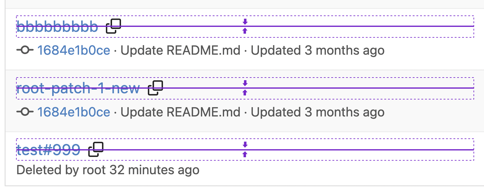
fix underline for label on issue sidebar
|
| | |
|
| |
|
|
|
|
| |
According to https://fomantic-ui.com/modules/dropdown.html and our
"devtest" page, many dropdown elements has incorrect "icon" position.
This PR fixes all of them. Fix #27173
|
| |
|
| |
same as (https://github.com/go-gitea/gitea/pull/26910)
|
| |
|
|
|
|
|
|
|
|
|
|
|
|
|
|
|
|
| |
Before, 20px:
<img width="474" alt="Screenshot 2023-09-19 at 00 10 05"
src="https://github.com/go-gitea/gitea/assets/115237/4bed4edb-219d-4844-9d3c-0d747033b09f">
After, 28px:
<img width="576" alt="Screenshot 2023-09-19 at 00 20 40"
src="https://github.com/go-gitea/gitea/assets/115237/f482ac09-38ae-4c84-80d9-0bd39b7f9772">
Dropdown in account settings is unchanged at 20px:
<img width="157" alt="Screenshot 2023-09-19 at 00 09 11"
src="https://github.com/go-gitea/gitea/assets/115237/9c998cdf-eeed-4118-9262-664faaa56092">
---------
Co-authored-by: Giteabot <teabot@gitea.io>
|
| |
|
|
|
|
|
|
|
|
|
|
|
|
|
|
|
|
|
|
|
|
|
|
| |
I think it's better if the primary actions have primary color instead of
green which fits better into the overall single-color UI design. This PR
currently replaces every green button with primary:
<img width="141" alt="Screenshot 2023-09-16 at 14 07 59"
src="https://github.com/go-gitea/gitea/assets/115237/843c1e50-4fb2-4ec6-84ba-0efb9472dcbe">
<img width="161" alt="Screenshot 2023-09-16 at 14 07 51"
src="https://github.com/go-gitea/gitea/assets/115237/9442195a-a3b2-4a42-b262-8377d6f5c0d1">
Modal actions now use uncolored/primary instead of previous green/red
colors. I also removed the box-shadow on all basic buttons:
<img width="259" alt="Screenshot 2023-09-16 at 14 16 39"
src="https://github.com/go-gitea/gitea/assets/115237/5beea529-127a-44b0-8d4c-afa7b034a490">
<img width="261" alt="Screenshot 2023-09-16 at 14 17 42"
src="https://github.com/go-gitea/gitea/assets/115237/4757f7b2-4d46-49bc-a797-38bb28437b88">
The change currently includes the "Merge PR" button, for which we might
want to make an exception to match the icon color there:
<img width="442" alt="Screenshot 2023-09-16 at 14 33 53"
src="https://github.com/go-gitea/gitea/assets/115237/993ac1a5-c94d-4895-b76c-0d872181a70b">
|
| |
|
|
|
|
|
|
|
| |
Regression of #26713
After #26713 , the base path of user edit has been changed to
`/admin/users/{userid}/edit`
## Before
https://github.com/go-gitea/gitea/assets/50507092/5f4a3f64-fe2b-4499-b110-e01c9d87ea19
|
| |
|
|
|
|
|
|
|
|
|
|
|
|
| |
Follow up https://github.com/go-gitea/gitea/pull/26741
Changes:
Added archived label for org labels and added into issue filter list.
Part of https://github.com/go-gitea/gitea/issues/25237
---------
Signed-off-by: puni9869 <punitinani1@hotmail.com>
Co-authored-by: silverwind <me@silverwind.io>
|
| |
|
|
|
|
|
|
| |
Follow Remove polluted .ui.right #26825
Remove more `gt-float-right`, remove unnecessary helpers, remove
negative margin tricks.

|
| |
|
|
|
|
|
|
|
| |
Fix #26234
close #26323
close #27040
---------
Co-authored-by: silverwind <me@silverwind.io>
|
| |
|
|
|
|
|
|
|
| |
Resolve #25233
<img width="1315" alt="图片"
src="https://github.com/go-gitea/gitea/assets/81045/3ba59b58-471a-4e1b-985c-87edac2268c0">
<img width="1297" alt="图片"
src="https://github.com/go-gitea/gitea/assets/81045/b6caa12f-323b-4f70-9c44-ef91cb71a26c">
|
| |
|
|
|
|
|
|
|
|
|
|
|
|
|
|
|
| |
Closes #26329
This PR adds the ability to ignore revisions specified in the
`.git-blame-ignore-revs` file in the root of the repository.

The banner is displayed in this case. I intentionally did not add a UI
way to bypass the ignore file (same behaviour as Github) but you can add
`?bypass-blame-ignore=true` to the url manually.
---------
Co-authored-by: wxiaoguang <wxiaoguang@gmail.com>
|
| |
|
|
|
| |
This PR adds a new field `RemoteAddress` to both mirror types which
contains the sanitized remote address for easier (database) access to
that information. Will be used in the audit PR if merged.
|
| |
|
| |
A bit more performant when we only use it for appending strings.
|
| |
|
|
|
|
|
|
|
|
| |
Follow #24026
<img width="1049" alt="图片"
src="https://github.com/go-gitea/gitea/assets/81045/d3fc5159-b5e7-411a-b6f8-4a111a027e6b">
---------
Co-authored-by: delvh <dev.lh@web.de>
|
| |
|
| |
Fix #27008
|
| |
|
|
|
|
|
|
|
|
|
|
|
|
|
|
|
|
| |
Before:

After:

---
1. **Remove the scroll bar exception that in the a tag**
2. **Reduce the actual width of the a tag to the actual width of the
content**

As shown in the screenshot, the red box area should not be clickable
|
| |
|
|
|
|
|
|
| |
Fix #19809
---------
Signed-off-by: Dmitry Sharshakov <d3dx12.xx@gmail.com>
Co-authored-by: jackHay22 <jack@allspice.io>
|
| |
|
|
|
|
|
|
|
|
|
|
|
|
| |
Hello,
The current package guide for cargo gives you only the git index, with
the HTTP Index stabilized being used as default for crates.io and being
better for most use-cases.
However, it's not documented that gitea supports the sparse spec, and it
does not require the _crates-index git repo for the sparse api.
I personally think we should push users to use the sparse instead of the
git repository. (Even let users disable crates-index repos if they only
want to use sparse)
|
| |
|
|
|
| |
Most middleware throw a 404 in case something is not found e.g. a Repo
that is not existing. But most API endpoints don't include the 404
response in their documentation. This PR changes this.
|
| |
|
|
|
|
|
|
|
|
|
|
|
|
|
| |
* Fix a regression from #26809 (the `data-org` is missing)
* Remove unnecessary style
Screenshots:


|
| |
|
|
| |
Fixes #24327 to avoid the sort icon changing the table header over
multiple lines and adds missing sort icons on the runners page.
|
| |
|
|
|
|
|
|
|
|
|
| |
Close #27012
By the way, rename the single-word ID to a long ID.


|
| |
|
|
|
|
|
|
|
|
|
| |
Before:
* The layout is quite complex
* The UI flickers when switch the stats (https://try.gitea.io/)
After:
* Simplify the code
* The UI doesn't flicker
|
