| Commit message (Collapse) | Author | Age | Files | Lines |
|---|
| |
|
|
|
|
|
|
|
|
|
|
|
|
|
|
|
|
|
|
|
|
|
|
|
|
|
|
|
|
|
|
|
|
|
| |
I've heard many reports of users getting scared when they see their own
email address for their own profile, as they believe that the email
field is also visible to other users. Currently, using Incognito mode
or going over the Settings is the only "reasonable" way to verify this
from the perspective of the user.
A locked padlock should be enough to indicate that the email is not
visible to anyone apart from the user and the admins. An unlocked
padlock is used if the email address is only shown to authenticated
users.
Some additional string-related changes in the Settings were introduced
as well to ensure consistency, and the comments in the relevant tests
were improved so as to allow for easier modifications in the future.
---
#### Screenshot (EDIT: Scroll down for more up-to-date screenshots)
***Please remove this section before merging.***

This lock should only appear if the email address is explicitly hidden
using the `Hide Email Address` setting. The change was originally tested
on top of and designed for the Forgejo fork, but I don't expect any
problems to arise from this and I don't think that a
documentation-related change is strictly necessary.
---------
Co-authored-by: silverwind <me@silverwind.io>
|
| |
|
|
|
|
|
|
|
|
|
|
|
|
|
| |
Fix regression from https://github.com/go-gitea/gitea/pull/23578. Only
visible on arc-green.
Before:
<img width="997" alt="Screenshot 2023-03-27 at 19 14 21"
src="https://user-images.githubusercontent.com/115237/228016589-e7cabfb9-bfd0-45fd-9407-6b76c665ed1a.png">
After:
<img width="1000" alt="Screenshot 2023-03-27 at 19 14 05"
src="https://user-images.githubusercontent.com/115237/228016600-db2e6002-4e2c-4d18-8393-9d7e1f525acb.png">
Fixes: https://github.com/go-gitea/gitea/issues/20625
Fixes: https://github.com/go-gitea/gitea/issues/23718
|
| |
|
|
|
|
|
|
|
|
|
|
|
|
|
| |
https://github.com/go-gitea/gitea/pull/22687 has discolored the repo tab
labels. This does the same for PR tabs for consistency. Value `0` is
still rendered like before.
Before:
<img width="502" alt="Screenshot 2023-04-06 at 19 35 24"
src="https://user-images.githubusercontent.com/115237/230454329-db6244ff-7d7e-4a2f-9240-f618a1c57f8c.png">
After:
<img width="497" alt="Screenshot 2023-04-06 at 19 35 07"
src="https://user-images.githubusercontent.com/115237/230454321-a0be6551-8c31-45e4-a1fb-ffc0d85d87bf.png">
<img width="497" alt="Screenshot 2023-04-06 at 19 38 37"
src="https://user-images.githubusercontent.com/115237/230454570-2fe2aa67-dfa7-4b2e-8c04-8dd40e6e99fc.png">
|
| |
|
|
|
|
|
|
|
|
|
|
|
|
|
|
|
|
|
|
|
|
|
|
|
|
|
|
|
|
|
|
|
|
|
|
|
|
|
|
|
| |
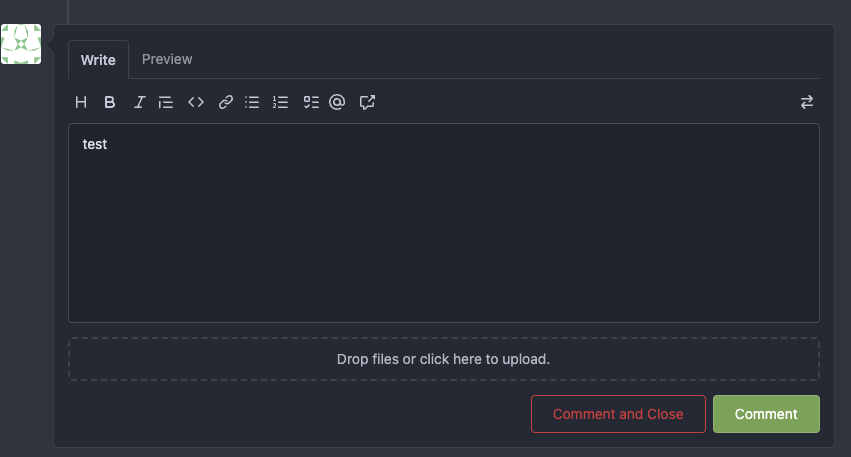
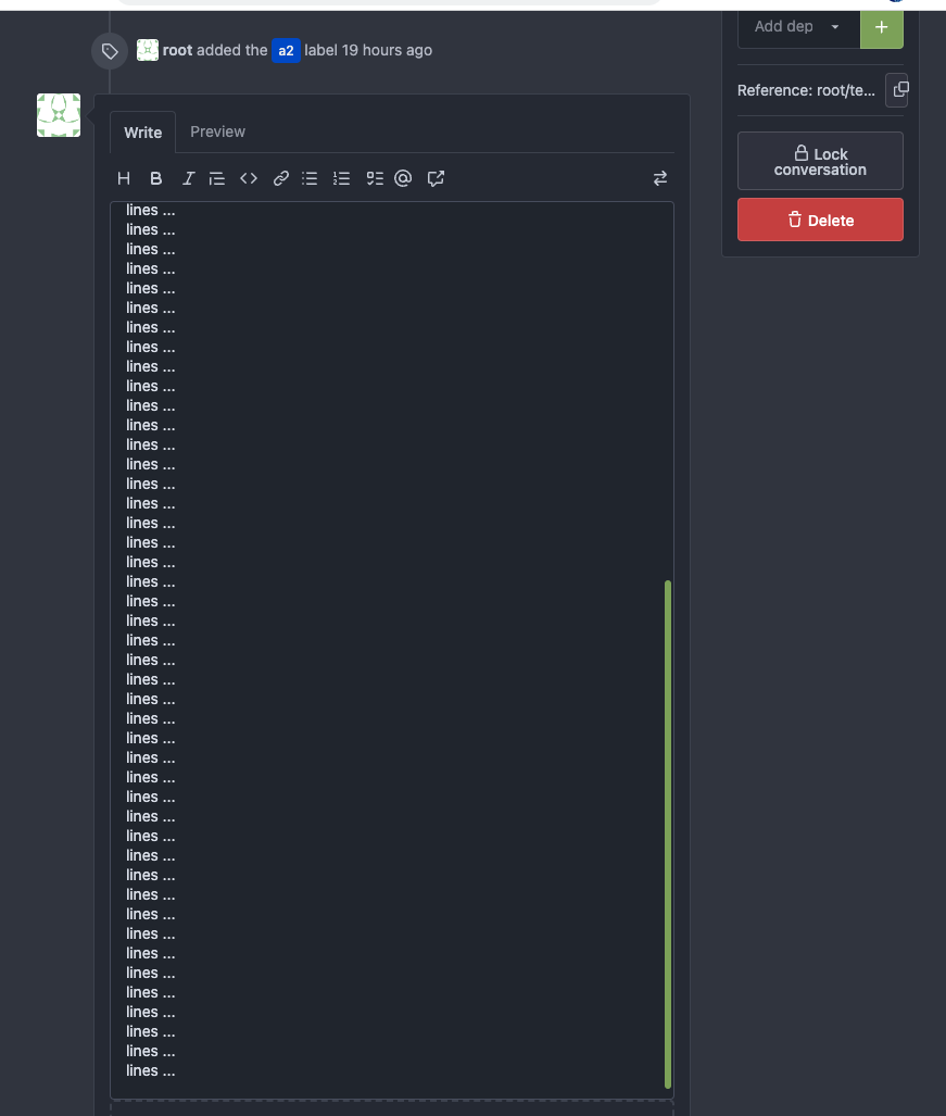
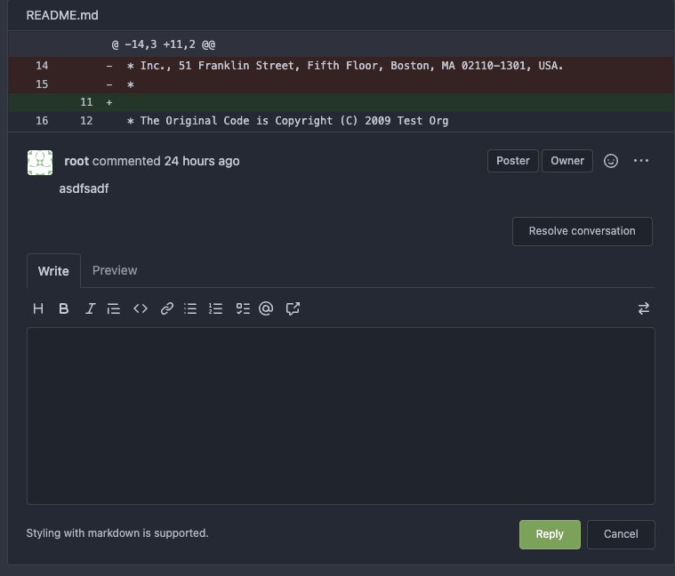
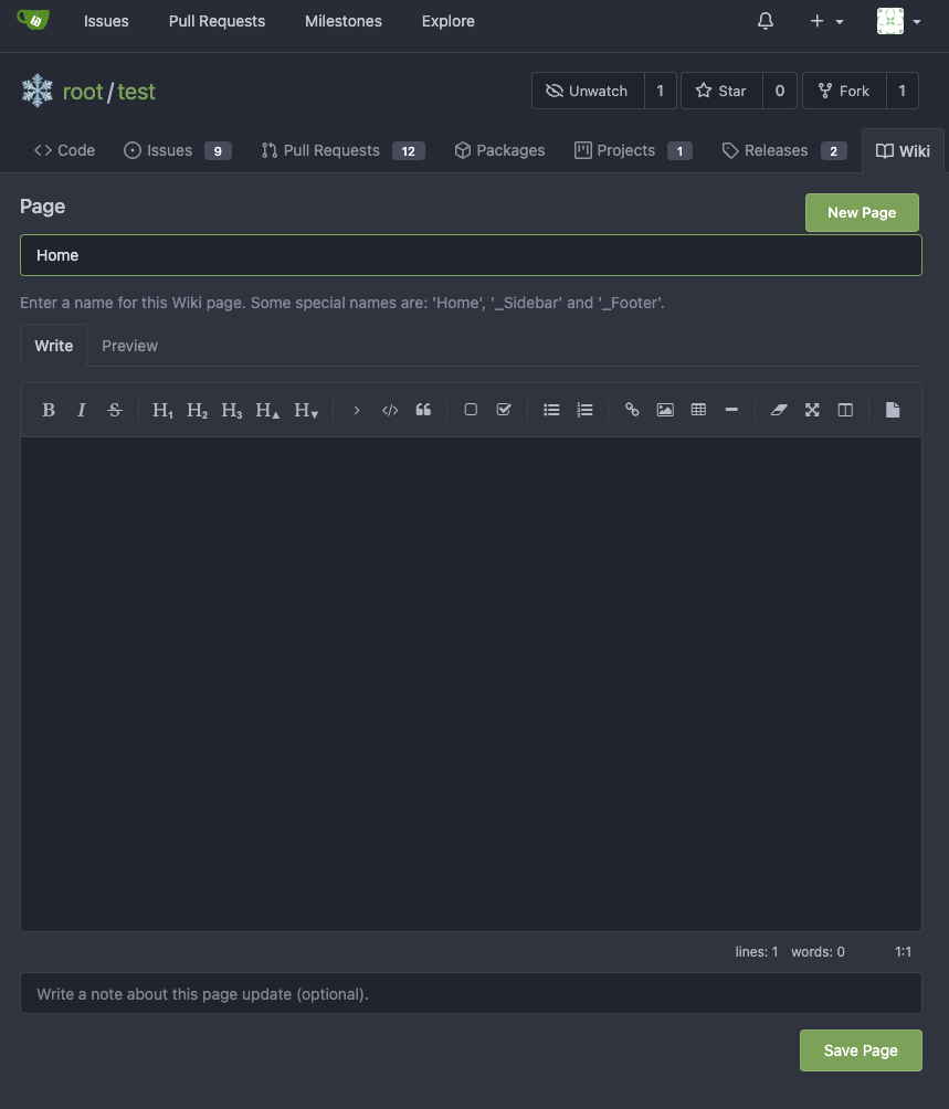
Follow #23876
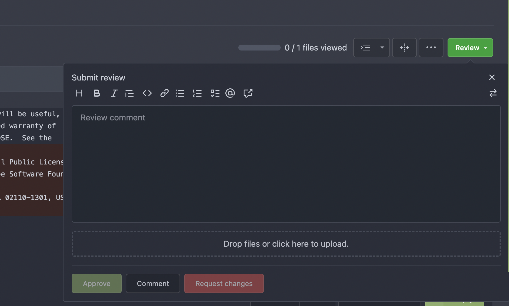
1. Fine tune the heights of the editors (like before)
* Auto expand the editor (increase/decrease the height) when editing
2. Remember user's last used editor (textarea/easymde) in LocalStorage,
then next time the editor will be switched automatically
* No need to introduce extra config option, it satisfies all users,
including who prefer EasyMDE
3. Also fix the width problem of Review Panel
Screenshot:
<details>

</details>
---------
Co-authored-by: silverwind <me@silverwind.io>
|
| |
|
|
|
|
|
|
|
|
|
|
|
|
|
|
|
|
| |
One of the steps in #23328
Before there were 3 different but similar functions: dict/Dict/mergeinto
The code was just copied & pasted, no test.
This PR defines a new stable `dict` function, it covers all the 3 old
functions behaviors, only +160 -171
Future developers do not need to think about or guess the different dict
functions, just use one: `dict`
Why use `dict` but not `Dict`? Because there are far more `dict` than
`Dict` in code already ......
|
| |
|
|
|
|
|
|
|
|
|
|
|
|
|
|
|
|
|
|
|
|
|
|
|
|
|
|
|
|
|
|
|
|
|
|
|
|
|
|
|
|
|
|
|
|
|
|
|
|
|
|
|
|
|
|
|
|
|
|
|
|
|
|
|
|
|
| |
One of the proposals in #23328
This PR introduces a simple expression calculator
(templates/eval/eval.go), it can do basic expression calculations.
Many untested template helper functions like `Mul` `Add` can be replaced
by this new approach.
Then these `Add` / `Mul` / `percentage` / `Subtract` / `DiffStatsWidth`
could all use this `Eval`.
And it provides enhancements for Golang templates, and improves
readability.
Some examples:
----
* Before: `{{Add (Mul $glyph.Row 12) 12}}`
* After: `{{Eval $glyph.Row "*" 12 "+" 12}}`
----
* Before: `{{if lt (Add $i 1) (len $.Topics)}}`
* After: `{{if Eval $i "+" 1 "<" (len $.Topics)}}`
## FAQ
### Why not use an existing expression package?
We need a highly customized expression engine:
* do the calculation on the fly, without pre-compiling
* deal with int/int64/float64 types, to make the result could be used in
Golang template.
* make the syntax could be used in the Golang template directly
* do not introduce too much complex or strange syntax, we just need a
simple calculator.
* it needs to strictly follow Golang template's behavior, for example,
Golang template treats all non-zero values as truth, but many 3rd
packages don't do so.
### What's the benefit?
* Developers don't need to add more `Add`/`Mul`/`Sub`-like functions,
they were getting more and more.
Now, only one `Eval` is enough for all cases.
* The new code reads better than old `{{Add (Mul $glyph.Row 12) 12}}`,
the old one isn't familiar to most procedural programming developers
(eg, the Golang expression syntax).
* The `Eval` is fully covered by tests, many old `Add`/`Mul`-like
functions were never tested.
### The performance?
It doesn't use `reflect`, it doesn't need to parse or compile when used
in Golang template, the performance is as fast as native Go template.
### Is it too complex? Could it be unstable?
The expression calculator program is a common homework for computer
science students, and it's widely used as a teaching and practicing
purpose for developers. The algorithm is pretty well-known.
The behavior can be clearly defined, it is stable.
|
| |
|
|
|
|
|
|
|
|
|
|
|
| |
The first step of #23328
This PR cleans:
1. Dead function like `SubStr`
2. Unnecessary function like `UseHTTPS`, it should be provided by
`window.origin`
3. Duplicate function like `IsShowFullName`, there was already a
`DeafultShowFullName`
I have searched these removed functions globally, no use in code.
|
| |
|
|
|
|
|
|
| |
Fixes #23809
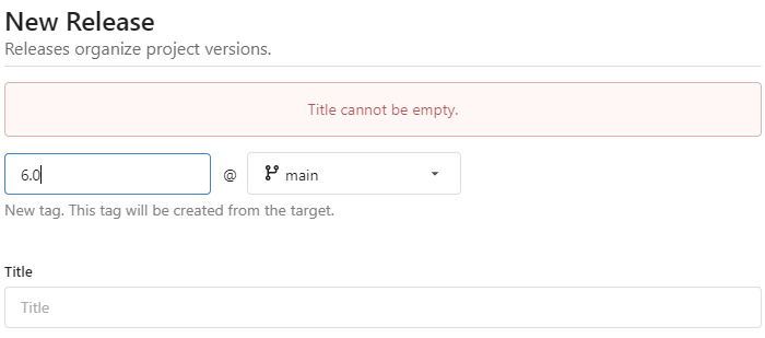
Make the title not required. If the title is empty when creating release
(not tag), an error message will be displayed.
|
| |
|
|
|
|
|
|
|
|
|
|
|
|
|
|
|
|
|
|
|
|
|
|
|
|
|
|
|
|
|
|
|
|
|
|
|
|
|
|
|
|
|
|
| |
time) (#23890)
Right now the authors search dropdown might take a long time to load if
amount of authors is huge.
Example: (In the video below, there are about 10000 authors, and it
takes about 10 seconds to open the author dropdown)
https://user-images.githubusercontent.com/17645053/229422229-98aa9656-3439-4f8c-9f4e-83bd8e2a2557.mov
Possible improvements can be made, which will take 2 steps (Thanks to
@wolfogre for advice):
Step 1:
Backend: Add a new api, which returns a limit of 30 posters with matched
prefix.
Frontend: Change the search behavior from frontend search(fomantic
search) to backend search(when input is changed, send a request to get
authors matching the current search prefix)
Step 2:
Backend: Optimize the api in step 1 using indexer to support fuzzy
search.
This PR is implements the first step. The main changes:
1. Added api: `GET /{type:issues|pulls}/posters` , which return a limit
of 30 users with matched prefix (prefix sent as query). If
`DEFAULT_SHOW_FULL_NAME` in `custom/conf/app.ini` is set to true, will
also include fullnames fuzzy search.
2. Added a tooltip saying "Shows a maximum of 30 users" to the author
search dropdown
3. Change the search behavior from frontend search to backend search
After:
https://user-images.githubusercontent.com/17645053/229430960-f88fafd8-fd5d-4f84-9df2-2677539d5d08.mov
Fixes: https://github.com/go-gitea/gitea/issues/22586
---------
Co-authored-by: wxiaoguang <wxiaoguang@gmail.com>
Co-authored-by: silverwind <me@silverwind.io>
|
| |
|
|
|
|
|
|
|
|
|
|
|
|
| |
The default command to setup a NuGet registry from the command line is:
```
dotnet nuget add source --name Gitea --username your_username --password your_token <gitea-origin-url/>
```
The feed name `Gitea` is hard-coded into the command template, so each
registry will by default have the same feed name. I know templates can
be overridden using the `custom` folder. But in my opinion, it's a good
practice to make a slight change in the default template to make the
feed name more context specific:
```
dotnet nuget add source --name {{.PackageDescriptor.Owner.Name}} --username your_username --password your_token <gitea-origin-url/>
```
|
| |
|
|
|
|
|
|
|
|
|
|
|
| |
editorconfigs (#21257)
The _graceful_ should fail less when the `.editorconfig` file isn't
properly written, e.g. boolean values from YAML or unparseable numbers
(when a number is expected). As is... information is lost as the
_warning_ (a go-multierror.Error) is ignored. If anybody knows how to
send them to the UI as warning; any help is appreciated.
Closes #20694
Signed-off-by: Yoan Blanc <yoan@dosimple.ch>
|
| |
|
|
|
| |
Close #5666
Add APIs for getting activity feeds.
|
| |
|
|
|
|
|
|
|
|
|
|
|
|
|
|
| |
Close #22911
I think it's ready for review now, feel free to test it, welcome to help
to improve.
### Before

### After

|
| |
|
|
|
|
|
|
|
|
|
|
|
|
|
|
|
| |
Few fixes/enhancements around org pages:
Use flexbox for member and repo lists and tweak rendering of tabs and
list:
<img width="765" alt="Screenshot 2023-04-03 at 22 54 24"
src="https://user-images.githubusercontent.com/115237/229625716-92a834c3-9121-4729-8b9b-3a3973cf9a91.png">
<img width="771" alt="Screenshot 2023-04-03 at 22 55 15"
src="https://user-images.githubusercontent.com/115237/229625719-acc08ce8-4489-44a6-a9b9-e36755c55b1d.png">
Vertically center remove/leave buttons, add link to avatar:
<img width="1223" alt="Screenshot 2023-04-03 at 21 51 20"
src="https://user-images.githubusercontent.com/115237/229612616-b662b795-e754-41a1-a77a-381c267e6104.png">
|
| |
|
|
|
|
|
|
| |
Thanks to @trwnh
Close #23802
The ActivityPub id is an HTTPS URI that should remain constant, even if
the user changes their name.
|
| |
|
|
|
|
|
|
|
|
|
|
|
|
|
|
|
|
|
|
|
|
|
|
|
|
|
|
|
|
|
| |
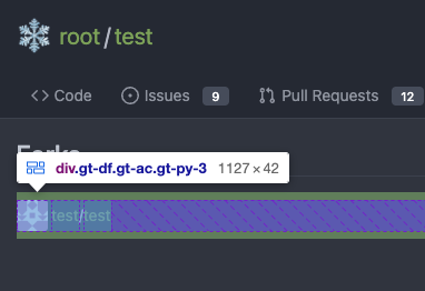
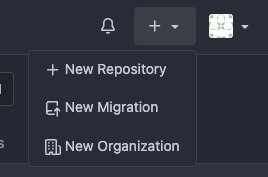
It's difficult to play with Fomantic's ".link" selector&styles, and it
doesn't bring any real benefit.
Instead, it sometimes introduces regressions (because of the `:not`
selector, really difficult to fine-tune).
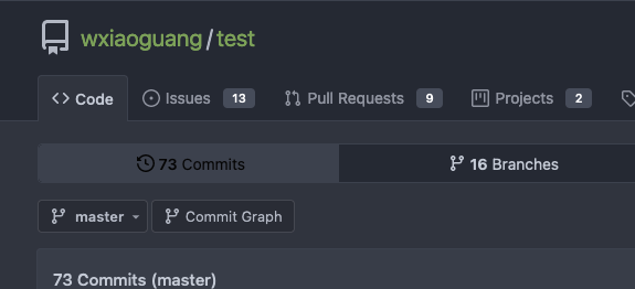
Regression:
<details>
</details>
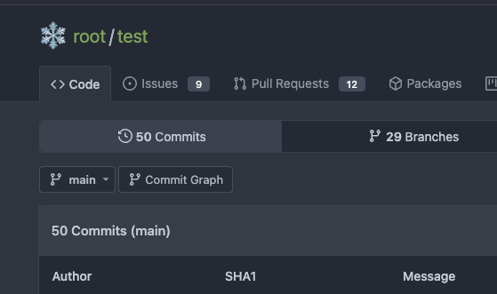
After this PR, there is no ".link" in code anymore. We do not need to
play the overwriting and `:not()` game anymore.

|
| |
|
|
|
|
|
|
|
|
|
|
| |
Fixes #23865
In GitHub, users cannot edit a tag.
<img
src="https://user-images.githubusercontent.com/15528715/229409445-4233941b-3a37-4846-bc0c-efa94b90d9e0.png"
width="600px" />
So in this PR the edit button will not be shown if the release's `IsTag`
is `true`
|
| |
|
|
|
|
|
|
|
|
|
|
|
|
|
|
|
|
|
|
|
|
|
| |
pages. (#23861)
Follow #21429 & #22861
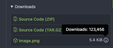
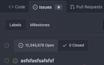
Use `<gitea-locale-number>` instead of backend `PrettyNumber`. All old
`PrettyNumber` related functions are removed. A lot of code could be
simplified.
And some functions haven't been used for long time (dead code), so they
are also removed by the way (eg: `SplitStringAtRuneN`, `Dedent`)
This PR only tries to improve the `PrettyNumber` rendering problem, it
doesn't touch the "plural" problem.
Screenshot:
|
| |
|
| |
`Source` doesn't have `SkipVerify`, it is defined in `cfg`
|
| |
|
|
|
|
|
|
|
|
|
|
|
|
|
|
|
|
|
|
|
|
|
|
|
|
|
|
|
|
|
|
|
|
|
|
|
|
|
|
|
|
|
|
|
|
| |
The first step of the plan
* #23290
Thanks to @silverwind for the first try in #15394 . Close #10729 and a
lot of related issues.
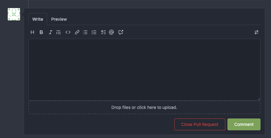
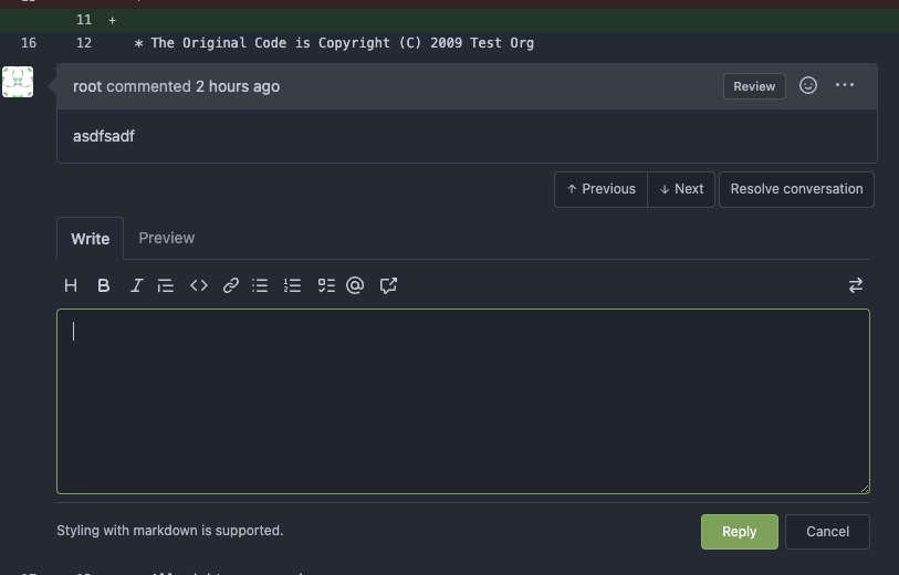
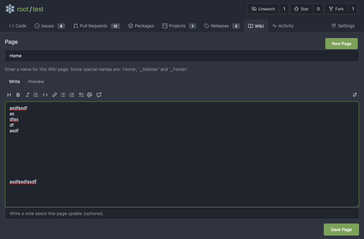
The EasyMDE is not removed, now it works as a fallback, users can switch
between these two editors.
Editor list:
* Issue / PR comment
* Issue / PR comment edit
* Issue / PR comment quote reply
* PR diff view, inline comment
* PR diff view, inline comment edit
* PR diff view, inline comment quote reply
* Release editor
* Wiki editor
Some editors have attached dropzone
Screenshots:
<details>

</details>
---------
Co-authored-by: silverwind <me@silverwind.io>
|
| |
|
|
|
|
|
|
|
| |
Depending on the current state, a close or open button appears.
Close https://github.com/go-gitea/gitea/issues/19083
---


|
| | |
|
| |
|
|
|
|
|
|
| |
Fixes #23771
Changes the display of different architectures for multiarch images to
show the image size:
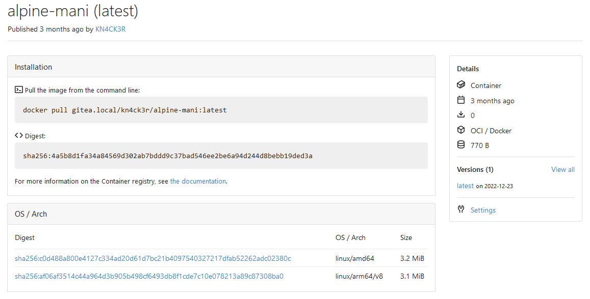
|
| |
|
|
|
| |
Regression of #23245
Close #23843
|
| |
|
|
|
|
|
|
|
|
|
|
|
|
|
|
|
|
| |
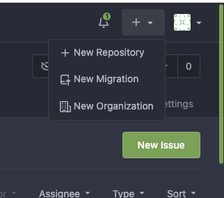
Follow #23854
Major changes:
1. The old `<div class="ui"><div class="six wide column ...">
</div></div>` doesn't have affect any more
* So clean them, and remove other unnecessary elements/styles.
2. Add padding for narrow view.
Before
After:

|
| |
|
|
|
|
|
|
|
| |
Before:
<img width="1272" alt="Screenshot 2023-03-31 at 19 56 16"
src="https://user-images.githubusercontent.com/115237/229195611-4570453c-26bf-4663-865b-7e7eb9115060.png">
After:
<img width="1270" alt="Screenshot 2023-03-31 at 20 00 14"
src="https://user-images.githubusercontent.com/115237/229195639-23841b62-38d8-4e43-8ee5-3f70cba5de6e.png">
|
| |
|
|
|
|
|
|
|
|
|
|
|
|
| |
Before:
<img width="641" alt="截屏2023-03-31 11 12 17"
src="https://user-images.githubusercontent.com/17645053/229013472-237701db-2c30-4477-a7b5-d40640361b14.png">
<img width="576" alt="截屏2023-03-31 11 10 48"
src="https://user-images.githubusercontent.com/17645053/229013535-571aa8be-8e58-4d93-8641-9b8b5fd90108.png">
After:
<img width="709" alt="截屏2023-03-31 11 05 44"
src="https://user-images.githubusercontent.com/17645053/229012963-ccd1e9a7-8bea-4197-aa36-865eafbf8858.png">
<img width="528" alt="截屏2023-03-31 11 06 56"
src="https://user-images.githubusercontent.com/17645053/229012971-a7313eb6-ecd2-4da3-89a7-c20be33f4611.png">
|
| |
|
|
|
|
|
|
|
|
|
| |
Close #23803
More details in the comment.
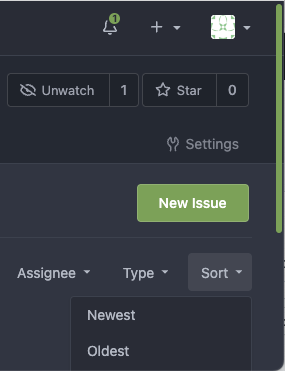
|
| |
|
|
|
|
|
|
|
|
|
|
|
|
| |
Fix regression of #22683 , it didn't pass all variables into
sub-template.
Close #23787
After the fix, all links and the form are correct.


|
| |
|
|
|
|
|
|
|
|
|
|
|
|
|
|
|
|
|
|
|
|
|
|
| |
Use native instead of fomantic checkboxes in issue list. Benefits
include no more JS pop-in on load and perfect a11y.
Before, with JS pop-in:
<img width="92" alt="Screenshot 2023-03-20 at 17 02 02"
src="https://user-images.githubusercontent.com/115237/226398955-99029a1c-1150-449c-821b-e4165e7446a8.png">
After, Firefox on macOS:
<img width="126" alt="Screenshot 2023-03-20 at 17 01 26"
src="https://user-images.githubusercontent.com/115237/226399018-58df2c32-c2b2-4c78-b7df-7b76523abe21.png">
After, Chrome on macOS:
<img width="79" alt="Screenshot 2023-03-20 at 17 01 42"
src="https://user-images.githubusercontent.com/115237/226399074-947e6279-8dc3-42c2-90b5-b106c471b23d.png">
I opted to not do styling yet but I see that the inconsistency between
browsers may already be reason enough on doing it. I think if we style
them, there should be one global style, including markdown ones which
currently have custom styling.
|
| |
|
|
|
|
|
|
|
|
|
|
|
|
|
|
|
|
|
|
|
|
|
|
|
|
|
|
| |
- Avoid flash of wrong tree toggle icon on page load by setting icon
based on sync state
- Avoid "pop-in" of tree on page load by leaving space based on sync
state
- Use the same border/box-shadow combo used on comment `:target` also
for file `:target`.
- Refactor `DiffFileTree.vue` to use `toggleElem` instead of hardcoded
class name.
- Left-align inline comment boxes and make them fit the same amount of
markup content on a line as GitHub.
- Fix height of `diff-file-list`
Fixes: https://github.com/go-gitea/gitea/issues/23593
<img width="1250" alt="Screenshot 2023-03-18 at 00 52 04"
src="https://user-images.githubusercontent.com/115237/226071392-6789a644-aead-4756-a77e-aba3642150a0.png">
<img width="1246" alt="Screenshot 2023-03-18 at 00 59 43"
src="https://user-images.githubusercontent.com/115237/226071443-8bcba924-458b-48bd-b2f0-0de59cb180ac.png">
<img width="1250" alt="Screenshot 2023-03-18 at 01 27 14"
src="https://user-images.githubusercontent.com/115237/226073121-ccb99f9a-d3ac-40b7-9589-43580c4a01c9.png">
<img width="1231" alt="Screenshot 2023-03-19 at 21 44 16"
src="https://user-images.githubusercontent.com/115237/226207951-81bcae1b-6b41-4e39-83a7-0f37951df6be.png">
(Yes I'm aware the border-radius in bottom corners is suboptimal, but
this would be notorously hard to fix without relying on `overflow:
hidden`).
|
| |
|
|
|
|
|
|
|
|
|
|
|
|
|
|
|
|
|
| |
strict (#23766)
Follow #21962
After I eat my own dogfood, I would say that
ONLY_SHOW_RELEVANT_REPOS=false is necessary for many private/enterprise
instances, because many private repositories do not have
"description/topic", users just want to search by their names.
This PR also adds `PageIsExploreRepositories` check, to make code more
strict, because the `search` template is shared for different purpose.
And during the test, I found a bug that the "Search" button didn't
respect the "relevant" parameter, so this PR fixes the bug by the way
together.
I think this PR needs to be backported.
|
| |
|
|
|
|
|
|
| |
Closes #20955
This PR adds the possibility to disable blank Issues, when the Repo has
templates. This can be done by creating the file
`.gitea/issue_config.yaml` with the content `blank_issues_enabled` in
the Repo.
|
| |
|
|
|
|
|
|
|
|
|
|
|
|
|
|
|
|
|
|
| |
Adds API endpoints to manage issue/PR dependencies
* `GET /repos/{owner}/{repo}/issues/{index}/blocks` List issues that are
blocked by this issue
* `POST /repos/{owner}/{repo}/issues/{index}/blocks` Block the issue
given in the body by the issue in path
* `DELETE /repos/{owner}/{repo}/issues/{index}/blocks` Unblock the issue
given in the body by the issue in path
* `GET /repos/{owner}/{repo}/issues/{index}/dependencies` List an
issue's dependencies
* `POST /repos/{owner}/{repo}/issues/{index}/dependencies` Create a new
issue dependencies
* `DELETE /repos/{owner}/{repo}/issues/{index}/dependencies` Remove an
issue dependency
Closes https://github.com/go-gitea/gitea/issues/15393
Closes #22115
Co-authored-by: Andrew Thornton <art27@cantab.net>
|
| |
|
|
| |
Fixes #21699
|
| |
|
|
|
|
|
|
|
|
|
|
|
|
|
|
|
|
|
|
|
|
|
|
| |
Before:
<img width="1403" alt="截屏2023-03-27 15 48 23"
src="https://user-images.githubusercontent.com/17645053/227875392-399debf7-db75-4d9a-9436-409f75447c65.png">
This happens because the `<br>` matches this
[rule](https://github.com/go-gitea/gitea/blob/e6e602fd8d35471f1e2f4a42669a1f17e76e0176/web_src/css/markup/content.css#L428),
which is not necessary here (This is introduced by #22861, did a quick
check, and this is the only place used `<br>` inside `<code>` from the
PR):
```css
.markup code br,
.markup tt br {
display: none;
}
```
After:
<img width="1398" alt="截屏2023-03-27 15 46 50"
src="https://user-images.githubusercontent.com/17645053/227875244-b7fba432-b32c-42f7-9517-4e05bb2e64ea.png">
---------
Co-authored-by: wxiaoguang <wxiaoguang@gmail.com>
|
| |
|
|
|
|
|
|
|
|
|
|
|
|
|
|
|
|
|
| |
Follow #23748
Thanks to @delvh
----
And, fix the UI alignment by the way (adding some `gt-mr-xx`)
Before:

After:

|
| |
|
| |
HTML is not XML.
|
| |
|
|
|
|
|
|
|
|
|
|
|
|
|
|
|
| |
### Before
* The check of `if PullRequest.BaseRepo.Name` doesn't make sense,
because the `$commitLink` is always constructed below
* Many `if` blocks make the HTML tags (likely) not match in IDE.
Although the rendered result matches, it's very unfriendly to editors or
code analyzer, and it's difficult to read.
### After
Move the `$commitLink` assignment ahead.
Simplify the code, resolve the above problems.
|
| |
|
|
|
|
|
|
|
|
|
|
|
|
|
|
|
|
|
|
|
|
|
|
|
|
|
|
| |
This PR fixes several issues reported in
https://github.com/go-gitea/gitea/issues/23221.
It does three things:
1. Fixes the `DefaultBranch` variable that has not been set.
2. Sets `Title` and `Message` for newly created tags from the Tag
message. This makes it easier to create releases from tags that have
messages and for those that don't it doesn't have any effect.
3. Makes UI changes so that tags look more like proper releases.
Before:

After:
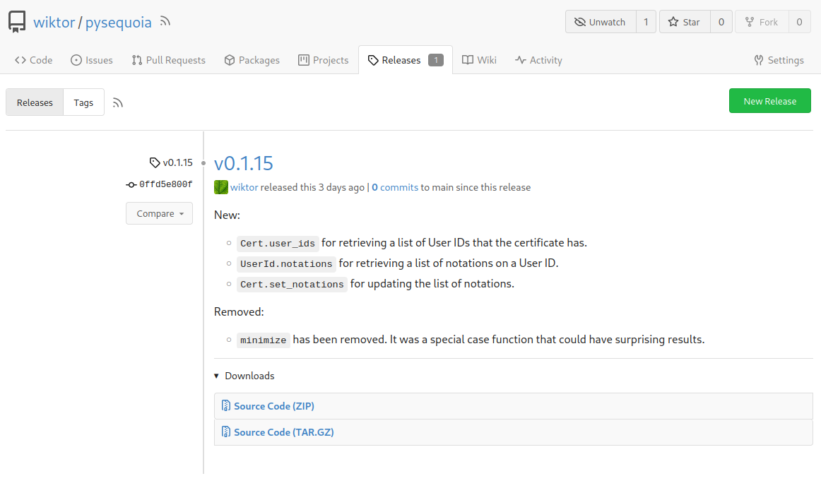
I purposefully didn't reformat the template so that the diff is cleaner
but can do so if that's welcome.
Thanks for your time!
---------
Signed-off-by: Wiktor Kwapisiewicz <wiktor@metacode.biz>
|
| |
|
|
|
|
|
|
|
|
|
| |
Now user cannot set Card Previews when creating a new project.
Before:
https://user-images.githubusercontent.com/15528715/227488883-29bbd636-8b98-45b3-b2f8-de5206b045dc.mp4
After:
https://user-images.githubusercontent.com/15528715/227488976-3447f252-805a-4f18-ae0e-1cddd921dcc3.mp4
|
| |
|
|
|
|
|
|
|
|
|
|
|
|
|
|
| |
Some of those are still Copy&Paste problems.
This PR:
* Only cleans the legacy incorrect code, doesn't change or improve the
"action" logic.
* Remove the redundant `$('.toggle.button').on('click')`, now
`$('.show-panel.button').on('click')` handles that kinds of buttons
Actually, there is only one correct "toggle button" in code, the one on
the webhook page.
No need to backport.
|
| |
|
|
|
|
|
|
|
|
|
|
|
|
|
|
|
|
|
|
|
|
|
|
|
|
|
|
|
|
|
|
|
|
|
|
|
|
|
|
|
|
|
|
|
|
|
|
| |
Edit form (#23626)
Although it seems that some different purposes are mixed in this PR,
however, they are all related, and can be tested together, so I put them
together to save everyone's time.
Diff: `+79 −84`, everything becomes much better.
### Improve the dropdown settings.
Move all fomantic-init related code into our `fomantic.js`
Fine-tune some dropdown global settings, see the comments.
Also help to fix the first problem in #23625 , cc: @yp05327
The "language" menu has been simplified, and it works with small-height
window better.
### Use SVG instead of `<i class="delete icon">`
It's also done by `$.fn.dropdown.settings.templates.label` , cc:
@silverwind
### Remove incorrect `tabable` CSS class
It doesn't have CSS styles, and it was only in Vue. So it's totally
unnecessary, remove it by the way.
### Improve the Repo Topic Edit form
* Simplify the code
* Add a "Cancel" button
* Align elements
Before:
<details>

</details>
After:

|
| |
|
|
|
|
|
|
|
|
|
|
|
|
|
|
| |
Close #23579
Inspired by
[idea](https://github.com/go-gitea/gitea/issues/23579#issuecomment-1475429247)
from @brechtvl
In this PR, the behavior is when extension switches from writatble to
not, preview will hide, and vice versa.
demo:
https://user-images.githubusercontent.com/17645053/226786119-d20063da-8763-41ce-9b00-ae34929120e1.mov
---------
Co-authored-by: silverwind <me@silverwind.io>
|
| |
|
|
|
|
|
|
|
|
|
|
| |
Resolves #22692
I don't think there's a need for this entire row to be clickable (and
even different links depending on which segment you click)
The links still point to the same spot, so no information is lost here.
---------
Signed-off-by: jolheiser <john.olheiser@gmail.com>
Co-authored-by: wxiaoguang <wxiaoguang@gmail.com>
|
| |
|
|
|
|
|
|
|
|
|
|
|
|
|
|
|
| |
Follow:
* #23574
* Remove all ".tooltip[data-content=...]"
Major changes:
* Remove "tooltip" class, use "[data-tooltip-content=...]" instead of
".tooltip[data-content=...]"
* Remove legacy `data-position`, it's dead code since last Fomantic
Tooltip -> Tippy Tooltip refactoring
* Rename reaction attribute from `data-content` to
`data-reaction-content`
* Add comments for some `data-content`: `{{/* used by the form */}}`
* Remove empty "ui" class
* Use "text color" for SVG icons (a few)
|
| |
|
|
|
|
|
|
|
|
|
|
|
|
|
|
| |
Before, in project edit page, the cancel button is not work.
https://user-images.githubusercontent.com/33891828/227182731-6478e29f-0e52-48c4-beb0-6a7d1dda6a1d.mov
1. The wrong classname `cancel` was added to the `<a>` tag. That
classname caused the default click event of `<a>` tag to be cancelled.
Because we have the following settings in the global. So I remove the
classname `cancel`.
https://github.com/go-gitea/gitea/blob/9be90a58754061171bbd5025d85d2b891364efd3/web_src/js/features/common-global.js#L325-L327
2. Another change is that page will redirect to the previous page.
https://user-images.githubusercontent.com/33891828/227187326-c653c6d6-9715-440f-a732-ba0a6f012c81.mov
|
| |
|
|
|
|
|
|
|
|
|
|
|
|
|
|
|
|
|
|
|
|
|
|
|
|
|
|
|
|
|
|
|
|
|
|
|
|
|
|
|
| |
This PR is to fix the second problem mentioned in #23625, along with the
long texts problem in `issue-item-bottom-row` of `issuelist.tmpl`
Main changes are:
1. Add `max-width` to the search dropdowns in issue list and make the
possible long texts inside to show ellipsis if texts are long
2. Adjust the conditions in
[issuelist.tmpl](https://github.com/go-gitea/gitea/blob/1d35fa0e784dffcadacb2322a3d7ac3ec2ff89b2/templates/shared/issuelist.tmpl#L146-L167)
to fix the problem as mentioned by the
[comment](https://github.com/go-gitea/gitea/issues/23625#issuecomment-1479281060)
3. Use `word-break: break-word;` in `issue-item-bottom-row` to break the
possible long texts.
After the PR
issuelist in repo (similar for pr list):
<img width="366" alt="截屏2023-03-23 17 42 40"
src="https://user-images.githubusercontent.com/17645053/227163953-93e9adbd-5785-4c16-b538-9db901787775.png">
dropdowns with long name (Here take reference from github to deal with
the long names cases: show ellipsis with no title, because all these
options are clickable, and it might not be necessary to add titles to
them ):
<img width="370" alt="截屏2023-03-23 17 43 50"
src="https://user-images.githubusercontent.com/17645053/227164215-df6fcaaa-9fee-4256-a57c-053fbcffafbb.png">
<img width="365" alt="截屏2023-03-23 17 43 56"
src="https://user-images.githubusercontent.com/17645053/227164227-9c99abcd-f410-4e07-b5b8-cbce764eedcd.png">
issue page (similar for pr page):
<img width="374" alt="截屏2023-03-23 17 45 37"
src="https://user-images.githubusercontent.com/17645053/227164668-654a8188-dac8-4bbf-a6e3-f3768a644a1b.png">
on PC:
<img width="1412" alt="截屏2023-03-23 17 47 20"
src="https://user-images.githubusercontent.com/17645053/227166694-e7bcc6e5-9667-4cef-9fbf-db85640a2c6c.png">
<img width="1433" alt="截屏2023-03-23 17 46 40"
src="https://user-images.githubusercontent.com/17645053/227165182-4e2a5d19-74bc-4c66-b73c-23cbca176ffe.png">
|
| |
|
|
|
|
|
|
|
|
|
|
|
|
|
|
|
|
|
|
|
|
|
|
| |
Remove `[repository.editor] PREVIEWABLE_FILE_MODES` setting that seemed
like it was intended to support this but did not work. Instead, whenever
viewing a file shows a preview, also have a Preview tab in the file
editor.
Add new `/markup` web and API endpoints with `comment`, `gfm`,
`markdown` and new `file` mode that uses a file path to determine the
renderer.
Remove `/markdown` web endpoint but keep the API for backwards and
GitHub compatibility.
## ⚠️ BREAKING ⚠️
The `[repository.editor] PREVIEWABLE_FILE_MODES` setting was removed.
This setting served no practical purpose and was not working correctly.
Instead a preview tab is always shown in the file editor when supported.
---------
Co-authored-by: zeripath <art27@cantab.net>
Co-authored-by: Lunny Xiao <xiaolunwen@gmail.com>
|
| |
|
|
|
|
|
|
|
|
|
|
|
|
|
|
|
|
|
|
|
| |
Close #23627
Added margin left to the button when it is next to the svg, which has a
margin-right of `-0.5rem`
And here it might be better if `white-space: nowrap;` is added because
otherwise it might look like below on pull requests page on smaller
screen
<img width="945" alt="截屏2023-03-23 09 57 41"
src="https://user-images.githubusercontent.com/17645053/227079613-71c696ab-55ec-4641-acb9-622a8baebb31.png">
After:
<img width="936" alt="截屏2023-03-23 10 08 27"
src="https://user-images.githubusercontent.com/17645053/227080971-6bf2588e-40dd-4770-b0d1-45d7c63e0f48.png">
Pull Request on smaller screen
<img width="922" alt="截屏2023-03-23 10 25 16"
src="https://user-images.githubusercontent.com/17645053/227084144-0c2ed3e6-5c11-4252-bba2-b5f971b70f4a.png">
|
