| Commit message (Collapse) | Author | Age | Files | Lines |
|---|
| |
|
|
|
|
| |
Percentage-based `border-radius` [creates undesirable
ellipse](https://jsfiddle.net/silverwind/j9ko5wnt/4/) on non-square
content. Instead, use pixel value and use same wording `full` like
tailwind does, but increast to 99999px over their 9999px.
|
| |
|
|
|
|
|
| |
Close #30919
---------
Co-authored-by: silverwind <me@silverwind.io>
|
| |
|
|
|
|
| |
Follow #30345
Follow #30547
`ellipsis` / `white-space` shouldn't be put on the general dropdown components.
|
| |
|
| |
Fix #30802
|
| |
|
|
|
|
|
|
|
|
|
|
|
| |
I guess there could be enough people liking to make the Settings menu
item right aligned. As a site admin, I found it's easier to find the
right-aligned Settings menu item.
Tested with various sizes:


|
| |
|
| |
Tested extensively using modal which is the only dependant.
|
| | |
|
| |
|
|
|
|
|
|
|
|
|
| |
- `.text-thin` and `.text-italic` are not present in CSS so were doing nothing and I removed them.
- `.text.middle` was unused so I removed it.
- `.text.italic` is replaced with `tw-italic`.
- `.text.normal` had exactly one use and it wasn't even needed.
- add a `muted` class to the link to `org_profile_avatar.tmpl`.
---------
Co-authored-by: wxiaoguang <wxiaoguang@gmail.com>
|
| |
|
|
|
|
|
|
|
|
|
|
|
| |
Follow
https://github.com/go-gitea/gitea/pull/30547#discussion_r1573866519
Fix #30624
The Fomantic UI Dropdown wasn't designed to work that way, its "text"
element might contain images. So the "overflow" shouldn't be added to
any general dropdown text.

|
| |
|
|
| |
Fixes https://github.com/go-gitea/gitea/issues/30566, regression from
https://github.com/go-gitea/gitea/pull/30214.
|
| |
|
|
|
|
|
|
| |
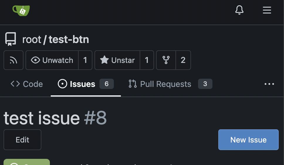
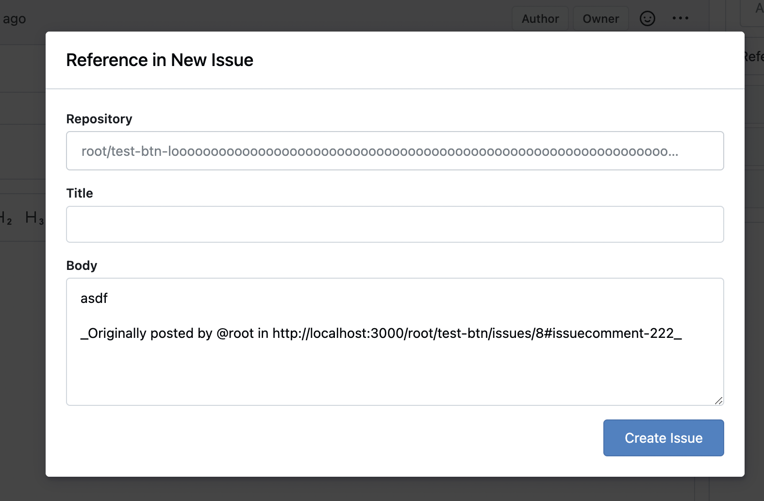
Fixes: https://github.com/go-gitea/gitea/issues/29994
Also some misc enhancements done to the form in the modal.
<img width="840" alt="Screenshot 2024-04-17 at 23 02 55"
src="https://github.com/go-gitea/gitea/assets/115237/e71fba55-55cd-4e48-a497-6b1025c36a43">
|
| |
|
|
|
|
|
|
|
|
|
|
|
| |
Fixes: https://github.com/go-gitea/gitea/issues/27971
Fixes: https://github.com/go-gitea/gitea/pull/28010
<img width="689" alt="Screenshot 2024-04-09 at 00 19 57"
src="https://github.com/go-gitea/gitea/assets/115237/7c895a47-274f-40a6-a126-290658f1982d">
Also fixes a similar issue in issue list where CSS was there but not
active because of missing `display: block`.
<img width="372" alt="Screenshot 2024-04-09 at 00 18 25"
src="https://github.com/go-gitea/gitea/assets/115237/cfbee7cd-2e15-4ac7-96ce-020816f48798">
|
| |
|
|
|
|
|
| |

---------
Co-authored-by: silverwind <me@silverwind.io>
|
| |
|
|
|
|
|
|
|
|
| |
CSS-only module. Button colors are reduced to this:
<img width="639" alt="Screenshot 2024-04-14 at 15 36 07"
src="https://github.com/go-gitea/gitea/assets/115237/882d6c02-d1de-44f2-b707-db02a9f5070d">
---------
Co-authored-by: wxiaoguang <wxiaoguang@gmail.com>
|
| |
|
|
|
| |
A lot of variants are in use, so the diff stat isn't so great.
Co-authored-by: Giteabot <teabot@gitea.io>
|
| |
|
|
|
|
|
|
|
|
|
| |
Enable `no-sizzle` lint rule, there was only one use in `initCompReactionSelector` and:
- Remove all jQuery except the necessary fomantic dropdown init
- Remove the recursion, instead bind event listeners to common parent container nodes
---------
Co-authored-by: wxiaoguang <wxiaoguang@gmail.com>
Co-authored-by: Giteabot <teabot@gitea.io>
|
| |
|
|
|
|
|
|
|
|
|
|
|
|
|
|
|
|
|
|
|
|
|
|
| |
Fixes: https://github.com/go-gitea/gitea/issues/29438
This contains numerous enhancements for how large commit messages and
large filenames render. Another notable change is that the file path is
no longer cut off by backend at 30 chars, but rendered in full with
wrapping.
<img width="1329" alt="Screenshot 2024-04-09 at 21 53 57"
src="https://github.com/go-gitea/gitea/assets/115237/5ccbb3d6-643a-4f60-ba79-3572b36d5182">
<hr>
<img width="711" alt="Screenshot 2024-04-09 at 21 44 24"
src="https://github.com/go-gitea/gitea/assets/115237/6ffe8fbb-407c-4aa7-b591-3d80daea7d57">
<hr>
<img width="439" alt="Screenshot 2024-04-09 at 21 19 03"
src="https://github.com/go-gitea/gitea/assets/115237/1ec7f6e9-2fd8-4841-87eb-6ca02ab9cd61">
<hr>
<img width="444" alt="Screenshot 2024-04-09 at 21 18 52"
src="https://github.com/go-gitea/gitea/assets/115237/70931b9e-5841-477e-b3bc-98f8d2662964">
---------
Co-authored-by: Giteabot <teabot@gitea.io>
|
| |
|
|
|
|
|
|
|
|
| |
Fixes https://github.com/go-gitea/gitea/issues/30353.
I don't know what causes `code-inner` to not inherit `line-height` from
its direct parent `.lines-code` but instead from grandparent `.markup`
even thought MDN tells me it's
[inherited](https://developer.mozilla.org/en-US/docs/Web/CSS/line-height#formal_definition).
This causes no negative impact on other code views, so I think it's the
best solution.
|
| |
|
|
|
|
| |
16 seems to big, 14 too small. Let's do 15. Alignment:
<img width="181" alt="image"
src="https://github.com/go-gitea/gitea/assets/115237/f2988611-dee2-492e-a18f-dc5ab3a1cd6c">
|
| |
|
|
|
|
|
|
|
|
|
|
|
|
|
|
|
|
|
|
| |
Fixes https://github.com/go-gitea/gitea/issues/30293 and introduce the
`--page-spacing` variable which holds the spacing between the elements
on the page. This is working vertically for all pages, including ones
that have fomantic grid, and horizontally for all that use
`flex-container`.
The `.page-content > :first-child:not(.secondary-nav)` selector uses
margin which in some cases enables to adjacent margins to overlap, which
is nice.
<img width="1320" alt="Screenshot 2024-04-06 at 01 35 19"
src="https://github.com/go-gitea/gitea/assets/115237/3e81e707-e9ff-4b7f-a211-3d98f4f85353">
---
<img width="1327" alt="Screenshot 2024-04-06 at 01 35 45"
src="https://github.com/go-gitea/gitea/assets/115237/aad196c0-9e21-4c06-ae59-7e33a76c61e1">
---
<img width="1321" alt="Screenshot 2024-04-06 at 01 35 31"
src="https://github.com/go-gitea/gitea/assets/115237/785f6c5d-08b6-4e66-aa16-aeca7cfed3ad">
|
| |
|
|
|
|
|
|
| |
Likely still some unnecessary CSS but any combinations with the `ui
list` classes are covered. There was only on instance of `horizontal
list` which I removed. It was this part of the commit page:
<img width="396" alt="image"
src="https://github.com/go-gitea/gitea/assets/115237/c49ec4f5-93c3-41d6-a907-cdbedf8abc44">
|
| |
|
|
|
| |
The permlink in markdown will be rendered as a code preview block, like GitHub
Co-authored-by: silverwind <me@silverwind.io>
|
| |
|
|
| |
Another pure CSS module. Some styling is part of the `form` module which
will likely follow next.
|
| |
|
|
|
|
|
|
|
|
|
|
|
|
|
|
|
|
|
| |
CSS is pretty slim already and the `.ui.toggle.checkbox` sliders on
admin page also still work. The only necessary JS is the one that links
`input` and `label` so that it can be toggled via label. All checkboxes
except the markdown ones render at `--checkbox-size: 16px` now.
<img width="174" alt="Screenshot 2024-03-28 at 22 15 10"
src="https://github.com/go-gitea/gitea/assets/115237/3455c1bb-166b-47e4-9847-2d20dd1f04db">
<img width="499" alt="Screenshot 2024-03-28 at 21 00 07"
src="https://github.com/go-gitea/gitea/assets/115237/412be2b3-d5a0-478a-b17b-43e6bc12e8ce">
<img width="83" alt="Screenshot 2024-03-28 at 22 14 34"
src="https://github.com/go-gitea/gitea/assets/115237/d8c89838-a420-4723-8c49-89405bb39474">
---------
Co-authored-by: delvh <dev.lh@web.de>
|
| |
|
|
|
|
|
|
|
|
|
|
|
|
|
|
|
|
| |
Get rid of one more jQuery dependant and have a nicer color picker as
well.
Now there is only a single global color picker init because that is all
that's necessary because the elements are present on the page when the
init code runs. The init is slightly weird because the module only takes
a selector instead of DOM elements directly.
The label modals now also perform form validation because previously it
was possible to trigger a 500 error `Color cannot be empty.` by clearing
out the color value on labels.
<img width="867" alt="Screenshot 2024-03-25 at 00 21 05"
src="https://github.com/go-gitea/gitea/assets/115237/71215c39-abb1-4881-b5c1-9954b4a89adb">
<img width="860" alt="Screenshot 2024-03-25 at 00 20 48"
src="https://github.com/go-gitea/gitea/assets/115237/a12cb68f-c38b-4433-ba05-53bbb4b1023e">
|
| |
|
|
|
|
|
|
|
|
|
|
|
|
|
|
|
|
| |
Extend https://github.com/go-gitea/gitea/pull/21432 to commit messages.
Color is changed because the markup code block bg does not offer enough
contrast on varying backgrounds.
<img width="568" alt="Screenshot 2024-03-27 at 19 52 55"
src="https://github.com/go-gitea/gitea/assets/115237/ddc9307e-f32f-4e97-8b88-91f88ced2a36">
<img width="573" alt="Screenshot 2024-03-27 at 19 53 33"
src="https://github.com/go-gitea/gitea/assets/115237/14b30fd2-bf28-46b8-9e82-eb60a28f6bf2">
<img width="422" alt="Screenshot 2024-03-27 at 19 53 01"
src="https://github.com/go-gitea/gitea/assets/115237/a12136b5-c02b-460c-9830-f830542987ae">
<img width="397" alt="Screenshot 2024-03-27 at 19 53 27"
src="https://github.com/go-gitea/gitea/assets/115237/c9f05d81-c73e-468e-98e9-e5929bc0da3e">
<img width="333" alt="Screenshot 2024-03-27 at 19 53 07"
src="https://github.com/go-gitea/gitea/assets/115237/06b5a9f9-f95d-46b6-8c57-df0b02555652">
<img width="279" alt="Screenshot 2024-03-27 at 19 53 21"
src="https://github.com/go-gitea/gitea/assets/115237/b06a0afc-ddd8-48ae-b557-a6dc47802e68">
|
| |
|
|
|
|
|
|
|
|
|
| |
Enable us to use tailwind's
[`font-family`](https://tailwindcss.com/docs/font-family) classes as
well as remove `gt-mono` in favor of `tw-font-mono`. I also merged the
"compensation" to one selector, previously this was two different values
0.9em and 0.95em. I did not declare a `serif` font because I don't think
there will ever be a use case for those. Command ran:
```sh
perl -p -i -e 's#gt-mono#tw-font-mono#g' web_src/js/**/* templates/**/*
|
| |
|
|
|
|
|
|
|
|
|
| |
Of note is the CSS has references to "floating label" and "transparent
label" but I could not find those anywhere in the code. They are related
to https://github.com/go-gitea/gitea/pull/3939, but I think these have
long been removed.
---------
Co-authored-by: delvh <dev.lh@web.de>
Co-authored-by: Giteabot <teabot@gitea.io>
|
| |
|
|
|
|
|
| |
Big CSS module. I tested basic functionality on admin and commits table.
---------
Co-authored-by: Giteabot <teabot@gitea.io>
|
| |
|
|
|
| |
Another CSS-only module. Also, I re-ordered the imports based on
[original fomantic
order](https://github.com/fomantic/Fomantic-UI/blob/2.8.7/src/semantic.less).
|
| |
|
|
|
|
|
|
|
| |
Small CSS module. There was a ordering conflict between `.ui.menu` and
`.ui.container` which I've solved by adding the `.ui.menu` rule into
base.
---------
Co-authored-by: Giteabot <teabot@gitea.io>
|
| |
|
|
|
|
|
|
|
| |
Likely still a few useless classes left, but I think I at least don't
have missed any.
---------
Co-authored-by: delvh <dev.lh@web.de>
Co-authored-by: Giteabot <teabot@gitea.io>
|
| |
|
|
|
|
|
|
|
|
|
|
|
|
|
|
|
|
|
|
|
|
|
|
|
|
|
|
|
|
|
|
| |
1. Restore missing styles for message close icon
2. Move `code-line-button` so that it does not go off-screen on small
viewports
3. Make `code-line-button` look and behave like other buttons
4. Make `code-line-button` work in blame
5. Make the active selection span the whole line, not just the code part
6. Tweak colors, make dark theme code bg darker, make line numbers same
color in diff and file view.
7. Move code background to parent, fixing border radius and other
problems
8. Enable code wrap in blame
9. Improve blame responsiveness
10. Remove `--color-code-sidebar-bg` in blame, now it uses same
background as code
11. Rename `--color-active-line` to `--color-highlight-bg`
12. Add `--color-highlight-bg`
13. Fix button group borders on hover and border-right on last button.
<img width="1343" alt="Screenshot 2024-03-23 at 22 34 13"
src="https://github.com/go-gitea/gitea/assets/115237/fcbb919f-5dc3-43f0-97f6-870d6f412554">
<img width="1334" alt="Screenshot 2024-03-23 at 22 34 26"
src="https://github.com/go-gitea/gitea/assets/115237/ca44c3b7-4328-4645-ba49-b0dc6a5ac06d">
<img width="1338" alt="Screenshot 2024-03-23 at 22 34 57"
src="https://github.com/go-gitea/gitea/assets/115237/00eb0b5a-1ec7-4669-a94a-4602b9d1c1ac">
<img width="1337" alt="Screenshot 2024-03-23 at 22 34 42"
src="https://github.com/go-gitea/gitea/assets/115237/752edc4a-064f-413c-9dff-c086187fcd85">
Fixes: https://github.com/go-gitea/gitea/issues/18074
|
| |
|
|
|
|
|
|
|
|
|
|
|
|
|
|
|
|
| |
(#29982)
Fixes: https://github.com/go-gitea/gitea/issues/29981. Introduce
`.secondary-nav` as a universal way for styling and margin adjustments
inside `.page-content`.
If the first child of `.page-content` is `.secondary-nav`, we add margin
below it, otherwise we add padding to the first child. Notable changes:
- `--color-header-wrapper` is replaced with `--color-secondary-nav-bg`.
- `navbar` class is removed.
---------
Co-authored-by: Giteabot <teabot@gitea.io>
Co-authored-by: wxiaoguang <wxiaoguang@gmail.com>
|
| |
|
|
|
| |
Had to fiddle a bit with the css ordering, but seems to work well now
and should render exactly like before. Some of the CSS may be
unnecessary, but I kept it for now.
|
| |
|
|
| |
1. Use general "mobile-only" and "not-mobile" CSS styles, remove some`@media (max-width: 767.98px)` tricks
2. Use `CountFmt` for repo list, just like the repo header (and it matches GitHub, to avoid big numbers bloat the page)
|
| |
|
|
|
|
|
|
|
|
|
|
|
|
|
|
|
|
|
|
|
|
|
| |
Various code was using fomantic `loading` class which I think got broken
a while ago and rendered only a full circle. Fix those to use
`is-loading`.
Before:
<img width="295" alt="Screenshot 2024-03-19 at 22 56 26"
src="https://github.com/go-gitea/gitea/assets/115237/dbe83395-5db4-4868-90bc-3613866a35f0">
After:
<img width="60" alt="Screenshot 2024-03-19 at 22 54 35"
src="https://github.com/go-gitea/gitea/assets/115237/8ac19b7e-035a-4c6d-850b-53a234ef69c2">
<img width="294" alt="Screenshot 2024-03-19 at 22 54 56"
src="https://github.com/go-gitea/gitea/assets/115237/34e819d7-25f7-43a1-9d48-4a68dcd2b6ad">
<img width="320" alt="Screenshot 2024-03-19 at 22 55 16"
src="https://github.com/go-gitea/gitea/assets/115237/05127544-47ff-4e18-9fd8-c84e44c374f8">
<img width="153" alt="Screenshot 2024-03-19 at 23 01 43"
src="https://github.com/go-gitea/gitea/assets/115237/a33248c6-b11d-40ff-82d8-f5a3d85b55aa">
<img width="1300" alt="Screenshot 2024-03-19 at 23 56 25"
src="https://github.com/go-gitea/gitea/assets/115237/562ca876-b5d5-4295-961e-9d2cdab31ab0">
<img width="136" alt="Screenshot 2024-03-20 at 00 00 38"
src="https://github.com/go-gitea/gitea/assets/115237/44838ac4-67f3-4fec-a8e3-978cc5dbdb72">
|
| |
|
|
|
|
|
|
|
|
|
|
|
| |
Two small CSS fixes:
1. Add background and reduced padding/avatar size to dashboard navbar.
We use that background already in a number of "secondary navbars", so it
fits.
<img width="1344" alt="Screenshot 2024-03-20 at 18 18 21"
src="https://github.com/go-gitea/gitea/assets/115237/ce5ebedc-e607-42c7-b7b4-b7a4c0ee68f2">
2. Fix padding on top of user settings and subscriptions, regressed by
https://github.com/go-gitea/gitea/pull/29922.
|
| |
|
|
|
|
|
|
|
|
|
|
|
|
|
|
|
|
|
|
|
|
|
|
|
|
|
| |
There is a small layout shift in when active tab changes. Notice how the
actions SVG is unstable:

This is because the active item with bold text is wider then the
inactive one. I have applied [this
trick](https://stackoverflow.com/a/32570813/808699) to prevent this
layout shift. It's only active inside `<overflow-menu>` because I wanted
to avoid changing HTML and doing it in regular JS would cause a flicker.
I don't expect us to introduce other similar menus without
`<overflow-menu>`, so that place is likely fine.

I also changed the weight from 500 to 600, slightly reduced horizontal
padding, merged some tab-bar related CSS rules and a added a small
margin below repo-header so it does not look so crammed against the
buttons on top.
---------
Co-authored-by: wxiaoguang <wxiaoguang@gmail.com>
|
| |
|
|
|
|
|
|
|
|
|
|
|
|
|
|
|
|
|
|
|
|
| |
The negative margin was suboptimal and presents a few unnecessary
challenges while styling the page. Remove it and add custom margin
values, which slightly changes the height a few things near the top of
the page as well:
15px less height of explore and login navbar:
<img width="899" alt="Screenshot 2024-03-20 at 00 52 34"
src="https://github.com/go-gitea/gitea/assets/115237/72a01ca4-5d17-4a0f-b915-61f95054fcb1">
15px reduced padding-top height of "user bar" and equal 4px padding
added:
<img width="484" alt="Screenshot 2024-03-20 at 00 52 50"
src="https://github.com/go-gitea/gitea/assets/115237/a8507e6d-372d-4a8b-9048-66fcf8a5facd">
3px less padding on top of repo:
<img width="552" alt="Screenshot 2024-03-20 at 00 53 49"
src="https://github.com/go-gitea/gitea/assets/115237/dede6e44-7688-440f-a1b6-13532638ae03">
|
| |
|
|
|
|
|
|
|
|
|
| |
Before:
<img width="449" alt="Screenshot 2024-03-18 at 22 35 10"
src="https://github.com/go-gitea/gitea/assets/115237/f2893870-e7a3-4e34-b0cf-4610735c9b36">
After:
<img width="453" alt="image"
src="https://github.com/go-gitea/gitea/assets/115237/36a9f800-28a4-40fc-b6d2-a2e717ddba01">
|
| |
|
|
| |
Remove this CSS-only module, which gives a nice reduction in CSS size.
Should look exactly like before.
|
| |
|
|
|
| |
Extract from https://github.com/go-gitea/gitea/pull/29344. With this
class it's possible to have links that don't color on hover. It will be
useful for https://github.com/go-gitea/gitea/pull/29429.
|
| |
|
|
|
|
|
| |
* Remove some deadcode
* Use 2-word name for CSS class names
* Remove "gt-*" rules for sanitizer
The UI doesn't change much.
|
| |
|
|
|
|
|
|
|
|
|
|
|
|
|
|
|
|
|
|
|
|
|
|
|
|
|
|
|
|
|
|
| |
1. Introduce a special "flex-items-block" for menu items, to align the
dropdown menu items
2. Simplify the "repo search" form
3. Add missing "TopicOnly" search option
Screenshots:
The old UI items don't align:
<details>

</details>
New UI (doesn't change much, but the items align)
<details>


</details>
---------
Co-authored-by: silverwind <me@silverwind.io>
|
| |
|
|
|
|
|
|
|
| |
Fixes https://github.com/go-gitea/gitea/issues/29652. Removes all
scrollbar customization as per popular vote on
https://github.com/go-gitea/gitea/issues/29652#issuecomment-1985846162.
There is one more case of `-webkit-scrollbar` left in CSS and
https://github.com/go-gitea/gitea/pull/29400 will get rid of that as
well.
|
| |
|
|
|
|
|
|
|
|
|
|
|
|
|
|
|
|
|
|
|
|
|
|
|
|
|
|
|
|
|
|
|
|
|
|
| |
1. Add `<overflow-menu>` web component
2. Rename `<gitea-origin-url>` to `<origin-url>` and make filenames
match.
<img width="439" alt="image"
src="https://github.com/go-gitea/gitea/assets/115237/2fbe4ca4-110b-4ad2-8e17-c1e116ccbd74">
<img width="444" alt="Screenshot 2024-03-02 at 21 36 52"
src="https://github.com/go-gitea/gitea/assets/115237/aa8f786e-dc8c-4030-b12d-7cfb74bdfd6e">
<img width="537" alt="Screenshot 2024-03-03 at 03 05 06"
src="https://github.com/go-gitea/gitea/assets/115237/fddd50aa-adf1-4b4b-bd7f-caf30c7b2245">


TODO:
- [x] Check if removal of `requestAnimationFrame` is possible to avoid
flash of content. Likely needs a `MutationObserver`.
- [x] Hide tippy when button is removed from DOM.
- [x] ~~Implement right-aligned items
(https://github.com/go-gitea/gitea/pull/28976)~~. Not going to do it.
- [x] Clean up CSS so base element has no background and add background
via tailwind instead.
- [x] Use it for org and user page.
---------
Co-authored-by: Giteabot <teabot@gitea.io>
Co-authored-by: wxiaoguang <wxiaoguang@gmail.com>
|
| |
|
|
|
|
|
|
|
|
|
|
|
|
|
|
|
|
|
|
|
|
|
|
|
|
|
|
|
|
|
|
|
| |
Unify all but a few search boxes to use uniform style, uniform
translations and shared templates where possible.
Remove a few duplicated search templates, e. g. code search.
<details><summary>Example after screenshots:</summary>


</details>
Also includes #29700
Co-authored-by: 6543 <6543@obermui.de>
---------
Co-authored-by: 6543 <m.huber@kithara.com>
Co-authored-by: 6543 <6543@obermui.de>
Co-authored-by: silverwind <me@silverwind.io>
Co-authored-by: Giteabot <teabot@gitea.io>
|
| |
|
|
|
|
|
|
|
|
|
|
| |
Previously it was only partially styled, e.g. there was black text on
white background even in dark theme caused by fomantic styles.
<img width="195" alt="image"
src="https://github.com/go-gitea/gitea/assets/115237/bc5cf516-2aef-45c3-854a-c9f5497aacca">
<img width="195" alt="Screenshot 2024-03-09 at 02 09 29"
src="https://github.com/go-gitea/gitea/assets/115237/ef0af17d-6e0b-402e-b24d-bfa34dc2f4e0">
Co-authored-by: Giteabot <teabot@gitea.io>
|
| |
|
|
|
|
|
|
|
|
| |
Fomantic grey labels in the dashboard repo lists were showing original
fomantic colors, fixed that. Also slightly tweaked the light theme
colors so it uses same opacity values as dark theme.
<img width="165" alt="Screenshot 2024-03-07 at 21 06 23"
src="https://github.com/go-gitea/gitea/assets/115237/72744d6f-2ee1-4e5d-8ba0-b482a446f535">
<img width="167" alt="Screenshot 2024-03-07 at 21 06 00"
src="https://github.com/go-gitea/gitea/assets/115237/1ba93775-e5a9-4b28-b90f-59c1e9199687">
|
