| Commit message (Collapse) | Author | Age | Files | Lines |
|---|
| |
|
|
|
|
|
|
|
|
|
|
|
|
| |
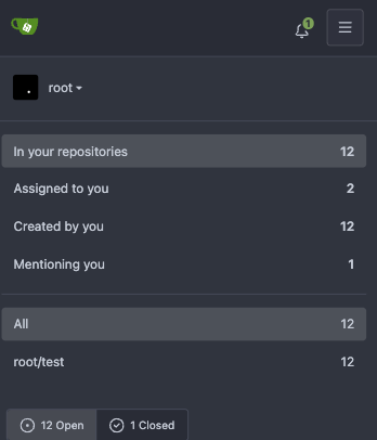
Backport #26140 by @silverwind
Extract from https://github.com/go-gitea/gitea/pull/26043, just the
padding increase.
Before and After (hard to notice, but it's there):
<img width="427" alt="Screenshot 2023-07-25 at 19 37 12"
src="https://github.com/go-gitea/gitea/assets/115237/9543dcda-eccb-4739-b7dd-06b076108ab4">
<img width="420" alt="Screenshot 2023-07-25 at 19 37 26"
src="https://github.com/go-gitea/gitea/assets/115237/0a9c3724-81a1-4c67-a13b-4b728a51fc3a">
Co-authored-by: silverwind <me@silverwind.io>
|
| |
|
|
|
|
|
|
|
|
|
|
| |
Backport https://github.com/go-gitea/gitea/pull/25601 to 1.20.
Various small enhancements to the actions list. Before and after:
<img width="1264" alt="Screenshot 2023-06-30 at 00 11 40"
src="https://github.com/go-gitea/gitea/assets/115237/bb4162ee-cdcf-4a73-b05e-f9521562edbb">
<img width="1264" alt="Screenshot 2023-06-30 at 00 09 51"
src="https://github.com/go-gitea/gitea/assets/115237/52a70ea9-4bb3-406e-904b-0fdaafde9582">
Co-authored-by: Giteabot <teabot@gitea.io>
|
| |
|
|
|
|
|
|
|
|
|
|
|
|
| |
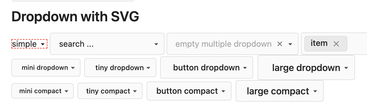
Backport https://github.com/go-gitea/gitea/pull/25652
This will prevent the most common cases of SVG shrinking because lack of
space. I evaluated multiple options and this seems to be the one with
the least impact in size and processing cost, so I went with it.
Unfortunately, CSS can not dynamically convert `16` obtained from
`attr()` to `16px`, or else a generic solution for all sizes would have
been possible. But a solution is [in
sight](https://developer.mozilla.org/en-US/docs/Web/CSS/attr#type-or-unit)
with `attr(width px)` but no browser supports it currently.
|
| |
|
|
|
|
|
|
|
|
|
|
|
|
|
|
|
|
|
|
|
|
|
|
|
|
|
| |
Backport #25568 by @silverwind
Fomantic's tables have too much padding. Reduce it so we have more
information density in them. Especially the admin tables need this
because they are bursting already because of column count.
## Admin repolist before and after
<img width="909" alt="Screenshot 2023-06-28 at 20 27 55"
src="https://github.com/go-gitea/gitea/assets/115237/954c925c-8db5-47ce-ae51-a2168b857014">
<img width="897" alt="Screenshot 2023-06-28 at 20 36 03"
src="https://github.com/go-gitea/gitea/assets/115237/0bddc09a-9117-48b3-a17e-3d34c58d8d3d">
## Other tables
<img width="1230" alt="Screenshot 2023-06-28 at 20 36 22"
src="https://github.com/go-gitea/gitea/assets/115237/38f555b6-a7ce-416a-9f1f-706eaf18863b">
<img width="1236" alt="Screenshot 2023-06-28 at 20 26 37"
src="https://github.com/go-gitea/gitea/assets/115237/82b2878e-358c-4dc2-a6b4-c66e43cd2dfb">
<img width="1231" alt="Screenshot 2023-06-28 at 20 59 30"
src="https://github.com/go-gitea/gitea/assets/115237/c6a92e55-a3a3-4c80-9a0d-50aebb49886c">
Files table is unaffected because it has custom padding already.
Co-authored-by: silverwind <me@silverwind.io>
|
| |
|
|
|
|
|
|
|
|
|
|
|
|
|
|
|
|
| |
Backport #25334 by @hiifong
Fix the incomplete display of input text
Before:
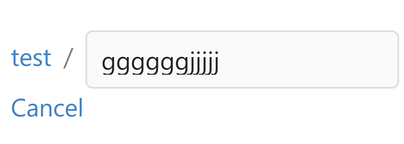
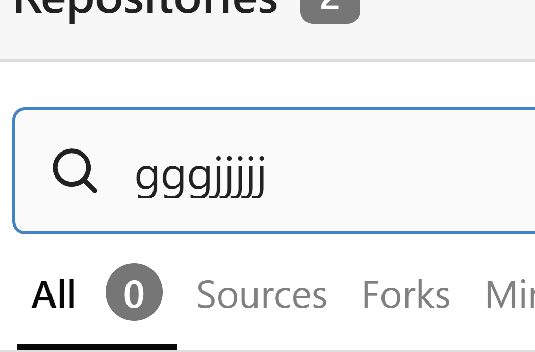
After:
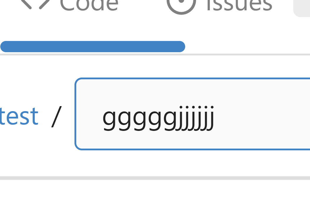
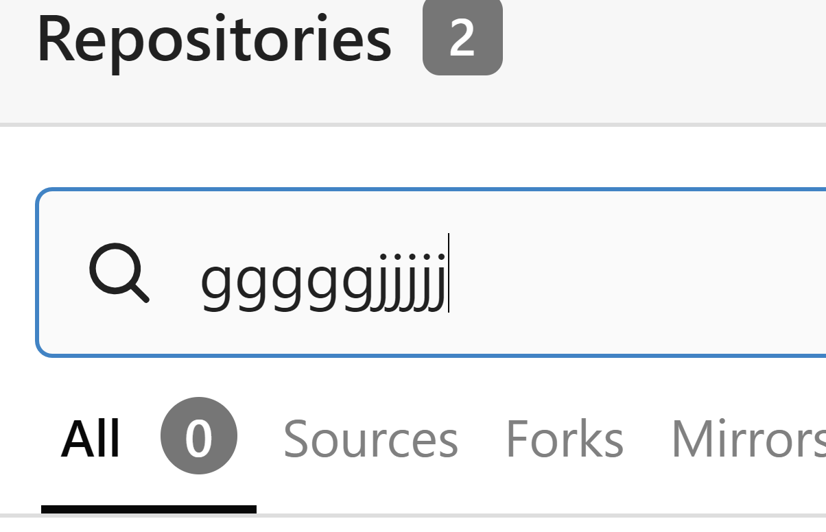
Co-authored-by: hiifong <i@hiif.ong>
Co-authored-by: silverwind <me@silverwind.io>
|
| |
|
|
|
|
|
|
|
|
|
| |
Backport #25442 by @wxiaoguang
----

Co-authored-by: wxiaoguang <wxiaoguang@gmail.com>
|
| |
|
|
|
|
|
|
|
|
|
|
|
|
|
|
|
|
|
|
|
|
|
|
|
|
|
|
|
|
|
|
|
|
|
|
|
|
|
|
| |
Backport #25264 by @silverwind
Numerous small UI fixes:
- Fix double border in collaborator list
- Fix system notice table background
- Mute links in repo and org lists
- Downsize projects edit buttons
- Improve milestones and project list rendering
- Condense milestone list entry to a single line of "metas"
- Mute ".." button in repo files list
<img width="899" alt="Screenshot 2023-06-14 at 21 19 23"
src="https://github.com/go-gitea/gitea/assets/115237/40d70006-5f76-49ad-b43c-4343ec3311e1">
<img width="905" alt="Screenshot 2023-06-14 at 21 18 29"
src="https://github.com/go-gitea/gitea/assets/115237/46ef39ea-ab26-452d-89b0-a55d0cfacfdb">
<img width="270" alt="Screenshot 2023-06-14 at 21 14 09"
src="https://github.com/go-gitea/gitea/assets/115237/aa16e833-a03b-4231-bc7c-159a6a6bee19">
<img width="409" alt="Screenshot 2023-06-14 at 21 12 13"
src="https://github.com/go-gitea/gitea/assets/115237/b5242d41-f87a-4837-b0cf-9cc4c1f43daf">
<img width="286" alt="Screenshot 2023-06-14 at 21 10 03"
src="https://github.com/go-gitea/gitea/assets/115237/d0c36e47-651b-4d34-ad95-3d59474a7c3e">
<img width="928" alt="Screenshot 2023-06-14 at 21 05 24"
src="https://github.com/go-gitea/gitea/assets/115237/fc3b713e-d252-40f5-b6ba-6e5a741ab500">
<img width="217" alt="Screenshot 2023-06-14 at 21 02 01"
src="https://github.com/go-gitea/gitea/assets/115237/c4c33376-18d6-4820-aff5-f508f6d351a0">
<img width="79" alt="Screenshot 2023-06-14 at 20 42 43"
src="https://github.com/go-gitea/gitea/assets/115237/034b5950-c0bf-473b-a2f7-0c27a0259f29">
<img width="607" alt="Screenshot 2023-06-14 at 21 00 42"
src="https://github.com/go-gitea/gitea/assets/115237/fba2d3fd-bd3e-4daf-8b2f-530a1c99c8bc">
Co-authored-by: silverwind <me@silverwind.io>
|
| |
|
|
|
|
|
|
|
|
|
|
|
|
|
|
|
|
|
|
|
|
|
|
|
|
|
|
|
|
|
| |
Backport #25277 by @wxiaoguang
Fixes: https://github.com/go-gitea/gitea/issues/25282
Fix the problems:
1. The `repo-button-row` had various patches before, this PR makes it
consistent
2. The "Add File" has wrong CSS class "icon", remove it
3. The "Add File" padding was overridden by "!important", fix it by
`.repo-button-row .button.dropdown` with comment
4. The selector `.ui.segments ~ .ui.top.attached.header` is incorrect,
it should use `+`
The `repo-button-row` is only used on 3 pages:

Co-authored-by: wxiaoguang <wxiaoguang@gmail.com>
|
| |
|
|
|
|
|
|
|
|
|
|
|
|
|
|
| |
Backport #25163 by @wxiaoguang
The code can be as simple as:
```html
<div class="flex-text-block">{{svg "octicon-alert"}} {{svg "octicon-x"}} text (block)</div>
<div><div class="flex-text-inline">{{svg "octicon-alert"}} {{svg "octicon-x"}} text</div> (inline)</div>
<div><button class="ui red button">{{svg "octicon-alert" 24}} {{svg "octicon-x" 24}} text</button></div>
```
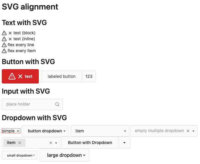
Co-authored-by: wxiaoguang <wxiaoguang@gmail.com>
|
| |
|
|
|
|
|
|
|
|
|
|
|
|
|
|
|
|
|
|
|
|
|
| |
Backport #25231 by @wxiaoguang
It causes not only one issue like #25221 (the footer width was also
affected by that change and was fixed some time ago)
The problem of "overflow: overlay" (#21850) is:
* It's not widely supported and is non-standard
https://caniuse.com/css-overflow-overlay
* It's not widely tested in Gitea (some standard layout like `ui
container + ui grid` may break it).
* The benefit seems smaller than the problems it brings.
So, I think it is good to revert it.
----
Let's leave enough time for testing and reviewing.
Co-authored-by: wxiaoguang <wxiaoguang@gmail.com>
Co-authored-by: silverwind <me@silverwind.io>
|
| |
|
|
|
|
|
|
|
|
|
| |
Backport #25208 by @wxiaoguang
According to my test, the UI (emoji) is fine in Safari
And actually the code is just dead code, because the "resize" event is
never fired on page loading. So for most cases users just view the pages
without this hacky patch, nobody ever complains.
Co-authored-by: wxiaoguang <wxiaoguang@gmail.com>
|
| |
|
|
|
|
|
|
|
|
|
|
|
|
| |
Backport #25175 by @silverwind
Some minor color tweaks
<img width="1271" alt="Screenshot 2023-06-09 at 13 29 25"
src="https://github.com/go-gitea/gitea/assets/115237/b7b34995-5d34-461f-8d19-4f5755a98109">
<img width="1272" alt="Screenshot 2023-06-09 at 13 31 20"
src="https://github.com/go-gitea/gitea/assets/115237/63c866b4-797e-46ed-ba28-b1162ccd3e15">
<img width="1276" alt="Screenshot 2023-06-09 at 13 32 21"
src="https://github.com/go-gitea/gitea/assets/115237/de7ee02e-d0c7-4979-a8aa-0fd03e8db491">
Co-authored-by: silverwind <me@silverwind.io>
|
| |
|
|
|
|
|
|
|
|
|
|
|
|
|
|
|
|
| |
Backport #24989. Clean cherry-pick aside from one small conflict with
divider.
- Various corrections to button styles, especially secondary
- Remove focus highlight, it's annoying when it stays on button after
press
- Clearly define ghost and link buttons with demos in devtest
- Remove black, grey and tertiary buttons, they should not be used
- Make `arc-green` slightly darker
<img width="1226" alt="image"
src="https://github.com/go-gitea/gitea/assets/115237/8d89786a-01ab-40f8-ae5a-e17f40e35084">
<img width="1249" alt="image"
src="https://github.com/go-gitea/gitea/assets/115237/83651e6d-3c27-46ff-b8bd-ff344d70e949">
|
| |
|
|
|
|
|
|
|
|
|
|
|
|
|
| |
Backport #25134 by @silverwind
- Fix and improve mobile navbar layout
- Apply all cleanups suggested in
https://github.com/go-gitea/gitea/pull/25111
- Make media query breakpoints match Fomantic's exactly
- Clean up whitespace in class on navbar items
Mobile navbar before and after:
<img width="745" alt="Screenshot 2023-06-08 at 08 40 56"
src="https://github.com/go-gitea/gitea/assets/115237/ca84b239-b10f-41db-8c06-dcf2b6dd9d28">
<img width="739" alt="Screenshot 2023-06-08 at 08 41 23"
src="https://github.com/go-gitea/gitea/assets/115237/09133c54-eb7e-4110-858c-ead23c3b7521">
|
| |
|
|
|
|
|
|
|
|
|
|
|
|
|
|
|
|
|
|
|
|
|
|
|
|
|
|
|
|
|
|
|
|
|
|
| |
(#25161)
Backport #25030 by @HesterG
Close #24808
Co-Authour @wxiaoguang @silverwind
1. Most svgs are found from https://worldvectorlogo.com/ , and some are
from conversion of png to svg. (facebook and nextcloud). And also
changed `templates/user/settings/security/accountlinks.tmpl`.
2. Fixed display name and iconurl related logic
# After
<img width="1436" alt="Screen Shot 2023-06-05 at 14 09 05"
src="https://github.com/go-gitea/gitea/assets/17645053/a5db39d8-1ab0-4676-82a4-fba60a1d1f84">
On mobile
<img width="378" alt="Screen Shot 2023-06-05 at 14 09 46"
src="https://github.com/go-gitea/gitea/assets/17645053/71d0f51b-baac-4f48-8ca2-ae0e013bd62e">
user/settings/security/accountlinks (The dropdown might be improved
later)
<img width="973" alt="Screen Shot 2023-06-01 at 10 01 44"
src="https://github.com/go-gitea/gitea/assets/17645053/27010e7e-2785-4fc5-8c49-b06621898f37">
Co-authored-by: HesterG <hestergong@gmail.com>
Co-authored-by: silverwind <me@silverwind.io>
Co-authored-by: wxiaoguang <wxiaoguang@gmail.com>
|
| |
|
|
|
|
|
|
|
|
|
|
|
|
|
|
|
|
|
|
|
|
|
|
|
|
|
|
|
|
|
| |
Backport #25111 by @silverwind
Improvements to the notification icon and `<nav>`:
- Add a opaque color for header hover and use it, allowing the border to
be the right color on hover (sadly, not otherwise possible with CSS, not
even `color-mix`).
- Increase font size by 1px
- Use flexbox for slightly better text centering
- Reduce padding of user and add repo button, add margin on right side
of user menu
- Remove the `following bar` wrapper on navbar
<img width="176" alt="Screenshot 2023-06-07 at 00 07 08"
src="https://github.com/go-gitea/gitea/assets/115237/23cdc3d6-7f63-49df-bec3-f2e75e32a304">
<img width="63" alt="Screenshot 2023-06-07 at 00 07 14"
src="https://github.com/go-gitea/gitea/assets/115237/fae602c2-4467-4d50-b1ec-56317843f9a2">
<img width="84" alt="Screenshot 2023-06-07 at 00 07 36"
src="https://github.com/go-gitea/gitea/assets/115237/c48141b8-0b3c-48cc-846a-3a272524dbdb">
<img width="329" alt="Screenshot 2023-06-07 at 00 25 10"
src="https://github.com/go-gitea/gitea/assets/115237/cda612f1-426e-466b-a351-fc992bfd18fd">
<img width="186" alt="Screenshot 2023-06-07 at 00 35 45"
src="https://github.com/go-gitea/gitea/assets/115237/04484a2e-9bbf-493c-aa26-8e936da008fa">
<img width="797" alt="Screenshot 2023-06-07 at 16 57 40"
src="https://github.com/go-gitea/gitea/assets/115237/e7ccb672-5807-4cb6-b306-b18ae0c7e321">
---------
Co-authored-by: silverwind <me@silverwind.io>
|
| |
|
|
|
|
|
|
|
|
|
|
|
|
|
|
|
|
|
|
|
|
| |
Close #25051
[referenced
answer](https://stackoverflow.com/questions/10813581/can-i-replace-the-expand-icon-of-the-details-element/69722686#69722686)
for marker overwrite. One limitation is that fomantic does not have
hover and active effects for the vertical submenu
([reference](https://fomantic-ui.com/collections/menu.html#sub-menu)).
And we might need to overwrite some styles if hover and active effects
are needed.
Update:
Used `data:image/svg` instead of `marker` content. And adjusted styles
for hover effect.
Take admin settings as an example:
https://github.com/go-gitea/gitea/assets/17645053/63f69823-ef43-47d5-a518-544b5ea35ba6
---------
Co-authored-by: silverwind <me@silverwind.io>
|
| |
|
|
|
|
|
|
|
|
|
|
|
|
|
|
|
| |
There were several issues with the WebAuthn registration and testing
code and the style
was very old javascript with jquery callbacks.
This PR uses async and fetch to replace the JQuery code.
Ref #22651
Signed-off-by: Andrew Thornton <art27@cantab.net>
---------
Signed-off-by: Andrew Thornton <art27@cantab.net>
Co-authored-by: delvh <dev.lh@web.de>
Co-authored-by: silverwind <me@silverwind.io>
|
| |
|
|
|
|
|
|
|
|
|
|
|
|
|
|
|
|
|
|
|
|
|
|
|
|
|
|
|
|
|
|
|
|
|
|
|
|
|
|
|
|
|
|
|
|
|
|
|
|
|
|
|
|
|
|
|
|
|
|
|
|
|
|
|
|
|
|
|
|
|
|
|
|
|
|
| |
(#25043)
Some minor UI improvements together (then no need to review 3 small PRs)
# The Map for auth sources
Close #24826
Now the LDAP and OAuth2 both have multiple line editor for the map (and
it can be resized by the handler)
<details>
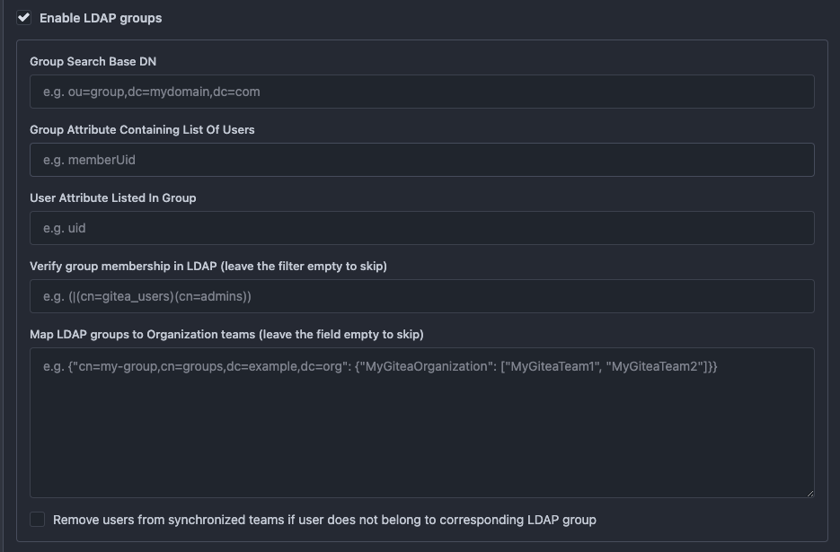
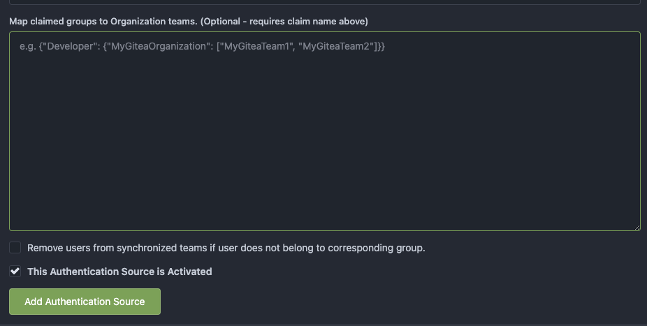
</details>
# The account link display
Before, the UI is misaligned
This PR fixes the misalignment, remove "float right", and show the auth
source name and auth type (in the tooltip).
And the "active" color is changed from dark red to primary color.
Before:
<details>

</details>
After:
<details>

</details>
# The UI logo alignment
Changed file: `css/base.css`.
Before, there were some "fine tunes", these "fine tunes" only causes
misalignment.
<details>

</details>
After this PR:
<details>
</details>
|
| |
|
|
|
|
|
|
|
|
|
|
|
|
|
|
|
|
|
|
|
| |
1. Add this button:
<img width="232" alt="Screenshot 2023-05-29 at 15 21 47"
src="https://github.com/go-gitea/gitea/assets/115237/5eaf6bd1-83db-4ffc-9503-eda0c59807d2">
<img width="297" alt="Screenshot 2023-05-29 at 15 20 22"
src="https://github.com/go-gitea/gitea/assets/115237/708a344f-f6d7-4229-bfda-76e1571b42c8">
2. Correct `button-link` styles to not have a background hover effect.
3. Tweak `.ui.container` padding to be the same for fluid and non-fluid.
4. Misc enhancements to diff header:
Before:
<img width="984" alt="Screenshot 2023-05-29 at 15 38 53"
src="https://github.com/go-gitea/gitea/assets/115237/c7926f6a-bd0a-4b05-97ad-c91fc25c62d5">
After:
<img width="987" alt="Screenshot 2023-05-29 at 15 43 10"
src="https://github.com/go-gitea/gitea/assets/115237/0149f545-45f8-42cf-b443-e1c76bd5cdeb">
|
| |
|
|
|
|
|
|
|
|
|
|
|
|
|
|
|
|
|
|
|
|
|
|
|
|
|
|
|
|
|
|
|
|
|
|
|
|
|
|
|
|
|
|
|
|
|
|
|
|
|
|
|
| |
- fixing various style issues (border color/radius, margin)
- added indent at some radio input blocks
---
### Before:


### After:


---------
Co-authored-by: silverwind <me@silverwind.io>
|
| |
|
|
|
|
|
|
|
|
|
|
|
|
|
|
|
|
|
|
| |
Part of #24728
- The timestamp shows local time and is parsed by `date.toLocaleString`;
- "show seconds" and "show timestamps" are mutually exclusive, and they
can be both hidden.
https://github.com/go-gitea/gitea/assets/17645053/89531e54-37b7-4400-a6a0-bb3cc69eb6f5
Update for timestamp format:
<img width="306" alt="Screen Shot 2023-05-25 at 09 07 47"
src="https://github.com/go-gitea/gitea/assets/17645053/2d99768d-d39c-4c9e-81a2-7bc7470399dd">
---------
Co-authored-by: silverwind <me@silverwind.io>
Co-authored-by: wxiaoguang <wxiaoguang@gmail.com>
|
| |
|
|
|
|
|
|
|
|
|
|
|
|
|
|
|
|
|
|
|
|
|
|
|
| |
We were missing overrides for `:focus` and `:active` styles which I've
added here along with two new color variants `dark-1` and `dark-2` for
them. Fomantic UI has 4 different colors but I think 3 are sufficient. I
also changed it on arc-green so button goes darker when pressed.
<img width="129" alt="Screenshot 2023-05-04 at 01 21 43"
src="https://user-images.githubusercontent.com/115237/236072060-7389276a-275b-4d3e-aa52-20b37c6e6d92.png">
<img width="130" alt="Screenshot 2023-05-04 at 01 17 59"
src="https://user-images.githubusercontent.com/115237/236071818-0e46414a-33db-4bb2-a3bd-35b514a8a2d0.png">
<img width="129" alt="Screenshot 2023-05-04 at 01 18 07"
src="https://user-images.githubusercontent.com/115237/236071819-562b1e38-541f-432b-b3b6-48e6d7594d00.png">
<img width="131" alt="Screenshot 2023-05-04 at 01 18 13"
src="https://user-images.githubusercontent.com/115237/236071820-89b7dba9-ce6c-48e5-a075-9053063e6ad3.png">
<img width="133" alt="Screenshot 2023-05-04 at 01 18 30"
src="https://user-images.githubusercontent.com/115237/236071823-b6fe2df4-b3f0-4dc8-97a8-f90ba6d19bec.png">
<img width="133" alt="Screenshot 2023-05-04 at 01 18 40"
src="https://user-images.githubusercontent.com/115237/236071824-b02ce61a-2367-4c29-8a25-45f231f5e5ee.png">
One misc change includes some fixes to editor and slightly darker
selection.
<img width="1245" alt="Screenshot 2023-05-28 at 19 16 19"
src="https://github.com/go-gitea/gitea/assets/115237/1ea4a4b6-26ba-45af-9cbc-5b8c476c2338">
|
| |
|
|
|
|
|
|
|
|
|
|
| |
Replace the `reset` module with a modern version based on
[modern-normalize](https://github.com/sindresorhus/modern-normalize).
The only things I removed from that module are the `font-family` rules
we don't need. Otherwise, it's similar to Fomantic's reset, but with the
legacy IE stuff removed.
I documented every change done to the module.
Also this introduces a new `--tab-size` variable but it has no real
effect on code yet.
|
| |
|
|
|
|
|
|
|
|
|
|
|
|
|
|
|
|
|
|
|
|
|
|
|
|
|
|
|
| |
- Slightly decrease size of reaction buttons
- Remove tooltip inside menu, it's obvious by the picture alone
- Fix top menu triangle
- Use `display: grid` to align icons in menu
- Use regular tooltip for reaction users
- Fix bug that deleted the reaction bar on clicking already reacted
reaction in dropdown
<img width="490" alt="Screenshot 2023-05-17 at 00 03 42"
src="https://github.com/go-gitea/gitea/assets/115237/61588b37-facb-4829-b75b-e1cb5dda8ca4">
<img width="67" alt="Screenshot 2023-05-17 at 00 11 14"
src="https://github.com/go-gitea/gitea/assets/115237/29605589-3b5f-40c6-8ad4-09923094bb8e">
<img width="211" alt="Screenshot 2023-05-17 at 00 29 30"
src="https://github.com/go-gitea/gitea/assets/115237/7d2725da-6a3d-4e42-a351-53647f79f762">
<img width="210" alt="Screenshot 2023-05-17 at 00 29 54"
src="https://github.com/go-gitea/gitea/assets/115237/b50f8364-033c-4445-ba25-61a814bb2d92">
<img width="892" alt="Screenshot 2023-05-17 at 00 12 20"
src="https://github.com/go-gitea/gitea/assets/115237/30a46424-406a-46e5-b4de-47172eb8679d">
---------
Co-authored-by: wxiaoguang <wxiaoguang@gmail.com>
Co-authored-by: Giteabot <teabot@gitea.io>
|
| |
|
|
|
|
|
|
|
|
|
| |
- Replace `<table>` with flexbox
- Add issue modification time and issue number
- Remove big title
- Replace tabs with menu items
- Add clicked item deletion on back button cache restoration
---------
Co-authored-by: wxiaoguang <wxiaoguang@gmail.com>
|
| |
|
|
|
|
|
|
|
|
|
|
|
|
|
|
|
|
|
| |
- Various color tweaks
- Add sticky positioning to left sidebar, right header and right step
header
- Adjust margins and border radiuses
<img width="1235" alt="Screenshot 2023-05-23 at 11 18 06"
src="https://github.com/go-gitea/gitea/assets/115237/f601b00d-c7f2-43de-89f2-3ac55f2d9cdc">
<img width="1239" alt="Screenshot 2023-05-23 at 11 18 18"
src="https://github.com/go-gitea/gitea/assets/115237/a2d24cc9-29fa-4c17-906b-84feea14b889">

---------
Co-authored-by: yp05327 <576951401@qq.com>
|
| |
|
|
|
|
|
|
|
|
| |
* Fix broken doc link:
https://github.com/go-gitea/gitea/actions/runs/5041309438/jobs/9040887385
* Improve comments about how font weight works:
https://github.com/go-gitea/gitea/pull/24827#pullrequestreview-1435584800
---------
Co-authored-by: silverwind <me@silverwind.io>
|
| |
|
|
|
|
|
|
|
|
|
|
|
|
|
|
|
|
|
|
|
|
|
|
|
|
|
|
|
|
|
|
|
|
| |
Close #24625
Main changes:
1. For the left panel, show rerun icon only on hover, and add style when
the job is selected, and removed icon on the "rerun all" button and
modify the text on the button
https://github.com/go-gitea/gitea/assets/17645053/cc437a17-d2e9-4f1b-a8cf-f56e53962767
2. Adjust fonts, and add on hover effects to the log lines. And add
loading effect when the job is done and the job step log is expanded for
the first time. (With reference to github)
https://github.com/go-gitea/gitea/assets/17645053/2808d77d-f402-4fb0-8819-7aa0a018cf0c
3. Add `gt-ellipsis` to `step-summary-msg` and `job-brief-name`
<img width="898" alt="ellipsis"
src="https://github.com/go-gitea/gitea/assets/17645053/e2fb7049-3125-4252-970d-15b0751febc7">
4. Fixed
https://github.com/go-gitea/gitea/issues/24625#issuecomment-1541380010
by adding explicit conditions to `ActionRunStatus.vue` and `status.tmpl`
5. Adjust some css styles
---------
Co-authored-by: silverwind <me@silverwind.io>
|
| |
|
|
|
|
|
|
|
|
|
|
|
| |
introduce new font weight variables (#24827)
There was some recent discussion about this in Discord `ui-design`
channel and the conclusion was that
https://github.com/go-gitea/gitea/issues/24305 should have fixed their
OS font installation to have semibold weights.
I have now tested this 601 weight on a Windows 10 machine on Firefox
myself, and I immediately noticed that bold was excessivly bold and
rendering as 700 because browsers are biased towards bolder fonts. So
revert this back to the previous value.
|
| |
|
|
|
|
|
|
|
|
|
|
|
|
|
|
|
|
|
|
| |
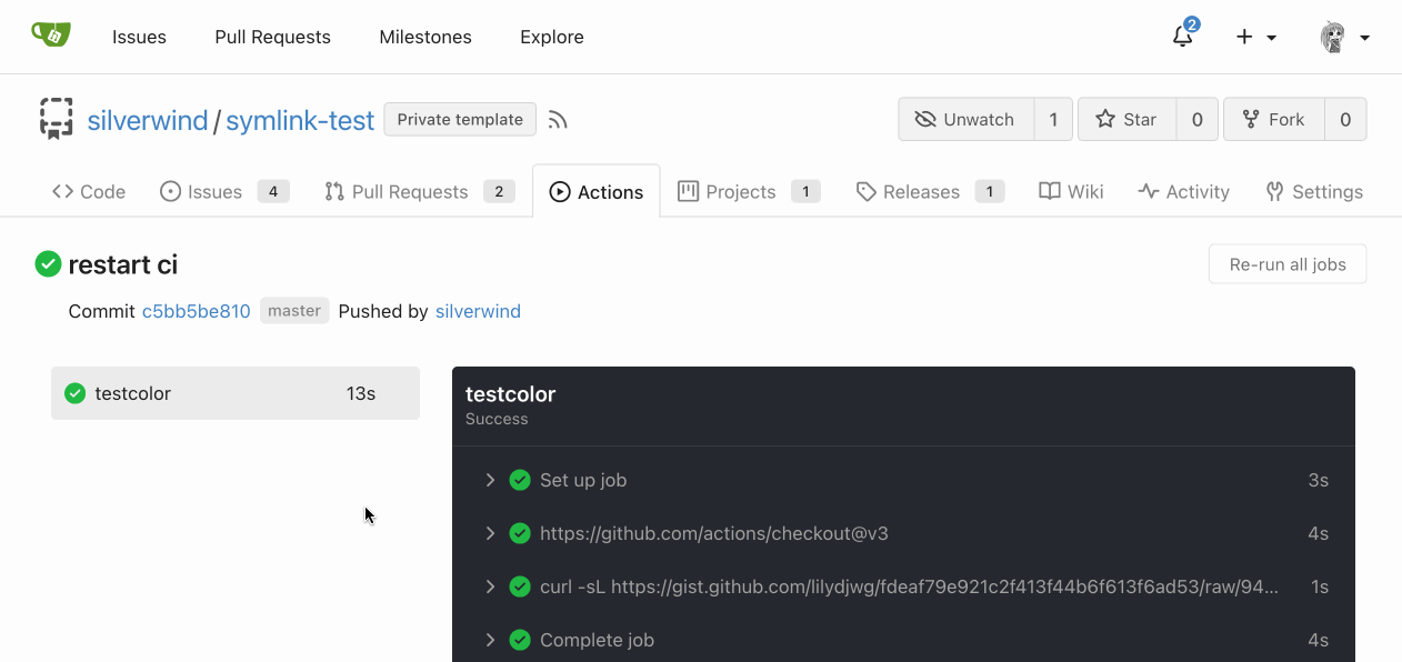
Support RTL content in Markdown:

Example document:
https://try.gitea.io/silverwind/symlink-test/src/branch/master/bidi-text.md
Same on GitHub:
https://github.com/silverwind/symlink-test/blob/master/bidi-text.md
`dir=auto` enables a browser heuristic that sets the text direction
automatically. It is the only way to get automatic text direction.
Ref: https://codeberg.org/Codeberg/Community/issues/1021
---------
Co-authored-by: wxiaoguang <wxiaoguang@gmail.com>
|
| |
|
|
|
|
|
|
|
|
|
|
|
|
|
|
|
|
|
| |
Introduce `--color-label-fg`, `--color-label-bg` and
`--color-label-hover-bg`, decoupling the label styles from other color
variables. I've set the colors so that non-interactive labels like on
tabs are dark-on-light on light theme, which imho looks better than
previous light-on-dark.
In the screenshot below, the leftmost label has hover, the second one
has active.
<img width="786" alt="Screenshot 2023-05-18 at 12 48 26"
src="https://github.com/go-gitea/gitea/assets/115237/d989bb68-504a-4406-b5f6-419ed9609f90">
<img width="789" alt="Screenshot 2023-05-18 at 13 04 07"
src="https://github.com/go-gitea/gitea/assets/115237/689a281a-a2b7-45e8-a5ee-dafb7a35e105">
---------
Co-authored-by: Giteabot <teabot@gitea.io>
|
| |
|
|
|
| |
Reorganize various CSS files for clarity, group together by subdirectory
in `index.css`. This reorders some of the rules, but I don't think it
should introduce any issues because of that.
|
| |
|
|
|
|
|
|
|
|
|
|
|
|
|
|
|
|
|
|
|
|
|
|
|
|
|
|
| |
Diff without whitespace:
https://github.com/go-gitea/gitea/pull/24740/files?diff=unified&w=1
- Use SVGs for GitHub and GitLab oauth providers
- Replace section wrapping with a divider
- Rework icon rendering, increase size from 32px to 40px
Before:
<img width="853" alt="Screenshot 2023-05-15 at 21 54 23"
src="https://github.com/go-gitea/gitea/assets/115237/6ab5cfb4-46ff-469a-bd1f-06780d4a6a0b">
After (more providers):
<img width="849" alt="Screenshot 2023-05-15 at 21 51 21"
src="https://github.com/go-gitea/gitea/assets/115237/fa84f92f-98e0-4aed-9357-5d62ddd98195">
<img width="856" alt="Screenshot 2023-05-15 at 21 56 45"
src="https://github.com/go-gitea/gitea/assets/115237/d3edd7ed-dadd-4302-aca7-08f20adc220e">
Ref: https://codeberg.org/Codeberg/Community/issues/1023
---------
Co-authored-by: Giteabot <teabot@gitea.io>
|
| |
|
|
|
|
|
|
|
|
|
|
|
|
|
|
|
|
|
|
|
|
| |
Clean up a few cases where avatar dimensions were overwritten via CSS,
which were no longer needed or were possible to set via HTML width.
Also included are two small fixes:
- Fix one more case of incorrect avatar offset on review timeline
- Vertically center avatars in review sidebar
There is more to be done here, but some of the work depends on Fomantic
`comment` module removal, or in the case of org member lists, a refactor
of the `avatarlink` template to accept a size.
<img width="371" alt="image"
src="https://github.com/go-gitea/gitea/assets/115237/9c5902fb-2b89-4a7d-a152-60e74c3b2c56">
<img width="306" alt="image"
src="https://github.com/go-gitea/gitea/assets/115237/c8d92e2a-91c9-4f4a-a7de-6ae1a6bc0479">
---------
Co-authored-by: Giteabot <teabot@gitea.io>
|
| |
|
|
|
|
|
|
|
|
|
|
|
|
|
|
|
|
|
|
|
|
|
|
| |
<img width="474" alt="image"
src="https://github.com/go-gitea/gitea/assets/2114189/7fd231f9-71c3-4769-ba96-37a5b77cf224">
<img width="557" alt="image"
src="https://github.com/go-gitea/gitea/assets/2114189/c9945f61-39b4-4711-aea8-c34ef1d714c5">
<img width="641" alt="image"
src="https://github.com/go-gitea/gitea/assets/2114189/691be76e-74fd-420d-9b9e-ba1f3b08e0b4">
And a page to test buttons:
<details>
<img width="451" alt="image"
src="https://github.com/go-gitea/gitea/assets/2114189/5f61da24-2f36-40ad-a9bb-2205da5f5f04">
</details>
---------
Co-authored-by: Giteabot <teabot@gitea.io>
Co-authored-by: silverwind <me@silverwind.io>
|
| |
|
|
|
|
|
|
|
|
|
|
|
|
|
|
|
|
|
|
|
|
|
|
|
|
|
|
|
|
|
|
|
|
|
|
|
|
|
|
|
|
|
|
|
|
|
|
|
|
|
|
|
|
|
|
|
|
| |
module (#24653)
Fixes: #8972
Fixes: #24263
And I think it also (partially) fix #24263 (no need to convert) ,
because users could upload any supported image format if it isn't larger
than AVATAR_MAX_ORIGIN_SIZE
The main idea:
* if the uploaded file size is not larger than AVATAR_MAX_ORIGIN_SIZE,
use the origin
* if the resized size is larger than the origin, use the origin
Screenshots:
JPG:
<details>

</details>
APNG:
<details>


</details>
WebP (animated)
<details>

</details>
The only exception: if a WebP image is larger than MaxOriginSize and it
is animated, then current `webp` package can't decode it, so only in
this case it isn't supported. IMO no need to support such case: why a
user would upload a 1MB animated webp as avatar? crazy .....
---------
Co-authored-by: silverwind <me@silverwind.io>
|
| |
|
|
|
|
|
|
|
|
|
|
|
|
|
|
|
|
|
|
|
|
|
|
|
|
|
|
|
|
|
|
| |
Mainstream frameworks:
* https://getbootstrap.com/docs/5.0/components/buttons/
* https://primer.style/css/components/buttons#link-button
* https://nextui.org/docs/components/button#light
* https://coreui.io/react/docs/components/button/
* https://design-system.hpe.design/components/button
* https://chakra-ui.com/docs/components/button/usage#button-variants
* https://mui.com/material-ui/react-button/
All (at least most?) of them make "link" button have "underline" when
hovering.
So, a "link" is a "link", when it's hovered, it should have the
underline by default. To be strict, Gitea's "button-link" is not
link-style, so it needs a better name.
Actually, for the "plain" button, there are some different approaches:
* Some frameworks just make "default" button as no style (not feasible
in Gitea/Fomantic UI)
* Primer uses "btn-invisible", which is not a proper word
* NextUI uses "light", which is not a proper word, either ...
* CoreUI / ChakraUI uses "ghost", I think this name is acceptable.
Welcome to suggest better name for such button.
Or, we just call it ".button-plain" or ".button-simple", in fact I
prefer such simple and clear name.
|
| |
|
|
|
|
|
|
|
|
|
|
|
|
|
|
|
|
|
|
|
|
|
|
|
|
|
|
|
|
|
|
|
|
| |
Fix regression from https://github.com/go-gitea/gitea/pull/24476 where
the `svg.svg` class misaligns SVG icons across the site and streched
buttons unintentionally in vertical height.
Before (button 30.3px):
<img width="157" alt="Screenshot 2023-05-11 at 22 09 42"
src="https://github.com/go-gitea/gitea/assets/115237/0fd137ab-ab52-4cf8-afca-c45776d526d0">
After (button 30px):
<img width="160" alt="Screenshot 2023-05-11 at 22 09 59"
src="https://github.com/go-gitea/gitea/assets/115237/4b741f4b-0fd2-4fae-9bee-16a7deb098e8">
[vertical-align:
middle](https://developer.mozilla.org/en-US/docs/Web/CSS/vertical-align)
is not suitable to align icons to text because
> Aligns the middle of the element with the baseline plus half the
x-height of the parent.
Example of `vertical-align: middle` from MDN:
<img width="232" alt="Screenshot 2023-05-11 at 22 29 28"
src="https://github.com/go-gitea/gitea/assets/115237/179fb756-85a1-4cab-8219-1a4958f333e2">
So I think the
[existing](https://github.com/go-gitea/gitea/blob/365bb77a5497d492836bf823cf780c823db27e8c/web_src/css/svg.css#L3)
`vertical-align: text-top` is generally still the best bet:
<img width="241" alt="Screenshot 2023-05-11 at 22 34 24"
src="https://github.com/go-gitea/gitea/assets/115237/0cd6edf5-12c0-4bdb-8771-a900f5ba2d35">
Co-authored-by: Giteabot <teabot@gitea.io>
|
| |
|
|
|
|
|
|
|
|
|
|
|
|
|
|
|
|
|
|
|
|
|
|
|
|
|
|
| |
Fix regression from https://github.com/go-gitea/gitea/pull/24471 where
CSS rules for `.icon.grey` were removed which were in use by the RSS
icons.
Gave them their own class instead, removed a wrapper and also fixed
vertical alignment on them. Additionally, did a few related fixes on the
org header for alignment.
Fixes: https://github.com/go-gitea/gitea/issues/24584
<img width="196" alt="Screenshot 2023-05-01 at 22 39 40"
src="https://user-images.githubusercontent.com/115237/235528228-959e2385-c1d2-4d5c-baec-e3784d459653.png">
<img width="216" alt="Screenshot 2023-05-01 at 22 44 20"
src="https://user-images.githubusercontent.com/115237/235528231-95cbff86-5672-48eb-b214-8bdcefa1612c.png">
<img width="120" alt="Screenshot 2023-05-01 at 22 56 36"
src="https://user-images.githubusercontent.com/115237/235529844-b94ab554-3259-4d0c-b040-82aed7d1a111.png">
<img width="372" alt="Screenshot 2023-05-01 at 22 54 25"
src="https://user-images.githubusercontent.com/115237/235529744-1a9c201b-5692-4122-9765-2f201a322a9e.png">
<img width="477" alt="Screenshot 2023-05-01 at 22 55 28"
src="https://user-images.githubusercontent.com/115237/235529748-62188554-9927-42ef-bc94-7052bce266e2.png">
---------
Co-authored-by: wxiaoguang <wxiaoguang@gmail.com>
|
| |
|
|
|
|
|
|
|
|
|
|
|
|
|
|
|
|
|
|
|
|
|
| |
- Make code block rendering via backticks work
- Remove link color unless hovered
- Remove table stripes and fix stripes rendering on dark theme for other
tables
- Introduce new `button-link` class discussed previously for buttons
that look and act like links and apply it to the two right-side buttons
- Reduce box padding by 8px on each side
- Fix "Mark all read" button margin-right
- brighten `--color-markup-code-block` on arc-green
### Before
<img width="1216" alt="Screenshot 2023-05-10 at 20 00 30"
src="https://github.com/go-gitea/gitea/assets/115237/66da9ec2-dd09-4ef0-8f1d-1822a18b6b43">
<img width="1211" alt="Screenshot 2023-05-10 at 20 00 48"
src="https://github.com/go-gitea/gitea/assets/115237/f48e30a2-9a00-4723-93aa-79b97ca0ba0c">
### After
<img width="1222" alt="Screenshot 2023-05-10 at 20 09 59"
src="https://github.com/go-gitea/gitea/assets/115237/c956e0d0-b3d9-42a4-a3ed-f0431c22bf3f">
<img width="1218" alt="Screenshot 2023-05-10 at 20 05 34"
src="https://github.com/go-gitea/gitea/assets/115237/f72c1628-3961-4c28-9263-07cdf7531316">
|
| |
|
|
|
|
|
|
|
|
|
|
|
|
|
|
|
|
|
|
|
|
|
|
|
|
|
|
|
|
|
|
|
|
|
|
|
|
|
|
|
|
|
|
|
|
|
|
|
|
|
|
|
| |
- Remove various horizontal dividers on repo pages that didn't provide
visual benefit
- Remove label/milestone pills on single issue/pr page
- Remove issue-related pill buttons on projects page
- Increase contrast of color-secondary on arc-green
- Improve notifications icon, make circle bigger
- Remove some inline styles
- Fix focus in issue/pr title edit and select all text on button click
### Issue and PR before and after
<img width="1249" alt="Screenshot 2023-05-01 at 11 44 22"
src="https://user-images.githubusercontent.com/115237/235436662-a708288e-84fb-4b2e-a5a2-3a1c17d28f6c.png">
<img width="1248" alt="Screenshot 2023-05-01 at 11 58 51"
src="https://user-images.githubusercontent.com/115237/235437992-f863e483-f3cc-4cc1-8204-fd223647a0c9.png">
### Projects before and after
<img width="1255" alt="Screenshot 2023-05-01 at 11 41 02"
src="https://user-images.githubusercontent.com/115237/235436433-0deb85d6-4e7d-4e74-847f-254cc70a0cf9.png">
<img width="1267" alt="Screenshot 2023-05-01 at 11 40 03"
src="https://user-images.githubusercontent.com/115237/235436431-715b13cb-f78c-4d86-b27a-9229f9738c5b.png">
### Releases before and after
<img width="1243" alt="Screenshot 2023-05-01 at 11 41 12"
src="https://user-images.githubusercontent.com/115237/235436457-b655ee6f-03b8-4595-8d8c-b15ea469e988.png">
<img width="1240" alt="Screenshot 2023-05-01 at 11 40 10"
src="https://user-images.githubusercontent.com/115237/235436456-05a2a0dd-7cbb-4f26-b0d3-4f667df4bb95.png">
### Misc
<img width="58" alt="Screenshot 2023-05-01 at 10 49 13"
src="https://user-images.githubusercontent.com/115237/235432494-936ce995-6e22-47bc-ab2d-c9e93d31987d.png">
<img width="57" alt="Screenshot 2023-05-01 at 18 57 08"
src="https://user-images.githubusercontent.com/115237/235492430-1d32cfe0-0f2c-467c-b2fa-925b27e30e0e.png">
Issue title edit and wrap:
<img width="1238" alt="Screenshot 2023-05-01 at 12 34 40"
src="https://user-images.githubusercontent.com/115237/235441407-d5067a57-e586-4865-a652-282e5944abb4.png">
<img width="1232" alt="Screenshot 2023-05-01 at 12 06 24"
src="https://user-images.githubusercontent.com/115237/235438710-1a543dda-220f-4d87-8f93-f1710c0695f0.png">
---------
Co-authored-by: wxiaoguang <wxiaoguang@gmail.com>
|
| |
|
|
|
|
|
|
|
|
|
|
|
|
|
|
|
|
|
|
|
|
|
|
|
|
|
|
|
|
|
|
|
|
| |
Follow #24393
The funny history:
* At the beginning, `.ui.message` was polluted by `text-align: center`
* Then people do `<div class="ui ... message text left">`
* But `.ui.left` is polluted by `float: left`
* Then people do `#xxx .ui.message { width: 100% !important;}`
The code just becomes more and more hacky.
After removing the pollution, everything becomes clear and straight.
And, this PR also does:
1. Remove the `package.css`, its styles could be provided by `top
aligned`
2. Remove `#avatar-arrow`, dead code
Screenshot:


Co-authored-by: Giteabot <teabot@gitea.io>
|
| |
|
|
|
|
|
|
|
|
|
|
|
|
|
|
|
|
|
|
|
|
| |
Make this stylelint rule match on more properties.
The dead CSS relates to the navbar, which currently has classes:
```
ui top secondary stackable main menu following bar light
```
Which means `.following.bar .top.menu` can never match, so remove this
dead CSS as well as inactive `z-index` and `left` on it.
Commits table striping becomes more visible on dark theme, but I don't
think it's worth introducing a new color until
https://github.com/go-gitea/gitea/pull/24423 is ready, which would have
to remove it again:
<img width="668" alt="Screenshot 2023-05-01 at 18 41 49"
src="https://user-images.githubusercontent.com/115237/235489873-6b272899-1d78-443a-872c-ee7731c269f9.png">
<img width="680" alt="Screenshot 2023-05-01 at 18 41 41"
src="https://user-images.githubusercontent.com/115237/235489878-1b9468af-c74f-48a6-a469-9eba57cfcb4d.png">
|
| |
|
|
|
|
|
|
|
|
|
|
|
| |
I am not sure what "new-menu" means, but I think we need to fix these
problems:
1. it shouldn't have "stackable", which makes the items stacked when
width is small. the `new-menu` already has `overflow: auto`
2. `justify-content: center` doesn't work with `overflow: auto` (for
small width), so use `margin: auto`
*
https://bhch.github.io/posts/2021/04/centring-flex-items-and-allowing-overflow-scroll/
3. `runner-new-menu` is dead code (copying & pasting ?)
|
| |
|
|
|
|
|
|
|
|
|
|
|
|
|
|
|
|
|
|
|
|
|
| |
### File path before/after
<img width="522" alt="Screenshot 2023-05-01 at 13 23 33"
src="https://user-images.githubusercontent.com/115237/235445636-57776038-c98e-4cab-8abe-045138a76958.png">
<img width="522" alt="Screenshot 2023-05-01 at 13 24 08"
src="https://user-images.githubusercontent.com/115237/235445638-70bef62a-1b70-41f8-ba51-728db4d54402.png">
### File edit before/after
<img width="499" alt="Screenshot 2023-05-01 at 13 24 46"
src="https://user-images.githubusercontent.com/115237/235445676-7b3cc23e-289b-40a6-8d4f-0d7fb2efb55e.png">
<img width="497" alt="Screenshot 2023-05-01 at 13 24 52"
src="https://user-images.githubusercontent.com/115237/235445677-db9f3974-8456-46de-a32b-9198110c0540.png">
### Cherry-pick before/after
<img width="590" alt="Screenshot 2023-05-01 at 13 25 30"
src="https://user-images.githubusercontent.com/115237/235445717-99445024-1bb2-46d4-9bd8-8086bad57d34.png">
<img width="582" alt="Screenshot 2023-05-01 at 13 25 37"
src="https://user-images.githubusercontent.com/115237/235445720-9c1dc497-eb23-4e10-a727-27f4d6df69e6.png">
|
| |
|
|
|
| |
Fix #24460
That's a mistake but ..... no idea why I wrote so ... remove it.
|
| |
|
|
|
|
|
|
|
| |
- Replace leftover dropdown triangles with SVG
- Replace remove icon with SVG and add styling for it:
<img width="817" alt="Screenshot 2023-05-01 at 00 40 05"
src="https://user-images.githubusercontent.com/115237/235379271-4674d4f7-b11e-4d6d-90f9-1478325443ca.png">
<img width="816" alt="Screenshot 2023-05-01 at 00 46 56"
src="https://user-images.githubusercontent.com/115237/235379451-b515afb3-9773-4f6f-a259-e7048235bcba.png">
|
| |
|
|
|
|
|
|
|
|
|
| |
- Add `ui-monospace` to support Safari 13.4+.
- Add `SF Mono` variant to support the font on non-mac.
- Quote fonts as per [W3C
recommendation](https://www.w3.org/TR/2018/REC-css-fonts-3-20180920/#propdef-font-family).
> it is recommended to quote font family names that contain white space,
digits, or punctuation characters other than hyphens
Fixes: https://github.com/go-gitea/gitea/issues/22125
|
| |
|
|
|
|
|
|
|
|
|
|
|
|
|
|
|
|
|
|
|
| |
- Make search bar dynamic full width via flexbox
- Make all buttons `small` so font size is the same for all elements in
the header
- Remove primary color from search field, add SVG icon like on Code tab
- Fix button vertical padding being enlarged by SVG icons
[View diff without
whitespace](https://github.com/go-gitea/gitea/pull/24420/files?diff=unified&w=1)
<img width="1226" alt="Screenshot 2023-04-29 at 11 58 53"
src="https://user-images.githubusercontent.com/115237/235296851-74848267-664f-4c1f-b94c-a1b94196ff75.png">
<img width="1219" alt="Screenshot 2023-04-29 at 11 59 39"
src="https://user-images.githubusercontent.com/115237/235296852-bcfde5ed-8658-43c2-b7e5-3ad84611e76f.png">
Mobile:
<img width="437" alt="Screenshot 2023-04-29 at 11 59 52"
src="https://user-images.githubusercontent.com/115237/235296860-99263373-7b27-4540-868c-a93e70f281ca.png">
<img width="433" alt="Screenshot 2023-04-29 at 12 00 00"
src="https://user-images.githubusercontent.com/115237/235296862-6cf64317-a864-405a-a00f-b5ab620349f5.png">
|
