| Commit message (Collapse) | Author | Age | Files | Lines |
|---|
| |
|
|
|
|
|
|
|
|
|
| |
Before, item would also resize on hover because of font weight:
<img width="381" alt="Screenshot 2024-04-25 at 01 28 53"
src="https://github.com/go-gitea/gitea/assets/115237/4f3291fc-90be-4d66-ae8b-3c2f763cb956">
After:
<img width="381" alt="Screenshot 2024-04-25 at 01 28 40"
src="https://github.com/go-gitea/gitea/assets/115237/06145bf2-1ddd-4171-9217-d92c100ea405">
Co-authored-by: Giteabot <teabot@gitea.io>
|
| |
|
|
|
|
|
|
|
| |
This is a very old bug with the bottom border-radiuses not being there
and the `:has` selector now makes it possible to cleanly solve it. It
affects all header+segment boxes, which there are many throughout the
UI:
<img width="1017" alt="Screenshot 2024-04-23 at 20 47 21"
src="https://github.com/go-gitea/gitea/assets/115237/870fe352-cc38-4bd6-bfe6-9fe8c3066f92">
|
| |
|
|
|
|
|
|
|
| |
Fixes: https://github.com/go-gitea/gitea/issues/30524. Slightly restyled
them so that the "knob" is contained inside the background.
<img width="179" alt="Screenshot 2024-04-16 at 21 58 09"
src="https://github.com/go-gitea/gitea/assets/115237/be94517b-9cb7-46e2-ae96-fcf6767ce4ba">
<img width="187" alt="Screenshot 2024-04-16 at 21 58 50"
src="https://github.com/go-gitea/gitea/assets/115237/c13a1959-5c5a-4e88-9225-e5f6fb72e3e0">
|
| |
|
|
|
|
|
|
|
|
|
|
|
|
|
|
|
|
|
|
|
|
|
| |
Fixes: https://github.com/go-gitea/gitea/issues/30514
Fixes:
https://github.com/go-gitea/gitea/pull/30288#issuecomment-2057466623
- Fix border-radius regression from
https://github.com/go-gitea/gitea/pull/30475
- Fix and simplify hover state
- Move the modal HTML so it does not interfere with the CSS
- Make the star and unwatch text show on mobile. There is still plenty
of space, below is iPhone 12 viewport size
<img width="696" alt="Screenshot 2024-04-15 at 20 34 03"
src="https://github.com/go-gitea/gitea/assets/115237/af90bb00-4671-4973-a255-8eb44ee6ba8d">
<img width="230" alt="Screenshot 2024-04-15 at 20 31 42"
src="https://github.com/go-gitea/gitea/assets/115237/986ef533-7a01-4bb0-8dcd-fd19e4259e84">
<img width="233" alt="Screenshot 2024-04-15 at 20 31 47"
src="https://github.com/go-gitea/gitea/assets/115237/5b825dd8-0ccc-4d56-9d8f-774abb935b68">
---------
Co-authored-by: Giteabot <teabot@gitea.io>
|
| |
|
| |
It looks better when these menus don't flash a border-bottom on click.
|
| |
|
|
|
|
| |
Previously these colors were provided by fomantic css. I missed them.
Fixes: https://github.com/go-gitea/gitea/issues/30499
Regressed by: https://github.com/go-gitea/gitea/pull/30475
|
| |
|
|
|
|
|
|
|
|
| |
Partial revert of https://github.com/go-gitea/gitea/pull/30479
It's causing problems at least here:
https://github.com/go-gitea/gitea/pull/30344#discussion_r1564895591
---------
Co-authored-by: wxiaoguang <wxiaoguang@gmail.com>
|
| |
|
|
|
|
|
| |

---------
Co-authored-by: silverwind <me@silverwind.io>
|
| |
|
|
|
|
|
|
|
|
| |
CSS-only module. Button colors are reduced to this:
<img width="639" alt="Screenshot 2024-04-14 at 15 36 07"
src="https://github.com/go-gitea/gitea/assets/115237/882d6c02-d1de-44f2-b707-db02a9f5070d">
---------
Co-authored-by: wxiaoguang <wxiaoguang@gmail.com>
|
| |
|
|
|
| |
A lot of variants are in use, so the diff stat isn't so great.
Co-authored-by: Giteabot <teabot@gitea.io>
|
| |
|
|
|
|
|
|
|
|
|
|
|
|
|
|
|
|
|
| |
Added new class `flex-container-sidebar` to cover the dashboard sidebar.
Previously this was 37.5% with more padding. Now there is less empty
space between the two columns and this matches other pages like repo or
admin settings page.
Desktop:
<img width="1345" alt="Screenshot 2024-03-31 at 15 11 36"
src="https://github.com/go-gitea/gitea/assets/115237/717389d9-d42c-466e-a8fe-e968f79447fd">
Mobile:
<img width="444" alt="Screenshot 2024-03-31 at 15 11 44"
src="https://github.com/go-gitea/gitea/assets/115237/7faa840b-513a-411b-bf2d-26d52b9b71a0">
---------
Co-authored-by: Giteabot <teabot@gitea.io>
|
| |
|
|
|
|
|
|
|
|
|
| |
Enable `no-sizzle` lint rule, there was only one use in `initCompReactionSelector` and:
- Remove all jQuery except the necessary fomantic dropdown init
- Remove the recursion, instead bind event listeners to common parent container nodes
---------
Co-authored-by: wxiaoguang <wxiaoguang@gmail.com>
Co-authored-by: Giteabot <teabot@gitea.io>
|
| |
|
|
|
|
|
|
|
|
| |
1. add border-radius and spacing to bars
2. use tailwind background classes
3. Add more space around activity list headers
<img width="983" alt="Screenshot 2024-03-27 at 23 40 54"
src="https://github.com/go-gitea/gitea/assets/115237/70f72c30-e69f-4ecb-882f-32b8bc94d638">
<img width="1020" alt="Screenshot 2024-03-27 at 23 41 02"
src="https://github.com/go-gitea/gitea/assets/115237/a35dbbda-515c-40b0-938a-d759f9686b8e">
|
| |
|
|
|
|
|
|
|
|
|
|
|
|
|
|
|
|
|
|
|
|
|
|
| |
Fixes: https://github.com/go-gitea/gitea/issues/29438
This contains numerous enhancements for how large commit messages and
large filenames render. Another notable change is that the file path is
no longer cut off by backend at 30 chars, but rendered in full with
wrapping.
<img width="1329" alt="Screenshot 2024-04-09 at 21 53 57"
src="https://github.com/go-gitea/gitea/assets/115237/5ccbb3d6-643a-4f60-ba79-3572b36d5182">
<hr>
<img width="711" alt="Screenshot 2024-04-09 at 21 44 24"
src="https://github.com/go-gitea/gitea/assets/115237/6ffe8fbb-407c-4aa7-b591-3d80daea7d57">
<hr>
<img width="439" alt="Screenshot 2024-04-09 at 21 19 03"
src="https://github.com/go-gitea/gitea/assets/115237/1ec7f6e9-2fd8-4841-87eb-6ca02ab9cd61">
<hr>
<img width="444" alt="Screenshot 2024-04-09 at 21 18 52"
src="https://github.com/go-gitea/gitea/assets/115237/70931b9e-5841-477e-b3bc-98f8d2662964">
---------
Co-authored-by: Giteabot <teabot@gitea.io>
|
| |
|
|
| |
Fixes https://github.com/go-gitea/gitea/issues/30365, regression from
https://github.com/go-gitea/gitea/pull/30281
|
| |
|
|
|
|
| |
16 seems to big, 14 too small. Let's do 15. Alignment:
<img width="181" alt="image"
src="https://github.com/go-gitea/gitea/assets/115237/f2988611-dee2-492e-a18f-dc5ab3a1cd6c">
|
| |
|
|
|
|
|
|
|
|
|
|
|
|
|
|
|
|
|
|
| |
Fixes https://github.com/go-gitea/gitea/issues/30293 and introduce the
`--page-spacing` variable which holds the spacing between the elements
on the page. This is working vertically for all pages, including ones
that have fomantic grid, and horizontally for all that use
`flex-container`.
The `.page-content > :first-child:not(.secondary-nav)` selector uses
margin which in some cases enables to adjacent margins to overlap, which
is nice.
<img width="1320" alt="Screenshot 2024-04-06 at 01 35 19"
src="https://github.com/go-gitea/gitea/assets/115237/3e81e707-e9ff-4b7f-a211-3d98f4f85353">
---
<img width="1327" alt="Screenshot 2024-04-06 at 01 35 45"
src="https://github.com/go-gitea/gitea/assets/115237/aad196c0-9e21-4c06-ae59-7e33a76c61e1">
---
<img width="1321" alt="Screenshot 2024-04-06 at 01 35 31"
src="https://github.com/go-gitea/gitea/assets/115237/785f6c5d-08b6-4e66-aa16-aeca7cfed3ad">
|
| |
|
|
|
|
|
|
|
|
|
|
|
|
|
|
|
|
|
| |
Fix regression from https://github.com/go-gitea/gitea/pull/30194 where
right-aligned items would not display correctly.
Before and After:
<img width="285" alt="Screenshot 2024-04-06 at 01 12 11"
src="https://github.com/go-gitea/gitea/assets/115237/f9168db5-0f69-4b5d-ba17-b60145ac4a09">
<img width="285" alt="Screenshot 2024-04-06 at 01 11 49"
src="https://github.com/go-gitea/gitea/assets/115237/639ab6ed-d018-4e3a-9980-1f079e4ebe9d">
Frontpage search tweaked to accommodate (which was the reason for the
changes that broken above):
<img width="445" alt="Screenshot 2024-04-06 at 01 11 34"
src="https://github.com/go-gitea/gitea/assets/115237/1919220b-390e-463a-8e3d-33a3556bf111">
<img width="438" alt="Screenshot 2024-04-06 at 01 11 39"
src="https://github.com/go-gitea/gitea/assets/115237/fd94f8e4-1d56-4b04-99e3-1cd240bd7ab4">
|
| |
|
|
|
|
|
|
| |
Likely still some unnecessary CSS but any combinations with the `ui
list` classes are covered. There was only on instance of `horizontal
list` which I removed. It was this part of the commit page:
<img width="396" alt="image"
src="https://github.com/go-gitea/gitea/assets/115237/c49ec4f5-93c3-41d6-a907-cdbedf8abc44">
|
| |
|
|
|
|
|
|
|
|
|
|
|
|
| |
Found [a better color
picker](https://github.com/web-padawan/vanilla-colorful) that [does not
rely](https://github.com/mdbassit/Coloris/issues/139) on
`querySelectorAll` or a global shared instance, and is also around a
third of the size of the previous one.
The popover is handled by tippy.js for which I introduced a new "bare"
theme and it uses a new sibling-based mechanism which should prove
useful later to create tippy popovers via HTML only.
<img width="846" alt="Screenshot 2024-03-31 at 04 03 38"
src="https://github.com/go-gitea/gitea/assets/115237/7639b911-a2d7-4f5c-bffd-a9d84561e747">
|
| |
|
|
|
|
|
| |
Create a new `issue-navbar` class specifically for this bar, previous
class used in many places and I thought I had them all removed, but not
this one.
Fixes: https://github.com/go-gitea/gitea/issues/30226
|
| |
|
|
| |
Another pure CSS module. Some styling is part of the `form` module which
will likely follow next.
|
| |
|
|
|
|
|
|
|
|
|
|
| |
On the labels list, This `left` class caused the dropdown content to
flash on page load until JS had hidden it. Remove it as I see no purpose
to it.
<img width="215" alt="image"
src="https://github.com/go-gitea/gitea/assets/115237/9e1de97f-dd89-41e0-9229-5c4a786ba762">
---------
Co-authored-by: wxiaoguang <wxiaoguang@gmail.com>
|
| |
|
|
|
|
|
|
|
|
|
|
|
|
| |
Fix https://github.com/go-gitea/gitea/issues/30185, regression from
https://github.com/go-gitea/gitea/pull/30162.
The checkboxes were unclickable because the label was positioned over
the checkbox with `padding`. Now it uses `margin` so the checkbox itself
will be clickable in all cases.
Secondly, I changed the for/id linking to also add missing `for`
attributes when `id` is present. The other way around (only `for`
present) is currently not handled and I think there are likey no
occurences in the code and introducing new non-generated `id`s might
cause problems elsewhere if we do, so I skipped on that.
|
| |
|
|
|
|
|
|
|
|
|
|
|
|
|
|
|
|
| |
Fix: [#29933](https://github.com/go-gitea/gitea/issues/29933)
**Before**

**After**

---------
Co-authored-by: silverwind <me@silverwind.io>
|
| |
|
|
|
|
|
|
|
|
|
|
|
|
|
|
|
|
|
| |
CSS is pretty slim already and the `.ui.toggle.checkbox` sliders on
admin page also still work. The only necessary JS is the one that links
`input` and `label` so that it can be toggled via label. All checkboxes
except the markdown ones render at `--checkbox-size: 16px` now.
<img width="174" alt="Screenshot 2024-03-28 at 22 15 10"
src="https://github.com/go-gitea/gitea/assets/115237/3455c1bb-166b-47e4-9847-2d20dd1f04db">
<img width="499" alt="Screenshot 2024-03-28 at 21 00 07"
src="https://github.com/go-gitea/gitea/assets/115237/412be2b3-d5a0-478a-b17b-43e6bc12e8ce">
<img width="83" alt="Screenshot 2024-03-28 at 22 14 34"
src="https://github.com/go-gitea/gitea/assets/115237/d8c89838-a420-4723-8c49-89405bb39474">
---------
Co-authored-by: delvh <dev.lh@web.de>
|
| |
|
|
|
| |
Fixes https://github.com/go-gitea/gitea/issues/30142, regression from
https://github.com/go-gitea/gitea/pull/30047. I searched the codebase
and only `bottom aligned` was definitely not in use so I removed it.
|
| |
|
|
|
|
|
|
| |
Fixes https://github.com/go-gitea/gitea/issues/30143, regression from
https://github.com/go-gitea/gitea/pull/29920.
We have `.button` on the repo page, but on the branch page it's a
`.btn`. Eventually we should find a solution to have a single button
class but until then this solution should be acceptable.
|
| |
|
|
|
|
|
|
|
|
|
| |
Of note is the CSS has references to "floating label" and "transparent
label" but I could not find those anywhere in the code. They are related
to https://github.com/go-gitea/gitea/pull/3939, but I think these have
long been removed.
---------
Co-authored-by: delvh <dev.lh@web.de>
Co-authored-by: Giteabot <teabot@gitea.io>
|
| |
|
| |
Fixes #30097, regression from #29894.
|
| |
|
|
|
|
|
|
|
|
|
|
|
| |
Fix regression from https://github.com/go-gitea/gitea/pull/30047.
Apparently tables have certain user-agent styles that center inside
`<th>` etc. Restored the original fomantic rules for these.
Before:
<img width="1332" alt="Screenshot 2024-03-25 at 21 59 33"
src="https://github.com/go-gitea/gitea/assets/115237/e06a5509-b505-4752-9b6e-91d5ed49f61d">
After:
<img width="1330" alt="Screenshot 2024-03-25 at 21 59 40"
src="https://github.com/go-gitea/gitea/assets/115237/6444817f-dd61-4a1e-a8b3-959c2780148d">
|
| |
|
|
|
|
|
| |
Big CSS module. I tested basic functionality on admin and commits table.
---------
Co-authored-by: Giteabot <teabot@gitea.io>
|
| |
|
|
|
| |
Fix regression from https://github.com/go-gitea/gitea/pull/30014. The
rule was to broad and affecting things like `primary` button
unintentionally.
|
| |
|
|
|
|
|
|
|
|
|
|
| |
We have to define this one in helpers.css because tailwind only
generates a single class but certain things rely on this being
double-class. Command ran:
```sh
perl -p -i -e 's#gt-hidden#tw-hidden#g' web_src/js/**/* templates/**/* models/**/* web_src/css/**/*
---------
Co-authored-by: wxiaoguang <wxiaoguang@gmail.com>
|
| |
|
|
|
| |
Another CSS-only module. Also, I re-ordered the imports based on
[original fomantic
order](https://github.com/fomantic/Fomantic-UI/blob/2.8.7/src/semantic.less).
|
| |
|
|
|
|
|
|
|
| |
Small CSS module. There was a ordering conflict between `.ui.menu` and
`.ui.container` which I've solved by adding the `.ui.menu` rule into
base.
---------
Co-authored-by: Giteabot <teabot@gitea.io>
|
| |
|
|
|
|
|
|
|
| |
Likely still a few useless classes left, but I think I at least don't
have missed any.
---------
Co-authored-by: delvh <dev.lh@web.de>
Co-authored-by: Giteabot <teabot@gitea.io>
|
| |
|
|
|
|
|
|
|
|
|
|
|
|
|
|
|
|
|
|
|
|
|
|
|
|
|
|
|
|
|
|
| |
1. Restore missing styles for message close icon
2. Move `code-line-button` so that it does not go off-screen on small
viewports
3. Make `code-line-button` look and behave like other buttons
4. Make `code-line-button` work in blame
5. Make the active selection span the whole line, not just the code part
6. Tweak colors, make dark theme code bg darker, make line numbers same
color in diff and file view.
7. Move code background to parent, fixing border radius and other
problems
8. Enable code wrap in blame
9. Improve blame responsiveness
10. Remove `--color-code-sidebar-bg` in blame, now it uses same
background as code
11. Rename `--color-active-line` to `--color-highlight-bg`
12. Add `--color-highlight-bg`
13. Fix button group borders on hover and border-right on last button.
<img width="1343" alt="Screenshot 2024-03-23 at 22 34 13"
src="https://github.com/go-gitea/gitea/assets/115237/fcbb919f-5dc3-43f0-97f6-870d6f412554">
<img width="1334" alt="Screenshot 2024-03-23 at 22 34 26"
src="https://github.com/go-gitea/gitea/assets/115237/ca44c3b7-4328-4645-ba49-b0dc6a5ac06d">
<img width="1338" alt="Screenshot 2024-03-23 at 22 34 57"
src="https://github.com/go-gitea/gitea/assets/115237/00eb0b5a-1ec7-4669-a94a-4602b9d1c1ac">
<img width="1337" alt="Screenshot 2024-03-23 at 22 34 42"
src="https://github.com/go-gitea/gitea/assets/115237/752edc4a-064f-413c-9dff-c086187fcd85">
Fixes: https://github.com/go-gitea/gitea/issues/18074
|
| |
|
|
|
|
|
|
|
|
|
|
|
|
|
|
|
|
| |
(#29982)
Fixes: https://github.com/go-gitea/gitea/issues/29981. Introduce
`.secondary-nav` as a universal way for styling and margin adjustments
inside `.page-content`.
If the first child of `.page-content` is `.secondary-nav`, we add margin
below it, otherwise we add padding to the first child. Notable changes:
- `--color-header-wrapper` is replaced with `--color-secondary-nav-bg`.
- `navbar` class is removed.
---------
Co-authored-by: Giteabot <teabot@gitea.io>
Co-authored-by: wxiaoguang <wxiaoguang@gmail.com>
|
| |
|
|
| |
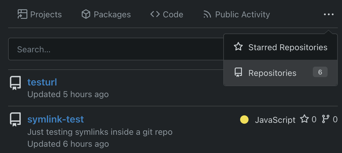
1. Use general "mobile-only" and "not-mobile" CSS styles, remove some`@media (max-width: 767.98px)` tricks
2. Use `CountFmt` for repo list, just like the repo header (and it matches GitHub, to avoid big numbers bloat the page)
|
| |
|
|
| |
Removed the grid module and moved the used parts it into our own CSS,
eliminating around 75% unused CSS in turn.
|
| |
|
|
|
|
|
|
|
|
|
|
|
|
| |
Previously, the citation js would load every time when opening a citable
repo. Now it only loads when the user clicks the button for it. The
loading state is representend with a spinner on the button:
<img width="83" alt="Screenshot 2024-03-17 at 00 25 13"
src="https://github.com/go-gitea/gitea/assets/115237/29649089-13f3-4974-ab81-e12c0f8e651f">
Diff ist best viewed with whitespace hidden.
---------
Co-authored-by: Giteabot <teabot@gitea.io>
|
| |
|
|
| |
Remove this CSS-only module, which gives a nice reduction in CSS size.
Should look exactly like before.
|
| |
|
|
|
|
|
|
|
|
|
|
|
|
|
|
|
|
|
|
|
|
|
|
|
|
|
|
|
|
|
|
|
|
|
|
| |
1. Add `<overflow-menu>` web component
2. Rename `<gitea-origin-url>` to `<origin-url>` and make filenames
match.
<img width="439" alt="image"
src="https://github.com/go-gitea/gitea/assets/115237/2fbe4ca4-110b-4ad2-8e17-c1e116ccbd74">
<img width="444" alt="Screenshot 2024-03-02 at 21 36 52"
src="https://github.com/go-gitea/gitea/assets/115237/aa8f786e-dc8c-4030-b12d-7cfb74bdfd6e">
<img width="537" alt="Screenshot 2024-03-03 at 03 05 06"
src="https://github.com/go-gitea/gitea/assets/115237/fddd50aa-adf1-4b4b-bd7f-caf30c7b2245">

TODO:
- [x] Check if removal of `requestAnimationFrame` is possible to avoid
flash of content. Likely needs a `MutationObserver`.
- [x] Hide tippy when button is removed from DOM.
- [x] ~~Implement right-aligned items
(https://github.com/go-gitea/gitea/pull/28976)~~. Not going to do it.
- [x] Clean up CSS so base element has no background and add background
via tailwind instead.
- [x] Use it for org and user page.
---------
Co-authored-by: Giteabot <teabot@gitea.io>
Co-authored-by: wxiaoguang <wxiaoguang@gmail.com>
|
| |
|
|
|
|
|
| |
Fixes: https://github.com/go-gitea/gitea/issues/29041
Fixes: https://github.com/go-gitea/gitea/pull/29713
Any of the `width: *-content` properties seem to workaround this Webkit
bug, this one seemed most suitable.
|
| |
|
|
|
|
|
|
|
|
|
|
|
|
|
|
|
|
|
|
|
|
|
| |
The buttons on the repo release tab were larger in height than on other
tabs because one of them contained the RSS icon which stretched the
button height by 3px. Workaround this problem by applying the "compact"
padding to any such button. They are within 0.4px in height now to
non-icon buttons.
Before:
<img width="406" alt="Screenshot 2024-02-28 at 15 30 23"
src="https://github.com/go-gitea/gitea/assets/115237/805bb93a-6fe4-40a0-82d1-03001bee8ecf">
After:
<img width="407" alt="Screenshot 2024-02-28 at 15 38 43"
src="https://github.com/go-gitea/gitea/assets/115237/27707588-890f-4852-ab08-105a57eda880">
For comparison, button on issue tab:
<img width="452" alt="Screenshot 2024-02-28 at 15 31 46"
src="https://github.com/go-gitea/gitea/assets/115237/74ac13d5-d016-49ba-9dd9-40ed32a748e9">
|
| |
|
|
|
|
|
|
|
|
|
|
|
|
|
|
|
| |
The current animation loops in a very fast manner, causing a slight
feeling of uncomfortableness. This change slows it a bit for a smoother
experience.
# Before
# After

Signed-off-by: Yarden Shoham <git@yardenshoham.com>
|
| |
|
| |
Fix #28489
|
| |
|
|
|
|
|
| |
Fix #27928
---------
Co-authored-by: silverwind <me@silverwind.io>
|
| |
|
|
|
|
|
|
|
|
|
|
|
|
|
|
|
|
|
|
|
|
|
|
|
| |
Step one for a GitHub like commit status check ui:
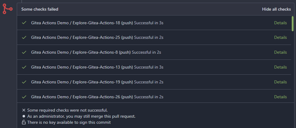
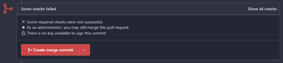
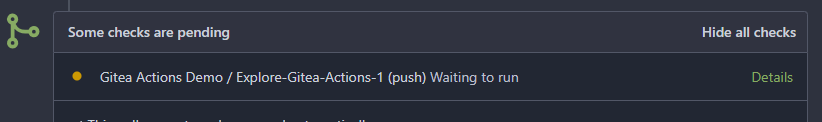
Step two:

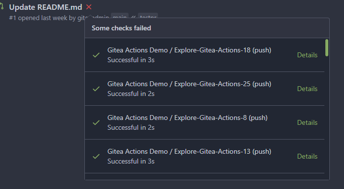
The design now will list all commit status checks which takes too much
space.
This is a pre-improve for #26247
---------
Co-authored-by: delvh <dev.lh@web.de>
Co-authored-by: silverwind <me@silverwind.io>
Co-authored-by: wxiaoguang <wxiaoguang@gmail.com>
|
