| Commit message (Collapse) | Author | Age | Files | Lines |
|---|
| |
|
|
|
|
|
|
|
|
|
|
|
|
|
|
|
|
|
| |
Backport #30837 by @silverwind
Fixes https://github.com/go-gitea/gitea/issues/30821 and restyles the
release list.
Desktop:
<img width="1199" alt="Screenshot 2024-05-02 at 20 46 10"
src="https://github.com/go-gitea/gitea/assets/115237/bee92423-d4a9-4b26-8301-3a1e09eef4cd">
Mobile:
<img width="443" alt="Screenshot 2024-05-02 at 20 46 21"
src="https://github.com/go-gitea/gitea/assets/115237/42ecbae5-bdb6-4b16-a0ee-9c64daede68d">
Co-authored-by: silverwind <me@silverwind.io>
|
| |
|
|
|
|
|
| |
Backport #30800 by wxiaoguang
Fix #30788
Co-authored-by: wxiaoguang <wxiaoguang@gmail.com>
|
| |
|
|
|
|
|
|
|
|
|
|
|
|
|
|
|
|
|
|
|
|
|
|
|
|
|
|
| |
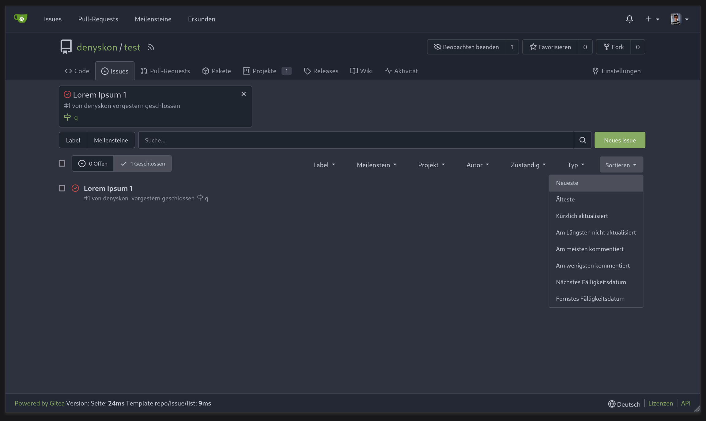
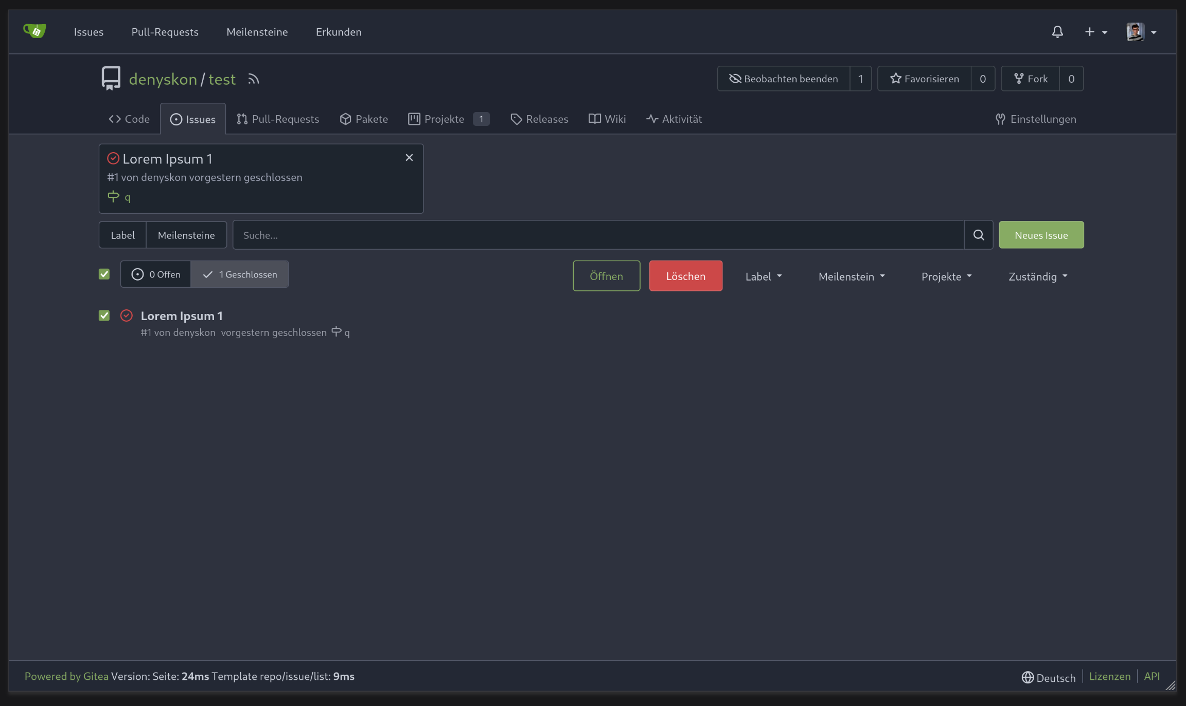
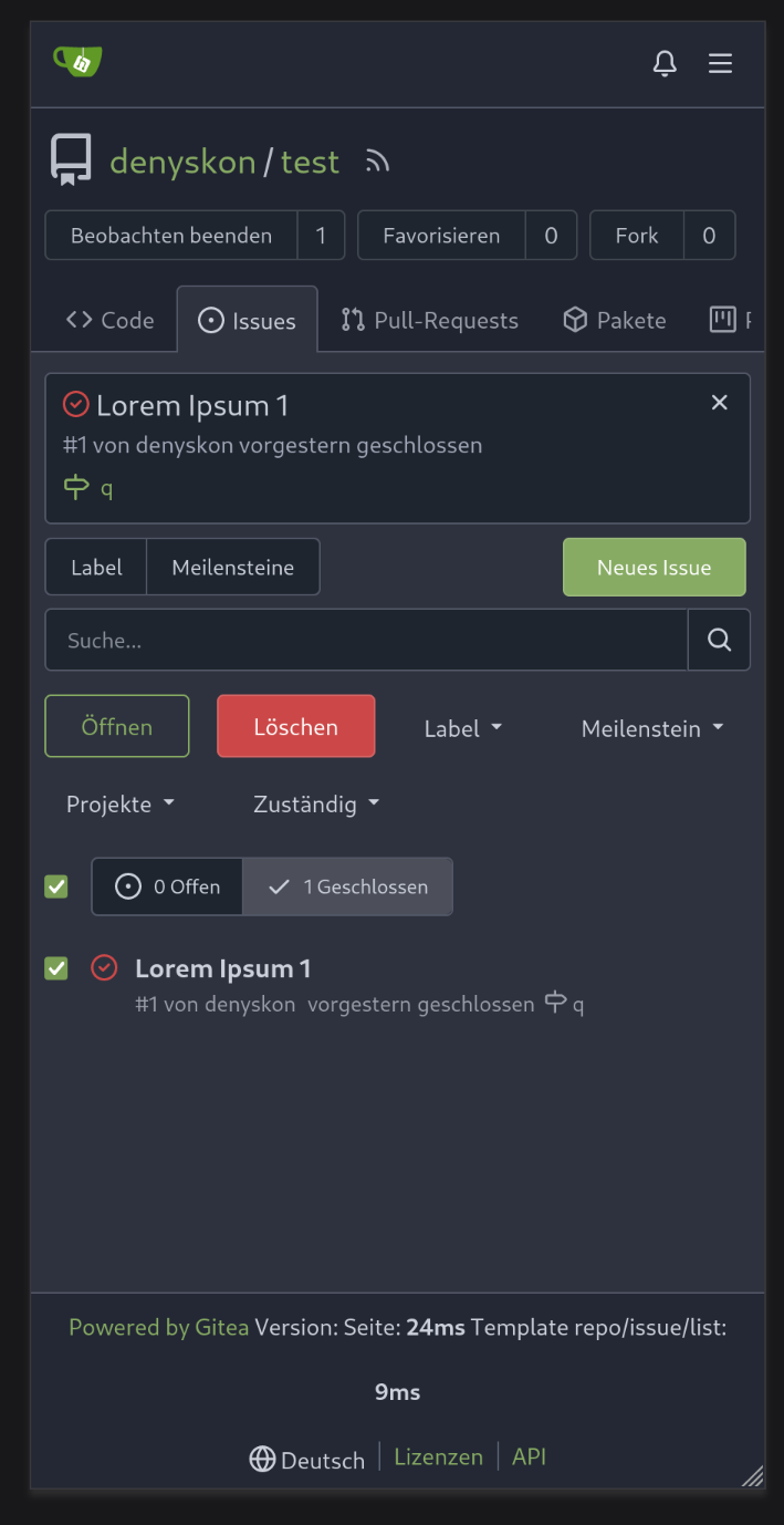
Backport #30707 by @silverwind
Fixes https://github.com/go-gitea/gitea/issues/30673, all 23 issues.
Notes:
- Tab bar menus had to change to pills because of unsolvable issue with
the border-radius as tab bar renders a overlapping border onto the box
below. And I think pills look better.
- Added padding to code editor empty preview message
- Hide monaco's built-in blue focus border, we don't need it and it
never showed before either.
- Label add menu is simplified, removing the nested segment.
<img width="1322" alt="Screenshot 2024-04-25 at 22 26 19"
src="https://github.com/go-gitea/gitea/assets/115237/7e394e0c-b7ad-417d-8e9f-12f1dea93ed1">
<img width="1326" alt="Screenshot 2024-04-25 at 22 28 00"
src="https://github.com/go-gitea/gitea/assets/115237/66c8499f-aa9f-4d95-8cca-ef13dfa82c65">
<img width="997" alt="Screenshot 2024-04-25 at 22 36 53"
src="https://github.com/go-gitea/gitea/assets/115237/07896102-c71d-4246-8173-c2bc2e1d3cae">
<img width="832" alt="Screenshot 2024-04-25 at 22 56 09"
src="https://github.com/go-gitea/gitea/assets/115237/d83afc96-08ca-4adc-baf4-3d02804be57c">
<img width="361" alt="Screenshot 2024-04-25 at 22 57 12"
src="https://github.com/go-gitea/gitea/assets/115237/c7371a68-00b5-47d8-84d0-ddc5268b2b2c">
Co-authored-by: silverwind <me@silverwind.io>
Co-authored-by: wxiaoguang <wxiaoguang@gmail.com>
|
| |
|
|
|
|
|
|
|
|
|
|
|
|
|
| |
Fixes https://github.com/go-gitea/gitea/issues/30682 and does a few
improvements:
- Use gap instead of margin/padding
- Don't render empty image div
- Remove `right floated` class that did nothing
<img width="406" alt="Screenshot 2024-04-24 at 20 21 20"
src="https://github.com/go-gitea/gitea/assets/115237/2fa88707-c2c4-40df-aee7-a684c3097ed0">
---------
Co-authored-by: KN4CK3R <admin@oldschoolhack.me>
|
| |
|
|
|
|
|
|
|
|
|
|
|
|
|
|
|
|
|
|
|
|
|
| |
Fixes: https://github.com/go-gitea/gitea/issues/30514
Fixes:
https://github.com/go-gitea/gitea/pull/30288#issuecomment-2057466623
- Fix border-radius regression from
https://github.com/go-gitea/gitea/pull/30475
- Fix and simplify hover state
- Move the modal HTML so it does not interfere with the CSS
- Make the star and unwatch text show on mobile. There is still plenty
of space, below is iPhone 12 viewport size
<img width="696" alt="Screenshot 2024-04-15 at 20 34 03"
src="https://github.com/go-gitea/gitea/assets/115237/af90bb00-4671-4973-a255-8eb44ee6ba8d">
<img width="230" alt="Screenshot 2024-04-15 at 20 31 42"
src="https://github.com/go-gitea/gitea/assets/115237/986ef533-7a01-4bb0-8dcd-fd19e4259e84">
<img width="233" alt="Screenshot 2024-04-15 at 20 31 47"
src="https://github.com/go-gitea/gitea/assets/115237/5b825dd8-0ccc-4d56-9d8f-774abb935b68">
---------
Co-authored-by: Giteabot <teabot@gitea.io>
|
| |
|
|
|
|
|
|
|
|
|
|
|
| |
Fixes: https://github.com/go-gitea/gitea/issues/27971
Fixes: https://github.com/go-gitea/gitea/pull/28010
<img width="689" alt="Screenshot 2024-04-09 at 00 19 57"
src="https://github.com/go-gitea/gitea/assets/115237/7c895a47-274f-40a6-a126-290658f1982d">
Also fixes a similar issue in issue list where CSS was there but not
active because of missing `display: block`.
<img width="372" alt="Screenshot 2024-04-09 at 00 18 25"
src="https://github.com/go-gitea/gitea/assets/115237/cfbee7cd-2e15-4ac7-96ce-020816f48798">
|
| |
|
|
|
|
|
|
|
|
|
| |
Enable `no-sizzle` lint rule, there was only one use in `initCompReactionSelector` and:
- Remove all jQuery except the necessary fomantic dropdown init
- Remove the recursion, instead bind event listeners to common parent container nodes
---------
Co-authored-by: wxiaoguang <wxiaoguang@gmail.com>
Co-authored-by: Giteabot <teabot@gitea.io>
|
| |
|
|
|
|
|
|
|
|
|
|
|
|
|
|
|
|
|
|
|
|
|
|
|
|
|
| |
1. The previous color contrast calculation function was incorrect at
least for the `#84b6eb` where it output low-contrast white instead of
black. I've rewritten these functions now to accept hex colors and to
match GitHub's calculation and to output pure white/black for maximum
contrast. Before and after:
<img width="94" alt="Screenshot 2024-04-02 at 01 53 46"
src="https://github.com/go-gitea/gitea/assets/115237/00b39e15-a377-4458-95cf-ceec74b78228"><img
width="90" alt="Screenshot 2024-04-02 at 01 51 30"
src="https://github.com/go-gitea/gitea/assets/115237/1677067a-8d8f-47eb-82c0-76330deeb775">
2. Fix project-related issues:
- Expose the new `ContrastColor` function as template helper and use it
for project cards, replacing the previous JS solution which eliminates a
flash of wrong color on page load.
- Fix a bug where if editing a project title, the counter would get
lost.
- Move `rgbToHex` function to color utils.
@HesterG fyi
---------
Co-authored-by: delvh <dev.lh@web.de>
Co-authored-by: Giteabot <teabot@gitea.io>
|
| |
|
|
|
|
|
|
|
|
|
|
|
|
|
|
|
|
|
| |
CSS is pretty slim already and the `.ui.toggle.checkbox` sliders on
admin page also still work. The only necessary JS is the one that links
`input` and `label` so that it can be toggled via label. All checkboxes
except the markdown ones render at `--checkbox-size: 16px` now.
<img width="174" alt="Screenshot 2024-03-28 at 22 15 10"
src="https://github.com/go-gitea/gitea/assets/115237/3455c1bb-166b-47e4-9847-2d20dd1f04db">
<img width="499" alt="Screenshot 2024-03-28 at 21 00 07"
src="https://github.com/go-gitea/gitea/assets/115237/412be2b3-d5a0-478a-b17b-43e6bc12e8ce">
<img width="83" alt="Screenshot 2024-03-28 at 22 14 34"
src="https://github.com/go-gitea/gitea/assets/115237/d8c89838-a420-4723-8c49-89405bb39474">
---------
Co-authored-by: delvh <dev.lh@web.de>
|
| |
|
|
|
|
|
|
|
|
|
|
|
|
|
| |
1. Add "grabbing" cursor while dragging items:

2. Make project board only drag via their header, not via their whole
body.
3. Fix some cursor problems in projects
4. Move shared options into `createSortable`.
|
| |
|
|
|
|
|
|
|
|
|
|
|
|
|
|
|
|
|
|
|
|
|
|
|
|
|
|
|
|
|
|
| |
1. Restore missing styles for message close icon
2. Move `code-line-button` so that it does not go off-screen on small
viewports
3. Make `code-line-button` look and behave like other buttons
4. Make `code-line-button` work in blame
5. Make the active selection span the whole line, not just the code part
6. Tweak colors, make dark theme code bg darker, make line numbers same
color in diff and file view.
7. Move code background to parent, fixing border radius and other
problems
8. Enable code wrap in blame
9. Improve blame responsiveness
10. Remove `--color-code-sidebar-bg` in blame, now it uses same
background as code
11. Rename `--color-active-line` to `--color-highlight-bg`
12. Add `--color-highlight-bg`
13. Fix button group borders on hover and border-right on last button.
<img width="1343" alt="Screenshot 2024-03-23 at 22 34 13"
src="https://github.com/go-gitea/gitea/assets/115237/fcbb919f-5dc3-43f0-97f6-870d6f412554">
<img width="1334" alt="Screenshot 2024-03-23 at 22 34 26"
src="https://github.com/go-gitea/gitea/assets/115237/ca44c3b7-4328-4645-ba49-b0dc6a5ac06d">
<img width="1338" alt="Screenshot 2024-03-23 at 22 34 57"
src="https://github.com/go-gitea/gitea/assets/115237/00eb0b5a-1ec7-4669-a94a-4602b9d1c1ac">
<img width="1337" alt="Screenshot 2024-03-23 at 22 34 42"
src="https://github.com/go-gitea/gitea/assets/115237/752edc4a-064f-413c-9dff-c086187fcd85">
Fixes: https://github.com/go-gitea/gitea/issues/18074
|
| |
|
|
|
|
|
|
|
|
|
|
|
|
|
|
|
|
| |
(#29982)
Fixes: https://github.com/go-gitea/gitea/issues/29981. Introduce
`.secondary-nav` as a universal way for styling and margin adjustments
inside `.page-content`.
If the first child of `.page-content` is `.secondary-nav`, we add margin
below it, otherwise we add padding to the first child. Notable changes:
- `--color-header-wrapper` is replaced with `--color-secondary-nav-bg`.
- `navbar` class is removed.
---------
Co-authored-by: Giteabot <teabot@gitea.io>
Co-authored-by: wxiaoguang <wxiaoguang@gmail.com>
|
| |
|
|
|
|
|
|
|
|
|
| |
Before
<img width="1312" alt="image"
src="https://github.com/go-gitea/gitea/assets/81045/26a6dec2-9fea-4c0c-b6fb-290eab12a55a">
After
<img width="1298" alt="image"
src="https://github.com/go-gitea/gitea/assets/81045/01f7a714-eae9-4729-918f-3b4795094d0b">
|
| |
|
|
| |
1. Use general "mobile-only" and "not-mobile" CSS styles, remove some`@media (max-width: 767.98px)` tricks
2. Use `CountFmt` for repo list, just like the repo header (and it matches GitHub, to avoid big numbers bloat the page)
|
| |
|
|
|
|
|
|
|
|
|
|
|
|
|
|
|
|
|
|
|
|
|
|
|
|
|
| |
There is a small layout shift in when active tab changes. Notice how the
actions SVG is unstable:

This is because the active item with bold text is wider then the
inactive one. I have applied [this
trick](https://stackoverflow.com/a/32570813/808699) to prevent this
layout shift. It's only active inside `<overflow-menu>` because I wanted
to avoid changing HTML and doing it in regular JS would cause a flicker.
I don't expect us to introduce other similar menus without
`<overflow-menu>`, so that place is likely fine.

I also changed the weight from 500 to 600, slightly reduced horizontal
padding, merged some tab-bar related CSS rules and a added a small
margin below repo-header so it does not look so crammed against the
buttons on top.
---------
Co-authored-by: wxiaoguang <wxiaoguang@gmail.com>
|
| |
|
|
|
|
|
|
|
|
|
|
|
|
|
|
|
|
|
|
|
|
| |
The negative margin was suboptimal and presents a few unnecessary
challenges while styling the page. Remove it and add custom margin
values, which slightly changes the height a few things near the top of
the page as well:
15px less height of explore and login navbar:
<img width="899" alt="Screenshot 2024-03-20 at 00 52 34"
src="https://github.com/go-gitea/gitea/assets/115237/72a01ca4-5d17-4a0f-b915-61f95054fcb1">
15px reduced padding-top height of "user bar" and equal 4px padding
added:
<img width="484" alt="Screenshot 2024-03-20 at 00 52 50"
src="https://github.com/go-gitea/gitea/assets/115237/a8507e6d-372d-4a8b-9048-66fcf8a5facd">
3px less padding on top of repo:
<img width="552" alt="Screenshot 2024-03-20 at 00 53 49"
src="https://github.com/go-gitea/gitea/assets/115237/dede6e44-7688-440f-a1b6-13532638ae03">
|
| |
|
|
|
|
|
| |
1. The borders were doubled on the "empty" page, fix it.
2. Remove unnecessary CSS classes like "clone", "compact", etc
3. Use CSS class "clone-panel" instead of ID "clone-panel"
4. Use `tw-flex-1` instead of `gt-f1`
5. Remove unnecessary ID "more-btn"
|
| |
|
|
|
|
|
|
|
|
|
|
|
|
|
|
|
|
|
|
|
|
|
|
|
|
|
|
|
|
|
|
|
|
|
|
| |
1. Add `<overflow-menu>` web component
2. Rename `<gitea-origin-url>` to `<origin-url>` and make filenames
match.
<img width="439" alt="image"
src="https://github.com/go-gitea/gitea/assets/115237/2fbe4ca4-110b-4ad2-8e17-c1e116ccbd74">
<img width="444" alt="Screenshot 2024-03-02 at 21 36 52"
src="https://github.com/go-gitea/gitea/assets/115237/aa8f786e-dc8c-4030-b12d-7cfb74bdfd6e">
<img width="537" alt="Screenshot 2024-03-03 at 03 05 06"
src="https://github.com/go-gitea/gitea/assets/115237/fddd50aa-adf1-4b4b-bd7f-caf30c7b2245">

TODO:
- [x] Check if removal of `requestAnimationFrame` is possible to avoid
flash of content. Likely needs a `MutationObserver`.
- [x] Hide tippy when button is removed from DOM.
- [x] ~~Implement right-aligned items
(https://github.com/go-gitea/gitea/pull/28976)~~. Not going to do it.
- [x] Clean up CSS so base element has no background and add background
via tailwind instead.
- [x] Use it for org and user page.
---------
Co-authored-by: Giteabot <teabot@gitea.io>
Co-authored-by: wxiaoguang <wxiaoguang@gmail.com>
|
| |
|
|
| |
1. Use "star/unstart", but not `{{if}}un{{}}star{{}}` (the same to "watch/unwatch")
2. Use "not-mobile" for hiding the elements on mobile
|
| |
|
|
|
|
|
|
|
|
|
|
|
|
|
|
|
|
|
|
|
|
|
|
|
|
|
|
|
|
|
|
|
| |
Redesign repo header with following new aspects:
- responsive & better-looking repo title
- hide repo button text instead of icons in mobile view
- use same tab style as on explore and org page
<details>
<summary>Before:</summary>


</details>
<details>
<summary>After:</summary>


|
| |
|
|
|
|
|
|
|
|
|
|
|
| |
In the commit 5a56f9699c (3.) the min-height was applied to all wiki
elements. This resulted in huge blank spaces when viewing the wiki.
This fixes this by only applying the min-height to the preview when
editing.
Refs: https://codeberg.org/forgejo/forgejo/pulls/2080
(cherry picked from commit 8f0baefe5dadc929fe7456c36c8b205e96f228f0)
Co-authored-by: Fl1tzi <git@fl1tzi.com>
|
| |
|
| |
The label list needs to wrap the items to avoid unnecessary overflow / incorrect text wrapping.
|
| |
|
|
|
|
|
|
|
|
| |
I propose to decrease font size. 18 is too big and looks ugly, on
windows. 14 is on par with other elements and save a bit of space.
Co-authored-by: Nikolay Kobzarev <n.kobzarev@aeronavigator.ru>
|
| |
|
|
|
|
|
|
|
|
|
|
|
|
|
|
|
|
|
|
|
|
|
|
| |
for an issue (#27451)
Followup of #27115
Finally closes #25237
## Screenshots
### Issue Sidebar
<img width="513" alt="image"
src="https://github.com/go-gitea/gitea/assets/80308335/9f7fda2f-5a03-4684-8619-fd3498a95b41">
### PR sidebar
<img width="367" alt="image"
src="https://github.com/go-gitea/gitea/assets/80308335/53db9b64-faec-4a67-91d6-76945596a469">
### PR sidebar with archived labels shown
<img width="352" alt="image"
src="https://github.com/go-gitea/gitea/assets/80308335/9dc5050f-4e69-4f76-bb83-582480a2281e">
---------
Signed-off-by: puni9869 <punitinani1@hotmail.com>
Co-authored-by: silverwind <me@silverwind.io>
|
| |
|
|
|
|
|
|
|
|
|
|
| |
This patch adds a hover background for the wiki row in wiki list page,
which make its behavior more close to repo's file list page.
This patch also make the wiki-git-entry visible on the row is hovered
instead of the cel, so users won't be confused since the 'grid' is not
visible from the web page.
After the patch: (when the wiki named 'Home' is hovered)

|
| |
|
|
|
|
|
|
|
|
|
|
|
|
|
|
|
|
|
|
|
|
|
|
|
|
|
|
|
|
|
|
|
|
|
|
|
|
|
|
|
|
|
|
|
|
|
|
|
|
|
|
|
|
|
|
|
|
|
| |
Followup https://github.com/go-gitea/gitea/pull/26820
## Archived labels UI for issue filter and issue filter actions for
issues/pull request pages.
Changed:
* Enhanced the Issue filter and Issue filter actions UI page to
seamlessly incorporate a list of archived labels.
* Pagination functionality is same as before. If archived label checkbox
is checked then we are adding a query string`archived=true` in the url
to save the state of page.
* Issue filter actions menu is separated into different template.
* Adding the archived flag in issue url labels.
* Pull Request page is also work the same.
Outsourced:
* Defer the implementation of specialized handling for archived labels
to upcoming pull requests. This step will be undertaken subsequent to
the successful merge of this pull request.
Screenshots
### Issue page
<img width="1360" alt="image"
src="https://github.com/go-gitea/gitea/assets/80308335/d7efb2ef-5b2b-449d-83f0-d430a32ec432">
### Issue page with label filter on archived label checkbox when not
checked --> No archived label is there in list
<img width="1249" alt="image"
src="https://github.com/go-gitea/gitea/assets/80308335/ceea68ef-91f2-4693-910f-2e25e236bfc9">
### Issue page with label filter on archived label checkbox when checked
--> Show archived label in the list.
<img width="710" alt="image"
src="https://github.com/go-gitea/gitea/assets/80308335/2414d26b-2079-4c3c-bd9e-f2f5411bcabf">
### Issue page with label filter on issue action menu on archived label
checkbox when checked --> Show archived label in the list.
<img width="409" alt="image"
src="https://github.com/go-gitea/gitea/assets/80308335/259cac87-3e21-4778-99a2-a6a0b8c81178">
### Applied the archived=true in Issue labels when archived checkbox is
checked.
<img width="984" alt="image"
src="https://github.com/go-gitea/gitea/assets/80308335/657ce3db-c0ae-402e-b12d-3b580d3c2ed0">
---
Part of https://github.com/go-gitea/gitea/issues/25237
---------
Signed-off-by: puni9869 <punitinani1@hotmail.com>
Co-authored-by: delvh <dev.lh@web.de>
Co-authored-by: Giteabot <teabot@gitea.io>
|
| |
|
|
|
|
|
|
|
|
|
|
|
|
| |
Follow up https://github.com/go-gitea/gitea/pull/26741
Changes:
Added archived label for org labels and added into issue filter list.
Part of https://github.com/go-gitea/gitea/issues/25237
---------
Signed-off-by: puni9869 <punitinani1@hotmail.com>
Co-authored-by: silverwind <me@silverwind.io>
|
| |
|
|
|
|
|
|
| |
Follow Remove polluted .ui.right #26825
Remove more `gt-float-right`, remove unnecessary helpers, remove
negative margin tricks.
|
| |
|
|
|
|
|
|
| |
Align everything with a new layout.
* Use "baseline" for some special elements, the "flex-item-icon" is for
the issue list only at the moment and I think it should be general
enough now (but not using "flex-item-leading" anymore in this case).
* Make the labels stretch themselves.
|
| |
|
|
|
|
|
|
|
|
|
|
|
| |
Each change is tested manually line by line. There are too many changes
so I can't share dozens of screenshots.
In short:
1. `ui right` could be still used in `ui top attached header`, because
there is a special case.
2. A lot of `ui right` are just no-op, so they can be removed safely.
3. Some of the `ui right` should be replaced by `gt-float-right` (to
avoid breaking, leave them to the future).
4. A few of the `ui right` could be rewritten by flex.
|
| |
|
|
|
|
|
|
|
|
|
|
|
|
| |
## Changes
- no more hardcoded `border-radius`es (apart from `0`)
- no more value inconsistencies
- no more guessing what pixel value you should use
- two new variables:
- `--border-radius-medium` (for elements where the normal border radius
does not suffice)
- `--border-radius-circle` (for displaying circles)
---------
Co-authored-by: silverwind <me@silverwind.io>
|
| |
|
|
|
|
|
|
|
|
|
|
|
|
|
|
|
|
|
|
|
|
|
|
|
|
|
|
|
|
|
|
|
|
|
|
|
|
|
|
|
|
|
|
|
|
|
|
|
|
|
|
| |
Removed CSS helper classes (some of them are not useful while some of
them are abused often)
* `gt-db`: in most cases it could be replaced by `gt-df` and the flex
layout should be encouraged. Other cases: either it does need the
`gt-df` (eg: by using `div` directly) or it is an abuse (eg: the warning
message in a form)
* `gt-di`: it doesn't seem useful, or it could be replaced by `gt-dib`
in most cases.
* `gt-dif`: not useful, it could be replaced by `flex-text-inline` or
`gt-df`
* `gt-js`: never used
* All `<i class="icon gt-df gt-ac gt-jc">` could be written as `<i
class="icon">`
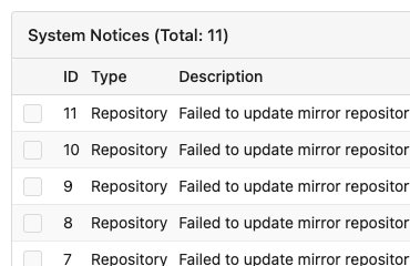
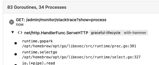
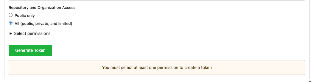
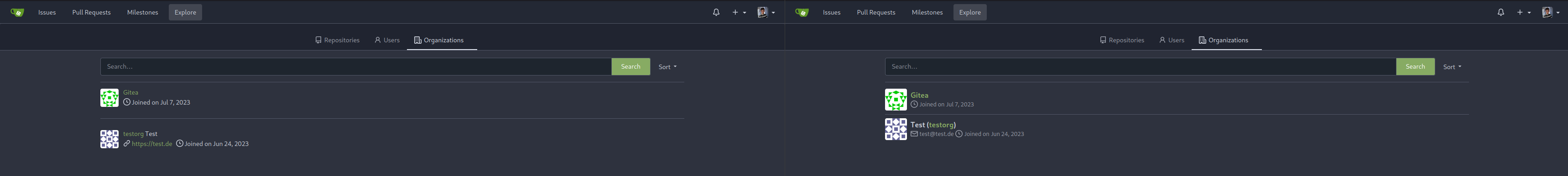
## Some UI samples
### Admin Notice
### Admin Stacktrace
### Org Home

### Org Team Repo

### Release List

### User Setting Application Token Scope
Co-authored-by: Giteabot <teabot@gitea.io>
|
| |
|
|
|
|
|
|
|
|
|
|
|
|
|
|
|
|
|
|
|
|
|
|
|
|
|
|
|
| |
This PR refactors a bunch of projects-related code, mostly the
templates.
The following things were done:
- rename boards to columns in frontend code
- use the new `ctx.Locale.Tr` method
- cleanup template, remove useless newlines, classes, comments
- merge org-/user and repo level project template together
- move "new column" button into project toolbar
- move issue card (shared by projects and pinned issues) to shared
template, remove useless duplicated styles
- add search function to projects (to make the layout more similar to
milestones list where it is inherited from :laughing:)
- maybe more changes I forgot I've done :laughing:
Closes #24893
After:


---------
Co-authored-by: silverwind <me@silverwind.io>
|
| |
|
|
|
|
|
|
|
|
|
|
|
|
|
|
|
|
|
|
|
|
|
|
|
|
|
|
|
|
|
|
|
|
|
|
|
|
|
|
|
|
|
|
|
|
|
|
|
|
|
|
|
|
|
|
|
|
|
|
|
|
|
|
|
|
|
|
|
|
|
|
|
|
|
| |
This PR introduces a new UI element type for Gitea called `flex-item`.
It consists of a horizontal card with a leading, main and trailing part:

The idea behind it is that in Gitea UI, we have many cases where we use
this kind of layout, but it is achieved in many different ways:
- grid layout
- `.ui.list` with additional hacky flexbox
- `.ui.key.list` - looks to me like a style set originally created for
ssh/gpg key list, was used in many other places
- `.issue.list` - created for issue cards, used in many other places
- ...
This new style is based on `.issue.list`, specifically the refactoring
of it done in #25750.
In this PR, the new element is introduced and lots of templates are
being refactored to use that style. This allows to remove a lot of
page-specific css, makes many of the elements responsive or simply
provides a cleaner/better-looking way to present information.
A devtest section with the new style is also available.
<details>
<summary>Screenshots (left: before, right: after)</summary>


</details>
---------
Co-authored-by: Giteabot <teabot@gitea.io>
|
| |
|
|
|
|
|
|
|
|
|
|
|
|
|
|
|
|
|
|
|
|
|
|
|
|
|
|
|
|
|
|
|
|
|
|
|
|
|
|
|
|
|
|
|
|
|
|
|
|
|
|
|
|
|
|
|
|
|
|
|
|
|
|
|
|
|
|
|
|
|
|
|
|
|
|
|
|
|
|
|
|
|
|
|
|
|
|
|
|
|
|
|
|
|
|
|
|
|
|
|
|
|
|
|
|
|
|
|
|
|
|
|
|
|
|
|
|
|
|
|
|
|
|
|
|
|
|
|
| |
Agenda:
This PR contains UI fixes for release tag page / wiki page /
subscription page.
Here is the list of changes made in this PR.
1. Release tag page
a. In the New Release page the whole ui got change. Now it is covering
in full page page with mobile view port. Description about the release
the editor preview now has a min-height. and the check boxes for
`Prerelease` and option are left aligned. Couple of divider are added.
2. Subscription page:
a. In the subscription page the ui was distorted in mobile view. Now its
fix. Couple of unused styles were removed.
3. Create Wiki page:-
a. In the page the preview of markdown is now contains a fix min-height
so this it will not distorted in desktop view and a divider is added
before action buttons. Couple of unused styles were removed.
# Before
## Release page
<img width="1391" alt="image"
src="https://github.com/go-gitea/gitea/assets/80308335/319dec2e-08cf-40c5-920a-d651930ee28e">
<img width="494" alt="image"
src="https://github.com/go-gitea/gitea/assets/80308335/03249f40-2d36-4552-bb93-43832aac2f8b">
<img width="1390" alt="image"
src="https://github.com/go-gitea/gitea/assets/80308335/bf8b2d31-4857-480b-abd9-66a3ae6e24d8">
<img width="484" alt="image"
src="https://github.com/go-gitea/gitea/assets/80308335/c3a58210-a337-4c8e-89a6-edb3975986bb">
Editor
<img width="958" alt="image"
src="https://github.com/go-gitea/gitea/assets/80308335/3bdd299d-d12b-4774-ace9-7184b1a57b18">
Editor preview
<img width="1293" alt="image"
src="https://github.com/go-gitea/gitea/assets/80308335/2b61c528-c018-4800-ab86-07aae56adecd">
<img width="484" alt="image"
src="https://github.com/go-gitea/gitea/assets/80308335/ff7bc5ee-9dc0-4f78-a0b1-94277ab27700">
#### After
<img width="1439" alt="image"
src="https://github.com/go-gitea/gitea/assets/80308335/94f7e073-5977-40bd-98ef-0711ed0815cc">
<img width="1384" alt="image"
src="https://github.com/go-gitea/gitea/assets/80308335/83e3105f-c1ee-4329-b90f-8bb724dac50f">
<img width="1440" alt="image"
src="https://github.com/go-gitea/gitea/assets/80308335/05f024a5-52eb-4072-8599-d6ca12f6fad1">
<img width="1387" alt="image"
src="https://github.com/go-gitea/gitea/assets/80308335/c73f069b-572a-4a13-aaa9-fc5b4dd3420d">
<img width="1440" alt="image"
src="https://github.com/go-gitea/gitea/assets/80308335/2f98f012-8e64-4a12-9595-5acdef18f85c">
Markdown preview change
<img width="1368" alt="image"
src="https://github.com/go-gitea/gitea/assets/80308335/31e583ec-48f6-4f1a-8b56-0164fcb127a5">
Wiki page
Before
<img width="1393" alt="image"
src="https://github.com/go-gitea/gitea/assets/80308335/9c9cfdf6-3c2a-4f47-883b-76624d96f9a0">
<img width="499" alt="image"
src="https://github.com/go-gitea/gitea/assets/80308335/522ad573-1ad2-4fa2-8bf7-48a3dded14e7">
Preview of mark down.
<img width="488" alt="image"
src="https://github.com/go-gitea/gitea/assets/80308335/998f3c25-9fca-43c8-b1ff-648aab291727">
Footer
<img width="490" alt="image"
src="https://github.com/go-gitea/gitea/assets/80308335/89c6cf4e-4599-4403-bac8-285efdd9361a">
After
<img width="1389" alt="image"
src="https://github.com/go-gitea/gitea/assets/80308335/1ee0fc72-f864-44c0-b2e4-e0e8a8470204">
<img width="498" alt="image"
src="https://github.com/go-gitea/gitea/assets/80308335/b35b9a5d-8e26-4869-a6ed-6cef1f4a87a6">
<img width="499" alt="image"
src="https://github.com/go-gitea/gitea/assets/80308335/b40bcbaa-fca6-42ab-9556-f950811b565d">
Preview tab block has min-height
<img width="1392" alt="image"
src="https://github.com/go-gitea/gitea/assets/80308335/4a53d6c2-596c-423a-91b1-533cef734f93">
Mobile view
<img width="496" alt="image"
src="https://github.com/go-gitea/gitea/assets/80308335/c5ffc4c9-3c21-4cad-bc32-2ea3f0644a08">
<img width="497" alt="image"
src="https://github.com/go-gitea/gitea/assets/80308335/08dd560f-4333-41ec-95b9-8154910d2254">
<img width="496" alt="image"
src="https://github.com/go-gitea/gitea/assets/80308335/9fba8f55-727b-4756-a4a6-2070c719b15b">
## Subscription page
### Before
<img width="1393" alt="image"
src="https://github.com/go-gitea/gitea/assets/80308335/0a7d561b-f56c-4ebe-93bd-952abecd437f">
<img width="492" alt="image"
src="https://github.com/go-gitea/gitea/assets/80308335/4dc44d0c-ea81-4130-8afb-8f271c029e8a">
After
<img width="1394" alt="image"
src="https://github.com/go-gitea/gitea/assets/80308335/a3567e30-2b5b-49d6-9ecb-2ab481ea4d36">
<img width="494" alt="image"
src="https://github.com/go-gitea/gitea/assets/80308335/024da9e2-dfc4-4672-95cc-a6ac034d9712">
<img width="508" alt="image"
src="https://github.com/go-gitea/gitea/assets/80308335/b748ecea-427c-4f8b-a1bf-08f82f9a42e6">
|
| |
|
|
|
|
|
|
|
|
|
|
|
|
|
|
| |
Issue filters are being used on repo list page and on milestone issues
page, and the code is mostly duplicated.
This PR does the following changes:
- move issue filters into a shared template
- allow filtering milestone issues by project, so no need to hide this
filter on milestone issues page
- remove some dead code (e. g. issue actions in milestone issues
template)
- fix label filter dropdown width
---------
Co-authored-by: 6543 <6543@obermui.de>
|
| |
|
|
|
|
|
|
|
|
|
|
|
|
| |
Close #20976
Close #20975
1. Fix the bug: the TOC in footer was incorrectly rendered as main
content's TOC
2. Fix the layout: on mobile, the TOC is put above the main content,
while the sidebar is put below the main content
3. Auto collapse the TOC on mobile
ps: many styles of "wiki.css" are moved from old css files, so leave
nits to following PRs.
|
| |
|
|
|
|
|
|
|
|
|
|
|
|
|
|
|
|
|
|
|
|
|
|
|
| |
Fix #24846 applying the solution proposed by @silverwind
<details>
<summary>Screenshots</summary>
</details>
Replaces #25335
|
| |
|
|
|
|
|
|
|
|
|
|
|
|
|
|
|
|
|
|
|
|
|
|
|
|
|
|
|
|
|
|
| |
Various fixes to pages or elements which were looking ugly on mobile.
<details>
<summary>Screenshots</summary>


</details>
Co-authored by @silverwind
---------
Co-authored-by: silverwind <me@silverwind.io>
|
| |
|
|
|
|
|
|
|
|
|
|
|
|
|
|
|
|
| |
- Fix and improve mobile navbar layout
- Apply all cleanups suggested in
https://github.com/go-gitea/gitea/pull/25111
- Make media query breakpoints match Fomantic's exactly
- Clean up whitespace in class on navbar items
Mobile navbar before and after:
<img width="745" alt="Screenshot 2023-06-08 at 08 40 56"
src="https://github.com/go-gitea/gitea/assets/115237/ca84b239-b10f-41db-8c06-dcf2b6dd9d28">
<img width="739" alt="Screenshot 2023-06-08 at 08 41 23"
src="https://github.com/go-gitea/gitea/assets/115237/09133c54-eb7e-4110-858c-ead23c3b7521">
---------
Co-authored-by: wxiaoguang <wxiaoguang@gmail.com>
Co-authored-by: Giteabot <teabot@gitea.io>
|
| |
|
|
|
|
|
|
|
|
|
|
|
|
|
|
|
|
| |
- Various corrections to button styles, especially secondary
- Remove focus highlight, it's annoying when it stays on button after
press
- Clearly define ghost and link buttons with demos in devtest
- Remove black, grey and tertiary buttons, they should not be used
- Make `arc-green` slightly darker
<img width="1226" alt="image"
src="https://github.com/go-gitea/gitea/assets/115237/8d89786a-01ab-40f8-ae5a-e17f40e35084">
<img width="1249" alt="image"
src="https://github.com/go-gitea/gitea/assets/115237/83651e6d-3c27-46ff-b8bd-ff344d70e949">
---------
Co-authored-by: wxiaoguang <wxiaoguang@gmail.com>
Co-authored-by: Giteabot <teabot@gitea.io>
|
| |
|
|
|
|
|
|
|
|
|
|
|
| |
introduce new font weight variables (#24827)
There was some recent discussion about this in Discord `ui-design`
channel and the conclusion was that
https://github.com/go-gitea/gitea/issues/24305 should have fixed their
OS font installation to have semibold weights.
I have now tested this 601 weight on a Windows 10 machine on Firefox
myself, and I immediately noticed that bold was excessivly bold and
rendering as 700 because browsers are biased towards bolder fonts. So
revert this back to the previous value.
|
|
|
Reorganize various CSS files for clarity, group together by subdirectory
in `index.css`. This reorders some of the rules, but I don't think it
should introduce any issues because of that.
|
