| Commit message (Collapse) | Author | Age | Files | Lines |
|---|
| ... | |
| |
|
|
|
|
|
|
|
|
|
|
|
|
|
|
|
|
|
|
|
|
|
|
| |
Use native instead of fomantic checkboxes in issue list. Benefits
include no more JS pop-in on load and perfect a11y.
Before, with JS pop-in:
<img width="92" alt="Screenshot 2023-03-20 at 17 02 02"
src="https://user-images.githubusercontent.com/115237/226398955-99029a1c-1150-449c-821b-e4165e7446a8.png">
After, Firefox on macOS:
<img width="126" alt="Screenshot 2023-03-20 at 17 01 26"
src="https://user-images.githubusercontent.com/115237/226399018-58df2c32-c2b2-4c78-b7df-7b76523abe21.png">
After, Chrome on macOS:
<img width="79" alt="Screenshot 2023-03-20 at 17 01 42"
src="https://user-images.githubusercontent.com/115237/226399074-947e6279-8dc3-42c2-90b5-b106c471b23d.png">
I opted to not do styling yet but I see that the inconsistency between
browsers may already be reason enough on doing it. I think if we style
them, there should be one global style, including markdown ones which
currently have custom styling.
|
| |
|
|
|
|
|
|
|
|
|
|
|
|
|
|
|
|
|
|
|
|
|
|
|
|
|
|
| |
- Avoid flash of wrong tree toggle icon on page load by setting icon
based on sync state
- Avoid "pop-in" of tree on page load by leaving space based on sync
state
- Use the same border/box-shadow combo used on comment `:target` also
for file `:target`.
- Refactor `DiffFileTree.vue` to use `toggleElem` instead of hardcoded
class name.
- Left-align inline comment boxes and make them fit the same amount of
markup content on a line as GitHub.
- Fix height of `diff-file-list`
Fixes: https://github.com/go-gitea/gitea/issues/23593
<img width="1250" alt="Screenshot 2023-03-18 at 00 52 04"
src="https://user-images.githubusercontent.com/115237/226071392-6789a644-aead-4756-a77e-aba3642150a0.png">
<img width="1246" alt="Screenshot 2023-03-18 at 00 59 43"
src="https://user-images.githubusercontent.com/115237/226071443-8bcba924-458b-48bd-b2f0-0de59cb180ac.png">
<img width="1250" alt="Screenshot 2023-03-18 at 01 27 14"
src="https://user-images.githubusercontent.com/115237/226073121-ccb99f9a-d3ac-40b7-9589-43580c4a01c9.png">
<img width="1231" alt="Screenshot 2023-03-19 at 21 44 16"
src="https://user-images.githubusercontent.com/115237/226207951-81bcae1b-6b41-4e39-83a7-0f37951df6be.png">
(Yes I'm aware the border-radius in bottom corners is suboptimal, but
this would be notorously hard to fix without relying on `overflow:
hidden`).
|
| |
|
|
|
|
|
|
|
|
|
|
|
| |
Before:
<img width="164" alt="Screenshot 2023-03-28 at 23 35 46"
src="https://user-images.githubusercontent.com/115237/228372437-663111b9-7285-4fa2-9125-fb5e1cad21d7.png">
After:
<img width="166" alt="Screenshot 2023-03-28 at 23 35 54"
src="https://user-images.githubusercontent.com/115237/228372441-49430517-6b2d-4389-b11c-c30a724f6de7.png">
Also I removed the `!important` on the primary label as it's very likely
unnecessary with the amount of specificity the selector already has.
|
| |
|
|
|
|
|
|
|
|
|
|
|
|
|
|
|
|
|
|
|
|
|
|
|
|
|
|
|
|
|
|
|
|
|
|
|
|
|
|
|
|
|
|
|
|
|
|
| |
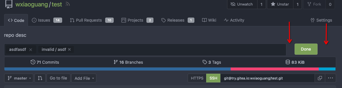
Edit form (#23626)
Although it seems that some different purposes are mixed in this PR,
however, they are all related, and can be tested together, so I put them
together to save everyone's time.
Diff: `+79 −84`, everything becomes much better.
### Improve the dropdown settings.
Move all fomantic-init related code into our `fomantic.js`
Fine-tune some dropdown global settings, see the comments.
Also help to fix the first problem in #23625 , cc: @yp05327
The "language" menu has been simplified, and it works with small-height
window better.
### Use SVG instead of `<i class="delete icon">`
It's also done by `$.fn.dropdown.settings.templates.label` , cc:
@silverwind
### Remove incorrect `tabable` CSS class
It doesn't have CSS styles, and it was only in Vue. So it's totally
unnecessary, remove it by the way.
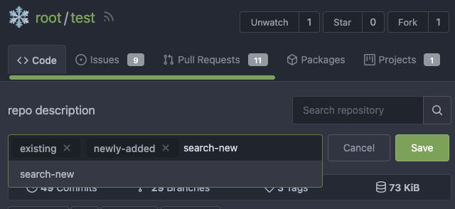
### Improve the Repo Topic Edit form
* Simplify the code
* Add a "Cancel" button
* Align elements
Before:
<details>
</details>
After:
|
| |
|
|
|
|
|
|
|
|
|
|
| |
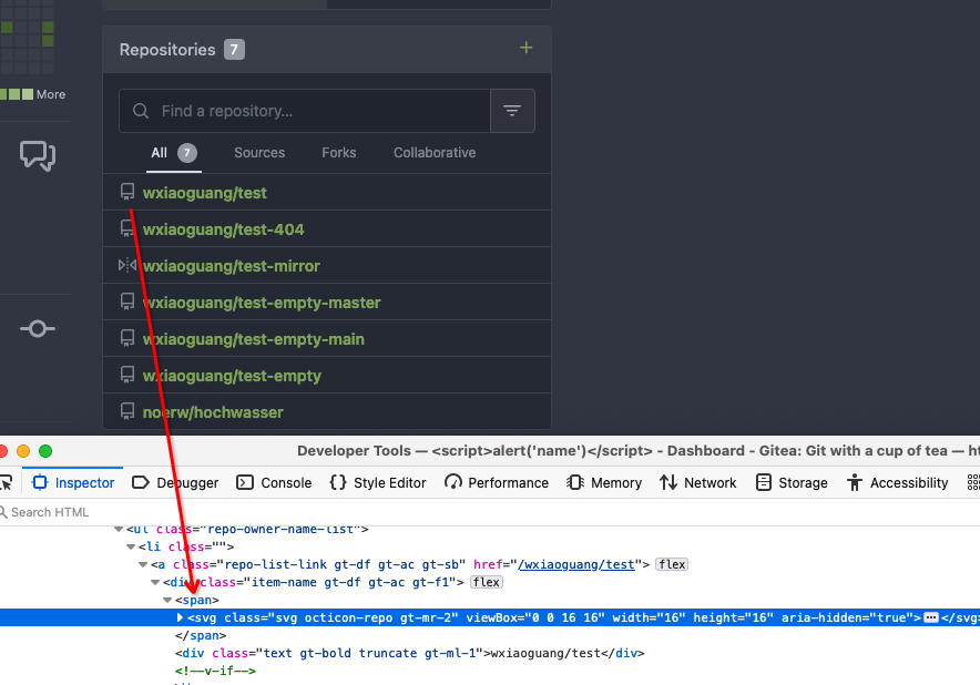
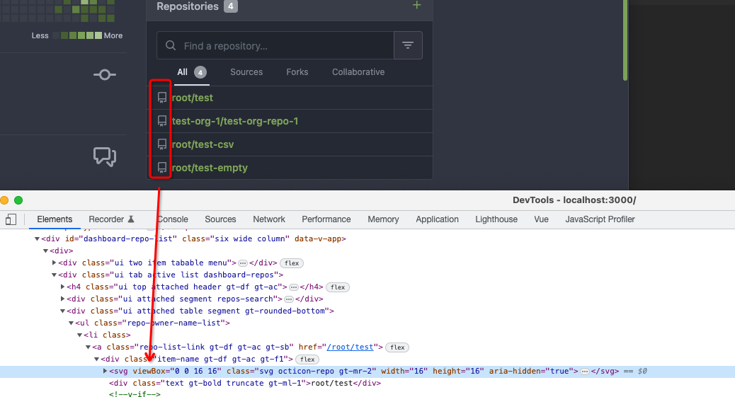
Resolves #22692
I don't think there's a need for this entire row to be clickable (and
even different links depending on which segment you click)
The links still point to the same spot, so no information is lost here.
---------
Signed-off-by: jolheiser <john.olheiser@gmail.com>
Co-authored-by: wxiaoguang <wxiaoguang@gmail.com>
|
| |
|
|
|
|
|
|
|
|
|
|
|
|
|
|
|
|
|
|
|
|
|
|
|
|
|
|
|
|
|
|
|
|
|
|
|
|
|
|
|
| |
This PR is to fix the second problem mentioned in #23625, along with the
long texts problem in `issue-item-bottom-row` of `issuelist.tmpl`
Main changes are:
1. Add `max-width` to the search dropdowns in issue list and make the
possible long texts inside to show ellipsis if texts are long
2. Adjust the conditions in
[issuelist.tmpl](https://github.com/go-gitea/gitea/blob/1d35fa0e784dffcadacb2322a3d7ac3ec2ff89b2/templates/shared/issuelist.tmpl#L146-L167)
to fix the problem as mentioned by the
[comment](https://github.com/go-gitea/gitea/issues/23625#issuecomment-1479281060)
3. Use `word-break: break-word;` in `issue-item-bottom-row` to break the
possible long texts.
After the PR
issuelist in repo (similar for pr list):
<img width="366" alt="截屏2023-03-23 17 42 40"
src="https://user-images.githubusercontent.com/17645053/227163953-93e9adbd-5785-4c16-b538-9db901787775.png">
dropdowns with long name (Here take reference from github to deal with
the long names cases: show ellipsis with no title, because all these
options are clickable, and it might not be necessary to add titles to
them ):
<img width="370" alt="截屏2023-03-23 17 43 50"
src="https://user-images.githubusercontent.com/17645053/227164215-df6fcaaa-9fee-4256-a57c-053fbcffafbb.png">
<img width="365" alt="截屏2023-03-23 17 43 56"
src="https://user-images.githubusercontent.com/17645053/227164227-9c99abcd-f410-4e07-b5b8-cbce764eedcd.png">
issue page (similar for pr page):
<img width="374" alt="截屏2023-03-23 17 45 37"
src="https://user-images.githubusercontent.com/17645053/227164668-654a8188-dac8-4bbf-a6e3-f3768a644a1b.png">
on PC:
<img width="1412" alt="截屏2023-03-23 17 47 20"
src="https://user-images.githubusercontent.com/17645053/227166694-e7bcc6e5-9667-4cef-9fbf-db85640a2c6c.png">
<img width="1433" alt="截屏2023-03-23 17 46 40"
src="https://user-images.githubusercontent.com/17645053/227165182-4e2a5d19-74bc-4c66-b73c-23cbca176ffe.png">
|
| |
|
|
|
|
|
|
|
|
|
|
|
|
|
|
|
|
|
|
|
| |
Close #23627
Added margin left to the button when it is next to the svg, which has a
margin-right of `-0.5rem`
And here it might be better if `white-space: nowrap;` is added because
otherwise it might look like below on pull requests page on smaller
screen
<img width="945" alt="截屏2023-03-23 09 57 41"
src="https://user-images.githubusercontent.com/17645053/227079613-71c696ab-55ec-4641-acb9-622a8baebb31.png">
After:
<img width="936" alt="截屏2023-03-23 10 08 27"
src="https://user-images.githubusercontent.com/17645053/227080971-6bf2588e-40dd-4770-b0d1-45d7c63e0f48.png">
Pull Request on smaller screen
<img width="922" alt="截屏2023-03-23 10 25 16"
src="https://user-images.githubusercontent.com/17645053/227084144-0c2ed3e6-5c11-4252-bba2-b5f971b70f4a.png">
|
| |
|
|
|
|
|
|
|
|
|
|
|
|
|
|
|
|
|
|
|
|
|
|
|
|
|
|
|
|
|
|
|
| |
(#23570)
Before, the Vue `<SvgIcon>` always outputs DOM nodes like:
```html
<span class="outer-class">
<svg class="class-name-defined" ...></svg>
</span>
```
The `span` is redundant and I guess such layout and the inconsistent
`class/class-name` attributes would cause bugs sooner or later.
This PR makes the `<SvgIcon>` clear, and it's faster than before,
because it doesn't need to parse the whole SVG string.
Before:
<details>
</details>
After:
---------
Co-authored-by: silverwind <me@silverwind.io>
|
| |
|
|
|
|
|
|
|
|
|
|
|
|
|
|
|
|
|
|
|
|
| |
- Set opaque background on markup images so they can visually break
`<hr>`
- Change padding of comment box so `padding` is provided by the
`.markup` element instead of its parent, matching the file rendering
view which does the same.
Before:
<img width="243" alt="Screenshot 2023-03-19 at 19 22 03"
src="https://user-images.githubusercontent.com/115237/226198663-8ff4d940-6a15-452d-ac58-14485b37fbc7.png">
After:
<img width="261" alt="Screenshot 2023-03-19 at 19 23 26"
src="https://user-images.githubusercontent.com/115237/226198689-1bf56561-4726-46dc-b583-423d65e1e13a.png">
<img width="263" alt="image"
src="https://user-images.githubusercontent.com/115237/226199002-e93c817d-6d9c-4b98-bad8-0aa0bd45b62f.png">
Example documents:
https://try.gitea.io/silverwind/symlink-test/src/branch/master/test-page.md
https://github.com/silverwind/symlink-test/blob/master/test-page.md
|
| |
|
|
|
|
|
|
|
|
|
|
|
|
|
|
|
|
| |
(#23565)
Dropdowns on `/notifications/subscriptions` before and after:
<img width="157" alt="Screenshot 2023-03-18 at 20 37 12"
src="https://user-images.githubusercontent.com/115237/226133906-e4ad6a0a-de24-4324-8e1d-94081d23fe85.png">
<img width="152" alt="Screenshot 2023-03-18 at 20 41 29"
src="https://user-images.githubusercontent.com/115237/226134038-c3946c32-a424-4b92-ad15-890e1036cafe.png">
These selectors are meant to target the notification list which I
improved:
<img width="1145" alt="Screenshot 2023-03-19 at 01 52 11"
src="https://user-images.githubusercontent.com/115237/226147907-1c35736a-4bc9-4698-9813-21a20a1d2106.png">
<img width="1148" alt="Screenshot 2023-03-19 at 01 54 17"
src="https://user-images.githubusercontent.com/115237/226147920-626dbd84-11d3-48db-a177-6d808e3212c0.png">
|
| |
|
|
|
|
|
|
|
|
|
|
|
|
|
|
| |
There are still many dropdowns using fomantic icon. For example: new
issue with issue template.
Avoid polluting the fomantic styles.
Before:

After:

|
| |
|
|
|
|
|
|
|
|
|
|
|
|
|
| |
Ressurection of #23549.
Fix regression https://github.com/go-gitea/gitea/pull/23513#issuecomment-1474356817 from #23271.
The previous sticky CSS did assume the content is always 2 rows, but since that PR, it's single-row above 993px width.
Adjust the sticky offset to match and add a small tweak that hides content behind the `border-radius`.
Single row:
<img width="1264" alt="Screenshot 2023-03-17 at 21 33 05"
src="https://user-images.githubusercontent.com/115237/226034050-a04b131d-fd3f-45c0-bc72-413738a59825.png">
Double row:
<img width="1243" alt="Screenshot 2023-03-17 at 21 32 53"
src="https://user-images.githubusercontent.com/115237/226034163-2f1c6aa9-fc72-432f-bc46-9a7119da8677.png">
|
| |
|
|
|
|
|
|
|
| |
1. The "close" inside "modal" are likely broken for long time
* There is no var called `--body-color`
* There is no `fullscreen modal`
* The `.ui.modal > .close.inside` doesn't seem to match most icons. It
only matches a few like "fork-repo-modal" or "adopt repo". Other places
are just buggy code copied again and again.
2. Convert the legacy `&:hover` LESS syntax to CSS syntax
|
| |
|
|
|
|
|
|
|
|
|
|
|
|
|
|
|
|
|
|
|
|
|
|
|
|
|
|
|
|
|
|
|
|
|
|
|
|
|
|
|
|
|
|
|
|
|
|
|
| |
This PR fixes some ui problems as mentioned in the two issues below.
1. Long file path has no word break
## Before
<img width="1357" alt="截屏2023-03-17 17 49 43"
src="https://user-images.githubusercontent.com/17645053/225873491-27c7bf9a-d5d5-4065-9e4a-ff228e935abf.png">
## After
<img width="1248" alt="截屏2023-03-17 17 51 22"
src="https://user-images.githubusercontent.com/17645053/225873562-93b87af7-9c83-43f8-aa0d-36a9174d25ac.png">
on mobile
<img width="408" alt="截屏2023-03-17 17 51 15"
src="https://user-images.githubusercontent.com/17645053/225873554-1b8c8999-1dfc-4251-a7fc-20ecd3444cb0.png">
2. Texts in labels
## Before
<img width="1219" alt="截屏2023-03-17 17 49 24"
src="https://user-images.githubusercontent.com/17645053/225873369-812b1b52-c104-4e32-988f-c3e55ad2f844.png">
## After
<img width="1259" alt="截屏2023-03-17 17 51 31"
src="https://user-images.githubusercontent.com/17645053/225873317-9717fd2c-e9e1-4a00-a27d-6bdc5933c3ca.png">
with two labels
<img width="1258" alt="截屏2023-03-17 17 51 53"
src="https://user-images.githubusercontent.com/17645053/225873323-13198192-71de-472d-8e78-6fd86ddba3d9.png">
In explore and star pages
<img width="896" alt="截屏2023-03-17 18 25 00"
src="https://user-images.githubusercontent.com/17645053/225878962-9e26e3aa-cff0-451c-9133-19f4ad1507a4.png">
<img width="913" alt="截屏2023-03-17 18 25 09"
src="https://user-images.githubusercontent.com/17645053/225878967-6adaa414-136e-43c2-87d0-7e46a0da112e.png">
3. Long name repository on creating new fork page
## Before
<img width="919" alt="截屏2023-03-17 17 50 01"
src="https://user-images.githubusercontent.com/17645053/225873723-5c4ea137-3b51-4074-a458-ef442e330ddf.png">
## After
<img width="907" alt="截屏2023-03-17 17 50 37"
src="https://user-images.githubusercontent.com/17645053/225873772-fc4a52c3-49c6-4ca6-903d-a13707f2a98b.png">
<img width="383" alt="截屏2023-03-17 17 50 48"
src="https://user-images.githubusercontent.com/17645053/225873779-6de1dfde-5c05-4ae9-89e1-85c25b3a1682.png">
Closes #23535
Closes #23534
|
| |
|
|
|
|
|
|
|
|
|
|
|
|
|
|
| |
Fix visual regression introduced by
https://github.com/go-gitea/gitea/pull/22986.
Before:
<img width="1277" alt="image"
src="https://user-images.githubusercontent.com/115237/222792814-d70c2173-0c7c-4db2-8839-95be63cdc8ee.png">
<img width="649" alt="image"
src="https://user-images.githubusercontent.com/115237/222792989-9b1f5e12-becd-40cc-b02c-e9f59a8e72a4.png">
After:
<img width="1274" alt="image"
src="https://user-images.githubusercontent.com/115237/222792769-e7a9702f-4b6a-46c4-9385-da103ed4dff0.png">
<img width="565" alt="image"
src="https://user-images.githubusercontent.com/115237/222793084-6de6482b-11dc-4d38-b514-15884d20e140.png">
|
| |
|
|
|
|
|
|
|
|
|
|
|
|
|
|
|
| |
Add a bit more empty space on left and right side of page content for a
more pleasant viewing experience. Also tweaked the mobile navbar to
match.
Before:
<img width="1276" alt="Screenshot 2023-03-16 at 00 58 23"
src="https://user-images.githubusercontent.com/115237/225473942-f544106f-1b61-456a-99fb-3ba136cabc8d.png">
After:
<img width="1270" alt="Screenshot 2023-03-16 at 00 58 37"
src="https://user-images.githubusercontent.com/115237/225473959-8b555359-a08d-48e1-9476-2710aabb1166.png">
Mobile Navbar:
<img width="673" alt="Screenshot 2023-03-16 at 01 05 12"
src="https://user-images.githubusercontent.com/115237/225473966-adccef2b-4d34-44ed-8c75-d4ca46d96cf3.png">
|
| |
|
|
|
|
|
|
|
|
|
|
|
|
|
| |
Follow-up and proper fix for
https://github.com/go-gitea/gitea/pull/23504
Update to
[mini-css-extract-plugin@2.7.4](https://github.com/webpack-contrib/mini-css-extract-plugin/releases/tag/v2.7.4)
which fixes our specific issue described in
https://github.com/webpack-contrib/css-loader/issues/1503 and which
allows us to again drop the postcss dependency.
Backport of this is not necessary as I have included it in
https://github.com/go-gitea/gitea/pull/23508.
Co-authored-by: techknowlogick <techknowlogick@gitea.io>
|
| |
|
|
|
|
|
|
|
|
|
|
|
|
|
|
|
|
|
|
| |
This is another regression of #22959 (the first regression has been
fixed by the Image Diff fix)
Close #23517
This is a quick fix. Luckily, there is no "dropdown menu" for image/csv
view, so we could only add the "overflow-x: scroll" to the image/csv
view.
After fix:


Co-authored-by: KN4CK3R <admin@oldschoolhack.me>
|
| |
|
|
|
|
|
|
|
|
|
|
|
|
|
|
|
|
|
|
|
|
|
|
|
|
|
|
|
|
|
|
|
|
|
|
|
|
|
|
|
|
|
|
|
|
|
|
|
|
|
|
|
|
|
|
|
|
|
|
| |
true (#23463)
This PR adds the ability to search both fullname and username for
assignees, reviewers and author search boxes when the config
[`DEFAULT_SHOW_FULL_NAME`](https://github.com/go-gitea/gitea/blob/6ff5400af91aefb02cbc7dd59f6be23cc2bf7865/custom/conf/app.example.ini#L1238)
in `app.ini` is set to `true`. Which is originally raised
[here](https://projects.blender.org/infrastructure/blender-projects-platform/issues/14)
And if `DEFAULT_SHOW_FULL_NAME` is set to `false`(default value), these
search boxes will only show username.
Example:
When `DEFAULT_SHOW_FULL_NAME = true`
<img width="1220" alt="截屏2023-03-14 14 28 06"
src="https://user-images.githubusercontent.com/17645053/224914546-80ef2837-ab72-4d66-9f00-6eb77ed4baaa.png">
When `DEFAULT_SHOW_FULL_NAME = false` (default value)
<img width="1243" alt="截屏2023-03-14 14 29 37"
src="https://user-images.githubusercontent.com/17645053/224914798-f69ec8a2-0929-4330-827c-3e30188f9b47.png">
The specific search boxes that adapts these changes include:
1. Author, Assignee search boxes in pull requests tab and issues tab in
repository
<img width="1283" alt="截屏2023-03-14 14 35 01"
src="https://user-images.githubusercontent.com/17645053/224916250-8e452525-71d6-4b48-bf1c-bf7a176abaaa.png">
2. Assigee and Author on milestones issue page (Added missing search box
for author here)
<img width="1261" alt="截屏2023-03-14 14 38 20"
src="https://user-images.githubusercontent.com/17645053/224916569-d3105619-7824-4bb8-a6d0-1a600eaa9963.png">
3. Assignee on issues and PR Sidebar, Reviewer on PR Sidebar
<img width="976" alt="截屏2023-03-14 14 41 06"
src="https://user-images.githubusercontent.com/17645053/224917431-c45d821e-9660-4f58-a196-5979a0bb64ce.png">
<img width="1027" alt="截屏2023-03-14 14 41 58"
src="https://user-images.githubusercontent.com/17645053/224917290-ad4dbc52-0c20-45c4-9fce-9dcd59ad7d47.png">
4. Assignee when creating new issue
<img width="961" alt="截屏2023-03-14 14 44 33"
src="https://user-images.githubusercontent.com/17645053/224917694-34bee5a7-e975-4f37-8862-56ebc2556808.png">
5. Whitelisted users for pushing, Whitelisted users for merging and
Whitelisted reviewers in Protected branch settings
<img width="920" alt="截屏2023-03-14 14 48 56"
src="https://user-images.githubusercontent.com/17645053/224918551-9b46b44e-b075-4895-8d33-1aafc7d3c8e5.png">
<img width="901" alt="截屏2023-03-14 14 49 02"
src="https://user-images.githubusercontent.com/17645053/224918584-efa66f23-a593-4e26-a3eb-bb1fbc5516ae.png">
<img width="944" alt="截屏2023-03-14 14 49 21"
src="https://user-images.githubusercontent.com/17645053/224918591-be60455d-0513-4f66-84f6-b5e1bc40ff91.png">
6. "Allowed users" in tags settings
<img width="935" alt="截屏2023-03-14 14 50 11"
src="https://user-images.githubusercontent.com/17645053/224918701-797699aa-c7e5-4290-b3fe-27dcead1c6c7.png">
|
| |
|
|
|
|
|
|
|
|
|
|
|
|
|
|
|
|
|
|
|
|
|
| |
Fix regression from https://github.com/go-gitea/gitea/pull/23481.
The conditional on the CSS import was being stripped away by webpack's
`css-loader`, resulting in the dark theme always loading. The old syntax
with `@import` nested inside `@media` also did not work as `css-loader`
(rightfully) ignores such non-standard `@import` syntax that was
previously supported by Less.
Unfortunately, we have to re-introduce postcss to the CSS pipeline to
fix this and I loaded only the minimal plugins to make it work.
There is one variant of the fix that does work without postcss, which is
to exclude the file from transpilation but I did not consider it as it
would have meant the `@import` was being done without a version suffix
in the URL, which would have caused cache issue.
Related: https://github.com/webpack-contrib/css-loader/issues/1503
---------
Co-authored-by: John Olheiser <john.olheiser@gmail.com>
|
| |
|
|
|
|
|
|
|
|
|
|
| |
Ran most of the Less files through the Less compiler and Prettier and
then followed up with a round of manual fixes.
The Less compiler had unfortunately stripped all `//` style comments
that I had to restore (It did preserve `/* */` comments). Other fixes
include duplicate selector removal which were revealed after the
transpilation and which weren't caught by stylelint before but now are.
Fixes: https://github.com/go-gitea/gitea/issues/15565
|
| |
|
|
|
|
|
|
|
|
|
|
| |
- move "vendor" files to js/vendor and less/vendor
- move swagger to js/standalone (meant for standalone pages)
- move gitgraph to features and streamline its loading
- add linting configs to webpack dependencies in make
- set ignored files for eslint/stylelint directly in their configs
Co-authored-by: Lunny Xiao <xiaolunwen@gmail.com>
Co-authored-by: zeripath <art27@cantab.net>
Co-authored-by: Antoine GIRARD <sapk@users.noreply.github.com>
|
|
|
* move semantic.dropdown.custom.js to webpack
Also disabled a annoying linter rule which insisted that imports can not
contain a file extension.
Fixes: https://github.com/go-gitea/gitea/issues/8971
* reorganize web_src files and rebuild
* restart ci
|
