| Commit message (Collapse) | Author | Age | Files | Lines |
|---|
| ... | |
| |
|
|
|
|
|
|
|
|
|
|
|
|
|
|
|
|
|
|
| |
Likely the biggest change of the tailwind refactors. Only thing of note
is that `tw-flex-1` resolves to `flex: 1 1 0%` while our `gt-f1` was
`flex: 1 1 0`, I don't think it will make any difference. Commands I've
ran:
```sh
perl -p -i -e 's#gt-vm#tw-align-middle#g' web_src/js/**/* templates/**/* models/**/*
perl -p -i -e 's#gt-fw#tw-flex-wrap#g' web_src/js/**/* templates/**/* models/**/*
perl -p -i -e 's#gt-f1#tw-flex-1#g' web_src/js/**/* templates/**/* models/**/*
perl -p -i -e 's#gt-fc#tw-flex-col#g' web_src/js/**/* templates/**/* models/**/*
perl -p -i -e 's#gt-sb#tw-justify-between#g' web_src/js/**/* templates/**/* models/**/*
perl -p -i -e 's#gt-je#tw-justify-end#g' web_src/js/**/* templates/**/* models/**/*
perl -p -i -e 's#gt-jc#tw-justify-center#g' web_src/js/**/* templates/**/* models/**/*
perl -p -i -e 's#gt-ac#tw-content-center#g' web_src/js/**/* templates/**/* models/**/* tests/**/*
perl -p -i -e 's#gt-df#tw-flex#g' web_src/js/**/* templates/**/* models/**/* tests/**/*
perl -p -i -e 's#gt-dib#tw-inline-block#g' web_src/js/**/* templates/**/* models/**/* tests/**/*
Co-authored-by: wxiaoguang <wxiaoguang@gmail.com>
|
| |
|
|
|
|
|
|
|
|
|
| |
Before
<img width="1312" alt="image"
src="https://github.com/go-gitea/gitea/assets/81045/26a6dec2-9fea-4c0c-b6fb-290eab12a55a">
After
<img width="1298" alt="image"
src="https://github.com/go-gitea/gitea/assets/81045/01f7a714-eae9-4729-918f-3b4795094d0b">
|
| |
|
|
|
| |
Had to fiddle a bit with the css ordering, but seems to work well now
and should render exactly like before. Some of the CSS may be
unnecessary, but I kept it for now.
|
| |
|
|
| |
1. Use general "mobile-only" and "not-mobile" CSS styles, remove some`@media (max-width: 767.98px)` tricks
2. Use `CountFmt` for repo list, just like the repo header (and it matches GitHub, to avoid big numbers bloat the page)
|
| |
|
|
|
|
|
|
|
|
|
|
|
|
|
|
|
|
|
|
|
|
|
| |
Various code was using fomantic `loading` class which I think got broken
a while ago and rendered only a full circle. Fix those to use
`is-loading`.
Before:
<img width="295" alt="Screenshot 2024-03-19 at 22 56 26"
src="https://github.com/go-gitea/gitea/assets/115237/dbe83395-5db4-4868-90bc-3613866a35f0">
After:
<img width="60" alt="Screenshot 2024-03-19 at 22 54 35"
src="https://github.com/go-gitea/gitea/assets/115237/8ac19b7e-035a-4c6d-850b-53a234ef69c2">
<img width="294" alt="Screenshot 2024-03-19 at 22 54 56"
src="https://github.com/go-gitea/gitea/assets/115237/34e819d7-25f7-43a1-9d48-4a68dcd2b6ad">
<img width="320" alt="Screenshot 2024-03-19 at 22 55 16"
src="https://github.com/go-gitea/gitea/assets/115237/05127544-47ff-4e18-9fd8-c84e44c374f8">
<img width="153" alt="Screenshot 2024-03-19 at 23 01 43"
src="https://github.com/go-gitea/gitea/assets/115237/a33248c6-b11d-40ff-82d8-f5a3d85b55aa">
<img width="1300" alt="Screenshot 2024-03-19 at 23 56 25"
src="https://github.com/go-gitea/gitea/assets/115237/562ca876-b5d5-4295-961e-9d2cdab31ab0">
<img width="136" alt="Screenshot 2024-03-20 at 00 00 38"
src="https://github.com/go-gitea/gitea/assets/115237/44838ac4-67f3-4fec-a8e3-978cc5dbdb72">
|
| |
|
|
|
|
|
|
|
|
|
|
|
| |
Minor color tweaks:
- Better text contrasts
- Better distinguish nav and header wrapper in light theme
- Input boxes are now white on light theme
- Slightly darker dark theme background
<img width="503" alt="Screenshot 2024-03-20 at 19 31 54"
src="https://github.com/go-gitea/gitea/assets/115237/c7802a84-2386-4332-bd91-f419473ff644">
<img width="510" alt="Screenshot 2024-03-20 at 19 32 24"
src="https://github.com/go-gitea/gitea/assets/115237/21d3529e-6e0a-413a-9e9e-a03bea2405eb">
|
| |
|
|
| |
Removed the grid module and moved the used parts it into our own CSS,
eliminating around 75% unused CSS in turn.
|
| |
|
|
|
|
|
|
|
|
|
|
|
| |
Two small CSS fixes:
1. Add background and reduced padding/avatar size to dashboard navbar.
We use that background already in a number of "secondary navbars", so it
fits.
<img width="1344" alt="Screenshot 2024-03-20 at 18 18 21"
src="https://github.com/go-gitea/gitea/assets/115237/ce5ebedc-e607-42c7-b7b4-b7a4c0ee68f2">
2. Fix padding on top of user settings and subscriptions, regressed by
https://github.com/go-gitea/gitea/pull/29922.
|
| |
|
|
|
|
|
|
|
|
|
|
|
|
|
|
|
|
|
|
|
|
|
|
|
|
|
| |
There is a small layout shift in when active tab changes. Notice how the
actions SVG is unstable:

This is because the active item with bold text is wider then the
inactive one. I have applied [this
trick](https://stackoverflow.com/a/32570813/808699) to prevent this
layout shift. It's only active inside `<overflow-menu>` because I wanted
to avoid changing HTML and doing it in regular JS would cause a flicker.
I don't expect us to introduce other similar menus without
`<overflow-menu>`, so that place is likely fine.

I also changed the weight from 500 to 600, slightly reduced horizontal
padding, merged some tab-bar related CSS rules and a added a small
margin below repo-header so it does not look so crammed against the
buttons on top.
---------
Co-authored-by: wxiaoguang <wxiaoguang@gmail.com>
|
| |
|
|
|
|
|
|
|
|
|
|
|
|
|
|
|
|
|
|
|
|
| |
The negative margin was suboptimal and presents a few unnecessary
challenges while styling the page. Remove it and add custom margin
values, which slightly changes the height a few things near the top of
the page as well:
15px less height of explore and login navbar:
<img width="899" alt="Screenshot 2024-03-20 at 00 52 34"
src="https://github.com/go-gitea/gitea/assets/115237/72a01ca4-5d17-4a0f-b915-61f95054fcb1">
15px reduced padding-top height of "user bar" and equal 4px padding
added:
<img width="484" alt="Screenshot 2024-03-20 at 00 52 50"
src="https://github.com/go-gitea/gitea/assets/115237/a8507e6d-372d-4a8b-9048-66fcf8a5facd">
3px less padding on top of repo:
<img width="552" alt="Screenshot 2024-03-20 at 00 53 49"
src="https://github.com/go-gitea/gitea/assets/115237/dede6e44-7688-440f-a1b6-13532638ae03">
|
| |
|
|
|
|
|
|
|
|
|
| |
Before:
<img width="449" alt="Screenshot 2024-03-18 at 22 35 10"
src="https://github.com/go-gitea/gitea/assets/115237/f2893870-e7a3-4e34-b0cf-4610735c9b36">
After:
<img width="453" alt="image"
src="https://github.com/go-gitea/gitea/assets/115237/36a9f800-28a4-40fc-b6d2-a2e717ddba01">
|
| |
|
|
|
|
|
| |
Used all existing css vars, other migrations are 1:1.
---------
Co-authored-by: wxiaoguang <wxiaoguang@gmail.com>
|
| |
|
|
|
|
|
| |
1. The borders were doubled on the "empty" page, fix it.
2. Remove unnecessary CSS classes like "clone", "compact", etc
3. Use CSS class "clone-panel" instead of ID "clone-panel"
4. Use `tw-flex-1` instead of `gt-f1`
5. Remove unnecessary ID "more-btn"
|
| |
|
|
|
|
|
|
|
|
|
|
|
|
| |
Previously, the citation js would load every time when opening a citable
repo. Now it only loads when the user clicks the button for it. The
loading state is representend with a spinner on the button:
<img width="83" alt="Screenshot 2024-03-17 at 00 25 13"
src="https://github.com/go-gitea/gitea/assets/115237/29649089-13f3-4974-ab81-e12c0f8e651f">
Diff ist best viewed with whitespace hidden.
---------
Co-authored-by: Giteabot <teabot@gitea.io>
|
| |
|
|
| |
Remove this CSS-only module, which gives a nice reduction in CSS size.
Should look exactly like before.
|
| |
|
|
|
| |
Extract from https://github.com/go-gitea/gitea/pull/29344. With this
class it's possible to have links that don't color on hover. It will be
useful for https://github.com/go-gitea/gitea/pull/29429.
|
| |
|
|
|
|
|
| |
* Remove some deadcode
* Use 2-word name for CSS class names
* Remove "gt-*" rules for sanitizer
The UI doesn't change much.
|
| |
|
|
|
|
|
|
|
|
|
|
|
|
|
|
|
|
|
|
|
|
|
| |
Same as https://github.com/go-gitea/gitea/pull/29822 but for light
theme. Slight shift towards blue and made the themes match more, like on
header and footer background.
Before
<img width="1342" alt="Screenshot 2024-03-16 at 00 43 03"
src="https://github.com/go-gitea/gitea/assets/115237/b46021a1-241c-446a-b220-ca25cc90f3bf">
After
<img width="1343" alt="Screenshot 2024-03-16 at 00 45 21"
src="https://github.com/go-gitea/gitea/assets/115237/1c898875-a6bb-4bd3-b059-f82e1a145c99">
Before
<img width="1018" alt="Screenshot 2024-03-16 at 00 43 13"
src="https://github.com/go-gitea/gitea/assets/115237/d237ee7d-b4cc-4688-a074-1e96515ac475">
After
<img width="1022" alt="Screenshot 2024-03-16 at 00 43 50"
src="https://github.com/go-gitea/gitea/assets/115237/89b1da77-6bc9-4b38-9688-546e794aadfa">
|
| |
|
|
|
|
|
|
|
|
| |
as followup of the not jet finished discussion at
https://github.com/go-gitea/gitea/pull/29680#discussion_r1521867261
we enhance and chat about how best to highlight archived labels here :)
---------
Co-authored-by: silverwind <me@silverwind.io>
|
| |
|
|
|
|
|
|
|
|
|
|
|
|
|
|
|
|
|
|
|
|
|
| |
- Few very minor colors tweaks to dark theme. Slightly darker
background, slightly bluer secondary colors.
- Alias `--color-nav-hover-bg` in both themes.
Before:
<img width="1013" alt="Screenshot 2024-03-15 at 18 43 59"
src="https://github.com/go-gitea/gitea/assets/115237/ce4bdb0d-6e25-4fd6-88f5-dc8f9e3093cd">
After:
<img width="1016" alt="Screenshot 2024-03-15 at 19 02 04"
src="https://github.com/go-gitea/gitea/assets/115237/4a6dd5a1-a5b4-4fc2-9835-05a0c2c58c42">
Before:
<img width="1340" alt="Screenshot 2024-03-15 at 18 40 19"
src="https://github.com/go-gitea/gitea/assets/115237/4465fa9c-d529-4a05-94d7-e21080e0a153">
After:
<img width="1341" alt="Screenshot 2024-03-15 at 19 00 51"
src="https://github.com/go-gitea/gitea/assets/115237/6595afef-592b-42c4-a6cd-196968ba5881">
|
| |
|
|
|
|
|
|
|
|
|
|
|
|
|
|
|
|
|
|
|
|
|
|
|
|
|
|
|
|
|
|
| |
1. Introduce a special "flex-items-block" for menu items, to align the
dropdown menu items
2. Simplify the "repo search" form
3. Add missing "TopicOnly" search option
Screenshots:
The old UI items don't align:
<details>
</details>
New UI (doesn't change much, but the items align)
<details>


</details>
---------
Co-authored-by: silverwind <me@silverwind.io>
|
| |
|
|
|
|
|
|
|
| |
Fixes https://github.com/go-gitea/gitea/issues/29652. Removes all
scrollbar customization as per popular vote on
https://github.com/go-gitea/gitea/issues/29652#issuecomment-1985846162.
There is one more case of `-webkit-scrollbar` left in CSS and
https://github.com/go-gitea/gitea/pull/29400 will get rid of that as
well.
|
| |
|
|
|
|
|
|
|
|
|
|
|
|
|
|
|
|
| |
Relate:[#27417](https://github.com/go-gitea/gitea/issues/27471)
Reference: [#26631](https://github.com/go-gitea/gitea/pull/26631)
Before
After
---------
Co-authored-by: silverwind <me@silverwind.io>
|
| |
|
|
|
|
|
|
|
|
| |
The modal was broken in two ways:
- On small screens, the input box was partially hanging outside the
modal. Fixed with flexbox and increased modal width.
- The clipboard copy was not working because the modal had both
`data-clipboard-text` and `data-clipboard-target`, while we only support
one of those. Made a small tweak in clipboard as well so that it will
still fall back to target if text is empty.
|
| |
|
|
|
|
|
|
|
|
|
|
|
|
|
|
|
|
|
|
|
|
|
|
|
|
|
|
|
|
|
|
|
|
|
|
| |
1. Add `<overflow-menu>` web component
2. Rename `<gitea-origin-url>` to `<origin-url>` and make filenames
match.
<img width="439" alt="image"
src="https://github.com/go-gitea/gitea/assets/115237/2fbe4ca4-110b-4ad2-8e17-c1e116ccbd74">
<img width="444" alt="Screenshot 2024-03-02 at 21 36 52"
src="https://github.com/go-gitea/gitea/assets/115237/aa8f786e-dc8c-4030-b12d-7cfb74bdfd6e">
<img width="537" alt="Screenshot 2024-03-03 at 03 05 06"
src="https://github.com/go-gitea/gitea/assets/115237/fddd50aa-adf1-4b4b-bd7f-caf30c7b2245">

TODO:
- [x] Check if removal of `requestAnimationFrame` is possible to avoid
flash of content. Likely needs a `MutationObserver`.
- [x] Hide tippy when button is removed from DOM.
- [x] ~~Implement right-aligned items
(https://github.com/go-gitea/gitea/pull/28976)~~. Not going to do it.
- [x] Clean up CSS so base element has no background and add background
via tailwind instead.
- [x] Use it for org and user page.
---------
Co-authored-by: Giteabot <teabot@gitea.io>
Co-authored-by: wxiaoguang <wxiaoguang@gmail.com>
|
| |
|
|
|
|
|
|
|
|
|
|
|
|
|
|
|
|
|
|
|
|
|
|
|
|
|
|
|
|
|
|
|
| |
Unify all but a few search boxes to use uniform style, uniform
translations and shared templates where possible.
Remove a few duplicated search templates, e. g. code search.
<details><summary>Example after screenshots:</summary>


</details>
Also includes #29700
Co-authored-by: 6543 <6543@obermui.de>
---------
Co-authored-by: 6543 <m.huber@kithara.com>
Co-authored-by: 6543 <6543@obermui.de>
Co-authored-by: silverwind <me@silverwind.io>
Co-authored-by: Giteabot <teabot@gitea.io>
|
| |
|
|
|
|
|
| |
Fixes: https://github.com/go-gitea/gitea/issues/29041
Fixes: https://github.com/go-gitea/gitea/pull/29713
Any of the `width: *-content` properties seem to workaround this Webkit
bug, this one seemed most suitable.
|
| |
|
|
|
|
|
|
|
|
|
|
|
|
|
|
|
| |
Before:
After:

---------
Co-authored-by: silverwind <me@silverwind.io>
|
| |
|
|
|
|
|
|
|
|
|
|
|
|
|
|
|
|
|
|
|
|
|
|
| |
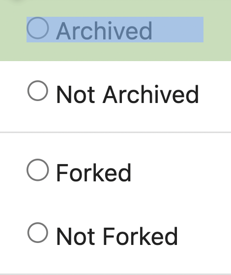
the issue is, that you can not distinguish between normal and archived
labels.
So this will make archived labels 80% **grayscale**. And prepend
"Archived: " to the tooltip info
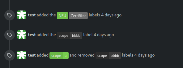
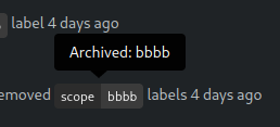
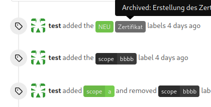
---
*Sponsored by Kithara Software GmbH*
---------
Co-authored-by: delvh <dev.lh@web.de>
|
| |
|
|
|
|
|
|
|
|
| |
Before:
<img width="1332" alt="Screenshot 2024-03-06 at 21 42 17"
src="https://github.com/go-gitea/gitea/assets/115237/0ea07eee-31f8-4783-bd56-37bd8396f00d">
After:
<img width="1336" alt="Screenshot 2024-03-06 at 21 41 58"
src="https://github.com/go-gitea/gitea/assets/115237/eb7f9cc9-587f-4e3b-92bd-cc67ca639963">
|
| |
|
|
|
|
|
|
|
|
|
|
| |
Previously it was only partially styled, e.g. there was black text on
white background even in dark theme caused by fomantic styles.
<img width="195" alt="image"
src="https://github.com/go-gitea/gitea/assets/115237/bc5cf516-2aef-45c3-854a-c9f5497aacca">
<img width="195" alt="Screenshot 2024-03-09 at 02 09 29"
src="https://github.com/go-gitea/gitea/assets/115237/ef0af17d-6e0b-402e-b24d-bfa34dc2f4e0">
Co-authored-by: Giteabot <teabot@gitea.io>
|
| |
|
| |
This will conclude the trivial class replacements.
|
| |
|
|
|
|
|
|
|
|
| |
Fomantic grey labels in the dashboard repo lists were showing original
fomantic colors, fixed that. Also slightly tweaked the light theme
colors so it uses same opacity values as dark theme.
<img width="165" alt="Screenshot 2024-03-07 at 21 06 23"
src="https://github.com/go-gitea/gitea/assets/115237/72744d6f-2ee1-4e5d-8ba0-b482a446f535">
<img width="167" alt="Screenshot 2024-03-07 at 21 06 00"
src="https://github.com/go-gitea/gitea/assets/115237/1ba93775-e5a9-4b28-b90f-59c1e9199687">
|
| |
|
|
|
|
|
|
|
|
|
| |
- Increase contrast overall
- Unalias the ansi color in dark theme and copy them to light
- Add outer border
- Add border radius
<img width="1337" alt="Screenshot 2024-03-06 at 22 30 03"
src="https://github.com/go-gitea/gitea/assets/115237/11407c0f-0bb2-435e-a034-22b1f106d9b0">
<img width="1335" alt="Screenshot 2024-03-06 at 22 36 59"
src="https://github.com/go-gitea/gitea/assets/115237/267db442-0979-4acc-a79e-8579b4cb0262">
|
| |
|
|
|
|
|
|
|
|
|
|
|
|
|
|
|
|
|
|
|
|
|
|
|
|
|
|
|
|
|
| |
There are a few inconsistencies within Gitea and this PR addresses one
of them. This PR updates the sign-in page layout, including the register
and openID tabs, to match the layout of the settings pages
(/user/settings) for more consistency.
This PR updates the following routes:
`/user/login`
`/user/sign_up`
`/user/login/openid`
`/user/forgot_password`
`/user/link_account`
`/user/recover_account`
**Before**
<img width="968" alt="Screenshot 2024-02-05 at 8 27 24 AM"
src="https://github.com/go-gitea/gitea/assets/6152817/fb0cb517-57c0-4eed-be1d-56f36bd1960d">
**After**
<img width="968" alt="Screenshot 2024-02-05 at 8 26 39 AM"
src="https://github.com/go-gitea/gitea/assets/6152817/428d691d-0a42-4a67-a646-05527f2a7b41">
This PR addresses a revert of the original PR due to this
[comment](https://github.com/go-gitea/gitea/pull/28753#issuecomment-1956596817).
---------
Co-authored-by: rafh <rafaelheard@gmail.com>
|
| |
|
|
|
|
|
|
| |
Tested a few things, all working fine. Not sure if the chinese machine
translation is good.
---------
Co-authored-by: wxiaoguang <wxiaoguang@gmail.com>
|
| |
|
|
|
|
|
|
| |
Follow #29418
I think using "flex-wrap: wrap" here is better than hard-coding the screen width.
By using "flex-wrap: wrap", the UI layouts automatically for various
widths (even if in some languages, the sentence might be pretty long)
|
| |
|
|
|
|
|
| |
Fixes #29189.
This is the result after the fix at a width of 768 pixels.
|
| |
|
|
| |
1. Use "star/unstart", but not `{{if}}un{{}}star{{}}` (the same to "watch/unwatch")
2. Use "not-mobile" for hiding the elements on mobile
|
| |
|
|
| |
Replace 18 `gt-` prefixes with `tw-` with perl replacement. I manually
checked them all with `rg` afterwards.
|
| |
|
|
|
| |
Improve contrast by lightening the text colors in dark theme by around
35%. Additionally, share some variables that had the same or similar
color, which will ease future theme creation.
|
| |
|
|
|
|
|
|
|
|
|
|
|
| |
Before, double border on top, bad contrast on dark:
<img width="155" alt="Screenshot 2024-02-29 at 02 06 17"
src="https://github.com/go-gitea/gitea/assets/115237/fc0f1e08-a5ce-47ed-9eb6-135eed5a1abb">
<img width="126" alt="Screenshot 2024-02-29 at 02 07 28"
src="https://github.com/go-gitea/gitea/assets/115237/38ae8483-8d9b-484c-8909-d4466131ea16">
After, no double border on top, good contrast:
<img width="154" alt="Screenshot 2024-02-29 at 02 20 20"
src="https://github.com/go-gitea/gitea/assets/115237/ad91282b-e9f5-4f41-8f5e-6ba28db3beac">
<img width="147" alt="Screenshot 2024-02-29 at 02 20 38"
src="https://github.com/go-gitea/gitea/assets/115237/7ee2ec92-e72a-4981-aec3-98fc8e579bae">
|
| |
|
|
|
|
|
|
|
|
|
|
|
|
|
|
|
|
|
|
|
|
|
| |
The buttons on the repo release tab were larger in height than on other
tabs because one of them contained the RSS icon which stretched the
button height by 3px. Workaround this problem by applying the "compact"
padding to any such button. They are within 0.4px in height now to
non-icon buttons.
Before:
<img width="406" alt="Screenshot 2024-02-28 at 15 30 23"
src="https://github.com/go-gitea/gitea/assets/115237/805bb93a-6fe4-40a0-82d1-03001bee8ecf">
After:
<img width="407" alt="Screenshot 2024-02-28 at 15 38 43"
src="https://github.com/go-gitea/gitea/assets/115237/27707588-890f-4852-ab08-105a57eda880">
For comparison, button on issue tab:
<img width="452" alt="Screenshot 2024-02-28 at 15 31 46"
src="https://github.com/go-gitea/gitea/assets/115237/74ac13d5-d016-49ba-9dd9-40ed32a748e9">
|
| |
|
|
|
|
|
|
|
|
|
|
|
|
|
|
|
|
| |
Now uses the same primary color as light theme. The secondary colors are
shifted towards a slightly blue shade. Could maybe desaturate a bit
more, but overall I think I'm happy with it.
Fixes: https://github.com/go-gitea/gitea/issues/27097
<img width="1343" alt="Screenshot 2024-02-27 at 22 21 46"
src="https://github.com/go-gitea/gitea/assets/115237/4163c393-b469-4a53-8f4b-1c33aa04f3ac">
<img width="581" alt="image"
src="https://github.com/go-gitea/gitea/assets/115237/e621f7f8-5679-4605-bf42-3d5ff1071e1e">
<img width="581" alt="image"
src="https://github.com/go-gitea/gitea/assets/115237/20e66493-2457-482b-b8f1-e5710934e189">
---------
Co-authored-by: Giteabot <teabot@gitea.io>
|
| |
|
|
|
| |
Follow #29357
- Replace `gt-w-*` -> `tw-w-*` and remove `gt-w-*`
- Replace `gt-h-*` -> `tw-h-*` and remove `gt-h-*`
|
| |
|
|
|
|
|
|
|
|
|
|
|
|
|
|
|
|
|
|
|
|
|
|
|
|
|
|
|
|
|
|
|
|
|
|
|
|
|
|
|
|
|
|
|
|
|
|
|
|
|
|
|
|
|
|
|
|
|
|
|
|
|
|
|
|
|
|
|
|
|
|
|
|
|
|
|
|
|
|
|
|
|
|
|
|
|
|
|
|
|
|
|
|
|
|
|
|
|
|
|
|
|
|
|
|
|
|
|
|
|
|
|
|
|
|
|
|
|
|
|
|
|
|
|
|
|
|
|
|
|
|
|
|
|
|
|
|
|
|
|
|
|
|
|
|
|
|
|
|
|
|
|
|
|
|
|
|
|
|
|
|
|
|
|
|
|
|
|
|
|
|
|
|
|
|
|
|
|
|
|
|
|
|
|
|
|
|
|
|
|
|
|
|
|
|
|
|
|
|
|
|
|
|
|
|
|
|
|
|
|
|
|
|
|
|
|
|
|
|
|
|
|
|
|
|
|
|
|
|
|
|
|
|
|
|
|
|
|
|
|
|
|
|
|
|
|
|
|
|
|
|
|
|
|
|
|
|
|
|
|
|
|
|
|
|
|
|
|
|
|
|
|
|
|
|
|
|
|
|
|
|
|
|
|
|
|
|
|
|
|
|
|
|
|
|
|
|
|
|
|
|
|
|
|
|
|
|
|
|
|
|
|
|
|
|
|
|
|
|
|
|
|
|
|
|
|
|
|
|
|
| |
This will get tailwindcss working on a basic level. It provides only the
utility classes, e.g. no tailwind base which we don't need because we
have our own CSS reset. Without the base, we also do not have their CSS
variables so a small amount of features do not work and I removed the
generated classes for them.
***Note for future developers: This currently uses a `tw-` prefix, so we
use it like `tw-p-3`.***
<details>
<summary>Currently added CSS, all false-positives</summary>
```
.\!visible{
visibility: visible !important
}
.visible{
visibility: visible
}
.invisible{
visibility: hidden
}
.collapse{
visibility: collapse
}
.static{
position: static
}
.\!fixed{
position: fixed !important
}
.absolute{
position: absolute
}
.relative{
position: relative
}
.sticky{
position: sticky
}
.left-10{
left: 2.5rem
}
.isolate{
isolation: isolate
}
.float-right{
float: right
}
.float-left{
float: left
}
.mr-2{
margin-right: 0.5rem
}
.mr-3{
margin-right: 0.75rem
}
.\!block{
display: block !important
}
.block{
display: block
}
.inline-block{
display: inline-block
}
.inline{
display: inline
}
.flex{
display: flex
}
.inline-flex{
display: inline-flex
}
.\!table{
display: table !important
}
.inline-table{
display: inline-table
}
.table-caption{
display: table-caption
}
.table-cell{
display: table-cell
}
.table-column{
display: table-column
}
.table-column-group{
display: table-column-group
}
.table-footer-group{
display: table-footer-group
}
.table-header-group{
display: table-header-group
}
.table-row-group{
display: table-row-group
}
.table-row{
display: table-row
}
.flow-root{
display: flow-root
}
.inline-grid{
display: inline-grid
}
.contents{
display: contents
}
.list-item{
display: list-item
}
.\!hidden{
display: none !important
}
.hidden{
display: none
}
.flex-shrink{
flex-shrink: 1
}
.shrink{
flex-shrink: 1
}
.flex-grow{
flex-grow: 1
}
.grow{
flex-grow: 1
}
.border-collapse{
border-collapse: collapse
}
.select-all{
user-select: all
}
.resize{
resize: both
}
.flex-wrap{
flex-wrap: wrap
}
.overflow-visible{
overflow: visible
}
.rounded{
border-radius: 0.25rem
}
.border{
border-width: 1px
}
.text-justify{
text-align: justify
}
.uppercase{
text-transform: uppercase
}
.lowercase{
text-transform: lowercase
}
.capitalize{
text-transform: capitalize
}
.italic{
font-style: italic
}
.text-red{
color: var(--color-red)
}
.text-shadow{
color: var(--color-shadow)
}
.underline{
text-decoration-line: underline
}
.overline{
text-decoration-line: overline
}
.line-through{
text-decoration-line: line-through
}
.outline{
outline-style: solid
}
.ease-in{
transition-timing-function: cubic-bezier(0.4, 0, 1, 1)
}
.ease-in-out{
transition-timing-function: cubic-bezier(0.4, 0, 0.2, 1)
}
.ease-out{
transition-timing-function: cubic-bezier(0, 0, 0.2, 1)
}
```
</details>
---------
Co-authored-by: Giteabot <teabot@gitea.io>
|
| |
|
|
|
|
|
|
|
|
|
|
|
|
|
| |
Unify organizations header
before:

after:

---------
Co-authored-by: silverwind <me@silverwind.io>
|
| |
|
|
| |
Revert #29255
Revert #28753
|
| |
|
|
|
|
|
|
|
|
|
|
|
|
|
|
|
|
| |
In a previous [PR](https://github.com/go-gitea/gitea/pull/28753) we
moved the labels to be above the inputs. The PR ensures that the
alignment is also on both tabs of the link account page
(`/user/link_account`).
Before
<img width="1094" alt="before"
src="https://github.com/go-gitea/gitea/assets/6152817/ac1e86bd-c4d6-4e45-87d1-87bb8a736149">
After
<img width="1094" alt="after"
src="https://github.com/go-gitea/gitea/assets/6152817/1b5fc109-f4d2-43ee-b924-0a9e53a0e391">
---------
Co-authored-by: rafh <rafaelheard@gmail.com>
|
| |
|
|
|
|
|
|
|
|
|
|
|
|
|
|
|
|
|
|
|
| |
1. Tweak diff header and remove a numbe of unneeded CSS for it:
Before:
<img width="433" alt="Screenshot 2024-02-18 at 01 08 09"
src="https://github.com/go-gitea/gitea/assets/115237/d8b377c0-57bc-44d5-bb57-a582c7d4b3b4">
After:
<img width="463" alt="Screenshot 2024-02-18 at 01 07 56"
src="https://github.com/go-gitea/gitea/assets/115237/d08c17e7-5b86-4d07-81da-6371f4754325">
3. Reduce height of review textarea and also reduce fomantic's CSS from
12em to 8em. Now fits better on my screen:
<img width="1352" alt="image"
src="https://github.com/go-gitea/gitea/assets/115237/5c658d13-295e-4929-94da-13ade888020d">
---------
Co-authored-by: delvh <dev.lh@web.de>
|
