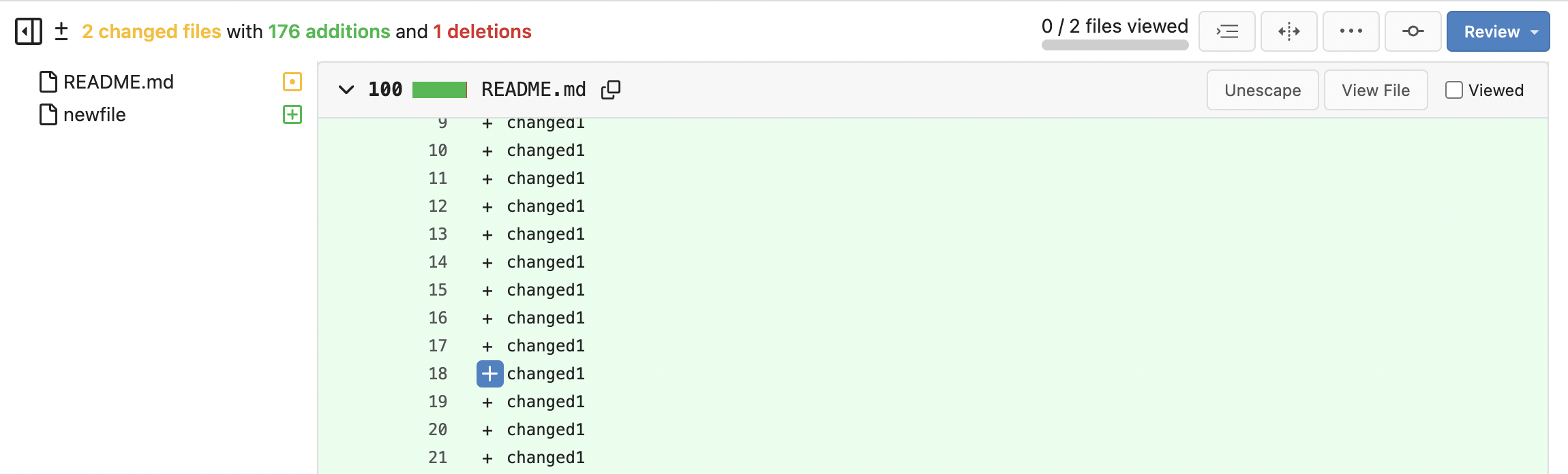
| Commit message (Collapse) | Author | Age | Files | Lines |
|---|
| ... | |
| |
|
|
|
|
|
|
|
|
|
|
|
|
|
|
| |
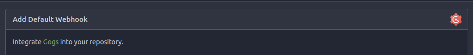
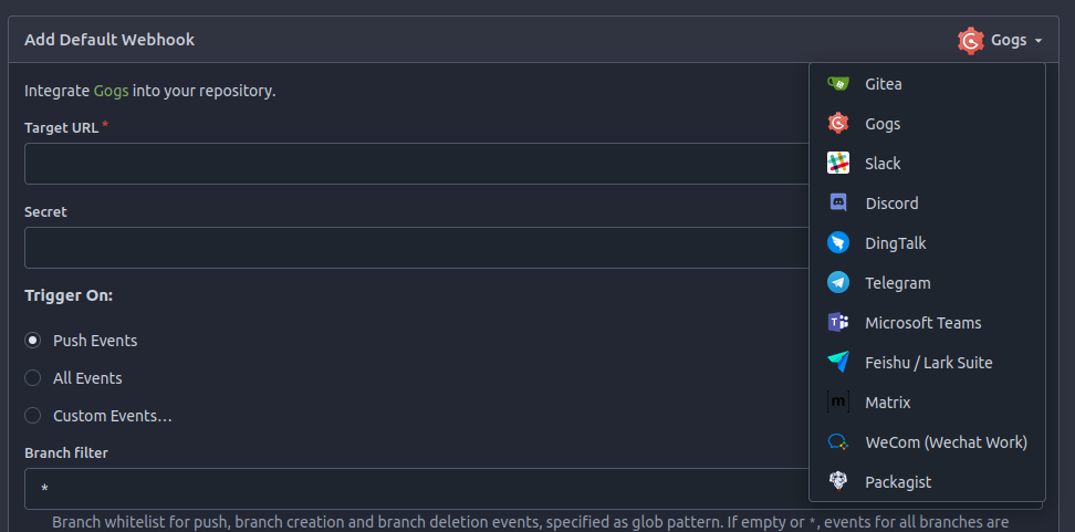
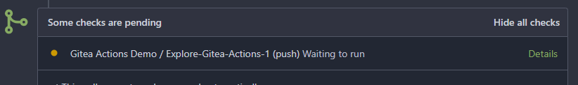
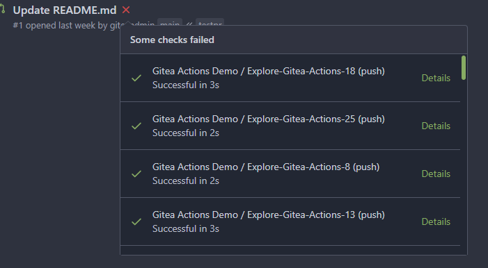
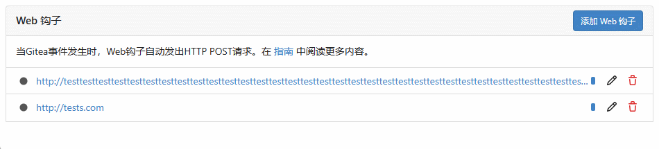
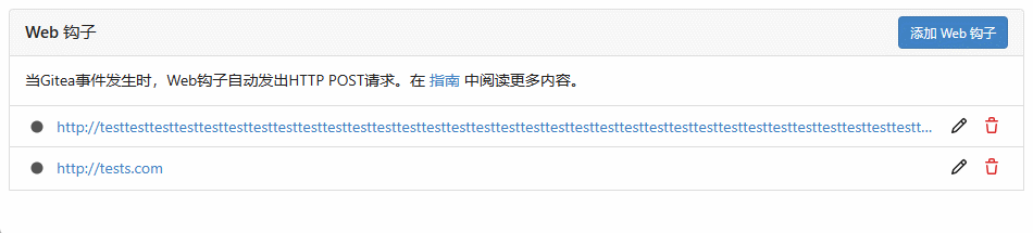
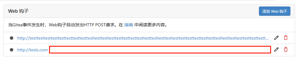
It's now possible to change webhook-type in create-view.
before:
after:
---------
Co-authored-by: silverwind <me@silverwind.io>
Co-authored-by: Giteabot <teabot@gitea.io>
|
| |
|
|
|
|
|
|
|
|
|
|
|
|
|
|
|
|
| |
There are a few inconsistencies within Gitea and this PR addresses one of them.
This PR updates the sign-in page layout, including the register and openID tabs,
to match the layout of the settings pages (`/user/settings`) for more consistency.
**Before**
<img width="968" alt="Screenshot 2024-02-05 at 8 27 24 AM"
src="https://github.com/go-gitea/gitea/assets/6152817/fb0cb517-57c0-4eed-be1d-56f36bd1960d">
**After**
<img width="968" alt="Screenshot 2024-02-05 at 8 26 39 AM"
src="https://github.com/go-gitea/gitea/assets/6152817/428d691d-0a42-4a67-a646-05527f2a7b41">
---------
Co-authored-by: rafh <rafaelheard@gmail.com>
|
| |
|
|
|
|
|
|
|
|
|
|
|
|
|
|
|
|
|
|
|
|
|
|
|
|
|
|
|
|
|
|
|
|
|
|
|
|
|
|
|
|
| |
- Follows https://github.com/go-gitea/gitea/pull/21711
- Closes https://github.com/go-gitea/gitea/issues/28316
Implement GitHub's alert blocks markdown feature
Docs:
-
https://docs.github.com/en/get-started/writing-on-github/getting-started-with-writing-and-formatting-on-github/basic-writing-and-formatting-syntax#alerts
- https://github.com/orgs/community/discussions/16925
### Before

### After
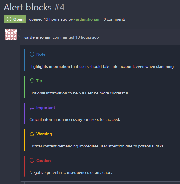
## :warning: BREAKING :warning:
The old syntax no longer works
How to migrate:
If you used
```md
> **Note** My note
```
Switch to
```md
> [!NOTE]
> My note
```
---------
Signed-off-by: Yarden Shoham <git@yardenshoham.com>
Co-authored-by: silverwind <me@silverwind.io>
Co-authored-by: Giteabot <teabot@gitea.io>
|
| |
|
|
|
|
|
|
|
|
|
|
| |
This border-radius is obsolete since we changed the comment rendering a
few months ago and it caused incorrect display on blockquotes.
Before:
<img width="160" alt="Screenshot 2024-02-10 at 18 42 48"
src="https://github.com/go-gitea/gitea/assets/115237/ccbf4660-acf9-4268-aad9-1ad49d317a67">
After:
<img width="135" alt="Screenshot 2024-02-10 at 18 42 40"
src="https://github.com/go-gitea/gitea/assets/115237/6f588e02-3b2a-49ee-b459-81d8068b2f4e">
|
| |
|
|
|
|
|
|
|
|
|
|
|
|
|
|
|
| |
It's too thick
I made it match GitHub's size
# Before
# After

Signed-off-by: Yarden Shoham <git@yardenshoham.com>
|
| |
|
|
|
|
|
|
|
|
|
|
|
|
|
|
|
| |
I tripped over this strange method and I don't think we need that
workaround to fix the value.
old:

new:

---------
Co-authored-by: silverwind <me@silverwind.io>
Co-authored-by: wxiaoguang <wxiaoguang@gmail.com>
|
| |
|
|
|
|
|
|
|
|
|
|
|
|
|
|
|
| |
The current animation loops in a very fast manner, causing a slight
feeling of uncomfortableness. This change slows it a bit for a smoother
experience.
# Before
# After

Signed-off-by: Yarden Shoham <git@yardenshoham.com>
|
| |
|
| |
Fixes #15981
|
| |
|
|
|
|
|
|
|
| |
If you view a file, you can now see the latest commit that changed that file.

---------
Co-authored-by: Denys Konovalov <kontakt@denyskon.de>
|
| |
|
|
|
|
|
|
|
|
|
|
|
|
|
|
|
|
|
|
|
|
|
| |
Before:
<details>

</details>
After:


|
| |
|
|
| |
* `gt-w-100` => `gt-w-full` to match tailwind
* clarify `gt-hidden` priority
|
| |
|
|
|
|
|
|
|
|
|
|
|
|
|
|
|
|
|
|
|
|
|
|
|
|
|
|
|
|
|
|
|
| |
Redesign repo header with following new aspects:
- responsive & better-looking repo title
- hide repo button text instead of icons in mobile view
- use same tab style as on explore and org page
<details>
<summary>Before:</summary>


</details>
<details>
<summary>After:</summary>


|
| |
|
|
|
|
|
|
|
|
|
|
|
|
|
|
| |
Close https://github.com/go-gitea/gitea/issues/28522
~Adds some [negative
margin](https://tailwindcss.com/docs/margin#using-negative-values)
helper css classes using tailwind's [prefix
syntax](https://tailwindcss.com/docs/configuration#prefix)~
### Before

### After
|
| |
|
|
|
|
|
|
|
|
|
|
|
| |
In the commit 5a56f9699c (3.) the min-height was applied to all wiki
elements. This resulted in huge blank spaces when viewing the wiki.
This fixes this by only applying the min-height to the preview when
editing.
Refs: https://codeberg.org/forgejo/forgejo/pulls/2080
(cherry picked from commit 8f0baefe5dadc929fe7456c36c8b205e96f228f0)
Co-authored-by: Fl1tzi <git@fl1tzi.com>
|
| |
|
| |
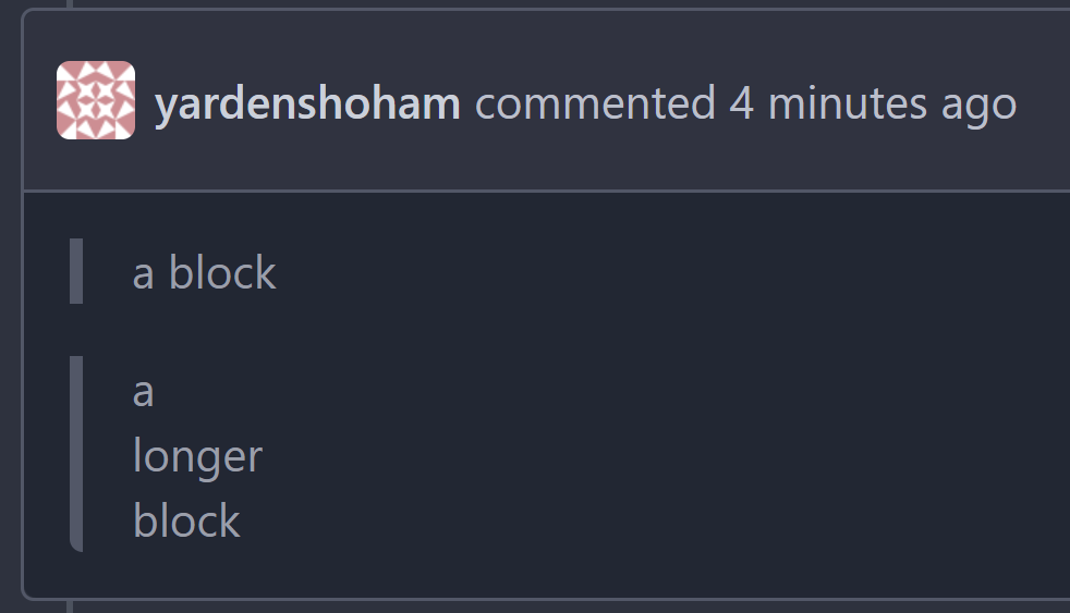
The label list needs to wrap the items to avoid unnecessary overflow / incorrect text wrapping.
|
| |
|
| |
Fix #28489
|
| |
|
|
|
|
|
|
|
|
| |
I propose to decrease font size. 18 is too big and looks ugly, on
windows. 14 is on par with other elements and save a bit of space.
Co-authored-by: Nikolay Kobzarev <n.kobzarev@aeronavigator.ru>
|
| |
|
|
|
|
|
| |
the gt-df's display:flex !important did override the display:none on small displays
---------
Co-authored-by: wxiaoguang <wxiaoguang@gmail.com>
|
| |
|
|
|
|
|
|
|
|
|
|
|
|
|
|
|
|
|
|
|
|
|
|
|
|
|
|
|
|
| |
1. Show diff stats only on large screens
these are already shown in tabs, so no need for this duplicate
information on small screens
2. Hide viewed files information on small screens
Github does the same and this gives us more free space on small screens
3. Review bar now doesn't wrap so we don't need the 77px even on very
small screens
(the sticky headers are still working)
|
| |
|
|
|
|
|
|
|
|
|
|
|
|
|
|
|
|
|
|
|
|
|
|
|
|
| |
In #25315, @denyskon fixed UI on mobile view.
But for the repo description, on desktop view there's no word-break.
So maybe we can just add `gt-word-break` to fix it on both mobile view
and desktop view.
Before:
desktop view:

mobile view:

After:
desktop view:

mobile view(almost same?)
---------
Co-authored-by: silverwind <me@silverwind.io>
|
| |
|
|
|
|
|
| |
Fix #27928
---------
Co-authored-by: silverwind <me@silverwind.io>
|
| |
|
|
|
|
|
|
|
|
|
|
|
|
|
|
|
|
|
|
|
|
|
|
|
| |
Step one for a GitHub like commit status check ui:
Step two:

The design now will list all commit status checks which takes too much
space.
This is a pre-improve for #26247
---------
Co-authored-by: delvh <dev.lh@web.de>
Co-authored-by: silverwind <me@silverwind.io>
Co-authored-by: wxiaoguang <wxiaoguang@gmail.com>
|
| |
|
|
| |
Small CSS tweak, reduces margin/padding from 14px to 10px, which I think
looks better
|
| |
|
|
|
|
|
|
|
|
| |
Fixes: https://github.com/go-gitea/gitea/issues/27784
<img width="1033" alt="Screenshot 2023-10-25 at 19 07 15"
src="https://github.com/go-gitea/gitea/assets/115237/1a363851-1a86-48cb-99ec-0a573371bb6e">
<img width="1051" alt="Screenshot 2023-10-25 at 19 07 41"
src="https://github.com/go-gitea/gitea/assets/115237/add4b606-2264-430a-af35-249ef005817f">
Co-authored-by: KN4CK3R <admin@oldschoolhack.me>
|
| |
|
|
|
|
|
|
|
|
|
|
|
|
|
|
|
|
|
|
|
| |
Fix #24318
Before:

After:

|
| |
|
|
|
|
|
|
|
| |
Before (almost no gap between files):
<img width="1240" alt="Screenshot 2023-10-24 at 19 43 32"
src="https://github.com/go-gitea/gitea/assets/115237/30cdbdbc-d102-479c-89ce-3f68837ae0cd">
After (with 8px gap):
<img width="1241" alt="Screenshot 2023-10-24 at 19 43 22"
src="https://github.com/go-gitea/gitea/assets/115237/72b26a30-8730-4a36-8de9-be143b684b98">
|
| |
|
|
|
|
|
|
|
|
|
|
|
|
|
|
| |
The current language stats are too obsessed with color matching. Similar
colors are always next to each other. It is a bit troublesome to find
the place where the color matching is generated, so just follow the
example of github and add a gap.
## before
<img width="883" alt="image"
src="https://github.com/go-gitea/gitea/assets/12915306/cf54430c-616c-4b37-b561-5a37c20b2d94">
## after
<img width="877" alt="image"
src="https://github.com/go-gitea/gitea/assets/12915306/e518ea36-2b8f-4f11-a867-a58dc393db85">
|
| |
|
|
|
|
|
|
|
|
| |
Fixes: https://github.com/go-gitea/gitea/issues/27604
Add negative margins so the header covers any shadow of active elements.
No rendering change of the content of the header because the padding
counteracts the effect.
<img width="128" alt="image"
src="https://github.com/go-gitea/gitea/assets/115237/3d0f55b6-9351-4985-a290-da9a92d15b4e">
|
| |
|
|
|
|
|
|
|
|
|
|
|
|
|
|
|
|
|
|
|
|
|
|
| |
for an issue (#27451)
Followup of #27115
Finally closes #25237
## Screenshots
### Issue Sidebar
<img width="513" alt="image"
src="https://github.com/go-gitea/gitea/assets/80308335/9f7fda2f-5a03-4684-8619-fd3498a95b41">
### PR sidebar
<img width="367" alt="image"
src="https://github.com/go-gitea/gitea/assets/80308335/53db9b64-faec-4a67-91d6-76945596a469">
### PR sidebar with archived labels shown
<img width="352" alt="image"
src="https://github.com/go-gitea/gitea/assets/80308335/9dc5050f-4e69-4f76-bb83-582480a2281e">
---------
Signed-off-by: puni9869 <punitinani1@hotmail.com>
Co-authored-by: silverwind <me@silverwind.io>
|
| |
|
|
| |
1. fix #27631 , and add samples to devtest page
2. fix incorrect color for "ui dropdown button" when hover
|
| |
|
|
|
|
|
|
|
|
|
| |
Enable [shorthand
matching](https://github.com/AndyOGo/stylelint-declaration-strict-value#expandshorthand)
in this lint rule and match color properties by regex. Patterns like
this will now fail lint:
```css
background: #123456;
border: 1px sold rgba(0,0,0,0);
```
|
| |
|
| |
Closes https://github.com/go-gitea/gitea/issues/27358
|
| |
|
|
|
|
|
|
|
|
|
|
| |
This patch adds a hover background for the wiki row in wiki list page,
which make its behavior more close to repo's file list page.
This patch also make the wiki-git-entry visible on the row is hovered
instead of the cel, so users won't be confused since the 'grid' is not
visible from the web page.
After the patch: (when the wiki named 'Home' is hovered)

|
| |
|
|
|
|
|
|
|
|
|
|
|
|
|
|
|
|
|
|
|
|
|
|
|
| |
Part of https://github.com/go-gitea/gitea/issues/27097:
- `gitea` theme is renamed to `gitea-light`
- `arc-green` theme is renamed to `gitea-dark`
- `auto` theme is renamed to `gitea-auto`
I put both themes in separate CSS files, removing all colors from the
base CSS. Existing users will be migrated to the new theme names. The
dark theme recolor will follow in a separate PR.
## :warning: BREAKING :warning:
1. If there are existing custom themes with the names `gitea-light` or
`gitea-dark`, rename them before this upgrade and update the `theme`
column in the `user` table for each affected user.
2. The theme in `<html>` has moved from `class="theme-name"` to
`data-theme="name"`, existing customizations that depend on should be
updated.
---------
Co-authored-by: Lunny Xiao <xiaolunwen@gmail.com>
Co-authored-by: Giteabot <teabot@gitea.io>
|
| |
|
|
|
|
|
|
|
| |
Fixes #3852
Fixes https://github.com/go-gitea/gitea/issues/26707
Add a button on file history which directs you to the file at the
selected commit.
Co-authored-by: silverwind <me@silverwind.io>
|
| |
|
|
|
|
|
|
|
|
|
|
|
|
|
|
|
|
|
|
|
|
|
|
|
|
|
|
|
|
|
|
|
|
|
|
|
|
|
|
|
|
|
|
|
|
|
|
|
|
|
|
|
|
|
|
|
|
|
| |
Followup https://github.com/go-gitea/gitea/pull/26820
## Archived labels UI for issue filter and issue filter actions for
issues/pull request pages.
Changed:
* Enhanced the Issue filter and Issue filter actions UI page to
seamlessly incorporate a list of archived labels.
* Pagination functionality is same as before. If archived label checkbox
is checked then we are adding a query string`archived=true` in the url
to save the state of page.
* Issue filter actions menu is separated into different template.
* Adding the archived flag in issue url labels.
* Pull Request page is also work the same.
Outsourced:
* Defer the implementation of specialized handling for archived labels
to upcoming pull requests. This step will be undertaken subsequent to
the successful merge of this pull request.
Screenshots
### Issue page
<img width="1360" alt="image"
src="https://github.com/go-gitea/gitea/assets/80308335/d7efb2ef-5b2b-449d-83f0-d430a32ec432">
### Issue page with label filter on archived label checkbox when not
checked --> No archived label is there in list
<img width="1249" alt="image"
src="https://github.com/go-gitea/gitea/assets/80308335/ceea68ef-91f2-4693-910f-2e25e236bfc9">
### Issue page with label filter on archived label checkbox when checked
--> Show archived label in the list.
<img width="710" alt="image"
src="https://github.com/go-gitea/gitea/assets/80308335/2414d26b-2079-4c3c-bd9e-f2f5411bcabf">
### Issue page with label filter on issue action menu on archived label
checkbox when checked --> Show archived label in the list.
<img width="409" alt="image"
src="https://github.com/go-gitea/gitea/assets/80308335/259cac87-3e21-4778-99a2-a6a0b8c81178">
### Applied the archived=true in Issue labels when archived checkbox is
checked.
<img width="984" alt="image"
src="https://github.com/go-gitea/gitea/assets/80308335/657ce3db-c0ae-402e-b12d-3b580d3c2ed0">
---
Part of https://github.com/go-gitea/gitea/issues/25237
---------
Signed-off-by: puni9869 <punitinani1@hotmail.com>
Co-authored-by: delvh <dev.lh@web.de>
Co-authored-by: Giteabot <teabot@gitea.io>
|
| |
|
|
|
|
|
|
|
|
|
|
|
|
|
|
|
| |
Various improvements related to feeds:
- Fix markdown rendering
- Increase font size from 13px to default 14px via `flex-item`
- Add style to hashes
- Move the timestamp to title line. I realize it's not optimal for
translation, we may need to change all these translations
Before:
<img width="768" alt="Screenshot 2023-09-29 at 22 52 58"
src="https://github.com/go-gitea/gitea/assets/115237/edda8b84-23cf-4a43-90ad-a892798f4e6c">
After:
<img width="781" alt="Screenshot 2023-09-29 at 22 58 09"
src="https://github.com/go-gitea/gitea/assets/115237/7097474d-efcf-4f22-a2ab-834a4e25c4e8">
|
| |
|
|
|
|
|
|
|
|
|
|
|
|
|
|
|
|
|
|
|
|
|
| |
Currently, checkboxes are positioned as absolute. This positioning
causes the input to overlay an element that has been floated within the
editor. Floated elements are useful if you want your text to wrap around
this element. This PR fixes the overlaying of checkboxes by removing the
absolute positioning, updating the `ul` padding, and
displaying`.task-list-item` `flex` to ensure inputs and the associated
label are on the same line.
Screenshots:
Before:
<img width="762" alt="Screenshot 2023-09-01 at 3 40 59 PM"
src="https://github.com/go-gitea/gitea/assets/6152817/570247c7-7f5c-4697-bfc9-ad4655e37991">
After:
<img width="762" alt="Screenshot 2023-09-01 at 3 42 20 PM"
src="https://github.com/go-gitea/gitea/assets/6152817/db53df45-1294-4eee-84c0-b21ac4fdf805">
---------
Co-authored-by: rafh <rafaelheard@gmail.com>
|
| |
|
|
|
|
|
|
|
|
|
|
|
|
|
|
|
|
| |
Close #26730
1. The `diff-detail-box` was abused, it shouldn't be used for
"DiffFileList/DiffFileTree".
2. Fix the sticky position for various screens.


|
| |
|
|
|
|
|
|
|
|
|
|
|
|
|
|
|
|
|
|
|
|
|
|
|
|
|
| |
(#27323)
Fix #27313 (see the comment)
And some UI improvements:
### Before


### After


|
| |
|
|
|
|
|
|
|
|
|
|
|
| |
1. Put the `"octicon-shield-lock"` into the flex container, then it
doesn't need a separate flex box
2. Remove some unnecessary `gt-df` helpers
3. Make `btn` button has the same flex behavior as `ui button`
|
| |
|
|
|
|
|
|
|
|
|
|
|
|
|
|
|
|
|
|
|
|
|
|
|
|
| |
The `.new-menu` was using a pseudo-element based fade-out effect.
Replace this with a more modern mask-based effect which in this case
required a child element to avoid fading out the background as well, so
I applied it to child `new-menu-inner` which was present on all these
menus except explore where I added it.
There is no visual difference except that the items on the explore page
have no `gap` between them any longer, making it consistent with other
menus. Before and after:
<img width="221" alt="Screenshot 2023-09-21 at 21 13 19"
src="https://github.com/go-gitea/gitea/assets/115237/b4a38ce2-cee1-4c54-84a5-e1d0bfd79e29">
<img width="222" alt="Screenshot 2023-09-21 at 21 32 36"
src="https://github.com/go-gitea/gitea/assets/115237/bb6b1335-d935-4ad4-bb85-3b0fc3027c2b">
Also, this cleans up the related CSS vars:
- `--color-header-wrapper-transparent` is removed, no longer needed
- `--color-header-wrapper` is defined in base theme as well, was
previously unset and therefor transparent.
[no whitespace
diff](https://github.com/go-gitea/gitea/pull/27181/files?diff=unified&w=1)
[demo of mask fade](https://jsfiddle.net/silverwind/tsfadb3u/)
|
| |
|
| |
Fixes: https://github.com/go-gitea/gitea/issues/27230
|
| |
|
|
|
|
|
|
|
|
| |
- switch from some weird status badge to label
- translate untranslated `Reset registration token` string
- change documentation link from act_runner README to Gitea Docs site
- fix "No runners available" message width
- use `ctx.Locale.Tr` where possible

|
| |
|
| |
Fix #27166
|
| |
|
|
|
|
|
|
|
|
|
|
|
|
|
|
|
|
|
|
|
|
|
|
| |
I think it's better if the primary actions have primary color instead of
green which fits better into the overall single-color UI design. This PR
currently replaces every green button with primary:
<img width="141" alt="Screenshot 2023-09-16 at 14 07 59"
src="https://github.com/go-gitea/gitea/assets/115237/843c1e50-4fb2-4ec6-84ba-0efb9472dcbe">
<img width="161" alt="Screenshot 2023-09-16 at 14 07 51"
src="https://github.com/go-gitea/gitea/assets/115237/9442195a-a3b2-4a42-b262-8377d6f5c0d1">
Modal actions now use uncolored/primary instead of previous green/red
colors. I also removed the box-shadow on all basic buttons:
<img width="259" alt="Screenshot 2023-09-16 at 14 16 39"
src="https://github.com/go-gitea/gitea/assets/115237/5beea529-127a-44b0-8d4c-afa7b034a490">
<img width="261" alt="Screenshot 2023-09-16 at 14 17 42"
src="https://github.com/go-gitea/gitea/assets/115237/4757f7b2-4d46-49bc-a797-38bb28437b88">
The change currently includes the "Merge PR" button, for which we might
want to make an exception to match the icon color there:
<img width="442" alt="Screenshot 2023-09-16 at 14 33 53"
src="https://github.com/go-gitea/gitea/assets/115237/993ac1a5-c94d-4895-b76c-0d872181a70b">
|
| |
|
|
|
|
|
|
|
|
|
|
|
|
| |
Follow up https://github.com/go-gitea/gitea/pull/26741
Changes:
Added archived label for org labels and added into issue filter list.
Part of https://github.com/go-gitea/gitea/issues/25237
---------
Signed-off-by: puni9869 <punitinani1@hotmail.com>
Co-authored-by: silverwind <me@silverwind.io>
|
| |
|
|
|
|
|
|
| |
Follow Remove polluted .ui.right #26825
Remove more `gt-float-right`, remove unnecessary helpers, remove
negative margin tricks.
|
| |
|
|
|
|
|
|
|
|
|
|
|
|
|
|
|
| |
As title
From the long time I was looking for this UI, Now its the time to fix
it.
Before
<img width="252" alt="image"
src="https://github.com/go-gitea/gitea/assets/80308335/963f2cb4-5cfd-4a14-ab85-88e25c3daef5">
<img width="502" alt="image"
src="https://github.com/go-gitea/gitea/assets/80308335/58453ef1-2555-4568-95d0-5293055b33b8">
---------
Co-authored-by: wxiaoguang <wxiaoguang@gmail.com>
Co-authored-by: Giteabot <teabot@gitea.io>
|
| |
|
|
|
|
|
|
|
|
|
|
|
|
|
|
|
|
| |
Before:
After:
---
1. **Remove the scroll bar exception that in the a tag**
2. **Reduce the actual width of the a tag to the actual width of the
content**
As shown in the screenshot, the red box area should not be clickable
|
