| Commit message (Collapse) | Author | Age | Files | Lines |
|---|
| ... | |
| |
|
|
|
|
|
|
|
|
|
|
|
| |
as title.
Screensots
before
after

|
| |
|
|
|
|
|
|
|
|
|
|
|
|
|
| |
* Fix a regression from #26809 (the `data-org` is missing)
* Remove unnecessary style
Screenshots:


|
| |
|
|
|
|
|
|
|
|
|
| |
Close #27012
By the way, rename the single-word ID to a long ID.
|
| |
|
|
|
|
|
|
|
|
|
| |
Before:
* The layout is quite complex
* The UI flickers when switch the stats (https://try.gitea.io/)
After:
* Simplify the code
* The UI doesn't flicker
|
| |
|
|
|
|
|
|
| |
Align everything with a new layout.
* Use "baseline" for some special elements, the "flex-item-icon" is for
the issue list only at the moment and I think it should be general
enough now (but not using "flex-item-leading" anymore in this case).
* Make the labels stretch themselves.
|
| | |
|
| |
|
|
|
|
|
|
|
|
|
|
|
|
|
|
|
|
|
|
| |
1. There is already `gt-ac`, so no need to introduce `flex-item-center`
2. The `flex-item-baseline` and `.flex-item-icon svg { margin-top: 1px
}` seem to be a tricky patch, they don't resolve the root problem, and
still cause misalignment in some cases.
* The root problem is: the "icon" needs to align with the sibling
"title"
* So, make the "icon" and the "title" both have the same height
3. `flex-text-inline` could only be used if the element is really
"inline", otherwise its `vertical-align` would make the box size change.
In most cases, `flex-text-block` is good enough.

---------
Co-authored-by: silverwind <me@silverwind.io>
Co-authored-by: Giteabot <teabot@gitea.io>
|
| |
|
|
| |
Co-authored-by: silverwind <me@silverwind.io>
Co-authored-by: Giteabot <teabot@gitea.io>
|
| |
|
|
|
|
|
|
|
|
|
| |
1. In many cases, the `flex-list` has previous and next `gt-hidden`
siblings, so relax the CSS selector to remove all ".segument .flex-list"
paddings.
2. Make the "Add key" button can toggle
3. Move help message into the related segment(panel). Otherwise users
would misread the message, eg: the SSH help seemed for GPG because they
are so near
4. Move modal element into the segment element, otherwise it affects the
layout
|
| |
|
| |
Fix #26931
|
| | |
|
| |
|
|
|
|
|
|
|
|
|
| |
The changes for "commit-body" in #26877 are not ideal.
The reason is: the "commit-body" is usually a `<pre>`, it has default
margins. In most cases, we do not need that large margin. So, this PR
introduces a general but small margin for all "commit-body" elements.
Then these `gt-m-0` could be removed.
The `:not` selector is not needed, because the `.timeline-item` selector
is already clear enough.
|
| |
|
|
|
|
|
|
|
|
|
|
|
|
|
|
|
|
|
|
| |
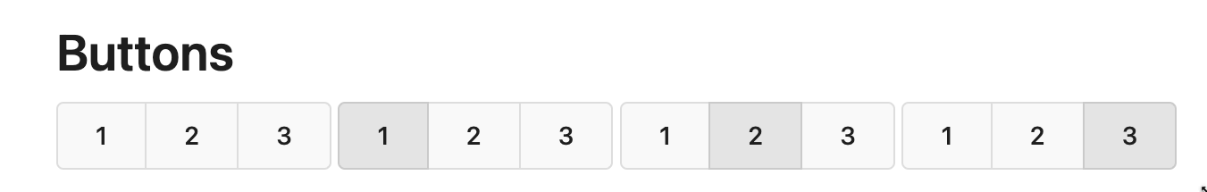
Replace #26850
Major changes:
1. Remove all `has` selectors, it is still not supported by firefox.
Actually there could be some more general and clearer approaches
2. Remove `two-toggle-buttons`, the `.ui.buttons` just works well
3. Rewrite the `.ui.buttons` border styles, see the screenshots
4. Remove the "fine-tuning" paddings from the the flex children, they
could layout themselves well.

|
| |
|
|
|
|
|
|
|
|
|
|
|
|
|
|
|
|
|
|
| |
The old code used complex `if` blocks and strange HTML layouts.
<details>

</details>
This PR refactors the template code and remove legacy CSS styles. The UI
doesn't change much.

|
| |
|
|
| |
---
*Sponsored by Kithara Software GmbH*
|
| |
|
|
| |
1. `icons`: globally searched, no use in templates.
2. toast's `display: inline-block;`: there is a `display: flex` below.
|
| |
|
|
|
|
|
|
|
|
|
|
|
|
|
|
|
|
|
|
| |
Some small dashboard tweaks:
- Remove margin-bottom from divider so first item does not appear to
have un-equal margins
- Restore previous icon color
- Add slight margin-right to icon
Before:
<img width="783" alt="Screenshot 2023-08-31 at 00 10 28"
src="https://github.com/go-gitea/gitea/assets/115237/b75f70d7-8704-4afb-866d-fea0484c52d4">
After:
<img width="783" alt="Screenshot 2023-08-31 at 00 10 08"
src="https://github.com/go-gitea/gitea/assets/115237/50ed0c47-6f7c-449e-a054-13091369d43f">
---------
Co-authored-by: wxiaoguang <wxiaoguang@gmail.com>
|
| |
|
|
|
|
|
|
| |
1. Use `gt-invisible` instead of `invisible`.
2. Use `gt-word-break` instead of `dont-break-out` (there is a slight
different "hyphens", but I think it won't affect too much since it is
only used for the "full name").
3. Remove `.small.button:has(svg)` , now our buttons could layout SVG
correctly, and actually I didn't see this CSS class is used in code.
|
| |
|
|
|
|
|
|
|
|
|
|
|
|
|
|
|
|
|
|
|
|
|
|
|
|
|
|
|
|
|
|
|
|
|
| |
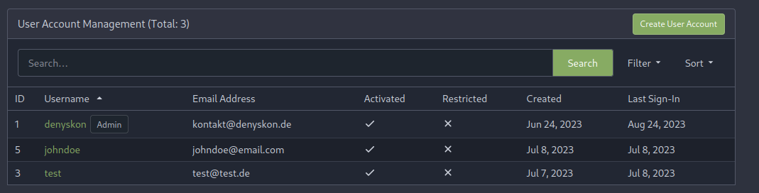
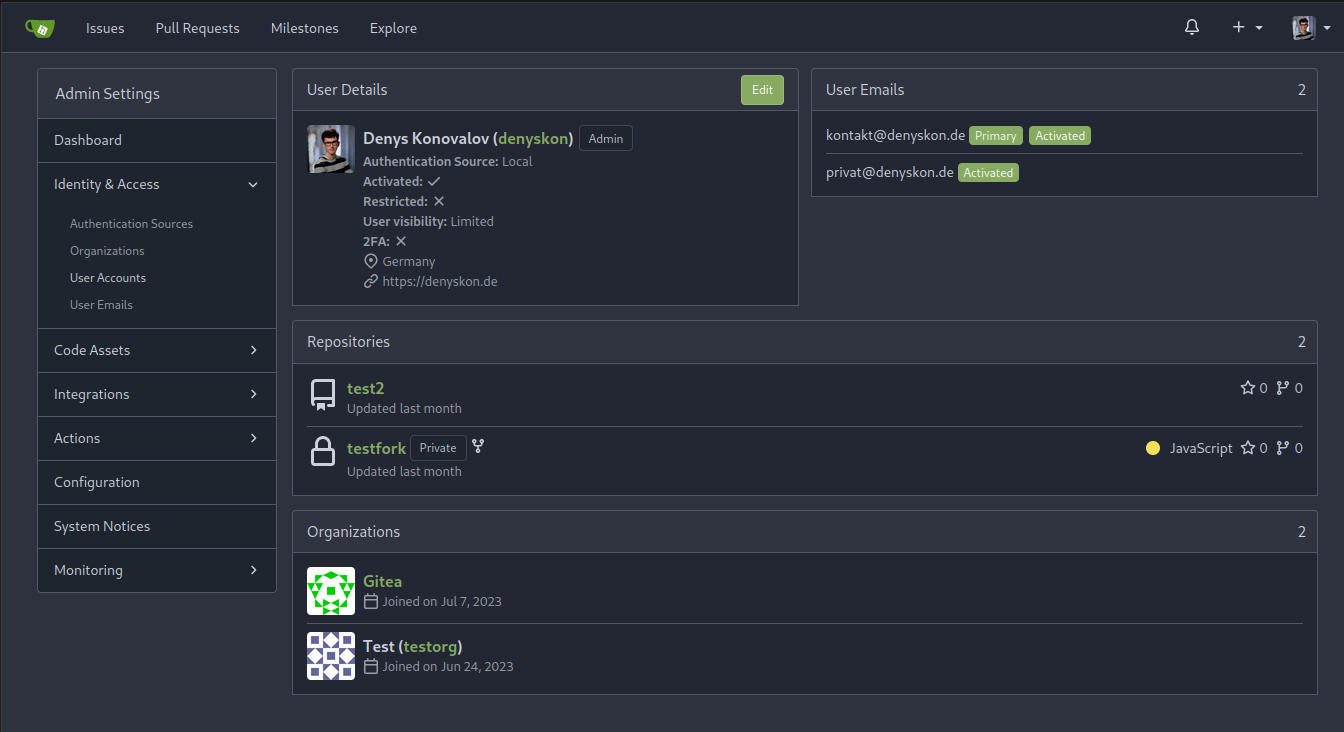
This PR implements a proposal to clean up the admin users table by
moving some information out to a separate user details page (which also
displays some additional information).
Other changes:
- move edit user page from `/admin/users/{id}` to
`/admin/users/{id}/edit` -> `/admin/users/{id}` now shows the user
details page
- show if user is instance administrator as a label instead of a
separate column
- separate explore users template into a page- and a shared one, to make
it possible to use it on the user details page
- fix issue where there was no margin between alert message and
following content on admin pages
<details>
<summary>Screenshots</summary>
</details>
Partially resolves #25939
---------
Co-authored-by: Giteabot <teabot@gitea.io>
|
| |
|
|
|
|
|
|
|
|
| |
Backtick syntax now works in repo description too. Also, I replaced the
CSS for this was a new single class, making it more flexible and not
dependent on a parent. Also, very slightly reduced font size from 16.8px
to 16px.
---------
Co-authored-by: wxiaoguang <wxiaoguang@gmail.com>
|
| |
|
|
|
|
|
|
|
|
|
|
|
| |
Each change is tested manually line by line. There are too many changes
so I can't share dozens of screenshots.
In short:
1. `ui right` could be still used in `ui top attached header`, because
there is a special case.
2. A lot of `ui right` are just no-op, so they can be removed safely.
3. Some of the `ui right` should be replaced by `gt-float-right` (to
avoid breaking, leave them to the future).
4. A few of the `ui right` could be rewritten by flex.
|
| | |
|
| |
|
|
|
|
| |
Corollary to #26775:
All selectors I found that are actually used and not necessarily present
in the current code have been copied to `web_src/css/base.css`.
Everything else should be a clean removal.
|
| |
|
|
|
|
|
|
|
|
|
|
|
|
|
|
|
|
|
|
|
|
|
|
|
|
| |
Replace #26761
It's better to keep children elements simple, and let parent containers
layout the necessary padding/margin.
The old `not(:last-child)` and `.flex-item + .flex-item` are not easy to
maintain (for example, what if the developer would like to use a "tiny
height" item?)
The old approach also makes some UI look strange because the first item
doesn't have proper padding-top.
In this PR, we just simply use `.flex-item { padding: ... }`:
* Developers could manually set the item height they want easily
* It's easier to make it work with various containers -- with padding
(`ui segment`) and without padding (`div`)
And added more samples/examples.
Co-authored-by: Giteabot <teabot@gitea.io>
|
| |
|
| |
`border-radius` means `radius`, not `diameter`, so it should be `50%` and `boxHeight / 2`
|
| |
|
|
|
| |
1. Fine tune the CSS styles, and add more examples
2. Add necessary "dimmer" animation for modal dialogs, otherwise the UI
seems flicking (follow #26469)
|
| |
|
|
|
|
|
|
|
|
|
|
|
|
| |
## Changes
- no more hardcoded `border-radius`es (apart from `0`)
- no more value inconsistencies
- no more guessing what pixel value you should use
- two new variables:
- `--border-radius-medium` (for elements where the normal border radius
does not suffice)
- `--border-radius-circle` (for displaying circles)
---------
Co-authored-by: silverwind <me@silverwind.io>
|
| |
|
|
|
| |
Refactor some CSS styles and simplify code.
Some styles are not in use, remove them.
|
| |
|
|
| |
Remove transition related code because the transition module has been
removed by #26469
|
| |
|
|
|
|
|
|
|
|
|
|
|
|
|
|
|
|
|
|
|
|
|
|
|
|
|
|
|
|
| |
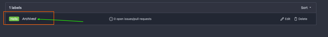
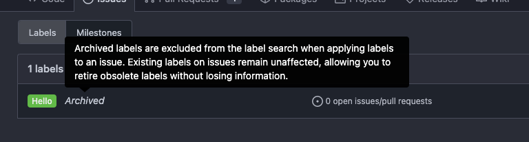
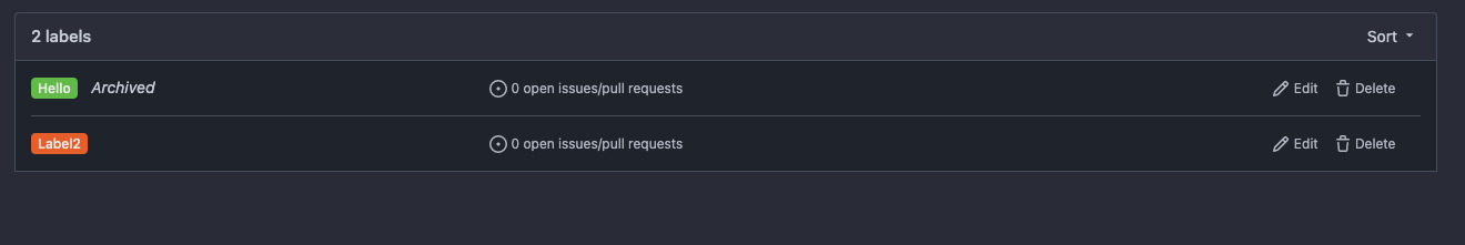
Followup https://github.com/go-gitea/gitea/pull/26478
## Archived labels UI
Changed:
* Enhanced the Filtered UI page to seamlessly incorporate a list of
archived labels.
Outsourced:
* Defer the implementation of specialized handling for archived labels
to upcoming pull requests. This step will be undertaken subsequent to
the successful merge of this pull request.
Screenshots
---
Part of https://github.com/go-gitea/gitea/issues/25237
---------
Co-authored-by: Giteabot <teabot@gitea.io>
Co-authored-by: silverwind <me@silverwind.io>
|
| |
|
|
|
|
|
|
|
|
|
|
|
|
|
|
|
|
|
|
|
|
|
|
|
|
|
|
|
|
|
|
|
|
|
|
|
|
|
|
|
|
|
|
|
|
|
|
|
|
|
|
| |
Removed CSS helper classes (some of them are not useful while some of
them are abused often)
* `gt-db`: in most cases it could be replaced by `gt-df` and the flex
layout should be encouraged. Other cases: either it does need the
`gt-df` (eg: by using `div` directly) or it is an abuse (eg: the warning
message in a form)
* `gt-di`: it doesn't seem useful, or it could be replaced by `gt-dib`
in most cases.
* `gt-dif`: not useful, it could be replaced by `flex-text-inline` or
`gt-df`
* `gt-js`: never used
* All `<i class="icon gt-df gt-ac gt-jc">` could be written as `<i
class="icon">`
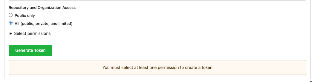
## Some UI samples
### Admin Notice
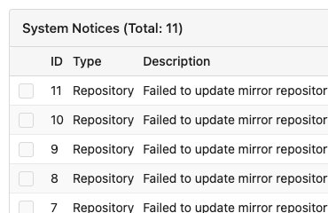
### Admin Stacktrace
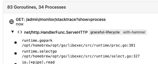
### Org Home

### Org Team Repo

### Release List

### User Setting Application Token Scope
Co-authored-by: Giteabot <teabot@gitea.io>
|
| |
|
|
|
|
|
|
|
|
|
|
|
|
|
|
|
|
|
|
|
|
|
|
|
|
| |
Replace Fomantic `loader` CSS module with our existing `is-loading`
spinner. Only three places in the UI used this module, which are
pictured here:
imagediff:
<img width="1237" alt="Screenshot 2023-08-22 at 22 18 01"
src="https://github.com/go-gitea/gitea/assets/115237/b0d82531-f05e-43c6-9e5b-1bfc268c056d">
webauthn:
<img width="894" alt="Screenshot 2023-08-22 at 22 05 05"
src="https://github.com/go-gitea/gitea/assets/115237/7b583425-d944-474a-a57a-22a65bbd8b29">
heatmap (I removed the previous loading text, it was unreadable because
it was tiny and on fast machines only visible for a fraction of a
second):
<img width="764" alt="Screenshot 2023-08-22 at 22 18 44"
src="https://github.com/go-gitea/gitea/assets/115237/1c7472d6-3e17-4224-a992-d8c0b380cc73">
Also, heatmap container does not resize any more after loading now and
previous duplicate id `user-heatmap` is gone.
---------
Co-authored-by: wxiaoguang <wxiaoguang@gmail.com>
|
| |
|
|
|
|
|
|
| |
Fixes #26622
Co-authored-by: Giteabot <teabot@gitea.io>
|
| | |
|
| | |
|
| |
|
|
|
|
|
|
| |
The "btn-octicon is-loading" was introduced by #21842 , it is only used
by the "Copy Content" button, but the "btn-octicon" selector would
affect too many uncertain elements.
Now there is a general "small-loading-icon" class, so the "btn-octicon
is-loading" could be removed.
|
| |
|
|
|
| |
1. Use `is-loading` instead of `ui loader`
2. Introduce class name `image-diff-tabs`, instead of searching `gt-hidden`, which is fragile
3. Align the UI elements, see the screenshots.
|
| |
|
| |
Follow #26649 and #25790 and add one more example (text truncate) in the devtest page
|
| |
|
| |
Fix #26537 again because 1.15 is too small for some fonts.
|
| |
|
|
|
|
|
|
| |
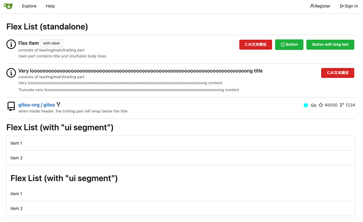
Fix #26617
1. Separate the "flex-list" examples into a dedicated template, and add some more examples
2. Use `flex-basis` instead of `flex-shrink` for `flex-item-trailing`, to avoid wrapping the texts too aggressively
3. Some `flex-wrap: wrap;` are removed
|
| | |
|
| |
|
|
|
|
|
|
|
|
|
|
|
| |
Add `box-shadow` replacement to the `floating` dropdown variant as well,
which was missed in https://github.com/go-gitea/gitea/pull/26469. The
Fomantic style has `!important`, so this has to have too. Also made a
tiny adjustment to shadow color on dark theme.
<img width="305" alt="Screenshot 2023-08-18 at 16 40 34"
src="https://github.com/go-gitea/gitea/assets/115237/a0aac9cb-6393-4d69-b0b3-00eaac5ccf9f">
<img width="202" alt="Screenshot 2023-08-18 at 16 40 22"
src="https://github.com/go-gitea/gitea/assets/115237/0a5fa3aa-7452-4dbd-86ed-ccbc1c872ebb">
Co-authored-by: Giteabot <teabot@gitea.io>
|
| |
|
|
|
|
|
|
|
|
|
|
|
|
| |
Fix #26537
Use the same default line-height as "normalize.css" instead of "1". "1"
is not right because it doesn't work with descent part and causes
overflow problems.
---------
Co-authored-by: silverwind <me@silverwind.io>
|
| |
|
|
|
|
|
|
|
|
| |
Removes all dropdown and dimmer animations. Works everywhere as far as I
can tell, but need to give this thorough testing. Removes around 70kb
JS/CSS.
Note, I'm not 100% sure regarding the various callbacks, those will need
more investigation, but it appears to work nonetheless.
Fixes: https://github.com/go-gitea/gitea/issues/15709
|
| |
|
|
|
|
|
|
|
|
|
|
|
|
|
| |
Fix regression from https://github.com/go-gitea/gitea/pull/25539:
https://github.com/go-gitea/gitea/pull/26519#issuecomment-1678825200.
Before:
<img width="429" alt="Screenshot 2023-08-15 at 15 46 12"
src="https://github.com/go-gitea/gitea/assets/115237/a818f60a-77a2-48fe-8e6f-363d152ccb1e">
After:
<img width="424" alt="Screenshot 2023-08-15 at 15 46 19"
src="https://github.com/go-gitea/gitea/assets/115237/c90159e2-ced2-4a74-8a0f-a1b2b5d0b565">
<img width="605" alt="Screenshot 2023-08-15 at 15 56 11"
src="https://github.com/go-gitea/gitea/assets/115237/3ded6f57-86f4-422a-86cb-56dd2c216dee">
|
| |
|
|
|
|
|
|
|
|
|
|
|
|
|
|
| |
The color is taken from "Name"
Before:
After:
Co-authored-by: Giteabot <teabot@gitea.io>
|
| | |
|
| |
|
|
|
|
|
|
| |
Avoid browser bugs:
- Firefox not cutting off -
https://github.com/go-gitea/gitea/pull/26354#issuecomment-1678456052
- Safari not showing ellipsis -
https://github.com/go-gitea/gitea/pull/26354#issuecomment-1678812801
|
| |
|
|
|
|
|
|
|
|
|
|
|
|
|
|
| |
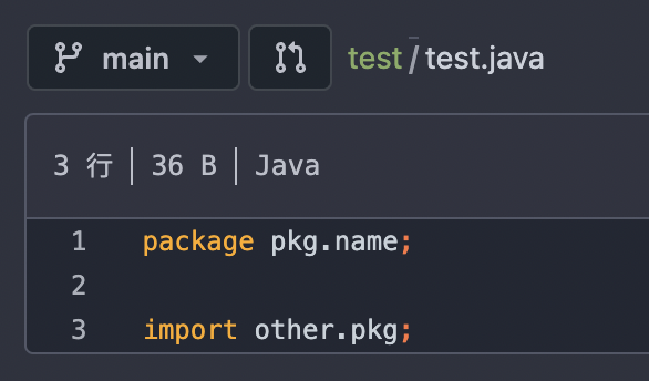
As title, that's simmilar with github.


---------
Signed-off-by: a1012112796 <1012112796@qq.com>
Co-authored-by: silverwind <me@silverwind.io>
Co-authored-by: Jason Song <i@wolfogre.com>
|
| |
|
|
| |
1. Make the "filename" visible
2. Avoiding UI flicker when the uploading is completing
|
