| Commit message (Collapse) | Author | Age | Files | Lines |
|---|
| ... | |
| |
|
|
|
|
|
|
| |
Move the previous custom `tw-` classes to be defined in a tailwind
plugin. I think it's cleaner that way and I also verified double-class
works as expected:
<img width="299" alt="Screenshot 2024-05-30 at 19 06 24"
src="https://github.com/go-gitea/gitea/assets/115237/003cbc76-2013-46a0-9e27-63023fa7c7a4">
|
| |
|
|
| |
Move the rule to the parent node. `tab-size` is inherited so will work
just as before.
|
| |
|
|
|
|
|
|
|
|
|
|
|
|
|
|
|
|
|
|
|
|
|
| |
Fixes: https://github.com/go-gitea/gitea/issues/31068
- Now it only does a single call to `GetExpandDirection` per line
instead of multiples.
- Exposed `data-expand-direction` to frontend so it can correctly size
the buttons (it's a pain to do in tables).
<img width="142" alt="Screenshot 2024-05-27 at 20 44 56"
src="https://github.com/go-gitea/gitea/assets/115237/8b0b45a6-8e50-4081-8822-5e0775d8d941">
<img width="142" alt="Screenshot 2024-05-27 at 20 44 51"
src="https://github.com/go-gitea/gitea/assets/115237/b7ba2c57-8f55-4e9f-9606-c96d16b77892">
<img width="132" alt="Screenshot 2024-05-27 at 20 44 46"
src="https://github.com/go-gitea/gitea/assets/115237/0e838fb8-5e8c-4250-9843-a68b88d5418b">
<img width="80" alt="Screenshot 2024-05-27 at 20 44 33"
src="https://github.com/go-gitea/gitea/assets/115237/da6c7f83-c160-4389-8ab2-889d0568cbe8">
<img width="80" alt="Screenshot 2024-05-27 at 20 44 26"
src="https://github.com/go-gitea/gitea/assets/115237/cdb490b2-5040-484a-92e5-46fc5e37c199">
<img width="78" alt="Screenshot 2024-05-27 at 20 44 20"
src="https://github.com/go-gitea/gitea/assets/115237/d2978ab0-764e-41ff-922c-25f8fe749f28">
Would backport as trivial enhancement.
|
| |
|
|
|
|
|
|
|
|
|
|
|
|
| |
Fixes: https://github.com/go-gitea/gitea/issues/31071
Not perfect but much better than before.
Before: Overflows, sticky not working, filename unreadable:
<img width="506" alt="Screenshot 2024-05-27 at 02 02 40"
src="https://github.com/go-gitea/gitea/assets/115237/a06b1edf-dece-4402-98c2-68670fca265f">
After:
<img width="457" alt="Screenshot 2024-05-27 at 01 59 06"
src="https://github.com/go-gitea/gitea/assets/115237/2a282c96-e719-4554-b418-81963ae6269c">
|
| |
|
|
|
|
|
|
|
|
|
|
|
| |
This PR split the `Board` into two parts. One is the struct has been
renamed to `Column` and the second we have a `Template Type`.
But to make it easier to review, this PR will not change the database
schemas, they are just renames. The database schema changes could be in
future PRs.
---------
Co-authored-by: silverwind <me@silverwind.io>
Co-authored-by: yp05327 <576951401@qq.com>
|
| |
|
|
|
|
|
|
|
|
|
|
|
|
|
|
|
|
|
|
|
|
|
|
|
|
|
|
|
|
|
|
|
| |
1. Extend concept of https://github.com/go-gitea/gitea/pull/29831 to all
tabular menus, there were only three left that weren't already
`<overflow-menu>`.
<img width="634" alt="Screenshot 2024-05-27 at 00 42 16"
src="https://github.com/go-gitea/gitea/assets/115237/d9a7e219-d05e-40a1-9e93-777f9a8a90dd">
<img width="965" alt="Screenshot 2024-05-27 at 00 29 32"
src="https://github.com/go-gitea/gitea/assets/115237/e6ed71b1-11fb-4a74-9adb-af4524286cff">
2. Remove extra padding on `fluid padded` container like for example PR
diff view. The page margin is already correctly sized via
`.ui.container`, so this was just extraneous padding that looked ugly.
Before:
<img width="1351" alt="Screenshot 2024-05-27 at 00 45 11"
src="https://github.com/go-gitea/gitea/assets/115237/4b45fd11-b1b2-4fbb-a618-26eb22be9472">
After:
<img width="1344" alt="Screenshot 2024-05-27 at 00 45 22"
src="https://github.com/go-gitea/gitea/assets/115237/d09593eb-6c7f-45e7-85b6-f0050047004b">
3. Replace `gt-word-break` with `tw-break-anywhere` in issue-title,
fixing overflow.
Before:
<img width="1333" alt="Screenshot 2024-05-27 at 00 50 14"
src="https://github.com/go-gitea/gitea/assets/115237/64d15d04-b456-401e-a972-df636965f0eb">
After:
<img width="1316" alt="Screenshot 2024-05-27 at 00 50 26"
src="https://github.com/go-gitea/gitea/assets/115237/ed1ce830-1408-414b-8263-eeaf773f52c8">
|
| |
|
|
|
|
|
|
| |
Presumably a regression from
https://github.com/go-gitea/gitea/pull/30325, these menus were showing a
border radius on hover, which is fixed with this change.
<img width="154" alt="image"
src="https://github.com/go-gitea/gitea/assets/115237/eafdc1c5-3cf5-48d1-86c4-21c58f92cfaf">
|
| |
|
|
|
|
| |
Percentage-based `border-radius` [creates undesirable
ellipse](https://jsfiddle.net/silverwind/j9ko5wnt/4/) on non-square
content. Instead, use pixel value and use same wording `full` like
tailwind does, but increast to 99999px over their 9999px.
|
| |
|
|
|
|
| |
By the way:
* Re-format the "color.go" to Golang code style
* Remove unused `overflow-y: scroll;` from `.project-column` because
there is `overflow: visible`
|
| |
|
|
|
|
|
|
|
|
|
|
|
|
|
|
|
|
|
| |
Fixes https://github.com/go-gitea/gitea/issues/30821 and restyles the
release list.
Desktop:
<img width="1199" alt="Screenshot 2024-05-02 at 20 46 10"
src="https://github.com/go-gitea/gitea/assets/115237/bee92423-d4a9-4b26-8301-3a1e09eef4cd">
Mobile:
<img width="443" alt="Screenshot 2024-05-02 at 20 46 21"
src="https://github.com/go-gitea/gitea/assets/115237/42ecbae5-bdb6-4b16-a0ee-9c64daede68d">
---------
Co-authored-by: Giteabot <teabot@gitea.io>
|
| |
|
|
|
|
| |
Fixes: https://github.com/go-gitea/gitea/issues/30940
<img width="1310" alt="Screenshot 2024-05-11 at 20 48 41"
src="https://github.com/go-gitea/gitea/assets/115237/f163dfd4-1299-421f-a99e-cd0c793e0e3d">
|
| |
|
|
|
|
| |
Enable
[`declaration-block-no-redundant-longhand-properties`](https://stylelint.io/user-guide/rules/declaration-block-no-redundant-longhand-properties/)
and autofix issues. The exclusions are because I find these two
shorthands to be harder to read.
|
| |
|
|
|
| |
Use [inset](https://developer.mozilla.org/en-US/docs/Web/CSS/inset)
shorthand instead of longhands. There may be more cases but these ones I
was able to definitely identify.
|
| |
|
|
|
|
|
| |
Close #30919
---------
Co-authored-by: silverwind <me@silverwind.io>
|
| |
|
|
|
|
|
|
|
|
|
|
|
|
|
|
|
|
| |
Forbid
[deprecated](https://drafts.csswg.org/css-text-3/#word-break-property)
`break-word` and fix all occurences.
Regarding `overflow-wrap: break-word` vs `overflow-wrap: anywhere`:
Example of difference: https://jsfiddle.net/silverwind/1va6972r/
[Here](https://stackoverflow.com/questions/77651244) it says:
> The differences between normal, break-word and anywhere are only clear
if you are using width: min-content on the element containing the text,
and you also set a max-width. A pretty rare scenario.
I don't think this difference will make any practical impact as we are
not hitting this rare scenario.
|
| |
|
| |
Fix #30578
|
| |
|
|
|
|
| |
Follow #30345
Follow #30547
`ellipsis` / `white-space` shouldn't be put on the general dropdown components.
|
| |
|
| |
Fix the space between the box and label for checkboxes, and fix incorrect usages in "repo-issue.js"
|
| |
|
|
|
| |
1. "enter" doesn't work (I think it is the last enter support for #14843)
2. if a branch name contains something like `&`, then the branch selector doesn't update
|
| |
|
|
|
|
|
|
|
|
|
|
|
|
|
|
|
|
|
| |
Since there is now a second `<input>` in the repo buttons, we can make a
better-looking layout with no empty space, except on mobile.
Also I fixed one bug with focus border on clone panel.
## Large
<img width="1163" alt="Screenshot 2024-04-23 at 22 25 22"
src="https://github.com/go-gitea/gitea/assets/115237/8135a572-aa67-4672-ad49-b76b06890b52">
## Medium
<img width="870" alt="Screenshot 2024-04-23 at 22 25 34"
src="https://github.com/go-gitea/gitea/assets/115237/9e93f61c-3315-4a78-8328-8cefad5b50fa">
## Mobile
<img width="416" alt="Screenshot 2024-04-23 at 22 25 52"
src="https://github.com/go-gitea/gitea/assets/115237/859e341f-807a-48e6-8bcf-31715963216c">
|
| |
|
|
|
|
|
|
|
|
| |
Makes it easier to use because you see which square is currently
hovered:
<img width="314" alt="Screenshot 2024-05-02 at 15 38 20"
src="https://github.com/go-gitea/gitea/assets/115237/3a15dad1-2259-4f28-9fae-5cf6ad3d8798">
I did try a `scoped` style for this, but that did not work for some
reason.
|
| |
|
| |
Fix #30788
|
| |
|
| |
Fix #30802
|
| |
|
|
| |
Fixes https://github.com/go-gitea/gitea/issues/30673, specifically
https://github.com/go-gitea/gitea/issues/30673#issuecomment-2085329812.
|
| |
|
|
|
|
|
|
|
|
|
|
|
|
|
|
|
|
|
|
|
|
|
| |
Fixes https://github.com/go-gitea/gitea/issues/30721 and overhauls the
stopwatch. Time is now shown inside the "dot" icon and on both mobile
and desktop. All rendering is now done by `<relative-time>`, the
`pretty-ms` dependency is dropped.
Desktop:
<img width="557" alt="Screenshot 2024-04-29 at 22 33 27"
src="https://github.com/go-gitea/gitea/assets/115237/3a46cdbf-6af2-4bf9-b07f-021348badaac">
Mobile:
<img width="640" alt="Screenshot 2024-04-29 at 22 34 19"
src="https://github.com/go-gitea/gitea/assets/115237/8a2beea7-bd5d-473f-8fff-66f63fd50877">
Note for tippy:
Previously, tippy instances defaulted to "menu" theme, but that theme is
really only meant for `.ui.menu`, so it was not optimal for the
stopwatch popover.
This introduces a unopinionated `default` theme that has no padding and
should be suitable for all content. I reviewed all existing uses and
explicitely set the desired `theme` on all of them.
|
| |
|
|
|
|
|
|
|
|
|
|
|
| |
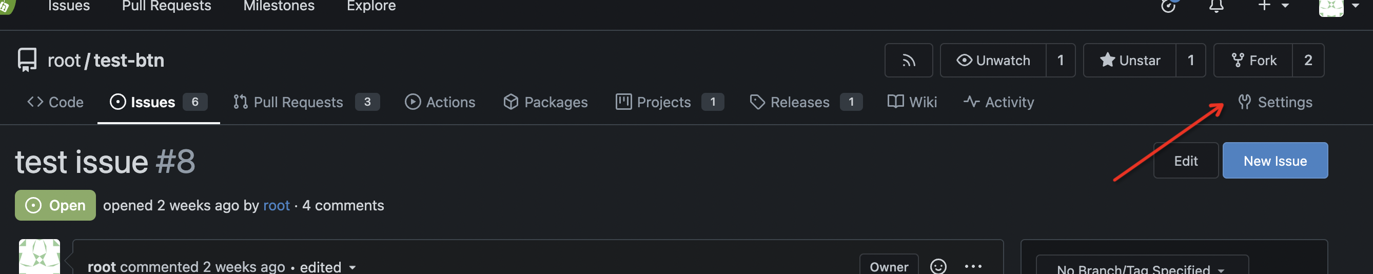
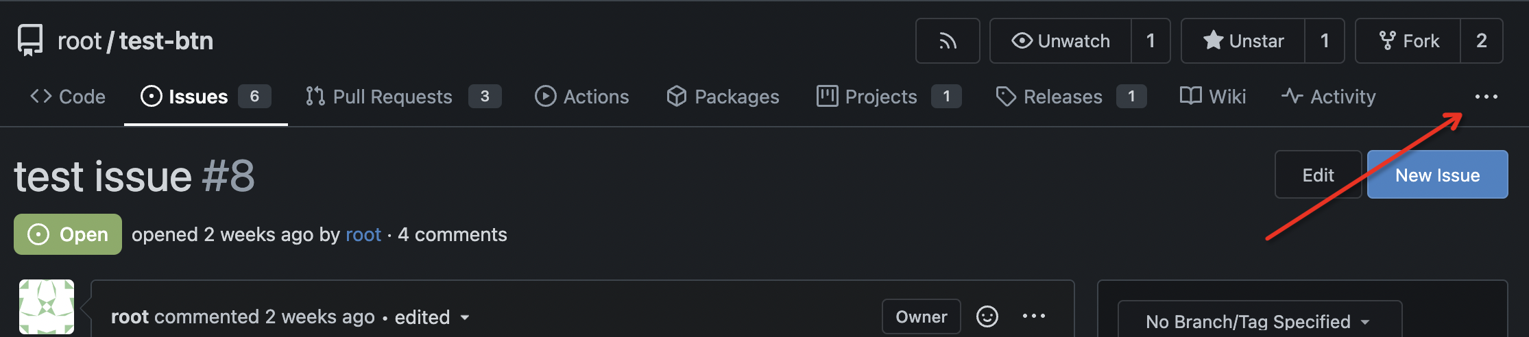
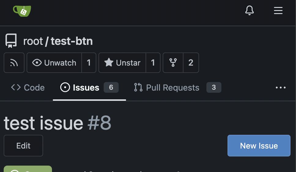
I guess there could be enough people liking to make the Settings menu
item right aligned. As a site admin, I found it's easier to find the
right-aligned Settings menu item.
Tested with various sizes:
|
| |
|
|
|
|
|
|
|
|
|
|
|
|
|
|
|
|
|
|
|
|
|
|
|
|
|
|
| |
Fixes https://github.com/go-gitea/gitea/issues/30673, all 23 issues.
Notes:
- Tab bar menus had to change to pills because of unsolvable issue with
the border-radius as tab bar renders a overlapping border onto the box
below. And I think pills look better.
- Added padding to code editor empty preview message
- Hide monaco's built-in blue focus border, we don't need it and it
never showed before either.
- Label add menu is simplified, removing the nested segment.
<img width="1322" alt="Screenshot 2024-04-25 at 22 26 19"
src="https://github.com/go-gitea/gitea/assets/115237/7e394e0c-b7ad-417d-8e9f-12f1dea93ed1">
<img width="1326" alt="Screenshot 2024-04-25 at 22 28 00"
src="https://github.com/go-gitea/gitea/assets/115237/66c8499f-aa9f-4d95-8cca-ef13dfa82c65">
<img width="997" alt="Screenshot 2024-04-25 at 22 36 53"
src="https://github.com/go-gitea/gitea/assets/115237/07896102-c71d-4246-8173-c2bc2e1d3cae">
<img width="832" alt="Screenshot 2024-04-25 at 22 56 09"
src="https://github.com/go-gitea/gitea/assets/115237/d83afc96-08ca-4adc-baf4-3d02804be57c">
<img width="361" alt="Screenshot 2024-04-25 at 22 57 12"
src="https://github.com/go-gitea/gitea/assets/115237/c7371a68-00b5-47d8-84d0-ddc5268b2b2c">
---------
Co-authored-by: wxiaoguang <wxiaoguang@gmail.com>
Co-authored-by: Giteabot <teabot@gitea.io>
|
| |
|
| |
Tested extensively using modal which is the only dependant.
|
| |
|
|
|
|
|
|
|
|
|
|
|
|
|
| |
Fixes https://github.com/go-gitea/gitea/issues/30682 and does a few
improvements:
- Use gap instead of margin/padding
- Don't render empty image div
- Remove `right floated` class that did nothing
<img width="406" alt="Screenshot 2024-04-24 at 20 21 20"
src="https://github.com/go-gitea/gitea/assets/115237/2fa88707-c2c4-40df-aee7-a684c3097ed0">
---------
Co-authored-by: KN4CK3R <admin@oldschoolhack.me>
|
| |
|
|
|
|
|
|
|
|
|
|
|
| |
Minor tweaks:
- Remove unnecessary `item` class which was causing unwanted padding to
be added.
- Add some padding and prevent wrapping so it looks better on mobile.
- Increase width by 4px.
<img width="116" alt="Screenshot 2024-04-24 at 00 15 07"
src="https://github.com/go-gitea/gitea/assets/115237/1f1cf54c-8053-4297-b309-71d9c2ceb9ee">
<img width="441" alt="Screenshot 2024-04-24 at 00 14 57"
src="https://github.com/go-gitea/gitea/assets/115237/2f3a33dc-edad-4b97-b64c-6812aae513cb">
|
| |
|
|
|
|
|
|
|
|
|
|
|
|
|
|
|
|
|
|
|
|
| |
1. Bring back the background on line numbers. This feature was lost a
long time ago.
<img width="457" alt="Screenshot 2024-04-24 at 01 36 09"
src="https://github.com/go-gitea/gitea/assets/115237/76a7f5a9-c22a-4c72-9f0a-ebf16a66513e">
<img width="473" alt="Screenshot 2024-04-24 at 01 22 47"
src="https://github.com/go-gitea/gitea/assets/115237/eef06cf2-f1b9-40e3-947d-dd5852ec12a3">
<img width="457" alt="Screenshot 2024-04-24 at 02 13 18"
src="https://github.com/go-gitea/gitea/assets/115237/59e317d4-76a7-468c-8a19-10d88c675cc3">
<img width="459" alt="Screenshot 2024-04-24 at 01 23 21"
src="https://github.com/go-gitea/gitea/assets/115237/f1a46f8d-8846-4d78-a9d7-8b7dc18ac6e4">
2. Expanded lines background is now full-line, including line numbers:
<img width="1303" alt="Screenshot 2024-04-24 at 01 37 12"
src="https://github.com/go-gitea/gitea/assets/115237/271eefe2-0869-424e-93fb-ccd8adc87806">
3. Sort affected colors alphabetically in the CSS
Fixes #14603
|
| |
|
|
|
|
|
|
|
|
|
| |
Before, item would also resize on hover because of font weight:
<img width="381" alt="Screenshot 2024-04-25 at 01 28 53"
src="https://github.com/go-gitea/gitea/assets/115237/4f3291fc-90be-4d66-ae8b-3c2f763cb956">
After:
<img width="381" alt="Screenshot 2024-04-25 at 01 28 40"
src="https://github.com/go-gitea/gitea/assets/115237/06145bf2-1ddd-4171-9217-d92c100ea405">
Co-authored-by: Giteabot <teabot@gitea.io>
|
| |
|
|
|
|
|
|
|
| |
This is a very old bug with the bottom border-radiuses not being there
and the `:has` selector now makes it possible to cleanly solve it. It
affects all header+segment boxes, which there are many throughout the
UI:
<img width="1017" alt="Screenshot 2024-04-23 at 20 47 21"
src="https://github.com/go-gitea/gitea/assets/115237/870fe352-cc38-4bd6-bfe6-9fe8c3066f92">
|
| |
|
|
|
|
|
| |
Initial support for #25680
This PR only adds some simple styles from GitHub, it is big enough and
it focuses on adding the necessary framework-level supports. More styles
could be fine-tuned later.
|
| | |
|
| |
|
|
|
|
|
|
|
|
|
| |
- `.text-thin` and `.text-italic` are not present in CSS so were doing nothing and I removed them.
- `.text.middle` was unused so I removed it.
- `.text.italic` is replaced with `tw-italic`.
- `.text.normal` had exactly one use and it wasn't even needed.
- add a `muted` class to the link to `org_profile_avatar.tmpl`.
---------
Co-authored-by: wxiaoguang <wxiaoguang@gmail.com>
|
| |
|
|
|
|
| |
Fix #30502 by a new approach.
|
| |
|
|
|
|
|
|
|
|
|
|
|
| |
Follow
https://github.com/go-gitea/gitea/pull/30547#discussion_r1573866519
Fix #30624
The Fomantic UI Dropdown wasn't designed to work that way, its "text"
element might contain images. So the "overflow" shouldn't be added to
any general dropdown text.
|
| |
|
|
| |
Fixes https://github.com/go-gitea/gitea/issues/30566, regression from
https://github.com/go-gitea/gitea/pull/30214.
|
| |
|
|
| |
1. Rewrite initGlobalEnterQuickSubmit (by the way, remove jQuery)
2. Fix issue comment form layout
|
| |
|
|
|
|
|
|
| |
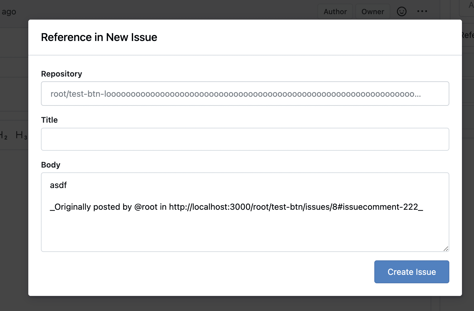
Fixes: https://github.com/go-gitea/gitea/issues/29994
Also some misc enhancements done to the form in the modal.
<img width="840" alt="Screenshot 2024-04-17 at 23 02 55"
src="https://github.com/go-gitea/gitea/assets/115237/e71fba55-55cd-4e48-a497-6b1025c36a43">
|
| |
|
|
|
|
|
|
|
|
|
|
|
|
|
|
|
|
|
|
| |
Fixes: https://github.com/go-gitea/gitea/issues/30540
1. Fix all these boxes by adding `bottom attached` and removing a
problematic CSS rule:
<img width="1319" alt="Screenshot 2024-04-17 at 22 25 31"
src="https://github.com/go-gitea/gitea/assets/115237/346445a4-4944-4003-a1ef-6f5b0eda624e">
<img width="643" alt="Screenshot 2024-04-17 at 22 21 18"
src="https://github.com/go-gitea/gitea/assets/115237/10f17ed3-9ad6-48de-92fa-bac6621815b9">
2. Change the "last commit" box to `ui segment` which has correct
border-radius. Also included is a tiny tweak to make author name ellipse
instead of wrap.
<img width="1331" alt="Screenshot 2024-04-17 at 22 23 23"
src="https://github.com/go-gitea/gitea/assets/115237/285fbd45-ced0-4d33-abe3-7384ffa03188">
Co-authored-by: Giteabot <teabot@gitea.io>
|
| |
|
|
|
|
|
|
| |
close #29685
---------
Signed-off-by: 6543 <6543@obermui.de>
Co-authored-by: silverwind <me@silverwind.io>
|
| |
|
|
|
|
|
|
|
|
|
| |
Fixes https://github.com/go-gitea/gitea/issues/30493, regression from
https://github.com/go-gitea/gitea/pull/30374.
Also did the flexbox convertion as suggested by the existing comment.
<img width="850" alt="Screenshot 2024-04-16 at 22 28 48"
src="https://github.com/go-gitea/gitea/assets/115237/e8905944-620a-4211-b5c5-53ed3b3ee23e">
Co-authored-by: Giteabot <teabot@gitea.io>
|
| |
|
|
|
|
|
|
|
|
|
| |
Fixes: https://github.com/go-gitea/gitea/issues/30523
1. Fix checkbox rendering
2. Fix width of selection dropdowns (was too small)
---------
Co-authored-by: delvh <dev.lh@web.de>
Co-authored-by: Giteabot <teabot@gitea.io>
|
| |
|
|
|
|
|
|
|
| |
Fixes: https://github.com/go-gitea/gitea/issues/30524. Slightly restyled
them so that the "knob" is contained inside the background.
<img width="179" alt="Screenshot 2024-04-16 at 21 58 09"
src="https://github.com/go-gitea/gitea/assets/115237/be94517b-9cb7-46e2-ae96-fcf6767ce4ba">
<img width="187" alt="Screenshot 2024-04-16 at 21 58 50"
src="https://github.com/go-gitea/gitea/assets/115237/c13a1959-5c5a-4e88-9225-e5f6fb72e3e0">
|
| |
|
|
|
|
|
|
|
|
|
|
|
|
|
|
|
|
|
|
|
|
|
| |
Fixes: https://github.com/go-gitea/gitea/issues/30514
Fixes:
https://github.com/go-gitea/gitea/pull/30288#issuecomment-2057466623
- Fix border-radius regression from
https://github.com/go-gitea/gitea/pull/30475
- Fix and simplify hover state
- Move the modal HTML so it does not interfere with the CSS
- Make the star and unwatch text show on mobile. There is still plenty
of space, below is iPhone 12 viewport size
<img width="696" alt="Screenshot 2024-04-15 at 20 34 03"
src="https://github.com/go-gitea/gitea/assets/115237/af90bb00-4671-4973-a255-8eb44ee6ba8d">
<img width="230" alt="Screenshot 2024-04-15 at 20 31 42"
src="https://github.com/go-gitea/gitea/assets/115237/986ef533-7a01-4bb0-8dcd-fd19e4259e84">
<img width="233" alt="Screenshot 2024-04-15 at 20 31 47"
src="https://github.com/go-gitea/gitea/assets/115237/5b825dd8-0ccc-4d56-9d8f-774abb935b68">
---------
Co-authored-by: Giteabot <teabot@gitea.io>
|
| |
|
|
|
|
|
|
|
|
|
|
|
| |
Fixes: https://github.com/go-gitea/gitea/issues/27971
Fixes: https://github.com/go-gitea/gitea/pull/28010
<img width="689" alt="Screenshot 2024-04-09 at 00 19 57"
src="https://github.com/go-gitea/gitea/assets/115237/7c895a47-274f-40a6-a126-290658f1982d">
Also fixes a similar issue in issue list where CSS was there but not
active because of missing `display: block`.
<img width="372" alt="Screenshot 2024-04-09 at 00 18 25"
src="https://github.com/go-gitea/gitea/assets/115237/cfbee7cd-2e15-4ac7-96ce-020816f48798">
|
| |
|
|
|
|
|
|
|
|
|
|
|
|
|
| |
Fix a number of text overflow issues in actions view and run list. Also
improve mobile view of run list.
Fixes: https://github.com/go-gitea/gitea/issues/30328
<img width="782" alt="Screenshot 2024-04-08 at 23 10 16"
src="https://github.com/go-gitea/gitea/assets/115237/3d9f9f88-3eab-44a0-8144-30c2b58b24cb">
<img width="935" alt="Screenshot 2024-04-08 at 23 17 46"
src="https://github.com/go-gitea/gitea/assets/115237/581d73ea-a31d-416b-be3a-47313b879b12">
<img width="1008" alt="Screenshot 2024-04-08 at 23 49 05"
src="https://github.com/go-gitea/gitea/assets/115237/c5d10565-f285-477f-8659-1caf94797647">
<img width="397" alt="Screenshot 2024-04-08 at 23 55 30"
src="https://github.com/go-gitea/gitea/assets/115237/368aaa75-1903-4058-9d75-d1fe91c564d6">
|
| |
|
| |
It looks better when these menus don't flash a border-bottom on click.
|
