| Commit message (Collapse) | Author | Age | Files | Lines |
|---|
| |
|
|
|
|
|
|
|
|
|
|
| |
1. restore background color
2. fix border radius on top/bottom and on hover
3. parent link is now full-row again, much easier to click
4. parent link now uses directory icon, matching github
5 changed grid layout to remove auto width on file name column which could get too small.
6. mobile layout now shows more of the filename.
---------
Co-authored-by: wxiaoguang <wxiaoguang@gmail.com>
|
| |
|
|
|
|
|
|
|
|
|
|
|
|
|
|
|
|
|
|
|
|
|
| |
Before and after:
<img width="218" alt="Screenshot 2024-12-15 at 04 53 53"
src="https://github.com/user-attachments/assets/299b1f0a-ba72-47c6-b662-a9d540d4d741"
/>
<img width="222" alt="Screenshot 2024-12-15 at 04 53 41"
src="https://github.com/user-attachments/assets/5a2b5332-e324-4d20-82e9-21d1c850e826"
/>
Diff without whitespace:
https://github.com/go-gitea/gitea/pull/32847/files?diff=unified&w=1
The `tw-mt-2` is fine even if the element renders empty:
<img width="387" alt="image"
src="https://github.com/user-attachments/assets/76a976e4-ba2e-48a5-9248-c361552a937a"
/>
---------
Co-authored-by: wxiaoguang <wxiaoguang@gmail.com>
|
| | |
|
| |
|
| |
Add more tests
|
| | |
|
| |
|
|
|
|
|
| |
1. use grid instead of table, completely drop "ui table" from that list
2. move some "commit sign" related styles into a new file by the way (no
change) because I need to figure out where `#repo-files-table` is used.
3. move legacy "branch/tag selector" related code into repo-legacy.ts,
now there are 13 `import $` files left.
|
| |
|
|
|
|
|
|
|
|
|
|
|
| |
Rearrange the clone panel to use less horizontal space.
The following changes have been made to achieve this:
- Moved everything into the dropdown menu
- Moved the HTTPS/SSH Switch to a separate line
- Moved the "Clone in VS Code"-Button up and added a divider
- Named the dropdown button "Code", added appropriate icon
---------
Co-authored-by: techknowlogick <techknowlogick@gitea.com>
Co-authored-by: wxiaoguang <wxiaoguang@gmail.com>
|
| |
|
|
|
|
|
|
|
|
| |
Replace #26661, fix #25979
Not perfect, but usable and much better than before. Since it is quite
complex, I am not quite sure whether there would be any regression, if
any, I will fix in first time.
I have tested the related pages many times: issue list, milestone issue
list, project view, user issue list, org issue list.
|
| |
|
|
|
|
|
|
|
|
|
|
| |
Rewrite a lot of legacy strange code, remove duplicate code, remove
jquery, and make these filters reusable.
Let's forget the old code, new code affects:
* issue list open/close switch
* issue list filter (label, author, assignee)
* milestone list open/close switch
* milestone issue list filter (label, author, assignee)
* project view (label, assignee)
|
| | |
|
| |
|
|
|
|
|
|
|
|
|
| |
And fix a regression:
https://github.com/go-gitea/gitea/pull/30053#discussion_r1874405470
Major changes:
* rewrite without jquery
* remove the "delete modal", using "link-action" is good enough
* merge "new modal" and "edit modal"
|
| |
|
|
|
|
|
| |
Move some components (description, license, release, language stats) to sidebar
---------
Co-authored-by: wxiaoguang <wxiaoguang@gmail.com>
|
| |
|
|
|
|
|
|
|
|
|
|
|
|
|
|
|
|
|
|
|
|
|
| |
Close #25037
Close #31037
This PR adds a Arch package registry usable with pacman.

Rewrite of #25396 and #31037. You can follow [this
tutorial](https://wiki.archlinux.org/title/Creating_packages) to build a
package for testing.
Docs PR: https://gitea.com/gitea/docs/pulls/111
Co-authored-by: [d1nch8g@ion.lc](mailto:d1nch8g@ion.lc)
Co-authored-by: @ExplodingDragon
---------
Co-authored-by: dancheg97 <dancheg97@fmnx.su>
Co-authored-by: dragon <ExplodingFKL@gmail.com>
Co-authored-by: wxiaoguang <wxiaoguang@gmail.com>
|
| |
|
|
|
|
|
|
|
|
| |
Refactor markdown editor to clarify its "preview" behavior and remove
jQuery code.
Close #15045
---------
Co-authored-by: silverwind <me@silverwind.io>
|
| |
|
|
|
|
|
|
|
|
|
|
|
|
|
|
|
|
|
|
| |
flex but don't float
diff with ignoring spaces :
https://github.com/go-gitea/gitea/pull/32691/files?diff=split&w=1
related pages:
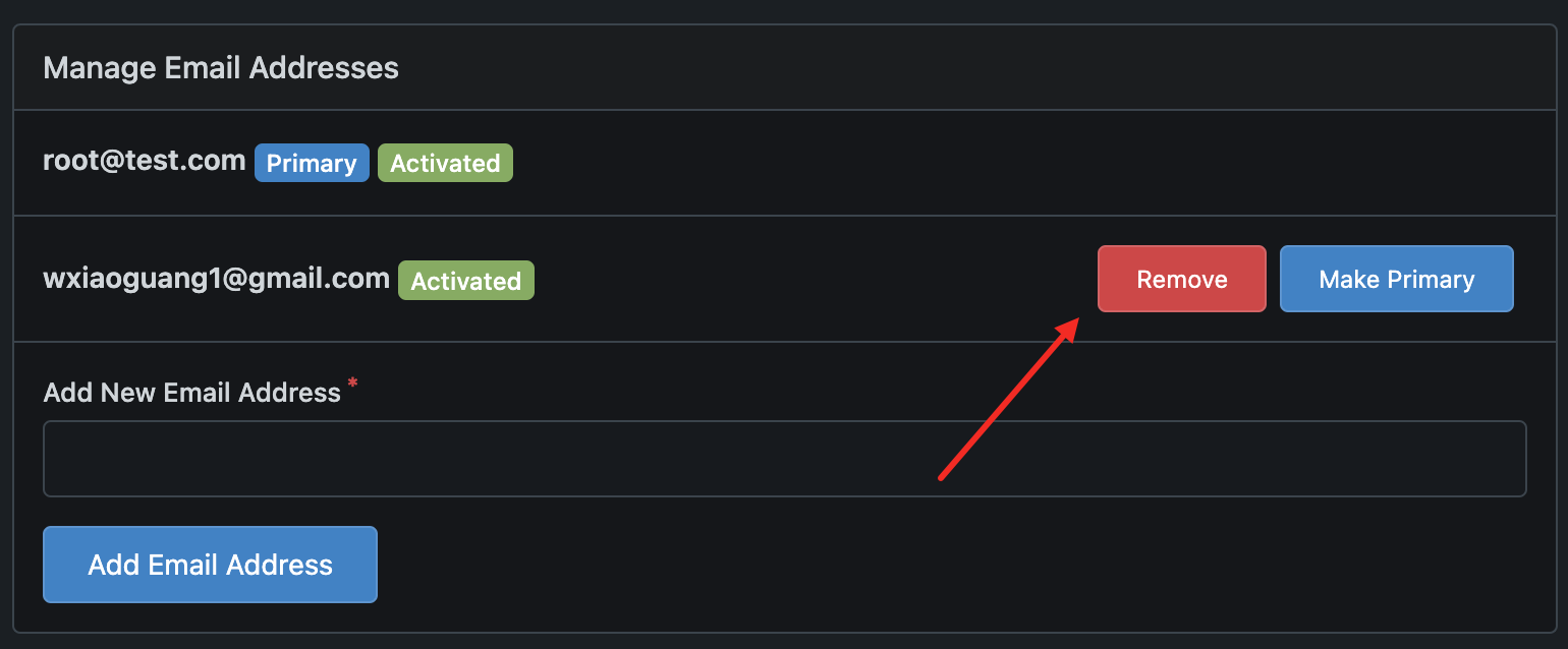
### admin users
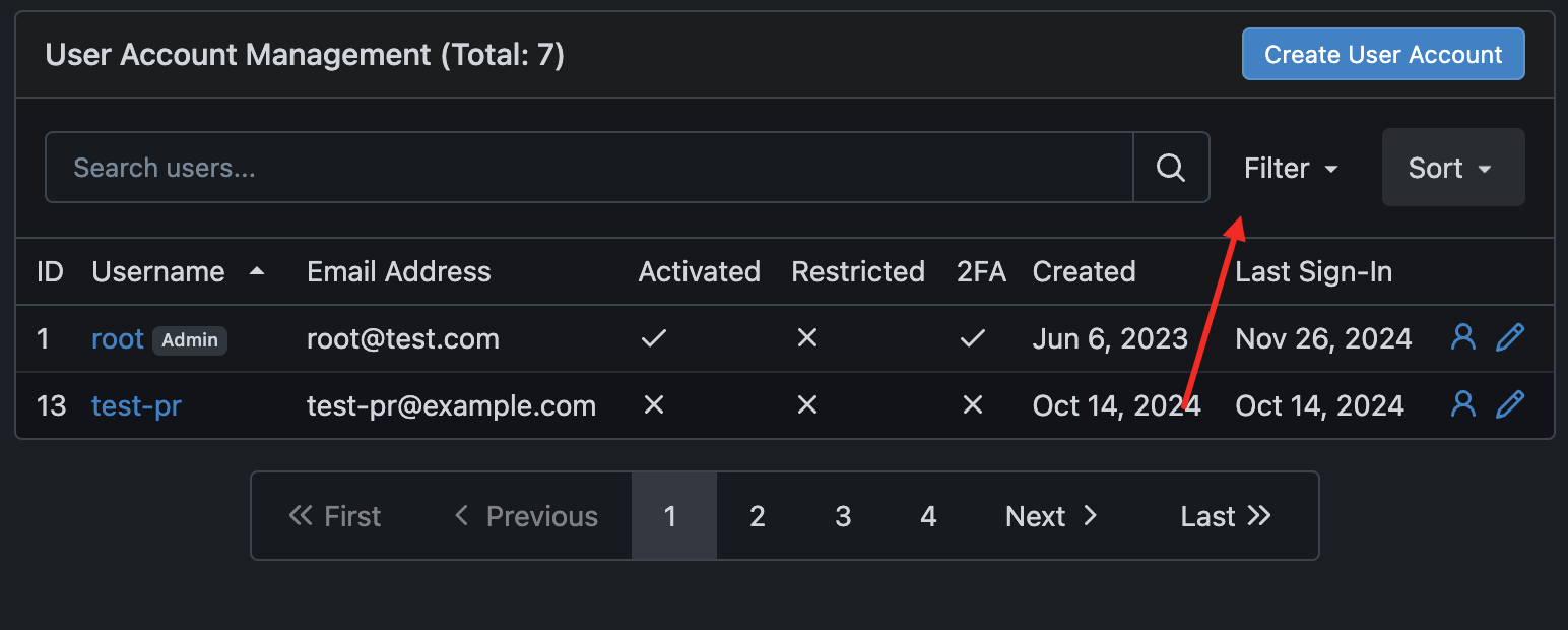
### milestone

### user account setting
|
| |
|
|
|
|
|
|
|
|
|
|
| |
Provide a cropping tool on the avatar editing page, allowing users to
select the cropping area themselves. This way, users can decide the
displayed area of the image, rather than us deciding for them.
---------
Co-authored-by: silverwind <me@silverwind.io>
Co-authored-by: wxiaoguang <wxiaoguang@gmail.com>
Co-authored-by: delvh <dev.lh@web.de>
Co-authored-by: Giteabot <teabot@gitea.io>
|
| |
|
|
|
|
|
| |
Fixed #31144
---------
Co-authored-by: wxiaoguang <wxiaoguang@gmail.com>
|
| |
|
|
|
|
|
|
|
|
|
|
|
|
|
|
|
|
|
|
|
|
|
|
|
|
|
|
|
|
|
|
|
| |
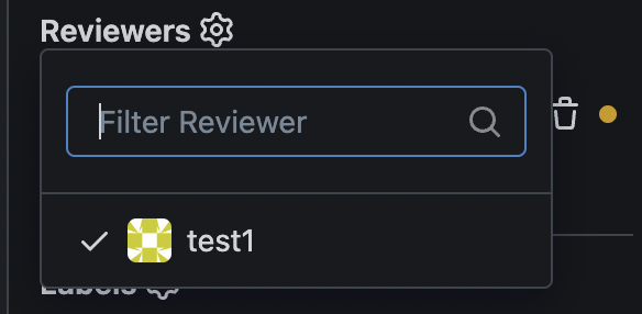
1. remove duplicate dividers
2. align reviewer items
3. merge & remove unused CSS styles
Before:
<details>
</details>
After:
<details>
</details>
|
| |
|
|
|
|
|
|
|
| |
(#32576)
as title, replace #31597 after #32460
---------
Signed-off-by: a1012112796 <1012112796@qq.com>
|
| |
|
|
|
|
|
|
|
|
|
|
|
|
|
|
|
|
|
|
|
|
| |
Close #31709
52px is calculate by avatar size in
templates\repo\issue\view_content\comments.tmpl
```html
<img src="{{.Poster.AvatarLink $.Context}}" width="40" height="40">
```
+
```css
.ui.comments .comment > .avatar ~ .content {
margin-left: 12px;
}
```
---------
Co-authored-by: wxiaoguang <wxiaoguang@gmail.com>
|
| |
|
|
|
|
|
|
|
|
|
|
|
|
|
|
|
|
|
| |
Follow #32460
Now the code could be much clearer than before and easier to maintain. A
lot of legacy code is removed.
Manually tested.
This PR is large enough, that fine tunes could be deferred to the future if
there is no bug found or design problem.
Screenshots:
<details>

</details>
|
| |
|
| |
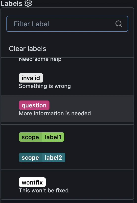
Introduce `issueSidebarLabelsData` to handle all sidebar labels related data.
|
| |
|
|
|
|
|
|
|
|
| |
Users could add reviewers when creating new PRs.
---------
Co-authored-by: splitt3r <splitt3r@users.noreply.github.com>
Co-authored-by: Sebastian Sauer <sauer.sebastian@gmail.com>
Co-authored-by: bb-ben <70356237+bboerben@users.noreply.github.com>
Co-authored-by: wxiaoguang <wxiaoguang@gmail.com>
|
| |
|
|
|
|
|
|
|
|
|
|
|
|
|
|
|
|
|
|
|
| |
Fix #32453
Major changes:
* revert the `<div class="divider"></div>` in
`templates/repo/issue/branch_selector_field.tmpl` (it was removed by
mistake in ##32444)
* remove incorrect `<div class="inline field">` in
`templates/repo/issue/sidebar/allow_maintainer_edit.tmpl`
* use `gt-ellipsis` to replace the "title" class in the dependency list,
then `.repository .issue-content-right .ui.list .title` could be removed
* remove the "relaxed" from dependency list, then there is no padding,
then `.repository .issue-content-right .ui.list .dependency` could be
removed (`white-space` doesn't have effect either because there is
`gt-ellipsis`)
* remove dead code `.repository .issue-content-right #deadlineForm input
`
The fixed UI should be the same as before.
|
| |
|
|
|
| |
1. Make `queryElem*` functions could correctly handle TS types
2. Remove some legacy jQuery $ calls (introduce fomanticQuery for Fomantic UI only)
3. Fix some TS typing problems
|
| |
|
|
|
|
|
|
|
| |
There were some missing features from EasyMDE:
1. H1 - H3 style
2. Auto add task list
3. Insert a table
And added some tests
|
| |
|
|
|
|
|
|
|
| |
close #31602

---------
Co-authored-by: wxiaoguang <wxiaoguang@gmail.com>
|
| |
|
|
|
|
|
|
|
|
|
| |
Fixes https://github.com/go-gitea/gitea/issues/31686.
A more elborate manual tabindex numbering could be done, but I think
it's not really worth the extra effort and such stuff could easily break
during refactors.
Includes another small tweak to un-stretch the`<a>` element so it's only
as large as it needs to be and this change also made the margin
unneeded.
|
| |
|
|
|
|
|
|
| |
In Projects, columns heights are defined by the sum of all contents
height of the biggest column, rather than a fraction of the viewport
height. It default to 60vh when there is no cards to display.
Fix #31666
|
| |
|
|
|
|
|
|
|
|
|
|
|
|
|
| |
Works in both organization and repository project boards
Fixes #21846
Replaces #21963
Replaces #27117
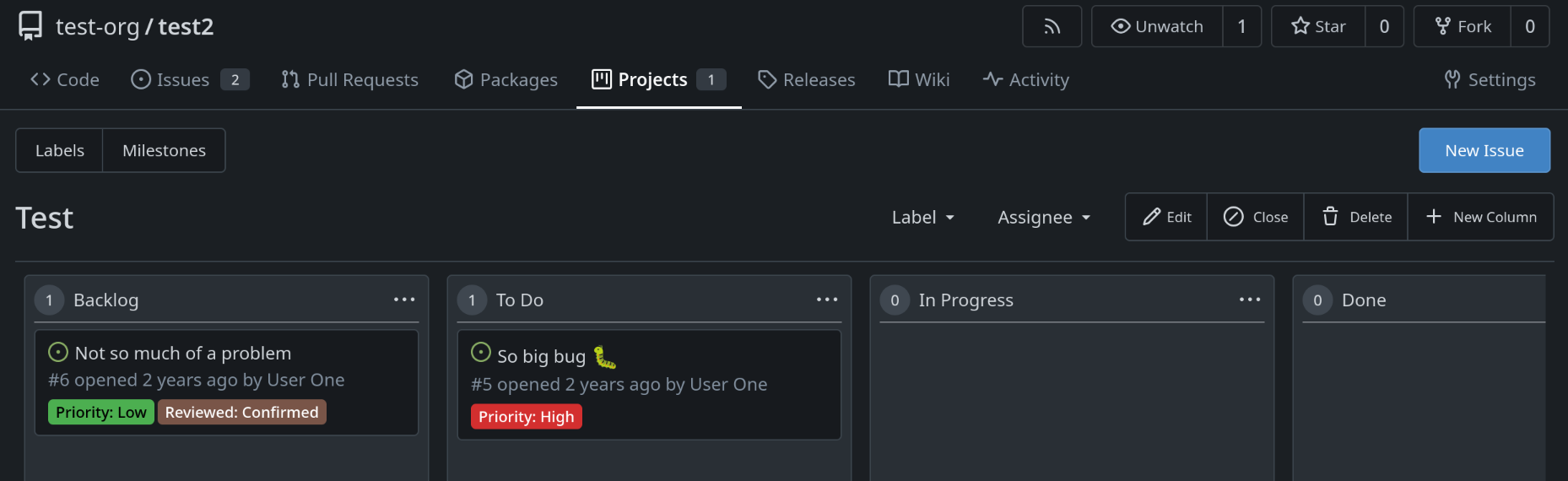
**Note** that implementation was made intentionally to work same as in
issue list so that URL can be bookmarked for quick access with
predefined filters in URL
|
| |
|
|
|
| |
The normal themes already have a variant which automatically chooses
light/dark mode based on the browser.
This PR adds the same variant, but for the colorblind themes.
|
| |
|
|
|
|
|
|
|
| |
As discussed in #31667 & #26561, when a card on a Project contains
images, they can overflow the card on its containing column. This aims
to fix this issue via snapping scrollbars.
---
Issue #31667 is open to discussion as there should be room for
improvement.
|
| |
|
|
|
|
|
|
|
|
|
| |
Buttons now show a focus style via
[`:focus-visible`](https://developer.mozilla.org/en-US/docs/Web/CSS/:focus-visible)
when the browser deems the focus to be important, like for example when
the button is focused via keyboard navigation.
<img width="492" alt="Screenshot 2024-08-07 at 22 12 51"
src="https://github.com/user-attachments/assets/060568b1-1599-4c56-bafb-b36ebb1bec35">
<img width="479" alt="image"
src="https://github.com/user-attachments/assets/885f4e10-f496-47f0-8ae5-45827ded09f8">
|
| |
|
|
|
|
|
|
|
|
| |
Fixes: https://github.com/go-gitea/gitea/issues/31636
1. Issue sidebar topic is disussed in
https://github.com/go-gitea/gitea/issues/31636
2. Org description already has `overflow-wrap: anywhere` to ensure no
overflow.
Co-authored-by: Giteabot <teabot@gitea.io>
|
| |
|
|
|
|
|
|
|
|
|
|
|
|
|
|
|
|
|
|
|
|
|
| |
1. Fixed border-radius
2. Monaco ignores the alpha channel on the shadow color, introduce
`color-shadow-opaque`
3. Remove scrollbar color which follows
https://github.com/go-gitea/gitea/pull/29800
Before:
<img width="34" alt="Screenshot 2024-07-13 at 15 38 18"
src="https://github.com/user-attachments/assets/042d9bde-6db9-4467-a2a4-8f61ecc773eb">
<img width="35" alt="Screenshot 2024-07-13 at 15 38 31"
src="https://github.com/user-attachments/assets/04146ee0-551c-4ff2-9636-bd119b33595a">
After:
<img width="45" alt="Screenshot 2024-07-13 at 15 38 06"
src="https://github.com/user-attachments/assets/1f58fa5a-1289-4e45-83c9-18ca82a5e266">
<img width="39" alt="Screenshot 2024-07-13 at 21 16 56"
src="https://github.com/user-attachments/assets/e12ebe22-b29b-4798-9f0d-4c100f311562">
|
| |
|
|
|
|
|
|
|
|
|
|
|
|
|
|
|
|
|
|
|
|
|
|
|
| |
As requested in
https://github.com/go-gitea/gitea/pull/31504#issuecomment-2196196646.
This PR refactor the login page:
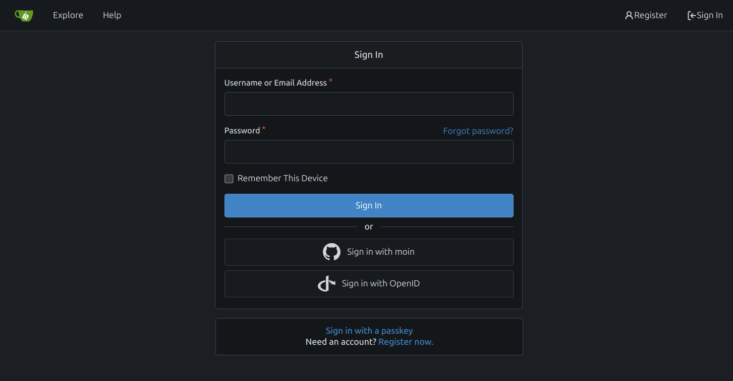
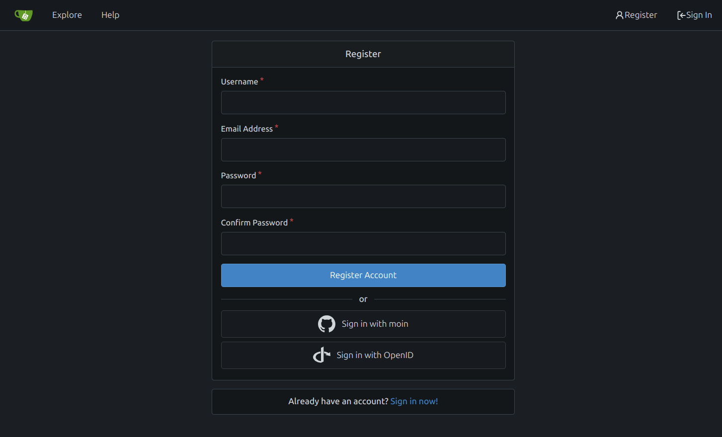
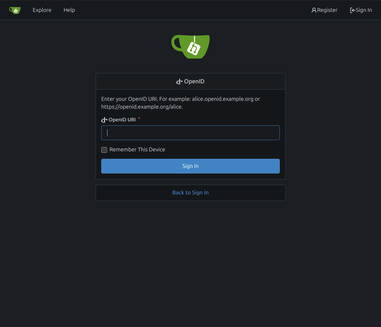
# Changes
- [x] use separate box for passkey login and go to registration
- [x] move forgot passoword next to password label
- [x] fix password required label `*` and padding
- [x] remove tabs from login page
---------
Co-authored-by: silverwind <me@silverwind.io>
|
| |
|
|
|
|
|
|
|
|
| |
Many avatars were rendered in HTML with certain width/height but then
resized again in CSS. This was pointless so I removed all these cases
and made the HTML size match the previous render size.
Also did a few CSS cleanups in the tribute rendering:
<img width="648" alt="image"
src="https://github.com/go-gitea/gitea/assets/115237/cb2fafb3-5e20-46e9-814f-07df20038beb">
|
| |
|
|
|
|
|
|
|
|
|
|
|
|
|
| |
Close #31502
Related to #31419.
In this PR, the avatar width is set to 3em, but the height is not set,
so the image is not squared.
When object-fit is set to contain, it can't maintain the radius of the
image.
Result:
|
| |
|
|
|
|
|
|
|
|
| |
make preventDuplicates default to true, users get a clear UI feedback
and know that "a new message appears".
Fixes: https://github.com/go-gitea/gitea/issues/26651
---------
Co-authored-by: silverwind <me@silverwind.io>
|
| |
|
|
|
|
|
| |
Caused by #31091
---------
Co-authored-by: silverwind <me@silverwind.io>
|
| | |
|
| |
|
|
|
| |
It was correct only on the new issue page.
Resolves #31415
|
| |
|
|
|
|
| |
The avatar on "New Issue" and "New Pull Request" pages was inconsistent.
Removed the extra margin and the new CSS rules now use common parent
`<form id="#new-issue">` because `.repository.new.issue` is not present
on pull request page.
|
| |
|
| |
Co-authored-by: silverwind <me@silverwind.io>
|
| |
|
|
|
|
|
|
|
|
|
|
|
|
|
|
|
|
| |
Fixes regression
https://github.com/go-gitea/gitea/pull/31307#issuecomment-2162554913
Table CSS is weird. A `auto` value does not work and causes the
regression while any pixel value causes another regression in diff where
the code lines do not stretch. Partially revert that PR and clean up
some related too-deep CSS selectors.
<img width="109" alt="Screenshot 2024-06-12 at 15 07 22"
src="https://github.com/go-gitea/gitea/assets/115237/756c5dea-44b8-49f9-8a08-acef68075f62">
<img width="119" alt="Screenshot 2024-06-12 at 15 07 43"
src="https://github.com/go-gitea/gitea/assets/115237/28ae1adc-118e-4016-8d09-033b9f1c9a6f">
<img width="151" alt="Screenshot 2024-06-12 at 15 07 07"
src="https://github.com/go-gitea/gitea/assets/115237/08db7ed9-de4e-405e-874d-c7ebe3082557">
<img width="141" alt="Screenshot 2024-06-12 at 15 07 14"
src="https://github.com/go-gitea/gitea/assets/115237/c4a5492b-1bf1-4773-bc8d-64eb36d823f9">
|
| |
|
|
|
|
|
|
|
|
|
| |
Fixes
https://github.com/go-gitea/gitea/pull/31273#issuecomment-2153771331.
Same method as used in https://github.com/go-gitea/gitea/pull/30215. All
left-opening dropdowns need to use it method.
---------
Co-authored-by: wxiaoguang <wxiaoguang@gmail.com>
Co-authored-by: Giteabot <teabot@gitea.io>
|
| |
|
|
|
|
|
| |
Line numbers were using some hacky CSS `width: 1%` that did nothing to
the code rendering as far as I can tell but broken the inline preview in
markup when line numbers are greater than 2 digits. Also I removed one
duplicate `font-family` rule (it is set below in the `.lines-num,
.lines-code` selector.
|
| |
|
|
|
|
|
|
|
|
|
|
|
|
|
|
| |
before:
***The problem was that the icon and text were not on a horizontal line,
and the horizontal was not centered;***
after:

---------
Co-authored-by: wxiaoguang <wxiaoguang@gmail.com>
Co-authored-by: Giteabot <teabot@gitea.io>
|
| |
|
|
|
| |
`overflow-wrap: anywhere` is a superior alternative to `word-wrap:
break-word` and we were already setting it in the class. I tested a few
cases, all look good.
|
| |
|
|
|
|
| |
Using `.segment` on the project columns is a major abuse of that class,
so remove it and instead set the border-radius directly on it.
Fixes: https://github.com/go-gitea/gitea/issues/31129
|
