| Commit message (Collapse) | Author | Age | Files | Lines |
|---|
| |
|
| |
Fix #30578
|
| |
|
|
|
|
| |
Follow #30345
Follow #30547
`ellipsis` / `white-space` shouldn't be put on the general dropdown components.
|
| |
|
| |
Fix the space between the box and label for checkboxes, and fix incorrect usages in "repo-issue.js"
|
| |
|
|
|
| |
1. "enter" doesn't work (I think it is the last enter support for #14843)
2. if a branch name contains something like `&`, then the branch selector doesn't update
|
| |
|
|
|
|
|
|
|
|
|
|
|
|
|
|
|
|
|
| |
Since there is now a second `<input>` in the repo buttons, we can make a
better-looking layout with no empty space, except on mobile.
Also I fixed one bug with focus border on clone panel.
## Large
<img width="1163" alt="Screenshot 2024-04-23 at 22 25 22"
src="https://github.com/go-gitea/gitea/assets/115237/8135a572-aa67-4672-ad49-b76b06890b52">
## Medium
<img width="870" alt="Screenshot 2024-04-23 at 22 25 34"
src="https://github.com/go-gitea/gitea/assets/115237/9e93f61c-3315-4a78-8328-8cefad5b50fa">
## Mobile
<img width="416" alt="Screenshot 2024-04-23 at 22 25 52"
src="https://github.com/go-gitea/gitea/assets/115237/859e341f-807a-48e6-8bcf-31715963216c">
|
| |
|
|
|
|
|
|
|
|
| |
Makes it easier to use because you see which square is currently
hovered:
<img width="314" alt="Screenshot 2024-05-02 at 15 38 20"
src="https://github.com/go-gitea/gitea/assets/115237/3a15dad1-2259-4f28-9fae-5cf6ad3d8798">
I did try a `scoped` style for this, but that did not work for some
reason.
|
| |
|
| |
Fix #30788
|
| |
|
| |
Fix #30802
|
| |
|
|
| |
Fixes https://github.com/go-gitea/gitea/issues/30673, specifically
https://github.com/go-gitea/gitea/issues/30673#issuecomment-2085329812.
|
| |
|
|
|
|
|
|
|
|
|
|
|
|
|
|
|
|
|
|
|
|
|
| |
Fixes https://github.com/go-gitea/gitea/issues/30721 and overhauls the
stopwatch. Time is now shown inside the "dot" icon and on both mobile
and desktop. All rendering is now done by `<relative-time>`, the
`pretty-ms` dependency is dropped.
Desktop:
<img width="557" alt="Screenshot 2024-04-29 at 22 33 27"
src="https://github.com/go-gitea/gitea/assets/115237/3a46cdbf-6af2-4bf9-b07f-021348badaac">
Mobile:
<img width="640" alt="Screenshot 2024-04-29 at 22 34 19"
src="https://github.com/go-gitea/gitea/assets/115237/8a2beea7-bd5d-473f-8fff-66f63fd50877">
Note for tippy:
Previously, tippy instances defaulted to "menu" theme, but that theme is
really only meant for `.ui.menu`, so it was not optimal for the
stopwatch popover.
This introduces a unopinionated `default` theme that has no padding and
should be suitable for all content. I reviewed all existing uses and
explicitely set the desired `theme` on all of them.
|
| |
|
|
|
|
|
|
|
|
|
|
|
| |
I guess there could be enough people liking to make the Settings menu
item right aligned. As a site admin, I found it's easier to find the
right-aligned Settings menu item.
Tested with various sizes:
|
| |
|
|
|
|
|
|
|
|
|
|
|
|
|
|
|
|
|
|
|
|
|
|
|
|
|
|
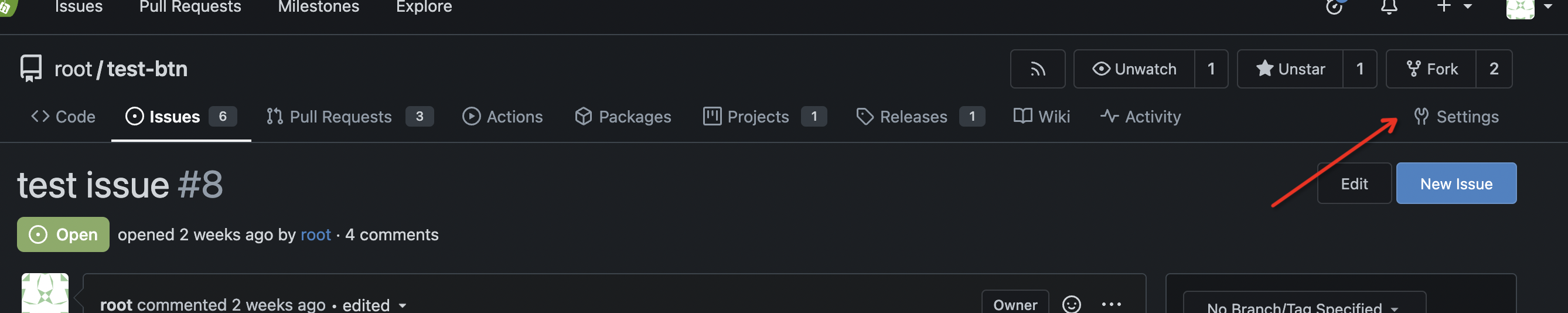
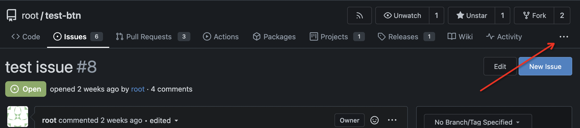
| |
Fixes https://github.com/go-gitea/gitea/issues/30673, all 23 issues.
Notes:
- Tab bar menus had to change to pills because of unsolvable issue with
the border-radius as tab bar renders a overlapping border onto the box
below. And I think pills look better.
- Added padding to code editor empty preview message
- Hide monaco's built-in blue focus border, we don't need it and it
never showed before either.
- Label add menu is simplified, removing the nested segment.
<img width="1322" alt="Screenshot 2024-04-25 at 22 26 19"
src="https://github.com/go-gitea/gitea/assets/115237/7e394e0c-b7ad-417d-8e9f-12f1dea93ed1">
<img width="1326" alt="Screenshot 2024-04-25 at 22 28 00"
src="https://github.com/go-gitea/gitea/assets/115237/66c8499f-aa9f-4d95-8cca-ef13dfa82c65">
<img width="997" alt="Screenshot 2024-04-25 at 22 36 53"
src="https://github.com/go-gitea/gitea/assets/115237/07896102-c71d-4246-8173-c2bc2e1d3cae">
<img width="832" alt="Screenshot 2024-04-25 at 22 56 09"
src="https://github.com/go-gitea/gitea/assets/115237/d83afc96-08ca-4adc-baf4-3d02804be57c">
<img width="361" alt="Screenshot 2024-04-25 at 22 57 12"
src="https://github.com/go-gitea/gitea/assets/115237/c7371a68-00b5-47d8-84d0-ddc5268b2b2c">
---------
Co-authored-by: wxiaoguang <wxiaoguang@gmail.com>
Co-authored-by: Giteabot <teabot@gitea.io>
|
| |
|
| |
Tested extensively using modal which is the only dependant.
|
| |
|
|
|
|
|
|
|
|
|
|
|
|
|
| |
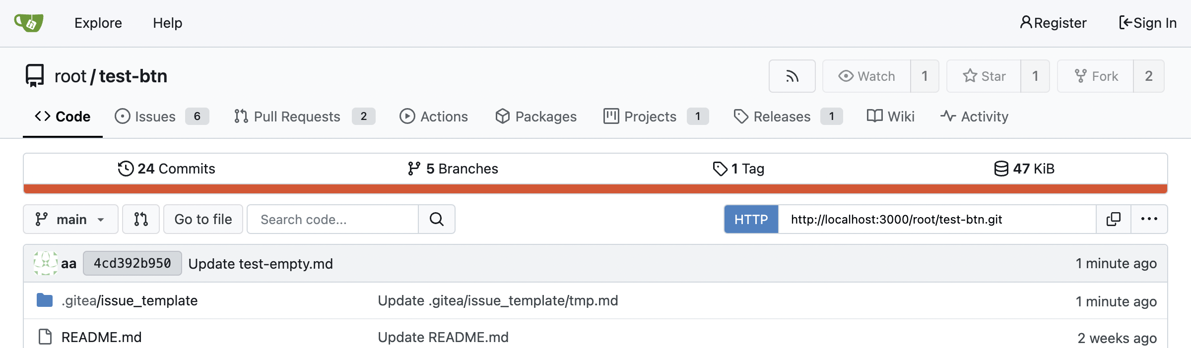
Fixes https://github.com/go-gitea/gitea/issues/30682 and does a few
improvements:
- Use gap instead of margin/padding
- Don't render empty image div
- Remove `right floated` class that did nothing
<img width="406" alt="Screenshot 2024-04-24 at 20 21 20"
src="https://github.com/go-gitea/gitea/assets/115237/2fa88707-c2c4-40df-aee7-a684c3097ed0">
---------
Co-authored-by: KN4CK3R <admin@oldschoolhack.me>
|
| |
|
|
|
|
|
|
|
|
|
|
|
| |
Minor tweaks:
- Remove unnecessary `item` class which was causing unwanted padding to
be added.
- Add some padding and prevent wrapping so it looks better on mobile.
- Increase width by 4px.
<img width="116" alt="Screenshot 2024-04-24 at 00 15 07"
src="https://github.com/go-gitea/gitea/assets/115237/1f1cf54c-8053-4297-b309-71d9c2ceb9ee">
<img width="441" alt="Screenshot 2024-04-24 at 00 14 57"
src="https://github.com/go-gitea/gitea/assets/115237/2f3a33dc-edad-4b97-b64c-6812aae513cb">
|
| |
|
|
|
|
|
|
|
|
|
|
|
|
|
|
|
|
|
|
|
|
| |
1. Bring back the background on line numbers. This feature was lost a
long time ago.
<img width="457" alt="Screenshot 2024-04-24 at 01 36 09"
src="https://github.com/go-gitea/gitea/assets/115237/76a7f5a9-c22a-4c72-9f0a-ebf16a66513e">
<img width="473" alt="Screenshot 2024-04-24 at 01 22 47"
src="https://github.com/go-gitea/gitea/assets/115237/eef06cf2-f1b9-40e3-947d-dd5852ec12a3">
<img width="457" alt="Screenshot 2024-04-24 at 02 13 18"
src="https://github.com/go-gitea/gitea/assets/115237/59e317d4-76a7-468c-8a19-10d88c675cc3">
<img width="459" alt="Screenshot 2024-04-24 at 01 23 21"
src="https://github.com/go-gitea/gitea/assets/115237/f1a46f8d-8846-4d78-a9d7-8b7dc18ac6e4">
2. Expanded lines background is now full-line, including line numbers:
<img width="1303" alt="Screenshot 2024-04-24 at 01 37 12"
src="https://github.com/go-gitea/gitea/assets/115237/271eefe2-0869-424e-93fb-ccd8adc87806">
3. Sort affected colors alphabetically in the CSS
Fixes #14603
|
| |
|
|
|
|
|
|
|
|
|
| |
Before, item would also resize on hover because of font weight:
<img width="381" alt="Screenshot 2024-04-25 at 01 28 53"
src="https://github.com/go-gitea/gitea/assets/115237/4f3291fc-90be-4d66-ae8b-3c2f763cb956">
After:
<img width="381" alt="Screenshot 2024-04-25 at 01 28 40"
src="https://github.com/go-gitea/gitea/assets/115237/06145bf2-1ddd-4171-9217-d92c100ea405">
Co-authored-by: Giteabot <teabot@gitea.io>
|
| |
|
|
|
|
|
|
|
| |
This is a very old bug with the bottom border-radiuses not being there
and the `:has` selector now makes it possible to cleanly solve it. It
affects all header+segment boxes, which there are many throughout the
UI:
<img width="1017" alt="Screenshot 2024-04-23 at 20 47 21"
src="https://github.com/go-gitea/gitea/assets/115237/870fe352-cc38-4bd6-bfe6-9fe8c3066f92">
|
| |
|
|
|
|
|
| |
Initial support for #25680
This PR only adds some simple styles from GitHub, it is big enough and
it focuses on adding the necessary framework-level supports. More styles
could be fine-tuned later.
|
| | |
|
| |
|
|
|
|
|
|
|
|
|
| |
- `.text-thin` and `.text-italic` are not present in CSS so were doing nothing and I removed them.
- `.text.middle` was unused so I removed it.
- `.text.italic` is replaced with `tw-italic`.
- `.text.normal` had exactly one use and it wasn't even needed.
- add a `muted` class to the link to `org_profile_avatar.tmpl`.
---------
Co-authored-by: wxiaoguang <wxiaoguang@gmail.com>
|
| |
|
|
|
|
| |
Fix #30502 by a new approach.
|
| |
|
|
|
|
|
|
|
|
|
|
|
| |
Follow
https://github.com/go-gitea/gitea/pull/30547#discussion_r1573866519
Fix #30624
The Fomantic UI Dropdown wasn't designed to work that way, its "text"
element might contain images. So the "overflow" shouldn't be added to
any general dropdown text.
|
| |
|
|
| |
Fixes https://github.com/go-gitea/gitea/issues/30566, regression from
https://github.com/go-gitea/gitea/pull/30214.
|
| |
|
|
| |
1. Rewrite initGlobalEnterQuickSubmit (by the way, remove jQuery)
2. Fix issue comment form layout
|
| |
|
|
|
|
|
|
| |
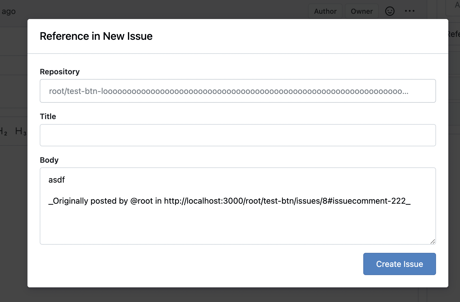
Fixes: https://github.com/go-gitea/gitea/issues/29994
Also some misc enhancements done to the form in the modal.
<img width="840" alt="Screenshot 2024-04-17 at 23 02 55"
src="https://github.com/go-gitea/gitea/assets/115237/e71fba55-55cd-4e48-a497-6b1025c36a43">
|
| |
|
|
|
|
|
|
|
|
|
|
|
|
|
|
|
|
|
|
| |
Fixes: https://github.com/go-gitea/gitea/issues/30540
1. Fix all these boxes by adding `bottom attached` and removing a
problematic CSS rule:
<img width="1319" alt="Screenshot 2024-04-17 at 22 25 31"
src="https://github.com/go-gitea/gitea/assets/115237/346445a4-4944-4003-a1ef-6f5b0eda624e">
<img width="643" alt="Screenshot 2024-04-17 at 22 21 18"
src="https://github.com/go-gitea/gitea/assets/115237/10f17ed3-9ad6-48de-92fa-bac6621815b9">
2. Change the "last commit" box to `ui segment` which has correct
border-radius. Also included is a tiny tweak to make author name ellipse
instead of wrap.
<img width="1331" alt="Screenshot 2024-04-17 at 22 23 23"
src="https://github.com/go-gitea/gitea/assets/115237/285fbd45-ced0-4d33-abe3-7384ffa03188">
Co-authored-by: Giteabot <teabot@gitea.io>
|
| |
|
|
|
|
|
|
| |
close #29685
---------
Signed-off-by: 6543 <6543@obermui.de>
Co-authored-by: silverwind <me@silverwind.io>
|
| |
|
|
|
|
|
|
|
|
|
| |
Fixes https://github.com/go-gitea/gitea/issues/30493, regression from
https://github.com/go-gitea/gitea/pull/30374.
Also did the flexbox convertion as suggested by the existing comment.
<img width="850" alt="Screenshot 2024-04-16 at 22 28 48"
src="https://github.com/go-gitea/gitea/assets/115237/e8905944-620a-4211-b5c5-53ed3b3ee23e">
Co-authored-by: Giteabot <teabot@gitea.io>
|
| |
|
|
|
|
|
|
|
|
|
| |
Fixes: https://github.com/go-gitea/gitea/issues/30523
1. Fix checkbox rendering
2. Fix width of selection dropdowns (was too small)
---------
Co-authored-by: delvh <dev.lh@web.de>
Co-authored-by: Giteabot <teabot@gitea.io>
|
| |
|
|
|
|
|
|
|
| |
Fixes: https://github.com/go-gitea/gitea/issues/30524. Slightly restyled
them so that the "knob" is contained inside the background.
<img width="179" alt="Screenshot 2024-04-16 at 21 58 09"
src="https://github.com/go-gitea/gitea/assets/115237/be94517b-9cb7-46e2-ae96-fcf6767ce4ba">
<img width="187" alt="Screenshot 2024-04-16 at 21 58 50"
src="https://github.com/go-gitea/gitea/assets/115237/c13a1959-5c5a-4e88-9225-e5f6fb72e3e0">
|
| |
|
|
|
|
|
|
|
|
|
|
|
|
|
|
|
|
|
|
|
|
|
| |
Fixes: https://github.com/go-gitea/gitea/issues/30514
Fixes:
https://github.com/go-gitea/gitea/pull/30288#issuecomment-2057466623
- Fix border-radius regression from
https://github.com/go-gitea/gitea/pull/30475
- Fix and simplify hover state
- Move the modal HTML so it does not interfere with the CSS
- Make the star and unwatch text show on mobile. There is still plenty
of space, below is iPhone 12 viewport size
<img width="696" alt="Screenshot 2024-04-15 at 20 34 03"
src="https://github.com/go-gitea/gitea/assets/115237/af90bb00-4671-4973-a255-8eb44ee6ba8d">
<img width="230" alt="Screenshot 2024-04-15 at 20 31 42"
src="https://github.com/go-gitea/gitea/assets/115237/986ef533-7a01-4bb0-8dcd-fd19e4259e84">
<img width="233" alt="Screenshot 2024-04-15 at 20 31 47"
src="https://github.com/go-gitea/gitea/assets/115237/5b825dd8-0ccc-4d56-9d8f-774abb935b68">
---------
Co-authored-by: Giteabot <teabot@gitea.io>
|
| |
|
|
|
|
|
|
|
|
|
|
|
| |
Fixes: https://github.com/go-gitea/gitea/issues/27971
Fixes: https://github.com/go-gitea/gitea/pull/28010
<img width="689" alt="Screenshot 2024-04-09 at 00 19 57"
src="https://github.com/go-gitea/gitea/assets/115237/7c895a47-274f-40a6-a126-290658f1982d">
Also fixes a similar issue in issue list where CSS was there but not
active because of missing `display: block`.
<img width="372" alt="Screenshot 2024-04-09 at 00 18 25"
src="https://github.com/go-gitea/gitea/assets/115237/cfbee7cd-2e15-4ac7-96ce-020816f48798">
|
| |
|
|
|
|
|
|
|
|
|
|
|
|
|
| |
Fix a number of text overflow issues in actions view and run list. Also
improve mobile view of run list.
Fixes: https://github.com/go-gitea/gitea/issues/30328
<img width="782" alt="Screenshot 2024-04-08 at 23 10 16"
src="https://github.com/go-gitea/gitea/assets/115237/3d9f9f88-3eab-44a0-8144-30c2b58b24cb">
<img width="935" alt="Screenshot 2024-04-08 at 23 17 46"
src="https://github.com/go-gitea/gitea/assets/115237/581d73ea-a31d-416b-be3a-47313b879b12">
<img width="1008" alt="Screenshot 2024-04-08 at 23 49 05"
src="https://github.com/go-gitea/gitea/assets/115237/c5d10565-f285-477f-8659-1caf94797647">
<img width="397" alt="Screenshot 2024-04-08 at 23 55 30"
src="https://github.com/go-gitea/gitea/assets/115237/368aaa75-1903-4058-9d75-d1fe91c564d6">
|
| |
|
| |
It looks better when these menus don't flash a border-bottom on click.
|
| |
|
|
|
|
| |
Previously these colors were provided by fomantic css. I missed them.
Fixes: https://github.com/go-gitea/gitea/issues/30499
Regressed by: https://github.com/go-gitea/gitea/pull/30475
|
| |
|
|
|
|
|
|
|
| |
Small tweak here to prevent this and likely other events from
overflowing in the timeline:
<img width="895" alt="Screenshot 2024-04-14 at 22 53 17"
src="https://github.com/go-gitea/gitea/assets/115237/001b4f6b-f649-44ff-b2f0-c8e0dedeb384">
Co-authored-by: Giteabot <teabot@gitea.io>
|
| |
|
|
|
|
|
|
|
|
| |
Partial revert of https://github.com/go-gitea/gitea/pull/30479
It's causing problems at least here:
https://github.com/go-gitea/gitea/pull/30344#discussion_r1564895591
---------
Co-authored-by: wxiaoguang <wxiaoguang@gmail.com>
|
| |
|
|
|
|
|
| |

---------
Co-authored-by: silverwind <me@silverwind.io>
|
| |
|
|
|
|
|
|
|
|
| |
CSS-only module. Button colors are reduced to this:
<img width="639" alt="Screenshot 2024-04-14 at 15 36 07"
src="https://github.com/go-gitea/gitea/assets/115237/882d6c02-d1de-44f2-b707-db02a9f5070d">
---------
Co-authored-by: wxiaoguang <wxiaoguang@gmail.com>
|
| |
|
|
|
| |
A lot of variants are in use, so the diff stat isn't so great.
Co-authored-by: Giteabot <teabot@gitea.io>
|
| |
|
|
|
|
|
|
|
|
|
|
|
|
|
|
|
|
|
| |
Added new class `flex-container-sidebar` to cover the dashboard sidebar.
Previously this was 37.5% with more padding. Now there is less empty
space between the two columns and this matches other pages like repo or
admin settings page.
Desktop:
<img width="1345" alt="Screenshot 2024-03-31 at 15 11 36"
src="https://github.com/go-gitea/gitea/assets/115237/717389d9-d42c-466e-a8fe-e968f79447fd">
Mobile:
<img width="444" alt="Screenshot 2024-03-31 at 15 11 44"
src="https://github.com/go-gitea/gitea/assets/115237/7faa840b-513a-411b-bf2d-26d52b9b71a0">
---------
Co-authored-by: Giteabot <teabot@gitea.io>
|
| |
|
|
|
|
|
|
|
|
|
| |
Enable `no-sizzle` lint rule, there was only one use in `initCompReactionSelector` and:
- Remove all jQuery except the necessary fomantic dropdown init
- Remove the recursion, instead bind event listeners to common parent container nodes
---------
Co-authored-by: wxiaoguang <wxiaoguang@gmail.com>
Co-authored-by: Giteabot <teabot@gitea.io>
|
| |
|
|
|
|
|
|
|
|
| |
1. add border-radius and spacing to bars
2. use tailwind background classes
3. Add more space around activity list headers
<img width="983" alt="Screenshot 2024-03-27 at 23 40 54"
src="https://github.com/go-gitea/gitea/assets/115237/70f72c30-e69f-4ecb-882f-32b8bc94d638">
<img width="1020" alt="Screenshot 2024-03-27 at 23 41 02"
src="https://github.com/go-gitea/gitea/assets/115237/a35dbbda-515c-40b0-938a-d759f9686b8e">
|
| |
|
|
|
|
|
|
|
|
| |
New approach to color shades: Stem all colors off the body color
`#1b1f23` using [this](https://pinetools.com/darken-color) and
[this](https://pinetools.com/lighten-color) tool. The differences are
very subtle, but it will give a more consistent color scheme until
https://github.com/go-gitea/gitea/issues/30160.
<img width="1342" alt="Screenshot 2024-04-10 at 20 44 16"
src="https://github.com/go-gitea/gitea/assets/115237/75b65797-2521-46ea-91d8-d76f77b591b1">
|
| |
|
|
|
|
|
|
|
|
|
|
|
|
|
|
|
|
|
|
|
|
|
|
| |
Fixes: https://github.com/go-gitea/gitea/issues/29438
This contains numerous enhancements for how large commit messages and
large filenames render. Another notable change is that the file path is
no longer cut off by backend at 30 chars, but rendered in full with
wrapping.
<img width="1329" alt="Screenshot 2024-04-09 at 21 53 57"
src="https://github.com/go-gitea/gitea/assets/115237/5ccbb3d6-643a-4f60-ba79-3572b36d5182">
<hr>
<img width="711" alt="Screenshot 2024-04-09 at 21 44 24"
src="https://github.com/go-gitea/gitea/assets/115237/6ffe8fbb-407c-4aa7-b591-3d80daea7d57">
<hr>
<img width="439" alt="Screenshot 2024-04-09 at 21 19 03"
src="https://github.com/go-gitea/gitea/assets/115237/1ec7f6e9-2fd8-4841-87eb-6ca02ab9cd61">
<hr>
<img width="444" alt="Screenshot 2024-04-09 at 21 18 52"
src="https://github.com/go-gitea/gitea/assets/115237/70931b9e-5841-477e-b3bc-98f8d2662964">
---------
Co-authored-by: Giteabot <teabot@gitea.io>
|
| |
|
|
|
|
|
|
|
|
| |
Fixes https://github.com/go-gitea/gitea/issues/30353.
I don't know what causes `code-inner` to not inherit `line-height` from
its direct parent `.lines-code` but instead from grandparent `.markup`
even thought MDN tells me it's
[inherited](https://developer.mozilla.org/en-US/docs/Web/CSS/line-height#formal_definition).
This causes no negative impact on other code views, so I think it's the
best solution.
|
| |
|
|
| |
Fixes https://github.com/go-gitea/gitea/issues/30365, regression from
https://github.com/go-gitea/gitea/pull/30281
|
| |
|
|
|
|
|
|
|
|
|
|
|
|
|
| |
Not sure exactly when this regressed, but has been a while I think.
Before:
<img width="895" alt="Screenshot 2024-04-08 at 22 46 50"
src="https://github.com/go-gitea/gitea/assets/115237/9b1788f8-017e-4fe1-8ab9-938e0d76fb41">
After:
<img width="689" alt="Screenshot 2024-04-08 at 23 00 58"
src="https://github.com/go-gitea/gitea/assets/115237/90193df9-5c24-4a1a-96fe-3d4e8392063c">
Co-authored-by: Giteabot <teabot@gitea.io>
|
| |
|
|
|
|
| |
16 seems to big, 14 too small. Let's do 15. Alignment:
<img width="181" alt="image"
src="https://github.com/go-gitea/gitea/assets/115237/f2988611-dee2-492e-a18f-dc5ab3a1cd6c">
|
