| Commit message (Collapse) | Author | Age | Files | Lines |
|---|
| |
|
|
|
|
| |
Ref: #29878
Backport #29884
Co-authored-by: wxiaoguang <wxiaoguang@gmail.com>
|
| |
|
|
|
|
|
|
|
|
|
|
|
|
|
| |
Backport #29845 by @silverwind
Before, double border-bottom and incorrect border-radius:
<img width="914" alt="Screenshot 2024-03-16 at 14 46 31"
src="https://github.com/go-gitea/gitea/assets/115237/6ea63c42-754c-420c-a0f5-c889a8507d9f">
After, both fixed:
<img width="917" alt="Screenshot 2024-03-16 at 14 45 59"
src="https://github.com/go-gitea/gitea/assets/115237/9d3f2dba-6b22-441d-8e99-5809d5f1f1c0">
Co-authored-by: silverwind <me@silverwind.io>
|
| |
|
| |
backport #29734
|
| |
|
|
|
|
|
|
|
|
|
|
|
|
|
|
|
|
| |
Backport #28140 by @earl-warren
- Make use of the `form-fetch-action` for the merge button, which will
automatically prevent the action from happening multiple times and show
a nice loading indicator as user feedback while the merge request is
being processed by the server.
- Adjust the merge PR code to JSON response as this is required for the
`form-fetch-action` functionality.
- Resolves https://codeberg.org/forgejo/forgejo/issues/774
- Likely resolves the cause of
https://codeberg.org/forgejo/forgejo/issues/1688#issuecomment-1313044
(cherry picked from commit 4ec64c19507caefff7ddaad722b1b5792b97cc5a)
Co-authored-by: Earl Warren <109468362+earl-warren@users.noreply.github.com>
Co-authored-by: Gusted <postmaster@gusted.xyz>
|
| |
|
|
|
|
|
|
|
| |
Backport #27912 by @delvh
This should be the easiest fix.
While other solutions might be possible that exterminate the root cause,
they will not be as trivial.
Co-authored-by: delvh <dev.lh@web.de>
|
| |
|
|
|
|
|
|
|
|
|
|
|
|
|
|
| |
Backport #27714 by @silverwind
1. Un-indent top-level items, matching GitHub rendering
2. Increase item padding and add 1px gap between items
Before and After:
<img width="247" alt="Screenshot 2023-10-20 at 18 37 32"
src="https://github.com/go-gitea/gitea/assets/115237/43c1ce86-1814-4a8a-9dd2-0c4a82a2be7c">
<img width="241" alt="Screenshot 2023-10-20 at 18 40 46"
src="https://github.com/go-gitea/gitea/assets/115237/b541b85b-c428-4903-becd-773ae5807495">
Co-authored-by: silverwind <me@silverwind.io>
Co-authored-by: 6543 <m.huber@kithara.com>
|
| |
|
|
|
|
|
|
|
|
|
|
|
| |
Backport #27504 by @silverwind
Partial revert of https://github.com/go-gitea/gitea/pull/25839. This
commit status is used by a number of external integrations, so I think
we should not remove it (See
https://github.com/go-gitea/gitea/pull/25839#issuecomment-1729002077).
This is a rare case where an existing migration needed to be alterted to
avoid data loss.
Co-authored-by: silverwind <me@silverwind.io>
Co-authored-by: delvh <dev.lh@web.de>
|
| |
|
|
|
|
|
|
|
|
|
|
|
|
|
|
|
|
|
|
|
|
| |
Backport #27322 by @wxiaoguang
Close #26730
1. The `diff-detail-box` was abused, it shouldn't be used for
"DiffFileList/DiffFileTree".
2. Fix the sticky position for various screens.


Co-authored-by: wxiaoguang <wxiaoguang@gmail.com>
|
| |
|
|
|
|
|
|
|
| |
Backport #27289 by @silverwind
Should fix: https://github.com/go-gitea/gitea/issues/27213
@denyskon can you test this? I can not reproduce this error locally.
Co-authored-by: silverwind <me@silverwind.io>
|
| |
|
|
|
|
|
|
|
|
|
|
| |
WIP because:
- [x] Some calls set a `content-type` but send no body, can likely
remove the header
- [x] Need to check whether `charset=utf-8` has any significance on the
webauthn calls, I assume not as it is the default for json content.
- [x] Maybe `no-restricted-globals` is better for eslint, but will
require a lot of duplication in the yaml or moving eslint config to a
`.js` extension.
- [x] Maybe export `request` as `fetch`, shadowing the global.
|
| |
|
|
|
|
|
|
|
|
|
|
|
|
|
|
|
|
|
|
|
|
|
|
| |
I think it's better if the primary actions have primary color instead of
green which fits better into the overall single-color UI design. This PR
currently replaces every green button with primary:
<img width="141" alt="Screenshot 2023-09-16 at 14 07 59"
src="https://github.com/go-gitea/gitea/assets/115237/843c1e50-4fb2-4ec6-84ba-0efb9472dcbe">
<img width="161" alt="Screenshot 2023-09-16 at 14 07 51"
src="https://github.com/go-gitea/gitea/assets/115237/9442195a-a3b2-4a42-b262-8377d6f5c0d1">
Modal actions now use uncolored/primary instead of previous green/red
colors. I also removed the box-shadow on all basic buttons:
<img width="259" alt="Screenshot 2023-09-16 at 14 16 39"
src="https://github.com/go-gitea/gitea/assets/115237/5beea529-127a-44b0-8d4c-afa7b034a490">
<img width="261" alt="Screenshot 2023-09-16 at 14 17 42"
src="https://github.com/go-gitea/gitea/assets/115237/4757f7b2-4d46-49bc-a797-38bb28437b88">
The change currently includes the "Merge PR" button, for which we might
want to make an exception to match the icon color there:
<img width="442" alt="Screenshot 2023-09-16 at 14 33 53"
src="https://github.com/go-gitea/gitea/assets/115237/993ac1a5-c94d-4895-b76c-0d872181a70b">
|
| |
|
| |
Fix #27008
|
| |
|
|
|
|
|
|
|
|
|
|
|
|
|
| |
1. Introduce lightweight `fetch` wrapper functions that automatically
sets csfr token, content-type and use it in `RepoActionView.vue`.
2. Fix a specific issue on `RepoActionView.vue` where a fetch network
error is shortly visible during page reload sometimes. It can be
reproduced by F5-in in quick succession on the actions view page and was
also producing a red error box on the page.
Once approved, we can replace all current `fetch` uses in UI with this
in another PR.
---------
Co-authored-by: Giteabot <teabot@gitea.io>
|
| |
|
|
|
|
|
|
|
|
|
|
|
| |
The [recommended order](https://vuejs.org/guide/scaling-up/sfc.html) for
SFC blocks is script -> template -> style, which we were violating
because template and script were swapped. I do find script first also
easier to read because the imports are on top, letting me immideatly see
a component's dependencies.
This is a pure cut-paste refactor with some removal of some empty lines.
---------
Co-authored-by: Lauris BH <lauris@nix.lv>
|
| |
|
|
|
|
|
|
|
|
|
|
|
| |
Each change is tested manually line by line. There are too many changes
so I can't share dozens of screenshots.
In short:
1. `ui right` could be still used in `ui top attached header`, because
there is a special case.
2. A lot of `ui right` are just no-op, so they can be removed safely.
3. Some of the `ui right` should be replaced by `gt-float-right` (to
avoid breaking, leave them to the future).
4. A few of the `ui right` could be rewritten by flex.
|
| | |
|
| | |
|
| |
|
|
|
|
|
|
|
|
|
|
| |
Fix #26731
Almost all "tabindex" in code are incorrect.
1. All "input/button" by default are focusable, so no need to use "tabindex=0"
2. All "div/span" by default are not focusable, so no need to use "tabindex=-1"
3. All "dropdown" are focusable by framework, so no need to use "tabindex"
4. Some tabindex values are incorrect (eg: `new_form.tmpl`), so remove them
Co-authored-by: Giteabot <teabot@gitea.io>
|
| |
|
|
|
|
|
|
|
|
|
|
|
|
|
|
|
|
|
|
|
|
|
|
|
|
|
|
|
|
|
|
|
|
|
|
|
|
|
|
|
|
|
|
|
|
|
|
|
|
|
|
| |
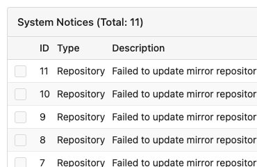
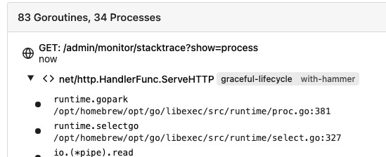
Removed CSS helper classes (some of them are not useful while some of
them are abused often)
* `gt-db`: in most cases it could be replaced by `gt-df` and the flex
layout should be encouraged. Other cases: either it does need the
`gt-df` (eg: by using `div` directly) or it is an abuse (eg: the warning
message in a form)
* `gt-di`: it doesn't seem useful, or it could be replaced by `gt-dib`
in most cases.
* `gt-dif`: not useful, it could be replaced by `flex-text-inline` or
`gt-df`
* `gt-js`: never used
* All `<i class="icon gt-df gt-ac gt-jc">` could be written as `<i
class="icon">`
## Some UI samples
### Admin Notice
### Admin Stacktrace
### Org Home

### Org Team Repo

### Release List

### User Setting Application Token Scope
Co-authored-by: Giteabot <teabot@gitea.io>
|
| |
|
|
|
|
|
|
|
|
|
|
|
|
|
|
|
|
|
|
|
|
|
|
|
|
| |
Replace Fomantic `loader` CSS module with our existing `is-loading`
spinner. Only three places in the UI used this module, which are
pictured here:
imagediff:
<img width="1237" alt="Screenshot 2023-08-22 at 22 18 01"
src="https://github.com/go-gitea/gitea/assets/115237/b0d82531-f05e-43c6-9e5b-1bfc268c056d">
webauthn:
<img width="894" alt="Screenshot 2023-08-22 at 22 05 05"
src="https://github.com/go-gitea/gitea/assets/115237/7b583425-d944-474a-a57a-22a65bbd8b29">
heatmap (I removed the previous loading text, it was unreadable because
it was tiny and on fast machines only visible for a fraction of a
second):
<img width="764" alt="Screenshot 2023-08-22 at 22 18 44"
src="https://github.com/go-gitea/gitea/assets/115237/1c7472d6-3e17-4224-a992-d8c0b380cc73">
Also, heatmap container does not resize any more after loading now and
previous duplicate id `user-heatmap` is gone.
---------
Co-authored-by: wxiaoguang <wxiaoguang@gmail.com>
|
| |
|
|
|
|
|
|
|
|
| |
Adds
[eslint-plugin-vue-scoped-css](https://github.com/future-architect/eslint-plugin-vue-scoped-css)
and fixes discovered issues which are:
- 1 unused selector
- 3 selectors with `.full.height` parent in a `<style scoped>` block so
the rule could not find the parent. Move these into the unscoped block
instead. They worked before and after.
|
| | |
|
| |
|
|
|
|
|
|
|
|
|
| |
Fix ui problem comes from #26326
Before:

After:

|
| |
|
|
|
|
|
|
| |
In GitHub, we can not rerun jobs if the workflow is disabled.
---------
Co-authored-by: silverwind <me@silverwind.io>
Co-authored-by: wxiaoguang <wxiaoguang@gmail.com>
|
| | |
|
| |
|
|
|
|
|
|
|
|
|
| |
dashboard (#26326)
Tooltip:

Link to the target job:

|
| |
|
|
|
|
|
|
|
|
|
|
|
|
|
| |
Fix some layout / user-interaction problems and close #25650 , the code
has been simplified (+46 −108)
<details>

</details>
---------
Co-authored-by: delvh <dev.lh@web.de>
|
| | |
|
| |
|
|
|
|
|
|
|
|
|
|
|
|
|
|
| |
Before:
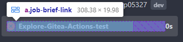
After:
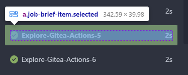
In current design, the clickable area is too small, and it is hard to
find the correct clickable area as the area with background color (div
with class name `job-brief-item selected`) is bigger than it.
---------
Co-authored-by: Giteabot <teabot@gitea.io>
|
| |
|
|
|
| |
Previously, the tooltip for this button was only shown after opening and
closing it once because it was only set after the server response, now
it shows before opening it.
|
| |
|
|
|
|
|
|
|
|
|
|
|
|
|
|
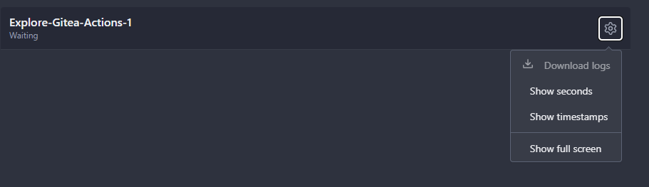
| |
Ressurect lost changes from
https://github.com/go-gitea/gitea/pull/24451.
- Always show icons for each entry in the menu
- Make all checkboxes toggle only their feature, e.g. "seconds" and
"timestamps" can now be toggled on together.
- Reorder the items
<img width="845" alt="Screenshot 2023-08-01 at 19 19 27"
src="https://github.com/go-gitea/gitea/assets/115237/8a76e9bf-7966-42a6-87c9-e88cdddaec82">
---------
Co-authored-by: Giteabot <teabot@gitea.io>
|
| |
|
|
|
|
|
|
|
|
|
|
|
|
|
|
|
|
|
|
|
|
|
|
|
|
|
|
|
|
|
|
|
|
|
|
|
|
|
| |
This PR adds a new dropdown to select a commit or a commit range
(shift-click like github) of a Pull Request.
After selection of a commit only the changes of this commit will be shown.
When selecting a range of commits the diff of this range is shown.
This allows to review a PR commit by commit or by viewing only commit ranges.
The "Show changes since your last review" mechanism github uses is implemented, too.
When reviewing a single commit or a commit range the "Viewed" functionality is disabled.
## Screenshots
### The commit dropdown
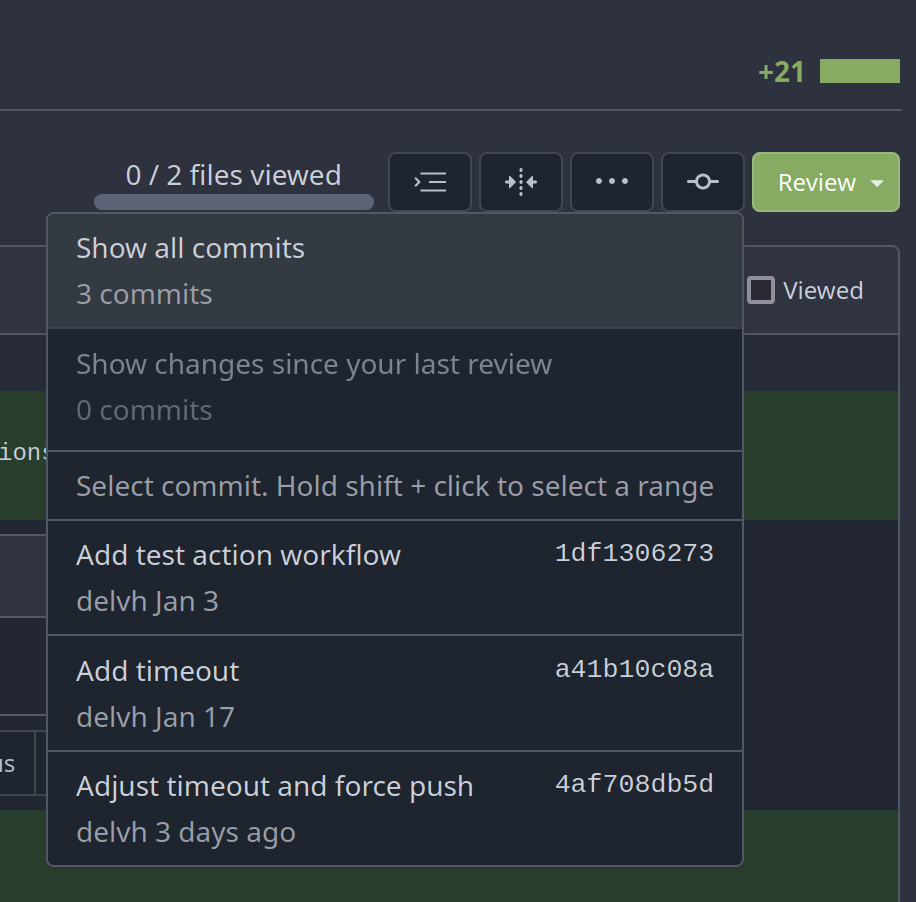
### Selecting a commit range

### Show changes of a single commit only
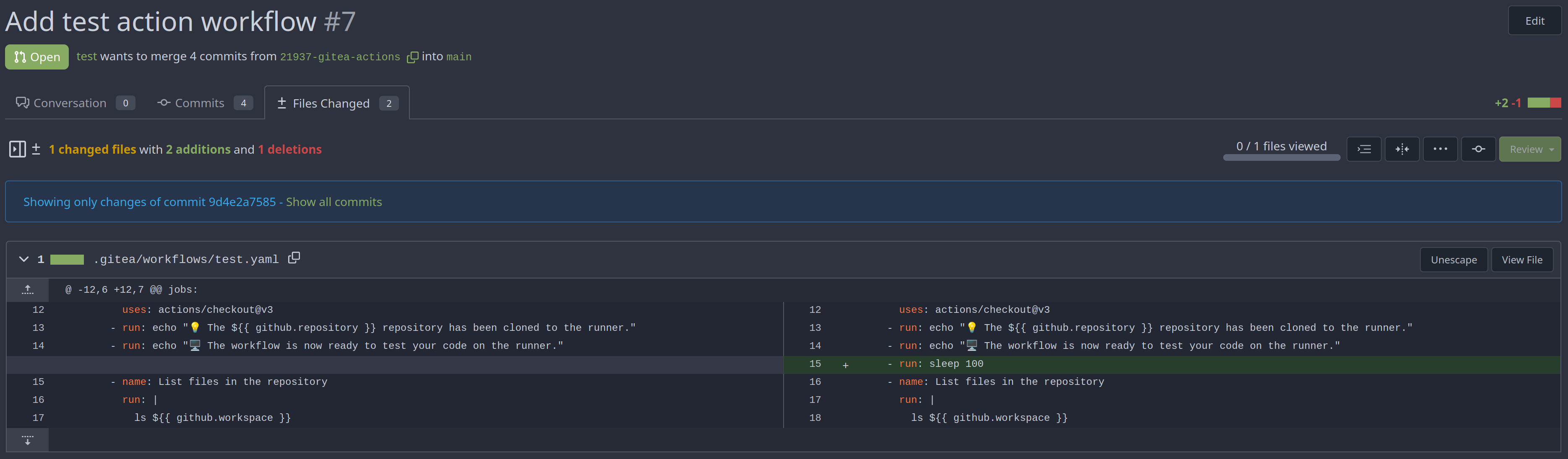
### Show changes of a commit range

Fixes https://github.com/go-gitea/gitea/issues/20989
Fixes https://github.com/go-gitea/gitea/issues/19263
---------
Co-authored-by: silverwind <me@silverwind.io>
Co-authored-by: KN4CK3R <admin@oldschoolhack.me>
Co-authored-by: wxiaoguang <wxiaoguang@gmail.com>
Co-authored-by: delvh <dev.lh@web.de>
|
| |
|
|
|
|
|
|
|
|
|
|
| |
If there's no logs, you can also click the download button, then you
will get `job is not started` page
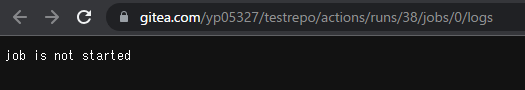
https://gitea.com/yp05327/testrepo/actions/runs/38
After:
If there's no steps displayed, the download button will be disabled.
|
| |
|
|
|
|
|
|
|
|
|
|
|
|
|
|
|
|
|
|
|
|
|
|
|
|
|
|
|
|
|
|
|
|
|
|
|
|
|
|
|
|
|
|
|
|
|
|
|
| |
- Send request to get branch/tag list, use loading icon when waiting for
response.
- Only fetch when the first time branch/tag list shows.
- For backend, removed assignment to `ctx.Data["Branches"]` and
`ctx.Data["Tags"]` from `context/repo.go` and passed these data wherever
needed.
- Changed some `v-if` to `v-show` and used native `svg` as mentioned in
https://github.com/go-gitea/gitea/pull/25719#issuecomment-1631712757 to
improve perfomance when there are a lot of branches.
- Places Used the dropdown component:
Repo Home Page
<img width="1429" alt="Screen Shot 2023-07-06 at 12 17 51"
src="https://github.com/go-gitea/gitea/assets/17645053/6accc7b6-8d37-4e88-ae1a-bd2b3b927ea0">
Commits Page
<img width="1431" alt="Screen Shot 2023-07-06 at 12 18 34"
src="https://github.com/go-gitea/gitea/assets/17645053/2d0bf306-d1e2-45a8-a784-bc424879f537">
Specific commit -> operations -> cherry-pick
<img width="758" alt="Screen Shot 2023-07-06 at 12 23 28"
src="https://github.com/go-gitea/gitea/assets/17645053/1e557948-3881-4e45-a625-8ef36d45ae2d">
Release Page
<img width="1433" alt="Screen Shot 2023-07-06 at 12 25 05"
src="https://github.com/go-gitea/gitea/assets/17645053/3ec82af1-15a4-4162-a50b-04a9502161bb">
- Demo
https://github.com/go-gitea/gitea/assets/17645053/d45d266b-3eb0-465a-82f9-57f78dc5f9f3
- Note:
UI of dropdown menu could be improved in another PR as it should apply
to more dropdown menus.
Fix #14180
---------
Co-authored-by: silverwind <me@silverwind.io>
Co-authored-by: wxiaoguang <wxiaoguang@gmail.com>
|
| |
|
|
|
|
|
|
| |
Also added comments so the next time the dashboard repo list won't be
forgotten
Follows #25839
Signed-off-by: Yarden Shoham <git@yardenshoham.com>
|
| |
|
| |
Fix #25865
|
| |
|
|
|
|
|
|
|
|
|
|
|
|
| |
current actions artifacts implementation only support single file
artifact. To support multiple files uploading, it needs:
- save each file to each db record with same run-id, same artifact-name
and proper artifact-path
- need change artifact uploading url without artifact-id, multiple files
creates multiple artifact-ids
- support `path` in download-artifact action. artifact should download
to `{path}/{artifact-path}`.
- in repo action view, it provides zip download link in artifacts list
in summary page, no matter this artifact contains single or multiple
files.
|
| |
|
|
|
|
|
| |
Followup to https://github.com/go-gitea/gitea/pull/25935 which has
missed to change the icon on the repolist because the logic is not
shared with templates.
Co-authored-by: Giteabot <teabot@gitea.io>
|
| |
|
|
|
|
|
|
|
|
|
|
| |
Monaco can not deal with color formats other than 6-digit hex, so we
convert the colors for it via new
[`tinycolor2`](https://github.com/bgrins/TinyColor) dependency (5kB
minzipped).
Also, with the addition of the module, we can replace the existing
`hexToRGBColor` usage, I verified it is compatible with the current
tests before removing the function.
Fixes: https://github.com/go-gitea/gitea/issues/25770
|
| |
|
|
|
|
|
|
|
|
|
|
|
|
|
|
|
|
|
|
|
|
|
|
|
|
|
|
|
| |
Resolves #25622
<details>
<summary>Screenshots</summary>


</details>
---------
Co-authored-by: wxiaoguang <wxiaoguang@gmail.com>
Co-authored-by: silverwind <me@silverwind.io>
|
| |
|
|
|
|
|
|
|
|
|
|
| |
Various small enhancements to the actions list. Before and after:
<img width="1264" alt="Screenshot 2023-06-30 at 00 11 40"
src="https://github.com/go-gitea/gitea/assets/115237/bb4162ee-cdcf-4a73-b05e-f9521562edbb">
<img width="1264" alt="Screenshot 2023-06-30 at 00 09 51"
src="https://github.com/go-gitea/gitea/assets/115237/52a70ea9-4bb3-406e-904b-0fdaafde9582">
---------
Co-authored-by: Giteabot <teabot@gitea.io>
|
| |
|
|
|
|
|
|
|
|
|
|
|
|
|
|
|
|
|
|
|
| |
Close #24593
Some behavior:
- If log step line in hash exists, expand the step and scroll to the log
line.
- If step exists but line not exists, the step will be expanded.
- If step not exists, stays on the job's page.
Some Notes:
- Changed mounted to async because need to await for first `loadJob` so
`currentJobStepsStates` can be initialized and used in
`hashChangeListener `.
---------
Co-authored-by: silverwind <me@silverwind.io>
Co-authored-by: wxiaoguang <wxiaoguang@gmail.com>
|
| |
|
|
|
|
|
|
| |
Hi!
This pull request adds support for downloading raw task logs for Gitea
Actions, similar to Github Actions
It looks like the following:
|
| |
|
|
|
|
|
|
|
|
|
|
|
|
|
|
|
| |
Right now rerun icon on action view component will not be seen when
duration text length is long, because the wrapper `job-brief-info` has a
fixed width, and the svg is squeezed. The way to fix this in this PR is
to change width to `fit-content` and exchange position of duration text
and rerun svg.
Before (rerun svg not shown on hover):
<img width="1401" alt="Screen Shot 2023-06-27 at 12 53 41"
src="https://github.com/go-gitea/gitea/assets/17645053/bb3f62ec-8c56-4dbc-96f1-718b50426d91">
After:
<img width="1409" alt="Screen Shot 2023-06-27 at 12 50 59"
src="https://github.com/go-gitea/gitea/assets/17645053/620aa02c-2326-408d-a763-453f48f42c40">
|
| |
|
|
|
|
|
|
|
| |
fixes #24566
---------
Co-authored-by: wxiaoguang <wxiaoguang@gmail.com>
|
| |
|
|
|
|
|
|
|
|
|
|
| |
- Set
[type=search](https://developer.mozilla.org/en-US/docs/Web/HTML/Element/input/search)
- Disable spellcheck
- Set maxLength 255 that I found in `templates/repo/issue/search.tmpl`
- Remove unnecessary `max-width`, it does nothing
---------
Co-authored-by: delvh <dev.lh@web.de>
Co-authored-by: Giteabot <teabot@gitea.io>
|
| |
|
| |
Fixes: https://github.com/go-gitea/gitea/issues/24777
|
| |
|
|
|
|
|
|
|
| |
Save another 50KB of CSS by removing unused and useless Fomantic
variants.
Removed the last instance if a `tertiary` button and fixed a TODO:
<img width="509" alt="Screenshot 2023-06-15 at 22 34 36"
src="https://github.com/go-gitea/gitea/assets/115237/8a16ae7b-2b17-439b-a096-60a52724e3d6">
|
| |
|
|
|
|
|
|
|
|
|
|
|
|
|
|
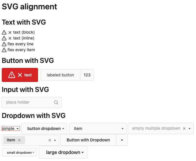
| |
The code can be as simple as:
```html
<div class="flex-text-block">{{svg "octicon-alert"}} {{svg "octicon-x"}} text (block)</div>
<div><div class="flex-text-inline">{{svg "octicon-alert"}} {{svg "octicon-x"}} text</div> (inline)</div>
<div><button class="ui red button">{{svg "octicon-alert" 24}} {{svg "octicon-x" 24}} text</button></div>
```
---------
Co-authored-by: Giteabot <teabot@gitea.io>
|
| |
|
|
|
|
|
|
|
|
|
|
|
|
|
|
|
|
|
|
|
|
|
|
|
|
|
|
|
|
|
|
| |
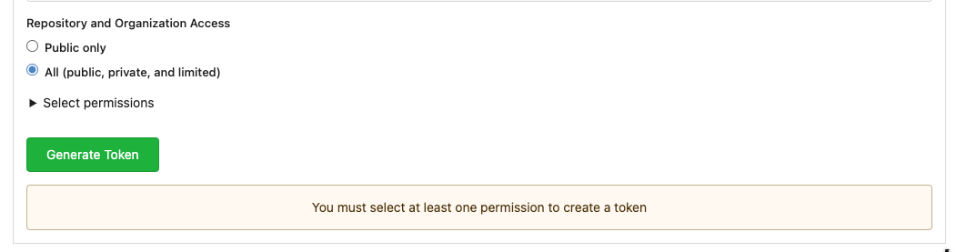
The current UI to create API access tokens uses checkboxes that have a
complicated relationship where some need to be checked and/or disabled
in certain states. It also requires that a user interact with it to
understand what their options really are.
This branch changes to use `<select>`s. It better fits the available
options, and it's closer to [GitHub's
UI](https://github.com/settings/personal-access-tokens/new), which is
good, in my opinion. It's more mobile friendly since the tap-areas are
larger. If we ever add more permissions, like Maintainer, there's a
natural place that doesn't take up more screen real-estate.
This branch also fixes a few minor issues:
- Hide the error about selecting at least one permission after second
submission
- Fix help description to call it "authorization" since that's what
permissions are about (not authentication)
Related: #24767.
<img width="883" alt="Screenshot 2023-06-07 at 5 07 34 PM"
src="https://github.com/go-gitea/gitea/assets/10803/6b63d807-c9be-4a4b-8e53-ecab6cbb8f76">
---
When it's open:
<img width="881" alt="Screenshot 2023-06-07 at 5 07 59 PM"
src="https://github.com/go-gitea/gitea/assets/10803/2432c6d0-39c2-4ca4-820e-c878ffdbfb69">
|
