| Commit message (Collapse) | Author | Age | Files | Lines |
|---|
| |
|
|
|
|
|
|
|
|
|
|
|
|
|
|
|
|
|
|
|
|
|
|
|
|
|
|
|
|
| |
Followup to https://github.com/go-gitea/gitea/pull/21784.
- Restore muted effect on timeline author and issuelist comment icon
- Remove whitespace inside shared user templates, fixing link hover
underline
- Use shared author link template more
- Use `bold` class instead of CSS
- Fix grey-light color being too dark on arc-green
- Add missing black-light color
- Fix issuelist progress bar color
- Fix various other cases of missing `.muted`
<img width="416" alt="Screenshot 2022-11-13 at 12 15 22"
src="https://user-images.githubusercontent.com/115237/201519497-1d4725c6-bc8b-47b5-9f68-1278ac9a8c92.png">
<img width="324" alt="Screenshot 2022-11-13 at 12 16 52"
src="https://user-images.githubusercontent.com/115237/201519501-c0d03700-f9af-4316-ab46-482f2c7c738b.png">
<img width="79" alt="Screenshot 2022-11-13 at 12 30 55"
src="https://user-images.githubusercontent.com/115237/201519502-46dc2d73-bbdf-4a2e-84d3-d2976f793163.png">
<img width="440" alt="Screenshot 2022-11-13 at 12 41 03"
src="https://user-images.githubusercontent.com/115237/201519876-ada33948-f84a-4aeb-a40d-5c873f9a49e9.png">
<img width="213" alt="Screenshot 2022-11-13 at 12 52 54"
src="https://user-images.githubusercontent.com/115237/201520291-a4d7238e-aeca-46c7-9008-8b644b1b676e.png">
<img width="208" alt="Screenshot 2022-11-13 at 12 56 16"
src="https://user-images.githubusercontent.com/115237/201520436-aa8ba109-b959-42fb-831a-021e806c7082.png">
Co-authored-by: Lauris BH <lauris@nix.lv>
Co-authored-by: techknowlogick <techknowlogick@gitea.io>
Co-authored-by: wxiaoguang <wxiaoguang@gmail.com>
|
| |
|
|
|
|
|
|
|
|
|
|
|
|
|
|
|
|
|
|
|
|
|
|
|
|
|
|
|
|
|
| |
Move the text color rules out of the unneeded `.ui` block, add missing
colors, tweak colors on arc-green to be more readable (red was
particulary bad to read).
Also, this removes the previous inheritance of link colors. I think
links should always be in primary color and if they are to be
discolored, the color should be set on them explicitely.
<img width="165" alt="Screenshot 2022-11-12 at 13 28 30"
src="https://user-images.githubusercontent.com/115237/201474098-700d9fed-3133-43c7-b57e-d4cc5c2795cb.png">
<img width="152" alt="Screenshot 2022-11-12 at 13 18 48"
src="https://user-images.githubusercontent.com/115237/201474156-b6de4cb5-bce8-4553-b3d4-8365aff9a3a7.png">
HTML to test with:
```html
<div class="text red">some text with <a href="#foo">a link</a>.</div>
<div class="text orange">some text with <a href="#foo">a link</a>.</div>
<div class="text yellow">some text with <a href="#foo">a link</a>.</div>
<div class="text olive">some text with <a href="#foo">a link</a>.</div>
<div class="text green">some text with <a href="#foo">a link</a>.</div>
<div class="text teal">some text with <a href="#foo">a link</a>.</div>
<div class="text blue">some text with <a href="#foo">a link</a>.</div>
<div class="text violet">some text with <a href="#foo">a link</a>.</div>
<div class="text purple">some text with <a href="#foo">a link</a>.</div>
<div class="text pink">some text with <a href="#foo">a link</a>.</div>
<div class="text brown">some text with <a href="#foo">a link</a>.</div>
<div class="text grey">some text with <a href="#foo">a link</a>.</div>
|
| |
|
| |
Add feature to easily copy CITATION.cff content in APA and BibTex format.
|
| |
|
|
|
|
|
|
|
|
|
|
|
|
|
|
|
|
| |
For each quote block, the first `**Note**` or `**Warning**` gets an icon
prepended to it and its text is colored accordingly. GitHub does this
(community/community#16925). [Initially requested on
Discord.](https://discord.com/channels/322538954119184384/322538954119184384/1038816475638661181)
### Before
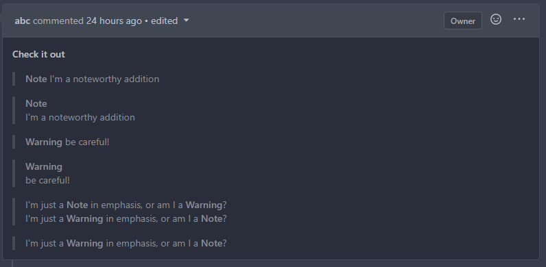
### After
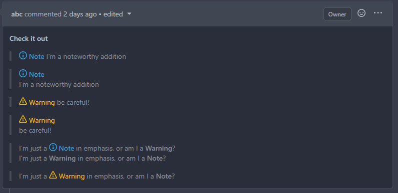
Signed-off-by: Yarden Shoham <hrsi88@gmail.com>
Co-authored-by: delvh <dev.lh@web.de>
Co-authored-by: silverwind <me@silverwind.io>
|
| |
|
|
|
|
|
|
|
|
|
|
|
|
|
|
|
|
|
|
|
| |
The install page has been somewhat inconsistently styled for a while.
This PR simplifies and standardises the styling of these fields makes
things line up better across widths.
Replace #21660
Signed-off-by: Andrew Thornton <art27@cantab.net>
Old:
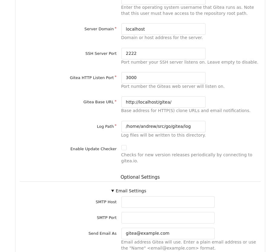
New:
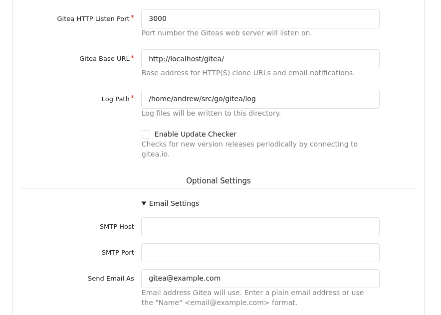
Signed-off-by: Andrew Thornton <art27@cantab.net>
|
| |
|
|
|
|
|
|
|
|
|
|
|
|
|
|
|
|
|
|
|
|
|
|
|
| |
Browsers introduce a opaque background on iframes if the iframe
element's color-scheme does not match the document's color scheme which
in case of a dark theme results in a mismatch and the browser adds a
white background. Avoid this by specifying the same color scheme outside
and inside the iframe.
See https://fvsch.com/transparent-iframes for more info.
My initial attempt was to make the iframe document the same color-scheme
as the parent page (light or dark) but with that, there was a ugly
background flash on load in Chrome because Chrome apparently always
loads iframe in light scheme initially. Firefox still shows a background
flash on load but this is not possible to get rid of and it's certainly
a browser bug.
Before:
<img width="1147" alt="Screen Shot 2022-10-31 at 13 30 55"
src="https://user-images.githubusercontent.com/115237/199017132-9828aace-bdd0-4ede-8118-359e72bcf2fe.png">
After:
<img width="1152" alt="Screen Shot 2022-10-31 at 13 30 36"
src="https://user-images.githubusercontent.com/115237/199017137-989a9e67-3fe0-445f-a191-df5bf290dabf.png">
|
| |
|
|
|
|
|
|
|
|
|
|
|
|
|
|
|
| |
This PR fixes the layout of PR status layouts on mobile. For longer
status context names or on very small screens the text would overflow
and push the "Details" and "Required" badges out of the container.
Before:
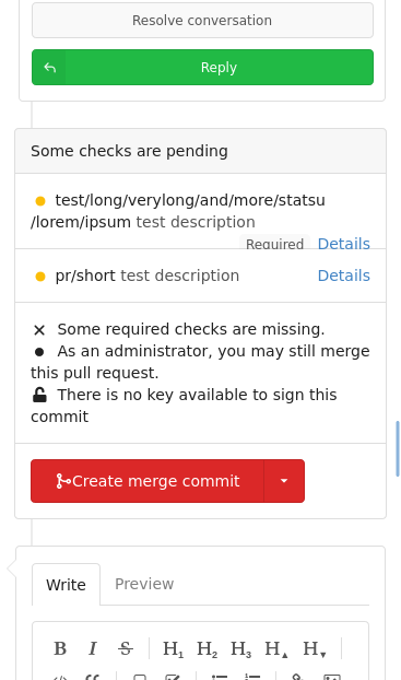
After:

Co-authored-by: Lunny Xiao <xiaolunwen@gmail.com>
|
| |
|
|
|
|
|
|
|
|
|
| |
- Update all JS dependencies to latest version
- Disable two redundant eslint rules
- Adapt stylelint config to codebase
- Regenerate SVGs
- Make file editor spinner "reserve" height so page does not shift
- Tested katex, swagger, monaco
Co-authored-by: Lunny Xiao <xiaolunwen@gmail.com>
Co-authored-by: 6543 <6543@obermui.de>
|
| |
|
|
|
|
|
|
|
|
|
|
|
|
|
|
|
|
|
|
|
|
| |
The
[`color-scheme`](https://developer.mozilla.org/en-US/docs/Web/CSS/color-scheme)
property changes the base color of certain form elements like the
datepicker icon in Chrome. Set it and remove the previous invert hack.
Before with invert removed:
<img width="840" alt="Screen Shot 2022-10-27 at 11 42 54"
src="https://user-images.githubusercontent.com/115237/198251927-b742e14e-0c62-492c-b667-ee6c69de4ad8.png">
<img width="238" alt="Screen Shot 2022-10-27 at 12 23 28"
src="https://user-images.githubusercontent.com/115237/198260413-37c1ca85-c2de-4c09-8b37-6aa8a23ab575.png">
After:
<img width="841" alt="Screen Shot 2022-10-27 at 11 43 05"
src="https://user-images.githubusercontent.com/115237/198251934-568fa291-0d18-4cd4-adec-58ae1ad90ab2.png">
<img width="839" alt="Screen Shot 2022-10-27 at 11 44 36"
src="https://user-images.githubusercontent.com/115237/198251936-a435105e-572b-41f6-8262-a53820f1d364.png">
<img width="243" alt="Screen Shot 2022-10-27 at 12 23 42"
src="https://user-images.githubusercontent.com/115237/198260432-5eaffc82-ffb8-4559-b1c2-08a39e8f4427.png">
Co-authored-by: Lunny Xiao <xiaolunwen@gmail.com>
|
| |
|
|
|
|
|
|
|
|
|
|
|
|
|
|
|
|
|
|
|
|
|
|
|
| |
- Fix placement of avatar image, this was not placed in the
`comment-header-left` and add CSS to cover the limiting of width+height
of avatar for code-review comment on "Files changed" page. This fixes
the big noticeable avatar issue.
- Apply `margin-bottom` to the "next" button, so it's consistent with
the "previous" button.
- Make sure the "next"/"previous" start at `flex-start` on mobile and
not off-screen at `flex-end`. As well force them to have `flex: 1` so
they won't overflow on x-asis. This also requires the `width: 100%` for
the `.ui.buttons` div.
- Resolves #20074
### Before
<details><img width="512"
src="https://user-images.githubusercontent.com/25481501/195952930-09560cad-419f-43a3-a8a4-a4166c117994.jpg"></details>
### After
<details><img width="512"
src="https://user-images.githubusercontent.com/25481501/197340081-0365dfa8-4344-46b4-8702-a40c778c073f.jpg"></details>
Co-authored-by: Lunny Xiao <xiaolunwen@gmail.com>
Co-authored-by: silverwind <me@silverwind.io>
|
| |
|
|
|
|
|
|
|
|
|
|
|
|
|
|
|
| |
Remove remaining non-color variables in arc-green, so the theme is now
100% defined from variables (excluding inverts). Adjusted red/green to
match previous overwritten colors.
`--color-gold-light` is removed, it was unused and is not part of
fomantic colors.
<img width="772" alt="Screen Shot 2022-10-24 at 20 22 25"
src="https://user-images.githubusercontent.com/115237/197599339-1d1bf6e3-aa90-4f38-9753-24effd4b178d.png">
<img width="275" alt="Screen Shot 2022-10-24 at 20 25 52"
src="https://user-images.githubusercontent.com/115237/197599344-79c1d3ac-c709-4e30-a60b-4738af672c12.png">
<img width="446" alt="Screen Shot 2022-10-24 at 20 26 46"
src="https://user-images.githubusercontent.com/115237/197599346-f2ef6449-7efd-4f81-bbb6-e7bee4528f50.png">
Co-authored-by: Lunny Xiao <xiaolunwen@gmail.com>
|
| |
|
|
|
|
|
|
|
|
|
|
|
|
|
|
| |
With https://github.com/go-gitea/gitea/pull/21428 we gained some space
so we are again able to show the "Go to File" button as text instead of
icon-only (the old icon was not particularily fitting anyways).
Before:
<img width="328" alt="image"
src="https://user-images.githubusercontent.com/115237/197334423-07731d9d-bf26-4aeb-95fa-490d9d0bf2a2.png">
After:
<img width="339" alt="Screen Shot 2022-10-22 at 12 28 01"
src="https://user-images.githubusercontent.com/115237/197334383-467c4107-09c9-4881-b75f-7f403eab7f3a.png">
<img width="413" alt="Screen Shot 2022-10-22 at 12 28 16"
src="https://user-images.githubusercontent.com/115237/197334384-f7d1fdda-a011-4138-ad1e-b52fc987501f.png">
|
| |
|
|
|
|
|
|
|
|
|
|
|
|
|
|
|
|
|
|
|
|
|
|
|
|
|
|
| |
- Add
[`accent-color`](https://developer.mozilla.org/en-US/docs/Web/CSS/accent-color)
which will change the color of various native HTML elements from
OS-color to specified one. Affects unstyled checkbox, radio, range and
progress
- Change `--color-accent` to `--color-primary-light-1`
- Change progress bar color to `--color-accent`
- Add new `--color-primary-contrast` meant to contrast over primary
- Avoid layout shift on clicking `.viewed-file-form`
- Add styles for `input[type=file]` upload button
<img width="301" alt="Screen Shot 2022-10-21 at 18 05 35"
src="https://user-images.githubusercontent.com/115237/197246896-7b3b5591-2934-4436-bf37-6aebcdfecb13.png">
<img width="98" alt="Screen Shot 2022-10-21 at 19 41 27"
src="https://user-images.githubusercontent.com/115237/197256892-c8fc6a0a-5d2f-4757-a98b-a79f9b7fcbc5.png">
<img width="93" alt="image"
src="https://user-images.githubusercontent.com/115237/197257029-293c02e9-ebf9-448a-a58f-ca418cf36953.png">
<img width="204" alt="Screen Shot 2022-10-21 at 18 21 24"
src="https://user-images.githubusercontent.com/115237/197246957-a99f5178-bbd5-4204-bd32-7a6977026f76.png">
<img width="449" alt="Screen Shot 2022-10-21 at 18 56 59"
src="https://user-images.githubusercontent.com/115237/197249305-d481abb7-9f16-4b48-936a-c75ed29f5b04.png">
<img width="449" alt="Screen Shot 2022-10-21 at 18 57 09"
src="https://user-images.githubusercontent.com/115237/197249309-7ab70c3b-325e-41bc-a4ba-07402c6826b6.png">
Co-authored-by: delvh <dev.lh@web.de>
Co-authored-by: Lunny Xiao <xiaolunwen@gmail.com>
|
| |
|
|
|
|
|
|
|
|
|
|
|
|
|
|
|
|
|
|
|
|
| |
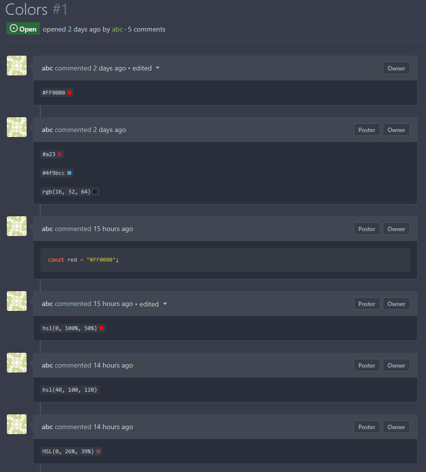
* Resolves #3047
Every time a color code will be in \`backticks`, a cute little color
preview will pop up
[Inspiration](https://docs.github.com/en/get-started/writing-on-github/getting-started-with-writing-and-formatting-on-github/basic-writing-and-formatting-syntax#supported-color-models)
#### Before
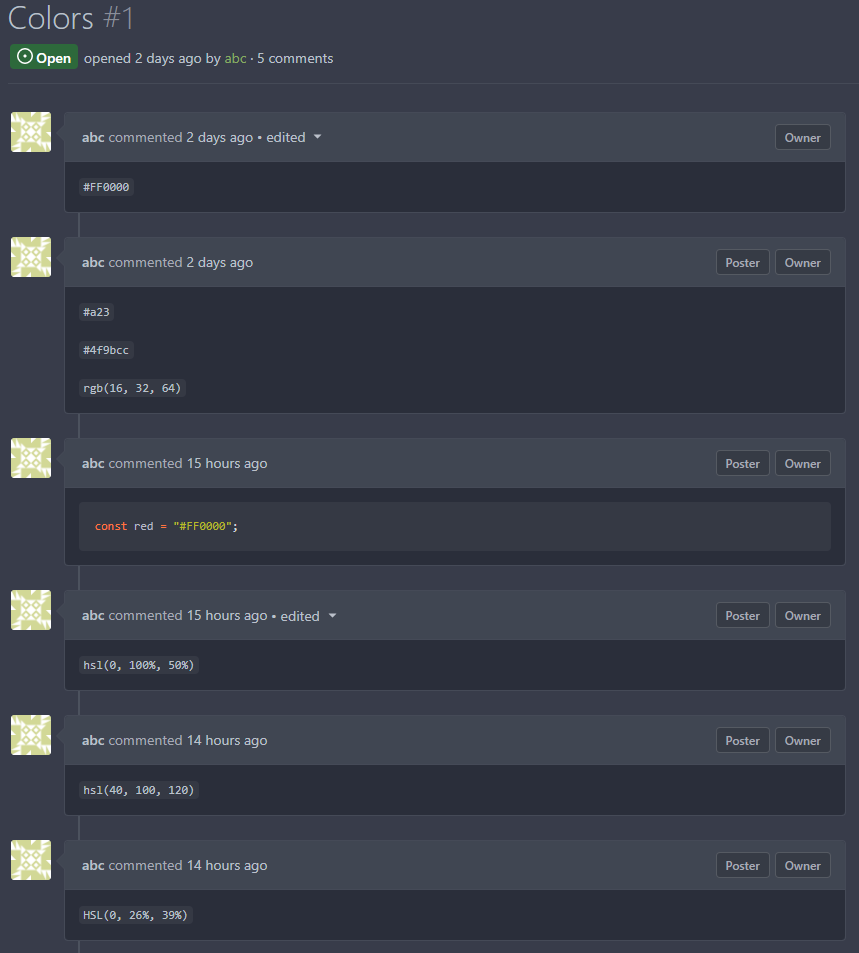
#### After
Signed-off-by: Yarden Shoham <hrsi88@gmail.com>
Co-authored-by: KN4CK3R <admin@oldschoolhack.me>
Co-authored-by: silverwind <me@silverwind.io>
Co-authored-by: Lunny Xiao <xiaolunwen@gmail.com>
|
| |
|
|
|
|
|
|
|
|
|
|
|
|
|
|
|
|
|
|
|
|
|
| |
Allows to add (not registered) team members by email.
related #5353
Invite by mail:
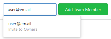
Pending invitations:
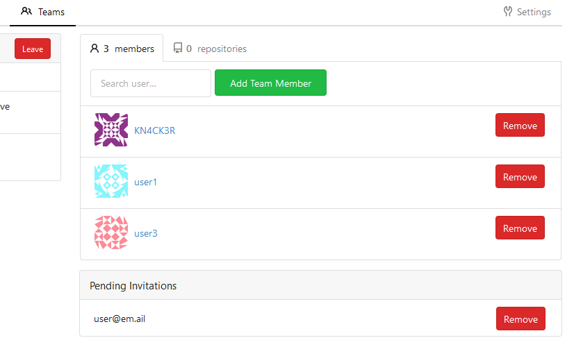
Email:
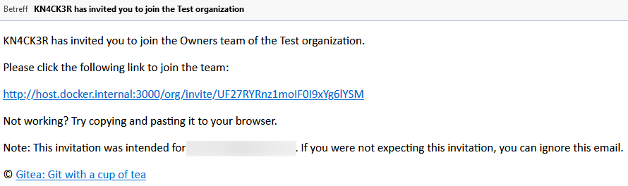
Join form:

Co-authored-by: Jack Hay <jjphay@gmail.com>
|
| |
|
|
| |
setting (#18058)
|
| |
|
|
|
|
|
|
|
|
|
|
| |
This changes the rendering logic of issue titles. If a substring in an
issue title is enclosed with a pair of backticks, it'll be rendered with
a monospace font (HTML `code` tag).
* Closes #20887
Signed-off-by: Yarden Shoham <hrsi88@gmail.com>
Co-authored-by: Gusted <williamzijl7@hotmail.com>
Co-authored-by: wxiaoguang <wxiaoguang@gmail.com>
Co-authored-by: 6543 <6543@obermui.de>
|
| |
|
|
|
|
|
|
|
|
|
|
|
|
|
|
|
|
|
|
| |
- Left-align the diff stat line again like previously.
- Default the file tree to collapsed view, which means the tree will
rendered initially collapsed and it may "pop in" via JS if enabled. I
think this is more desirable than having the empty space for the tree
"pop out" like it currently does.
- Mute the icon, removing color unless hovered.
- Increase icon size and vertically center it.
Before:
<img width="1271" alt="image"
src="https://user-images.githubusercontent.com/115237/195666451-55771595-0525-42b8-be1b-d03cc1cb2961.png">
After:
<img width="1280" alt="image"
src="https://user-images.githubusercontent.com/115237/195666385-c91fd0de-6dcc-4d9c-89ff-7581828fcf14.png">
Co-authored-by: wxiaoguang <wxiaoguang@gmail.com>
|
| |
|
|
|
|
|
|
|
|
|
|
|
|
|
|
|
| |
Move more colors into variables. The only real notable change is the dot
in the release timeline. Also, made the variable comments a bit more
clear.
<img width="279" alt="Screen Shot 2022-10-10 at 21 10 23"
src="https://user-images.githubusercontent.com/115237/194938496-e5a21056-67c4-4219-9c68-134b0edf0e61.png">
<img width="88" alt="Screen Shot 2022-10-10 at 21 31 53"
src="https://user-images.githubusercontent.com/115237/194939712-f666c43e-fb1a-4045-be52-1176391bd8ea.png">
<img width="90" alt="Screen Shot 2022-10-10 at 21 31 44"
src="https://user-images.githubusercontent.com/115237/194939710-2e620c06-75a9-41b7-a3e1-18eab7a57614.png">
Co-authored-by: wxiaoguang <wxiaoguang@gmail.com>
Co-authored-by: techknowlogick <techknowlogick@gitea.io>
|
| |
|
|
|
|
|
|
|
|
|
|
|
|
|
|
|
| |
This PR adds more space to the review screen on mobile so that comments
are more readable and less "squashed" an smaller screens.
Before:
After:
Co-authored-by: techknowlogick <techknowlogick@gitea.io>
Co-authored-by: Lauris BH <lauris@nix.lv>
|
| |
|
|
|
|
|
|
|
|
| |
Adds the settings pages to create OAuth2 apps also to the org settings
and allows to create apps for orgs.
Refactoring: the oauth2 related templates are shared for
instance-wide/org/user, and the backend code uses `OAuth2CommonHandlers`
to share code for instance-wide/org/user.
Co-authored-by: wxiaoguang <wxiaoguang@gmail.com>
|
| |
|
|
|
|
|
|
| |
At the moment, this is only used to replace the color of the `viewed`
checkbox and of the `has changed` label.
Previously, the used variable accentuated always either darker or
lighter, which meant that one theme looked good while the other didn't.
Co-authored-by: silverwind <me@silverwind.io>
|
| | |
|
| |
|
| |
Close #19902
|
| |
|
|
|
|
|
|
|
| |
- Consolidate various CSS rules into base rules
- Fix inline code in Markdown not having enough contrast on arc-green
Adds one new color variable, `--color-label-active-bg` for the
background of active labels.
Co-authored-by: wxiaoguang <wxiaoguang@gmail.com>
|
| |
|
| |
Fixes #21248
|
| |
|
|
|
|
|
|
|
|
|
|
|
|
| |
This PR adds a filetree to the left side of the files/diff view.
Initially the filetree will not be shown and may be shown via a new
"Show file tree" button.
Showing and hiding is using the same icon as github. Folders are
collapsible. On small devices (max-width 991 PX) the file tree will be
hidden.
Close #18192
Co-authored-by: wxiaoguang <wxiaoguang@gmail.com>
|
| |
|
|
|
|
|
|
|
|
|
|
|
|
|
| |
Use native `<input type="radio">` instead of fake icon font. The
`pointer-events: none` is necessary so the link click always takes
effect. Tested in Firefox, Safari and Chrome.
Before:
<img width="305" alt="Screen Shot 2022-08-27 at 20 42 11"
src="https://user-images.githubusercontent.com/115237/187044786-6655c766-c3fb-4672-9e3e-219b3ec4896c.png">
After:
<img width="298" alt="Screen Shot 2022-08-27 at 21 10 05"
src="https://user-images.githubusercontent.com/115237/187044790-33f87741-062e-4744-80b1-d3bd3fd725e3.png">
<img width="302" alt="image"
src="https://user-images.githubusercontent.com/115237/187044872-6c133cea-65ee-4ebd-b18a-a8b38c791565.png">
|
| |
|
|
|
|
| |
- Remove arc-green specific rules and instead fix the colors in the base
rules.
- Make file table row border visible on arc-green.
- Remove remnants of fomantic accordeon module that was removed.
|
| |
|
|
|
|
|
|
|
|
|
|
|
|
| |
The problem was that many PR review components loaded by `Show more`
received the same ID as previous batches, which confuses browsers (when
clicked). All such occurrences should now be fixed.
Additionally improved the background of the `viewed` checkbox.
Lastly, the `go-licenses.json` was automatically updated.
Fixes #21228.
Fixes #20681.
Co-authored-by: wxiaoguang <wxiaoguang@gmail.com>
|
| |
|
|
|
| |
Fomantic has abrupt breakpoints at 991px and 768px which leads to
variable amounts of wasted screen space below those breakpoints.
Instead, enable fluid width for all viewport sizes below 1200px.
|
| |
|
|
|
|
|
|
|
|
|
|
| |
- Remove non-matching selector
- Set font-size on parent so `.mono` can correctly reduce it
Before (font subjectively too big):
<img width="1270" alt="Screenshot 2022-09-15 at 19 03 56"
src="https://user-images.githubusercontent.com/115237/190466867-283e9c23-cbfa-457e-8dbe-94902e886cc7.png">
After:
<img width="1266" alt="image"
src="https://user-images.githubusercontent.com/115237/190467290-eb392007-5db2-4ab0-a5be-e7cfe4618dcc.png">
|
| |
|
|
|
|
|
|
|
|
|
|
|
|
|
|
|
|
|
|
| |
This PR adds mathematical rendering with KaTeX.
The first step is to add a Goldmark extension that detects the latex
(and tex) mathematics delimiters.
The second step to make this extension only run if math support is
enabled.
The second step is to then add KaTeX CSS and JS to the head which will
load after the dom is rendered.
Fix #3445
Signed-off-by: Andrew Thornton <art27@cantab.net>
Signed-off-by: Andrew Thornton <art27@cantab.net>
Co-authored-by: silverwind <me@silverwind.io>
Co-authored-by: Lunny Xiao <xiaolunwen@gmail.com>
|
| |
|
|
|
|
|
|
|
| |
Remove this small, but unnecessary
[module](https://fomantic-ui.com/elements/image.html) and use `img`
selector over previous `.image`. Did a few tests, could not notice any
visual regression.
Co-authored-by: 6543 <6543@obermui.de>
Co-authored-by: Lauris BH <lauris@nix.lv>
|
| |
|
|
|
|
|
|
|
|
|
|
|
|
|
|
|
|
|
|
|
| |
- Show popover on hover/focus (tippy default) instead of click
- If there is only one status, add href to trigger element
- Increase tippy
[interactiveBorder](https://atomiks.github.io/tippyjs/v6/all-props/#interactiveborder),
making it easier to keep interactive tooltips open with sloppy mouse
movement
- Fix a overflow issue in the commit list
Commit list before:
<img width="459" alt="Screen Shot 2022-09-09 at 19 00 01"
src="https://user-images.githubusercontent.com/115237/189405517-68de5a69-e312-4ea2-ab81-87629db6064b.png">
Commit List after:
<img width="475" alt="Screen Shot 2022-09-09 at 19 01 43"
src="https://user-images.githubusercontent.com/115237/189405574-13e84885-9073-4f86-9eeb-d008c1639647.png">
Co-authored-by: 6543 <6543@obermui.de>
Co-authored-by: techknowlogick <techknowlogick@gitea.io>
|
| |
|
|
|
|
|
|
|
|
|
|
|
| |
- Increase contrasts overall
- Add various missing theme classes
- Ensure strings and constants are colored the same across languages
Before:
<img width="575" alt="Screen Shot 2022-09-03 at 15 20 19" src="https://user-images.githubusercontent.com/115237/188272267-c3af3de0-a1d9-4a80-a3ab-278e9b04cb44.png">
<img width="705" alt="Screen Shot 2022-09-03 at 15 10 12" src="https://user-images.githubusercontent.com/115237/188272194-dc40ac7d-1629-44a0-a881-5f0922285195.png">
After:
<img width="579" alt="Screen Shot 2022-09-03 at 15 19 31" src="https://user-images.githubusercontent.com/115237/188272275-55b87bc7-1122-410f-9250-14cf9e973124.png">
<img width="703" alt="image" src="https://user-images.githubusercontent.com/115237/188272715-a5fcd180-c5dc-4303-8e77-de785d5e0937.png">
|
| |
|
|
|
|
|
|
|
|
|
|
|
|
|
|
|
|
|
|
|
|
|
|
|
|
|
|
|
|
|
|
|
|
|
|
|
|
|
|
|
|
|
|
|
|
|
|
|
|
|
|
|
|
|
|
|
|
|
|
|
|
|
|
|
|
|
|
|
|
|
|
|
|
|
|
|
|
|
|
|
|
|
|
|
|
|
|
|
|
|
| |
* feat: extend issue template for yaml
* feat: support yaml template
* feat: render form to markdown
* feat: support yaml template for pr
* chore: rename to Fields
* feat: template unmarshal
* feat: split template
* feat: render to markdown
* feat: use full name as template file name
* chore: remove useless file
* feat: use dropdown of fomantic ui
* feat: update input style
* docs: more comments
* fix: render text without render
* chore: fix lint error
* fix: support use description as about in markdown
* fix: add field class in form
* chore: generate swagger
* feat: validate template
* feat: support is_nummber and regex
* test: fix broken unit tests
* fix: ignore empty body of md template
* fix: make multiple easymde editors work in one page
* feat: better UI
* fix: js error in pr form
* chore: generate swagger
* feat: support regex validation
* chore: generate swagger
* fix: refresh each markdown editor
* chore: give up required validation
* fix: correct issue template candidates
* fix: correct checkboxes style
* chore: ignore .hugo_build.lock in docs
* docs: separate out a new doc for merge templates
* docs: introduce syntax of yaml template
* feat: show a alert for invalid templates
* test: add case for a valid template
* fix: correct attributes of required checkbox
* fix: add class not-under-easymde for dropzone
* fix: use more back-quotes
* chore: remove translation in zh-CN
* fix EasyMDE statusbar margin
* fix: remove repeated blocks
* fix: reuse regex for quotes
Co-authored-by: wxiaoguang <wxiaoguang@gmail.com>
|
| |
|
|
| |
Co-authored-by: John Olheiser <john.olheiser@gmail.com>
Co-authored-by: Lunny Xiao <xiaolunwen@gmail.com>
|
| |
|
|
|
| |
The layout on the review code view was broken depending on length of the text. Change all three buttons to icons with tooltip to make more space for these long texts.
Fixes: #20922
|
| |
|
|
|
|
|
| |
Adds a new option to only show relevant repo's on the explore page, for bigger Gitea instances like Codeberg this is a nice option to enable to make the explore page more populated with unique and "high" quality repo's. A note is shown that the results are filtered and have the possibility to see the unfiltered results.
Co-authored-by: vednoc <vednoc@protonmail.com>
Co-authored-by: delvh <dev.lh@web.de>
Co-authored-by: 6543 <6543@obermui.de>
|
| | |
|
| | |
|
| |
|
|
|
| |
Co-authored-by: silverwind <me@silverwind.io>
Co-authored-by: zeripath <art27@cantab.net>
Co-authored-by: John Olheiser <john.olheiser@gmail.com>
|
| |
|
|
|
|
|
|
|
|
|
|
|
|
|
|
| |
- Since
https://github.com/go-gitea/gitea/commit/b9e8fa5beb300eac7bd0623c9d7201a9e3a92a4a
the avatar will be inlined into the comment header, so there's more room
for the actual comment container(thus more text per line in the comment
body). However this didn't take into consideration that the flex didn't
allow any wrapping and thus was shrinking the avatar. Well this isn't a
perfect solution, as you ideally all want these elements to be
individually wrapped(such that `comment-header-right` can be on the same
line as `comment-header-left`, which now causes a new line in certain
situations). It's a better solution than the current CSS and to not
mess with the desktop CSS/HTML.
Co-authored-by: Lauris BH <lauris@nix.lv>
Co-authored-by: zeripath <art27@cantab.net>
|
| |
|
|
|
|
|
|
|
|
|
|
|
|
|
| |
This PR rewrites the invisible unicode detection algorithm to more
closely match that of the Monaco editor on the system. It provides a
technique for detecting ambiguous characters and relaxes the detection
of combining marks.
Control characters are in addition detected as invisible in this
implementation whereas they are not on monaco but this is related to
font issues.
Close #19913
Signed-off-by: Andrew Thornton <art27@cantab.net>
|
| |
|
|
|
|
|
|
|
|
|
|
|
|
|
|
|
|
|
|
|
|
| |
* Make branch icon stand out more
- Currently the branch icon is "squashed" between the two branch names
and feels a bit "amateur-ish" to my feeling(relative to other UI
elements).
- This patch tries to improve that by making the icon bigger
and by adding some margin to not have a "squashed" icon.
- This patch also includes a "fix", for some reason this symbol is not
centering correctly within the span(or without for that matter), so
simply manually patch this by adding `bottom: 1.px`.
* Use svg
* Apply suggestion
Co-authored-by: silverwind <me@silverwind.io>
Co-authored-by: silverwind <me@silverwind.io>
Co-authored-by: Lunny Xiao <xiaolunwen@gmail.com>
Co-authored-by: techknowlogick <techknowlogick@gitea.io>
|
| |
|
|
|
|
| |
Previous solution that re-purposed the 'hide' class by making it
`!important` had various unintended side-effects where jQuery .show() was
not able to outweight it. Use a separate class to prevent these
interactions.
|
| |
|
|
|
| |
https://mcaptcha.org/
Co-authored-by: Felipe Leopoldo Sologuren Gutiérrez <fsologureng@users.noreply.github.com>
|
| |
|
|
|
|
|
|
| |
- replace fomantic popup module with tippy.js
- fix chaining and add comment
- add 100ms delay to tooltips
- stopwatch improvments, raise default maxWidth
- update web_src/js/features/common-global.js
- use type=submit instead of js
|
| |
|
|
|
|
|
|
|
|
|
|
|
|
|
|
|
| |
* Rework repo buttons
- Replace "New PR" and "Go to File" button with Icon Button
- Move all "Add File" actions into a dropdown button
- Remove most custom styling of clone buttons
- Margin and wiki tweaks
Buttons are now all equal height, mobile layout wraps gracefully.
Fixes: https://github.com/go-gitea/gitea/issues/13671
Replaces: https://github.com/go-gitea/gitea/pull/20375
Co-authored-by: Lauris BH <lauris@nix.lv>
Co-authored-by: zeripath <art27@cantab.net>
Co-authored-by: Lunny Xiao <xiaolunwen@gmail.com>
|
