| Commit message (Collapse) | Author | Age | Files | Lines |
|---|
| |
|
|
| |
setting (#18058)
|
| | |
|
| |
|
|
|
|
|
|
|
|
|
|
| |
This changes the rendering logic of issue titles. If a substring in an
issue title is enclosed with a pair of backticks, it'll be rendered with
a monospace font (HTML `code` tag).
* Closes #20887
Signed-off-by: Yarden Shoham <hrsi88@gmail.com>
Co-authored-by: Gusted <williamzijl7@hotmail.com>
Co-authored-by: wxiaoguang <wxiaoguang@gmail.com>
Co-authored-by: 6543 <6543@obermui.de>
|
| |
|
|
|
|
|
|
|
|
|
|
|
|
| |
Even if we are not bundling with `vite` yet, we can use `vitest` in
place of Jest which brings a few benefits like not requiring to use
`NODE_OPTIONS` to run and having sane module resolution.
It's possible to also use `jest-extended` with vitest, but I opted to
not do so for now because it brings heavyweight dependencies and it was
trivial to just rewrite the affected matchers to be compatible.
This PR also removes 153 JS dependencies, which is certainly nice.
Co-authored-by: 6543 <6543@obermui.de>
Co-authored-by: wxiaoguang <wxiaoguang@gmail.com>
|
| |
|
|
|
|
|
|
|
|
|
|
|
|
|
|
|
|
|
|
| |
- Left-align the diff stat line again like previously.
- Default the file tree to collapsed view, which means the tree will
rendered initially collapsed and it may "pop in" via JS if enabled. I
think this is more desirable than having the empty space for the tree
"pop out" like it currently does.
- Mute the icon, removing color unless hovered.
- Increase icon size and vertically center it.
Before:
<img width="1271" alt="image"
src="https://user-images.githubusercontent.com/115237/195666451-55771595-0525-42b8-be1b-d03cc1cb2961.png">
After:
<img width="1280" alt="image"
src="https://user-images.githubusercontent.com/115237/195666385-c91fd0de-6dcc-4d9c-89ff-7581828fcf14.png">
Co-authored-by: wxiaoguang <wxiaoguang@gmail.com>
|
| |
|
|
| |
The only usage of `appVer` was in serviceworker.js, while indeed it
needs the asset version.
|
| |
|
|
|
|
|
|
|
|
|
|
|
|
|
|
|
|
|
|
|
|
|
|
|
|
|
|
|
|
|
|
|
|
|
|
|
|
|
|
|
|
|
|
|
|
|
|
|
|
|
|
|
|
|
|
|
|
| |
page (#21410)
# Description
Previously, to make the date range understood by all, we used the format
"2006-01-02" for the dates as it's locale-generic.
This commit changes the rendering logic. Instead of rendering the date
on the server, we send a formatted computer-readable timestamp. The
client's javascript then renders it according to the user's locale.
This approach is reusable across the codebase, any `<time></time>` tag
with the data-format="date" attribute would get rendered according to
the user's chosen locale.
## Previous View

## New View
### English

### French

### Portuguese

### Italian

# References
* #21380
* #21387
* #21396
Inspiration:
I think either differentiating by class, or probably better by a custom
attribute such as `data-format` or similar, is the best course of
action.
_Originally posted by @delvh in
https://github.com/go-gitea/gitea/issues/21396#issuecomment-1274424788_
Resolves #21380
Signed-off-by: Yarden Shoham <hrsi88@gmail.com>
Co-authored-by: silverwind <me@silverwind.io>
|
| |
|
|
|
|
|
|
|
|
|
|
|
|
|
|
|
| |
Move more colors into variables. The only real notable change is the dot
in the release timeline. Also, made the variable comments a bit more
clear.
<img width="279" alt="Screen Shot 2022-10-10 at 21 10 23"
src="https://user-images.githubusercontent.com/115237/194938496-e5a21056-67c4-4219-9c68-134b0edf0e61.png">
<img width="88" alt="Screen Shot 2022-10-10 at 21 31 53"
src="https://user-images.githubusercontent.com/115237/194939712-f666c43e-fb1a-4045-be52-1176391bd8ea.png">
<img width="90" alt="Screen Shot 2022-10-10 at 21 31 44"
src="https://user-images.githubusercontent.com/115237/194939710-2e620c06-75a9-41b7-a3e1-18eab7a57614.png">
Co-authored-by: wxiaoguang <wxiaoguang@gmail.com>
Co-authored-by: techknowlogick <techknowlogick@gitea.io>
|
| |
|
|
|
|
|
|
|
|
|
|
|
|
|
|
|
| |
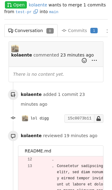
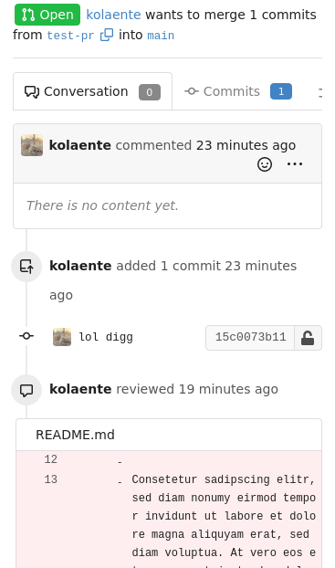
This PR adds more space to the review screen on mobile so that comments
are more readable and less "squashed" an smaller screens.
Before:

After:

Co-authored-by: techknowlogick <techknowlogick@gitea.io>
Co-authored-by: Lauris BH <lauris@nix.lv>
|
| |
|
|
|
|
|
|
| |
- Update all JS dependencies and playwright image
- Add new eslint rules, enable a few more, fix issues
- Regenerate SVGs
- Tested Vue and Swagger
Co-authored-by: wxiaoguang <wxiaoguang@gmail.com>
|
| |
|
|
|
|
|
|
|
|
| |
Adds the settings pages to create OAuth2 apps also to the org settings
and allows to create apps for orgs.
Refactoring: the oauth2 related templates are shared for
instance-wide/org/user, and the backend code uses `OAuth2CommonHandlers`
to share code for instance-wide/org/user.
Co-authored-by: wxiaoguang <wxiaoguang@gmail.com>
|
| |
|
| |
Signed-off-by: Yarden Shoham <hrsi88@gmail.com>
|
| |
|
|
|
|
|
|
|
|
|
|
|
|
|
|
|
|
|
|
|
|
|
|
|
|
|
|
|
| |
This PR is for:
* https://github.com/go-gitea/gitea/issues/20231
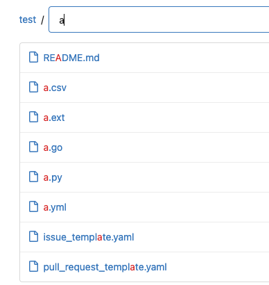
Now, when a user searches `word`, they always see `/{word}.txt` before
`/{w}e-g{o}t-{r}esult.{d}at`
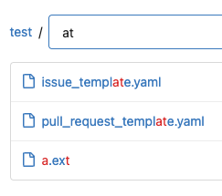
Demo:
When searching "a", "a.ext" comes first.
Then when searching "at", the longer matched "template" comes first.
<details>


</details>
This PR also makes the frontend tests could import feature JS files by
introducing `jestSetup.js`
Co-authored-by: delvh <dev.lh@web.de>
Co-authored-by: silverwind <me@silverwind.io>
|
| |
|
|
|
|
|
|
| |
At the moment, this is only used to replace the color of the `viewed`
checkbox and of the `has changed` label.
Previously, the used variable accentuated always either darker or
lighter, which meant that one theme looked good while the other didn't.
Co-authored-by: silverwind <me@silverwind.io>
|
| | |
|
| |
|
| |
Close #19902
|
| |
|
|
|
|
|
|
|
| |
- Consolidate various CSS rules into base rules
- Fix inline code in Markdown not having enough contrast on arc-green
Adds one new color variable, `--color-label-active-bg` for the
background of active labels.
Co-authored-by: wxiaoguang <wxiaoguang@gmail.com>
|
| |
|
|
|
|
|
|
|
|
|
|
|
| |
This (short) PR builds upon #15028 and makes the file search
case-insensitive.
Previously, having a file named `TestFile.cs` would not be shown if
`test` was typed in the search box.
This now changes the matching function to be case-insensitive (without
affecting the UI).
The matching function, `strSubMatch`, is only used for this feature (it
has been introduced by #15028), meaning that this PR does not affect the
behaviour of any unrelated functionality of Gitea.
|
| |
|
| |
Fixes #21248
|
| |
|
|
|
|
|
|
|
|
|
|
|
|
| |
This PR adds a filetree to the left side of the files/diff view.
Initially the filetree will not be shown and may be shown via a new
"Show file tree" button.
Showing and hiding is using the same icon as github. Folders are
collapsible. On small devices (max-width 991 PX) the file tree will be
hidden.
Close #18192
Co-authored-by: wxiaoguang <wxiaoguang@gmail.com>
|
| |
|
|
|
|
|
|
|
|
|
|
|
|
|
| |
Use native `<input type="radio">` instead of fake icon font. The
`pointer-events: none` is necessary so the link click always takes
effect. Tested in Firefox, Safari and Chrome.
Before:
<img width="305" alt="Screen Shot 2022-08-27 at 20 42 11"
src="https://user-images.githubusercontent.com/115237/187044786-6655c766-c3fb-4672-9e3e-219b3ec4896c.png">
After:
<img width="298" alt="Screen Shot 2022-08-27 at 21 10 05"
src="https://user-images.githubusercontent.com/115237/187044790-33f87741-062e-4744-80b1-d3bd3fd725e3.png">
<img width="302" alt="image"
src="https://user-images.githubusercontent.com/115237/187044872-6c133cea-65ee-4ebd-b18a-a8b38c791565.png">
|
| |
|
|
|
|
| |
- Remove arc-green specific rules and instead fix the colors in the base
rules.
- Make file table row border visible on arc-green.
- Remove remnants of fomantic accordeon module that was removed.
|
| |
|
|
|
|
|
|
|
|
|
|
|
|
| |
The problem was that many PR review components loaded by `Show more`
received the same ID as previous batches, which confuses browsers (when
clicked). All such occurrences should now be fixed.
Additionally improved the background of the `viewed` checkbox.
Lastly, the `go-licenses.json` was automatically updated.
Fixes #21228.
Fixes #20681.
Co-authored-by: wxiaoguang <wxiaoguang@gmail.com>
|
| |
|
|
|
| |
Fomantic has abrupt breakpoints at 991px and 768px which leads to
variable amounts of wasted screen space below those breakpoints.
Instead, enable fluid width for all viewport sizes below 1200px.
|
| |
|
|
|
|
|
|
|
|
|
|
| |
- Remove non-matching selector
- Set font-size on parent so `.mono` can correctly reduce it
Before (font subjectively too big):
<img width="1270" alt="Screenshot 2022-09-15 at 19 03 56"
src="https://user-images.githubusercontent.com/115237/190466867-283e9c23-cbfa-457e-8dbe-94902e886cc7.png">
After:
<img width="1266" alt="image"
src="https://user-images.githubusercontent.com/115237/190467290-eb392007-5db2-4ab0-a5be-e7cfe4618dcc.png">
|
| |
|
|
|
|
|
|
|
|
|
|
|
|
|
|
|
|
|
|
| |
This PR adds mathematical rendering with KaTeX.
The first step is to add a Goldmark extension that detects the latex
(and tex) mathematics delimiters.
The second step to make this extension only run if math support is
enabled.
The second step is to then add KaTeX CSS and JS to the head which will
load after the dom is rendered.
Fix #3445
Signed-off-by: Andrew Thornton <art27@cantab.net>
Signed-off-by: Andrew Thornton <art27@cantab.net>
Co-authored-by: silverwind <me@silverwind.io>
Co-authored-by: Lunny Xiao <xiaolunwen@gmail.com>
|
| |
|
|
|
|
|
|
|
| |
Remove this small, but unnecessary
[module](https://fomantic-ui.com/elements/image.html) and use `img`
selector over previous `.image`. Did a few tests, could not notice any
visual regression.
Co-authored-by: 6543 <6543@obermui.de>
Co-authored-by: Lauris BH <lauris@nix.lv>
|
| |
|
|
|
|
|
|
|
|
|
|
|
|
|
|
|
|
|
|
|
| |
- Show popover on hover/focus (tippy default) instead of click
- If there is only one status, add href to trigger element
- Increase tippy
[interactiveBorder](https://atomiks.github.io/tippyjs/v6/all-props/#interactiveborder),
making it easier to keep interactive tooltips open with sloppy mouse
movement
- Fix a overflow issue in the commit list
Commit list before:
<img width="459" alt="Screen Shot 2022-09-09 at 19 00 01"
src="https://user-images.githubusercontent.com/115237/189405517-68de5a69-e312-4ea2-ab81-87629db6064b.png">
Commit List after:
<img width="475" alt="Screen Shot 2022-09-09 at 19 01 43"
src="https://user-images.githubusercontent.com/115237/189405574-13e84885-9073-4f86-9eeb-d008c1639647.png">
Co-authored-by: 6543 <6543@obermui.de>
Co-authored-by: techknowlogick <techknowlogick@gitea.io>
|
| |
|
|
|
|
|
|
|
|
|
|
|
| |
- Increase contrasts overall
- Add various missing theme classes
- Ensure strings and constants are colored the same across languages
Before:
<img width="575" alt="Screen Shot 2022-09-03 at 15 20 19" src="https://user-images.githubusercontent.com/115237/188272267-c3af3de0-a1d9-4a80-a3ab-278e9b04cb44.png">
<img width="705" alt="Screen Shot 2022-09-03 at 15 10 12" src="https://user-images.githubusercontent.com/115237/188272194-dc40ac7d-1629-44a0-a881-5f0922285195.png">
After:
<img width="579" alt="Screen Shot 2022-09-03 at 15 19 31" src="https://user-images.githubusercontent.com/115237/188272275-55b87bc7-1122-410f-9250-14cf9e973124.png">
<img width="703" alt="image" src="https://user-images.githubusercontent.com/115237/188272715-a5fcd180-c5dc-4303-8e77-de785d5e0937.png">
|
| |
|
|
|
|
|
|
| |
Fixes an issue where users would not be able to select by pressing the down arrow when using @TAG above a message
Bug videos:
https://user-images.githubusercontent.com/1255041/188095999-c4ccde18-e53b-4251-8a14-d90c4042d768.mp4
|
| |
|
|
| |
Each repo has a bar which shows the used programming languages. If you want to know, what language is behind a color, you need to click the bar. With this PR, you just need to hover over the color the view the name.
|
| |
|
|
|
|
|
|
|
|
|
|
|
|
|
|
|
|
|
|
|
|
|
|
|
|
|
|
|
|
|
|
|
|
|
|
|
|
|
|
|
|
|
|
|
|
|
|
|
|
|
|
|
|
|
|
|
|
|
|
|
|
|
|
|
|
|
|
|
|
|
|
|
|
|
|
|
|
|
|
|
|
|
|
|
|
|
|
|
|
|
| |
* feat: extend issue template for yaml
* feat: support yaml template
* feat: render form to markdown
* feat: support yaml template for pr
* chore: rename to Fields
* feat: template unmarshal
* feat: split template
* feat: render to markdown
* feat: use full name as template file name
* chore: remove useless file
* feat: use dropdown of fomantic ui
* feat: update input style
* docs: more comments
* fix: render text without render
* chore: fix lint error
* fix: support use description as about in markdown
* fix: add field class in form
* chore: generate swagger
* feat: validate template
* feat: support is_nummber and regex
* test: fix broken unit tests
* fix: ignore empty body of md template
* fix: make multiple easymde editors work in one page
* feat: better UI
* fix: js error in pr form
* chore: generate swagger
* feat: support regex validation
* chore: generate swagger
* fix: refresh each markdown editor
* chore: give up required validation
* fix: correct issue template candidates
* fix: correct checkboxes style
* chore: ignore .hugo_build.lock in docs
* docs: separate out a new doc for merge templates
* docs: introduce syntax of yaml template
* feat: show a alert for invalid templates
* test: add case for a valid template
* fix: correct attributes of required checkbox
* fix: add class not-under-easymde for dropzone
* fix: use more back-quotes
* chore: remove translation in zh-CN
* fix EasyMDE statusbar margin
* fix: remove repeated blocks
* fix: reuse regex for quotes
Co-authored-by: wxiaoguang <wxiaoguang@gmail.com>
|
| |
|
|
| |
Co-authored-by: John Olheiser <john.olheiser@gmail.com>
Co-authored-by: Lunny Xiao <xiaolunwen@gmail.com>
|
| |
|
|
|
|
|
|
|
|
|
|
|
|
|
|
|
|
| |
* Add support for Vagrant boxes.
* Add authentication.
* Add tests.
* Add integration tests.
* Add docs.
* Add icons.
* Update routers/api/packages/api.go
Co-authored-by: Lauris BH <lauris@nix.lv>
Co-authored-by: 6543 <6543@obermui.de>
|
| |
|
|
|
| |
The layout on the review code view was broken depending on length of the text. Change all three buttons to icons with tooltip to make more space for these long texts.
Fixes: #20922
|
| |
|
|
|
|
|
| |
Adds a new option to only show relevant repo's on the explore page, for bigger Gitea instances like Codeberg this is a nice option to enable to make the explore page more populated with unique and "high" quality repo's. A note is shown that the results are filtered and have the possibility to see the unfiltered results.
Co-authored-by: vednoc <vednoc@protonmail.com>
Co-authored-by: delvh <dev.lh@web.de>
Co-authored-by: 6543 <6543@obermui.de>
|
| |
|
|
|
|
|
| |
Tippy allows HTML strings to be passed as content but we do not use this
feature (we do pass HTML only as Element), so it's better to disable it
for increased security.
Ref: https://atomiks.github.io/tippyjs/v6/html-content/#string
|
| |
|
|
|
| |
This should solve the main problem of dynamic assets getting stale after
a version upgrade. Everything not affected will use query-string based
cache busting, which includes files loaded via HTML or worker scripts.
|
| | |
|
| | |
|
| |
|
|
|
| |
Co-authored-by: silverwind <me@silverwind.io>
Co-authored-by: zeripath <art27@cantab.net>
Co-authored-by: John Olheiser <john.olheiser@gmail.com>
|
| |
|
|
|
|
|
| |
When writing html in tribute.js ensure that strings are properly escaped.
Signed-off-by: Andrew Thornton <art27@cantab.net>
Signed-off-by: Andrew Thornton <art27@cantab.net>
|
| |
|
|
|
|
|
|
|
|
| |
* Fix tooltip init after review
Previous code passed a jQuery collection which initTooltip couldn't
handle. Instead, iterate the individial matched elements and add a
dollar to the variable name to make it clear it's jQuery.
Fixes: https://github.com/go-gitea/gitea/issues/20809
|
| |
|
|
|
|
|
|
|
|
|
|
|
|
|
|
| |
- Since
https://github.com/go-gitea/gitea/commit/b9e8fa5beb300eac7bd0623c9d7201a9e3a92a4a
the avatar will be inlined into the comment header, so there's more room
for the actual comment container(thus more text per line in the comment
body). However this didn't take into consideration that the flex didn't
allow any wrapping and thus was shrinking the avatar. Well this isn't a
perfect solution, as you ideally all want these elements to be
individually wrapped(such that `comment-header-right` can be on the same
line as `comment-header-left`, which now causes a new line in certain
situations). It's a better solution than the current CSS and to not
mess with the desktop CSS/HTML.
Co-authored-by: Lauris BH <lauris@nix.lv>
Co-authored-by: zeripath <art27@cantab.net>
|
| |
|
|
|
|
|
|
|
|
|
|
|
|
|
| |
This PR rewrites the invisible unicode detection algorithm to more
closely match that of the Monaco editor on the system. It provides a
technique for detecting ambiguous characters and relaxes the detection
of combining marks.
Control characters are in addition detected as invisible in this
implementation whereas they are not on monaco but this is related to
font issues.
Close #19913
Signed-off-by: Andrew Thornton <art27@cantab.net>
|
| |
|
|
|
|
|
|
|
|
|
| |
This operation that shifts the content from title to data-content is
useless when we can directly render the expected HTML instead.
This change does prevent these tooltips from working when the user has
JS disabled in their browser, but I think we made it clear by now that
JS is required for gitea to work properly.
Co-authored-by: Lunny Xiao <xiaolunwen@gmail.com>
Co-authored-by: techknowlogick <techknowlogick@gitea.io>
|
| |
|
|
|
|
|
| |
It seemed a tad to big compared to other icons. Shrink it slightly.
Co-authored-by: Lauris BH <lauris@nix.lv>
Co-authored-by: Lunny Xiao <xiaolunwen@gmail.com>
Co-authored-by: techknowlogick <techknowlogick@gitea.io>
|
| |
|
|
|
|
|
|
| |
Previously, if a invalid form was submitted (for example issue with no
title), the form could not be re-submitted again because the button
would not stay stuck in loading state. Fix that by hooking the 'submit'
event instead which triggers only when the form is valid.
Co-authored-by: Lunny Xiao <xiaolunwen@gmail.com>
|
| |
|
|
|
|
|
|
|
|
|
|
|
|
|
|
|
|
|
|
|
|
| |
* Make branch icon stand out more
- Currently the branch icon is "squashed" between the two branch names
and feels a bit "amateur-ish" to my feeling(relative to other UI
elements).
- This patch tries to improve that by making the icon bigger
and by adding some margin to not have a "squashed" icon.
- This patch also includes a "fix", for some reason this symbol is not
centering correctly within the span(or without for that matter), so
simply manually patch this by adding `bottom: 1.px`.
* Use svg
* Apply suggestion
Co-authored-by: silverwind <me@silverwind.io>
Co-authored-by: silverwind <me@silverwind.io>
Co-authored-by: Lunny Xiao <xiaolunwen@gmail.com>
Co-authored-by: techknowlogick <techknowlogick@gitea.io>
|
| |
|
|
|
|
|
| |
- Replace some icons with SVG
- Create teams help page
- Application and SSH keys icons
- Add new icon for app token
- Use fontawesom-send
|
