| Commit message (Collapse) | Author | Age | Files | Lines |
|---|
| ... | |
| |
|
|
|
|
|
|
|
| |
Backport #23343
Fix a regression of #23014: the `a` couldn't be used here because
Fomantic UI has style conflicts: `.ui.comments .comment .actions a {
display: inline-block; }`
Co-authored-by: Lunny Xiao <xiaolunwen@gmail.com>
|
| |
|
|
|
|
|
|
|
|
|
|
|
|
|
|
| |
Backport #23352
This PR is to fix the error shown below. The reason is because
[`class-name`
prop](https://github.com/go-gitea/gitea/blob/main/web_src/js/components/ActionRunStatus.vue#L6)
given to `svg` component has a space, and classList cannot add empty
string.
https://user-images.githubusercontent.com/17645053/223346720-c7f9de43-5e69-4ecf-93c0-90bf04090693.mov
Co-authored-by: Hester Gong <hestergong@gmail.com>
Co-authored-by: Lunny Xiao <xiaolunwen@gmail.com>
|
| |
|
|
|
|
|
|
|
|
|
|
|
|
|
|
|
|
|
|
|
|
|
|
|
|
|
|
|
|
|
|
|
|
|
|
|
|
|
|
|
|
|
|
|
|
|
|
| |
Backport #23312
Replace #23310, Close #19733
And fix various UI problems, including regressions from #22959 #22950
and more.
## SVG Detection
The old regexp may mismatch non-SVG files. This PR adds new tests for
those cases.
## UI Changes
### Before
### After
Co-authored-by: wxiaoguang <wxiaoguang@gmail.com>
Co-authored-by: Lunny Xiao <xiaolunwen@gmail.com>
|
| |
|
|
|
|
|
|
|
|
|
|
| |
Backport #23321
Close #23248
The UI after this PR:
https://user-images.githubusercontent.com/17645053/223009758-7f0c9f12-d346-4cb2-a605-729fddce732f.mov
Co-authored-by: Hester Gong <hestergong@gmail.com>
Co-authored-by: Lunny Xiao <xiaolunwen@gmail.com>
|
| |
|
|
|
|
|
|
|
|
| |
Backport #23303
Alt doesn't work on all browsers, the simplest solution for v1.19 is to
just not require it and toggle the label by just clicking.
Part of #22974
Co-authored-by: Brecht Van Lommel <brecht@blender.org>
|
| |
|
|
|
|
|
|
|
|
|
|
| |
Backport #23169
Close #23073.
Used the solution as reference to the reply:
https://github.com/go-gitea/gitea/issues/23073#issuecomment-1440124609
Here made the change inside the `contextpopup.js` because this is where
the popup component is created and tippy configuration is given.
Co-authored-by: Hester Gong <hestergong@gmail.com>
Co-authored-by: Lunny Xiao <xiaolunwen@gmail.com>
|
| |
|
|
|
|
|
|
|
|
|
|
|
|
| |
(#23311)
Backport #23306
It is convenient to be able to toggle off this option after removing /
from the name. This ensures the muted state is communicated to blind
users even when the input is not fully disabled.
Part of #22974
Co-authored-by: Brecht Van Lommel <brecht@blender.org>
Co-authored-by: Lunny Xiao <xiaolunwen@gmail.com>
|
| |
|
|
|
|
|
|
|
|
|
|
|
|
|
|
|
|
|
|
|
|
|
|
|
|
|
|
|
|
|
|
|
|
|
|
|
|
|
|
|
|
|
|
|
|
|
|
|
|
|
|
|
|
|
|
|
|
|
|
|
|
|
|
|
|
|
|
|
|
| |
Backport #23194
## TLDR
* Fix the broken page / broken image problem when click "Install"
* Fix the Password Hash Algorithm display problem for #22942
* Close #20089
* Close #23183
* Close #23184
## Details
### The broken page / broken image problem when clicking on "Install"
(Redirect failed after install - #23184)
Before: when clicking on "install", all new requests will fail, because the
server has been restarted. Users just see a broken page with broken
images, sometimes the server is not ready but the user would have been
redirect to "/user/login" page, then the users see a new broken page
(connection refused or something wrong ...)
After: only check InstallLock=true for necessary handlers, and sleep for
a while before restarting the server, then the browser has enough time
to load the "post-install" page. And there is a script to check whether
"/user/login" is ready, the user will only be redirected to the login
page when the server is ready.
### During new instance setup fill 'Gitea Base URL' with
window.location.origin - #20089
If the "app_url" input contains `localhost` (the default value from
config), use current window's location href as the `app_url` (aka
ROOT_URL)
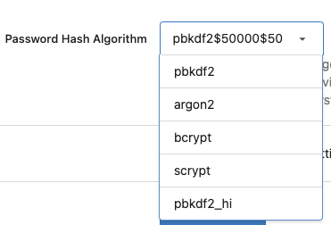
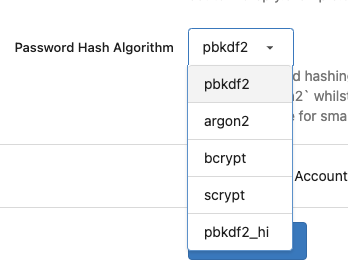
### Fix the Password Hash Algorithm display problem for "Provide the
ability to set password hash algorithm parameters #22942"
Before: the UI shows `pbkdf2$50000$50`
<details>
</details>
After: the UI shows `pbkdf2`
<details>
</details>
### GET data: net::ERR_INVALID_URL #23183
Cause by empty `data:` in `<link rel="manifest"
href="data:{{.ManifestData}}">`
Co-authored-by: wxiaoguang <wxiaoguang@gmail.com>
Co-authored-by: Jason Song <i@wolfogre.com>
Co-authored-by: Lunny Xiao <xiaolunwen@gmail.com>
Co-authored-by: techknowlogick <techknowlogick@gitea.io>
|
| |
|
|
|
|
|
|
|
| |
Backport #23178
fix #23153
Co-authored-by: techknowlogick <techknowlogick@gitea.io>
Co-authored-by: silverwind <me@silverwind.io>
Co-authored-by: delvh <leon@kske.dev>
|
| |
|
|
|
|
|
|
|
|
|
|
|
|
|
|
|
|
|
|
|
| |
Backport #23268
## The Problem
`overflow-wrap: break-word` doesn't work well for unbroken lines. Use
`overflow-wrap: anywhere` instead, and remove legacy alias `word-wrap`
## Before

## After

Co-authored-by: wxiaoguang <wxiaoguang@gmail.com>
Co-authored-by: silverwind <me@silverwind.io>
|
| |
|
|
|
|
|
|
|
|
|
|
|
|
|
|
|
|
|
|
|
|
|
|
|
|
|
|
|
|
|
| |
Backport #23168
The reason why quote reply is empty is when quote reply is clicked, it
triggers the click function on `.comment-form-reply` button, and when
the first time this function is triggered, easyMDE for the reply has not
yet initialized, so that click handler of `.quote-reply` button in
`repo-legacy.js` got an `undefined` as easyMDE, and the following lines
which put quoted reply into the easyMDE is not executed.
The workaround in this PR is to pass the replied content to
'.comment-form-reply' button if easyMDE is not yet initialized (quote
reply first clicked) and put the replied content into it the after
easyMDE is created.
Now quote reply on first click:
https://user-images.githubusercontent.com/17645053/221452823-fc699d50-1649-4af1-952e-f04fc8d2978e.mov
<br />
Update:
The above change is not appropriate as stated in the
[comment](https://github.com/go-gitea/gitea/pull/23168#issuecomment-1445562284)
Use await instead
Close #22075.
Close #23247.
Co-authored-by: HesterG <hestergong@gmail.com>
|
| |
|
|
|
|
|
|
|
| |
Backport #23250
Due to switched input parameters, the citation texts for Bibtex and Apa
were switched.
This pull request fixes #23244
Co-authored-by: Blender Defender <contact.blenderdefender@gmail.com>
|
| |
|
|
|
|
|
|
|
|
|
|
|
|
|
|
|
|
|
|
|
|
|
|
|
|
|
|
|
|
|
|
|
|
|
|
|
|
|
|
|
|
|
|
|
| |
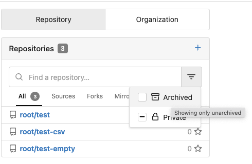
(#23205)
Backport #23147
Co-author: yp05327 , this PR is based on yp05327's #22813.
The problems of the old DashboardRepoList / repolist.tmpl:
* It mixes many different frameworks together
* It "just works", bug on bug
* It uses many anti-pattern of Vue
This PR:
* Fix bugs and close #22800
* Decouple the "checkbox" elements from Fomantic UI (only use CSS
styles)
* Simplify the HTML layout
* Simplify JS logic
* Make it easier to refactor the DashboardRepoList into a pure Vue
component in the future.
### Screenshots
#### Default
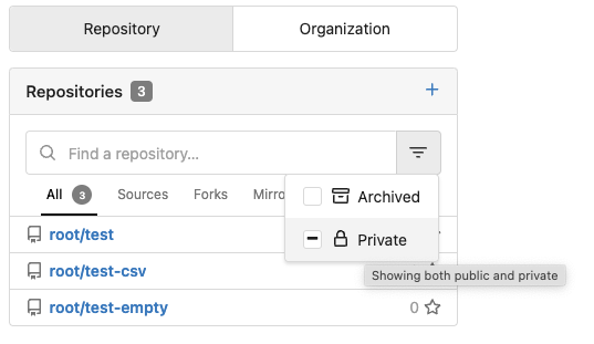
#### Click "Archived" to make it checked
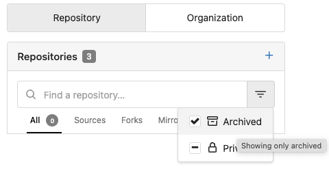
#### Click "Archived" to make it intermediate

#### Click "Archived" to make it unchecked
Co-authored-by: wxiaoguang <wxiaoguang@gmail.com>
Co-authored-by: yp05327 <576951401@qq.com>
Co-authored-by: Lunny Xiao <xiaolunwen@gmail.com>
|
| |
|
|
|
|
|
|
|
|
|
|
|
|
|
|
|
|
|
|
|
|
|
|
| |
(#23224) (#23228)
Backport #23224
Regression of #10107
(https://github.com/go-gitea/gitea/pull/10107/files#diff-a15e36f2f9c13339f7fdd38bc2887db2ff2945cb8434464318ab9105fcc846bdR460)
Fix #22222
Before: the "clear" action couldn't remove these check marks.
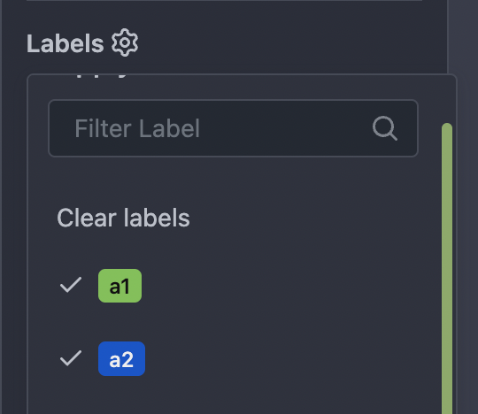
After: the "clear" action can remove these check marks.
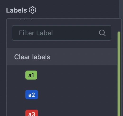
Co-authored-by: wxiaoguang <wxiaoguang@gmail.com>
|
| |
|
|
|
|
|
|
|
|
|
|
|
|
|
|
|
|
|
|
|
| |
(#23135) (#23182)
Backport #23135
Close #10468
Without SimpleMDE/EasyMDE, using Simple Textarea, the button text could
be changed when content changes.
After introducing SimpleMDE/EasyMDE, there is no code for updating the
button text.
---------
Co-authored-by: wxiaoguang <wxiaoguang@gmail.com>
|
| |
|
|
|
|
|
|
|
|
|
|
|
|
|
|
|
|
|
|
|
|
|
|
|
| |
events (#23065) (#23195)
Backport #23065
Using `touchstart` for `click` events is a black magic for mobile
browsers (Google: `fastclick`).
However, it causes many UX problems if the fastclick is used without
careful design.
Fomantic UI uses this fastclick for its `dimmer` and `dropdown`, it
makes mobile users feel strange when they "touch" the dropdown menu.
This PR uses a simple patch to fix that behavior. Then the Fomantic
dropdown only uses `click` for click events.
This PR is simple enough and won't cause hidden bugs even if the patch
doesn't work. In the future, if there are more patches for Fomantic UI,
the patches could be placed in a directory like
`web_src/fomantic/patches/001-fix-click-touchstart`, etc.
Co-authored-by: Lunny Xiao <xiaolunwen@gmail.com>
|
| |
|
|
|
|
|
|
|
|
| |
Backport #23146
Fixes https://github.com/go-gitea/gitea/issues/22953
Co-authored-by: yp05327 <576951401@qq.com>
Co-authored-by: delvh <leon@kske.dev>
|
| |
|
|
|
|
|
|
|
|
|
|
|
|
|
|
|
|
|
|
|
|
|
| |
(#23093) (#23120)
Backport #23093
Given mardown source
```
x ` a` y
x `a ` y
x ` a ` y
```
Render
<img width="1421" alt="2023-02-23 15 33 14"
src="https://user-images.githubusercontent.com/17645053/220844280-a304c788-ac79-4a26-a55a-0db00f2fb3f3.png">
Fixes #23080.
Co-authored-by: HesterG <hestergong@gmail.com>
Co-authored-by: Lunny Xiao <xiaolunwen@gmail.com>
|
| |
|
|
|
|
|
|
|
|
|
|
|
|
|
|
|
|
| |
Backport #23111
Right now on the PR 'File Change' Tab, the file title header sticky to
the top on large screens has wrong height, resulting in wrong ui
behavior when scrolling down. This PR is to fix this.
Before:
<img width="964" alt="截屏2023-02-24 17 12 29"
src="https://user-images.githubusercontent.com/17645053/221140409-025c4a84-6bbe-4b5b-a13f-bd2b79063522.png">
After:
<img width="1430" alt="截屏2023-02-24 21 10 12"
src="https://user-images.githubusercontent.com/17645053/221186750-0344d652-4610-4a90-a4c0-7f6269f950d6.png">
Co-authored-by: HesterG <hestergong@gmail.com>
|
| |
|
|
|
|
|
|
|
|
|
|
|
|
|
|
|
|
|
|
|
|
|
|
|
|
|
|
|
|
|
|
|
|
|
|
|
|
|
|
|
|
|
|
|
|
|
|
|
|
|
|
|
|
|
|
|
|
|
| |
(#23102)
Backport #23014
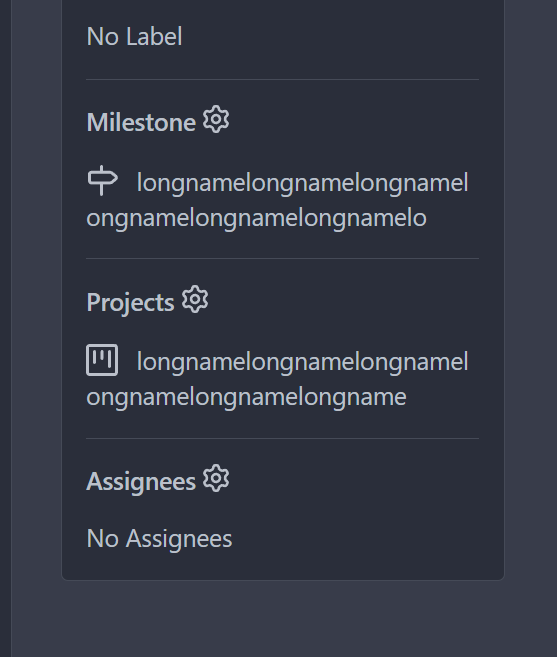
As the title. Label/assignee share the same code.
* Close #22607
* Close #20727
Also:
* partially fix for #21742, now the comment reaction and menu work with
keyboard.
* partially fix for #17705, in most cases the comment won't be lost.
* partially fix for #21539
* partially fix for #20347
* partially fix for #7329
### The `Enter` support
Before, if user presses Enter, the dropdown just disappears and nothing
happens or the window reloads.
After, Enter can be used to select/deselect labels, and press Esc to
hide the dropdown to update the labels (still no way to cancel ....
maybe you can do a Cmd+R or F5 to refresh the window to discard the
changes .....)
This is only a quick patch, the UX is still not perfect, but it's much
better than before.
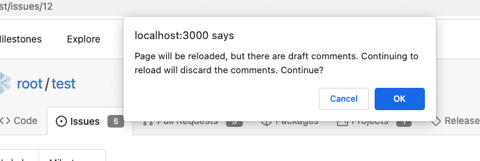
### The `confirm` before reloading
And more fixes for the `reload` problem, the new behaviors:
* If nothing changes (just show/hide the dropdown), then the page won't
be reloaded.
* If there are draft comments, show a confirm dialog before reloading,
to avoid losing comments.
That's the best effect can be done at the moment, unless completely
refactor these dropdown related code.
Screenshot of the confirm dialog:
<details>
</details>
Co-authored-by: wxiaoguang <wxiaoguang@gmail.com>
Co-authored-by: Brecht Van Lommel <brecht@blender.org>
Co-authored-by: Lunny Xiao <xiaolunwen@gmail.com>
|
| |
|
|
|
|
|
|
|
|
|
|
|
|
|
|
|
|
|
|
| |
Backport #23030
This PR is a possible solution for issue #22866. Main change is to add a
`author-wrapper` class around author name, like the wrapper added to
message. The `max-width` is set to 200px on PC, and 100px on mobile
device for now. Which will work like below:
<img width="1183" alt="2023-02-21 11 57 53"
src="https://user-images.githubusercontent.com/17645053/220244146-3d47c512-33b6-4ed8-938e-de0a8bc26ffb.png">
<img width="417" alt="2023-02-21 11 58 43"
src="https://user-images.githubusercontent.com/17645053/220244154-1ea0476b-9d1c-473a-9917-d3216860f9a9.png">
And `title` is added to the wrapper like it did in message wrapper. So
the full author name will show on hover.
Co-authored-by: HesterG <hestergong@gmail.com>
Co-authored-by: Lunny Xiao <xiaolunwen@gmail.com>
|
| |
|
| |
Backport #23074
|
| |
|
|
|
|
| |
At that moment I made a mistake (failed to detect a JS variable type
correctly)
Close #23040
|
| |
|
|
|
|
|
|
| |
- Upgrade stylelint and plugin
- Change ruleset to a explicit one, with all deprecated rules removed
- Fix new issues detected by value validation
For `overflow: overlay` see
https://github.com/stylelint/stylelint/issues/6667
|
| |
|
| |
Fix #23000.
|
| |
|
|
|
|
|
|
|
|
|
|
|
|
|
|
|
|
|
|
|
|
|
|
|
|
|
|
|
|
|
|
|
|
|
|
|
|
|
|
|
|
|
|
|
|
|
|
| |
This PR follows:
* #22950
### Before
The Review Box has many problems:
* It doesn't work for small screens.
* It has an anonying animation which makes the UI laggy.
* It uses "custom dropdown menu" which is very difficult to fine tune.
* `$().toggle('visible')` is not a correct call
* jQuery just accepts any invalid `duration` argument:
`$().toggle('anyting')`
* The button is not a button.
<details>
</details>
### After
These problems are fixed, and eliminate many `!important` games.
<details>
</details>
And most dropdown icons still looks good:
<details>
</details>
Co-authored-by: delvh <leon@kske.dev>
|
| |
|
|
|
|
|
|
|
|
|
|
|
|
|
|
|
|
| |
On the home page of an organization, there are unexpected dashes between
the avatars of the members when hovering over the avatars, as shown in
below:


This is because in `fomantic/build/semantic.css` there is a
rule `text-decoration: underline;` when hovering over the `<a>` tag.
Here, the `<a>` tag has width and height because of the avatar image inside,
leading to the unexpected underlines.
This PR overrides the `a:hover` rule so the underline does not exist anymore.
Co-authored-by: delvh <leon@kske.dev>
|
| |
|
|
|
|
|
|
|
|
|
|
|
|
|
|
|
|
|
| |
Regression bug of #19650
Close #20983
Close #21912
### The "Manually Merged" form

### Mark a PR as Manually Merged and close it

---------
Co-authored-by: Jason Song <i@wolfogre.com>
Co-authored-by: Lunny Xiao <xiaolunwen@gmail.com>
|
| |
|
| |
Some were out-dated, some are added.
|
| |
|
|
|
|
|
|
|
|
| |
`.gt-relative` is also `position: relative !important;`
There are `gt-pr-?` styles below (line 140) for `padding-right`, which
makes `.gt-pr` ambiguous
Co-authored-by: delvh <leon@kske.dev>
Co-authored-by: John Olheiser <john.olheiser@gmail.com>
Co-authored-by: techknowlogick <techknowlogick@gitea.io>
|
| |
|
|
|
|
|
|
|
|
| |
Follows:
* #22950
The dropdown menu works well without these codes.
The reason is that the event bubbling still works for the dropdown menu,
the Fomantic UI dropdown menu module will hide the menu correctly if an
item is clicked.
|
| |
|
|
|
|
|
|
|
|
|
|
|
|
| |
Since #22632, when a commit status has multiple checks, no check is
shown at all (hence no way to see the other checks).
This PR fixes this by always adding a tag with the
`.commit-statuses-trigger` to the DOM (the `.vm` is for vertical
alignment).
---------
Co-authored-by: Lunny Xiao <xiaolunwen@gmail.com>
|
| |
|
|
|
|
|
|
|
|
|
|
|
|
|
|
|
|
|
|
| |
Fix #22818.
| Before | After |
| ---- | ---- |
| <img
src="https://user-images.githubusercontent.com/15528715/219617504-d86e7a90-d4ac-4a92-bd8a-100dddc693d5.png"
width="200px" /> | <img
src="https://user-images.githubusercontent.com/15528715/219618645-a4045f65-bda6-49ce-a676-f03a9817bb70.png"
width="200px" />|
| <img
src="https://user-images.githubusercontent.com/15528715/219618013-844ef208-853b-44bd-a67c-36e360f0ffa7.png"
width="200px" /> | <img
src="https://user-images.githubusercontent.com/15528715/219618361-cb13c369-852e-47bf-ae30-e429d348823d.png"
width="200px" /> |
---------
Co-authored-by: Lunny Xiao <xiaolunwen@gmail.com>
|
| |
|
|
|
|
|
|
|
|
|
|
|
|
|
|
|
|
|
|
|
|
|
|
|
|
|
|
| |
remove inline style=display:none (#22950)
Close #22847
This PR:
* introduce Gitea's own `showElem` and related functions
* remove jQuery show/hide
* remove .hide class
* remove inline style=display:none
From now on:
do not use:
* "[hidden]" attribute: it's too weak, can not be applied to an element
with "display: flex"
* ".hidden" class: it has been polluted by Fomantic UI in many cases
* inline style="display: none": it's difficult to tweak
* jQuery's show/hide/toggle: it can not show/hide elements with
"display: xxx !important"
only use:
* this ".gt-hidden" class
* showElem/hideElem/toggleElem functions in "utils/dom.js"
cc: @silverwind , this is the all-in-one PR
|
| |
|
|
|
|
|
|
|
|
|
|
|
|
|
|
|
|
|
|
|
|
|
|
|
|
|
|
|
|
|
|
|
|
|
|
|
|
|
|
|
|
|
|
|
|
|
|
|
|
|
|
|
|
| |
Add a new "exclusive" option per label. This makes it so that when the
label is named `scope/name`, no other label with the same `scope/`
prefix can be set on an issue.
The scope is determined by the last occurence of `/`, so for example
`scope/alpha/name` and `scope/beta/name` are considered to be in
different scopes and can coexist.
Exclusive scopes are not enforced by any database rules, however they
are enforced when editing labels at the models level, automatically
removing any existing labels in the same scope when either attaching a
new label or replacing all labels.
In menus use a circle instead of checkbox to indicate they function as
radio buttons per scope. Issue filtering by label ensures that only a
single scoped label is selected at a time. Clicking with alt key can be
used to remove a scoped label, both when editing individual issues and
batch editing.
Label rendering refactor for consistency and code simplification:
* Labels now consistently have the same shape, emojis and tooltips
everywhere. This includes the label list and label assignment menus.
* In label list, show description below label same as label menus.
* Don't use exactly black/white text colors to look a bit nicer.
* Simplify text color computation. There is no point computing luminance
in linear color space, as this is a perceptual problem and sRGB is
closer to perceptually linear.
* Increase height of label assignment menus to show more labels. Showing
only 3-4 labels at a time leads to a lot of scrolling.
* Render all labels with a new RenderLabel template helper function.
Label creation and editing in multiline modal menu:
* Change label creation to open a modal menu like label editing.
* Change menu layout to place name, description and colors on separate
lines.
* Don't color cancel button red in label editing modal menu.
* Align text to the left in model menu for better readability and
consistent with settings layout elsewhere.
Custom exclusive scoped label rendering:
* Display scoped label prefix and suffix with slightly darker and
lighter background color respectively, and a slanted edge between them
similar to the `/` symbol.
* In menus exclusive labels are grouped with a divider line.
---------
Co-authored-by: Yarden Shoham <hrsi88@gmail.com>
Co-authored-by: Lauris BH <lauris@nix.lv>
|
| |
|
|
|
|
|
|
|
|
|
|
|
|
|
| |
If the content is quite large the diff body overflows the container and
can not be read.
This is fixed by setting the diff body maximum width to 100% and enable
overflow scrollbars:
before | after
---|---

|

Signed-off-by: Ferdinand Thiessen <rpm@fthiessen.de>
|
| |
|
|
|
|
|
|
|
|
|
|
|
|
|
|
|
|
|
|
|
|
|
|
|
|
|
|
|
|
|
|
|
|
|
|
|
|
|
|
|
|
|
|
|
|
|
|
|
|
|
|
|
|
|
|
|
|
|
|
| |
(#22861)
This PR follows:
* #21986
* #22831
This PR also introduce customized HTML elements, which would also help
problems like:
* #17760
* #21429
* #21440
With customized HTML elements, there won't be any load-search-replace
operations, and it can avoid page flicking (which @silverwind cares a
lot).
Browser support:
https://developer.mozilla.org/en-US/docs/Web/API/Window/customElements
# FAQ
## Why the component has the prefix?
As usual, I would strongly suggest to add prefixes for our own/private
names. The dedicated prefix will avoid conflicts in the future, and it
makes it easier to introduce various 3rd components, like GitHub's
`relative-time` component. If there is no prefix, it's impossible to
introduce another public component with the same name in the future.
## Why the `custcomp.js` is loaded before HTML body? The `index.js` is
after HTML body.
Customized components must be registered before the content loading.
Otherwise there would be still some flicking.
`custcomp.js` should have its own dependencies and should be very light,
so it won't affect the page loading time too much.
## Why use `data-url` attribute but not use the `textContent`?
According to the standard, the `connectedCallback` occurs on the
tag-opening moment. The element's children are not ready yet.
## Why not use `{{.GuessCurrentOrigin $.ctx ...}}` to let backend decide
the absolute URL?
It's difficult for backend to guess the correct protocol(scheme)
correctly with zero configuration. Generating the absolute URL from
frontend can guarantee that the URL is 100% correct -- since the user is
visiting it.
# Screenshot
<details>
</details>
|
| |
|
| |
A separate PR from #22884 (without touching the jQuery methods)
|
| |
|
|
|
|
|
|
|
|
|
|
|
|
|
|
|
|
|
|
|
|
|
|
|
|
|
|
|
|
|
|
| |
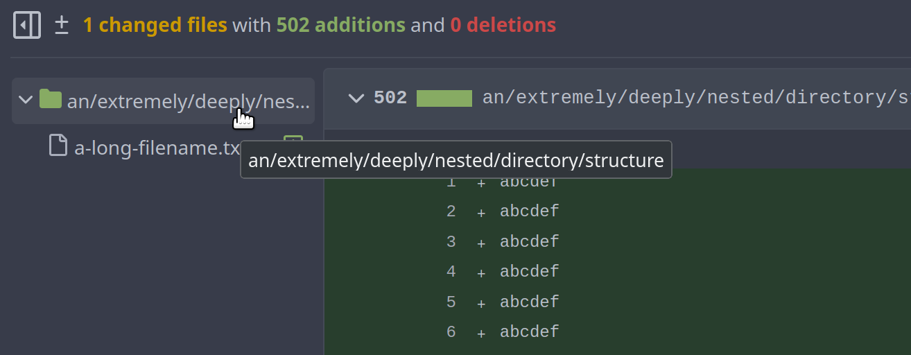
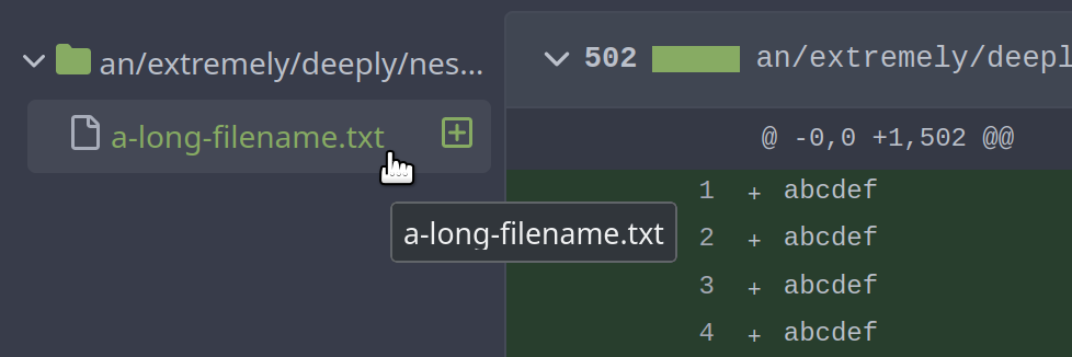
Previously, a file/directory name was simply cut when it was too long.
Now, we display the browser-native tooltip (`title`) instead, so you can
still see it when hovering over it.
In this case, we don't use the normal `tippy` tooltips for three
reasons:
1. Vue components are not included in the global tooltip initialization
2. Vue components would need to initialize their tooltips themselves
whenever their content is changed
3. The tooltips are shown too long under the default configuration (the
tooltip one element above is still shown when hovering on the element
below)
Fixes #22915
## Appearance
## Room for future improvement
We could think about displaying the whole file path in the title, not
just its name.
This is not done at the moment:
---------
Co-authored-by: techknowlogick <techknowlogick@gitea.io>
|
| |
|
| |
Fix #22873.
|
| |
|
|
|
|
|
|
|
|
|
|
|
|
|
|
|
|
|
|
| |
Really fix #22883, close #22901
I made a mistake that the global styles in RepoActionView.vue could
still pollute global styles (I forgot that the code of this component is
still loaded on every page, instead of loaded on demand)
This PR makes a complete fix: only change the page's full-height
behavior if the component is used.
Screenshot after the fix:
<details>
</details>
Co-authored-by: Lunny Xiao <xiaolunwen@gmail.com>
|
| |
|
|
|
|
|
|
|
|
|
|
|
|
|
|
|
|
|
|
| |
As discussed in #22847 the helpers in helpers.less need to have a
separate prefix as they are causing conflicts with fomantic styles
This will allow us to have the `.gt-hidden { display:none !important; }`
style that is needed to for the reverted PR.
Of note in doing this I have noticed that there was already a conflict
with at least one chroma style which this PR now avoids.
I've also added in the `gt-hidden` style that matches the tailwind one
and switched the code that needed it to use that.
Signed-off-by: Andrew Thornton <art27@cantab.net>
---------
Signed-off-by: Andrew Thornton <art27@cantab.net>
Co-authored-by: wxiaoguang <wxiaoguang@gmail.com>
|
| |
|
|
|
| |
Fix #22883.
Revert commit 59beb2dba6b35b88dae5ac5c3d094bc6c1bba19c.
|
| |
|
|
|
|
|
|
|
|
|
|
|
| |
When a diff file has been focused through the URL ID fragment, it will
be highlighted.

---------
Co-authored-by: Lunny Xiao <xiaolunwen@gmail.com>
|
| |
|
|
|
|
|
|
|
|
|
|
|
|
|
|
|
|
|
|
| |
Authored by @a1012112796 at
https://github.com/go-gitea/gitea/pull/22798#issuecomment-1421820001
Avoid putting `button` in `a`.
A patch for #22798 .
Now it looks like:
<img width="393" alt="image"
src="https://user-images.githubusercontent.com/9418365/217791913-b491fc86-ee9b-4672-80ea-7286eef2d11f.png">
<img width="389" alt="image"
src="https://user-images.githubusercontent.com/9418365/217791967-d8c09c8b-4cea-4011-b01e-db0d1333e7f6.png">
---------
Co-authored-by: silverwind <me@silverwind.io>
Co-authored-by: Lunny Xiao <xiaolunwen@gmail.com>
|
| |
|
|
|
|
|
|
|
|
|
| |
Per https://github.com/go-gitea/gitea/pull/22845#issuecomment-1426950234
Reverts go-gitea/gitea#22845
Let's have a better PR.
@silverwind @zeripath
Co-authored-by: zeripath <art27@cantab.net>
|
| |
|
|
|
|
|
|
|
|
|
|
|
|
|
|
|
|
|
|
|
|
|
|
|
|
|
|
|
|
|
| |
Collapsing folders currently just throws a console error
```
index.js?v=1.19.0~dev-403-gb6b8feb3d:10 TypeError: this.$set is not a function
at Proxy.handleClick (index.js?v=1.19.0~dev-403-gb6b8feb3d:58:7159)
at index.js?v=1.19.0~dev-403-gb6b8feb3d:58:6466
at index.js?v=1.19.0~dev-403-gb6b8feb3d:10:93922
at ce (index.js?v=1.19.0~dev-403-gb6b8feb3d:10:1472)
at Q (index.js?v=1.19.0~dev-403-gb6b8feb3d:10:1567)
at HTMLDivElement.$e (index.js?v=1.19.0~dev-403-gb6b8feb3d:10:79198)
```
This PR fixes this and allows folders to be collapsed again.
Also:
- better cursor interaction with folders
- added some color to the diff detail stats
- remove green link color from all the file names
Screenshots:
---------
Co-authored-by: zeripath <art27@cantab.net>
Co-authored-by: Lunny Xiao <xiaolunwen@gmail.com>
|
| |
|
|
|
|
|
|
|
|
|
|
|
|
|
|
|
|
|
|
|
|
|
|
|
| |
Previous solution was relying on fomantic selector `.ui.label.hidden` to
hide the elements in their empty state, but this doesn't work any more
with the removal of the `label` class. Instead, introduce a standalone
CSS rule for the `hidden` class, which is universally usable as a single
class.
We can unfortunately not use the existing `hide` class because without
the `!important`, it does not have enough specificity to win against
fomantic's `.ui.menu:not(.vertical) .item {display: flex}` rule.
Followup and fixes regression from
https://github.com/go-gitea/gitea/pull/22169.
Before:
<img width="98" alt="image"
src="https://user-images.githubusercontent.com/115237/217959380-d3279ff3-526a-4ac4-9a18-3ab7c9ae91dd.png">
After:
<img width="77" alt="image"
src="https://user-images.githubusercontent.com/115237/217959463-44852716-cb25-4110-8481-668842ad4454.png">
|
| |
|
|
|
|
|
|
|
|
|
|
|
|
|
|
|
|
|
|
|
|
|
|
|
|
|
|
|
|
|
|
|
|
|
|
|
|
| |
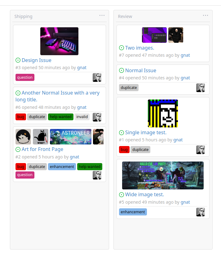
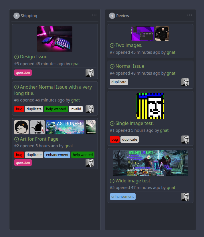
Original Issue: https://github.com/go-gitea/gitea/issues/22102
This addition would be a big benefit for design and art teams using the
issue tracking.
The preview will be the latest "image type" attachments on an issue-
simple, and allows for automatic updates of the cover image as issue
progress is made!
This would make Gitea competitive with Trello... wouldn't it be amazing
to say goodbye to Atlassian products? Ha.
First image is the most recent, the SQL will fetch up to 5 latest images
(URL string).
All images supported by browsers plus upcoming formats: *.avif *.bmp
*.gif *.jpg *.jpeg *.jxl *.png *.svg *.webp
The CSS will try to center-align images until it cannot, then it will
left align with overflow hidden. Single images get to be slightly
larger!
Tested so far on: Chrome, Firefox, Android Chrome, Android Firefox.
Current revision with light and dark themes:
---------
Co-authored-by: Jason Song <i@wolfogre.com>
Co-authored-by: Lunny Xiao <xiaolunwen@gmail.com>
Co-authored-by: delvh <dev.lh@web.de>
|
| |
|
|
|
|
|
|
|
|
|
|
|
|
|
|
|
|
|
|
|
|
|
|
|
|
|
|
|
|
|
|
|
|
| |
Replace #19922 , which is stale since my last review:
https://github.com/go-gitea/gitea/pull/19922#pullrequestreview-1003546506
and https://github.com/go-gitea/gitea/pull/19922#issuecomment-1153181546
Close #19769
Changes:
1. Use `<button>` instead of `<div>` for buttons
2. Prevent default event handler in `initGlobalButtonClickOnEnter`
3. Fix the incorrect call to `pullrequest_targetbranch_change`
4. Add a slight margin-left to the input element to make UI look better
The logic in repo-issue.js is not ideal, but this PR isn't going to
touch the logic.
This is also an example for future developers to understand how to make
buttons work properly.
### Before
### After
* Add a slight margin-left.
* The `Cancel` button is focused.
Co-authored-by: techknowlogick <techknowlogick@gitea.io>
|
