| Commit message (Collapse) | Author | Age | Files | Lines |
|---|
| |
|
|
|
|
|
|
|
|
|
|
|
|
|
|
| |
Backport #27000 by @wxiaoguang
This PR reduces the complexity of the system setting system.
It only needs one line to introduce a new option, and the option can be
used anywhere out-of-box.
It is still high-performant (and more performant) because the config
values are cached in the config system.

Co-authored-by: wxiaoguang <wxiaoguang@gmail.com>
|
| |
|
|
|
|
|
|
|
|
|
|
|
|
|
|
|
|
|
|
|
|
|
|
|
|
|
|
|
|
|
|
|
|
|
|
|
|
|
|
|
|
|
|
|
|
|
|
|
|
|
|
|
|
|
|
|
|
|
|
|
| |
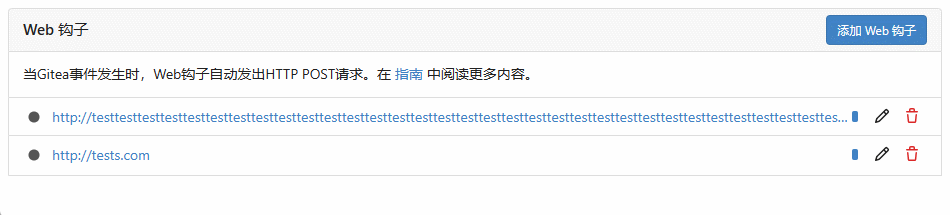
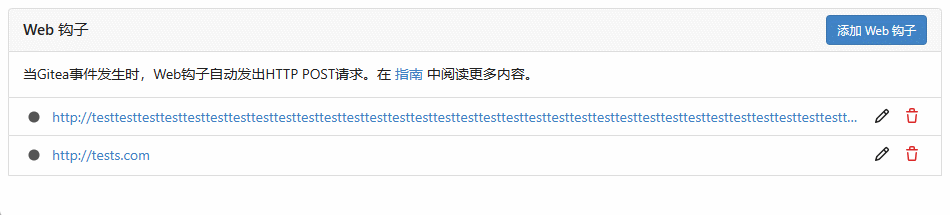
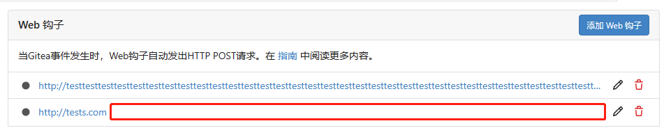
(#27381)
Backport #27115 by @puni9869
Followup https://github.com/go-gitea/gitea/pull/26820
## Archived labels UI for issue filter and issue filter actions for
issues/pull request pages.
Changed:
* Enhanced the Issue filter and Issue filter actions UI page to
seamlessly incorporate a list of archived labels.
* Pagination functionality is same as before. If archived label checkbox
is checked then we are adding a query string`archived=true` in the url
to save the state of page.
* Issue filter actions menu is separated into different template.
* Adding the archived flag in issue url labels.
* Pull Request page is also work the same.
Outsourced:
* Defer the implementation of specialized handling for archived labels
to upcoming pull requests. This step will be undertaken subsequent to
the successful merge of this pull request.
Screenshots
### Issue page
<img width="1360" alt="image"
src="https://github.com/go-gitea/gitea/assets/80308335/d7efb2ef-5b2b-449d-83f0-d430a32ec432">
### Issue page with label filter on archived label checkbox when not
checked --> No archived label is there in list
<img width="1249" alt="image"
src="https://github.com/go-gitea/gitea/assets/80308335/ceea68ef-91f2-4693-910f-2e25e236bfc9">
### Issue page with label filter on archived label checkbox when checked
--> Show archived label in the list.
<img width="710" alt="image"
src="https://github.com/go-gitea/gitea/assets/80308335/2414d26b-2079-4c3c-bd9e-f2f5411bcabf">
### Issue page with label filter on issue action menu on archived label
checkbox when checked --> Show archived label in the list.
<img width="409" alt="image"
src="https://github.com/go-gitea/gitea/assets/80308335/259cac87-3e21-4778-99a2-a6a0b8c81178">
### Applied the archived=true in Issue labels when archived checkbox is
checked.
<img width="984" alt="image"
src="https://github.com/go-gitea/gitea/assets/80308335/657ce3db-c0ae-402e-b12d-3b580d3c2ed0">
---
Part of https://github.com/go-gitea/gitea/issues/25237
Signed-off-by: puni9869 <punitinani1@hotmail.com>
Co-authored-by: puni9869 <80308335+puni9869@users.noreply.github.com>
Co-authored-by: delvh <dev.lh@web.de>
|
| |
|
|
|
|
|
|
|
|
|
|
|
|
|
|
|
|
|
|
|
|
|
|
| |
Backport #26870 by @rafh
Currently, checkboxes are positioned as absolute. This positioning
causes the input to overlay an element that has been floated within the
editor. Floated elements are useful if you want your text to wrap around
this element. This PR fixes the overlaying of checkboxes by removing the
absolute positioning, updating the `ul` padding, and
displaying`.task-list-item` `flex` to ensure inputs and the associated
label are on the same line.
Screenshots:
Before:
<img width="762" alt="Screenshot 2023-09-01 at 3 40 59 PM"
src="https://github.com/go-gitea/gitea/assets/6152817/570247c7-7f5c-4697-bfc9-ad4655e37991">
After:
<img width="762" alt="Screenshot 2023-09-01 at 3 42 20 PM"
src="https://github.com/go-gitea/gitea/assets/6152817/db53df45-1294-4eee-84c0-b21ac4fdf805">
Co-authored-by: Rafael Heard <rafael.heard@gmail.com>
Co-authored-by: rafh <rafaelheard@gmail.com>
|
| |
|
|
|
|
|
|
|
|
|
|
|
|
|
|
|
|
|
|
|
|
| |
Backport #27322 by @wxiaoguang
Close #26730
1. The `diff-detail-box` was abused, it shouldn't be used for
"DiffFileList/DiffFileTree".
2. Fix the sticky position for various screens.


Co-authored-by: wxiaoguang <wxiaoguang@gmail.com>
|
| |
|
|
|
|
|
|
|
|
|
|
|
|
|
|
|
|
|
|
|
|
|
|
|
|
|
|
|
|
|
| |
(#27323) (#27327)
Backport #27323 by @wxiaoguang
Fix #27313 (see the comment)
And some UI improvements:
### Before


### After


Co-authored-by: wxiaoguang <wxiaoguang@gmail.com>
|
| |
|
|
|
|
|
|
|
|
|
|
|
|
| |
Backport #27319 by @wxiaoguang
1. Put the `"octicon-shield-lock"` into the flex container, then it
doesn't need a separate flex box
2. Remove some unnecessary `gt-df` helpers
3. Make `btn` button has the same flex behavior as `ui button`
Co-authored-by: wxiaoguang <wxiaoguang@gmail.com>
|
| |
|
|
|
|
|
|
| |
Backport #27102 by @silverwind
Enable [globals](https://vitest.dev/config/#globals) in vitest, reducing
the noise in test files.
Co-authored-by: silverwind <me@silverwind.io>
|
| |
|
|
|
|
|
|
| |
Backport #27287
Fix #27286
Replace #27279
Co-authored-by: wxiaoguang <wxiaoguang@gmail.com>
|
| |
|
|
|
|
|
|
|
| |
Backport #27289 by @silverwind
Should fix: https://github.com/go-gitea/gitea/issues/27213
@denyskon can you test this? I can not reproduce this error locally.
Co-authored-by: silverwind <me@silverwind.io>
|
| |
|
|
|
|
|
|
|
|
|
|
|
|
|
|
|
|
|
|
|
|
|
|
|
|
|
|
|
|
| |
Backport #27181 by @silverwind
The `.new-menu` was using a pseudo-element based fade-out effect.
Replace this with a more modern mask-based effect which in this case
required a child element to avoid fading out the background as well, so
I applied it to child `new-menu-inner` which was present on all these
menus except explore where I added it.
There is no visual difference except that the items on the explore page
have no `gap` between them any longer, making it consistent with other
menus. Before and after:
<img width="221" alt="Screenshot 2023-09-21 at 21 13 19"
src="https://github.com/go-gitea/gitea/assets/115237/b4a38ce2-cee1-4c54-84a5-e1d0bfd79e29">
<img width="222" alt="Screenshot 2023-09-21 at 21 32 36"
src="https://github.com/go-gitea/gitea/assets/115237/bb6b1335-d935-4ad4-bb85-3b0fc3027c2b">
Also, this cleans up the related CSS vars:
- `--color-header-wrapper-transparent` is removed, no longer needed
- `--color-header-wrapper` is defined in base theme as well, was
previously unset and therefor transparent.
[no whitespace
diff](https://github.com/go-gitea/gitea/pull/27181/files?diff=unified&w=1)
[demo of mask fade](https://jsfiddle.net/silverwind/tsfadb3u/)
Co-authored-by: silverwind <me@silverwind.io>
|
| |
|
|
|
|
|
| |
Backport #27237 by @silverwind
Fixes: https://github.com/go-gitea/gitea/issues/27230
Co-authored-by: silverwind <me@silverwind.io>
|
| |
|
|
|
|
|
|
|
|
|
|
|
| |
Backport #27141 by @silverwind
Fixes https://github.com/go-gitea/gitea/issues/27136.
This does the following for Monaco's EOL setting:
1. Use editorconfig setting if present
2. Use the file's dominant line ending as detected by monaco, which uses
LF for empty file
Co-authored-by: silverwind <me@silverwind.io>
|
| |
|
|
|
|
|
|
|
|
|
|
|
|
| |
Backport #27226 by @denyskon
- switch from some weird status badge to label
- translate untranslated `Reset registration token` string
- change documentation link from act_runner README to Gitea Docs site
- fix "No runners available" message width
- use `ctx.Locale.Tr` where possible

Co-authored-by: Denys Konovalov <kontakt@denyskon.de>
|
| |
|
|
|
|
|
|
|
|
|
| |
(#27225) (#27228)
Backport #27225 by @wxiaoguang
Fix #27224
And add the case to the devtest page.
Co-authored-by: wxiaoguang <wxiaoguang@gmail.com>
|
| |
|
|
|
|
|
| |
Backport #27169 by @wxiaoguang
Fix #27166
Co-authored-by: wxiaoguang <wxiaoguang@gmail.com>
|
| |
|
|
|
|
|
|
|
|
|
|
| |
WIP because:
- [x] Some calls set a `content-type` but send no body, can likely
remove the header
- [x] Need to check whether `charset=utf-8` has any significance on the
webauthn calls, I assume not as it is the default for json content.
- [x] Maybe `no-restricted-globals` is better for eslint, but will
require a lot of duplication in the yaml or moving eslint config to a
`.js` extension.
- [x] Maybe export `request` as `fetch`, shadowing the global.
|
| |
|
|
|
|
|
|
|
|
|
|
|
|
|
|
|
|
|
|
|
|
|
|
| |
I think it's better if the primary actions have primary color instead of
green which fits better into the overall single-color UI design. This PR
currently replaces every green button with primary:
<img width="141" alt="Screenshot 2023-09-16 at 14 07 59"
src="https://github.com/go-gitea/gitea/assets/115237/843c1e50-4fb2-4ec6-84ba-0efb9472dcbe">
<img width="161" alt="Screenshot 2023-09-16 at 14 07 51"
src="https://github.com/go-gitea/gitea/assets/115237/9442195a-a3b2-4a42-b262-8377d6f5c0d1">
Modal actions now use uncolored/primary instead of previous green/red
colors. I also removed the box-shadow on all basic buttons:
<img width="259" alt="Screenshot 2023-09-16 at 14 16 39"
src="https://github.com/go-gitea/gitea/assets/115237/5beea529-127a-44b0-8d4c-afa7b034a490">
<img width="261" alt="Screenshot 2023-09-16 at 14 17 42"
src="https://github.com/go-gitea/gitea/assets/115237/4757f7b2-4d46-49bc-a797-38bb28437b88">
The change currently includes the "Merge PR" button, for which we might
want to make an exception to match the icon color there:
<img width="442" alt="Screenshot 2023-09-16 at 14 33 53"
src="https://github.com/go-gitea/gitea/assets/115237/993ac1a5-c94d-4895-b76c-0d872181a70b">
|
| |
|
|
|
|
|
|
|
|
|
|
|
|
| |
Follow up https://github.com/go-gitea/gitea/pull/26741
Changes:
Added archived label for org labels and added into issue filter list.
Part of https://github.com/go-gitea/gitea/issues/25237
---------
Signed-off-by: puni9869 <punitinani1@hotmail.com>
Co-authored-by: silverwind <me@silverwind.io>
|
| |
|
|
|
|
|
|
| |
Follow Remove polluted .ui.right #26825
Remove more `gt-float-right`, remove unnecessary helpers, remove
negative margin tricks.
|
| |
|
|
|
|
|
|
|
|
|
|
|
|
|
|
|
| |
As title
From the long time I was looking for this UI, Now its the time to fix
it.
Before
<img width="252" alt="image"
src="https://github.com/go-gitea/gitea/assets/80308335/963f2cb4-5cfd-4a14-ab85-88e25c3daef5">
<img width="502" alt="image"
src="https://github.com/go-gitea/gitea/assets/80308335/58453ef1-2555-4568-95d0-5293055b33b8">
---------
Co-authored-by: wxiaoguang <wxiaoguang@gmail.com>
Co-authored-by: Giteabot <teabot@gitea.io>
|
| |
|
| |
Fix #27008
|
| |
|
|
|
|
|
|
|
|
|
|
|
|
|
|
|
|
|
|
|
|
|
|
|
|
|
|
|
|
| |
(#27052)
Currently 'userxx' and 'orgxx' are both used as username in test files
when the user type is org, which is confusing. This PR replaces all
'userxx' with 'orgxx' when the user type is org(`user.type==1`).
Some non-trivial changes
1. Rename `user3` dir to `org3` in `tests/git-repositories-meta`
2. Change `end` in `issue reference` because 'org3' is one char shorter
than 'user3'
3. Change the search result number of `user/repo2` because
`user3/repo21` can't be searched now
4. Change the first org name getting from API because the result is
ordered by alphabet asc and now `org 17` is before `org25`

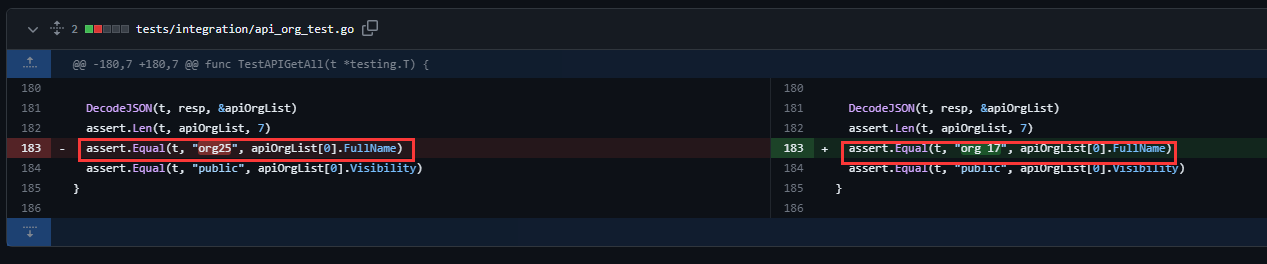
Other modifications are just find all and replace all.
Unit tests with SQLite are all passed.
---------
Co-authored-by: caicandong <1290147055@qq.com>
|
| |
|
|
|
|
|
|
|
|
|
|
|
|
|
|
|
|
| |
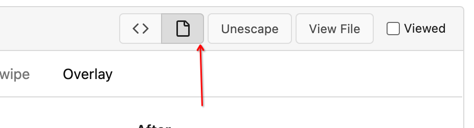
Before:
After:
---
1. **Remove the scroll bar exception that in the a tag**
2. **Reduce the actual width of the a tag to the actual width of the
content**
As shown in the screenshot, the red box area should not be clickable
|
| |
|
|
|
|
|
|
|
|
|
|
|
| |
as title.
Screensots
before
after

|
| |
|
|
|
|
|
|
|
|
|
|
|
|
|
| |
* Fix a regression from #26809 (the `data-org` is missing)
* Remove unnecessary style
Screenshots:


|
| |
|
|
|
|
|
|
|
|
|
| |
Close #27012
By the way, rename the single-word ID to a long ID.
|
| |
|
|
|
|
|
|
|
|
|
|
|
|
|
| |
1. Introduce lightweight `fetch` wrapper functions that automatically
sets csfr token, content-type and use it in `RepoActionView.vue`.
2. Fix a specific issue on `RepoActionView.vue` where a fetch network
error is shortly visible during page reload sometimes. It can be
reproduced by F5-in in quick succession on the actions view page and was
also producing a red error box on the page.
Once approved, we can replace all current `fetch` uses in UI with this
in another PR.
---------
Co-authored-by: Giteabot <teabot@gitea.io>
|
| |
|
|
|
|
|
|
|
|
|
| |
Before:
* The layout is quite complex
* The UI flickers when switch the stats (https://try.gitea.io/)
After:
* Simplify the code
* The UI doesn't flicker
|
| |
|
|
|
|
|
|
| |
Align everything with a new layout.
* Use "baseline" for some special elements, the "flex-item-icon" is for
the issue list only at the moment and I think it should be general
enough now (but not using "flex-item-leading" anymore in this case).
* Make the labels stretch themselves.
|
| | |
|
| |
|
|
|
|
|
|
|
|
|
|
|
|
|
|
|
|
|
|
| |
1. There is already `gt-ac`, so no need to introduce `flex-item-center`
2. The `flex-item-baseline` and `.flex-item-icon svg { margin-top: 1px
}` seem to be a tricky patch, they don't resolve the root problem, and
still cause misalignment in some cases.
* The root problem is: the "icon" needs to align with the sibling
"title"
* So, make the "icon" and the "title" both have the same height
3. `flex-text-inline` could only be used if the element is really
"inline", otherwise its `vertical-align` would make the box size change.
In most cases, `flex-text-block` is good enough.

---------
Co-authored-by: silverwind <me@silverwind.io>
Co-authored-by: Giteabot <teabot@gitea.io>
|
| | |
|
| |
|
|
| |
Co-authored-by: silverwind <me@silverwind.io>
Co-authored-by: Giteabot <teabot@gitea.io>
|
| |
|
|
|
|
|
|
|
|
|
| |
1. In many cases, the `flex-list` has previous and next `gt-hidden`
siblings, so relax the CSS selector to remove all ".segument .flex-list"
paddings.
2. Make the "Add key" button can toggle
3. Move help message into the related segment(panel). Otherwise users
would misread the message, eg: the SSH help seemed for GPG because they
are so near
4. Move modal element into the segment element, otherwise it affects the
layout
|
| |
|
| |
Fix #26931
|
| | |
|
| |
|
|
|
|
|
|
|
|
|
|
|
|
| |
Extract from https://github.com/go-gitea/gitea/pull/25940 and because
https://github.com/go-gitea/gitea/pull/26743 does seem to need more
work.
This will be required if we are to run our JS in [strict
mode](https://developer.mozilla.org/en-US/docs/Web/JavaScript/Reference/Strict_mode).
Previously, the two variables `$fields` and `$dirtyForms` polluted
`window`:
<img width="1145" alt="image"
src="https://github.com/go-gitea/gitea/assets/115237/e0270a0e-b881-4ed7-9cc4-e9ab25c0a2bc">
|
| |
|
|
|
|
|
|
|
|
|
| |
The changes for "commit-body" in #26877 are not ideal.
The reason is: the "commit-body" is usually a `<pre>`, it has default
margins. In most cases, we do not need that large margin. So, this PR
introduces a general but small margin for all "commit-body" elements.
Then these `gt-m-0` could be removed.
The `:not` selector is not needed, because the `.timeline-item` selector
is already clear enough.
|
| |
|
|
|
|
|
|
|
|
|
|
|
|
|
|
|
|
|
|
| |
Replace #26850
Major changes:
1. Remove all `has` selectors, it is still not supported by firefox.
Actually there could be some more general and clearer approaches
2. Remove `two-toggle-buttons`, the `.ui.buttons` just works well
3. Rewrite the `.ui.buttons` border styles, see the screenshots
4. Remove the "fine-tuning" paddings from the the flex children, they
could layout themselves well.

|
| |
|
|
|
|
|
|
|
|
|
|
|
|
|
|
|
|
|
|
| |
The old code used complex `if` blocks and strange HTML layouts.
<details>

</details>
This PR refactors the template code and remove legacy CSS styles. The UI
doesn't change much.

|
| |
|
|
|
|
|
|
|
|
|
|
|
| |
The [recommended order](https://vuejs.org/guide/scaling-up/sfc.html) for
SFC blocks is script -> template -> style, which we were violating
because template and script were swapped. I do find script first also
easier to read because the imports are on top, letting me immideatly see
a component's dependencies.
This is a pure cut-paste refactor with some removal of some empty lines.
---------
Co-authored-by: Lauris BH <lauris@nix.lv>
|
| |
|
|
| |
---
*Sponsored by Kithara Software GmbH*
|
| |
|
|
| |
1. `icons`: globally searched, no use in templates.
2. toast's `display: inline-block;`: there is a `display: flex` below.
|
| |
|
|
|
|
|
|
|
|
|
|
|
|
|
|
|
|
|
|
| |
Some small dashboard tweaks:
- Remove margin-bottom from divider so first item does not appear to
have un-equal margins
- Restore previous icon color
- Add slight margin-right to icon
Before:
<img width="783" alt="Screenshot 2023-08-31 at 00 10 28"
src="https://github.com/go-gitea/gitea/assets/115237/b75f70d7-8704-4afb-866d-fea0484c52d4">
After:
<img width="783" alt="Screenshot 2023-08-31 at 00 10 08"
src="https://github.com/go-gitea/gitea/assets/115237/50ed0c47-6f7c-449e-a054-13091369d43f">
---------
Co-authored-by: wxiaoguang <wxiaoguang@gmail.com>
|
| |
|
|
|
|
|
|
| |
1. Use `gt-invisible` instead of `invisible`.
2. Use `gt-word-break` instead of `dont-break-out` (there is a slight
different "hyphens", but I think it won't affect too much since it is
only used for the "full name").
3. Remove `.small.button:has(svg)` , now our buttons could layout SVG
correctly, and actually I didn't see this CSS class is used in code.
|
| |
|
|
|
|
|
|
|
|
|
|
|
|
|
|
|
|
|
|
|
|
|
|
|
|
|
|
|
|
|
|
|
|
|
| |
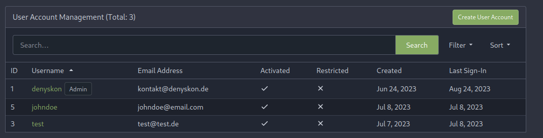
This PR implements a proposal to clean up the admin users table by
moving some information out to a separate user details page (which also
displays some additional information).
Other changes:
- move edit user page from `/admin/users/{id}` to
`/admin/users/{id}/edit` -> `/admin/users/{id}` now shows the user
details page
- show if user is instance administrator as a label instead of a
separate column
- separate explore users template into a page- and a shared one, to make
it possible to use it on the user details page
- fix issue where there was no margin between alert message and
following content on admin pages
<details>
<summary>Screenshots</summary>
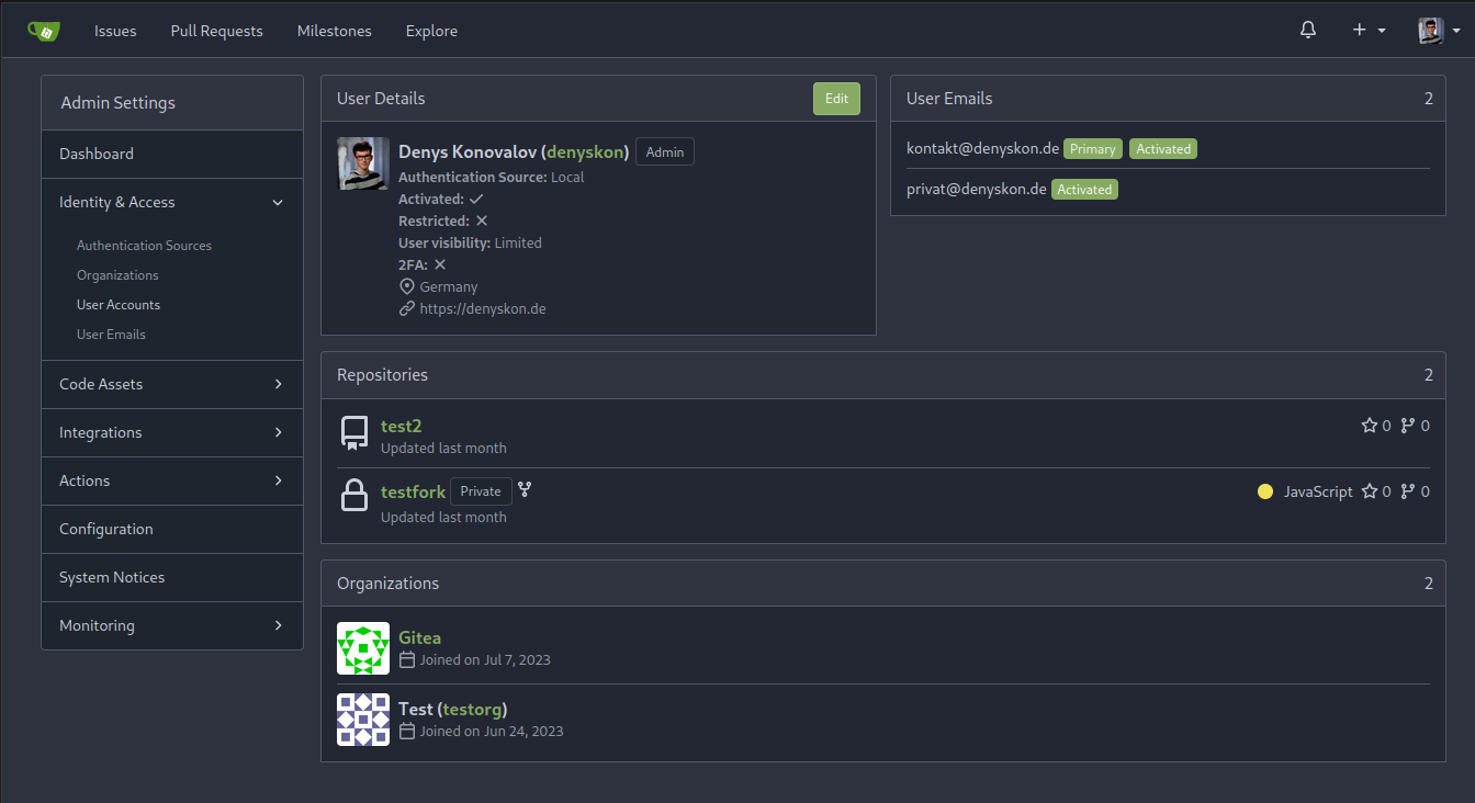
</details>
Partially resolves #25939
---------
Co-authored-by: Giteabot <teabot@gitea.io>
|
| |
|
|
|
|
|
|
|
|
| |
Backtick syntax now works in repo description too. Also, I replaced the
CSS for this was a new single class, making it more flexible and not
dependent on a parent. Also, very slightly reduced font size from 16.8px
to 16px.
---------
Co-authored-by: wxiaoguang <wxiaoguang@gmail.com>
|
| |
|
|
|
|
| |
Extract from https://github.com/go-gitea/gitea/pull/25940.
`assetUrlPrefix` is guaranteed to not contain trailing slashes, making
this function unneeded.
|
| |
|
|
|
|
|
|
|
|
|
|
|
| |
Each change is tested manually line by line. There are too many changes
so I can't share dozens of screenshots.
In short:
1. `ui right` could be still used in `ui top attached header`, because
there is a special case.
2. A lot of `ui right` are just no-op, so they can be removed safely.
3. Some of the `ui right` should be replaced by `gt-float-right` (to
avoid breaking, leave them to the future).
4. A few of the `ui right` could be rewritten by flex.
|
| | |
|
