| Commit message (Collapse) | Author | Age | Files | Lines |
|---|
| |
|
|
|
|
|
|
|
|
|
|
|
|
|
|
|
|
|
|
|
|
|
|
|
| |
Partially for #24457
Major changes:
1. The old `signedUserNameStringPointerKey` is quite hacky, use
`ctx.Data[SignedUser]` instead
2. Move duplicate code from `Contexter` to `CommonTemplateContextData`
3. Remove incorrect copying&pasting code `ctx.Data["Err_Password"] =
true` in API handlers
4. Use one unique `RenderPanicErrorPage` for panic error page rendering
5. Move `stripSlashesMiddleware` to be the first middleware
6. Install global panic recovery handler, it works for both `install`
and `web`
7. Make `500.tmpl` only depend minimal template functions/variables,
avoid triggering new panics
Screenshot:
<details>
</details>
|
| |
|
|
|
|
|
|
|
|
|
|
|
|
|
|
|
|
|
|
|
|
|
|
|
|
|
|
|
|
|
|
|
|
|
|
|
|
|
|
|
|
|
|
|
|
|
|
|
|
|
|
|
| |
- Remove various horizontal dividers on repo pages that didn't provide
visual benefit
- Remove label/milestone pills on single issue/pr page
- Remove issue-related pill buttons on projects page
- Increase contrast of color-secondary on arc-green
- Improve notifications icon, make circle bigger
- Remove some inline styles
- Fix focus in issue/pr title edit and select all text on button click
### Issue and PR before and after
<img width="1249" alt="Screenshot 2023-05-01 at 11 44 22"
src="https://user-images.githubusercontent.com/115237/235436662-a708288e-84fb-4b2e-a5a2-3a1c17d28f6c.png">
<img width="1248" alt="Screenshot 2023-05-01 at 11 58 51"
src="https://user-images.githubusercontent.com/115237/235437992-f863e483-f3cc-4cc1-8204-fd223647a0c9.png">
### Projects before and after
<img width="1255" alt="Screenshot 2023-05-01 at 11 41 02"
src="https://user-images.githubusercontent.com/115237/235436433-0deb85d6-4e7d-4e74-847f-254cc70a0cf9.png">
<img width="1267" alt="Screenshot 2023-05-01 at 11 40 03"
src="https://user-images.githubusercontent.com/115237/235436431-715b13cb-f78c-4d86-b27a-9229f9738c5b.png">
### Releases before and after
<img width="1243" alt="Screenshot 2023-05-01 at 11 41 12"
src="https://user-images.githubusercontent.com/115237/235436457-b655ee6f-03b8-4595-8d8c-b15ea469e988.png">
<img width="1240" alt="Screenshot 2023-05-01 at 11 40 10"
src="https://user-images.githubusercontent.com/115237/235436456-05a2a0dd-7cbb-4f26-b0d3-4f667df4bb95.png">
### Misc
<img width="58" alt="Screenshot 2023-05-01 at 10 49 13"
src="https://user-images.githubusercontent.com/115237/235432494-936ce995-6e22-47bc-ab2d-c9e93d31987d.png">
<img width="57" alt="Screenshot 2023-05-01 at 18 57 08"
src="https://user-images.githubusercontent.com/115237/235492430-1d32cfe0-0f2c-467c-b2fa-925b27e30e0e.png">
Issue title edit and wrap:
<img width="1238" alt="Screenshot 2023-05-01 at 12 34 40"
src="https://user-images.githubusercontent.com/115237/235441407-d5067a57-e586-4865-a652-282e5944abb4.png">
<img width="1232" alt="Screenshot 2023-05-01 at 12 06 24"
src="https://user-images.githubusercontent.com/115237/235438710-1a543dda-220f-4d87-8f93-f1710c0695f0.png">
---------
Co-authored-by: wxiaoguang <wxiaoguang@gmail.com>
|
| |
|
|
|
|
|
|
|
|
|
|
|
|
|
|
|
|
|
|
|
|
|
|
|
|
|
|
|
|
|
|
|
|
| |
Follow #24393
The funny history:
* At the beginning, `.ui.message` was polluted by `text-align: center`
* Then people do `<div class="ui ... message text left">`
* But `.ui.left` is polluted by `float: left`
* Then people do `#xxx .ui.message { width: 100% !important;}`
The code just becomes more and more hacky.
After removing the pollution, everything becomes clear and straight.
And, this PR also does:
1. Remove the `package.css`, its styles could be provided by `top
aligned`
2. Remove `#avatar-arrow`, dead code
Screenshot:


Co-authored-by: Giteabot <teabot@gitea.io>
|
| |
|
|
|
|
|
|
|
|
|
|
|
| |
Fixes https://github.com/go-gitea/gitea/issues/24486
The "clean block" button is gone because I could not find a matching
octicon. Order of buttons is roughly equal to textarea.
<img width="824" alt="Screenshot 2023-05-02 at 21 10 00"
src="https://user-images.githubusercontent.com/115237/235762593-ceccb260-e665-4932-ac8a-ef6fe8406a3c.png">
---------
Co-authored-by: wxiaoguang <wxiaoguang@gmail.com>
|
| |
|
|
|
|
|
|
|
|
|
|
|
|
|
|
|
|
|
|
|
|
| |
Make this stylelint rule match on more properties.
The dead CSS relates to the navbar, which currently has classes:
```
ui top secondary stackable main menu following bar light
```
Which means `.following.bar .top.menu` can never match, so remove this
dead CSS as well as inactive `z-index` and `left` on it.
Commits table striping becomes more visible on dark theme, but I don't
think it's worth introducing a new color until
https://github.com/go-gitea/gitea/pull/24423 is ready, which would have
to remove it again:
<img width="668" alt="Screenshot 2023-05-01 at 18 41 49"
src="https://user-images.githubusercontent.com/115237/235489873-6b272899-1d78-443a-872c-ee7731c269f9.png">
<img width="680" alt="Screenshot 2023-05-01 at 18 41 41"
src="https://user-images.githubusercontent.com/115237/235489878-1b9468af-c74f-48a6-a469-9eba57cfcb4d.png">
|
| |
|
|
|
|
|
|
|
|
|
|
|
|
|
|
|
|
|
|
|
|
|
|
| |
Co-authored-by: @awkwardbunny
This PR adds a Debian package registry.
You can follow [this
tutorial](https://www.baeldung.com/linux/create-debian-package) to build
a *.deb package for testing.
Source packages are not supported at the moment and I did not find
documentation of the architecture "all" and how these packages should be
treated.
Part of #20751.
Revised copy of #22854.
---------
Co-authored-by: Brian Hong <brian@hongs.me>
Co-authored-by: techknowlogick <techknowlogick@gitea.io>
Co-authored-by: Giteabot <teabot@gitea.io>
|
| |
|
|
|
|
|
|
|
|
|
| |
Remove the
[renderWhitespace](https://microsoft.github.io/monaco-editor/docs.html#interfaces/editor.IEditorOptions.html#renderWhitespace)
override, so the default value of `selection` takes over and makes
whitespace visible on selection.
<img width="128" alt="Screenshot 2023-04-30 at 19 09 41"
src="https://user-images.githubusercontent.com/115237/235366707-d598268d-03cc-4839-a195-c460bddae99b.png">
Co-authored-by: Giteabot <teabot@gitea.io>
|
| |
|
|
|
|
|
|
|
|
|
|
|
|
| |
Followup to https://github.com/go-gitea/gitea/pull/24427.
Reasoning is that `N/A` is specific to english while `-` is
language-neutral and does not need translation.
Before:
<img width="891" alt="Screenshot 2023-05-01 at 20 58 20"
src="https://user-images.githubusercontent.com/115237/235511592-8a36d0f2-34ff-4dbe-b642-67c0ade644fe.png">
After:
<img width="901" alt="Screenshot 2023-05-01 at 20 59 59"
src="https://user-images.githubusercontent.com/115237/235511594-d49f6d09-92e8-4e99-be7b-2a37f5d24129.png">
|
| |
|
|
| |
Fixes https://github.com/go-gitea/gitea/issues/10410.
This PR removes around 120kB of CSS.
|
| |
|
|
|
|
|
|
|
|
|
|
|
| |
I am not sure what "new-menu" means, but I think we need to fix these
problems:
1. it shouldn't have "stackable", which makes the items stacked when
width is small. the `new-menu` already has `overflow: auto`
2. `justify-content: center` doesn't work with `overflow: auto` (for
small width), so use `margin: auto`
*
https://bhch.github.io/posts/2021/04/centring-flex-items-and-allowing-overflow-scroll/
3. `runner-new-menu` is dead code (copying & pasting ?)
|
| |
|
|
|
|
|
|
|
|
|
|
|
|
|
|
|
|
|
|
|
|
|
| |
### File path before/after
<img width="522" alt="Screenshot 2023-05-01 at 13 23 33"
src="https://user-images.githubusercontent.com/115237/235445636-57776038-c98e-4cab-8abe-045138a76958.png">
<img width="522" alt="Screenshot 2023-05-01 at 13 24 08"
src="https://user-images.githubusercontent.com/115237/235445638-70bef62a-1b70-41f8-ba51-728db4d54402.png">
### File edit before/after
<img width="499" alt="Screenshot 2023-05-01 at 13 24 46"
src="https://user-images.githubusercontent.com/115237/235445676-7b3cc23e-289b-40a6-8d4f-0d7fb2efb55e.png">
<img width="497" alt="Screenshot 2023-05-01 at 13 24 52"
src="https://user-images.githubusercontent.com/115237/235445677-db9f3974-8456-46de-a32b-9198110c0540.png">
### Cherry-pick before/after
<img width="590" alt="Screenshot 2023-05-01 at 13 25 30"
src="https://user-images.githubusercontent.com/115237/235445717-99445024-1bb2-46d4-9bd8-8086bad57d34.png">
<img width="582" alt="Screenshot 2023-05-01 at 13 25 37"
src="https://user-images.githubusercontent.com/115237/235445720-9c1dc497-eb23-4e10-a727-27f4d6df69e6.png">
|
| |
|
|
|
|
|
|
|
|
|
|
|
|
|
|
|
| |
Changes:
- Add rerun workflow button. Then users can rerun the whole workflow by
only one-click.
- Refactor to use SVG octicons in RepoActionView.vue

---------
Co-authored-by: silverwind <me@silverwind.io>
Co-authored-by: wxiaoguang <wxiaoguang@gmail.com>
|
| |
|
|
|
| |
Fix #24460
That's a mistake but ..... no idea why I wrote so ... remove it.
|
| |
|
|
|
|
|
|
|
| |
- Replace leftover dropdown triangles with SVG
- Replace remove icon with SVG and add styling for it:
<img width="817" alt="Screenshot 2023-05-01 at 00 40 05"
src="https://user-images.githubusercontent.com/115237/235379271-4674d4f7-b11e-4d6d-90f9-1478325443ca.png">
<img width="816" alt="Screenshot 2023-05-01 at 00 46 56"
src="https://user-images.githubusercontent.com/115237/235379451-b515afb3-9773-4f6f-a259-e7048235bcba.png">
|
| |
|
|
|
|
|
|
|
|
|
|
|
|
|
|
|
| |
- Related #10410
- I had to add an SVG for an empty checkbox
https://github.com/primer/octicons/issues/942
# Before

# After
---------
Signed-off-by: Yarden Shoham <git@yardenshoham.com>
|
| |
|
|
|
|
|
|
|
|
|
| |
- Add `ui-monospace` to support Safari 13.4+.
- Add `SF Mono` variant to support the font on non-mac.
- Quote fonts as per [W3C
recommendation](https://www.w3.org/TR/2018/REC-css-fonts-3-20180920/#propdef-font-family).
> it is recommended to quote font family names that contain white space,
digits, or punctuation characters other than hyphens
Fixes: https://github.com/go-gitea/gitea/issues/22125
|
| |
|
|
|
|
| |
Fixes: https://github.com/go-gitea/gitea/issues/24299
<img width="531" alt="Screenshot 2023-04-24 at 21 05 40"
src="https://user-images.githubusercontent.com/115237/234091905-9db42697-87b3-40a0-bd18-9e910ad8a2ae.png">
|
| |
|
|
|
|
|
|
|
|
|
|
|
|
|
|
|
|
|
|
|
|
| |
Partial regression of #24393, not only regression, but broken for long
time, 24393 didn't really improve it but used wrong `overflow: scroll`.
Actually, that "ui secondary filter menu labels" shouldn't be set as
scrollable (I missed that at that time), the problem is: if a "ui menu"
has "dropdown" items, then it should not be scrollable. Otherwise the
dropdown menu can't be shown correctly.
And there are more problems:
* The "issue-filters" shouldn't be used anywhere else (copying&pasting
problem again ....)
* There is also an "issue-actions" container, it should also be fixed.
* There are similar problems on the milestone page.
* The old comment in code: "grid column" doesn't work well.
The major changes of this PR are: use "flex: 1" instead of "ui grid
column".
After this PR, not 100% perfect but much better than before.
|
| |
|
|
|
|
|
|
|
|
|
|
|
|
|
|
| |
(#24380)
Co-Author: @wxiaoguang
It is more convenient that user just need to enter a new branch name after he selects the branch which he want to rename.
So this PR move the function of renaming branch to the page of branches list.
This PR also restyle the button of `new branch`, `download`, `delete`....
https://user-images.githubusercontent.com/33891828/235277997-413060bb-759f-430a-b5c4-df5e40ffcd28.mov
---------
Co-authored-by: wxiaoguang <wxiaoguang@gmail.com>
|
| |
|
|
|
|
|
|
|
|
|
|
|
|
|
|
|
|
|
|
|
| |
- Make search bar dynamic full width via flexbox
- Make all buttons `small` so font size is the same for all elements in
the header
- Remove primary color from search field, add SVG icon like on Code tab
- Fix button vertical padding being enlarged by SVG icons
[View diff without
whitespace](https://github.com/go-gitea/gitea/pull/24420/files?diff=unified&w=1)
<img width="1226" alt="Screenshot 2023-04-29 at 11 58 53"
src="https://user-images.githubusercontent.com/115237/235296851-74848267-664f-4c1f-b94c-a1b94196ff75.png">
<img width="1219" alt="Screenshot 2023-04-29 at 11 59 39"
src="https://user-images.githubusercontent.com/115237/235296852-bcfde5ed-8658-43c2-b7e5-3ad84611e76f.png">
Mobile:
<img width="437" alt="Screenshot 2023-04-29 at 11 59 52"
src="https://user-images.githubusercontent.com/115237/235296860-99263373-7b27-4540-868c-a93e70f281ca.png">
<img width="433" alt="Screenshot 2023-04-29 at 12 00 00"
src="https://user-images.githubusercontent.com/115237/235296862-6cf64317-a864-405a-a00f-b5ab620349f5.png">
|
| |
|
|
|
|
|
|
|
|
|
|
|
|
|
|
|
|
|
|
|
|
|
|
|
|
|
|
|
|
|
|
|
|
| |
fix stackable menu (#24393)
Since 2015/2016, there is a global pollution: ".ui.left" / ".ui.right".
Fomantic UI doesn't work this way, it just conflicts with many Fomantic
definitions.
This PR starts the cleaning work of such techinical debts.
And, the "label list" page has been quite messy for long time, for
example, why "li" appears in "div" ......
And fix #24296
<details>


</details>
|
| |
|
|
|
|
|
|
|
|
|
|
|
|
|
|
|
|
|
|
|
|
|
|
|
|
|
|
|
|
|
|
|
|
|
|
|
|
|
|
|
|
|
|
|
|
|
|
|
|
|
|
|
|
|
|
| |
Main changes:
1. Change html structure of protected branch page, use [`grouped
fields`](https://fomantic-ui.com/collections/form.html#grouped-fields)
instead of `fields` for better margin, and wrap `grouped fields` around
related `field`s, remove unnecessary `<div id="protection_box"
class="fields">` outer div
2. Changed some order of field to make them more categorized, used `ui
dividing header` for categorization and fine tune css.
Before:
<img width="1907" alt="Screen Shot 2023-04-27 at 14 56 19"
src="https://user-images.githubusercontent.com/17645053/234783731-bce8a7ce-dfc9-4d47-a3a8-b962ebea9467.png">
<img width="1849" alt="Screen Shot 2023-04-27 at 14 56 30"
src="https://user-images.githubusercontent.com/17645053/234783740-c47d314e-5e2d-4854-98fd-c88f85ef3584.png">
<img width="1872" alt="Screen Shot 2023-04-27 at 14 56 36"
src="https://user-images.githubusercontent.com/17645053/234783745-18e35a75-07e8-451d-b001-f9bcf16fcab5.png">
After:
https://user-images.githubusercontent.com/17645053/235114568-da010aad-7654-4410-ab8c-5d0fce7edadb.mov
3. Changed "Enable Merge Whitelist" to radio checkbox, and added "Enable
Merge" radio checkbox, which are exclusive
Before:
<img width="926" alt="Screen Shot 2023-04-28 at 13 08 29"
src="https://user-images.githubusercontent.com/17645053/235059233-75790f7a-e5ea-4e1c-82c6-509fef8b84b3.png">
After:
<img width="942" alt="Screen Shot 2023-04-28 at 13 09 28"
src="https://user-images.githubusercontent.com/17645053/235059367-852d1f61-8407-4126-8c79-315b9c1ffada.png">
4. Add a link to set default branch on branch list page (with reference
to github)
https://user-images.githubusercontent.com/17645053/234787404-61c1c7b6-aabf-429f-a109-5b690e4e0b5a.mov
5. Removed dead codes.
---------
Co-authored-by: wxiaoguang <wxiaoguang@gmail.com>
Co-authored-by: silverwind <me@silverwind.io>
Co-authored-by: Giteabot <teabot@gitea.io>
|
| |
|
| |
Reverts go-gitea/gitea#22854
|
| |
|
|
|
|
|
|
|
|
|
|
|
|
| |
Co-authored-by: @awkwardbunny
This PR adds a Debian package registry. You can follow [this
tutorial](https://www.baeldung.com/linux/create-debian-package) to build
a *.deb package for testing. Source packages are not supported at the
moment and I did not find documentation of the architecture "all" and
how these packages should be treated.
---------
Co-authored-by: Brian Hong <brian@hongs.me>
Co-authored-by: techknowlogick <techknowlogick@gitea.io>
|
| |
|
|
|
|
|
|
|
|
|
|
|
|
|
|
|
|
|
|
|
| |
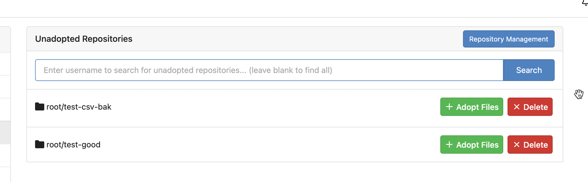
Ref:
https://github.com/go-gitea/gitea/pull/24315#pullrequestreview-1403034993
And fix the incorrect layout for "dasbboard", the "form" shouldn't
follow `<h4 class="ui top attached header">`, so move it to inner.
Diff with ignoring spaces:
https://github.com/go-gitea/gitea/pull/24370/files?diff=unified&w=1
A known bug: the adapt/delete button doesn't work due to a historical
messy logic, will fix it in next PR (#24374)
|
| |
|
|
|
|
|
|
|
|
|
|
|
|
|
|
|
|
|
|
|
|
|
|
|
|
|
|
|
|
|
|
|
|
|
|
|
|
|
|
|
|
|
|
|
|
|
|
|
| |
This PR moves the secrets and runners settings to actions settings on
all settings(repo,org,user,admin) levels.
After this PR, if
[ENABLED](https://github.com/go-gitea/gitea/blob/5e7543fcf441afb30aba6188edac754ef32b9ac3/custom/conf/app.example.ini#L2604)
inside `app.ini` under `[actions]` is set to `false`, the "Actions" tab
(including runners management and secrets management) will not be shown.
After, the settings under actions settings for each level:
1. Admin Level
"Runners Management"
<img width="1437" alt="Screen Shot 2023-04-26 at 14 34 20"
src="https://user-images.githubusercontent.com/17645053/234489731-15822d21-38e1-4560-8bbe-69f122376abc.png">
2. User Level
"Secrets Management"
<img width="1427" alt="Screen Shot 2023-04-26 at 14 34 30"
src="https://user-images.githubusercontent.com/17645053/234489795-68c9c0cb-24f8-4f09-95c6-458ab914c313.png">
3. Repo and Organization Levels
"Runners Management" and "Secrets Management"
Org:
<img width="1437" alt="Screen Shot 2023-04-26 at 14 35 07"
src="https://user-images.githubusercontent.com/17645053/234489996-f3af5ebb-d354-46ca-9087-a0b586845281.png">
<img width="1433" alt="Screen Shot 2023-04-26 at 14 35 14"
src="https://user-images.githubusercontent.com/17645053/234490004-3abf8fed-81fd-4ce2-837a-935dade1793d.png">
Repo:
<img width="1419" alt="Screen Shot 2023-04-26 at 14 34 50"
src="https://user-images.githubusercontent.com/17645053/234489904-80c11038-4b58-462c-9d0b-8b7cf70bc2b3.png">
<img width="1430" alt="Screen Shot 2023-04-26 at 14 34 57"
src="https://user-images.githubusercontent.com/17645053/234489918-4e8d1fe2-9bcd-4d8a-96c1-238a8088d92e.png">
It also finished these tasks :
- [x] rename routers function "runners" to "actions", and refactor
related file names
- [x] check and modify part of the runners related functions to match
their name
- [x] Fix backend check caused by fmt check
---------
Co-authored-by: wxiaoguang <wxiaoguang@gmail.com>
|
| |
|
|
|
|
| |
Add
[`eslint-plugin-regexp`](https://github.com/ota-meshi/eslint-plugin-regexp)
and fix discovered issues. Config is mostly the recommended one, but I
relaxed a few rules.
|
| |
|
|
|
|
|
|
|
| |
to batch close (#24329)
fix #24185
---------
Co-authored-by: wxiaoguang <wxiaoguang@gmail.com>
|
| |
|
|
|
|
|
|
|
|
|
|
|
|
|
|
|
|
|
|
|
|
|
|
|
|
|
|
|
| |
header (#24315)
Close #24302
Part of #24229, Follows #24246
This PR focused on CSS style fine-tune, main changes:
1. Give `.ui.ui.ui.container` a width of `1280px` with a max-width of
`calc(100vw - 64px)`, so the main contents looks better on large
devices.
2. Share styles for table elements in all levels settings pages to fix
overflow of runners table on mobile and for consistency (The headers on
mobile can be further improved, but haven't found a proper way yet).
3. Use [stackable
grid](https://fomantic-ui.com/collections/grid.html#stackable) and
[device column width](https://fomantic-ui.com/examples/responsive.html)
for responsiveness for some pages (repo/org collaborators settings
pages, org teams related page)
4. Fixed #24302 by sharing label related CSS in reporg.css
5. Fine tune repo tags settings page
---------
Co-authored-by: wxiaoguang <wxiaoguang@gmail.com>
|
| |
|
|
|
|
|
|
|
|
|
|
|
|
| |
Fix https://github.com/go-gitea/gitea/issues/16188. Turns out the
element was completely misaligned by fomantic styles. Add most of the
original styles in `!important` form to fix.
Tapping the button doesn't do anything useful in Simulator.app, but I
guess it's still better to not outright hide it in case it has a
possiblity to work.
<img width="121" alt="image"
src="https://user-images.githubusercontent.com/115237/234379685-4e67f8cd-7e91-4bcc-8e17-9d5b2ebed6cd.png">
Co-authored-by: Giteabot <teabot@gitea.io>
|
| |
|
|
|
|
|
|
|
|
| |
Fixes https://github.com/go-gitea/gitea/issues/24326.
Set size class and downsize any such buttons that have a dropdown icon
because the dropdown icon increases button height artificially.
[`:has()`](https://developer.mozilla.org/en-US/docs/Web/CSS/:has) is not
supported in Firefox yet, but works fine with the experimental pref
enabled. I see this as a graceful degradation in unsupporting browsers.
|
| |
|
|
|
|
|
|
|
|
|
|
|
|
|
|
|
|
|
|
|
|
|
|
|
|
|
|
|
|
|
|
|
|
|
|
|
|
|
|
|
|
|
|
|
|
|
|
| |
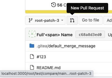
Follow #22719
### Major changes
1. `ServerError` doesn't do format, so remove the `%s`
2. Simplify `RenderBranchFeed` (slightly)
3. Remove unused `BranchFeedRSS`
4. Make `feed.RenderBranchFeed` respect `EnableFeed` config
5. Make `RepoBranchTagSelector.vue` respect `EnableFeed` setting,
otherwise there is always RSS icon
6. The `(branchURLPrefix + item.url).replace('src', 'rss')` doesn't seem
right for all cases, for example, the string `src` could appear in
`branchURLPrefix`, so we need a separate `rssURLPrefix`
7. The `<a>` in Vue menu needs `@click.stop`, otherwise the menu itself
would be triggered at the same time
8. Change `<a><button></button></a>` to `<a role=button>`
9. Use `{{PathEscapeSegments .TreePath}}` instead of `{{range $i, $v :=
.TreeNames}}/{{$v}}{{end}}`
Screenshot of changed parts:
<details>
</details>
### Other thoughts
Should we remove the RSS icon from the branch dropdown list? It seems
too complex for a list UI, and users already have the chance to get the
RSS feed URL from "branches" page.
---------
Co-authored-by: 6543 <6543@obermui.de>
Co-authored-by: silverwind <me@silverwind.io>
|
| |
|
|
|
|
| |
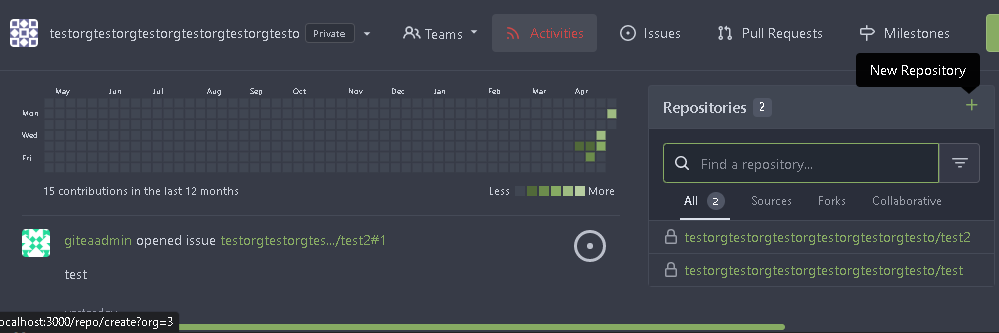
In org dashboard, the create repo link will be `repo/create?org={orgId}`
|
| |
|
|
|
|
|
|
| |
Looking at it again, it does look a bit "odd" without bold, so revert
the repolist change done in
https://github.com/go-gitea/gitea/pull/24307.
<img width="141" alt="image"
src="https://user-images.githubusercontent.com/115237/234331813-c6e2402f-e099-43b3-aed6-46a0e24e3899.png">
|
| |
|
|
|
|
| |
Before, 500 error

|
| |
|
|
|
|
|
|
|
|
|
|
|
|
|
|
|
|
|
|
|
|
|
|
|
|
|
|
|
|
| |
Close #23427
Co-Author: @wxiaoguang
If a repo's release setting is enabled, the logic has't changed.
Clicking the "Tags" button will jump to `/{user}/{repo}/tags` and
`templates/repo/release/list.tmpl` template will be used.
<img
src="https://user-images.githubusercontent.com/15528715/224939362-bd8974fd-08b0-4f79-a114-3389d15847ca.png"
width="600px" />
If the release setting is disabled, clicking the "Tags" button will
still jump to `/{user}/{repo}/tags` but a new template
`templates/repo/tag/list.tmpl` will be used.
<img
src="https://user-images.githubusercontent.com/15528715/233834564-74741e49-f4e9-47c8-ac12-e306642798dc.png"
width="600px" />
Since both templates above need to render the tags list, I moved the
tags list to a shared template located in
`templates/repo/tag/table.tmpl`.
---------
Co-authored-by: wxiaoguang <wxiaoguang@gmail.com>
Co-authored-by: Giteabot <teabot@gitea.io>
|
| |
|
|
|
|
|
|
|
|
|
| |
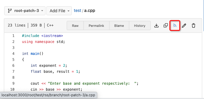
Fix #22228 adding RSS feeds for branches and files.
RSS feeds are accessed through:
* [gitea]/src/branch/{branch}.rss
* [gitea]/src/branch/{branch}/{file_name}.rss
No changes have been made to the UI to expose the feed urls for branches
and files.
|
| |
|
|
|
|
|
|
|
| |
Fix #24226

Co-authored-by: silverwind <me@silverwind.io>
|
| |
|
|
|
|
|
|
|
|
|
|
|
| |
Fix #24305
According to MDN, "bold" starts from 700, some fonts do not provide
"bolding" for weight 600
https://developer.mozilla.org/en-US/docs/Web/CSS/font-weight
---------
Co-authored-by: silverwind <me@silverwind.io>
Co-authored-by: Giteabot <teabot@gitea.io>
|
| |
|
|
|
|
|
|
|
|
|
|
|
|
|
|
|
|
|
|
|
|
|
|
|
|
|
|
|
|
|
| |
Follow #24097 and #24285
And add a devtest page for modal action button testing.
http://localhost:3000/devtest/fomantic-modal
Now the `modal_actions_confirm.tmpl` could support: green / blue /
yellow positive buttons, the negative button is "secondary".
ps: this PR is only a small improvement, there are still a lot of
buttons not having proper colors. In the future these buttons could be
improved by this approach.
These buttons could also be improved according to the conclusion of
#24285 in the future.

And add GitHub-like single danger button (context:
https://github.com/go-gitea/gitea/issues/24285#issuecomment-1519100312)

---------
Co-authored-by: silverwind <me@silverwind.io>
|
| |
|
|
|
|
|
|
|
|
|
|
|
|
|
|
|
|
|
|
|
|
|
| |
- Move delete button to right and remove red color on it.
- Remove CLI instructions when PR has been merged.
Before:
<img width="855" alt="Screenshot 2023-04-06 at 20 21 47"
src="https://user-images.githubusercontent.com/115237/230463178-95735fc0-9632-4d51-bbd5-2131c40186c4.png">
After:
<img width="865" alt="Screenshot 2023-04-06 at 20 23 17"
src="https://user-images.githubusercontent.com/115237/230463347-8155cbf9-4e58-421a-93a8-56ce6188dab8.png">
After (deleted):
<img width="860" alt="Screenshot 2023-04-06 at 20 19 30"
src="https://user-images.githubusercontent.com/115237/230463442-f53d7500-191d-4d75-a097-d100a461672a.png">
---------
Co-authored-by: Giteabot <teabot@gitea.io>
|
| |
|
|
|
|
|
|
|
|
|
|
|
|
|
|
|
|
|
|
|
|
|
|
|
|
|
|
|
|
|
|
|
|
|
|
|
|
|
|
|
|
|
|
|
|
|
|
|
|
|
|
|
| |
actions (#24097)
Co-Author: @wxiaoguang
This PR is to fix
https://github.com/go-gitea/gitea/issues/23318#issuecomment-1506275446 .
The way to fix this in this PR is to use `delete_modal_actions.tmpl`
here both to fix this issue and keep ui consistency (as suggested by
[TODO
here](https://github.com/go-gitea/gitea/blob/4299c3b7db61f8741eca0ba3d663bb65745a4acc/templates/projects/view.tmpl#L161))
And this PR also refactors `delete_modal_actions.tmpl` and its related
styles, and use the template for more modal actions:
1. Added template attributes:
* locale
* ModalButtonStyle: "yes" (default) or "confirm"
* ModalButtonCancelText
* ModalButtonOkText
2. Rename `delete_modal_actions.tmpl` template to
`modal_actions_confirm.tmpl` because it is not only used for action
modals deletion now.
3. Refactored css related to modals into `web_src/css/modules/modal.css`
and improved the styles.
4. Also use the template for PR deletion modal and remove issue
dependency modal.
5. Some modals should also use the template, but not sure how to open
them, so mark these modal actions by `{{/* TODO: Convert to
base/modal_actions_confirm */}}`
After (Also tested on arc green):
Hovering on the left buttons
<img width="711" alt="Screen Shot 2023-04-23 at 15 17 12"
src="https://user-images.githubusercontent.com/17645053/233825650-76307e65-9255-44bb-80e8-7062f58ead1b.png">
<img width="786" alt="Screen Shot 2023-04-23 at 15 17 21"
src="https://user-images.githubusercontent.com/17645053/233825652-4dc6f7d1-a180-49fb-a468-d60950eaee0d.png">
Test for functionalities:
https://user-images.githubusercontent.com/17645053/233826857-76376fda-022c-42d0-b0f3-339c17ca4e59.mov
---------
Co-authored-by: wxiaoguang <wxiaoguang@gmail.com>
|
| |
|
|
|
|
|
|
|
|
|
|
|
|
|
|
|
|
|
|
|
|
|
|
| |
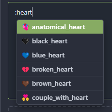
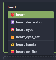
Prioritize matches that start with the given text, then matches that
contain the given text.
I wanted to add a heart emoji on a pull request comment so I started
writing `:`, `h`, `e`, `a`, `r` (at this point I still couldn't find the
heart), `t`... The heart was not on the list, that's weird - it feels
like I made a typo or a mistake. This fixes that.
This also feels more like GitHub's emoji auto-complete.
# Before
# After
---------
Signed-off-by: Yarden Shoham <git@yardenshoham.com>
Co-authored-by: silverwind <me@silverwind.io>
|
| |
|
|
|
|
|
|
|
|
|
|
|
|
|
|
|
|
|
|
|
|
|
| |
Fix #24249
Diff with ignoring spaces:
https://github.com/go-gitea/gitea/pull/24251/files?diff=split&w=1
Screenshots:
<details>
<img width="1440" alt="image"
src="https://user-images.githubusercontent.com/2114189/233592840-d9ef7296-64eb-4e48-a598-300807a7c2f9.png">
<img width="923" alt="image"
src="https://user-images.githubusercontent.com/2114189/233593015-16edc531-43c2-4ff0-b27e-ca75dbadce0c.png">
</details>
---------
Co-authored-by: silverwind <me@silverwind.io>
Co-authored-by: Giteabot <teabot@gitea.io>
|
| |
|
|
|
|
|
|
| |
Two small CSS fixes:
1. Fix basic primary label hover
2. Fix border color of divider in dropdown and remove margin so it looks
better with hover effect, as discussed in
https://github.com/go-gitea/gitea/pull/24143:
|
| |
|
|
|
|
|
| |
https://github.com/go-gitea/gitea/pull/24098#issuecomment-1514010690
---------
Co-authored-by: silverwind <me@silverwind.io>
|
| |
|
|
|
|
|
|
|
|
|
|
|
|
|
|
|
|
|
|
|
|
|
|
|
|
|
|
|
|
|
|
|
|
|
| |
Close #24108
Use secondary pointing menu for tabs on user/organization home page so
the tabs look the same.
Main changes:
1. modified a part of dom structure in
`templates/user/overview/header.tmpl` to make it the same as
`templates/org/header.tmpl` in order to produce the same ui.
2. Move some css to `web_src/css/shared/repoorgshared.css` to make them
shareable between `templates/user/overview/header.tmpl` and
`templates/org/header.tmpl`
After:
https://user-images.githubusercontent.com/17645053/232400617-2add5bec-d483-4ab1-b48d-eaee157f7b09.mov
For further improvements. Need some thoughts:
For [this
TODO](https://github.com/HesterG/gitea/blob/729ad294cbec7a77623b2e3eab750ea7a20e8ee0/templates/user/overview/header.tmpl#L1),
it is viable to make it a shared template for [this
part](https://github.com/HesterG/gitea/blob/729ad294cbec7a77623b2e3eab750ea7a20e8ee0/templates/user/overview/header.tmpl#L2-L17)
and [this
part](https://github.com/HesterG/gitea/blob/729ad294cbec7a77623b2e3eab750ea7a20e8ee0/templates/org/header.tmpl#L1-L16)
because they are the same except for the variable. But for the menu
parts, they are quite different so might not be suitable to use a shared
template. So need some thoughts and advice about extracting the shared
template from these two headers.
---------
Co-authored-by: Giteabot <teabot@gitea.io>
|
| |
|
|
|
|
|
|
|
|
|
|
|
|
|
|
|
|
|
|
|
|
| |
Close #24195
Some of the changes are taken from my another fix
https://github.com/go-gitea/gitea/pull/20147/commits/f07b0de997125c9b79cc5af27966a7cdd1803a4d
in #20147 (although that PR was discarded ....)
The bug is:
1. The old code doesn't handle `removedfile` event correctly
2. The old code doesn't provide attachments for type=CommentTypeReview
This PR doesn't intend to refactor the "upload" code to a perfect state
(to avoid making the review difficult), so some legacy styles are kept.
---------
Co-authored-by: silverwind <me@silverwind.io>
Co-authored-by: Giteabot <teabot@gitea.io>
|
| |
|
|
|
|
|
|
|
|
|
|
|
|
|
|
|
|
|
|
|
|
|
|
|
|
|
|
|
| |
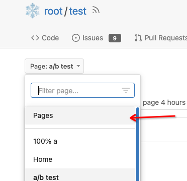
Close #7570
1. Clearly define the wiki path behaviors, see
`services/wiki/wiki_path.go` and tests
2. Keep compatibility with old contents
3. Allow to use dashes in titles, eg: "2000-01-02 Meeting record"
4. Add a "Pages" link in the dropdown, otherwise users can't go to the
Pages page easily.
5. Add a "View original git file" link in the Pages list, even if some
file names are broken, users still have a chance to edit or remove it,
without cloning the wiki repo to local.
6. Fix 500 error when the name contains prefix spaces.
This PR also introduces the ability to support sub-directories, but it
can't be done at the moment due to there are a lot of legacy wiki data,
which use "%2F" in file names.
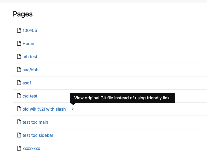
Co-authored-by: Giteabot <teabot@gitea.io>
|
| |
|
|
|
| |
It only worked in the Files Changed view.
Caused by #23639.
|
