| Commit message (Collapse) | Author | Age | Files | Lines |
|---|
| |
|
|
|
|
|
|
|
|
|
|
|
|
|
| |
Follow #23394
There were many bad smells in old code. This PR only moves the code into
Vue SFC, doesn't touch the unrelated logic.
update: after
https://github.com/go-gitea/gitea/pull/23421/commits/5f23218c851e12132f538a404c946bbf6ff38e62
, there should be no usage of the vue-rumtime-compiler anymore
(hopefully), so I think this PR could close #19851
---------
Co-authored-by: Lunny Xiao <xiaolunwen@gmail.com>
|
| |
|
|
|
|
|
|
|
|
|
|
|
|
|
|
|
|
|
|
|
|
|
|
|
|
|
|
|
|
|
|
| |
Similar to #23394
The dashboard repo list mixes jQuery/Fomantic UI/Vue together, it's very
diffcult to maintain and causes unfixable a11y problems.
This PR uses two steps to refactor the repo list:
1. move `data-` attributes to JS object and use Vue data as much as
possible
https://github.com/go-gitea/gitea/pull/23405/commits/d3adc0dcacf7de87b9819277e6598ac3993bbfa3
2. move the code into a Vue SFC
https://github.com/go-gitea/gitea/pull/23405/commits/7ebe55df6e67adfd272a4bf0a96ad6688edf661f
Total: +516 −585
Screenshots:
<details>
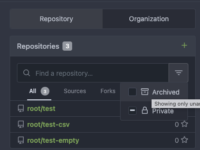
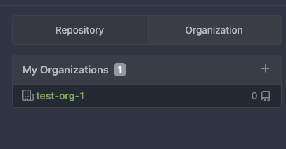
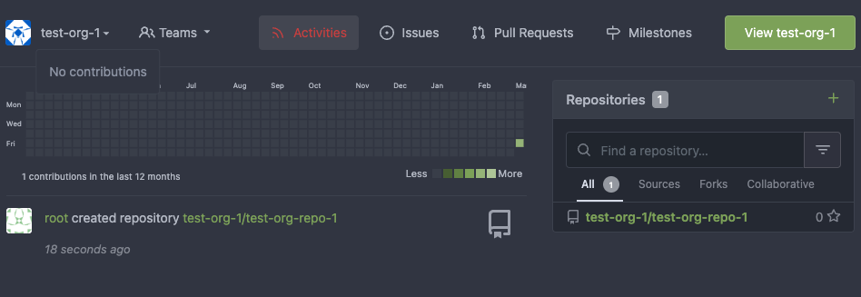
</details>
---------
Co-authored-by: John Olheiser <john.olheiser@gmail.com>
|
| |
|
|
|
|
|
|
|
|
|
|
|
|
|
|
|
|
|
|
|
|
|
|
|
|
|
|
|
|
|
|
| |
This improves a lot of accessibility shortcomings.
Every possible instance of `<div class="button">` matching the command
`ag '<[^ab].*?class=.*?[" ]button[ "]' templates/ | grep -v 'dropdown'`
has been converted when possible.
divs with the `dropdown` class and their children were omitted as
1. more analysis must be conducted whether the dropdowns still work as
intended when they are a `button` instead of a `div`.
2. most dropdowns have `div`s as children. The HTML standard disallows
`div`s inside `button`s.
3. When a dropdown child that's part of the displayed text content is
converted to a `button`, the dropdown can be focused twice
Further changes include that all "gitea-managed" buttons with JS code
received an `e.preventDefault()` so that they don't accidentally submit
an underlying form, which would execute instead of cancel the action.
Lastly, some minor issues were fixed as well during the refactoring.
## Future improvements
As mentioned in
https://github.com/go-gitea/gitea/pull/23337#discussion_r1127277391,
`<a>`s without `href` attribute are not focusable.
They should later on be converted to `<button>`s.
---------
Co-authored-by: wxiaoguang <wxiaoguang@gmail.com>
Co-authored-by: silverwind <me@silverwind.io>
Co-authored-by: techknowlogick <techknowlogick@gitea.io>
Co-authored-by: Lunny Xiao <xiaolunwen@gmail.com>
|
| |
|
|
|
|
| |
This PR adds a [Swift](https://www.swift.org/) package registry.
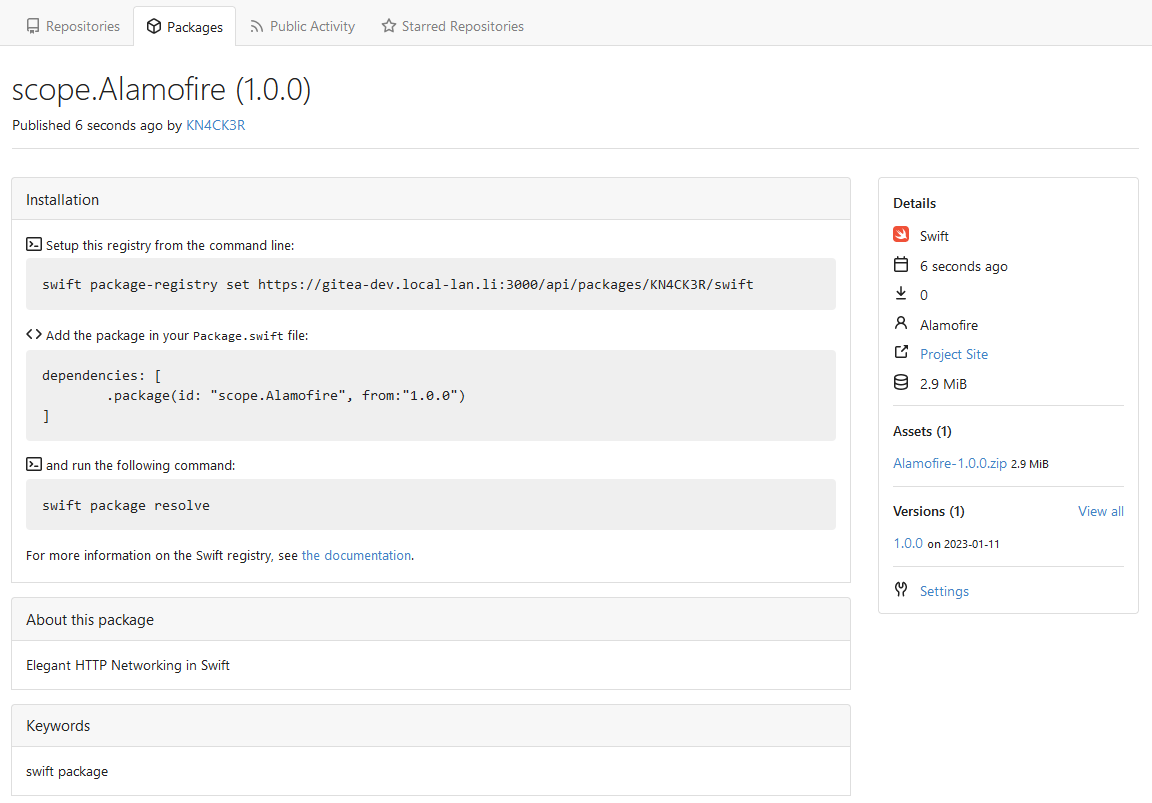
|
| |
|
|
|
|
|
|
|
|
|
|
|
|
|
|
|
|
|
|
|
|
|
|
|
|
|
|
|
|
|
|
|
|
|
|
|
|
| |
simplify (#23370)
1 Right now on actions page, the action list will not be aligned if
commit message is long. In this PR, the changes are:
- The branch tag is moved to bottom row
- Width percentage is given to make them aligned
- Show "..." if commit is longer than two lines.
- Align the status icon with the commit message with baseline
Before:
<img width="1068" alt="截屏2023-03-08 12 23 22"
src="https://user-images.githubusercontent.com/17645053/223628534-6b9472cb-29f5-40a3-9714-c5152553049e.png">
After:
<img width="756" alt="截屏2023-03-08 13 34 28"
src="https://user-images.githubusercontent.com/17645053/223628571-da94698b-0e0a-43e3-ae82-34d8c780e5ba.png">
2 Right now the actions list's pagination is not working properly
because Param is not passed to pagination template, in this PR Param
Strings are passed to the pager
Before:
<img width="1176" alt="截屏2023-03-08 12 23 50"
src="https://user-images.githubusercontent.com/17645053/223629207-8b67ce74-2342-4259-bc81-036e37752716.png">
After:
<img width="1343" alt="截屏2023-03-08 13 11 54"
src="https://user-images.githubusercontent.com/17645053/223629321-4f538f8a-45dc-4d6f-ae60-2c82680ae3e7.png">
3 A small simplify in `RepoActionView.vue` .
---------
Co-authored-by: wxiaoguang <wxiaoguang@gmail.com>
Co-authored-by: Lunny Xiao <xiaolunwen@gmail.com>
|
| |
|
|
|
|
|
|
|
|
|
| |
* Fix scoped label left and right part breaking across lines.
* Remove slanted divider in scoped label display, make it straight.
After using this for a while, this feels more visually noisy than
helpful.
* Reduce contrast between scope and item to reduce probability of
unreadable text on background.
* Change documentation to remove mention of non-exclusive scoped labels.
Co-authored-by: Lunny Xiao <xiaolunwen@gmail.com>
|
| |
|
|
|
|
|
|
|
|
| |
In #22767, we changed the class of `Edit Column` button from `red` to
`primary`
But `red` is used to find this button in js.....
---------
Co-authored-by: techknowlogick <techknowlogick@gitea.io>
Co-authored-by: zeripath <art27@cantab.net>
|
| |
|
|
|
|
|
|
|
|
|
|
|
|
|
|
|
|
|
|
|
|
|
|
|
|
|
|
|
| |
Follow:
* #23345
The branch/tag selector dropdown mixes jQuery/Fomantic UI/Vue together,
it's very diffcult to maintain and causes unfixable a11y problems. It
also causes problems like #19851 #21314 #21952
This PR is the first step for the refactoring, move `data-` attributes
to JS object and use Vue data as much as possible.
The old selector `'.choose.reference .dropdown'` was also wrong, it hits
`<div class="choose reference"><svg class="dropdown icon">` and would
cause undefined behaviors.
I have done some quick tests and it works. After this PR gets merged, I
will move the code into a Vue SFC in next PR.


---------
Co-authored-by: techknowlogick <techknowlogick@gitea.io>
|
| |
|
|
|
|
|
|
|
|
|
|
|
|
|
| |
Close #22649.
|status|screenshot|
|-|-|
|empty tag name|<img
src="https://user-images.githubusercontent.com/15528715/221490165-fd3abd2e-6dc5-4562-bece-d1d6a305479e.png"
width="300px"/>|
|new tag|<img
src="https://user-images.githubusercontent.com/15528715/221490450-49b2a48e-b206-49f4-bd79-34b1ea64156f.png"
width="300px"/>|
|existing tag|<img
src="https://user-images.githubusercontent.com/15528715/221490301-4d1879dd-4947-4abc-9b9a-e77be1806981.png"
width="300px"/>|
|
| |
|
|
|
|
|
|
|
|
|
|
|
|
|
|
|
|
|
| |
The CSS styles in Gitea themes are out-of-sync of Chroma's styles.
This PR introduces a `chroma-style-diff.go` tool to compare the diff.
The missing CSS styles have been added manually. They are left as empty
to reduce arguments because there was no color for them before.
And this PR fixes #22348, with just 2 lines changed: `.chroma .kt & .n`,
these colors are taken from GitHub.
It's good enough for #22348

---------
Co-authored-by: silverwind <me@silverwind.io>
|
| |
|
|
|
|
|
|
|
|
|
|
|
| |
Before:
<img width="1157" alt="Screenshot 2023-03-09 at 23 21 25"
src="https://user-images.githubusercontent.com/115237/224174168-869966cc-fa59-4231-b449-23bd9db12862.png">
After:
<img width="1145" alt="Screenshot 2023-03-09 at 23 24 34"
src="https://user-images.githubusercontent.com/115237/224174173-7f5b9c22-44c4-4eed-990c-da49d749eb0e.png">
---------
Co-authored-by: techknowlogick <techknowlogick@gitea.io>
|
| |
|
|
|
|
|
|
|
|
|
| |
Replace #23342
Fix a regression of #23014: the `a` couldn't be used here because
Fomantic UI has style conflicts: `.ui.comments .comment .actions a {
display: inline-block; }`
And complete one more of my TODOs: "in the future there could be a
special CSS class for it"
|
| |
|
|
|
|
|
|
|
|
|
|
|
| |
This PR is to fix the error shown below. The reason is because
[`class-name`
prop](https://github.com/go-gitea/gitea/blob/main/web_src/js/components/ActionRunStatus.vue#L6)
given to `svg` component has a space, and classList cannot add empty
string.
https://user-images.githubusercontent.com/17645053/223346720-c7f9de43-5e69-4ecf-93c0-90bf04090693.mov
---------
Co-authored-by: Lunny Xiao <xiaolunwen@gmail.com>
|
| |
|
|
|
|
|
|
|
|
|
|
|
|
|
|
|
|
|
|
|
|
|
|
|
|
|
|
|
|
|
|
|
|
|
|
|
| |
Replace #23310, Close #19733
And fix various UI problems, including regressions from #22959 #22950
and more.
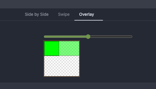
## SVG Detection
The old regexp may mismatch non-SVG files. This PR adds new tests for
those cases.
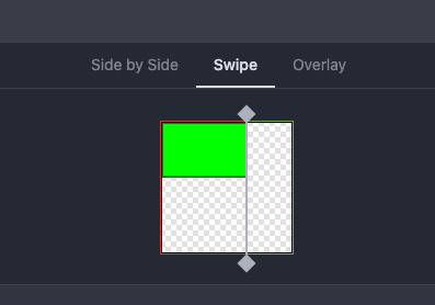
## UI Changes
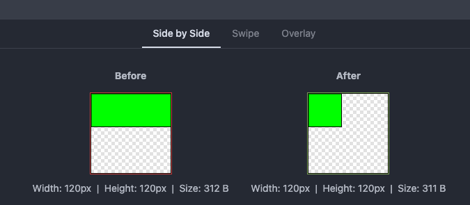
### Before
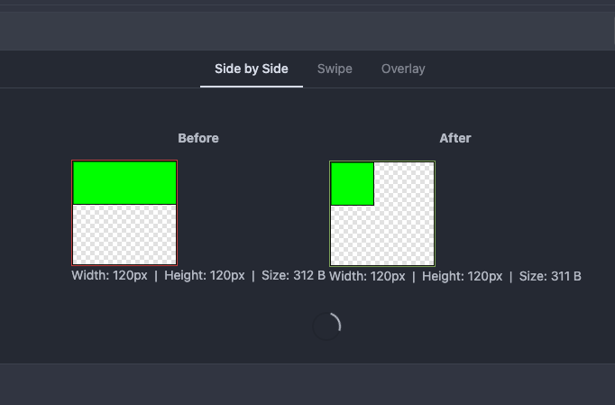
### After
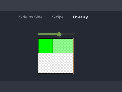
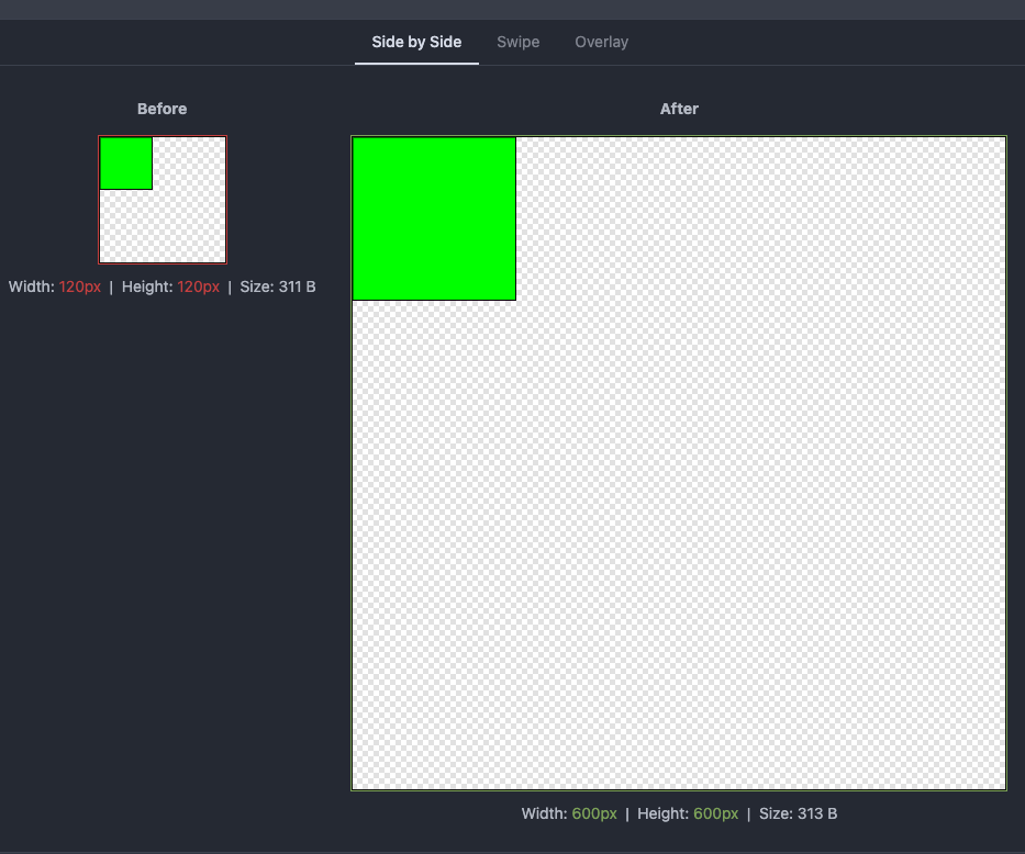
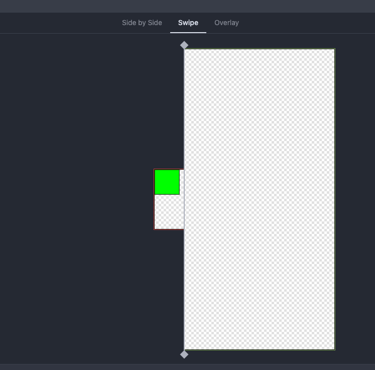
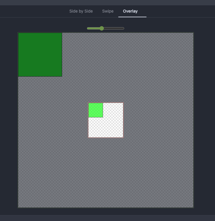
---------
Co-authored-by: Lunny Xiao <xiaolunwen@gmail.com>
|
| |
|
|
|
|
|
|
|
| |
Close #23248
The UI after this PR:
https://user-images.githubusercontent.com/17645053/223009758-7f0c9f12-d346-4cb2-a605-729fddce732f.mov
|
| |
|
|
|
|
|
|
|
|
| |
Related to:
https://github.com/go-gitea/gitea/pull/23212#discussion_r1122856231
Decrease duplication of SvgIcon when display a run status svg.
---------
Co-authored-by: Lunny Xiao <xiaolunwen@gmail.com>
|
| |
|
|
|
|
|
|
|
| |
Alt doesn't work on all browsers, the simplest solution for v1.19 is to
just not require it and toggle the label by just clicking.
Part of #22974
Co-authored-by: Lauris BH <lauris@nix.lv>
Co-authored-by: Lunny Xiao <xiaolunwen@gmail.com>
|
| |
|
|
|
|
|
|
|
| |
Close #23073.
Used the solution as reference to the reply:
https://github.com/go-gitea/gitea/issues/23073#issuecomment-1440124609
Here made the change inside the `contextpopup.js` because this is where
the popup component is created and tippy configuration is given.
Co-authored-by: Lunny Xiao <xiaolunwen@gmail.com>
|
| |
|
|
|
|
|
|
|
|
|
|
|
|
|
|
|
|
|
|
|
|
|
|
|
|
|
|
|
|
|
|
|
|
|
|
| |
### The CustomEvent prefix
There was already `ce-quick-submit`, the `ce-` prefix seems better than
`us-`. Rename the only `us-` prefixed `us-load-context-popup` to `ce-`
prefixed.
### Styles and Attributes in Go HTML Template
https://github.com/go-gitea/gitea/pull/21855#issuecomment-1429643073
Suggest to stick to `class="c1 {{if $var}}c2{{end}}"`
The readability and maintainability should be applied to the code which
is read by developers, but not for the generated outputs.
The template code is the code for developers, while the generated HTML
are only for browsers.
The `class="c1 {{if $var}}c2{{end}}"` style is clearer for developers
and more intuitive, and the generated HTML also makes browsers happy (a
few spaces do not affect anything)
Think about a more complex case:
* `class="{{if $active}}active{{end}} menu item {{if $show}}show{{end}}
{{if $warn}}warn{{end}}"`
* --vs--
* `class="{{if $active}}active {{end}}menu item{{if $show}}
show{{end}}{{if $warn}} warn{{end}}"`
The first style make it clearer to see each CSS class name with its
`{{if}}` block.
Co-authored-by: Lunny Xiao <xiaolunwen@gmail.com>
|
| |
|
|
|
|
|
|
|
| |
It is convenient to be able to toggle off this option after removing /
from the name. This ensures the muted state is communicated to blind
users even when the input is not fully disabled.
Part of #22974
Co-authored-by: Lunny Xiao <xiaolunwen@gmail.com>
|
| |
|
|
|
|
|
|
|
|
|
|
|
|
|
|
|
|
| |
submitting a single comment (#23245)
Close #23241
Before: press Ctrl+Enter in the Code Review Form, a single comment will
be added.
After: press Ctrl+Enter in the Code Review Form, start the review with
pending comments.
The old name `is_review` is not clear, so the new code use
`pending_review` as the new name.
Co-authored-by: delvh <leon@kske.dev>
Co-authored-by: techknowlogick <techknowlogick@gitea.io>
|
| |
|
|
|
|
|
|
|
|
|
|
|
|
|
|
|
| |
Before:

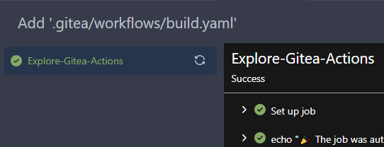
After:
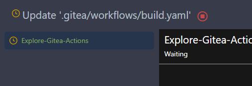

---------
Co-authored-by: techknowlogick <techknowlogick@gitea.io>
|
| |
|
|
|
|
|
| |
fix #23153
---------
Co-authored-by: silverwind <me@silverwind.io>
|
| |
|
|
|
|
|
|
|
|
|
|
|
|
|
|
|
|
|
|
| |
## The Problem
`overflow-wrap: break-word` doesn't work well for unbroken lines. Use
`overflow-wrap: anywhere` instead, and remove legacy alias `word-wrap`
## Before

## After

---------
Co-authored-by: silverwind <me@silverwind.io>
|
| |
|
|
|
|
|
|
|
|
|
|
|
|
|
|
|
|
|
|
|
|
|
|
|
|
|
|
|
|
|
|
|
|
|
|
|
|
|
|
|
|
|
|
|
|
|
|
|
|
|
|
|
|
|
|
|
|
|
|
|
|
|
| |
## TLDR
* Fix the broken page / broken image problem when click "Install"
* Close #20089
* Fix the Password Hash Algorithm display problem for #22942
* Close #23183
* Close #23184
## Details
### The broken page / broken image problem when click "Install"
(Redirect failed after install gitea #23184)
Before: when click "install", all new requests will fail, because the
server has been restarted. Users just see a broken page with broken
images, sometimes the server is not ready but the user would have been
redirect to "/user/login" page, then the users see a new broken page
(connection refused or something wrong ...)
After: only check InstallLock=true for necessary handlers, and sleep for
a while before restarting the server, then the browser has enough time
to load the "post-install" page. And there is a script to check whether
"/user/login" is ready, the user will only be redirected to the login
page when the server is ready.
### During new instance setup make 'Gitea Base URL' filled from
window.location.origin #20089
If the "app_url" input contains `localhost` (the default value from
config), use current window's location href as the `app_url` (aka
ROOT_URL)
### Fix the Password Hash Algorithm display problem for "Provide the
ability to set password hash algorithm parameters #22942"
Before: the UI shows `pbkdf2$50000$50`
<details>

</details>
After: the UI shows `pbkdf2`
<details>

</details>
### GET data: net::ERR_INVALID_URL #23183
Cause by empty `data:` in `<link rel="manifest"
href="data:{{.ManifestData}}">`
---------
Co-authored-by: Jason Song <i@wolfogre.com>
Co-authored-by: Lunny Xiao <xiaolunwen@gmail.com>
Co-authored-by: techknowlogick <techknowlogick@gitea.io>
|
| |
|
|
|
|
|
|
|
|
|
|
|
|
| |
(#23209)
Close #23204
Quick Demo:
https://user-images.githubusercontent.com/17645053/222058727-ad30a37c-f0ac-4184-9946-a71fcee473b5.mov
---------
Co-authored-by: delvh <leon@kske.dev>
|
| | |
|
| |
|
|
|
|
|
|
|
|
|
|
|
|
|
|
|
|
|
|
|
|
|
|
|
|
|
| |
The reason why quote reply is empty is when quote reply is clicked, it
triggers the click function on `.comment-form-reply` button, and when
the first time this function is triggered, easyMDE for the reply has not
yet initialized, so that click handler of `.quote-reply` button in
`repo-legacy.js` got an `undefined` as easyMDE, and the following lines
which put quoted reply into the easyMDE is not executed.
The workaround in this PR is to pass the replied content to
'.comment-form-reply' button if easyMDE is not yet initialized (quote
reply first clicked) and put the replied content into it the after
easyMDE is created.
Now quote reply on first click:
https://user-images.githubusercontent.com/17645053/221452823-fc699d50-1649-4af1-952e-f04fc8d2978e.mov
<br />
Update:
The above change is not appropriate as stated in the
[comment](https://github.com/go-gitea/gitea/pull/23168#issuecomment-1445562284)
Use await instead
Close #22075.
Close #23247.
|
| |
|
|
|
| |
Due to switched input parameters, the citation texts for Bibtex and Apa
were switched.
This pull request fixes #23244
|
| |
|
| |
To quickly see what changed without having to re-read the whole diff.
|
| |
|
|
|
|
|
|
|
|
|
|
|
|
|
|
|
|
|
|
| |
(#23224)
Regression of #10107
(https://github.com/go-gitea/gitea/pull/10107/files#diff-a15e36f2f9c13339f7fdd38bc2887db2ff2945cb8434464318ab9105fcc846bdR460)
Fix #22222
Before: the "clear" action couldn't remove these check marks.
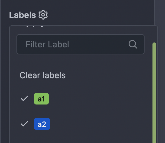
After: the "clear" action can remove these check marks.
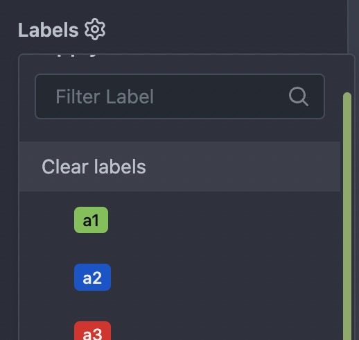
|
| |
|
|
|
|
|
|
|
|
|
|
|
|
|
|
|
|
|
|
|
|
|
|
|
|
|
|
|
|
|
|
|
|
|
|
|
|
|
|
|
|
| |
Co-author: yp05327 , this PR is based on yp05327's #22813.
The problems of the old DashboardRepoList / repolist.tmpl:
* It mixes many different frameworks together
* It "just works", bug on bug
* It uses many anti-pattern of Vue
This PR:
* Fix bugs and close #22800
* Decouple the "checkbox" elements from Fomantic UI (only use CSS
styles)
* Simplify the HTML layout
* Simplify JS logic
* Make it easier to refactor the DashboardRepoList into a pure Vue
component in the future.
### Screenshots
#### Default
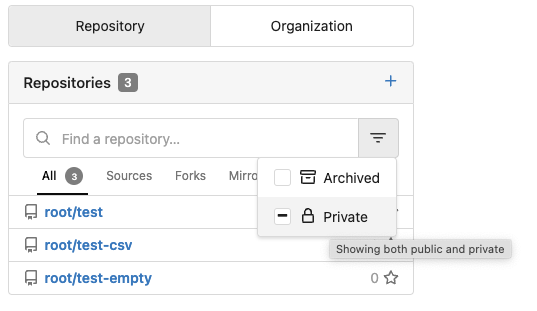
#### Click "Archived" to make it checked
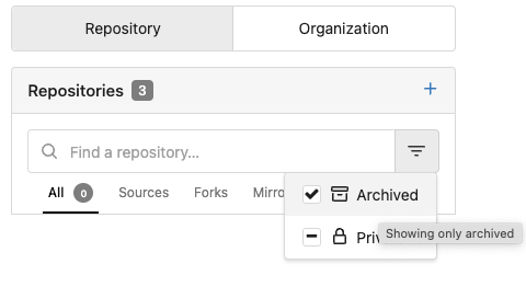
#### Click "Archived" to make it intermediate

#### Click "Archived" to make it unchecked
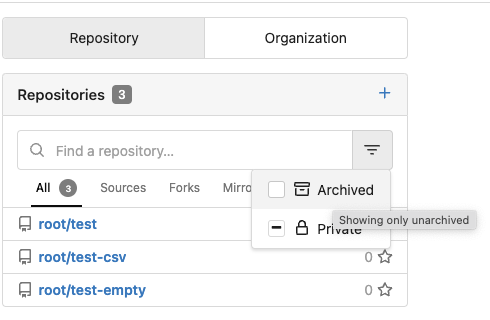
---------
Co-authored-by: yp05327 <576951401@qq.com>
Co-authored-by: Lunny Xiao <xiaolunwen@gmail.com>
|
| |
|
|
|
|
|
|
|
| |
Close #10468
Without SimpleMDE/EasyMDE, using Simple Textarea, the button text could
be changed when content changes.
After introducing SimpleMDE/EasyMDE, there is no code for updating the
button text.
|
| |
|
|
|
|
|
| |
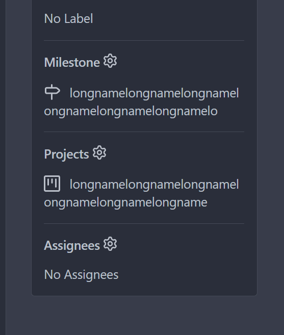
Fixes https://github.com/go-gitea/gitea/issues/22953
Co-authored-by: delvh <leon@kske.dev>
|
| |
|
|
|
|
|
|
|
|
|
|
|
|
|
|
|
|
|
|
|
|
|
|
|
|
| |
events (#23065)
Using `touchstart` for `click` events is a black magic for mobile
browsers (Google: `fastclick`).
However, it causes many UX problems if the fastclick is used without
careful design.
Fomantic UI uses this fastclick for its `dimmer` and `dropdown`, it
makes mobile users feel strange when they "touch" the dropdown menu.
This PR uses a simple patch to fix that behavior. Then the Fomantic
dropdown only uses `click` for click events.
This PR is simple enough and won't cause hidden bugs even if the patch
doesn't work. In the future, if there are more patches for Fomantic UI,
the patches could be placed in a directory like
`web_src/fomantic/patches/001-fix-click-touchstart`, etc.

Co-authored-by: Lunny Xiao <xiaolunwen@gmail.com>
|
| |
|
|
| |
Previously only the last few activities where available. This works for
all activity and for activity on a date chosen on the heatmap.
|
| |
|
|
|
|
|
|
|
|
|
|
|
|
|
| |
Right now on the PR 'File Change' Tab, the file title header sticky to
the top on large screens has wrong height, resulting in wrong ui
behavior when scrolling down. This PR is to fix this.
Before:
<img width="964" alt="截屏2023-02-24 17 12 29"
src="https://user-images.githubusercontent.com/17645053/221140409-025c4a84-6bbe-4b5b-a13f-bd2b79063522.png">
After:
<img width="1430" alt="截屏2023-02-24 21 10 12"
src="https://user-images.githubusercontent.com/17645053/221186750-0344d652-4610-4a90-a4c0-7f6269f950d6.png">
|
| |
|
|
|
|
|
|
|
|
|
|
|
|
|
|
|
|
|
|
|
|
|
|
|
|
|
|
|
|
| |
Currently, Gitea will run actions automatically which are triggered by
fork pull request. It's a security risk, people can create a PR and
modify the workflow yamls to execute a malicious script.
So we should require approval for first-time contributors, which is the
default strategy of a public repo on GitHub, see [Approving workflow
runs from public
forks](https://docs.github.com/en/actions/managing-workflow-runs/approving-workflow-runs-from-public-forks).
Current strategy:
- don't need approval if it's not a fork PR;
- always need approval if the user is restricted;
- don't need approval if the user can write;
- don't need approval if the user has been approved before;
- otherwise, need approval.
https://user-images.githubusercontent.com/9418365/217207121-badf50a8-826c-4425-bef1-d82d1979bc81.mov
GitHub has an option for that, you can see that at
`/<owner>/<repo>/settings/actions`, and we can support that later.
<img width="835" alt="image"
src="https://user-images.githubusercontent.com/9418365/217199990-2967e68b-e693-4e59-8186-ab33a1314a16.png">
---------
Co-authored-by: Lunny Xiao <xiaolunwen@gmail.com>
|
| |
|
|
|
|
|
|
|
|
|
|
|
|
|
|
|
|
|
|
|
|
|
|
|
|
|
|
|
|
|
|
|
|
|
|
|
|
|
|
|
|
|
|
|
|
|
|
|
|
|
|
|
|
|
|
| |
As the title. Label/assignee share the same code.
* Close #22607
* Close #20727
Also:
* partially fix for #21742, now the comment reaction and menu work with
keyboard.
* partially fix for #17705, in most cases the comment won't be lost.
* partially fix for #21539
* partially fix for #20347
* partially fix for #7329
### The `Enter` support
Before, if user presses Enter, the dropdown just disappears and nothing
happens or the window reloads.
After, Enter can be used to select/deselect labels, and press Esc to
hide the dropdown to update the labels (still no way to cancel ....
maybe you can do a Cmd+R or F5 to refresh the window to discard the
changes .....)
This is only a quick patch, the UX is still not perfect, but it's much
better than before.
### The `confirm` before reloading
And more fixes for the `reload` problem, the new behaviors:
* If nothing changes (just show/hide the dropdown), then the page won't
be reloaded.
* If there are draft comments, show a confirm dialog before reloading,
to avoid losing comments.
That's the best effect can be done at the moment, unless completely
refactor these dropdown related code.
Screenshot of the confirm dialog:
<details>

</details>
---------
Co-authored-by: Brecht Van Lommel <brecht@blender.org>
Co-authored-by: Lunny Xiao <xiaolunwen@gmail.com>
|
| |
|
|
|
|
| |
This PR is a possible solution for issue #22866. Main change is to add a
`author-wrapper` class around author name, like the wrapper added to
message. The `max-width` is set to 200px on PC, and 100px on mobile
device for now.
|
| |
|
|
|
|
|
|
|
|
|
|
|
|
|
|
|
| |
(#23093)
Given mardown source
```
x ` a` y
x `a ` y
x ` a ` y
```
Render
<img width="1421" alt="2023-02-23 15 33 14"
src="https://user-images.githubusercontent.com/17645053/220844280-a304c788-ac79-4a26-a55a-0db00f2fb3f3.png">
Fixes #23080.
|
| |
|
| |
Follows #22950
|
| |
|
|
|
|
| |
At that moment I made a mistake (failed to detect a JS variable type
correctly)
Close #23040
|
| |
|
|
|
|
|
|
| |
- Upgrade stylelint and plugin
- Change ruleset to a explicit one, with all deprecated rules removed
- Fix new issues detected by value validation
For `overflow: overlay` see
https://github.com/stylelint/stylelint/issues/6667
|
| |
|
| |
Fix #23000.
|
| |
|
|
|
|
|
|
|
|
|
|
|
|
|
|
|
|
|
|
|
|
|
|
|
|
|
|
|
|
|
|
|
|
|
|
|
|
|
|
|
|
|
|
|
|
|
|
| |
This PR follows:
* #22950
### Before
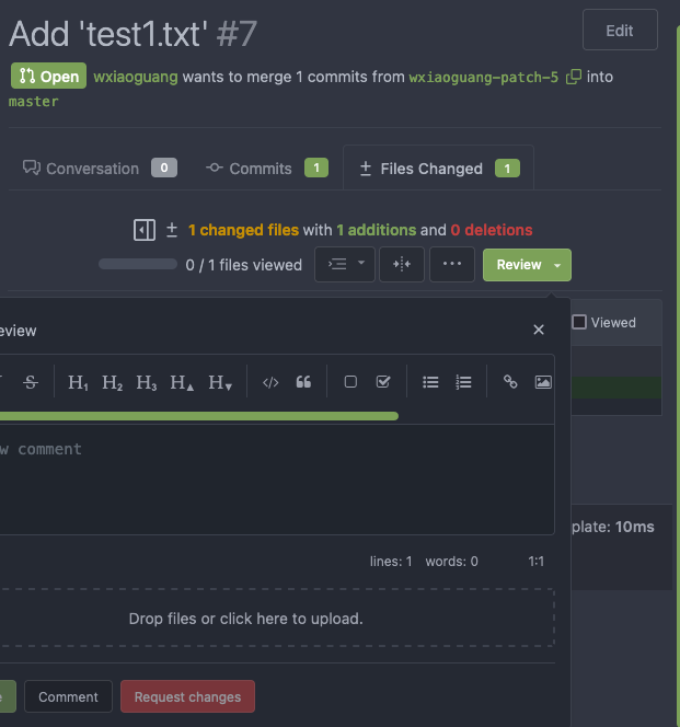
The Review Box has many problems:
* It doesn't work for small screens.
* It has an anonying animation which makes the UI laggy.
* It uses "custom dropdown menu" which is very difficult to fine tune.
* `$().toggle('visible')` is not a correct call
* jQuery just accepts any invalid `duration` argument:
`$().toggle('anyting')`
* The button is not a button.
<details>
</details>
### After
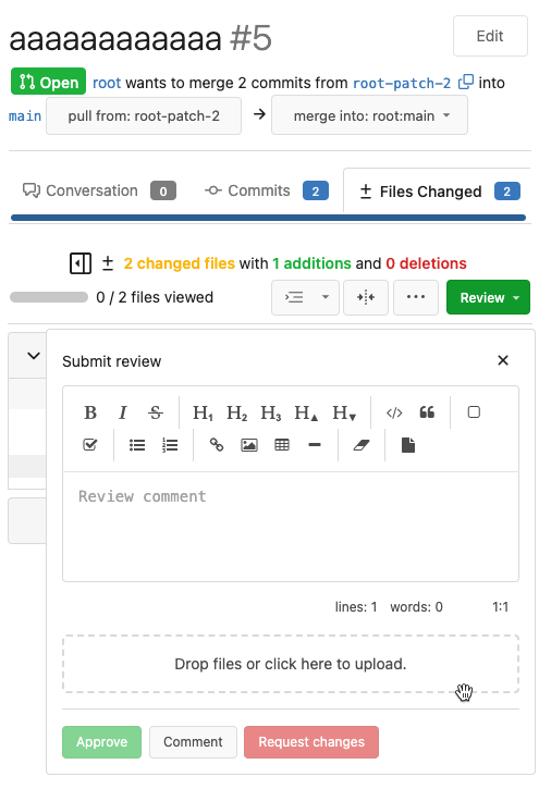
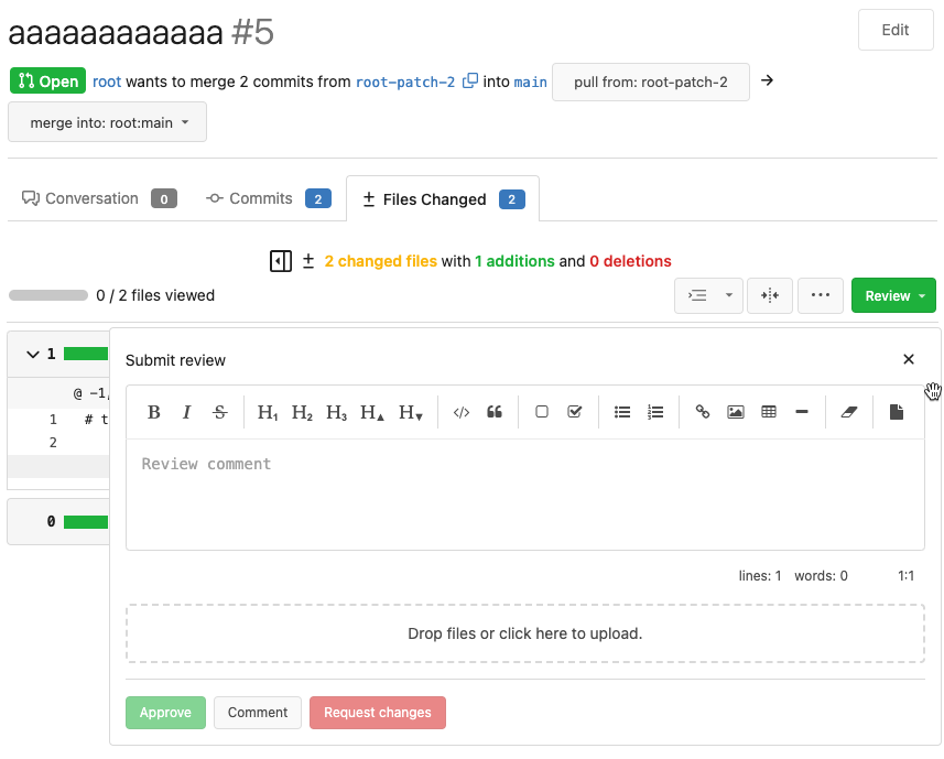
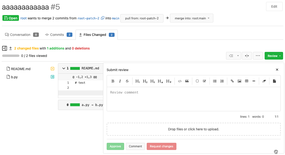
These problems are fixed, and eliminate many `!important` games.
<details>
</details>
And most dropdown icons still looks good:
<details>

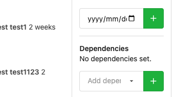
</details>
Co-authored-by: delvh <leon@kske.dev>
|
| |
|
|
|
|
|
|
|
|
|
|
|
|
|
|
|
|
| |
On the home page of an organization, there are unexpected dashes between
the avatars of the members when hovering over the avatars, as shown in
below:


This is because in `fomantic/build/semantic.css` there is a
rule `text-decoration: underline;` when hovering over the `<a>` tag.
Here, the `<a>` tag has width and height because of the avatar image inside,
leading to the unexpected underlines.
This PR overrides the `a:hover` rule so the underline does not exist anymore.
Co-authored-by: delvh <leon@kske.dev>
|
| |
|
|
|
|
|
|
|
|
|
|
|
|
|
|
|
|
|
| |
Regression bug of #19650
Close #20983
Close #21912
### The "Manually Merged" form

### Mark a PR as Manually Merged and close it

---------
Co-authored-by: Jason Song <i@wolfogre.com>
Co-authored-by: Lunny Xiao <xiaolunwen@gmail.com>
|
| |
|
| |
Some were out-dated, some are added.
|
| |
|
|
|
|
|
|
|
|
| |
`.gt-relative` is also `position: relative !important;`
There are `gt-pr-?` styles below (line 140) for `padding-right`, which
makes `.gt-pr` ambiguous
Co-authored-by: delvh <leon@kske.dev>
Co-authored-by: John Olheiser <john.olheiser@gmail.com>
Co-authored-by: techknowlogick <techknowlogick@gitea.io>
|
