| Commit message (Collapse) | Author | Age | Files | Lines |
|---|
| |
|
| |
Fix #33150
|
| | |
|
| |
|
|
|
|
|
|
| |
Implemented #29503
---------
Co-authored-by: Ben Chang <ben_chang@htc.com>
Co-authored-by: wxiaoguang <wxiaoguang@gmail.com>
|
| |
|
|
|
|
|
|
|
|
|
| |
Fixes https://github.com/go-gitea/gitea/issues/31686.
A more elborate manual tabindex numbering could be done, but I think
it's not really worth the extra effort and such stuff could easily break
during refactors.
Includes another small tweak to un-stretch the`<a>` element so it's only
as large as it needs to be and this change also made the margin
unneeded.
|
| |
|
|
|
|
|
|
|
|
|
|
|
|
|
|
|
|
|
|
|
|
|
|
|
| |
As requested in
https://github.com/go-gitea/gitea/pull/31504#issuecomment-2196196646.
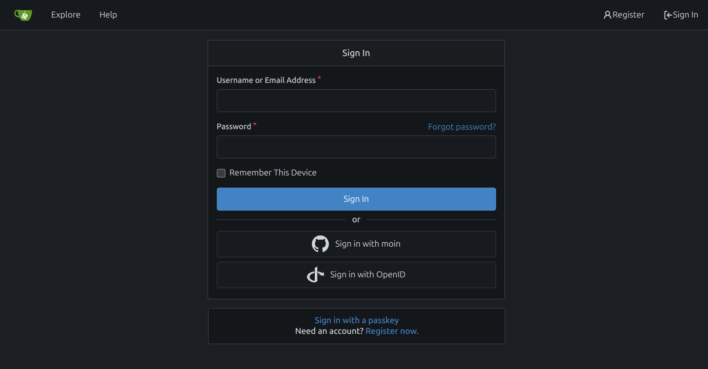
This PR refactor the login page:


# Changes
- [x] use separate box for passkey login and go to registration
- [x] move forgot passoword next to password label
- [x] fix password required label `*` and padding
- [x] remove tabs from login page
---------
Co-authored-by: silverwind <me@silverwind.io>
|
| |
|
|
|
|
| |
Follow #30345
Follow #30547
`ellipsis` / `white-space` shouldn't be put on the general dropdown components.
|
| |
|
|
|
|
|
|
| |
close #29685
---------
Signed-off-by: 6543 <6543@obermui.de>
Co-authored-by: silverwind <me@silverwind.io>
|
| |
|
|
|
|
|
|
|
|
|
|
|
|
|
|
| |
Fix the checkbox issues in
https://github.com/go-gitea/gitea/issues/30303 which were existing
problems with these selectors, but made visible with
https://github.com/go-gitea/gitea/pull/30162.
There is a lot of dead/useless CSS in `form.css`, I only fixed the two
problems and remove CSS that was definitely not in use or needed.
<img width="369" alt="Screenshot 2024-04-06 at 18 00 08"
src="https://github.com/go-gitea/gitea/assets/115237/720f178b-1b22-48d4-8704-becb8ce66129">
<img width="405" alt="Screenshot 2024-04-06 at 18 00 28"
src="https://github.com/go-gitea/gitea/assets/115237/61c0f8ec-34af-46c5-a3fa-7c5c4d30c7d2">
Co-authored-by: Giteabot <teabot@gitea.io>
|
| |
|
|
|
|
|
|
|
|
|
|
|
|
|
|
|
|
|
| |
CSS is pretty slim already and the `.ui.toggle.checkbox` sliders on
admin page also still work. The only necessary JS is the one that links
`input` and `label` so that it can be toggled via label. All checkboxes
except the markdown ones render at `--checkbox-size: 16px` now.
<img width="174" alt="Screenshot 2024-03-28 at 22 15 10"
src="https://github.com/go-gitea/gitea/assets/115237/3455c1bb-166b-47e4-9847-2d20dd1f04db">
<img width="499" alt="Screenshot 2024-03-28 at 21 00 07"
src="https://github.com/go-gitea/gitea/assets/115237/412be2b3-d5a0-478a-b17b-43e6bc12e8ce">
<img width="83" alt="Screenshot 2024-03-28 at 22 14 34"
src="https://github.com/go-gitea/gitea/assets/115237/d8c89838-a420-4723-8c49-89405bb39474">
---------
Co-authored-by: delvh <dev.lh@web.de>
|
| |
|
|
|
|
|
|
|
|
|
|
|
|
|
|
|
|
|
|
|
|
|
|
|
|
|
|
|
|
|
|
|
| |
Unify all but a few search boxes to use uniform style, uniform
translations and shared templates where possible.
Remove a few duplicated search templates, e. g. code search.
<details><summary>Example after screenshots:</summary>


</details>
Also includes #29700
Co-authored-by: 6543 <6543@obermui.de>
---------
Co-authored-by: 6543 <m.huber@kithara.com>
Co-authored-by: 6543 <6543@obermui.de>
Co-authored-by: silverwind <me@silverwind.io>
Co-authored-by: Giteabot <teabot@gitea.io>
|
| |
|
|
|
|
|
|
|
|
|
|
|
|
|
|
|
|
|
|
|
|
|
|
|
|
|
|
|
|
|
| |
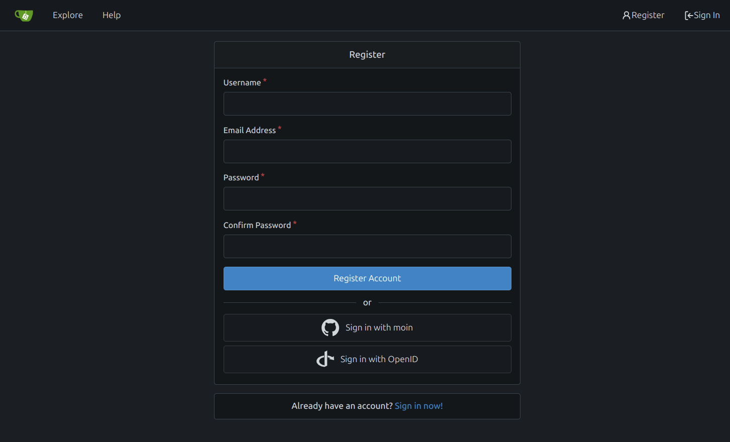
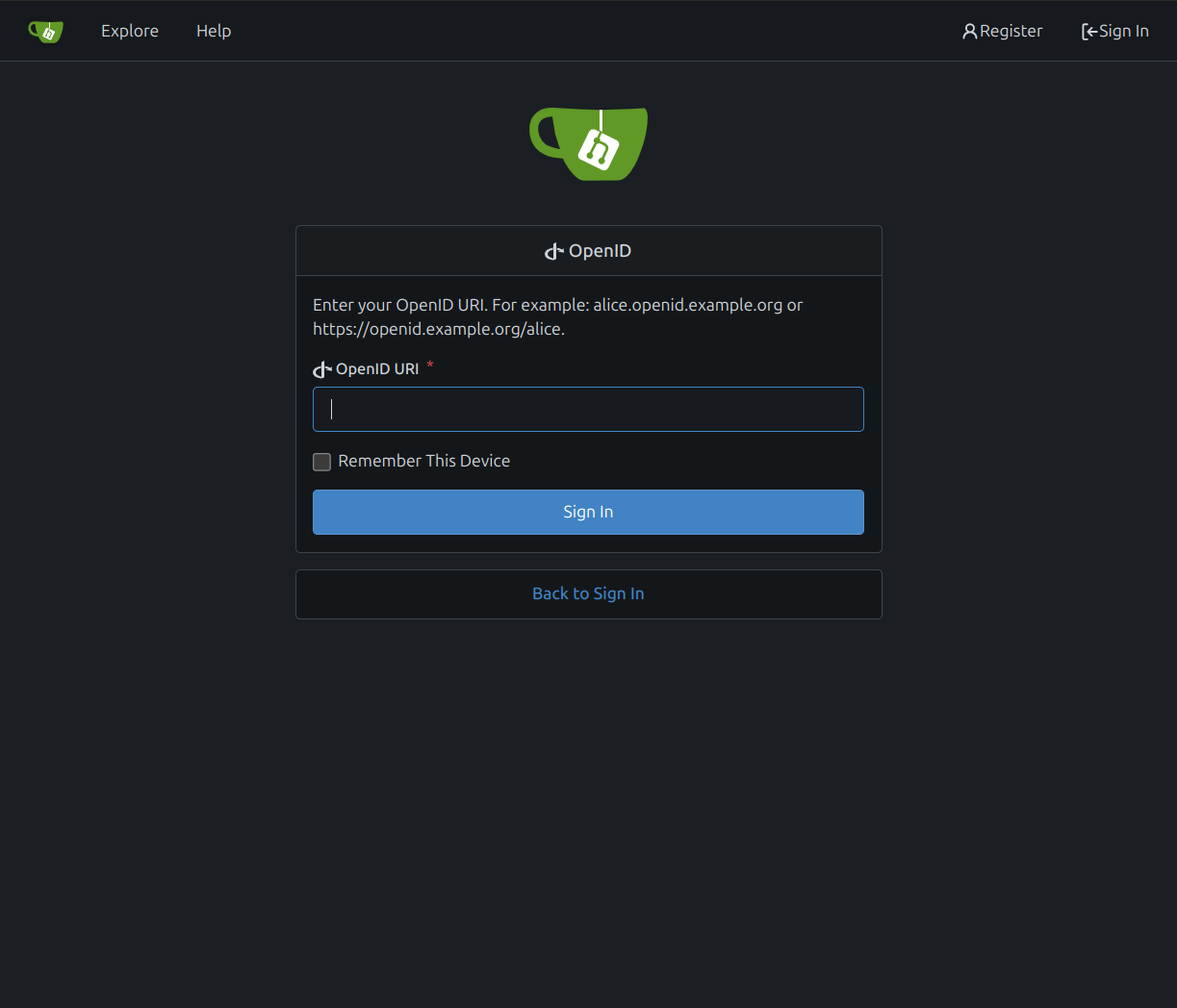
There are a few inconsistencies within Gitea and this PR addresses one
of them. This PR updates the sign-in page layout, including the register
and openID tabs, to match the layout of the settings pages
(/user/settings) for more consistency.
This PR updates the following routes:
`/user/login`
`/user/sign_up`
`/user/login/openid`
`/user/forgot_password`
`/user/link_account`
`/user/recover_account`
**Before**
<img width="968" alt="Screenshot 2024-02-05 at 8 27 24 AM"
src="https://github.com/go-gitea/gitea/assets/6152817/fb0cb517-57c0-4eed-be1d-56f36bd1960d">
**After**
<img width="968" alt="Screenshot 2024-02-05 at 8 26 39 AM"
src="https://github.com/go-gitea/gitea/assets/6152817/428d691d-0a42-4a67-a646-05527f2a7b41">
This PR addresses a revert of the original PR due to this
[comment](https://github.com/go-gitea/gitea/pull/28753#issuecomment-1956596817).
---------
Co-authored-by: rafh <rafaelheard@gmail.com>
|
| |
|
|
| |
Revert #29255
Revert #28753
|
| |
|
|
|
|
|
|
|
|
|
|
|
|
|
|
|
|
| |
In a previous [PR](https://github.com/go-gitea/gitea/pull/28753) we
moved the labels to be above the inputs. The PR ensures that the
alignment is also on both tabs of the link account page
(`/user/link_account`).
Before
<img width="1094" alt="before"
src="https://github.com/go-gitea/gitea/assets/6152817/ac1e86bd-c4d6-4e45-87d1-87bb8a736149">
After
<img width="1094" alt="after"
src="https://github.com/go-gitea/gitea/assets/6152817/1b5fc109-f4d2-43ee-b924-0a9e53a0e391">
---------
Co-authored-by: rafh <rafaelheard@gmail.com>
|
| |
|
|
|
|
|
|
|
|
|
|
|
|
|
|
|
|
| |
There are a few inconsistencies within Gitea and this PR addresses one of them.
This PR updates the sign-in page layout, including the register and openID tabs,
to match the layout of the settings pages (`/user/settings`) for more consistency.
**Before**
<img width="968" alt="Screenshot 2024-02-05 at 8 27 24 AM"
src="https://github.com/go-gitea/gitea/assets/6152817/fb0cb517-57c0-4eed-be1d-56f36bd1960d">
**After**
<img width="968" alt="Screenshot 2024-02-05 at 8 26 39 AM"
src="https://github.com/go-gitea/gitea/assets/6152817/428d691d-0a42-4a67-a646-05527f2a7b41">
---------
Co-authored-by: rafh <rafaelheard@gmail.com>
|
| |
|
|
|
|
|
|
|
|
|
|
|
|
| |
## Changes
- no more hardcoded `border-radius`es (apart from `0`)
- no more value inconsistencies
- no more guessing what pixel value you should use
- two new variables:
- `--border-radius-medium` (for elements where the normal border radius
does not suffice)
- `--border-radius-circle` (for displaying circles)
---------
Co-authored-by: silverwind <me@silverwind.io>
|
| | |
|
| |
|
|
|
|
|
|
|
|
|
|
|
|
|
|
|
|
| |
- Fix and improve mobile navbar layout
- Apply all cleanups suggested in
https://github.com/go-gitea/gitea/pull/25111
- Make media query breakpoints match Fomantic's exactly
- Clean up whitespace in class on navbar items
Mobile navbar before and after:
<img width="745" alt="Screenshot 2023-06-08 at 08 40 56"
src="https://github.com/go-gitea/gitea/assets/115237/ca84b239-b10f-41db-8c06-dcf2b6dd9d28">
<img width="739" alt="Screenshot 2023-06-08 at 08 41 23"
src="https://github.com/go-gitea/gitea/assets/115237/09133c54-eb7e-4110-858c-ead23c3b7521">
---------
Co-authored-by: wxiaoguang <wxiaoguang@gmail.com>
Co-authored-by: Giteabot <teabot@gitea.io>
|
| |
|
|
|
|
|
|
|
|
|
|
|
|
|
|
|
|
|
|
|
|
|
|
|
|
|
|
|
|
|
|
|
| |
Close #24808
Co-Authour @wxiaoguang @silverwind
1. Most svgs are found from https://worldvectorlogo.com/ , and some are
from conversion of png to svg. (facebook and nextcloud). And also
changed `templates/user/settings/security/accountlinks.tmpl`.
2. Fixed display name and iconurl related logic
# After
<img width="1436" alt="Screen Shot 2023-06-05 at 14 09 05"
src="https://github.com/go-gitea/gitea/assets/17645053/a5db39d8-1ab0-4676-82a4-fba60a1d1f84">
On mobile
<img width="378" alt="Screen Shot 2023-06-05 at 14 09 46"
src="https://github.com/go-gitea/gitea/assets/17645053/71d0f51b-baac-4f48-8ca2-ae0e013bd62e">
user/settings/security/accountlinks (The dropdown might be improved
later)
<img width="973" alt="Screen Shot 2023-06-01 at 10 01 44"
src="https://github.com/go-gitea/gitea/assets/17645053/27010e7e-2785-4fc5-8c49-b06621898f37">
---------
Co-authored-by: silverwind <me@silverwind.io>
Co-authored-by: wxiaoguang <wxiaoguang@gmail.com>
|
| |
|
|
|
|
|
|
|
|
|
|
|
|
|
|
|
|
|
|
|
|
|
|
|
|
|
|
|
|
|
|
|
|
|
|
|
|
|
|
|
|
|
|
|
|
|
|
|
|
| |
Follow:
* #22697
There are some bugs in #22697:
* https://github.com/go-gitea/gitea/pull/22697#issuecomment-1577957966
* the webauthn failure message is never shown and causes console error
* The `document.getElementById('register-button')` and
`document.getElementById('login-button')` is wrong
* there is no such element in code
* it causes JS error when a browser doesn't provide webauthn
* the end user can't see the real error message
These bugs are fixed in this PR.
Other changes:
* Use simple HTML/CSS layouts, no need to use too many `gt-` patches
* Make the webauthn page have correct "page-content" layout
* The "data-webauthn-error-msg" elements are only used to provide locale
texts, so move them into a single "gt-hidden", then no need to repeat a
lot of "gt-hidden" in code
* The `{{.CsrfTokenHtml}}` is a no-op because there is no form
* Many `hideElem('#webauthn-error')` in code is no-op because the
`webauthn-error` already has "gt-hidden" by default
* Make the tests for "URLEncodedBase64" really test with concrete cases.
Screenshots:
* Error message when webauthn fails (before, there is no error message):
<details>

</details>
* Error message when webauthn is unavailable
<details>

</details>
|
| |
|
|
|
|
|
|
|
|
|
|
|
|
|
|
|
|
|
|
|
|
|
|
|
|
|
|
| |
Diff without whitespace:
https://github.com/go-gitea/gitea/pull/24740/files?diff=unified&w=1
- Use SVGs for GitHub and GitLab oauth providers
- Replace section wrapping with a divider
- Rework icon rendering, increase size from 32px to 40px
Before:
<img width="853" alt="Screenshot 2023-05-15 at 21 54 23"
src="https://github.com/go-gitea/gitea/assets/115237/6ab5cfb4-46ff-469a-bd1f-06780d4a6a0b">
After (more providers):
<img width="849" alt="Screenshot 2023-05-15 at 21 51 21"
src="https://github.com/go-gitea/gitea/assets/115237/fa84f92f-98e0-4aed-9357-5d62ddd98195">
<img width="856" alt="Screenshot 2023-05-15 at 21 56 45"
src="https://github.com/go-gitea/gitea/assets/115237/d3edd7ed-dadd-4302-aca7-08f20adc220e">
Ref: https://codeberg.org/Codeberg/Community/issues/1023
---------
Co-authored-by: Giteabot <teabot@gitea.io>
|
| |
|
|
|
|
|
|
|
|
|
|
|
|
| |
The completion popup now behaves now much more as expected than before
for the raw textarea:
- You can press <kbd>Tab</kbd> or <kbd>Enter</kbd> once the completion
popup is open to accept the selected item
- The menu does not close automatically when moving the cursor
- When you delete text, previously correct suggestions are shown again
- If you delete all text until the opening char (`@` or `:`) after
applying a suggestion, the popup reappears again
- Menu UI has been improved
<img width="278" alt="Screenshot 2023-04-07 at 19 43 42"
src="https://user-images.githubusercontent.com/115237/230653601-d6517b9f-0988-445e-aa57-5ebfaf5039f3.png">
|
| |
|
|
|
|
|
|
|
|
|
|
|
|
|
|
|
|
|
|
|
|
|
|
|
|
|
|
|
|
|
|
|
|
|
| |
Change grey shades in arc-green to match the theme more:
<img width="661" alt="Screenshot 2023-03-30 at 21 42 34"
src="https://user-images.githubusercontent.com/115237/228957952-8e099e56-6923-4aa6-8ce9-3c1cd898b73e.png">
Adjusted grey shade in light theme:
<img width="652" alt="image"
src="https://user-images.githubusercontent.com/115237/228963876-3bde6181-8397-4dc2-be72-33982e6c7acb.png">
Increase contrast in arc-green, change background to slightly darker
shade, change forgeground to slightly brighter colors:
<img width="283" alt="Screenshot 2023-03-30 at 22 33 20"
src="https://user-images.githubusercontent.com/115237/228957957-272c24a5-dd0b-427a-b6b7-e62836bdd73c.png">
Increase contrast of grey text in light theme as well by making them
darker:
<img width="273" alt="Screenshot 2023-03-30 at 22 33 35"
src="https://user-images.githubusercontent.com/115237/228957959-283139c7-6fa7-4b68-9fdd-16c668ad1301.png">
Add color rule for border multiple select items:
<img width="183" alt="Screenshot 2023-03-30 at 22 29 31"
src="https://user-images.githubusercontent.com/115237/228957954-6b5a752d-bbb0-4519-ab35-d02c0804d955.png">
<img width="181" alt="Screenshot 2023-03-30 at 22 29 46"
src="https://user-images.githubusercontent.com/115237/228957956-fca9790a-d6c9-4f31-8d1b-d183ab3ac669.png">
Added color rule for red `*` on required form fields:
<img width="97" alt="image"
src="https://user-images.githubusercontent.com/115237/228958760-517ad9ef-565d-4349-b734-9b559ab42429.png">
|
| |
|
|
|
|
|
|
|
|
|
|
|
|
|
|
|
|
|
|
|
|
|
|
|
|
|
|
|
|
|
|
|
|
|
|
|
|
|
|
|
|
|
|
|
|
|
|
|
| |
This PR fixes some ui problems as mentioned in the two issues below.
1. Long file path has no word break
## Before
<img width="1357" alt="截屏2023-03-17 17 49 43"
src="https://user-images.githubusercontent.com/17645053/225873491-27c7bf9a-d5d5-4065-9e4a-ff228e935abf.png">
## After
<img width="1248" alt="截屏2023-03-17 17 51 22"
src="https://user-images.githubusercontent.com/17645053/225873562-93b87af7-9c83-43f8-aa0d-36a9174d25ac.png">
on mobile
<img width="408" alt="截屏2023-03-17 17 51 15"
src="https://user-images.githubusercontent.com/17645053/225873554-1b8c8999-1dfc-4251-a7fc-20ecd3444cb0.png">
2. Texts in labels
## Before
<img width="1219" alt="截屏2023-03-17 17 49 24"
src="https://user-images.githubusercontent.com/17645053/225873369-812b1b52-c104-4e32-988f-c3e55ad2f844.png">
## After
<img width="1259" alt="截屏2023-03-17 17 51 31"
src="https://user-images.githubusercontent.com/17645053/225873317-9717fd2c-e9e1-4a00-a27d-6bdc5933c3ca.png">
with two labels
<img width="1258" alt="截屏2023-03-17 17 51 53"
src="https://user-images.githubusercontent.com/17645053/225873323-13198192-71de-472d-8e78-6fd86ddba3d9.png">
In explore and star pages
<img width="896" alt="截屏2023-03-17 18 25 00"
src="https://user-images.githubusercontent.com/17645053/225878962-9e26e3aa-cff0-451c-9133-19f4ad1507a4.png">
<img width="913" alt="截屏2023-03-17 18 25 09"
src="https://user-images.githubusercontent.com/17645053/225878967-6adaa414-136e-43c2-87d0-7e46a0da112e.png">
3. Long name repository on creating new fork page
## Before
<img width="919" alt="截屏2023-03-17 17 50 01"
src="https://user-images.githubusercontent.com/17645053/225873723-5c4ea137-3b51-4074-a458-ef442e330ddf.png">
## After
<img width="907" alt="截屏2023-03-17 17 50 37"
src="https://user-images.githubusercontent.com/17645053/225873772-fc4a52c3-49c6-4ca6-903d-a13707f2a98b.png">
<img width="383" alt="截屏2023-03-17 17 50 48"
src="https://user-images.githubusercontent.com/17645053/225873779-6de1dfde-5c05-4ae9-89e1-85c25b3a1682.png">
Closes #23535
Closes #23534
|
|
|
Ran most of the Less files through the Less compiler and Prettier and
then followed up with a round of manual fixes.
The Less compiler had unfortunately stripped all `//` style comments
that I had to restore (It did preserve `/* */` comments). Other fixes
include duplicate selector removal which were revealed after the
transpilation and which weren't caught by stylelint before but now are.
Fixes: https://github.com/go-gitea/gitea/issues/15565
|
