| Commit message (Collapse) | Author | Age | Files | Lines |
|---|
| ... | |
| |
|
|
|
|
|
|
|
|
|
| |
The changes for "commit-body" in #26877 are not ideal.
The reason is: the "commit-body" is usually a `<pre>`, it has default
margins. In most cases, we do not need that large margin. So, this PR
introduces a general but small margin for all "commit-body" elements.
Then these `gt-m-0` could be removed.
The `:not` selector is not needed, because the `.timeline-item` selector
is already clear enough.
|
| |
|
|
|
|
|
|
|
|
|
|
|
|
|
|
|
|
|
|
| |
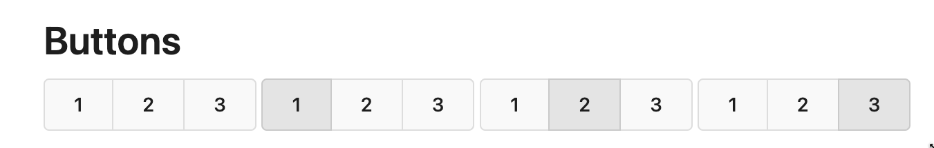
Replace #26850
Major changes:
1. Remove all `has` selectors, it is still not supported by firefox.
Actually there could be some more general and clearer approaches
2. Remove `two-toggle-buttons`, the `.ui.buttons` just works well
3. Rewrite the `.ui.buttons` border styles, see the screenshots
4. Remove the "fine-tuning" paddings from the the flex children, they
could layout themselves well.

|
| |
|
|
|
|
|
|
|
|
|
|
|
|
|
|
|
|
|
|
| |
The old code used complex `if` blocks and strange HTML layouts.
<details>

</details>
This PR refactors the template code and remove legacy CSS styles. The UI
doesn't change much.

|
| |
|
|
|
|
|
|
|
|
| |
Backtick syntax now works in repo description too. Also, I replaced the
CSS for this was a new single class, making it more flexible and not
dependent on a parent. Also, very slightly reduced font size from 16.8px
to 16px.
---------
Co-authored-by: wxiaoguang <wxiaoguang@gmail.com>
|
| | |
|
| |
|
|
|
|
|
|
|
|
|
|
|
|
| |
## Changes
- no more hardcoded `border-radius`es (apart from `0`)
- no more value inconsistencies
- no more guessing what pixel value you should use
- two new variables:
- `--border-radius-medium` (for elements where the normal border radius
does not suffice)
- `--border-radius-circle` (for displaying circles)
---------
Co-authored-by: silverwind <me@silverwind.io>
|
| |
|
|
|
|
|
|
| |
Fixes #26622
Co-authored-by: Giteabot <teabot@gitea.io>
|
| | |
|
| | |
|
| |
|
|
|
|
|
|
|
|
|
|
|
|
| |
Fix #26537
Use the same default line-height as "normalize.css" instead of "1". "1"
is not right because it doesn't work with descent part and causes
overflow problems.
---------
Co-authored-by: silverwind <me@silverwind.io>
|
| |
|
|
|
|
|
|
|
|
|
|
|
|
|
|
|
|
|
|
|
|
|
|
|
|
|
|
|
| |
This PR refactors a bunch of projects-related code, mostly the
templates.
The following things were done:
- rename boards to columns in frontend code
- use the new `ctx.Locale.Tr` method
- cleanup template, remove useless newlines, classes, comments
- merge org-/user and repo level project template together
- move "new column" button into project toolbar
- move issue card (shared by projects and pinned issues) to shared
template, remove useless duplicated styles
- add search function to projects (to make the layout more similar to
milestones list where it is inherited from :laughing:)
- maybe more changes I forgot I've done :laughing:
Closes #24893
After:


---------
Co-authored-by: silverwind <me@silverwind.io>
|
| |
|
|
|
|
|
|
|
|
| |
together (#26265)
(cherry picked from commit 473862a1d599382ca022482e2e044025872d240b)
Refs: https://codeberg.org/forgejo/forgejo/pulls/1126
Co-authored-by: Louis Seubert <louis.seubert.ls@gmail.com>
Co-authored-by: Giteabot <teabot@gitea.io>
|
| |
|
|
|
|
|
|
|
|
|
|
|
|
|
|
|
|
|
|
|
|
|
|
|
|
|
|
|
|
|
|
|
|
|
|
|
|
|
|
|
|
|
|
|
|
|
|
|
|
|
|
|
|
|
|
|
|
|
|
|
|
|
|
|
|
|
|
|
|
|
|
|
|
|
| |
This PR introduces a new UI element type for Gitea called `flex-item`.
It consists of a horizontal card with a leading, main and trailing part:

The idea behind it is that in Gitea UI, we have many cases where we use
this kind of layout, but it is achieved in many different ways:
- grid layout
- `.ui.list` with additional hacky flexbox
- `.ui.key.list` - looks to me like a style set originally created for
ssh/gpg key list, was used in many other places
- `.issue.list` - created for issue cards, used in many other places
- ...
This new style is based on `.issue.list`, specifically the refactoring
of it done in #25750.
In this PR, the new element is introduced and lots of templates are
being refactored to use that style. This allows to remove a lot of
page-specific css, makes many of the elements responsive or simply
provides a cleaner/better-looking way to present information.
A devtest section with the new style is also available.
<details>
<summary>Screenshots (left: before, right: after)</summary>


</details>
---------
Co-authored-by: Giteabot <teabot@gitea.io>
|
| |
|
|
| |
Fixing the align center to row and space around for commit_page
template.
|
| |
|
|
|
|
|
|
|
|
|
|
|
|
|
|
|
|
|
|
|
|
|
|
|
|
|
|
|
|
|
|
|
|
|
|
|
|
|
|
|
|
|
|
|
|
|
|
|
| |
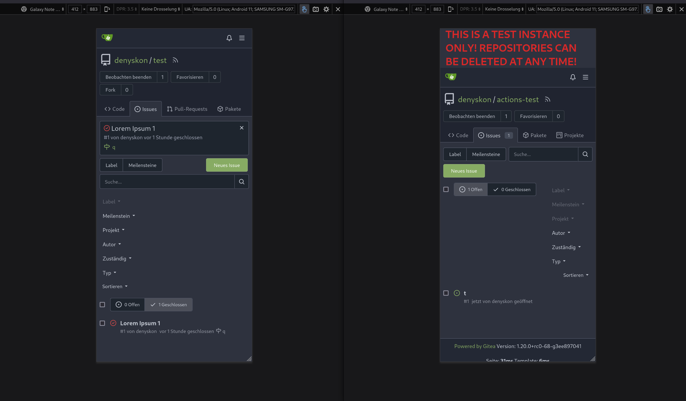
- Send request to get branch/tag list, use loading icon when waiting for
response.
- Only fetch when the first time branch/tag list shows.
- For backend, removed assignment to `ctx.Data["Branches"]` and
`ctx.Data["Tags"]` from `context/repo.go` and passed these data wherever
needed.
- Changed some `v-if` to `v-show` and used native `svg` as mentioned in
https://github.com/go-gitea/gitea/pull/25719#issuecomment-1631712757 to
improve perfomance when there are a lot of branches.
- Places Used the dropdown component:
Repo Home Page
<img width="1429" alt="Screen Shot 2023-07-06 at 12 17 51"
src="https://github.com/go-gitea/gitea/assets/17645053/6accc7b6-8d37-4e88-ae1a-bd2b3b927ea0">
Commits Page
<img width="1431" alt="Screen Shot 2023-07-06 at 12 18 34"
src="https://github.com/go-gitea/gitea/assets/17645053/2d0bf306-d1e2-45a8-a784-bc424879f537">
Specific commit -> operations -> cherry-pick
<img width="758" alt="Screen Shot 2023-07-06 at 12 23 28"
src="https://github.com/go-gitea/gitea/assets/17645053/1e557948-3881-4e45-a625-8ef36d45ae2d">
Release Page
<img width="1433" alt="Screen Shot 2023-07-06 at 12 25 05"
src="https://github.com/go-gitea/gitea/assets/17645053/3ec82af1-15a4-4162-a50b-04a9502161bb">
- Demo
https://github.com/go-gitea/gitea/assets/17645053/d45d266b-3eb0-465a-82f9-57f78dc5f9f3
- Note:
UI of dropdown menu could be improved in another PR as it should apply
to more dropdown menus.
Fix #14180
---------
Co-authored-by: silverwind <me@silverwind.io>
Co-authored-by: wxiaoguang <wxiaoguang@gmail.com>
|
| |
|
|
|
|
|
|
|
|
|
|
|
|
|
| |
the stacking takes up screen space - display the tabs as the navigation
bar. github uses the same layout.
Screenshots (left before, right after):

Large screen:

|
| |
|
|
|
|
|
|
|
|
|
|
|
|
|
|
| |
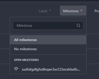
Issue filters are being used on repo list page and on milestone issues
page, and the code is mostly duplicated.
This PR does the following changes:
- move issue filters into a shared template
- allow filtering milestone issues by project, so no need to hide this
filter on milestone issues page
- remove some dead code (e. g. issue actions in milestone issues
template)
- fix label filter dropdown width
---------
Co-authored-by: 6543 <6543@obermui.de>
|
| |
|
|
|
|
|
|
|
|
|
|
|
|
|
|
|
|
|
|
|
|
|
|
| |
Minor tweaks to repo topics:
- Use gap instead of margin to align "Manage Topics" when no topics
present
- Add margin to description instead
Before:
<img width="1232" alt="Screenshot 2023-07-08 at 13 08 15"
src="https://github.com/go-gitea/gitea/assets/115237/a5d3586c-6cbf-4b74-8137-11d91f2cbb45">
<img width="1233" alt="Screenshot 2023-07-08 at 13 08 05"
src="https://github.com/go-gitea/gitea/assets/115237/59b18d93-e4cb-4f2b-9bc2-d6aa63f93827">
After:
<img width="1232" alt="Screenshot 2023-07-08 at 13 08 42"
src="https://github.com/go-gitea/gitea/assets/115237/470d42ad-3f7e-40f9-b0a1-203b4af77eb9">
<img width="1231" alt="Screenshot 2023-07-08 at 13 08 32"
src="https://github.com/go-gitea/gitea/assets/115237/42d18048-748c-4a3f-ab89-3403866cef34">
---------
|
| |
|
|
|
|
|
|
|
|
|
|
|
|
|
|
|
|
|
|
|
|
|
|
|
|
|
|
|
| |
Changes:
* Rename gt-tl/gt-tc/gt-tr to gt-text-left/gt-text-center/gt-text-right
* The gt-ab and gt-br-0 are removed because they are not needed anymore
* Fix the clone dropdown button padding by ":not(.icon)"
Before:
<details>

</details>
After:
<details>

</details>
Fixes #25758
Co-authored-by: Giteabot <teabot@gitea.io>
|
| |
|
|
|
|
|
|
|
|
|
|
|
|
|
|
|
|
|
|
|
|
|
|
|
|
|
|
|
|
|
| |
Fixes #25693
The commits table appearance fix in #25634 was incomplete and caused a
regression. This PR fixes that issue and removes some unneeded CSS
classes because of the proper fix.
<details>
<summary>Before</summary>
</details>
<details>
<summary>After</summary>
</details>
---------
Co-authored-by: silverwind <me@silverwind.io>
|
| |
|
|
|
|
|
|
|
|
|
|
|
|
|
|
|
|
|
|
|
|
|
|
|
|
|
|
|
| |
Resolves #25622
<details>
<summary>Screenshots</summary>


</details>
---------
Co-authored-by: wxiaoguang <wxiaoguang@gmail.com>
Co-authored-by: silverwind <me@silverwind.io>
|
| |
|
|
|
|
|
|
|
|
|
|
|
|
|
|
|
|
|
|
|
|
|
|
|
|
|
| |
Fix #25628
Diff with ignoring space:
https://github.com/go-gitea/gitea/pull/25629/files?diff=unified&w=1
The "modal" shouldn't appear between "ui attached segment", otherwise
these segments lose margin-top.
After the fix:
<details>


</details>
|
| |
|
|
|
|
|
|
|
|
|
|
|
|
|
|
|
|
|
|
|
| |
Should look exactly like before for normal dividers. "Horizontal" ones
look better because they no longer use image backgrounds.
<img width="917" alt="Screenshot 2023-06-27 at 19 07 56"
src="https://github.com/go-gitea/gitea/assets/115237/d97d8dec-6859-44a8-85ba-e4549b4dd9df">
<img width="914" alt="Screenshot 2023-06-27 at 19 05 58"
src="https://github.com/go-gitea/gitea/assets/115237/8bf98544-2d82-4ebf-ac68-d6dc237bd6b2">
<img width="1246" alt="Screenshot 2023-06-27 at 19 00 42"
src="https://github.com/go-gitea/gitea/assets/115237/36a6bb21-6029-4f53-8bee-535f55c66fed">
<img width="344" alt="Screenshot 2023-06-27 at 18 58 15"
src="https://github.com/go-gitea/gitea/assets/115237/a9e70aee-8e6b-4ea1-9e93-19c9f96aec6e">
<img width="823" alt="Screenshot 2023-06-27 at 18 56 22"
src="https://github.com/go-gitea/gitea/assets/115237/e7a497cd-f262-4683-8872-23c3c8cce32f">
<img width="330" alt="Screenshot 2023-06-27 at 19 21 11"
src="https://github.com/go-gitea/gitea/assets/115237/42f24149-a655-4c7e-bd26-8ab52db6446b">
|
| |
|
|
|
|
|
|
|
|
|
|
| |
- Update all JS dependencies
- Enable `declaration-property-unit-disallowed-list` to forbid `em` on
`line-height`
- Rename dependency update targets to `update-js` and `update-py` and
document them
- Remove margin on Asciicast viewer
- Tested Swagger, Katex, Asciicast
<img width="1243" alt="Screenshot 2023-06-27 at 19 51 05"
src="https://github.com/go-gitea/gitea/assets/115237/2d2722a0-2aa7-4f4c-b8bd-17e1f3637b78">
|
| |
|
|
|
|
|
|
|
|
|
|
| |
Fixes: https://github.com/go-gitea/gitea/issues/25462
On supporting browsers, text in description is [wrapped
equally](https://caniuse.com/css-text-wrap-balance).
<img width="488" alt="Screenshot 2023-06-26 at 00 17 21"
src="https://github.com/go-gitea/gitea/assets/115237/cb8e3a50-6225-4a8c-a6c0-f35a17d2af76">
<img width="1254" alt="Screenshot 2023-06-26 at 00 14 51"
src="https://github.com/go-gitea/gitea/assets/115237/0885404e-973e-45ce-b41e-5cb265a4cd1e">
|
| |
|
|
|
|
|
|
|
|
|
|
|
|
| |
Close #20976
Close #20975
1. Fix the bug: the TOC in footer was incorrectly rendered as main
content's TOC
2. Fix the layout: on mobile, the TOC is put above the main content,
while the sidebar is put below the main content
3. Auto collapse the TOC on mobile
ps: many styles of "wiki.css" are moved from old css files, so leave
nits to following PRs.
|
| |
|
|
|
|
|
|
| |
Make use of the [new
octicon](https://github.com/primer/octicons/issues/945) that indicates a
symlink to a directory:
<img width="189" alt="Screenshot 2023-06-22 at 22 50 57"
src="https://github.com/go-gitea/gitea/assets/115237/a70690ea-ebfc-48fe-af23-cdc33bcb2098">
|
| |
|
|
|
|
|
|
|
|
|
|
|
|
|
|
|
|
| |
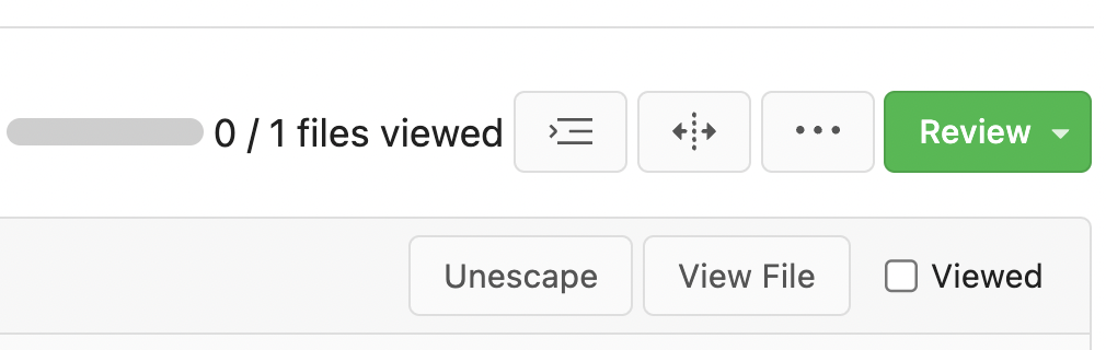
Two small tweaks:
1. Vertically center arrow here when editing a PR:
<img width="405" alt="Screenshot 2023-06-20 at 19 48 49"
src="https://github.com/go-gitea/gitea/assets/115237/1d63764d-9fd9-467e-8a8e-9258c06475eb">
2. Use 2-row layout on diff viewed status and show it again on mobile:
<img width="142" alt="Screenshot 2023-06-20 at 19 51 21"
src="https://github.com/go-gitea/gitea/assets/115237/3046e782-163c-4f87-910c-a22066de8f1b">
Mobile view:
<img width="370" alt="Screenshot 2023-06-20 at 19 44 40"
src="https://github.com/go-gitea/gitea/assets/115237/9cf56347-7323-4d05-99a5-17ad215ee44d">
|
| |
|
|
|
|
|
|
|
|
|
| |
Numerous small UI fixes:
- Fix double border in collaborator list
- Fix system notice table background
- Mute links in repo and org lists
- Downsize projects edit buttons
- Improve milestones and project list rendering
- Condense milestone list entry to a single line of "metas"
- Mute ".." button in repo files list
|
| |
|
|
|
|
|
|
|
|
|
|
|
|
|
|
|
|
|
|
|
|
|
|
|
|
|
|
|
|
|
|
|
| |
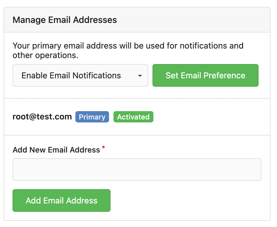
If enabled show a clickable label in the comment. A click on the label
opens the Conversation tab with the comment focussed - there you're able
to view the old diff (or original diff the comment was created on).
**Screenshots**
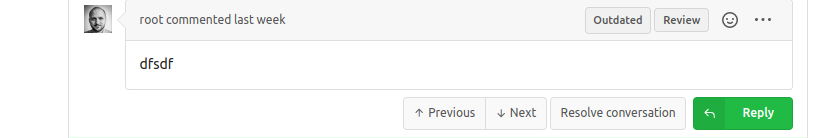

When resolved and outdated:

Option to enable/disable this (stored in user settings - default is
disabled):


fixes #24913
---------
Co-authored-by: silverwind <me@silverwind.io>
|
| |
|
|
|
|
|
|
|
|
|
|
|
|
|
|
|
|
|
|
|
|
|
|
| |
Part of #25042
1. Added actor and status dropdowns first in case something is offtrack
and PR is too large.
2. Also added "No results matched." and "The workflow has no runs yet.",
and "No results matched." will show if there is no filter results and
there is no workflows (with [reference to github
action](https://github.com/go-gitea/gitea/actions/workflows/files-changed.yml?query=actor%3AGiteaBot))
Demo:
https://github.com/go-gitea/gitea/assets/17645053/6e76292c-4c1f-450d-8b48-99944cfc920c
TODOs:
- [x] Get available status (same as those in `aggregateJobStatus`)
instead of getting from database
- [x] Use `JOIN` to get actors, actors order by name
- [x] Make self on top
|
| |
|
|
|
|
|
|
|
|
|
|
|
|
|
|
|
|
|
|
|
|
|
|
|
|
|
|
| |
Address
https://github.com/go-gitea/gitea/pull/25163#issuecomment-1599207916
Remove the unused "icon-button".
And fix the layout:
Without the dropdown icon:
```
{{svg "gitea-whitespace"}}
```
With the dropdown icon:
```
{{svg "gitea-whitespace" 16 "gt-mr-3"}}
{{svg "octicon-triangle-down" 14 "dropdown icon"}}
```

|
| |
|
|
|
|
|
|
|
|
|
|
|
|
|
|
| |
We only needs 2 lines to hide the dividers.
```
$dropdownLabelFilter.dropdown('setting', {'hideDividers': 'empty'});
$dropdownLabelFilter.dropdown('refreshItems');
```
Other code blocks are refactored by the way.


|
| |
|
|
|
|
|
|
|
|
|
|
|
|
|
|
|
|
|
|
|
|
|
|
|
|
|
|
|
|
|
|
| |
Various fixes to pages or elements which were looking ugly on mobile.
<details>
<summary>Screenshots</summary>


</details>
Co-authored by @silverwind
---------
Co-authored-by: silverwind <me@silverwind.io>
|
| |
|
|
|
|
| |
Add
[stylelint-stylistic](https://github.com/elirasza/stylelint-stylistic),
autofix all issues with two manual tweaks. This restores all the
stylistic rules removed in Stylelint 15.
|
| |
|
|
|
|
|
|
|
|
|
|
|
|
| |
Fixes: https://github.com/go-gitea/gitea/issues/25282
Fix the problems:
1. The `repo-button-row` had various patches before, this PR makes it
consistent
2. The "Add File" has wrong CSS class "icon", remove it
3. The "Add File" padding was overridden by "!important", fix it by
`.repo-button-row .button.dropdown` with comment
4. The selector `.ui.segments ~ .ui.top.attached.header` is incorrect,
it should use `+`
|
| |
|
|
|
|
|
|
|
|
|
|
|
|
|
|
| |
The code can be as simple as:
```html
<div class="flex-text-block">{{svg "octicon-alert"}} {{svg "octicon-x"}} text (block)</div>
<div><div class="flex-text-inline">{{svg "octicon-alert"}} {{svg "octicon-x"}} text</div> (inline)</div>
<div><button class="ui red button">{{svg "octicon-alert" 24}} {{svg "octicon-x" 24}} text</button></div>
```
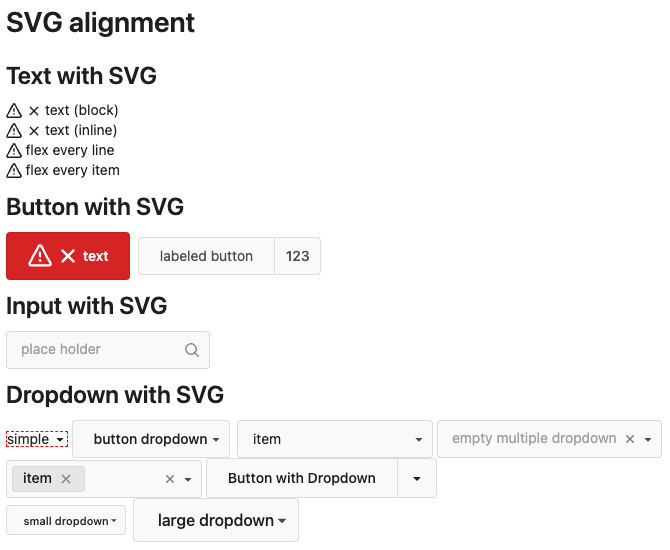
---------
Co-authored-by: Giteabot <teabot@gitea.io>
|
| |
|
|
|
|
|
|
|
|
|
|
|
|
|
|
|
|
| |
- Fix and improve mobile navbar layout
- Apply all cleanups suggested in
https://github.com/go-gitea/gitea/pull/25111
- Make media query breakpoints match Fomantic's exactly
- Clean up whitespace in class on navbar items
Mobile navbar before and after:
<img width="745" alt="Screenshot 2023-06-08 at 08 40 56"
src="https://github.com/go-gitea/gitea/assets/115237/ca84b239-b10f-41db-8c06-dcf2b6dd9d28">
<img width="739" alt="Screenshot 2023-06-08 at 08 41 23"
src="https://github.com/go-gitea/gitea/assets/115237/09133c54-eb7e-4110-858c-ead23c3b7521">
---------
Co-authored-by: wxiaoguang <wxiaoguang@gmail.com>
Co-authored-by: Giteabot <teabot@gitea.io>
|
| |
|
|
|
|
|
|
|
|
|
|
|
|
|
|
|
|
| |
- Various corrections to button styles, especially secondary
- Remove focus highlight, it's annoying when it stays on button after
press
- Clearly define ghost and link buttons with demos in devtest
- Remove black, grey and tertiary buttons, they should not be used
- Make `arc-green` slightly darker
<img width="1226" alt="image"
src="https://github.com/go-gitea/gitea/assets/115237/8d89786a-01ab-40f8-ae5a-e17f40e35084">
<img width="1249" alt="image"
src="https://github.com/go-gitea/gitea/assets/115237/83651e6d-3c27-46ff-b8bd-ff344d70e949">
---------
Co-authored-by: wxiaoguang <wxiaoguang@gmail.com>
Co-authored-by: Giteabot <teabot@gitea.io>
|
| |
|
|
|
|
|
|
|
|
|
|
|
|
|
|
|
|
|
|
|
|
|
|
|
|
| |
Improvements to the notification icon and `<nav>`:
- Add a opaque color for header hover and use it, allowing the border to
be the right color on hover (sadly, not otherwise possible with CSS, not
even `color-mix`).
- Increase font size by 1px
- Use flexbox for slightly better text centering
- Reduce padding of user and add repo button, add margin on right side
of user menu
- Remove the `following bar` wrapper on navbar
<img width="176" alt="Screenshot 2023-06-07 at 00 07 08"
src="https://github.com/go-gitea/gitea/assets/115237/23cdc3d6-7f63-49df-bec3-f2e75e32a304">
<img width="63" alt="Screenshot 2023-06-07 at 00 07 14"
src="https://github.com/go-gitea/gitea/assets/115237/fae602c2-4467-4d50-b1ec-56317843f9a2">
<img width="84" alt="Screenshot 2023-06-07 at 00 07 36"
src="https://github.com/go-gitea/gitea/assets/115237/c48141b8-0b3c-48cc-846a-3a272524dbdb">
<img width="329" alt="Screenshot 2023-06-07 at 00 25 10"
src="https://github.com/go-gitea/gitea/assets/115237/cda612f1-426e-466b-a351-fc992bfd18fd">
<img width="186" alt="Screenshot 2023-06-07 at 00 35 45"
src="https://github.com/go-gitea/gitea/assets/115237/04484a2e-9bbf-493c-aa26-8e936da008fa">
<img width="797" alt="Screenshot 2023-06-07 at 16 57 40"
src="https://github.com/go-gitea/gitea/assets/115237/e7ccb672-5807-4cb6-b306-b18ae0c7e321">
|
| |
|
|
|
|
|
|
|
|
|
|
|
|
|
|
|
| |
There were several issues with the WebAuthn registration and testing
code and the style
was very old javascript with jquery callbacks.
This PR uses async and fetch to replace the JQuery code.
Ref #22651
Signed-off-by: Andrew Thornton <art27@cantab.net>
---------
Signed-off-by: Andrew Thornton <art27@cantab.net>
Co-authored-by: delvh <dev.lh@web.de>
Co-authored-by: silverwind <me@silverwind.io>
|
| |
|
|
|
|
|
|
|
|
|
| |
This is adds the progress bar, which is already on the Milestone List,
also to the Page of a Single Milestone.
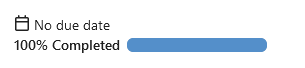
---------
Co-authored-by: silverwind <me@silverwind.io>
|
| |
|
|
|
|
|
|
|
|
|
|
|
|
|
|
|
|
|
|
|
| |
1. Add this button:
<img width="232" alt="Screenshot 2023-05-29 at 15 21 47"
src="https://github.com/go-gitea/gitea/assets/115237/5eaf6bd1-83db-4ffc-9503-eda0c59807d2">
<img width="297" alt="Screenshot 2023-05-29 at 15 20 22"
src="https://github.com/go-gitea/gitea/assets/115237/708a344f-f6d7-4229-bfda-76e1571b42c8">
2. Correct `button-link` styles to not have a background hover effect.
3. Tweak `.ui.container` padding to be the same for fluid and non-fluid.
4. Misc enhancements to diff header:
Before:
<img width="984" alt="Screenshot 2023-05-29 at 15 38 53"
src="https://github.com/go-gitea/gitea/assets/115237/c7926f6a-bd0a-4b05-97ad-c91fc25c62d5">
After:
<img width="987" alt="Screenshot 2023-05-29 at 15 43 10"
src="https://github.com/go-gitea/gitea/assets/115237/0149f545-45f8-42cf-b443-e1c76bd5cdeb">
|
| |
|
|
|
|
|
|
|
| |
This addressees some things from #24406 that came up after the PR was
merged. Mostly from @delvh.
---------
Co-authored-by: silverwind <me@silverwind.io>
Co-authored-by: delvh <dev.lh@web.de>
|
| |
|
|
|
|
|
|
|
|
|
|
|
|
|
|
|
|
|
|
|
|
|
|
|
| |
We were missing overrides for `:focus` and `:active` styles which I've
added here along with two new color variants `dark-1` and `dark-2` for
them. Fomantic UI has 4 different colors but I think 3 are sufficient. I
also changed it on arc-green so button goes darker when pressed.
<img width="129" alt="Screenshot 2023-05-04 at 01 21 43"
src="https://user-images.githubusercontent.com/115237/236072060-7389276a-275b-4d3e-aa52-20b37c6e6d92.png">
<img width="130" alt="Screenshot 2023-05-04 at 01 17 59"
src="https://user-images.githubusercontent.com/115237/236071818-0e46414a-33db-4bb2-a3bd-35b514a8a2d0.png">
<img width="129" alt="Screenshot 2023-05-04 at 01 18 07"
src="https://user-images.githubusercontent.com/115237/236071819-562b1e38-541f-432b-b3b6-48e6d7594d00.png">
<img width="131" alt="Screenshot 2023-05-04 at 01 18 13"
src="https://user-images.githubusercontent.com/115237/236071820-89b7dba9-ce6c-48e5-a075-9053063e6ad3.png">
<img width="133" alt="Screenshot 2023-05-04 at 01 18 30"
src="https://user-images.githubusercontent.com/115237/236071823-b6fe2df4-b3f0-4dc8-97a8-f90ba6d19bec.png">
<img width="133" alt="Screenshot 2023-05-04 at 01 18 40"
src="https://user-images.githubusercontent.com/115237/236071824-b02ce61a-2367-4c29-8a25-45f231f5e5ee.png">
One misc change includes some fixes to editor and slightly darker
selection.
<img width="1245" alt="Screenshot 2023-05-28 at 19 16 19"
src="https://github.com/go-gitea/gitea/assets/115237/1ea4a4b6-26ba-45af-9cbc-5b8c476c2338">
|
| |
|
|
|
|
|
|
|
|
|
|
|
|
|
|
|
|
|
|
|
|
|
|
|
|
|
| |
Use [PDFObject](https://pdfobject.com/) to embed PDFs, replacing our
outdated PDF.js copy we vendor (the last non-webpack vendoring).
[Commit
1](https://github.com/go-gitea/gitea/pull/24086/commits/673e0263da64b72565ff59b990ab1b8e87271872)
is the PDFObject integration
[Commit
2](https://github.com/go-gitea/gitea/pull/24086/commits/9336f5769d54445bba0e16776164f6a2fe2c32ac)
is the removal of PDF.js
<img width="1251" alt="Screenshot 2023-05-27 at 09 57 52"
src="https://github.com/go-gitea/gitea/assets/115237/169ce50c-bd1d-4bb0-86e5-1710bd0400a9">
<img width="1257" alt="Screenshot 2023-05-27 at 10 12 50"
src="https://github.com/go-gitea/gitea/assets/115237/318f7ee9-fb11-4093-83e7-17475aa70629">
Fallback for unsupporting browsers (most mobile ones, except Firefox
Mobile):
<img width="358" alt="Screenshot 2023-05-27 at 09 43 34"
src="https://github.com/go-gitea/gitea/assets/115237/8c12d7ba-57d6-4228-89a0-5fef9fad0cbb">
---------
Co-authored-by: Giteabot <teabot@gitea.io>
|
| |
|
|
|
|
|
|
|
|
|
|
|
|
|
|
|
|
|
|
|
|
|
|
|
| |
View diff:
https://github.com/go-gitea/gitea/pull/24738/files?diff=unified&w=1
Improve layout and functionality in review area:
<img width="439" alt="Screenshot 2023-05-15 at 20 10 01"
src="https://github.com/go-gitea/gitea/assets/115237/be10452b-5829-4927-8801-7b26a57b3dbd">
Remove the "Reviewers" timeline box that appears before the merge box.
it's a duplicate of the top-right review area and all functionality of
it has been moved to the other box:
<img width="868" alt="Screenshot 2023-05-15 at 19 39 31"
src="https://github.com/go-gitea/gitea/assets/115237/35489445-e54b-40d3-b3cf-38d029478f96">
Increase timeline item vertical padding from 12px to 16px:
<img width="449" alt="Screenshot 2023-05-15 at 19 43 50"
src="https://github.com/go-gitea/gitea/assets/115237/919c4f9d-a485-4f51-b08c-2c0fc714a413">
---------
Co-authored-by: Giteabot <teabot@gitea.io>
|
| |
|
|
|
|
|
|
|
|
|
|
|
|
|
|
|
|
|
|
|
|
|
|
|
|
|
|
|
| |
- Slightly decrease size of reaction buttons
- Remove tooltip inside menu, it's obvious by the picture alone
- Fix top menu triangle
- Use `display: grid` to align icons in menu
- Use regular tooltip for reaction users
- Fix bug that deleted the reaction bar on clicking already reacted
reaction in dropdown
<img width="490" alt="Screenshot 2023-05-17 at 00 03 42"
src="https://github.com/go-gitea/gitea/assets/115237/61588b37-facb-4829-b75b-e1cb5dda8ca4">
<img width="67" alt="Screenshot 2023-05-17 at 00 11 14"
src="https://github.com/go-gitea/gitea/assets/115237/29605589-3b5f-40c6-8ad4-09923094bb8e">
<img width="211" alt="Screenshot 2023-05-17 at 00 29 30"
src="https://github.com/go-gitea/gitea/assets/115237/7d2725da-6a3d-4e42-a351-53647f79f762">
<img width="210" alt="Screenshot 2023-05-17 at 00 29 54"
src="https://github.com/go-gitea/gitea/assets/115237/b50f8364-033c-4445-ba25-61a814bb2d92">
<img width="892" alt="Screenshot 2023-05-17 at 00 12 20"
src="https://github.com/go-gitea/gitea/assets/115237/30a46424-406a-46e5-b4de-47172eb8679d">
---------
Co-authored-by: wxiaoguang <wxiaoguang@gmail.com>
Co-authored-by: Giteabot <teabot@gitea.io>
|
| |
|
|
|
|
|
|
|
|
|
|
|
|
|
|
|
|
|
|
|
|
|
|
|
|
|
|
|
|
|
|
|
|
|
|
|
| |
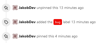
This adds the ability to pin important Issues and Pull Requests. You can
also move pinned Issues around to change their Position. Resolves #2175.
## Screenshots
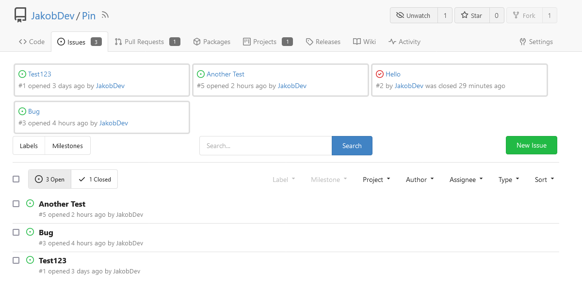
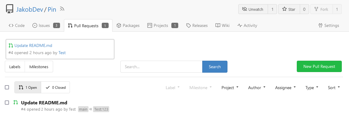
The Design was mostly copied from the Projects Board.
## Implementation
This uses a new `pin_order` Column in the `issue` table. If the value is
set to 0, the Issue is not pinned. If it's set to a bigger value, the
value is the Position. 1 means it's the first pinned Issue, 2 means it's
the second one etc. This is dived into Issues and Pull requests for each
Repo.
## TODO
- [x] You can currently pin as many Issues as you want. Maybe we should
add a Limit, which is configurable. GitHub uses 3, but I prefer 6, as
this is better for bigger Projects, but I'm open for suggestions.
- [x] Pin and Unpin events need to be added to the Issue history.
- [x] Tests
- [x] Migration
**The feature itself is currently fully working, so tester who may find
weird edge cases are very welcome!**
---------
Co-authored-by: silverwind <me@silverwind.io>
Co-authored-by: Giteabot <teabot@gitea.io>
|
| |
|
|
|
|
|
|
|
|
|
|
|
| |
introduce new font weight variables (#24827)
There was some recent discussion about this in Discord `ui-design`
channel and the conclusion was that
https://github.com/go-gitea/gitea/issues/24305 should have fixed their
OS font installation to have semibold weights.
I have now tested this 601 weight on a Windows 10 machine on Firefox
myself, and I immediately noticed that bold was excessivly bold and
rendering as 700 because browsers are biased towards bolder fonts. So
revert this back to the previous value.
|
