| Commit message (Collapse) | Author | Age | Files | Lines |
|---|
| |
|
|
|
|
|
| |
Fix #34775
---------
Co-authored-by: wxiaoguang <wxiaoguang@gmail.com>
|
| |
|
|
|
|
|
| |
Make labels list use consistent gap
---------
Co-authored-by: wxiaoguang <wxiaoguang@gmail.com>
|
| |
|
| |
Remove unclear code
|
| |
|
| |
A complete rewrite
|
| |
|
|
|
|
| |
1. Use `OpenXxx` instead of `GetXxx` because the returned readers should
be correctly closed, and clarify the behaviors of the functions: they
increase the download counter
2. Use `packages-content` styles instead of `issue-content`
|
| |
|
|
|
|
|
|
|
|
|
|
|
|
|
|
|
|
|
|
|
|
|
|
|
|
|
| |
1. apply [`text-wrap:
balance`](https://developer.mozilla.org/en-US/docs/Web/CSS/text-wrap#balance)
to various places making the text wrapping nicer, moving
`empty-placeholder` CSS to base because it's not repo-specific.
<img width="537" alt="Screenshot 2025-06-07 at 15 09 00"
src="https://github.com/user-attachments/assets/8b37d031-269d-4ab3-ba59-2ac469c431e4"
/>
<img width="514" alt="Screenshot 2025-06-07 at 15 11 16"
src="https://github.com/user-attachments/assets/27a63117-be1d-4797-80f7-9ed14cca41dc"
/>
<img width="346" alt="Screenshot 2025-06-07 at 15 22 26"
src="https://github.com/user-attachments/assets/2f371384-0330-4a00-bb79-bc3c50ba5c91"
/>
2. fix overflow-related bug on actions run list, before:
<img width="302" alt="Screenshot 2025-06-07 at 15 26 26"
src="https://github.com/user-attachments/assets/d6607eeb-288b-4e81-a770-45a421c9c68c"
/>
After:
<img width="299" alt="Screenshot 2025-06-07 at 15 26 59"
src="https://github.com/user-attachments/assets/b0ddb66f-d4fe-4711-8ed9-eca08ce608f3"
/>
|
| |
|
| |
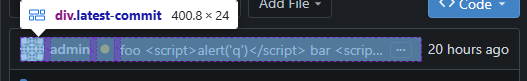
Reduced spacing around history entries and inside the commits list, also fixed unequal horizontal spacing inside the commit badge.
|
| |
|
|
| |
Move "file-view" and "code-view" related styles to their own file,
remove unnecessary `!important`
|
| |
|
| |
Also fix #34300
|
| |
|
|
|
|
|
|
|
|
|
|
|
|
|
|
|
|
|
|
|
|
| |
`[repository.pull-request] DELAY_CHECK_FOR_INACTIVE_DAYS` is a new
setting to delay the mergeable check for pull requests that have been
inactive for the specified number of days.
This avoids potentially long delays for big repositories with many pull
requests. and reduces system load overall when there are many
repositories or pull requests.
When viewing the PR, checking will start immediately and the PR merge
box will automatically reload when complete. Accessing the PR through
the API will also start checking immediately.
The default value of `7` provides a balance between system load, and
keeping behavior similar to what it was before both for users and API
access. With `0` all conflict checking will be delayed, while `-1`
always checks immediately to restore the previous behavior.
---------
Co-authored-by: wxiaoguang <wxiaoguang@gmail.com>
|
| |
|
| |
Also fix #34242
|
| |
|
|
| |
Co-authored-by: wxiaoguang <wxiaoguang@gmail.com>
|
| |
|
|
|
|
|
|
|
|
|
|
|
| |
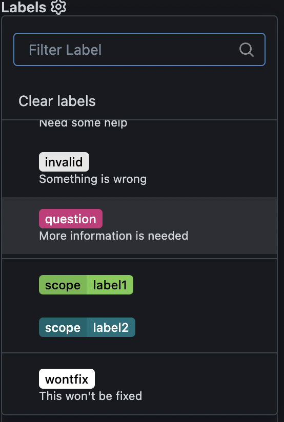
Fix #2616
This PR adds a new sort option for exclusive labels.
For exclusive labels, a new property is exposed called "order", while in
the UI options are populated automatically in the `Sort` column (see
screenshot below) for each exclusive label scope.
---------
Co-authored-by: wxiaoguang <wxiaoguang@gmail.com>
|
| | |
|
| |
|
|
|
|
|
|
|
|
|
|
|
|
|
|
| |
1. Rewrite `dirauto.ts` to `observer.ts`.
* We have been using MutationObserver for long time, it's proven that it
is quite performant.
* Now we extend its ability to handle more "init" works.
2. Use `observeAddedElement` to init all non-custom "dropdown".
3. Use `data-global-click` to handle click events from dynamically
loaded elements.
* By this new approach, the old fragile selector-based
(`.comment-reaction-button`) mechanism is removed.
4. By the way, remove unused `.diff-box` selector, it was abused and
never really used.
A lot of FIXMEs in "repo-diff.ts" are completely fixed, newly loaded
contents could work as expected.
|
| |
|
|
|
|
|
|
|
|
| |
- Add box-shadow to default tippy theme
- Make colors for tabs match the ones from `.ui.tabular.menu`
- Remove tippy arrow and slightly offset tooltip closer to the button
- Fix setting of `aria-haspopup` when default role is used with tippy
---------
Co-authored-by: wxiaoguang <wxiaoguang@gmail.com>
|
| | |
|
| |
|
| |
Fix #33283
|
| |
|
| |
The old code is unnecessarily complex.
|
| |
|
|
|
|
|
|
|
|
|
|
|
|
|
|
|
|
|
|
|
|
|
|
|
|
| |
#### Before

#### After

## Edit:
I found an issue on mobile view and changed the code as using flex gap

---------
Co-authored-by: wxiaoguang <wxiaoguang@gmail.com>
|
| |
|
|
|
|
|
|
|
| |
### Before

### After

|
| |
|
|
|
|
|
|
|
|
| |
The new code structure is easier to make more improvements or
refactor, for example: change the colors to de-emphasize more, or design
some new layouts.
---------
Co-authored-by: silverwind <me@silverwind.io>
Co-authored-by: wxiaoguang <wxiaoguang@gmail.com>
|
| |
|
|
|
|
|
|
|
|
|
|
|
|
|
|
|
|
|
|
|
|
|
| |
Before and after:
<img width="218" alt="Screenshot 2024-12-15 at 04 53 53"
src="https://github.com/user-attachments/assets/299b1f0a-ba72-47c6-b662-a9d540d4d741"
/>
<img width="222" alt="Screenshot 2024-12-15 at 04 53 41"
src="https://github.com/user-attachments/assets/5a2b5332-e324-4d20-82e9-21d1c850e826"
/>
Diff without whitespace:
https://github.com/go-gitea/gitea/pull/32847/files?diff=unified&w=1
The `tw-mt-2` is fine even if the element renders empty:
<img width="387" alt="image"
src="https://github.com/user-attachments/assets/76a976e4-ba2e-48a5-9248-c361552a937a"
/>
---------
Co-authored-by: wxiaoguang <wxiaoguang@gmail.com>
|
| |
|
|
|
|
|
| |
1. use grid instead of table, completely drop "ui table" from that list
2. move some "commit sign" related styles into a new file by the way (no
change) because I need to figure out where `#repo-files-table` is used.
3. move legacy "branch/tag selector" related code into repo-legacy.ts,
now there are 13 `import $` files left.
|
| |
|
|
|
|
|
|
|
|
|
|
|
| |
Rearrange the clone panel to use less horizontal space.
The following changes have been made to achieve this:
- Moved everything into the dropdown menu
- Moved the HTTPS/SSH Switch to a separate line
- Moved the "Clone in VS Code"-Button up and added a divider
- Named the dropdown button "Code", added appropriate icon
---------
Co-authored-by: techknowlogick <techknowlogick@gitea.com>
Co-authored-by: wxiaoguang <wxiaoguang@gmail.com>
|
| |
|
|
|
|
|
|
|
|
| |
Replace #26661, fix #25979
Not perfect, but usable and much better than before. Since it is quite
complex, I am not quite sure whether there would be any regression, if
any, I will fix in first time.
I have tested the related pages many times: issue list, milestone issue
list, project view, user issue list, org issue list.
|
| |
|
|
|
|
|
|
|
|
|
|
| |
Rewrite a lot of legacy strange code, remove duplicate code, remove
jquery, and make these filters reusable.
Let's forget the old code, new code affects:
* issue list open/close switch
* issue list filter (label, author, assignee)
* milestone list open/close switch
* milestone issue list filter (label, author, assignee)
* project view (label, assignee)
|
| |
|
|
|
|
|
|
|
|
|
| |
And fix a regression:
https://github.com/go-gitea/gitea/pull/30053#discussion_r1874405470
Major changes:
* rewrite without jquery
* remove the "delete modal", using "link-action" is good enough
* merge "new modal" and "edit modal"
|
| |
|
|
|
|
|
| |
Move some components (description, license, release, language stats) to sidebar
---------
Co-authored-by: wxiaoguang <wxiaoguang@gmail.com>
|
| |
|
|
|
|
|
|
|
|
| |
Refactor markdown editor to clarify its "preview" behavior and remove
jQuery code.
Close #15045
---------
Co-authored-by: silverwind <me@silverwind.io>
|
| |
|
|
|
|
|
|
|
|
|
|
|
|
|
|
|
|
|
|
|
|
|
|
|
|
|
|
|
|
|
|
|
| |
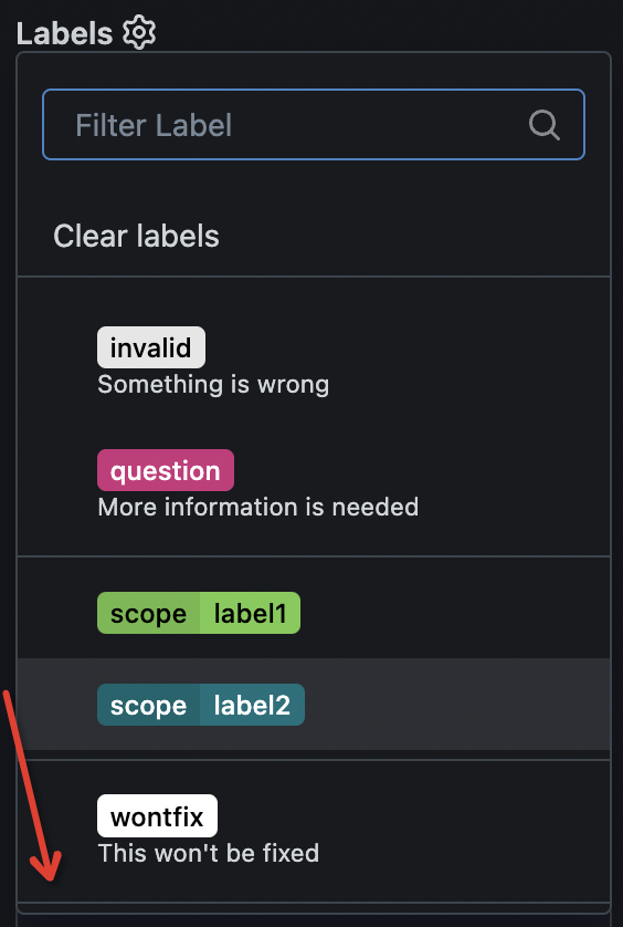
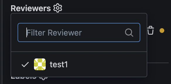
1. remove duplicate dividers
2. align reviewer items
3. merge & remove unused CSS styles
Before:
<details>
</details>
After:
<details>
</details>
|
| |
|
|
|
|
|
|
|
| |
(#32576)
as title, replace #31597 after #32460
---------
Signed-off-by: a1012112796 <1012112796@qq.com>
|
| |
|
|
|
|
|
|
|
|
|
|
|
|
|
|
|
|
|
| |
Follow #32460
Now the code could be much clearer than before and easier to maintain. A
lot of legacy code is removed.
Manually tested.
This PR is large enough, that fine tunes could be deferred to the future if
there is no bug found or design problem.
Screenshots:
<details>

</details>
|
| |
|
| |
Introduce `issueSidebarLabelsData` to handle all sidebar labels related data.
|
| |
|
|
|
|
|
|
|
|
| |
Users could add reviewers when creating new PRs.
---------
Co-authored-by: splitt3r <splitt3r@users.noreply.github.com>
Co-authored-by: Sebastian Sauer <sauer.sebastian@gmail.com>
Co-authored-by: bb-ben <70356237+bboerben@users.noreply.github.com>
Co-authored-by: wxiaoguang <wxiaoguang@gmail.com>
|
| |
|
|
|
|
|
|
|
|
|
|
|
|
|
|
|
|
|
|
|
| |
Fix #32453
Major changes:
* revert the `<div class="divider"></div>` in
`templates/repo/issue/branch_selector_field.tmpl` (it was removed by
mistake in ##32444)
* remove incorrect `<div class="inline field">` in
`templates/repo/issue/sidebar/allow_maintainer_edit.tmpl`
* use `gt-ellipsis` to replace the "title" class in the dependency list,
then `.repository .issue-content-right .ui.list .title` could be removed
* remove the "relaxed" from dependency list, then there is no padding,
then `.repository .issue-content-right .ui.list .dependency` could be
removed (`white-space` doesn't have effect either because there is
`gt-ellipsis`)
* remove dead code `.repository .issue-content-right #deadlineForm input
`
The fixed UI should be the same as before.
|
| |
|
|
|
|
|
|
|
|
| |
Fixes: https://github.com/go-gitea/gitea/issues/31636
1. Issue sidebar topic is disussed in
https://github.com/go-gitea/gitea/issues/31636
2. Org description already has `overflow-wrap: anywhere` to ensure no
overflow.
Co-authored-by: Giteabot <teabot@gitea.io>
|
| |
|
|
|
|
|
|
|
|
| |
Many avatars were rendered in HTML with certain width/height but then
resized again in CSS. This was pointless so I removed all these cases
and made the HTML size match the previous render size.
Also did a few CSS cleanups in the tribute rendering:
<img width="648" alt="image"
src="https://github.com/go-gitea/gitea/assets/115237/cb2fafb3-5e20-46e9-814f-07df20038beb">
|
| |
|
|
|
|
|
|
|
|
|
|
|
|
|
| |
Close #31502
Related to #31419.
In this PR, the avatar width is set to 3em, but the height is not set,
so the image is not squared.
When object-fit is set to contain, it can't maintain the radius of the
image.
Result:
|
| |
|
|
|
| |
It was correct only on the new issue page.
Resolves #31415
|
| |
|
|
|
|
| |
The avatar on "New Issue" and "New Pull Request" pages was inconsistent.
Removed the extra margin and the new CSS rules now use common parent
`<form id="#new-issue">` because `.repository.new.issue` is not present
on pull request page.
|
| |
|
| |
Co-authored-by: silverwind <me@silverwind.io>
|
| |
|
|
|
|
|
|
|
|
|
|
|
|
|
|
|
|
| |
Fixes regression
https://github.com/go-gitea/gitea/pull/31307#issuecomment-2162554913
Table CSS is weird. A `auto` value does not work and causes the
regression while any pixel value causes another regression in diff where
the code lines do not stretch. Partially revert that PR and clean up
some related too-deep CSS selectors.
<img width="109" alt="Screenshot 2024-06-12 at 15 07 22"
src="https://github.com/go-gitea/gitea/assets/115237/756c5dea-44b8-49f9-8a08-acef68075f62">
<img width="119" alt="Screenshot 2024-06-12 at 15 07 43"
src="https://github.com/go-gitea/gitea/assets/115237/28ae1adc-118e-4016-8d09-033b9f1c9a6f">
<img width="151" alt="Screenshot 2024-06-12 at 15 07 07"
src="https://github.com/go-gitea/gitea/assets/115237/08db7ed9-de4e-405e-874d-c7ebe3082557">
<img width="141" alt="Screenshot 2024-06-12 at 15 07 14"
src="https://github.com/go-gitea/gitea/assets/115237/c4a5492b-1bf1-4773-bc8d-64eb36d823f9">
|
| |
|
|
| |
Move the rule to the parent node. `tab-size` is inherited so will work
just as before.
|
| |
|
|
|
|
|
|
|
|
|
|
|
|
| |
Fixes: https://github.com/go-gitea/gitea/issues/31071
Not perfect but much better than before.
Before: Overflows, sticky not working, filename unreadable:
<img width="506" alt="Screenshot 2024-05-27 at 02 02 40"
src="https://github.com/go-gitea/gitea/assets/115237/a06b1edf-dece-4402-98c2-68670fca265f">
After:
<img width="457" alt="Screenshot 2024-05-27 at 01 59 06"
src="https://github.com/go-gitea/gitea/assets/115237/2a282c96-e719-4554-b418-81963ae6269c">
|
| |
|
|
|
|
| |
Percentage-based `border-radius` [creates undesirable
ellipse](https://jsfiddle.net/silverwind/j9ko5wnt/4/) on non-square
content. Instead, use pixel value and use same wording `full` like
tailwind does, but increast to 99999px over their 9999px.
|
| |
|
|
|
|
| |
Fixes: https://github.com/go-gitea/gitea/issues/30940
<img width="1310" alt="Screenshot 2024-05-11 at 20 48 41"
src="https://github.com/go-gitea/gitea/assets/115237/f163dfd4-1299-421f-a99e-cd0c793e0e3d">
|
| |
|
|
|
|
|
| |
Close #30919
---------
Co-authored-by: silverwind <me@silverwind.io>
|
| |
|
|
|
|
|
|
|
|
|
|
|
|
|
|
|
|
| |
Forbid
[deprecated](https://drafts.csswg.org/css-text-3/#word-break-property)
`break-word` and fix all occurences.
Regarding `overflow-wrap: break-word` vs `overflow-wrap: anywhere`:
Example of difference: https://jsfiddle.net/silverwind/1va6972r/
[Here](https://stackoverflow.com/questions/77651244) it says:
> The differences between normal, break-word and anywhere are only clear
if you are using width: min-content on the element containing the text,
and you also set a max-width. A pretty rare scenario.
I don't think this difference will make any practical impact as we are
not hitting this rare scenario.
|
| |
|
|
|
|
| |
Follow #30345
Follow #30547
`ellipsis` / `white-space` shouldn't be put on the general dropdown components.
|
