| Commit message (Collapse) | Author | Age | Files | Lines |
|---|
| ... | |
| |
|
|
|
| |
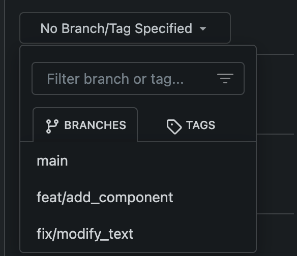
1. "enter" doesn't work (I think it is the last enter support for #14843)
2. if a branch name contains something like `&`, then the branch selector doesn't update
|
| |
|
|
|
|
|
|
|
|
|
|
|
|
|
|
|
|
|
| |
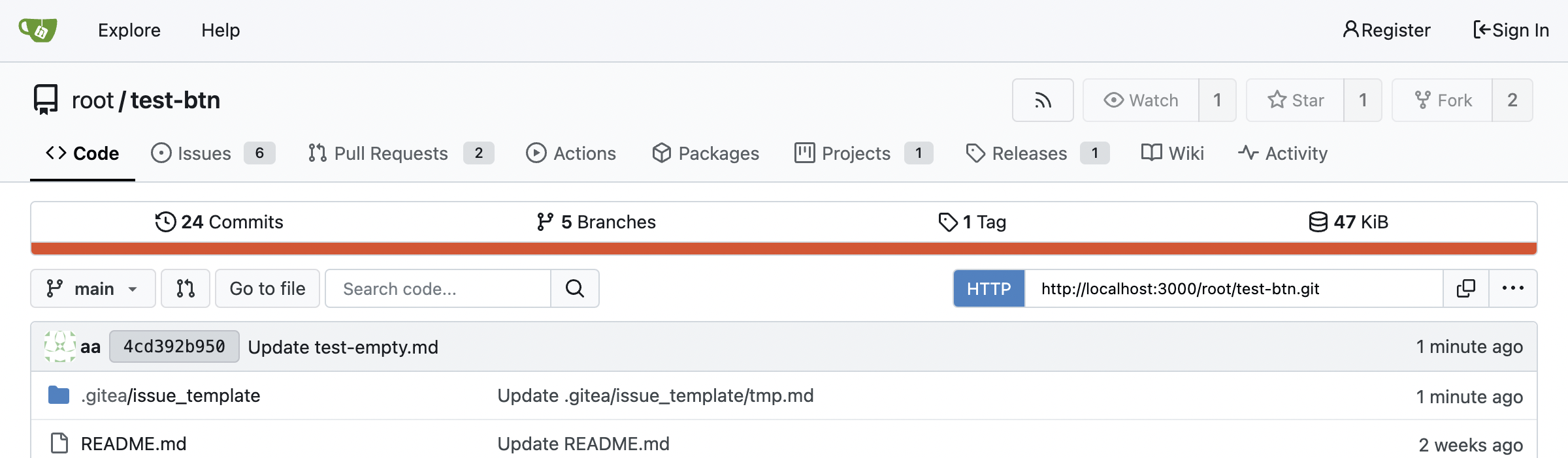
Since there is now a second `<input>` in the repo buttons, we can make a
better-looking layout with no empty space, except on mobile.
Also I fixed one bug with focus border on clone panel.
## Large
<img width="1163" alt="Screenshot 2024-04-23 at 22 25 22"
src="https://github.com/go-gitea/gitea/assets/115237/8135a572-aa67-4672-ad49-b76b06890b52">
## Medium
<img width="870" alt="Screenshot 2024-04-23 at 22 25 34"
src="https://github.com/go-gitea/gitea/assets/115237/9e93f61c-3315-4a78-8328-8cefad5b50fa">
## Mobile
<img width="416" alt="Screenshot 2024-04-23 at 22 25 52"
src="https://github.com/go-gitea/gitea/assets/115237/859e341f-807a-48e6-8bcf-31715963216c">
|
| |
|
| |
Fix #30788
|
| |
|
| |
Fix #30802
|
| |
|
|
|
|
|
|
|
|
|
|
|
|
|
|
|
|
|
|
|
|
|
|
|
|
|
|
| |
Fixes https://github.com/go-gitea/gitea/issues/30673, all 23 issues.
Notes:
- Tab bar menus had to change to pills because of unsolvable issue with
the border-radius as tab bar renders a overlapping border onto the box
below. And I think pills look better.
- Added padding to code editor empty preview message
- Hide monaco's built-in blue focus border, we don't need it and it
never showed before either.
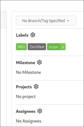
- Label add menu is simplified, removing the nested segment.
<img width="1322" alt="Screenshot 2024-04-25 at 22 26 19"
src="https://github.com/go-gitea/gitea/assets/115237/7e394e0c-b7ad-417d-8e9f-12f1dea93ed1">
<img width="1326" alt="Screenshot 2024-04-25 at 22 28 00"
src="https://github.com/go-gitea/gitea/assets/115237/66c8499f-aa9f-4d95-8cca-ef13dfa82c65">
<img width="997" alt="Screenshot 2024-04-25 at 22 36 53"
src="https://github.com/go-gitea/gitea/assets/115237/07896102-c71d-4246-8173-c2bc2e1d3cae">
<img width="832" alt="Screenshot 2024-04-25 at 22 56 09"
src="https://github.com/go-gitea/gitea/assets/115237/d83afc96-08ca-4adc-baf4-3d02804be57c">
<img width="361" alt="Screenshot 2024-04-25 at 22 57 12"
src="https://github.com/go-gitea/gitea/assets/115237/c7371a68-00b5-47d8-84d0-ddc5268b2b2c">
---------
Co-authored-by: wxiaoguang <wxiaoguang@gmail.com>
Co-authored-by: Giteabot <teabot@gitea.io>
|
| |
|
|
|
|
|
|
|
|
|
|
|
| |
Minor tweaks:
- Remove unnecessary `item` class which was causing unwanted padding to
be added.
- Add some padding and prevent wrapping so it looks better on mobile.
- Increase width by 4px.
<img width="116" alt="Screenshot 2024-04-24 at 00 15 07"
src="https://github.com/go-gitea/gitea/assets/115237/1f1cf54c-8053-4297-b309-71d9c2ceb9ee">
<img width="441" alt="Screenshot 2024-04-24 at 00 14 57"
src="https://github.com/go-gitea/gitea/assets/115237/2f3a33dc-edad-4b97-b64c-6812aae513cb">
|
| |
|
|
|
|
|
|
|
|
|
|
|
|
|
|
|
|
|
|
|
|
| |
1. Bring back the background on line numbers. This feature was lost a
long time ago.
<img width="457" alt="Screenshot 2024-04-24 at 01 36 09"
src="https://github.com/go-gitea/gitea/assets/115237/76a7f5a9-c22a-4c72-9f0a-ebf16a66513e">
<img width="473" alt="Screenshot 2024-04-24 at 01 22 47"
src="https://github.com/go-gitea/gitea/assets/115237/eef06cf2-f1b9-40e3-947d-dd5852ec12a3">
<img width="457" alt="Screenshot 2024-04-24 at 02 13 18"
src="https://github.com/go-gitea/gitea/assets/115237/59e317d4-76a7-468c-8a19-10d88c675cc3">
<img width="459" alt="Screenshot 2024-04-24 at 01 23 21"
src="https://github.com/go-gitea/gitea/assets/115237/f1a46f8d-8846-4d78-a9d7-8b7dc18ac6e4">
2. Expanded lines background is now full-line, including line numbers:
<img width="1303" alt="Screenshot 2024-04-24 at 01 37 12"
src="https://github.com/go-gitea/gitea/assets/115237/271eefe2-0869-424e-93fb-ccd8adc87806">
3. Sort affected colors alphabetically in the CSS
Fixes #14603
|
| |
|
|
|
|
| |
Fix #30502 by a new approach.
|
| |
|
|
| |
1. Rewrite initGlobalEnterQuickSubmit (by the way, remove jQuery)
2. Fix issue comment form layout
|
| |
|
|
|
|
|
|
|
|
|
|
|
|
|
|
|
|
|
|
| |
Fixes: https://github.com/go-gitea/gitea/issues/30540
1. Fix all these boxes by adding `bottom attached` and removing a
problematic CSS rule:
<img width="1319" alt="Screenshot 2024-04-17 at 22 25 31"
src="https://github.com/go-gitea/gitea/assets/115237/346445a4-4944-4003-a1ef-6f5b0eda624e">
<img width="643" alt="Screenshot 2024-04-17 at 22 21 18"
src="https://github.com/go-gitea/gitea/assets/115237/10f17ed3-9ad6-48de-92fa-bac6621815b9">
2. Change the "last commit" box to `ui segment` which has correct
border-radius. Also included is a tiny tweak to make author name ellipse
instead of wrap.
<img width="1331" alt="Screenshot 2024-04-17 at 22 23 23"
src="https://github.com/go-gitea/gitea/assets/115237/285fbd45-ced0-4d33-abe3-7384ffa03188">
Co-authored-by: Giteabot <teabot@gitea.io>
|
| |
|
|
|
|
|
|
|
|
|
| |
Fixes https://github.com/go-gitea/gitea/issues/30493, regression from
https://github.com/go-gitea/gitea/pull/30374.
Also did the flexbox convertion as suggested by the existing comment.
<img width="850" alt="Screenshot 2024-04-16 at 22 28 48"
src="https://github.com/go-gitea/gitea/assets/115237/e8905944-620a-4211-b5c5-53ed3b3ee23e">
Co-authored-by: Giteabot <teabot@gitea.io>
|
| |
|
|
|
|
|
|
|
|
|
|
|
| |
Fixes: https://github.com/go-gitea/gitea/issues/27971
Fixes: https://github.com/go-gitea/gitea/pull/28010
<img width="689" alt="Screenshot 2024-04-09 at 00 19 57"
src="https://github.com/go-gitea/gitea/assets/115237/7c895a47-274f-40a6-a126-290658f1982d">
Also fixes a similar issue in issue list where CSS was there but not
active because of missing `display: block`.
<img width="372" alt="Screenshot 2024-04-09 at 00 18 25"
src="https://github.com/go-gitea/gitea/assets/115237/cfbee7cd-2e15-4ac7-96ce-020816f48798">
|
| |
|
|
|
|
|
|
|
| |
Small tweak here to prevent this and likely other events from
overflowing in the timeline:
<img width="895" alt="Screenshot 2024-04-14 at 22 53 17"
src="https://github.com/go-gitea/gitea/assets/115237/001b4f6b-f649-44ff-b2f0-c8e0dedeb384">
Co-authored-by: Giteabot <teabot@gitea.io>
|
| |
|
|
|
|
|
|
|
|
| |
CSS-only module. Button colors are reduced to this:
<img width="639" alt="Screenshot 2024-04-14 at 15 36 07"
src="https://github.com/go-gitea/gitea/assets/115237/882d6c02-d1de-44f2-b707-db02a9f5070d">
---------
Co-authored-by: wxiaoguang <wxiaoguang@gmail.com>
|
| |
|
|
|
| |
A lot of variants are in use, so the diff stat isn't so great.
Co-authored-by: Giteabot <teabot@gitea.io>
|
| |
|
|
|
|
|
|
|
|
|
| |
Enable `no-sizzle` lint rule, there was only one use in `initCompReactionSelector` and:
- Remove all jQuery except the necessary fomantic dropdown init
- Remove the recursion, instead bind event listeners to common parent container nodes
---------
Co-authored-by: wxiaoguang <wxiaoguang@gmail.com>
Co-authored-by: Giteabot <teabot@gitea.io>
|
| |
|
|
|
|
|
|
|
|
| |
1. add border-radius and spacing to bars
2. use tailwind background classes
3. Add more space around activity list headers
<img width="983" alt="Screenshot 2024-03-27 at 23 40 54"
src="https://github.com/go-gitea/gitea/assets/115237/70f72c30-e69f-4ecb-882f-32b8bc94d638">
<img width="1020" alt="Screenshot 2024-03-27 at 23 41 02"
src="https://github.com/go-gitea/gitea/assets/115237/a35dbbda-515c-40b0-938a-d759f9686b8e">
|
| |
|
|
|
|
|
|
|
|
|
|
|
|
|
|
|
|
|
|
|
|
|
|
| |
Fixes: https://github.com/go-gitea/gitea/issues/29438
This contains numerous enhancements for how large commit messages and
large filenames render. Another notable change is that the file path is
no longer cut off by backend at 30 chars, but rendered in full with
wrapping.
<img width="1329" alt="Screenshot 2024-04-09 at 21 53 57"
src="https://github.com/go-gitea/gitea/assets/115237/5ccbb3d6-643a-4f60-ba79-3572b36d5182">
<hr>
<img width="711" alt="Screenshot 2024-04-09 at 21 44 24"
src="https://github.com/go-gitea/gitea/assets/115237/6ffe8fbb-407c-4aa7-b591-3d80daea7d57">
<hr>
<img width="439" alt="Screenshot 2024-04-09 at 21 19 03"
src="https://github.com/go-gitea/gitea/assets/115237/1ec7f6e9-2fd8-4841-87eb-6ca02ab9cd61">
<hr>
<img width="444" alt="Screenshot 2024-04-09 at 21 18 52"
src="https://github.com/go-gitea/gitea/assets/115237/70931b9e-5841-477e-b3bc-98f8d2662964">
---------
Co-authored-by: Giteabot <teabot@gitea.io>
|
| |
|
|
|
|
|
|
|
|
|
|
|
|
|
| |
Not sure exactly when this regressed, but has been a while I think.
Before:
<img width="895" alt="Screenshot 2024-04-08 at 22 46 50"
src="https://github.com/go-gitea/gitea/assets/115237/9b1788f8-017e-4fe1-8ab9-938e0d76fb41">
After:
<img width="689" alt="Screenshot 2024-04-08 at 23 00 58"
src="https://github.com/go-gitea/gitea/assets/115237/90193df9-5c24-4a1a-96fe-3d4e8392063c">
Co-authored-by: Giteabot <teabot@gitea.io>
|
| |
|
|
|
|
|
|
|
|
|
|
|
|
|
|
|
|
|
|
|
|
|
|
|
|
|
| |
1. The previous color contrast calculation function was incorrect at
least for the `#84b6eb` where it output low-contrast white instead of
black. I've rewritten these functions now to accept hex colors and to
match GitHub's calculation and to output pure white/black for maximum
contrast. Before and after:
<img width="94" alt="Screenshot 2024-04-02 at 01 53 46"
src="https://github.com/go-gitea/gitea/assets/115237/00b39e15-a377-4458-95cf-ceec74b78228"><img
width="90" alt="Screenshot 2024-04-02 at 01 51 30"
src="https://github.com/go-gitea/gitea/assets/115237/1677067a-8d8f-47eb-82c0-76330deeb775">
2. Fix project-related issues:
- Expose the new `ContrastColor` function as template helper and use it
for project cards, replacing the previous JS solution which eliminates a
flash of wrong color on page load.
- Fix a bug where if editing a project title, the counter would get
lost.
- Move `rgbToHex` function to color utils.
@HesterG fyi
---------
Co-authored-by: delvh <dev.lh@web.de>
Co-authored-by: Giteabot <teabot@gitea.io>
|
| |
|
|
|
|
|
|
|
| |
Before:
<img width="162" alt="Screenshot 2024-04-05 at 02 25 27"
src="https://github.com/go-gitea/gitea/assets/115237/9f786811-3e45-4b3c-aaf9-e1d2cad284d2">
After:
<img width="172" alt="Screenshot 2024-04-05 at 02 27 25"
src="https://github.com/go-gitea/gitea/assets/115237/f5254877-9e0d-44cb-9605-ba15c75872bb">
|
| |
|
|
|
|
|
|
|
| |
Remove most jQuery function calls
---------
Signed-off-by: Yarden Shoham <git@yardenshoham.com>
Co-authored-by: silverwind <me@silverwind.io>
Co-authored-by: wxiaoguang <wxiaoguang@gmail.com>
|
| |
|
|
|
| |
Tailwind does not support. Dropped the vendor-prefix.
Co-authored-by: Giteabot <teabot@gitea.io>
|
| |
|
|
|
|
|
|
|
|
|
|
|
|
|
|
|
|
| |
Get rid of one more jQuery dependant and have a nicer color picker as
well.
Now there is only a single global color picker init because that is all
that's necessary because the elements are present on the page when the
init code runs. The init is slightly weird because the module only takes
a selector instead of DOM elements directly.
The label modals now also perform form validation because previously it
was possible to trigger a 500 error `Color cannot be empty.` by clearing
out the color value on labels.
<img width="867" alt="Screenshot 2024-03-25 at 00 21 05"
src="https://github.com/go-gitea/gitea/assets/115237/71215c39-abb1-4881-b5c1-9954b4a89adb">
<img width="860" alt="Screenshot 2024-03-25 at 00 20 48"
src="https://github.com/go-gitea/gitea/assets/115237/a12cb68f-c38b-4433-ba05-53bbb4b1023e">
|
| |
|
|
|
|
|
|
|
|
|
|
|
|
|
|
|
|
| |
Before:
After:
If repo is a mirror, external user's name will be white, but if user is
existed, then you will see blue names and white names together:

---------
Co-authored-by: silverwind <me@silverwind.io>
|
| |
|
|
|
|
|
|
|
|
|
|
|
|
|
|
|
|
|
|
|
|
|
|
|
|
|
|
|
|
|
|
| |
1. Restore missing styles for message close icon
2. Move `code-line-button` so that it does not go off-screen on small
viewports
3. Make `code-line-button` look and behave like other buttons
4. Make `code-line-button` work in blame
5. Make the active selection span the whole line, not just the code part
6. Tweak colors, make dark theme code bg darker, make line numbers same
color in diff and file view.
7. Move code background to parent, fixing border radius and other
problems
8. Enable code wrap in blame
9. Improve blame responsiveness
10. Remove `--color-code-sidebar-bg` in blame, now it uses same
background as code
11. Rename `--color-active-line` to `--color-highlight-bg`
12. Add `--color-highlight-bg`
13. Fix button group borders on hover and border-right on last button.
<img width="1343" alt="Screenshot 2024-03-23 at 22 34 13"
src="https://github.com/go-gitea/gitea/assets/115237/fcbb919f-5dc3-43f0-97f6-870d6f412554">
<img width="1334" alt="Screenshot 2024-03-23 at 22 34 26"
src="https://github.com/go-gitea/gitea/assets/115237/ca44c3b7-4328-4645-ba49-b0dc6a5ac06d">
<img width="1338" alt="Screenshot 2024-03-23 at 22 34 57"
src="https://github.com/go-gitea/gitea/assets/115237/00eb0b5a-1ec7-4669-a94a-4602b9d1c1ac">
<img width="1337" alt="Screenshot 2024-03-23 at 22 34 42"
src="https://github.com/go-gitea/gitea/assets/115237/752edc4a-064f-413c-9dff-c086187fcd85">
Fixes: https://github.com/go-gitea/gitea/issues/18074
|
| |
|
|
|
|
|
|
|
|
|
|
|
|
|
|
|
|
| |
(#29982)
Fixes: https://github.com/go-gitea/gitea/issues/29981. Introduce
`.secondary-nav` as a universal way for styling and margin adjustments
inside `.page-content`.
If the first child of `.page-content` is `.secondary-nav`, we add margin
below it, otherwise we add padding to the first child. Notable changes:
- `--color-header-wrapper` is replaced with `--color-secondary-nav-bg`.
- `navbar` class is removed.
---------
Co-authored-by: Giteabot <teabot@gitea.io>
Co-authored-by: wxiaoguang <wxiaoguang@gmail.com>
|
| |
|
|
|
|
|
| |
1. The borders were doubled on the "empty" page, fix it.
2. Remove unnecessary CSS classes like "clone", "compact", etc
3. Use CSS class "clone-panel" instead of ID "clone-panel"
4. Use `tw-flex-1` instead of `gt-f1`
5. Remove unnecessary ID "more-btn"
|
| |
|
|
|
|
|
|
|
|
| |
as followup of the not jet finished discussion at
https://github.com/go-gitea/gitea/pull/29680#discussion_r1521867261
we enhance and chat about how best to highlight archived labels here :)
---------
Co-authored-by: silverwind <me@silverwind.io>
|
| |
|
|
|
|
|
|
|
|
|
|
|
|
|
|
|
|
| |
Relate:[#27417](https://github.com/go-gitea/gitea/issues/27471)
Reference: [#26631](https://github.com/go-gitea/gitea/pull/26631)
Before
After
---------
Co-authored-by: silverwind <me@silverwind.io>
|
| |
|
|
|
|
|
|
|
|
| |
The modal was broken in two ways:
- On small screens, the input box was partially hanging outside the
modal. Fixed with flexbox and increased modal width.
- The clipboard copy was not working because the modal had both
`data-clipboard-text` and `data-clipboard-target`, while we only support
one of those. Made a small tweak in clipboard as well so that it will
still fall back to target if text is empty.
|
| |
|
|
|
|
|
|
|
|
|
|
|
|
|
|
|
|
|
|
|
|
|
|
|
|
|
|
|
|
|
|
|
|
|
|
| |
1. Add `<overflow-menu>` web component
2. Rename `<gitea-origin-url>` to `<origin-url>` and make filenames
match.
<img width="439" alt="image"
src="https://github.com/go-gitea/gitea/assets/115237/2fbe4ca4-110b-4ad2-8e17-c1e116ccbd74">
<img width="444" alt="Screenshot 2024-03-02 at 21 36 52"
src="https://github.com/go-gitea/gitea/assets/115237/aa8f786e-dc8c-4030-b12d-7cfb74bdfd6e">
<img width="537" alt="Screenshot 2024-03-03 at 03 05 06"
src="https://github.com/go-gitea/gitea/assets/115237/fddd50aa-adf1-4b4b-bd7f-caf30c7b2245">

TODO:
- [x] Check if removal of `requestAnimationFrame` is possible to avoid
flash of content. Likely needs a `MutationObserver`.
- [x] Hide tippy when button is removed from DOM.
- [x] ~~Implement right-aligned items
(https://github.com/go-gitea/gitea/pull/28976)~~. Not going to do it.
- [x] Clean up CSS so base element has no background and add background
via tailwind instead.
- [x] Use it for org and user page.
---------
Co-authored-by: Giteabot <teabot@gitea.io>
Co-authored-by: wxiaoguang <wxiaoguang@gmail.com>
|
| |
|
|
|
|
|
|
|
|
|
|
|
|
|
|
|
| |
Before:
After:

---------
Co-authored-by: silverwind <me@silverwind.io>
|
| |
|
|
|
|
|
|
|
|
|
|
|
|
|
|
|
|
|
|
|
|
|
|
| |
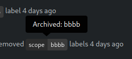
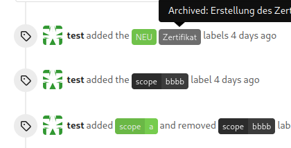
the issue is, that you can not distinguish between normal and archived
labels.
So this will make archived labels 80% **grayscale**. And prepend
"Archived: " to the tooltip info
---
*Sponsored by Kithara Software GmbH*
---------
Co-authored-by: delvh <dev.lh@web.de>
|
| |
|
|
|
|
|
|
|
|
| |
Before:
<img width="1332" alt="Screenshot 2024-03-06 at 21 42 17"
src="https://github.com/go-gitea/gitea/assets/115237/0ea07eee-31f8-4783-bd56-37bd8396f00d">
After:
<img width="1336" alt="Screenshot 2024-03-06 at 21 41 58"
src="https://github.com/go-gitea/gitea/assets/115237/eb7f9cc9-587f-4e3b-92bd-cc67ca639963">
|
| |
|
|
|
|
|
|
| |
Follow #29418
I think using "flex-wrap: wrap" here is better than hard-coding the screen width.
By using "flex-wrap: wrap", the UI layouts automatically for various
widths (even if in some languages, the sentence might be pretty long)
|
| |
|
|
|
|
|
| |
Fixes #29189.
This is the result after the fix at a width of 768 pixels.
|
| |
|
|
|
|
|
|
|
|
|
|
|
|
|
|
|
|
|
|
|
| |
1. Tweak diff header and remove a numbe of unneeded CSS for it:
Before:
<img width="433" alt="Screenshot 2024-02-18 at 01 08 09"
src="https://github.com/go-gitea/gitea/assets/115237/d8b377c0-57bc-44d5-bb57-a582c7d4b3b4">
After:
<img width="463" alt="Screenshot 2024-02-18 at 01 07 56"
src="https://github.com/go-gitea/gitea/assets/115237/d08c17e7-5b86-4d07-81da-6371f4754325">
3. Reduce height of review textarea and also reduce fomantic's CSS from
12em to 8em. Now fits better on my screen:
<img width="1352" alt="image"
src="https://github.com/go-gitea/gitea/assets/115237/5c658d13-295e-4929-94da-13ade888020d">
---------
Co-authored-by: delvh <dev.lh@web.de>
|
| |
|
|
|
|
|
|
|
|
|
|
| |
This border-radius is obsolete since we changed the comment rendering a
few months ago and it caused incorrect display on blockquotes.
Before:
<img width="160" alt="Screenshot 2024-02-10 at 18 42 48"
src="https://github.com/go-gitea/gitea/assets/115237/ccbf4660-acf9-4268-aad9-1ad49d317a67">
After:
<img width="135" alt="Screenshot 2024-02-10 at 18 42 40"
src="https://github.com/go-gitea/gitea/assets/115237/6f588e02-3b2a-49ee-b459-81d8068b2f4e">
|
| |
|
|
|
|
|
|
|
|
|
|
|
|
|
|
|
| |
I tripped over this strange method and I don't think we need that
workaround to fix the value.
old:

new:

---------
Co-authored-by: silverwind <me@silverwind.io>
Co-authored-by: wxiaoguang <wxiaoguang@gmail.com>
|
| |
|
|
|
|
|
|
|
| |
If you view a file, you can now see the latest commit that changed that file.

---------
Co-authored-by: Denys Konovalov <kontakt@denyskon.de>
|
| |
|
|
|
|
|
|
|
|
|
|
|
|
|
|
|
|
|
|
|
|
|
|
|
|
|
|
|
|
|
|
|
| |
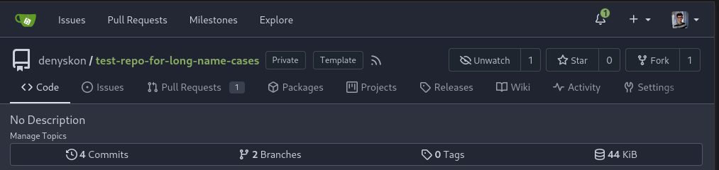
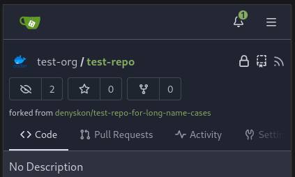
Redesign repo header with following new aspects:
- responsive & better-looking repo title
- hide repo button text instead of icons in mobile view
- use same tab style as on explore and org page
<details>
<summary>Before:</summary>


</details>
<details>
<summary>After:</summary>


|
| |
|
|
|
|
|
|
|
|
|
|
|
|
|
|
| |
Close https://github.com/go-gitea/gitea/issues/28522
~Adds some [negative
margin](https://tailwindcss.com/docs/margin#using-negative-values)
helper css classes using tailwind's [prefix
syntax](https://tailwindcss.com/docs/configuration#prefix)~
### Before

### After
|
| |
|
|
|
|
|
| |
the gt-df's display:flex !important did override the display:none on small displays
---------
Co-authored-by: wxiaoguang <wxiaoguang@gmail.com>
|
| |
|
|
|
|
|
|
|
|
|
|
|
|
|
|
|
|
|
|
|
|
|
|
|
|
|
|
|
|
| |
1. Show diff stats only on large screens
these are already shown in tabs, so no need for this duplicate
information on small screens
2. Hide viewed files information on small screens
Github does the same and this gives us more free space on small screens
3. Review bar now doesn't wrap so we don't need the 77px even on very
small screens
(the sticky headers are still working)
|
| |
|
|
|
|
|
|
|
|
|
|
|
|
|
|
|
|
|
|
|
|
|
|
|
|
| |
In #25315, @denyskon fixed UI on mobile view.
But for the repo description, on desktop view there's no word-break.
So maybe we can just add `gt-word-break` to fix it on both mobile view
and desktop view.
Before:
desktop view:

mobile view:

After:
desktop view:

mobile view(almost same?)
---------
Co-authored-by: silverwind <me@silverwind.io>
|
| |
|
|
|
|
|
| |
Fix #27928
---------
Co-authored-by: silverwind <me@silverwind.io>
|
| |
|
|
|
|
|
|
|
|
|
|
|
|
|
|
|
|
|
|
|
|
|
|
|
| |
Step one for a GitHub like commit status check ui:
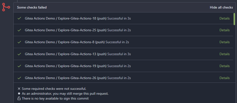
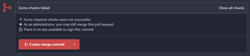
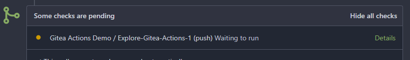
Step two:

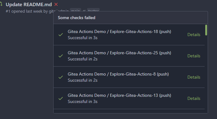
The design now will list all commit status checks which takes too much
space.
This is a pre-improve for #26247
---------
Co-authored-by: delvh <dev.lh@web.de>
Co-authored-by: silverwind <me@silverwind.io>
Co-authored-by: wxiaoguang <wxiaoguang@gmail.com>
|
| |
|
|
|
|
|
|
|
|
| |
Fixes: https://github.com/go-gitea/gitea/issues/27784
<img width="1033" alt="Screenshot 2023-10-25 at 19 07 15"
src="https://github.com/go-gitea/gitea/assets/115237/1a363851-1a86-48cb-99ec-0a573371bb6e">
<img width="1051" alt="Screenshot 2023-10-25 at 19 07 41"
src="https://github.com/go-gitea/gitea/assets/115237/add4b606-2264-430a-af35-249ef005817f">
Co-authored-by: KN4CK3R <admin@oldschoolhack.me>
|
| |
|
|
|
|
|
|
|
|
|
|
|
|
|
|
|
|
|
|
|
| |
Fix #24318
Before:

After:

|
