| Commit message (Collapse) | Author | Age | Files | Lines |
|---|
| |
|
| |
Fix #35033
|
| |
|
|
|
|
|
| |
Fix #34775
---------
Co-authored-by: wxiaoguang <wxiaoguang@gmail.com>
|
| | |
|
| |
|
|
|
|
|
|
|
| |
before:

after:

|
| |
|
|
|
|
|
| |
Make labels list use consistent gap
---------
Co-authored-by: wxiaoguang <wxiaoguang@gmail.com>
|
| |
|
| |
Remove unclear code
|
| |
|
|
|
|
| |
1. Use `OpenXxx` instead of `GetXxx` because the returned readers should
be correctly closed, and clarify the behaviors of the functions: they
increase the download counter
2. Use `packages-content` styles instead of `issue-content`
|
| |
|
| |
Fix #34696
|
| |
|
|
|
|
| |
* Fix #34679
* Fix #34676
* Fix #34674
* Fix #34526
|
| |
|
|
|
|
|
|
| |
Fix the issue where the line-button fails to work after selecting a file
from the file tree.
---------
Co-authored-by: wxiaoguang <wxiaoguang@gmail.com>
|
| |
|
|
| |
Move "file-view" and "code-view" related styles to their own file,
remove unnecessary `!important`
|
| |
|
|
|
|
|
|
|
|
| |
#34298" (#34321)
There is a known issue where scrolling to the bottom of the page is
affected by unknown elements in the footer area:
https://github.com/go-gitea/gitea/blob/24145f811069295b9727f25469f1dd3a7c2c5dd7/templates/base/footer.tmpl#L11-L18

|
| |
|
| |
Fix #34260
|
| |
|
|
|
| |
---------
Co-authored-by: wxiaoguang <wxiaoguang@gmail.com>
|
| |
|
|
| |
Co-authored-by: wxiaoguang <wxiaoguang@gmail.com>
|
| |
|
|
|
|
|
| |
Remove duplicate border
---------
Co-authored-by: wxiaoguang <wxiaoguang@gmail.com>
|
| |
|
|
|
|
|
|
|
|
|
|
|
|
|
|
|
|
|
|
|
|
| |
submodules/symlinks (#34137)
In the file tree, the icons are not vertically centered, which affects
the overall visual consistency.
Currently, the icons of submodules and symlinks do not adopt the value
of entryIcon, resulting in inconsistent icon display.
before:

after:

---------
Co-authored-by: silverwind <me@silverwind.io>
|
| |
|
|
|
|
|
| |
Align items
---------
Co-authored-by: wxiaoguang <wxiaoguang@gmail.com>
|
| | |
|
| |
|
|
|
|
|
|
|
|
|
| |
Resolve #29328
This pull request introduces a file tree on the left side when reviewing
files of a repository.
---------
Co-authored-by: Lunny Xiao <xiaolunwen@gmail.com>
Co-authored-by: wxiaoguang <wxiaoguang@gmail.com>
|
| |
|
|
|
|
|
|
| |
Make "initRepoBranchTagSelector" to use new init framework and fix the
abused "js-branch-tag-selector" styles
---------
Co-authored-by: wxiaoguang <wxiaoguang@gmail.com>
|
| |
|
| |
Fix #33409
|
| |
|
|
|
|
|
|
|
|
| |
- Add box-shadow to default tippy theme
- Make colors for tabs match the ones from `.ui.tabular.menu`
- Remove tippy arrow and slightly offset tooltip closer to the button
- Fix setting of `aria-haspopup` when default role is used with tippy
---------
Co-authored-by: wxiaoguang <wxiaoguang@gmail.com>
|
| |
|
| |
Fix #33385
|
| |
|
|
|
|
|
|
|
|
|
|
|
|
|
| |
Reduce it to a value that results in `.repo-home-sidebar-top` and
`.repo-home-sidebar-bottom` having 240px content width, the same as
GitHub.
Before:
<img width="1333" alt="Screenshot 2025-01-15 at 18 28 34"
src="https://github.com/user-attachments/assets/cf0fa21b-87be-40e3-a6cd-26d146bce9cc"
/>
After:
<img width="1330" alt="Screenshot 2025-01-15 at 18 28 27"
src="https://github.com/user-attachments/assets/28acd837-10f4-4176-b8a0-510cd28c8b8d"
/>
|
| |
|
|
|
|
|
|
|
|
| |
The new code structure is easier to make more improvements or
refactor, for example: change the colors to de-emphasize more, or design
some new layouts.
---------
Co-authored-by: silverwind <me@silverwind.io>
Co-authored-by: wxiaoguang <wxiaoguang@gmail.com>
|
| |
|
|
|
|
|
|
|
|
|
|
| |
1. restore background color
2. fix border radius on top/bottom and on hover
3. parent link is now full-row again, much easier to click
4. parent link now uses directory icon, matching github
5 changed grid layout to remove auto width on file name column which could get too small.
6. mobile layout now shows more of the filename.
---------
Co-authored-by: wxiaoguang <wxiaoguang@gmail.com>
|
| |
|
|
|
|
|
|
|
|
|
|
|
|
|
|
|
|
|
|
|
|
|
| |
Before and after:
<img width="218" alt="Screenshot 2024-12-15 at 04 53 53"
src="https://github.com/user-attachments/assets/299b1f0a-ba72-47c6-b662-a9d540d4d741"
/>
<img width="222" alt="Screenshot 2024-12-15 at 04 53 41"
src="https://github.com/user-attachments/assets/5a2b5332-e324-4d20-82e9-21d1c850e826"
/>
Diff without whitespace:
https://github.com/go-gitea/gitea/pull/32847/files?diff=unified&w=1
The `tw-mt-2` is fine even if the element renders empty:
<img width="387" alt="image"
src="https://github.com/user-attachments/assets/76a976e4-ba2e-48a5-9248-c361552a937a"
/>
---------
Co-authored-by: wxiaoguang <wxiaoguang@gmail.com>
|
| |
|
| |
Add more tests
|
| | |
|
| |
|
|
|
|
|
| |
1. use grid instead of table, completely drop "ui table" from that list
2. move some "commit sign" related styles into a new file by the way (no
change) because I need to figure out where `#repo-files-table` is used.
3. move legacy "branch/tag selector" related code into repo-legacy.ts,
now there are 13 `import $` files left.
|
| |
|
|
|
|
|
|
|
|
|
|
|
| |
Rearrange the clone panel to use less horizontal space.
The following changes have been made to achieve this:
- Moved everything into the dropdown menu
- Moved the HTTPS/SSH Switch to a separate line
- Moved the "Clone in VS Code"-Button up and added a divider
- Named the dropdown button "Code", added appropriate icon
---------
Co-authored-by: techknowlogick <techknowlogick@gitea.com>
Co-authored-by: wxiaoguang <wxiaoguang@gmail.com>
|
| |
|
|
|
|
|
|
|
|
| |
Replace #26661, fix #25979
Not perfect, but usable and much better than before. Since it is quite
complex, I am not quite sure whether there would be any regression, if
any, I will fix in first time.
I have tested the related pages many times: issue list, milestone issue
list, project view, user issue list, org issue list.
|
| |
|
|
|
|
|
|
|
|
|
|
| |
Rewrite a lot of legacy strange code, remove duplicate code, remove
jquery, and make these filters reusable.
Let's forget the old code, new code affects:
* issue list open/close switch
* issue list filter (label, author, assignee)
* milestone list open/close switch
* milestone issue list filter (label, author, assignee)
* project view (label, assignee)
|
| | |
|
| |
|
|
|
|
|
| |
Move some components (description, license, release, language stats) to sidebar
---------
Co-authored-by: wxiaoguang <wxiaoguang@gmail.com>
|
| |
|
| |
Introduce `issueSidebarLabelsData` to handle all sidebar labels related data.
|
| |
|
|
|
|
|
|
|
| |
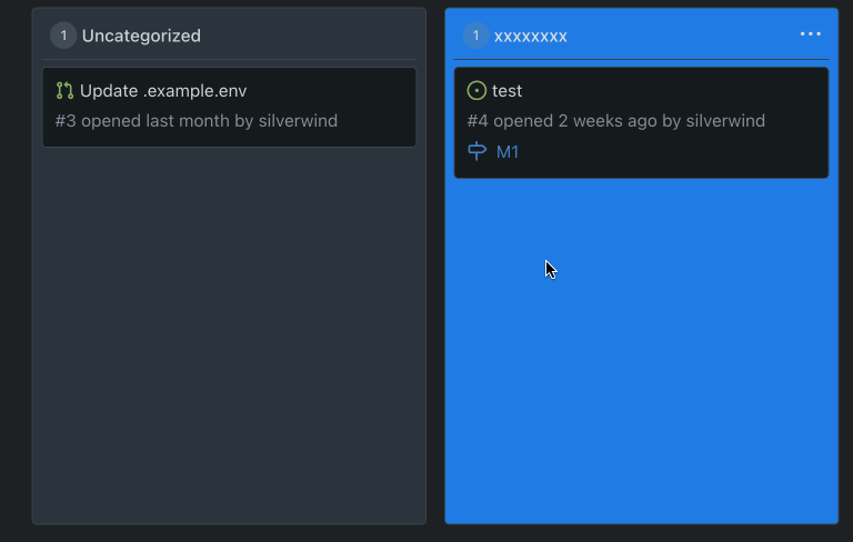
As discussed in #31667 & #26561, when a card on a Project contains
images, they can overflow the card on its containing column. This aims
to fix this issue via snapping scrollbars.
---
Issue #31667 is open to discussion as there should be room for
improvement.
|
| |
|
|
|
|
|
|
|
|
|
|
|
|
|
|
|
|
|
| |
Fixes https://github.com/go-gitea/gitea/issues/30821 and restyles the
release list.
Desktop:
<img width="1199" alt="Screenshot 2024-05-02 at 20 46 10"
src="https://github.com/go-gitea/gitea/assets/115237/bee92423-d4a9-4b26-8301-3a1e09eef4cd">
Mobile:
<img width="443" alt="Screenshot 2024-05-02 at 20 46 21"
src="https://github.com/go-gitea/gitea/assets/115237/42ecbae5-bdb6-4b16-a0ee-9c64daede68d">
---------
Co-authored-by: Giteabot <teabot@gitea.io>
|
| |
|
| |
Fix #30788
|
| |
|
|
|
|
|
|
|
|
|
|
|
|
|
|
|
|
|
|
|
|
|
|
|
|
|
|
| |
Fixes https://github.com/go-gitea/gitea/issues/30673, all 23 issues.
Notes:
- Tab bar menus had to change to pills because of unsolvable issue with
the border-radius as tab bar renders a overlapping border onto the box
below. And I think pills look better.
- Added padding to code editor empty preview message
- Hide monaco's built-in blue focus border, we don't need it and it
never showed before either.
- Label add menu is simplified, removing the nested segment.
<img width="1322" alt="Screenshot 2024-04-25 at 22 26 19"
src="https://github.com/go-gitea/gitea/assets/115237/7e394e0c-b7ad-417d-8e9f-12f1dea93ed1">
<img width="1326" alt="Screenshot 2024-04-25 at 22 28 00"
src="https://github.com/go-gitea/gitea/assets/115237/66c8499f-aa9f-4d95-8cca-ef13dfa82c65">
<img width="997" alt="Screenshot 2024-04-25 at 22 36 53"
src="https://github.com/go-gitea/gitea/assets/115237/07896102-c71d-4246-8173-c2bc2e1d3cae">
<img width="832" alt="Screenshot 2024-04-25 at 22 56 09"
src="https://github.com/go-gitea/gitea/assets/115237/d83afc96-08ca-4adc-baf4-3d02804be57c">
<img width="361" alt="Screenshot 2024-04-25 at 22 57 12"
src="https://github.com/go-gitea/gitea/assets/115237/c7371a68-00b5-47d8-84d0-ddc5268b2b2c">
---------
Co-authored-by: wxiaoguang <wxiaoguang@gmail.com>
Co-authored-by: Giteabot <teabot@gitea.io>
|
| |
|
|
|
|
|
|
|
|
|
|
|
|
|
| |
Fixes https://github.com/go-gitea/gitea/issues/30682 and does a few
improvements:
- Use gap instead of margin/padding
- Don't render empty image div
- Remove `right floated` class that did nothing
<img width="406" alt="Screenshot 2024-04-24 at 20 21 20"
src="https://github.com/go-gitea/gitea/assets/115237/2fa88707-c2c4-40df-aee7-a684c3097ed0">
---------
Co-authored-by: KN4CK3R <admin@oldschoolhack.me>
|
| |
|
|
|
|
|
|
|
|
|
|
|
|
|
|
|
|
|
|
|
|
|
| |
Fixes: https://github.com/go-gitea/gitea/issues/30514
Fixes:
https://github.com/go-gitea/gitea/pull/30288#issuecomment-2057466623
- Fix border-radius regression from
https://github.com/go-gitea/gitea/pull/30475
- Fix and simplify hover state
- Move the modal HTML so it does not interfere with the CSS
- Make the star and unwatch text show on mobile. There is still plenty
of space, below is iPhone 12 viewport size
<img width="696" alt="Screenshot 2024-04-15 at 20 34 03"
src="https://github.com/go-gitea/gitea/assets/115237/af90bb00-4671-4973-a255-8eb44ee6ba8d">
<img width="230" alt="Screenshot 2024-04-15 at 20 31 42"
src="https://github.com/go-gitea/gitea/assets/115237/986ef533-7a01-4bb0-8dcd-fd19e4259e84">
<img width="233" alt="Screenshot 2024-04-15 at 20 31 47"
src="https://github.com/go-gitea/gitea/assets/115237/5b825dd8-0ccc-4d56-9d8f-774abb935b68">
---------
Co-authored-by: Giteabot <teabot@gitea.io>
|
| |
|
|
|
|
|
|
|
|
|
|
|
| |
Fixes: https://github.com/go-gitea/gitea/issues/27971
Fixes: https://github.com/go-gitea/gitea/pull/28010
<img width="689" alt="Screenshot 2024-04-09 at 00 19 57"
src="https://github.com/go-gitea/gitea/assets/115237/7c895a47-274f-40a6-a126-290658f1982d">
Also fixes a similar issue in issue list where CSS was there but not
active because of missing `display: block`.
<img width="372" alt="Screenshot 2024-04-09 at 00 18 25"
src="https://github.com/go-gitea/gitea/assets/115237/cfbee7cd-2e15-4ac7-96ce-020816f48798">
|
| |
|
|
|
|
|
|
|
|
|
| |
Enable `no-sizzle` lint rule, there was only one use in `initCompReactionSelector` and:
- Remove all jQuery except the necessary fomantic dropdown init
- Remove the recursion, instead bind event listeners to common parent container nodes
---------
Co-authored-by: wxiaoguang <wxiaoguang@gmail.com>
Co-authored-by: Giteabot <teabot@gitea.io>
|
| |
|
|
|
|
|
|
|
|
|
|
|
|
|
|
|
|
|
|
|
|
|
|
|
|
|
| |
1. The previous color contrast calculation function was incorrect at
least for the `#84b6eb` where it output low-contrast white instead of
black. I've rewritten these functions now to accept hex colors and to
match GitHub's calculation and to output pure white/black for maximum
contrast. Before and after:
<img width="94" alt="Screenshot 2024-04-02 at 01 53 46"
src="https://github.com/go-gitea/gitea/assets/115237/00b39e15-a377-4458-95cf-ceec74b78228"><img
width="90" alt="Screenshot 2024-04-02 at 01 51 30"
src="https://github.com/go-gitea/gitea/assets/115237/1677067a-8d8f-47eb-82c0-76330deeb775">
2. Fix project-related issues:
- Expose the new `ContrastColor` function as template helper and use it
for project cards, replacing the previous JS solution which eliminates a
flash of wrong color on page load.
- Fix a bug where if editing a project title, the counter would get
lost.
- Move `rgbToHex` function to color utils.
@HesterG fyi
---------
Co-authored-by: delvh <dev.lh@web.de>
Co-authored-by: Giteabot <teabot@gitea.io>
|
| |
|
|
|
|
|
|
|
|
|
|
|
|
|
|
|
|
|
| |
CSS is pretty slim already and the `.ui.toggle.checkbox` sliders on
admin page also still work. The only necessary JS is the one that links
`input` and `label` so that it can be toggled via label. All checkboxes
except the markdown ones render at `--checkbox-size: 16px` now.
<img width="174" alt="Screenshot 2024-03-28 at 22 15 10"
src="https://github.com/go-gitea/gitea/assets/115237/3455c1bb-166b-47e4-9847-2d20dd1f04db">
<img width="499" alt="Screenshot 2024-03-28 at 21 00 07"
src="https://github.com/go-gitea/gitea/assets/115237/412be2b3-d5a0-478a-b17b-43e6bc12e8ce">
<img width="83" alt="Screenshot 2024-03-28 at 22 14 34"
src="https://github.com/go-gitea/gitea/assets/115237/d8c89838-a420-4723-8c49-89405bb39474">
---------
Co-authored-by: delvh <dev.lh@web.de>
|
| |
|
|
|
|
|
|
|
|
|
|
|
|
|
| |
1. Add "grabbing" cursor while dragging items:

2. Make project board only drag via their header, not via their whole
body.
3. Fix some cursor problems in projects
4. Move shared options into `createSortable`.
|
| |
|
|
|
|
|
|
|
|
|
|
|
|
|
|
|
|
|
|
|
|
|
|
|
|
|
|
|
|
|
|
| |
1. Restore missing styles for message close icon
2. Move `code-line-button` so that it does not go off-screen on small
viewports
3. Make `code-line-button` look and behave like other buttons
4. Make `code-line-button` work in blame
5. Make the active selection span the whole line, not just the code part
6. Tweak colors, make dark theme code bg darker, make line numbers same
color in diff and file view.
7. Move code background to parent, fixing border radius and other
problems
8. Enable code wrap in blame
9. Improve blame responsiveness
10. Remove `--color-code-sidebar-bg` in blame, now it uses same
background as code
11. Rename `--color-active-line` to `--color-highlight-bg`
12. Add `--color-highlight-bg`
13. Fix button group borders on hover and border-right on last button.
<img width="1343" alt="Screenshot 2024-03-23 at 22 34 13"
src="https://github.com/go-gitea/gitea/assets/115237/fcbb919f-5dc3-43f0-97f6-870d6f412554">
<img width="1334" alt="Screenshot 2024-03-23 at 22 34 26"
src="https://github.com/go-gitea/gitea/assets/115237/ca44c3b7-4328-4645-ba49-b0dc6a5ac06d">
<img width="1338" alt="Screenshot 2024-03-23 at 22 34 57"
src="https://github.com/go-gitea/gitea/assets/115237/00eb0b5a-1ec7-4669-a94a-4602b9d1c1ac">
<img width="1337" alt="Screenshot 2024-03-23 at 22 34 42"
src="https://github.com/go-gitea/gitea/assets/115237/752edc4a-064f-413c-9dff-c086187fcd85">
Fixes: https://github.com/go-gitea/gitea/issues/18074
|
| |
|
|
|
|
|
|
|
|
|
|
|
|
|
|
|
|
| |
(#29982)
Fixes: https://github.com/go-gitea/gitea/issues/29981. Introduce
`.secondary-nav` as a universal way for styling and margin adjustments
inside `.page-content`.
If the first child of `.page-content` is `.secondary-nav`, we add margin
below it, otherwise we add padding to the first child. Notable changes:
- `--color-header-wrapper` is replaced with `--color-secondary-nav-bg`.
- `navbar` class is removed.
---------
Co-authored-by: Giteabot <teabot@gitea.io>
Co-authored-by: wxiaoguang <wxiaoguang@gmail.com>
|
