| Commit message (Collapse) | Author | Age | Files | Lines |
|---|
| |
|
| |
Fix #35060
|
| |
|
|
|
| |
* Fix #35011
* Fix incorrect log message for "Protocol"
* Remove unnecessary styles, fix "comment-header" wrap, fix label height
|
| |
|
|
| |
Fix #34609
Fix #34967
|
| |
|
|
|
|
|
| |
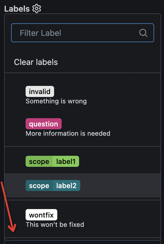
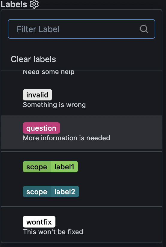
Make labels list use consistent gap
---------
Co-authored-by: wxiaoguang <wxiaoguang@gmail.com>
|
| |
|
|
|
|
|
|
|
|
|
|
|
|
|
|
|
|
|
|
|
|
|
|
|
|
|
|
|
|
|
|
|
|
|
| |
# What's the problem of the original implementation
Renaming organization will mix with organization's information change
make the operation difficult to keep consistent.
This PR created a danger zone like what's repository setting. It also
moved organization's `rename` and `delete` operations to this zone. The
original updating repository will not change the name any more.
This is also a step to extract the `updaterepository` function
completely.
Before:


After:


---------
Co-authored-by: wxiaoguang <wxiaoguang@gmail.com>
|
| |
|
|
|
|
|
|
|
|
|
|
|
|
|
|
|
|
|
|
|
|
|
|
|
|
|
| |
1. apply [`text-wrap:
balance`](https://developer.mozilla.org/en-US/docs/Web/CSS/text-wrap#balance)
to various places making the text wrapping nicer, moving
`empty-placeholder` CSS to base because it's not repo-specific.
<img width="537" alt="Screenshot 2025-06-07 at 15 09 00"
src="https://github.com/user-attachments/assets/8b37d031-269d-4ab3-ba59-2ac469c431e4"
/>
<img width="514" alt="Screenshot 2025-06-07 at 15 11 16"
src="https://github.com/user-attachments/assets/27a63117-be1d-4797-80f7-9ed14cca41dc"
/>
<img width="346" alt="Screenshot 2025-06-07 at 15 22 26"
src="https://github.com/user-attachments/assets/2f371384-0330-4a00-bb79-bc3c50ba5c91"
/>
2. fix overflow-related bug on actions run list, before:
<img width="302" alt="Screenshot 2025-06-07 at 15 26 26"
src="https://github.com/user-attachments/assets/d6607eeb-288b-4e81-a770-45a421c9c68c"
/>
After:
<img width="299" alt="Screenshot 2025-06-07 at 15 26 59"
src="https://github.com/user-attachments/assets/b0ddb66f-d4fe-4711-8ed9-eca08ce608f3"
/>
|
| |
|
|
| |
Move "file-view" and "code-view" related styles to their own file,
remove unnecessary `!important`
|
| |
|
| |
Also fix #34300
|
| |
|
|
|
|
|
|
| |
Continue with #34206.
---------
Co-authored-by: wxiaoguang <wxiaoguang@gmail.com>
Co-authored-by: Lunny Xiao <xiaolunwen@gmail.com>
|
| |
|
|
|
|
|
|
|
| |
Previously we would always leave 80px space before the page footer, but
this is problematic with small viewport heights on projects page for
example. I think it' ideal that we use `--page-spacing` which is already
in use for spacing on top of the page.
The `secondary-nav` margin is also adjusted as I see no value why this
shouldn't be the same value.
|
| |
|
|
|
|
|
|
|
|
| |
1. Fix #20606
2. Fix #34246
3. Fix missing spaces, fix misspells, no visual change.
4. Fix missing "not-mobile", fix #34265
---------
Co-authored-by: silverwind <me@silverwind.io>
|
| |
|
| |
Also fix #34242
|
| |
|
|
| |
Co-authored-by: wxiaoguang <wxiaoguang@gmail.com>
|
| |
|
|
|
|
|
|
|
|
| |
Optimized the overflow-menu:
1. Close the tippy when a menu item inside the tippy is clicked.
2. When a menu item inside the tippy is selected, move the active state
of the menu to the tippy's button.
---------
Co-authored-by: wxiaoguang <wxiaoguang@gmail.com>
|
| |
|
|
|
|
|
|
|
|
|
|
|
| |
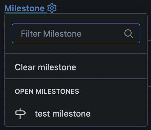
Fix #2616
This PR adds a new sort option for exclusive labels.
For exclusive labels, a new property is exposed called "order", while in
the UI options are populated automatically in the `Sort` column (see
screenshot below) for each exclusive label scope.
---------
Co-authored-by: wxiaoguang <wxiaoguang@gmail.com>
|
| |
|
|
|
|
|
|
|
|
|
|
|
|
|
|
|
|
|
|
|
|
| |
submodules/symlinks (#34137)
In the file tree, the icons are not vertically centered, which affects
the overall visual consistency.
Currently, the icons of submodules and symlinks do not adopt the value
of entryIcon, resulting in inconsistent icon display.
before:

after:

---------
Co-authored-by: silverwind <me@silverwind.io>
|
| | |
|
| |
|
| |
Remove legacy `truncated-item-container` and `truncated-item-name`.
|
| |
|
|
|
|
|
|
|
|
|
|
|
|
|
|
| |
It seems like most of our custom styles around the .emoji class are
useless and we can just make them render like any other text. Rendering
should now match GitHub.
Fixes: https://github.com/go-gitea/gitea/issues/34019
Also see https://github.com/go-gitea/gitea/pull/11541 and
https://github.com/go-gitea/gitea/pull/12317 for some context. I think
browser emoji rendering has improved in recent years so these hacks are
no longer needed.
---------
Co-authored-by: wxiaoguang <wxiaoguang@gmail.com>
|
| |
|
|
|
|
|
|
|
|
|
| |
On the list page, labels and milestones do not serve as a switch-tab.
Instead, they function as page navigation. The switch-tab is only
appropriate for use on the labels and milestones pages.
And fix projects page layout.
---------
Co-authored-by: wxiaoguang <wxiaoguang@gmail.com>
|
| |
|
|
|
|
|
| |
Small refactor to remove these CSS classes in favor of tailwind.
---------
Co-authored-by: wxiaoguang <wxiaoguang@gmail.com>
|
| |
|
|
|
|
|
|
|
|
|
|
|
|
|
|
|
|
|
|
|
|
|
|
|
|
|
|
|
|
|
|
|
|
|
| |
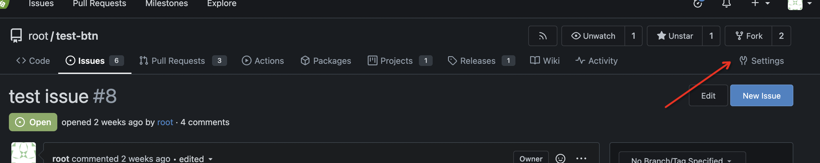
Currently, the issue/pr sidebar is hard to read visually. One of the
reason is that the gear icons make reading difficult because they are
"in the way" when reading, and not aligned together.
This PR proposes to align them on the right.
Actions are also better highlighted this way.
## Screenshots
### Issue
| Before this PR | After this PR |
| --- | --- |
| <img width="322" alt="Capture d’écran 2025-02-25 à 19 59 39"
src="https://github.com/user-attachments/assets/efdd13af-7b22-4f2b-8e65-dd17d6f3ffad"
/> | <img width="322" alt="Capture d’écran 2025-02-25 à 19 58 56"
src="https://github.com/user-attachments/assets/eeacc3f4-5e2c-4558-a4b3-0f1ab4742107"
/> |
### Pull Request
| Before this PR | After this PR |
| --- | --- |
| <img width="322" alt="Capture d’écran 2025-02-25 à 20 16 12"
src="https://github.com/user-attachments/assets/c274b58b-ad50-4ad8-b3da-91dbabd1b120"
/> | <img width="322" alt="Capture d’écran 2025-02-25 à 20 15 54"
src="https://github.com/user-attachments/assets/ecfd6d60-a525-4767-872d-2ef84030d81e"
/> |
Signed-off-by: Quentin Guidée <quentin.guidee@gmail.com>
Co-authored-by: Giteabot <teabot@gitea.io>
|
| | |
|
| |
|
|
|
| |
1. remove jquery
2. rewrite the "line number selection", fix various edge cases
3. fix the scroll
|
| | |
|
| | |
|
| |
|
|
|
|
|
|
|
|
| |
The new code structure is easier to make more improvements or
refactor, for example: change the colors to de-emphasize more, or design
some new layouts.
---------
Co-authored-by: silverwind <me@silverwind.io>
Co-authored-by: wxiaoguang <wxiaoguang@gmail.com>
|
| |
|
|
|
|
|
|
|
|
|
|
| |
Rewrite a lot of legacy strange code, remove duplicate code, remove
jquery, and make these filters reusable.
Let's forget the old code, new code affects:
* issue list open/close switch
* issue list filter (label, author, assignee)
* milestone list open/close switch
* milestone issue list filter (label, author, assignee)
* project view (label, assignee)
|
| |
|
|
|
|
|
|
|
|
|
|
|
|
|
|
|
|
|
|
|
|
|
| |
Close #25037
Close #31037
This PR adds a Arch package registry usable with pacman.

Rewrite of #25396 and #31037. You can follow [this
tutorial](https://wiki.archlinux.org/title/Creating_packages) to build a
package for testing.
Docs PR: https://gitea.com/gitea/docs/pulls/111
Co-authored-by: [d1nch8g@ion.lc](mailto:d1nch8g@ion.lc)
Co-authored-by: @ExplodingDragon
---------
Co-authored-by: dancheg97 <dancheg97@fmnx.su>
Co-authored-by: dragon <ExplodingFKL@gmail.com>
Co-authored-by: wxiaoguang <wxiaoguang@gmail.com>
|
| |
|
|
|
|
|
|
|
|
|
|
|
|
|
|
|
|
|
|
|
|
|
|
|
|
|
|
|
|
|
|
|
| |
1. remove duplicate dividers
2. align reviewer items
3. merge & remove unused CSS styles
Before:
<details>
</details>
After:
<details>
</details>
|
| |
|
|
|
|
|
|
|
|
| |
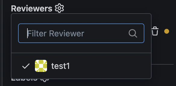
Users could add reviewers when creating new PRs.
---------
Co-authored-by: splitt3r <splitt3r@users.noreply.github.com>
Co-authored-by: Sebastian Sauer <sauer.sebastian@gmail.com>
Co-authored-by: bb-ben <70356237+bboerben@users.noreply.github.com>
Co-authored-by: wxiaoguang <wxiaoguang@gmail.com>
|
| |
|
|
|
|
|
|
|
| |
close #31602

---------
Co-authored-by: wxiaoguang <wxiaoguang@gmail.com>
|
| | |
|
| |
|
|
|
|
|
|
|
|
|
|
|
|
|
|
|
|
| |
Fixes regression
https://github.com/go-gitea/gitea/pull/31307#issuecomment-2162554913
Table CSS is weird. A `auto` value does not work and causes the
regression while any pixel value causes another regression in diff where
the code lines do not stretch. Partially revert that PR and clean up
some related too-deep CSS selectors.
<img width="109" alt="Screenshot 2024-06-12 at 15 07 22"
src="https://github.com/go-gitea/gitea/assets/115237/756c5dea-44b8-49f9-8a08-acef68075f62">
<img width="119" alt="Screenshot 2024-06-12 at 15 07 43"
src="https://github.com/go-gitea/gitea/assets/115237/28ae1adc-118e-4016-8d09-033b9f1c9a6f">
<img width="151" alt="Screenshot 2024-06-12 at 15 07 07"
src="https://github.com/go-gitea/gitea/assets/115237/08db7ed9-de4e-405e-874d-c7ebe3082557">
<img width="141" alt="Screenshot 2024-06-12 at 15 07 14"
src="https://github.com/go-gitea/gitea/assets/115237/c4a5492b-1bf1-4773-bc8d-64eb36d823f9">
|
| |
|
|
|
|
|
| |
Line numbers were using some hacky CSS `width: 1%` that did nothing to
the code rendering as far as I can tell but broken the inline preview in
markup when line numbers are greater than 2 digits. Also I removed one
duplicate `font-family` rule (it is set below in the `.lines-num,
.lines-code` selector.
|
| |
|
|
|
|
| |
Percentage-based `border-radius` [creates undesirable
ellipse](https://jsfiddle.net/silverwind/j9ko5wnt/4/) on non-square
content. Instead, use pixel value and use same wording `full` like
tailwind does, but increast to 99999px over their 9999px.
|
| |
|
|
|
|
|
| |
Close #30919
---------
Co-authored-by: silverwind <me@silverwind.io>
|
| |
|
|
|
|
| |
Follow #30345
Follow #30547
`ellipsis` / `white-space` shouldn't be put on the general dropdown components.
|
| |
|
| |
Fix #30802
|
| |
|
|
|
|
|
|
|
|
|
|
|
| |
I guess there could be enough people liking to make the Settings menu
item right aligned. As a site admin, I found it's easier to find the
right-aligned Settings menu item.
Tested with various sizes:
|
| |
|
| |
Tested extensively using modal which is the only dependant.
|
| | |
|
| |
|
|
|
|
|
|
|
|
|
| |
- `.text-thin` and `.text-italic` are not present in CSS so were doing nothing and I removed them.
- `.text.middle` was unused so I removed it.
- `.text.italic` is replaced with `tw-italic`.
- `.text.normal` had exactly one use and it wasn't even needed.
- add a `muted` class to the link to `org_profile_avatar.tmpl`.
---------
Co-authored-by: wxiaoguang <wxiaoguang@gmail.com>
|
| |
|
|
|
|
|
|
|
|
|
|
|
| |
Follow
https://github.com/go-gitea/gitea/pull/30547#discussion_r1573866519
Fix #30624
The Fomantic UI Dropdown wasn't designed to work that way, its "text"
element might contain images. So the "overflow" shouldn't be added to
any general dropdown text.
|
| |
|
|
| |
Fixes https://github.com/go-gitea/gitea/issues/30566, regression from
https://github.com/go-gitea/gitea/pull/30214.
|
| |
|
|
|
|
|
|
| |
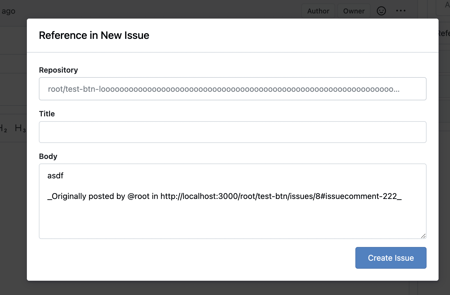
Fixes: https://github.com/go-gitea/gitea/issues/29994
Also some misc enhancements done to the form in the modal.
<img width="840" alt="Screenshot 2024-04-17 at 23 02 55"
src="https://github.com/go-gitea/gitea/assets/115237/e71fba55-55cd-4e48-a497-6b1025c36a43">
|
| |
|
|
|
|
|
|
|
|
|
|
|
| |
Fixes: https://github.com/go-gitea/gitea/issues/27971
Fixes: https://github.com/go-gitea/gitea/pull/28010
<img width="689" alt="Screenshot 2024-04-09 at 00 19 57"
src="https://github.com/go-gitea/gitea/assets/115237/7c895a47-274f-40a6-a126-290658f1982d">
Also fixes a similar issue in issue list where CSS was there but not
active because of missing `display: block`.
<img width="372" alt="Screenshot 2024-04-09 at 00 18 25"
src="https://github.com/go-gitea/gitea/assets/115237/cfbee7cd-2e15-4ac7-96ce-020816f48798">
|
| |
|
|
|
|
|
| |

---------
Co-authored-by: silverwind <me@silverwind.io>
|
| |
|
|
|
|
|
|
|
|
| |
CSS-only module. Button colors are reduced to this:
<img width="639" alt="Screenshot 2024-04-14 at 15 36 07"
src="https://github.com/go-gitea/gitea/assets/115237/882d6c02-d1de-44f2-b707-db02a9f5070d">
---------
Co-authored-by: wxiaoguang <wxiaoguang@gmail.com>
|
| |
|
|
|
| |
A lot of variants are in use, so the diff stat isn't so great.
Co-authored-by: Giteabot <teabot@gitea.io>
|
